- Latest SAPUI Version 1.124
- SAPUI5 Version 1.122
- SAPUI5 Version 1.120
- SAPUI5 Version 1.118
- SAPUI5 Version 1.116
- SAPUI5 Version 1.112
- SAPUI5 Version 1.110
- SAPUI5 Version 1.108
- SAPUI5 Version 1.106
- SAPUI5 Version 1.104
- SAPUI5 Version 1.102
- SAPUI5 Version 1.100
- SAPUI5 Version 1.98
- SAPUI5 Version 1.96
- SAPUI5 Version 1.94
- SAPUI5 Version 1.92
- SAPUI5 Version 1.90
- SAPUI5 Version 1.88
- SAPUI5 Version 1.86
- SAPUI5 Version 1.84
- SAPUI5 Version 1.82
- SAPUI5 Version 1.80
- SAPUI5 Version 1.78
- SAPUI5 Version 1.76
- SAPUI5 Version 1.74
- SAPUI5 Version 1.72
- SAPUI5 Version 1.70
- SAPUI5 Version 1.68
- SAPUI5 Version 1.66
- SAPUI5 Version 1.64
- SAPUI5 Version 1.62
- SAPUI5 Version 1.60
- SAPUI5 Version 1.58
- SAPUI5 Version 1.56
- SAPUI5 Version 1.54
- SAPUI5 Version 1.52
- SAPUI5 Version 1.50
- SAPUI5 Version 1.48
- SAPUI5 Version 1.46
- SAPUI5 Version 1.44
- SAPUI5 Version 1.42
- SAPUI5 Version 1.40
- SAPUI5 Version 1.38
- SAPUI5 Version 1.36
- SAPUI5 Version 1.34
- SAPUI5 Version 1.32
- SAPUI5 Version 1.30
- SAPUI5 Version 1.28
- SAPUI5 Version 1.26
- Latest SAPUI Version 1.124
- SAPUI5 Version 1.122
- SAPUI5 Version 1.120
- SAPUI5 Version 1.118
- SAPUI5 Version 1.116
- SAPUI5 Version 1.114
- SAPUI5 Version 1.112
- SAPUI5 Version 1.110
- SAPUI5 Version 1.108
- SAPUI5 Version 1.106
- SAPUI5 Version 1.104
- SAPUI5 Version 1.102
- SAPUI5 Version 1.100
- SAPUI5 Version 1.98
- SAPUI5 Version 1.96
- SAPUI5 Version 1.94
- SAPUI5 Version 1.92
- SAPUI5 Version 1.90
- SAPUI5 Version 1.88
- SAPUI5 Version 1.86
- SAPUI5 Version 1.84
- SAPUI5 Version 1.82
- SAPUI5 Version 1.80
- SAPUI5 Version 1.78
- SAPUI5 Version 1.76
- SAPUI5 Version 1.74
- SAPUI5 Version 1.72
- SAPUI5 Version 1.70
- SAPUI5 Version 1.68
- SAPUI5 Version 1.66
- SAPUI5 Version 1.64
- SAPUI5 Version 1.62
- SAPUI5 Version 1.60
- SAPUI5 Version 1.58
- SAPUI5 Version 1.56
- SAPUI5 Version 1.54
- SAPUI5 Version 1.52
- SAPUI5 Version 1.50
- SAPUI5 Version 1.48
- SAPUI5 Version 1.46
- SAPUI5 Version 1.44
- SAPUI5 Version 1.42
- SAPUI5 Version 1.40
- SAPUI5 Version 1.38
- SAPUI5 Version 1.36
- SAPUI5 Version 1.34
- SAPUI5 Version 1.32
- SAPUI5 Version 1.30
- SAPUI5 Version 1.28
- SAPUI5 Version 1.26
Design Tokens
Intro
SAP offers design tokens for color, typography, shadow, and metrics in a central repository. The central design token styles can be used in Figma and are linked directly to the SAP base theming content implementation that is used for all products to adopt the SAP standard and accessibility themes across all SAP technologies and platforms. Using design tokens instead of hard-coded values can streamline the work of building, maintaining, and scaling products with a design system.
What Are Design Tokens?
Tokens help maintain alignment and consistency in a design system and replace hard-coded values, such as hex codes for style values, with self-explanatory names that are easy to map to UI components. Tokens work across SAP technologies and are mapped 1:1 with theming variables provided in multiple formats in the SAP theming base content.
Token Hierarchy
There are three kinds of token:
1. Internal reference tokens
Reference tokens contain primary and secondary colors that make up the essence of the theme and can be very different in each theme. These tokens are not intended for use in the control implementation.
2. Main/base tokens
These are high-level tokens, such as sapBrandColor, sapBaseColor, sapHighlightColor, and sapTextColor. They provide a base token that can connect to several component tokens. This also allows quick themeability of SAP applications.
3. Component tokens
Component tokens are semantically named tokens that represent all of the component parts at an atomic level. Component tokens enable detailed themeability of SAP UI components, and are the styles documented in design specifications. Component tokens use names that remain stable from theme to theme. They are aligned 1:1 with the CSS variables provided for all SAP UI technologies.

Relationship between reference tokens, main/base tokens, and component tokens
Why are design tokens important?
Tokens serve as a single source of truth for recording design decisions and modifications for each supported theme in the SAP design system. With tokens, style changes are spread consistently throughout the entire SAP framework of technologies. Because tokens are meaningful and reusable, they allow for standardized updates to themes and other requirements, such as implementing a high-contrast color scheme for better visibility. Design tokens also help keep track of changes as the design system evolves, ensuring consistent experiences over time.
SAP component tokens consist of 3 parts:
- Token name: An understandable semantic name that is connected to a UI component. For example, sapButton_Background or
sapButton_BorderCornerRadius - Token value: An associated value, such as a color value (like HEX or HLSA), metrics (like 0.5rem / 8px), or even a combination of values. The value of a token can refer to any CSS-compatible property value.
Component tokens are usually mapped to main tokens or can map to other component tokens. The mapping of tokens is based on the logic of the theming concept and also helps to ensure that style values can be reused within several components. - Token type: Specifies the type of value associated with a design token. This information allows any tool that supports the standard structure to interpret those values reliably. Examples of token types are: color, font-size, font-family, dimension, corner-radius, border-style.
Design tokens meaningfully connect style choices that would otherwise lack a clear relationship.
For example, if a designer’s mock-up and a developer’s implementation both reference the same component token called sapButton_Emphasized_Background, then design and development can be confident that the same color will be used in both places. This consistency remains in place even when the color value assigned to a token gets updated.
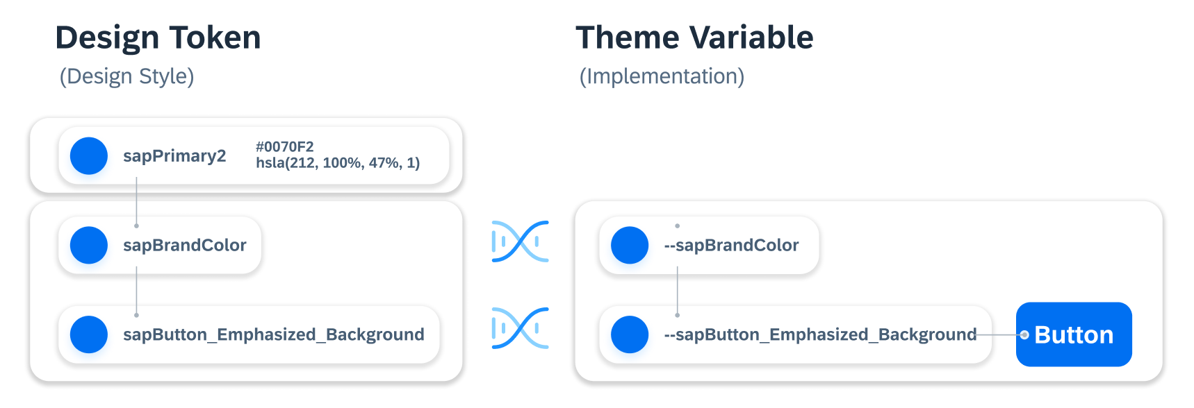
Design tokens are named the same as theming variables.
Cross-Technology Design Tokens
SAP has invested in applying theming variables to all of the UI components over the years and this has paid off. The names of the design tokens match 1:1 with the names of the theme variables that are implemented within SAP’s central theming base content repository. With design tokens, you can now download, customize, and apply SAP styles and integrate them across your design and development process.
Tokens and theming variables allow design decisions to be documented in a cross-technology and shareable format.
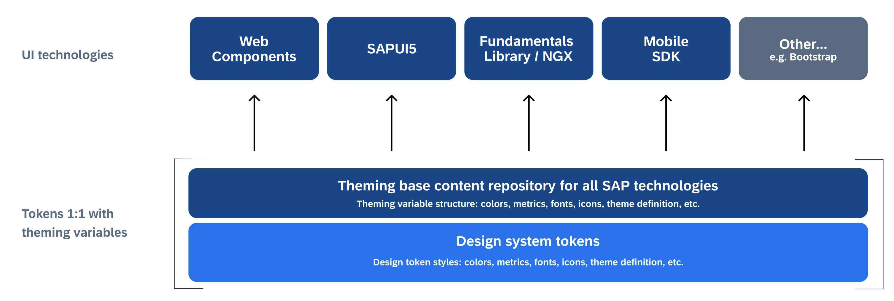
The SAP theming base content repository provides all of the foundational theme assets for all of the main SAP UI technology frameworks.
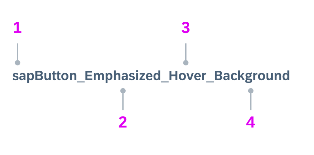
How To Read Tokens
Although some components may have deviating names, the rules below describe the common naming conventions for SAP.
| 1 | All token names in a design system start with our company name in lower case, such as sapButton_Background.
The direct component name or semantic usage is then connected to the sap name. Examples of main/base parameters: sapBrandColor, sapBaseColor, sapTextColor Examples of component names: sapButton, sapList |
| 2 | For components, additional styles or semantics are separated by underscores.
Example: sapButton_Emphasized_Hover_Background |
| 3 | Component states or additional identifiers should ideally be placed after the component name and before the direct usage name.
Example: sapButton_Emphasized_Hover_Background |
| 4 | The token name ends with a name that should directly describe exactly what the token is used for. The usage is separated with an underscore.
Examples: sapButton_Background, sapField_BorderColor |
Tokens and Style Libraries
Design tokens are the basis for the Horizon-themed style libraries that are available as Figma assets. The Horizon style libraries are independent of all of the UI kits provided by SAP design teams and are created to enable the teams to connect styles that come directly from the master branches of the SAP technology implementations.
Because we provide the Figma style libraries in addition to the tokens, Figma users can access the Horizon styles with or without a design token plugin.
SAP customers or partners who wish to preview the Evening Horizon theme, or even create custom themes directly in the Figma design tool, have the following options:
- Design tokens can be pulled from the master branches and set as local document styles. This allows you to modify the styles and create custom themes with Figma that match the style mapping connections used in SAP theming tools, such as the UI theme designer.
- Figma users who don’t have access to design tokens can still use the Figma styles provided, which have the same names as the tokens/theme variables in the Morning Horizon or Evening Horizon Style libraries. These libraries allow you to use the standard Figma features, such as swapping libraries between Morning Horizon (light theme) and Evening Horizon (dark theme).
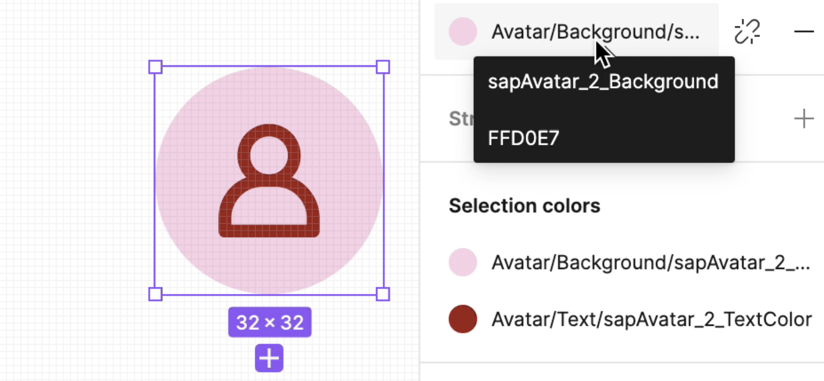
Tokens and Figma styles

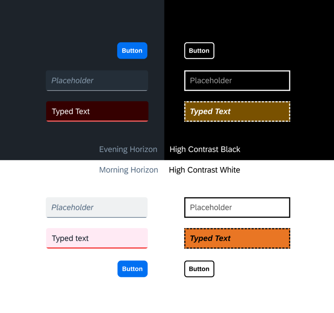
Horizon theme style libraries: Morning Horizon and Evening Horizon.
Related Links
Related Guidelines
Theming
An explanation of the theming concept.
Morning Horizon Colors
An overview of the Morning Horizon theme colors.
Evening Horizon Colors
An overview of the Evening Horizon theme colors.
Download SAP S/4HANA UI Kit
Morning & Evening Figma style libraries as part of the Figma download assets.
Implementation
SAP Theming Base Content
GitHub repository of SAP themes.

 Your feedback has been sent to the SAP Fiori design team.