
- Latest SAPUI Version 1.124
- SAPUI5 Version 1.122
- SAPUI5 Version 1.120
- SAPUI5 Version 1.118
- SAPUI5 Version 1.116
- SAPUI5 Version 1.114
- SAPUI5 Version 1.112
- SAPUI5 Version 1.110
- SAPUI5 Version 1.108
- SAPUI5 Version 1.106
- SAPUI5 Version 1.104
- SAPUI5 Version 1.102
- SAPUI5 Version 1.100
- SAPUI5 Version 1.98
- SAPUI5 Version 1.94
- SAPUI5 Version 1.92
- SAPUI5 Version 1.90
- SAPUI5 Version 1.88
- SAPUI5 Version 1.86
- SAPUI5 Version 1.84
- SAPUI5 Version 1.82
- SAPUI5 Version 1.80
- SAPUI5 Version 1.78
- SAPUI5 Version 1.76
- SAPUI5 Version 1.74
- SAPUI5 Version 1.72
- SAPUI5 Version 1.70
- SAPUI5 Version 1.68
- SAPUI5 Version 1.66
- SAPUI5 Version 1.64
- SAPUI5 Version 1.62
- SAPUI5 Version 1.60
- SAPUI5 Version 1.58
- SAPUI5 Version 1.56
- SAPUI5 Version 1.54
- SAPUI5 Version 1.52
- SAPUI5 Version 1.50
- SAPUI5 Version 1.48
- SAPUI5 Version 1.46
- SAPUI5 Version 1.44
- SAPUI5 Version 1.42
- SAPUI5 Version 1.40
- SAPUI5 Version 1.38
- SAPUI5 Version 1.36
- SAPUI5 Version 1.34
- SAPUI5 Version 1.32
- SAPUI5 Version 1.30
- SAPUI5 Version 1.28
- SAPUI5 Version 1.26
- Latest SAPUI Version 1.124
- SAPUI5 Version 1.122
- SAPUI5 Version 1.120
- SAPUI5 Version 1.118
- SAPUI5 Version 1.116
- SAPUI5 Version 1.114
- SAPUI5 Version 1.112
- SAPUI5 Version 1.110
- SAPUI5 Version 1.108
- SAPUI5 Version 1.106
- SAPUI5 Version 1.104
- SAPUI5 Version 1.102
- SAPUI5 Version 1.100
- SAPUI5 Version 1.98
- SAPUI5 Version 1.96
- SAPUI5 Version 1.94
- SAPUI5 Version 1.92
- SAPUI5 Version 1.90
- SAPUI5 Version 1.88
- SAPUI5 Version 1.86
- SAPUI5 Version 1.84
- SAPUI5 Version 1.82
- SAPUI5 Version 1.80
- SAPUI5 Version 1.78
- SAPUI5 Version 1.76
- SAPUI5 Version 1.74
- SAPUI5 Version 1.72
- SAPUI5 Version 1.70
- SAPUI5 Version 1.68
- SAPUI5 Version 1.66
- SAPUI5 Version 1.64
- SAPUI5 Version 1.62
- SAPUI5 Version 1.60
- SAPUI5 Version 1.58
- SAPUI5 Version 1.56
- SAPUI5 Version 1.54
- SAPUI5 Version 1.52
- SAPUI5 Version 1.50
- SAPUI5 Version 1.48
- SAPUI5 Version 1.46
- SAPUI5 Version 1.44
- SAPUI5 Version 1.42
- SAPUI5 Version 1.40
- SAPUI5 Version 1.38
- SAPUI5 Version 1.36
- SAPUI5 Version 1.34
- SAPUI5 Version 1.32
- SAPUI5 Version 1.30
- SAPUI5 Version 1.28
- SAPUI5 Version 1.26
Dynamic Date (Smart Filter Bar)
sap.ui.comp.smartfilterbar.SmartFilterBar Property: useDateRangeType
Intro
The dynamic date is a smart control that is only available in the smart filter bar. When the user enters a value in the date field, it suggests corresponding fixed and dynamic dates. It also offers a value help feature that lets users choose between different time periods and define them further.
The set of values offered must be defined by the app.
Usage
Use the dynamic date control if:
- You need flexibility between fixed and dynamic dates.
- You need dynamic dates that can be saved in the variant management (for example, show values from today regardless of when you open the app).
- You are using the smart filter bar.
- The user only needs to select one value.
Do not use the dynamic date control if:
- Users need to enter a date and a time. In this case, use the date picker or the date/time picker instead.
- Selecting ranges is not the user’s primary goal. In this case, use the simple date picker.
- You are not using the smart filter bar.
- You want to offer dynamic date range selection outside the smart filter bar (for example, in a table toolbar). Use the dynamic date range control instead.
Responsiveness
The dynamic date control is fully responsive. It provides a touch-friendly screen in sizes S and M (cozy mode) and is smaller in size L (compact mode). For more information on cozy and compact modes, see the article on content density.
Value help for dynamic date range – Size S
Value help for dynamic date range – Size L
Components
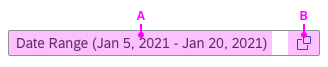
The two clickable areas of the dynamic date control
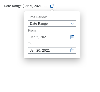
The dynamic date consists of two components:
(A) Date input field with suggestions
(B) Value help popover
On all devices, users can either use the input field to type a date, or use the value help button to open the popover.
Dynamic Date Input Field
The user can type data directly into the input field. Upon user input, a list of suggestions appears.
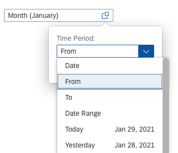
Value Help Popover
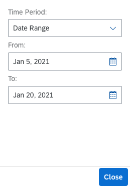
The value help popover offers all available values the user can choose from. Depending on the selected time period, the popover shows different controls. It either shows:
(A) An input field
(B) One or two date pickers
(C) A read-only text with the chosen date range
(D) A select control
Value help popover – Input field
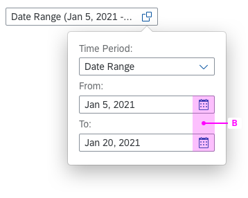
Value help popover – Date pickers
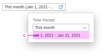
Value help popover – Read only
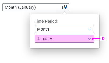
Value help popover – Select control
Values Offered
- From
- To
- Date Range
- Today
- Today -X / +Y days
- Last X days
- Next X days
- This week
- Last week
- Last X weeks
Offered Values
- Next week
- Next X weeks
- Month
- This month
- Last month
- Last X months
- Next X months
- This quarter
- Last quarter
- Last X quarters
- Next quarter
Offered Values
- Next X quarters
- First quarter
- Second quarter
- Third quarter
- Fourth quarter
- This year
- Last year
- Last X years
- Next year
- Next X years
- Year to date
Behavior & Interaction
Typing data into the date range input field
The user can type keywords or numbers into the date range input field. For example, if the user types a number, the system automatically suggests possible dates. All dynamic dates show the actual dates to help the user select the right value.
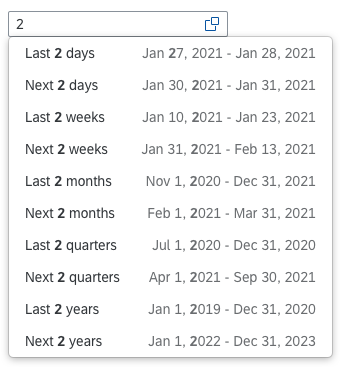
List of suggestions shown after typed input
Opening the value help and selecting a time period
Clicking the value help icon opens a popover with additional options for defining the time period. The user can choose from several time periods by clicking the down arrow in the select control. Once a time period has been chosen, the selection box closes.
Opening the value help popover and selecting a time period
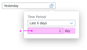
Defining a custom time period (X)
If the user selects a custom time period with “X”, such as Last X days, the control shows a simple input field for entering the number. The text in the date input field changes according to the user’s input.
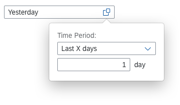
Custom time period with a simple input field
Selecting a date range
If the user selects a time period that requires input of a start and end date, two date pickers appear. These can be opened by clicking the calendar icon. The text in the date range input field changes according to the user’s input.
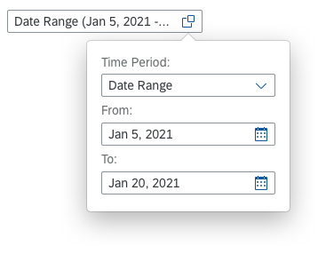
Selected time period with two date pickers (start date and end date)
Styles
Validation
Use inline validation to give the user feedback, especially for errors and warnings. The possible states are “warning”, “error”, and “success”.
The dynamic date input field in question is highlighted by a frame in the corresponding color. If the focus is inside the field, an explanation is shown. Ensure that this explanation is as specific as possible.
Visible frame that shows an error when the field is out of focus
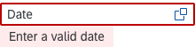
Error state with meaningful text – The date range input field is in focus
Guidelines
See the Date Picker and Date Range Selection articles for the guidelines. They also apply to the dynamic date control.
List of Options
- Only provide values that are relevant for the use case in the list of options.
- You can also add your own values, if necessary.
- If you use your own values, provide human readable text.
Resources
Want to dive deeper? Follow the links below to find out more about related controls, the SAPUI5 implementation, and the visual design.
Implementation
- Date Picker (SAPUI5 samples)
- Input (SAPUI5 samples)
- Select (SAPUI5 samples)
- Smart Controls (SAPUI5 samples)
- Smart Filter Bar (SAPUI5 API reference)
 Your feedback has been sent to the SAP Fiori design team.