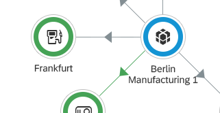
Skip to search Skip to content
  • Home
  • Get Started
    • Why Design Guidelines?
    • Navigating the Guidelines
    • Best Practices for Designing SAP Fiori Apps
  • Explore SAP Fiori
  • What’s New
  • SAP Fiori Design System
    • Overview
    • Design Principles
    • Design-Led Development
    • Accessibility
    • Multi-Device Support
    • Responsive Spacing
  • Look, Feel, and Wording
    • Overview
    • Theming
    • Colors
      • Belize Colors
      • Quartz Light Colors
      • Quartz Dark Colors
    • Iconography – Quartz
    • Motion Design
    • Typography – Quartz
    • UX Illustrations
    • UI Texts and In-App Help
      • UI Text Guidelines for SAP Fiori
      • Overview Page – UI Text Guidelines
      • Web Assistant
  • SAP Fiori Launchpad
    • Overview
    • Shell Bar
      • Overview
      • Enterprise Search
      • Notifications
      • Services
    • Home Page
    • Spaces
    • My Home
    • App Finder
    • Tile
  • General Patterns
    • Overview
    • Action Placement
    • Busy States
    • Collaboration
    • Content Density (Cozy & Compact)
    • Drafts
    • Empty States
    • Export to Spreadsheet
    • Flag and Favorite
    • Form Field Validation
    • Formatting
      • Overview
      • Dates
      • Numbers
      • Time
      • Units of Measurement
    • Forward
    • Intelligent Systems
      • Overview
      • Explainable AI
      • Matching
      • Ranking
      • Recommendations
      • Situation Handling
      • User Feedback
    • Navigation
    • Message Handling – Overview
    • Mobile Integration
    • Object Handling (Create, Edit, Delete)
      • Overview
      • Simple Objects (Create, Edit)
      • Complex Objects – Global Flow (Create, Edit)
      • Complex Objects – Local Flow (Create, Edit)
      • Copy
      • Create with Reference
      • Partial Edit
      • Mass Edit
      • Delete
    • Placeholder Loading
  • Layouts and Floorplans
    • Overview
    • When to Use Which Floorplan
    • Layouts
      • Comparison Pattern
      • Dynamic Page
      • Semantic Page
      • Flexible Column Layout
      • Letterboxing
      • Multi Instance
    • Floorplans
      • Analytical List Page
      • Initial Page
      • List Report
      • Object Page
      • Overview Page
      • Wizard
      • Worklist
  • UI Elements
    • Overview
    • When to Use
      • Semantic Colors
      • Tooltips
      • Which Selection Control?
      • Which UI Element State?
      • Wrapping and Truncation
    • Action / Navigation
      • Action Sheet
      • Breadcrumb
      • Button
      • Icon Tab Bar
      • Link
      • Smart Link
    • Collaboration
      • Feed and Notes
      • Group Feed Component
      • Timeline
    • Data Visualization
      • 3D Viewport
      • Analytical Card
      • Calendar Card
      • Chart (VizFrame)
      • Gantt Chart
      • Interactive Chart
      • Map
      • Micro Chart
      • Micro Process Flow
      • Network Graph
      • Process Flow
      • Status Indicator
      • Timeline
    • Dialog / Popover
      • Dialog
      • Message Box
      • Select Dialog
      • Table Select Dialog
      • Value Help Dialog
      • ———————————–
      • Popover
      • Quick View
    • Display
      • Avatar
      • Avatar Group
      • Carousel
      • Currency
      • Expandable Text
      • Formatted Text
      • Generic Tag
      • HTML
      • Image
      • Infobar
      • Label
      • Lightbox
      • Object Display Components
      • PDF Viewer
      • Progress Indicator
      • Status Indicator
      • T Account
      • Text
      • Tile
      • Token
    • Filter
      • Filter Bar
      • Icon Tab Bar
      • Info Bar
      • Smart Filter Bar
      • Token
      • Visual Filter Bar
      • Views
        (Variant Management)
    • Form / Layout / Container
      • Card
      • Carousel
      • Dynamic Side Content
      • Flexible Grid
      • Form / Simple Form
      • Icon Tab Bar
      • Panel
      • Scroll Container
      • Smart Form
    • Loading / Processing
      • Busy Dialog
      • Busy Indicator
      • Busy State
    • Messaging
      • Illustrated Message
      • Message Box
      • Message Page
      • Message Popover
      • Message Strip
      • Message Toast
      • Message View
    • Table / List / Tree
      • Overview
      • ———————————–
      • Analytical Table (ALV)
      • Grid Table
      • Responsive Table
      • Smart Table
      • Tree Table
      • ———————————–
      • Table Personalization
      • ———————————–
      • Grid List
      • List
      • Smart List
      • Tree
    • Toolbar
      • Overview
      • Chart Toolbar
      • Footer Toolbar
      • Header Toolbar
      • Table Toolbar
      • Tree Toolbar
    • User Input
      • Input Field
      • Multi-Input Field
      • Combo Box
      • Multi-Combo Box
      • Select
      • Smart Field
      • Mask Input
      • ———————————–
      • Select Dialog
      • Table Select Dialog
      • Value Help Dialog
      • ———————————–
      • Checkbox
      • Radio Button
      • Rating Indicator
      • Slider
      • Range Slider
      • Step Input
      • Switch
      • ———————————–
      • Date Picker
      • Time Picker
      • Date/Time Picker
      • Date Range Selection
      • Dynamic Date
        (Smart Filter Bar)
      • Dynamic Date Range
      • Calendar Date Interval
      • Calendar
      • Planning Calendar
      • Single Planning Calendar
      • ———————————–
      • Color Palette
      • Color Palette Popover
      • Color Picker
      • Color Picker Popover
      • ———————————–
      • Feed and Notes
      • Rich Text Editor
      • Search
      • Text Area
      • Upload Set
    • Reuse Components
      • Calculation Builder
      • PDF Viewer
    • Smart Controls
      • Dynamic Date
        (Smart Filter Bar)
      • Smart Field
      • Smart Filter Bar
      • Smart Form
      • Smart Link
      • Smart List
      • Smart Table
    • Support for Assistive Technologies
      • Invisible Message
      • Invisible Text
  • SAP Fiori Elements Framework
    • Overview
    • Analytical List Page / Overview Page
    • List Report / Worklist
      • Header
      • Content Area
      • Worklist
    • Object Page
      • Overview
      • Header
      • Content Area
      • Footer Bar
    • Table / List
      • Table Types
      • Table Toolbar
      • Table Features
      • Table Rows
      • List
    • Terminology
  • Analytical Frameworks
    • Overview
    • Analysis Path Framework
    • SAP Smart Business
  • Designer Toolkit
    • Overview
    • Download Design Stencils
      • Overview
      • Figma
      • Sketch
      • Axure RP
      • Adobe XD
    • Download User Research Method Cards
    • Ask the Community

Fiori for Web Design Guidelines

Explore SAP Fiori

Explore SAP Fiori

Categories

UI Element Types

3D Viewport

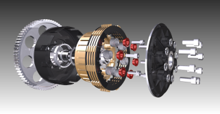
The 3D viewport control can display simple and complex 3D objects in SAP Fiori, including basic user interaction.

Category: UI Elements
Type: Data Visualization

Action List Item

Action-List-Items_small_1.46

The action list item control lets the user trigger actions directly from a list. Used in dialog boxes and popovers.

Category: UI Elements
Type: -

Action Sheet

An action sheet lets you to display a list of actions for the user to choose from. You can also cluster actions.

Category: UI Elements
Type: Action / Navigation

Analytical Card

Analytical Card article preview

Analytical cards visualize data on an overview page. Each card has a header/KPI area and a chart area.

Category: UI Elements
Type: Data Visualization

Analytical List Page

The analytical list page offers step-by-step analysis with data visualization for investigating root causes and taking action.

Category: Floorplans
Type: -

Analytical Table (ALV)

Analytical tables offer powerful options for working with the data, including advanced grouping and aggregations.

Category: UI Elements
Type: Table / List / Tree

Area Micro Chart

An area micro chart is a trend chart, which provides information for actual and target values for a specific time range.

Category: UI Elements
Type: Data Visualization

Avatar

The avatar is a control that has various display options for representing images, icons, and initials.

Category: UI Elements
Type: Display

Avatar Group

The avatar group displays a set of avatars that represent people.

Category: UI Elements
Type: Display

Breadcrumb

Breadcrumb - Featured image

A breadcrumb is a type of secondary navigation that indicates the position of a page in a hierarchy.

Category: UI Elements
Type: Action / Navigation

Bullet Chart

Bullet chart article preview

The bullet chart is used to compare primary and secondary (comparison) values.

Category: UI Elements
Type: Data Visualization

Bullet Micro Chart

A bullet chart is a variation of a bar graph, and serves as a replacement for dashboard gauges and meters.

Category: UI Elements
Type: Data Visualization

Busy Dialog

The busy dialog informs the user about an ongoing operation. During the operation the entire screen is blocked.

Category: UI Elements
Type: Loading / Processing

Busy Indicator

Busy Indicator - Featured image

The busy indicator informs the user about an ongoing operation.

Category: UI Elements
Type: Loading / Processing

Busy State

Busy State - Featured image

You can set a busy state for each SAPUI5 control. This function adapts to the space available on the UI.

Category: UI Elements
Type: Loading / Processing

Calculation Builder

The calculation builder can be used to create complex arithmetic expressions using arithmetic and logical operators.

Category: UI Elements
Type: Reuse Components

Calendar

The calendar control lets users select a single date, multiple days, entire weeks, or a date range.

Category: UI Elements
Type: User Input

Calendar Card

The calendar card shows a schedule for a single entity (such as a person) for a selected time interval.

Category: UI Elements
Type: Data Visualization

Calendar Date Interval

The calendar date interval control displays a range of days in a single row, saving on horizontal space.

Category: UI Elements
Type: User Input

Card

A card represents an app or page. It can be used to launch the app or navigate to the page content.

Category: UI Elements
Type: Form / Layout / Container

Carousel

The carousel is a control for browsing through a set of items one item at a time.

Category: UI Elements
Type: Display, Form / Layout / Container

Chart – Deviation

This article explains how to visualize the deviation (difference or variance) between two measures.

Category: UI Elements
Type: Data Visualization

Chart – Semantic Patterns

This article explains how to use patterns like dashes, dots or hatches to distinguish actual, projected, and reference values.

Category: UI Elements
Type: Data Visualization

Chart – Variation Over Time

This article illustrates the different ways you can visualize changes of measures through time.

Category: UI Elements
Type: Data Visualization

Chart – Color Palette – Values and Names

This page provides all the color names in the chart palettes.

Category: UI Elements
Type: Data Visualization

Chart – Color Palettes

This article explains the three chart visualization color palettes and how you can leverage their unique properties.

Category: UI Elements
Type: Data Visualization

Chart – Comparison

This article will help you choose the correct chart for comparing items that do not need to be displayed in a particular order.

Category: UI Elements
Type: Data Visualization

Chart – Correlation

The article explains how to use different charts to visualize the relationship between sets of numerical values.

Category: UI Elements
Type: Data Visualization

Chart – Distribution

Overview of the charts you can use to visualize how values are distributed within a set.

Category: UI Elements
Type: Data Visualization

Chart – Embedding

This article explains how to embed an SAP Fiori chart in an app to ensure the correct size and scrolling behavior.

Category: UI Elements
Type: Data Visualization

Chart – Gestures

The following gestures are available in charts: tap, press and drag, drag or slide, flick, or spread or pinch.

Category: UI Elements
Type: Data Visualization

Chart – Legend

Chart legend

The legend explains the meaning of all the visual elements in the chart.

Category: UI Elements
Type: Data Visualization

Chart – Number and Time Format

This article explains how numbers and time information can be configured to users’ local settings.

Category: UI Elements
Type: Data Visualization

Chart – Part to Whole

This article explains how to use charts to visualize the different parts of a whole (expressed as a percentage).

Category: UI Elements
Type: Data Visualization

Chart – Ranking

This article explains how to choose the correct chart for ranking items based on numeric values.

Category: UI Elements
Type: Data Visualization

Chart – Reference Lines

Add reference lines to highlight a particular value.

Category: UI Elements
Type: Data Visualization

Chart – Selection

This article describes the different ways users can select one or more data points.

Category: UI Elements
Type: Data Visualization

Chart – Time Axis

The time axis shows the variation of values through time (years, quarters, months, weeks, days, and so on).

Category: UI Elements
Type: Data Visualization

Chart – Value Display

This article describes how value labels are displayed and how you can customize them.

Category: UI Elements
Type: Data Visualization

Chart – Value-Based Legend

The value-based legend is used to visually represent value ranges through color shades.

Category: UI Elements
Type: Data Visualization

Chart – Zoom

The zoom function enables users to change the scale of an axis on a chart.

Category: UI Elements
Type: Data Visualization

Chart (VizFrame)

You can use the VizFrame control to display different types of chart that are both interactive and responsive.

Category: UI Elements
Type: Data Visualization

Chart Popover

The chart popover displays information or actions related to the selected data points.

Category: UI Elements
Type: Data Visualization

Chart Toolbar

The chart toolbar acts as a container for charts. It comes with built-in actions for the table display and personalization.

Category: UI Elements
Type: Toolbar

Checkbox

Checkbox-Featured-Image

A checkbox indicates whether a state is true (checked) or false (unchecked). Users can check multiple options.

Category: UI Elements
Type: User Input

Color Palette

Color Palette - Explore - 1.60

The color palette allows the user to choose a color from a predefined set of colors.

Category: UI Elements
Type: User Input

Color Palette Popover

Color Palette Popover - Explore - 1.60

The color palette popover combines the color palette and color picker.

Category: UI Elements
Type: User Input

Color Picker

The color picker lets users pick any color.

Category: UI Elements
Type: User Input

Color Picker Popover

Color Picker Popover - Explore - 1.60

The color picker popover consists of a color picker within a popover.

Category: UI Elements
Type: User Input

Column Chart

Column chart article preview

Column charts are used to compare multiple values over time, or values that have an intrinsic order (such as age or ratings).

Category: UI Elements
Type: Data Visualization

Column Micro Chart

column-micro-chart-explore-img-1-56

A column chart uses rectangular bars to compare multiple values over time or across categories.

Category: UI Elements
Type: Data Visualization

Combo Box

The combo box lets users select an item from a predefined list. It has both an input field and a dropdown menu.

Category: UI Elements
Type: User Input

Comparison Micro Chart

The comparison chart is a bar chart for comparing the top n entries in a list.

Category: UI Elements
Type: Data Visualization

Comparison Pattern

The comparison pattern displays information from multiple items side by side on the same page.

Category: Layouts
Type: -

Cumulation (Waterfall Chart)

Waterfall Chart - Featured image

Use waterfall charts to analyze a cumulative value.

Category: UI Elements
Type: Data Visualization

Currency

Currency - Featured image

The currency control lets you align amounts with different currencies vertically at the decimal point.

Category: UI Elements
Type: Display

Date Picker

Date Picker Featured Image

The date picker lets users pick a localized date using touch, mouse, or keyboard input.

Category: UI Elements
Type: User Input

Date Range Selection

Date Range Selection Featured Image

Users can type in a localized date range manually, or select a date range in the calendar.

Category: UI Elements
Type: User Input

Date/Time Picker

The date/time input control allows users to select a combination of date and time.

Category: UI Elements
Type: User Input

Delta Micro Chart

The delta micro chart helps to visualize a delta value (difference) between two main key figures.

Category: UI Elements
Type: Data Visualization

Dialog

The dialog control interrupts the current app process to prompt the user for information or a response.

Category: UI Elements
Type: Dialog / Popover

Display List Item

Display List Item - Featured image

Display list items are simple list items comprising a label and a text. They have largely been replaced by forms.

Category: UI Elements
Type: -

Dynamic Date (Smart Filter Bar)

Flexible smart control for entering fixed and dynamic dates. Available options respond to the user input.

Category: UI Elements
Type: Smart Controls, User Input

Dynamic Date Range

Standalone control that offers a choice of absolute and relative dates.

Category: UI Elements
Type: User Input

Dynamic Page

The dynamic page is a flexible, responsive layout control designed to support various floorplans and use cases.

Category: Layouts
Type: -

Expandable Text

The expandable text control provides access to truncated text.

Category: UI Elements
Type: Display

Feed and Notes

A combination of controls to input and post plain text, and to display the text alongside the user’s name.

Category: UI Elements
Type: Collaboration, User Input

Filter Bar

Filter Bar - Filters

The filter bar lets users filter item lists and tables by various criteria, and create custom filter variants.

Category: UI Elements
Type: Filter, User Input

Flexible Column Layout

The flexible column layout displays multiple floorplans on a single page for faster and more fluid navigation.

Category: Layouts
Type: -

Flexible Grid

The flexible grid control allows you to divide a layout into multiple columns and rows in which you can place UI elements.

Category: UI Elements
Type: Form / Layout / Container

Footer Toolbar

The footer toolbar at the bottom of the screen is used for key actions that impact the whole page.

Category: UI Elements
Type: Toolbar

Form / Simple Form

Form - Explore-and-Search - 1.46

Forms display other UI elements (such as labels, input fields, checkboxes, and sliders) in a structured layout.

Category: UI Elements
Type: Form / Layout / Container

Formatted Text

The formatted text control displays HTML text. You can format the text using HTML tags, or embed formatted text.

Category: UI Elements
Type: Display

Gantt Chart

The Gantt chart shows the sequence in which various activities occur and the dependencies between these activities.

Category: UI Elements
Type: Data Visualization

Generic Tag

Generic Tag

The generic tag displays complementary information that relates to the current page, such as KPIs and situations.

Category: UI Elements
Type: Display

Grid List

A grid list displays items using images, charts, object cards, or other formats that benefit from more height (but less width).

Category: UI Elements
Type: Table / List / Tree

Grid Table

A grid table can handle large numbers of items and columns, but is not fully responsive.

Category: UI Elements
Type: Table / List / Tree

Group Feed Component

Collaboration - GroupFeedComponent

You can use the group feed component to offer a social timeline that is integrated with SAP Jam.

Category: UI Elements
Type: Collaboration

Harvey Ball Micro Chart

You can use a Harvey Ball chart to visualize a value compared to its total.

Category: UI Elements
Type: Data Visualization

Header Toolbar

The header toolbar is always visible at the top of the page, and contains actions that are relevant for the entire page.

Category: UI Elements
Type: Toolbar

HTML

HTML_teaser_image

The HTML control allows you to display rich text or add freestyle HTML to your apps.

Category: UI Elements
Type: Display

Icon Tab Bar

The icon tab bar comprises a series of tabs that each link to a different content area or view.

Category: UI Elements
Type: Action / Navigation, Filter, Form / Layout / Container

Illustrated Message

An illustrated message is a combination of a solution-oriented message and a UX illustration.

Category: UI Elements
Type: Messaging

Image

You can use the image control to insert responsive images in various places within an app.

Category: UI Elements
Type: Display

Infobar

The infobar is a type of toolbar that appears above a list or panel, and shows filter or selection settings.

Category: UI Elements
Type: Display, Filter

Initial Page Floorplan

Use the “Initial Page” floorplan if the user needs to navigate to a single object in as few steps as possible.

Category: Floorplans
Type: -

Input Field

Input Field - Featured image

A text input field allows users to enter and edit text or numeric values in one line.

Category: UI Elements
Type: User Input

Input List Item

Input List Item - Featured image

The input list item comprises a label and input UI element. This control has largely been replaced by forms.

Category: UI Elements
Type: -

Interactive Chart

Interactive charts

The interactive chart is used for visual-based filtering in the visual filter bar within the analytical list page.

Category: UI Elements
Type: Data Visualization

Invisible Message

The invisible message control provides a hidden message that can be used by assistive technologies.

Category: UI Elements
Type: Support for Assistive Technologies

Invisible Text

invisible text - featured

The invisible text control provides a simple hidden text that can be used by assistive technologies.

Category: UI Elements
Type: Support for Assistive Technologies

Label

A label is the name or title of a control or group of related controls.

Category: UI Elements
Type: Display

Letterboxing

The letterboxing layoput restricts the user interface to a certain width to preserve the original aspect ratio.

Category: Layouts
Type: -

Lightbox

The lightbox control allows the user to view an image in its original size.

Category: UI Elements
Type: Display

Line Chart

A line chart displays information as a series of data points connected by straight lines.

Category: UI Elements
Type: Data Visualization

Line Micro Chart

The line micro chart shows as a series of data points connected by a line. It is typically used to visualize a trend over time.

Category: UI Elements
Type: Data Visualization

Link

A link is a clickable text element that can be used for navigation or to trigger an event.

Category: UI Elements
Type: Action / Navigation

List

The list control displays a simple data set that the user can sort, filter, or group.

Category: UI Elements
Type: Table / List / Tree

List Report Floorplan

The list report floorplan allows the user to work with a large, filterable list of items and take action.

Category: Floorplans
Type: -

Map

Map - Featured image

A map is a symbolic visual illustration of areas, regions, and themes. Maps can be analytical or geographic.

Category: UI Elements
Type: Data Visualization

Mask Input

Mask Input - Featured image

The mask input control governs what a user is allowed to enter in an input field.

Category: UI Elements
Type: User Input

Message Box

The message box is a special dialog for displaying error, warning, information, and success messages.

Category: UI Elements
Type: Dialog / Popover, Messaging

Message Page

Message pages give feedback to the user when an app or list is empty, or when an error has occurred.

Category: UI Elements
Type: Messaging

Message Page

Message pages give feedback to the user when an app or list is empty, or when an error has occurred.

Category: UI Elements
Type: Messaging

Message Popover

The message popover can display multiple messages without interrupting the user.

Category: UI Elements
Type: Dialog / Popover, Messaging

Message Strip

An embedded message bar that contains information about an object or a status.

Category: UI Elements
Type: Messaging

Message Toast

A message toast is a non-disruptive popup for success messages, which disappears after a few seconds.

Category: UI Elements
Type: Messaging

Message View

The message view can display multiple messages triggered by a user action (not related to form/table fields).

Category: UI Elements
Type: Messaging

Micro Chart

micro-chart-explore-img-1-56

Micro charts help you visualize a small number of data points, and can be embedded in other controls.

Category: UI Elements
Type: Data Visualization

Micro Process Flow

The micro process flow visualizes the state of individual items in a workflow, and can be embedded in a list or a table.

Category: UI Elements
Type: Data Visualization

Multi-Combo Box

The multi-combo box lets users select one or more options from a predefined list, and has an input box for filtering.

Category: UI Elements
Type: User Input

Multi-Input Field

Multi Input Field - Article Image - 1.92

A multi-input field allows the user to enter multiple values, which are displayed as tokens.

Category: UI Elements
Type: User Input

Multi-Instance Layout

The multi-instance floorplan allows users to open multiple documents in a tabbed view.

Category: Layouts
Type: -

Network Graph

The network graph displays a large amount of data by highlighting relationships between individual records.

Category: UI Elements
Type: Data Visualization

Object Display Components

Object display components represent key object attributes, such as the object ID or status.

Category: UI Elements
Type: Display

Object List Item

The object list item provides a quick overview of an object in a list, typically in the master list of a split-screen app.

Category: UI Elements
Type: -

Object Page Floorplan

The object page floorplan is the recommended floorplan for displaying, creating, and editing business objects.

Category: Floorplans
Type: -

Output Management

A reusable component for managing the output process for business documents (such as sales orders or billing documents).

Category: UI Elements
Type: Reuse Components

Overview Page

The overview page is a data-driven SAP Fiori app that provides all the information a user needs in a single page.

Category: Floorplans
Type: -

P13n Dialog

The P13n dialog allows you to offer more extensive personalization options for tables.

Category: UI Elements
Type: Table / List / Tree, User Input

Panel

The panel is a container for grouping and displaying information. It can be collapsed to save space.

Category: UI Elements
Type: Form / Layout / Container

PDF Viewer

The PDF Viewer control enables PDF documents to be displayed, printed and downloaded within your app.

Category: UI Elements
Type: Display, Reuse Components

Planning Calendar

Planning Calendar - Featured image

The planning calendar allows users to see parallel appointments and create new events.

Category: UI Elements
Type: User Input

Popover

Popover - Featured Image

A popover displays additional information for an object, and can also offer actions.

Category: UI Elements
Type: Dialog / Popover

Process Flow

You can use the process flow control to represent the stages in a business process (such as approval).

Category: UI Elements
Type: Data Visualization

Progress Indicator

The progress indicator shows the current completion status for a business process (static value).

Category: UI Elements
Type: Display

Quick View

The quick view is similar to a popover, but has a predefined structure and automatic UI rendering.

Category: UI Elements
Type: Dialog / Popover

Radial Micro Chart

Radial micro chart -explore image

You can use the radial micro chart to display a single percentage value.

Category: UI Elements
Type: Data Visualization

Radio Button

Use radio buttons if you want the user to select only one option from a group of mutually exclusive alternatives.

Category: UI Elements
Type: User Input

Range Selector

Range Selector Explore Image

The range selector is a user interface control that enables the user to select a range of data points in a data set.

Category: UI Elements
Type: Data Visualization

Range Slider

The range slider enables the user to select a value range within a predefined numerical interval.

Category: UI Elements
Type: User Input

Rating Indicator

You can use the rating indicator to let users rate content, or to display a content rating.

Category: UI Elements
Type: User Input

Responsive Table

Responsive Table - Create01

The responsive table is the default table in SAP Fiori. It supports various features at line item level.

Category: UI Elements
Type: Table / List / Tree

Rich Text Editor

The rich text editor is a text input control that lets users format the text and insert different types of elements.

Category: UI Elements
Type: User Input

Rule Builder

The rule builder lets users define simple business rules in an SAP Fiori app using a decision table.

Category: UI Elements
Type: Reuse Components

Scroll Container

The scroll container is an empty area that can be filled with content, such as other UI elements.

Category: UI Elements
Type: Form / Layout / Container

Search

Feed Input - User input controls search

The search field enables users to search for information or filter data by entering key words as text.

Category: UI Elements
Type: User Input

Select

The select control (also known as a dropdown) allows users to select an item from a predefined list.

Category: UI Elements
Type: User Input

Select Dialog

Select Dialog - Featured image

The select dialog enables users to select one or more items from a comprehensive and searchable list.

Category: UI Elements
Type: Dialog / Popover, User Input

Single Planning Calendar

The single planning calendar displays the calendar of a single person or resource over a day, work week, or week.

Category: UI Elements
Type: User Input

Size of the Chart Container

The property “autoAdjustHeight” helps to correctly manage the sizes of charts contained in a chart container.

Category: UI Elements
Type: Data Visualization

Slider

A slider is a control that enables the user to adjust single values within a specified numerical range.

Category: UI Elements
Type: User Input

Smart Chart

The smart chart is a wrapper around existing chart types, which can be used together with all existing chart types within VizFrame.

Category: UI Elements
Type: Data Visualization

Smart Field

The smart field creates different user input controls automatically based on an OData service and its annotations.

Category: UI Elements
Type: Smart Controls, User Input

Smart Form

The smart form control creates a form, including a toolbar and title. It is typically used together with smart fields.

Category: UI Elements
Type: Form / Layout / Container, Smart Controls

Smart Link

The smart link triggers a popover with additional information and links to related apps.

Category: UI Elements
Type: Action / Navigation, Smart Controls

Smart List

You can use the smart list control to create lists or trees.

Category: UI Elements
Type: Smart Controls, Table / List / Tree

Smart Table

The smart table is a wrapper for SAP Fiori tables that lets you reuse back-end data structures and generic features.

Category: UI Elements
Type: Table / List / Tree

Stacked Bar Micro Chart

The stacked bar micro chart can be used to visualize single values as part of a whole.

Category: UI Elements
Type: Data Visualization

Standard List Item

You can use the standard list item to display a simple set of data in a select dialog or (non-object) master list.

Category: UI Elements
Type: -

Status Indicator

The status indicator control shows status values as fill levels within a shape.

Category: UI Elements
Type: Data Visualization, Display

Step Input

Step Input Featured image

The step input control allows the user to adjust numeric values in predefined increments (steps).

Category: UI Elements
Type: User Input

Switch

The toggle switch mimics a physical switch that allows users to turn things on or off.

Category: UI Elements
Type: User Input

T Account

Control that allows you to display one or more ledger accounts in T-Account format.

Category: UI Elements
Type: Display

Table Personalization Dialog

Table Personalization Dialog - Explore Page - 1.90

This personalization dialog for small tables allows users to show/hide columns, and sort and filter the entries.

Category: UI Elements
Type: User Input

Table Select Dialog

The table select dialog is a table-based selection list. It allows you to show comprehensive data for each item.

Category: UI Elements
Type: Dialog / Popover, User Input

Table Toolbar

The table toolbar appears above a table and is used for key actions that impact the entire table.

Category: UI Elements
Type: Toolbar

Text

You can use the text control to display text inside a form, table, or any other content area.

Category: UI Elements
Type: Display

Text Area

Text Area - User input controls textarea

The text area is an input control that allows the user to enter multiple lines of text.

Category: UI Elements
Type: User Input

Time Picker

The time picker allows the user to select a localized time, an exact duration, or a time range (with two time pickers).

Category: UI Elements
Type: User Input

Timeline

The timeline control shows objects, events, or posts in chronological order, with the most recent entry on top.

Category: UI Elements
Type: Collaboration, Data Visualization

Title

The title control is a simple, one-line text with additional semantic information for accessibility purposes.

Category: UI Elements
Type: Display

Token

Tokens visualize previously selected items, and are similar to tags. Users can add, remove, select, or deselect tokens.

Category: UI Elements
Type: Display, Filter

Tree

tree_final

The tree control allows you to display a basic hierarchy, for example, in a master list or dialog.

Category: UI Elements
Type: Table / List / Tree

Tree Table

A tree table contains a hierarchical set of data that is structured in rows and columns and grouped into nodes.

Category: UI Elements
Type: Table / List / Tree

Tree Toolbar

Toolbar that appears above a tree or tree table.

Category: UI Elements
Type: Toolbar

Treemap Chart

Treemaps display hierarchical data as a cluster of rectangles varying in size and color, depending on their data value.

Category: UI Elements
Type: Data Visualization

Upload Set

The upload set control allows users to upload single or multiple files to an SAP Fiori app.

Category: UI Elements
Type: User Input

Value Help Dialog

Value Help Dialog - Featured image

The value help dialog helps the user find and select single or multiple values, based on different attributes.

Category: UI Elements
Type: Dialog / Popover, User Input

View Settings Dialog

The view settings dialog allows the user to sort, filter, or group data within a (master) list or a table.

Category: UI Elements
Type: Table / List / Tree

Views (Variant Management)

Variant management allows users to save and load different sets of filter or table settings.

Category: UI Elements
Type: Filter

Visual Filter Bar

Visual Filter Bar

The visual filter bar offers a unique way of filtering large datasets through vizualisations.

Category: UI Elements
Type: Filter

Wizard Floorplan

You can use the wizard floorplan to guide users through a long or unfamiliar task by dividing it into sections.

Category: Floorplans
Type: -

Worklist Floorplan

The worklist floorplan shows a list of items the user needs to process. The focus is on completing the tasks.

Category: Floorplans
Type: -
© 2023 SAP SE. All rights reserved.
  • Privacy
  • Legal Disclosure
  • Copyright
  • Terms of Use
  • Go.SAP.com
  • SAP Community Network
We'd appreciate your feedback!

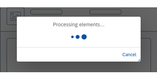
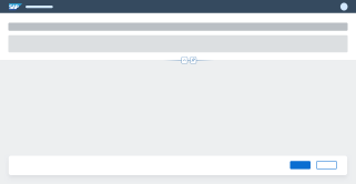
Processing your feedback

Thank you Your feedback has been sent to the SAP Fiori design team.

Thank you for your helping us to improve our guidelines!

 
We'd appreciate your feedback!
Please fill out the form to send us your feedback.
    • Can you tell us why?

Your feedback is anonymous, so you won't receive a reply. If you'd like help with a specific question, please visit the SAP Fiori Community