Media Card
Intro
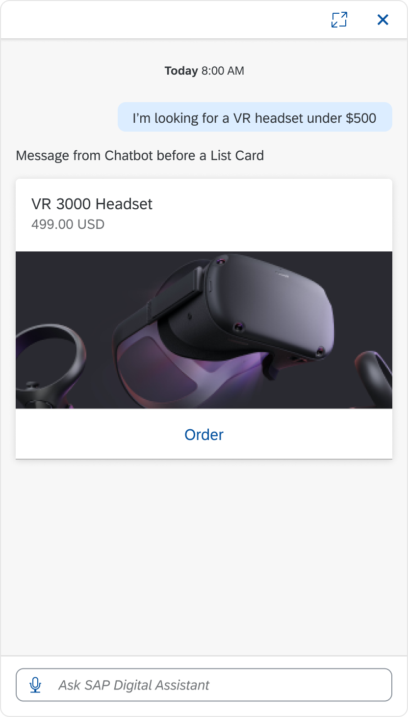
Media card displays enriched message content. It is similar to Object Cards. The media content can be an image or video.
Media Card
Usage
These are some best practices when using the media card with the digital assistant.
Dos
- Do use media card to enhance the message content and convey the information better to users.
Don’ts
- Don’t use images or video that aren’t related to the message.
Structure
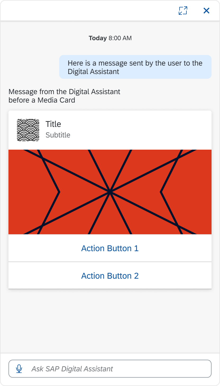
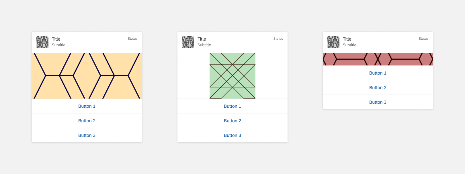
The media card can contain text, image/video, and action buttons. All media cards must have a header. Content and Footer are optional. Content and Header can be switched.
A. Header
The header displays a title and introduces the media card. The header content is similar to the Object Card.
B. Content (Optional)
The content on the media card can contain an image or video.
C. Footer (Optional)
The footer includes action buttons the user can select for the media card. The footer content is similar to the Object Card.
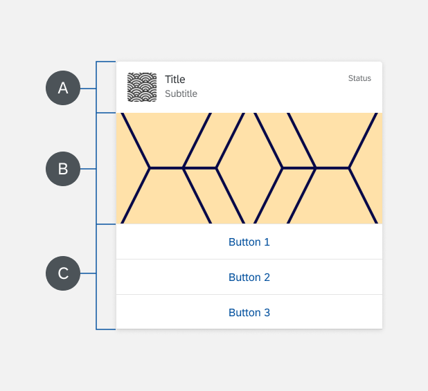
Media Card Structure
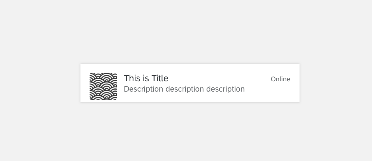
Header
A. Title
The title introduces the header.
B. Icon (Optional)
The icon gives a visual reference for the header.
C. Subtitle (Optional)
The subtitle gives the details of the header.
D. Status (Optional)
The status shows the current stage the media card is in. Statuses can also be replaced with buttons.

Content (Optional)
The media card content can have an image or video.
Media Card Content
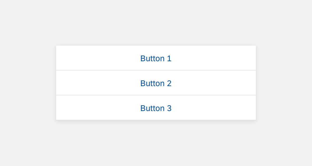
Footer (Optional)
The footer contains action buttons that the user can select for the media card. A Media Card can contain up to three actions.
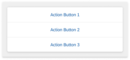
Footer
Variations
Size
You can have two media card variations depending on the screen size and device: 4-column and 8-column that follows the structure of Responsive Grids.
Here are the recommendations for the media card content area.
4-column cards:
- Maximum height 10rem (160px)
- Minimum height is 2.75rem (44px).
8-column cards:
- Maximum height is 20rem (320px)
- Minimum height is 2.75rem (44px)

Header and Content Switch
The header and content can switch places with each other.

Image Ratio
When the image width and height ratio is smaller or larger than the ratio of the media content area, the image fills the space and keeps the correct proportions.
Variation: Image Ratio
Specifications
These visual design specifications apply to the media card style and spacing.
Header
The examples show the specifications for the header in the media card.
Header Example for Media Card
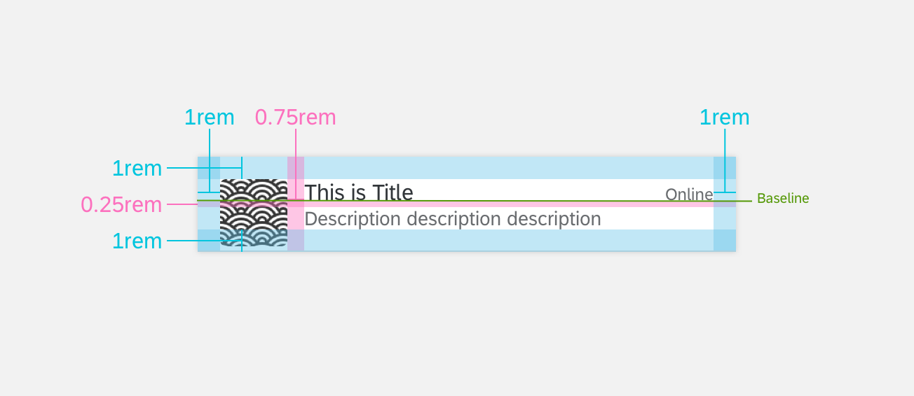
Header Specifications for Media Card
Footer
The examples show the specifications for the footer in the media card.
Footer Example for Media Card
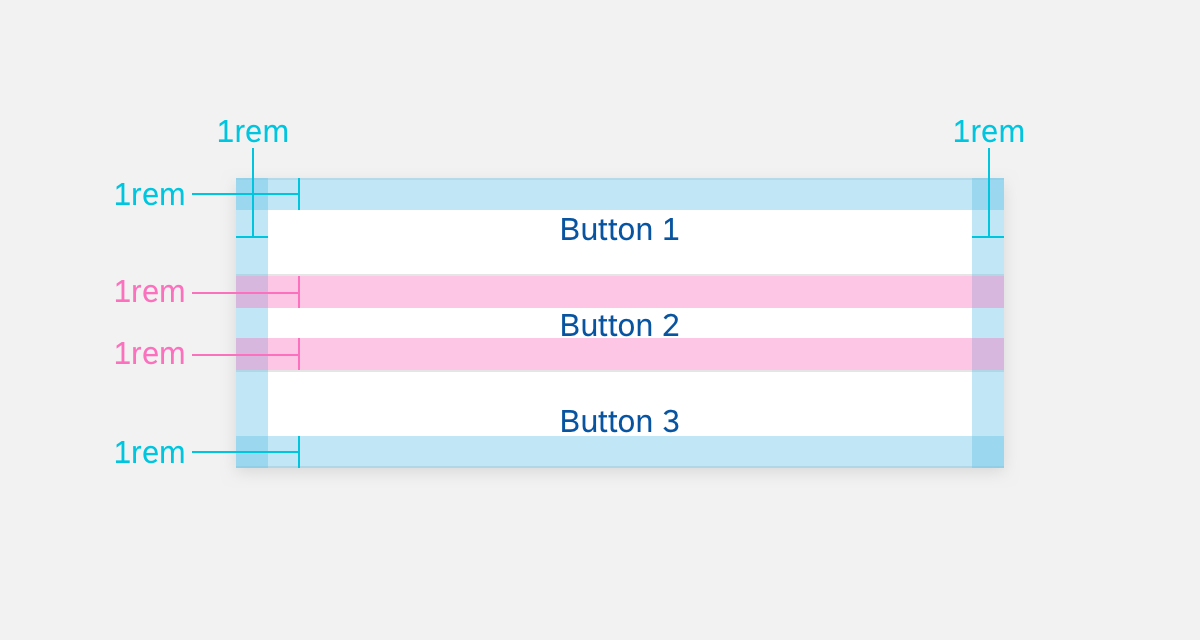
Footer Specifications for Media Card
Colors
These color specifications apply to the media card.
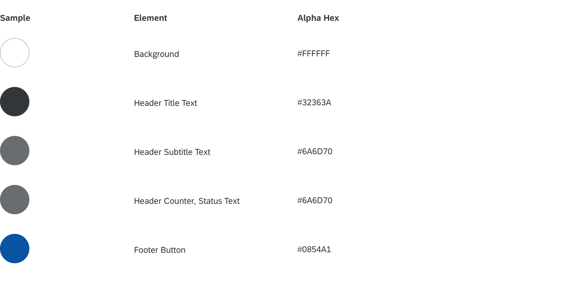
Color Specifications for Media Card
Mockup