 Tabstrips
Use and Design of Tabstrips
Tab Titles
The labels on tab titles must be as short and meaningful as possible. You should arrange your tab titles from left to right in the sequence of the work process flow.
Since the advantage of the tabstrip control is that it displays all possible navigation options, you should try not to define more tab titles than it is possible to display on the screen. Certain sections of tasks in the SAP R/3 system are extremely complex and therefore it is not always possible to follow this guideline in practice.
If you define more tab titles than can be displayed, some will be concealed. Navigation buttons appear automatically at the end of the row of tab indexes to help users find the concealed titles. Users can also request a popup menu containing a list of all the tab titles.
If tab titles correspond to entries in Goto or Extras menus, remove them. However, the screen containing the tabstrip control itself must be accessible using the Goto menu.
While a user is working with the tabstrip control, the number of pages and their contents must remain constant.
Visibility
Tab indexes (title elements) must always be clearly visible and legible. This means there should only be as many tab indexes as there is space for them on the standard size sceen. If more tab pages are needed than can be shown on the screen, choose a different design solution, for example a list of the pages, a sequential processing "Roadmap", or even a wizard.
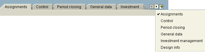
Figure 1: Avoid scrolling of tab titles!
Tab Page
The first line of the tab page is locked by the Screen Painter, since it is required by the tab titles. Normal screen design rules apply.
Including the tab title line, frame below, and locked first line, a tabstrip control requires three additional dynpro lines.
Tabstrip control and the tab page titles (labels on the tab titles) are the equivalent of a group frame, which means that frames to surround all fields in a tabstrip control page are unnecessary.
It is possible to arrange several group frames on a tabstrip control page. Take care to ensure that the tab page titles (labels on the tab titles) provide an appropriate description of the field groups on the tabstrip control page.
Screen Design
Screens should never be scrollable.
If there are more fields than there is room for on the screen, check whether tabstrips or other design alternatives would be appropriate. Always decide which alternative to use in the light of the task and the context:
- Tabstrip
- Closer packing of fields on a screen
- Dialogue box
- Separate screens
- Mechanisms for zooming in and out of particular screen areas
- Long screen with vertical scrollbar
Tab Environment
The environment of the tabstrip control must remain constant. This means that the menu bar and application toolbar must not change when the user switches between tab pages. Consequently, specific functions that are only active on one tab page must be implemented as pushbuttons on the page itself. These functions do not appear in the menu.
Leave one line between the header data and tabstrip control, as normal.
Interaction between Page Elements
Avoid complex interaction between tab pages. Users should not have to worry about why, say, a field that is not ready for input on page element no. 4 should become active when a selection is made on page element no. 2.
Navigation
Screens that contain tabstrip controls are regarded by users as a single screen. Therefore, the individual tab pages are part of that one screen, as though they were group boxes or field groups. The "F3", "F12", and "F15" functions act not on the individual pages, but on the whole of the 'container' screen.
If the user navigates from a tab page to another screen, you should ensure that the tab page from which they navigated is the active page when they return to the screen containing the tabstrip control.
Arrangement of Information
Do not distribute information the user wants to see together across different tabs. If in doubt, do not use a tabstrip. If, in a typical user scenario, the user would have to visit several tabs to work on a small number of fields, choose a different design that reduces navigation and increases clarity.
Required Entry Fields
The first page on a tabstrip should contain the most important and frequently used information. Any required entry fields should be on the top page element. If, for any reason, required entry fields are needed on other pages elements than the first, you must use the "backend variant" (field check on changing tab page).
Fields that are not technically required entry fields but which nevertheless must be maintained for completeness (for example, the short texts for data elements) should not be "hidden" on other page elementss than the first. If necessary, pages that the user must visit should be marked with a special icon on the tab.
Field Check
When you use required entry fields on a page element other than the top (first) page element there may be problems with field checking. Depending whether you use the frontend or backend method, you may create a situation where fields are not checked or where users see various error messages.
Branching away from the Tabstrip Area
Pushbuttons that trigger a jump to another screen should not be used in the tab area. Tabstrips should not include options to branch away during the task process flow because of the risk of disorientation.
Exceptionally, objects in a tabstrip may be choosable by double-click as long users are subsequently returned to the same page element they came from.
Function Triggered
When users choose a tab index (title element), it must be a tab page (page element) that appears, not a dialogue box or similar.
Element Arrangement
The arrangement and design of elements on tab pages (page elements) is subject to the same standards as on screens. If there is more than enough space available, do not space the elements overgenerously. Arrange the elements as compactly as usual, even if this means leaving a part of the tab page empty.
The vertical and horizontal points of origin of control elements on page elements should be consistent, to avoid any flicker effect when moving from page to page.
Non-Hierarchical Design
Do not use nested tabstrips, because they increase visual complexity and cause navigation problems. Instead, use other design solutions (for example, a dropdown listbox for choosing tabstrip units) .
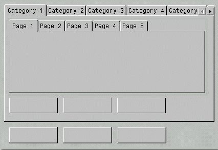
Figure 2: Don' t use tabstrips in tabstrips !
Arrangement of Pushbuttons
Buttons that are valid for all tab pages (page elements) or for a whole screen should be placed outside the borders of the tabstrip or in the application toolbar. Buttons valid for a particular tab page should be on that page.
Figure 3: Distinguish between function belonging to the tab page and functions belonging to the dynpro !
Access to Tab Pages
Direct access to tab pages (page elements) by pushbutton or menu option is not appropriate from the page the tab is on.
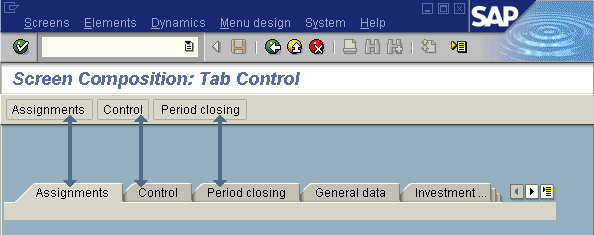
Figure 4: Incorrect pushbutton navigation from the page where there is also a tabstrip access
It may be appropriate to provide fast navigation.
Using Icons
In general, you should not use icons in tab indexes (title elements). If you must, the icons you use must help the user to recognize the individual tab indexes quickly: Using the same icon in more than one tab index (title element) tends to confuse users and does not provide any additional useful information.
Source: SAP R/3 Style Guide