
Multi-User Onboarding
FlowType
Intro
The multi-user onboarding pattern addresses onboarding scenarios where more than one user may share a device. Users can select from a list of existing accounts on the device to log in with or add a new account. The multi-user onboarding pattern is an extension of the single-user onboarding pattern. Much like the single-user onboarding pattern, the multi-user onboarding process and designs can vary depending on the application’s configuration.
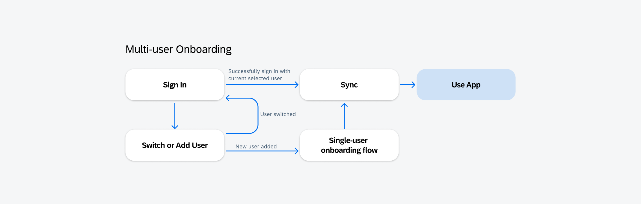
Multi-user onboarding flow
Usage
Only use the multi-user onboarding pattern when there is more than one user who may share a single device. It is used in tandem with the single-user onboarding pattern as an additional module to the overall onboarding process.
Don’t use multi-user onboarding if devices are not being shared by multiple individuals.
Anatomy
Sign In
A. Application Details
- App Logo (Optional): Recommended for better branding visuals.
- App Title: Use clear and concise naming conventions for the application’s title. It’s recommended to keep the title length to two rows for mobile or one row for tablet.
B. User Profile
The user profile may contain items that provide more information about the user, such as a profile image, user’s name, job title, etc. The items are fully customizable to provide flexibility to address any privacy or security concerns.
- User Image (Optional): If a user’s profile image is not available, then the user’s initials can replace the image instead.
- User Title: This is the primary identifier for the user.
- User Subtitle: This is the secondary identifier for the user.
C. Sign In Form
- Passcode Field: The passcode is local to the specific device and user.
- Sign In Button: The button label should be signed in as the primary call to action. Before a passcode is entered, the sign in button should remain disabled. When tapped, the credentials are validated and will route the user to the sync flow.
- Forgot Passcode Link: Takes users to a flow where they can recover or change their passcode.
D. Switch or Add User Button
Allows the user to either select existing user accounts on the device to sign in with or add a new user and go through the onboarding process.
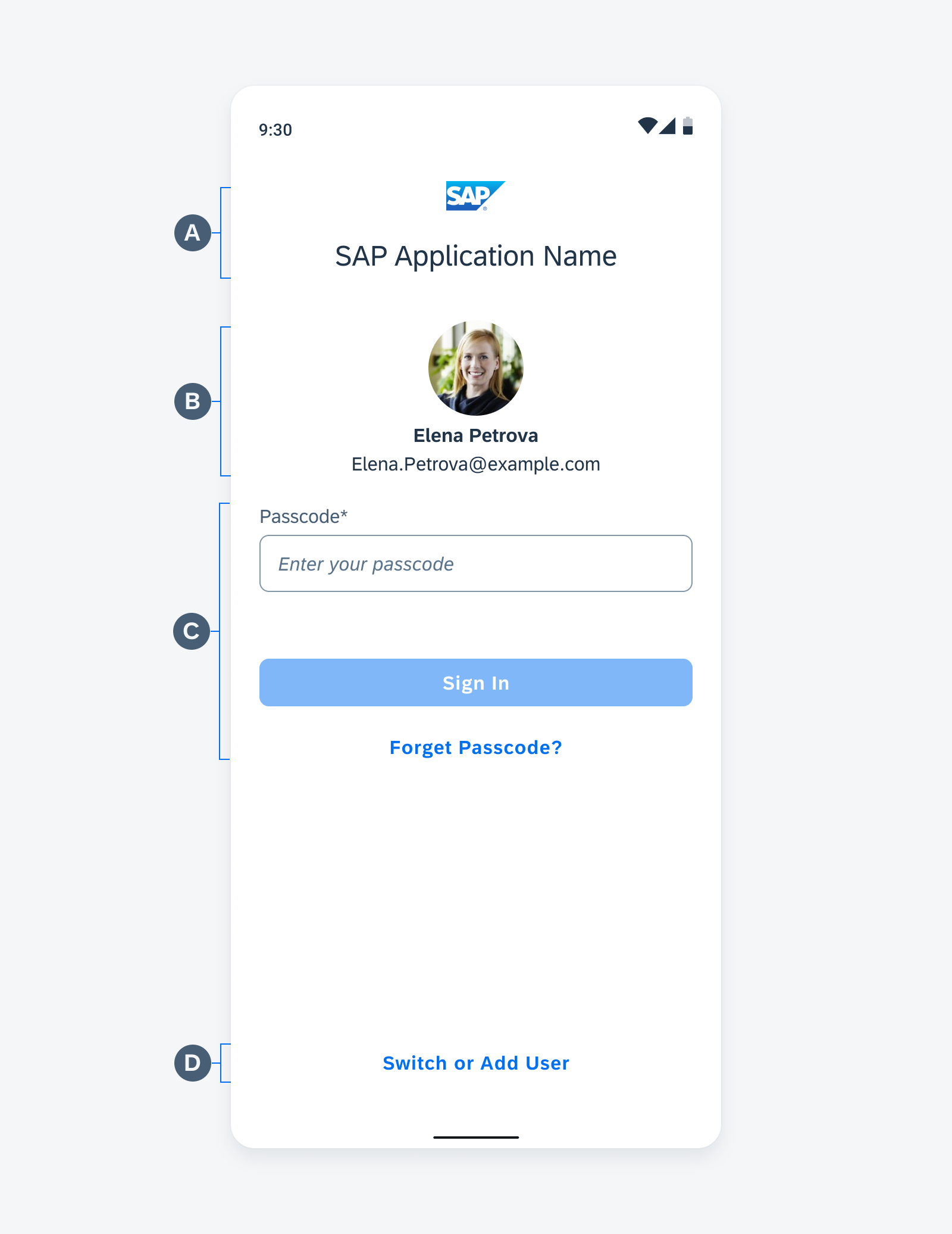
Anatomy of the sign in screen
Switch or Add User
A. App Bar
The app bar contains a back button, search button, screen title, and the add new user button.
B. Selected User Section
The selected user section indicates the current user.
C. User List
The user list displays available users that have already onboarded on that specific device.
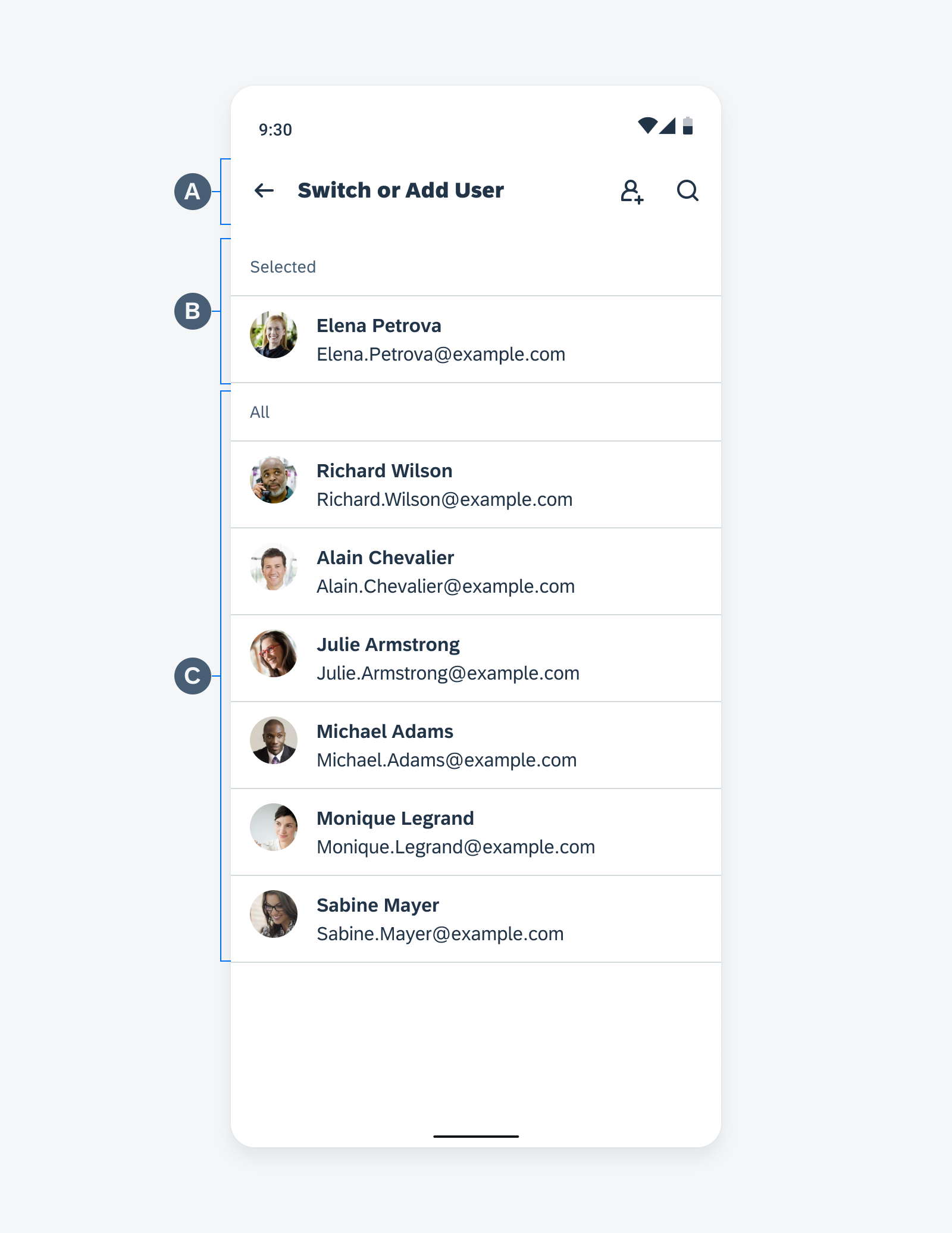
Anatomy of the switch or add user screen
Sync
A. App Bar
The app bar contains a back button and screen title.
B. Sync Indicator
The sync indicator contains items that provide information about sync progress
- Linear Indicator: Determinate indicators display how long a process will take. They should be used when a process completion can be measured.
- Title Area: The title area is used to place the main text content related to the sync status.
- Description: A description is used to provide supplementary information relating to the sync status. It is recommended that the description label does not exceed three lines.
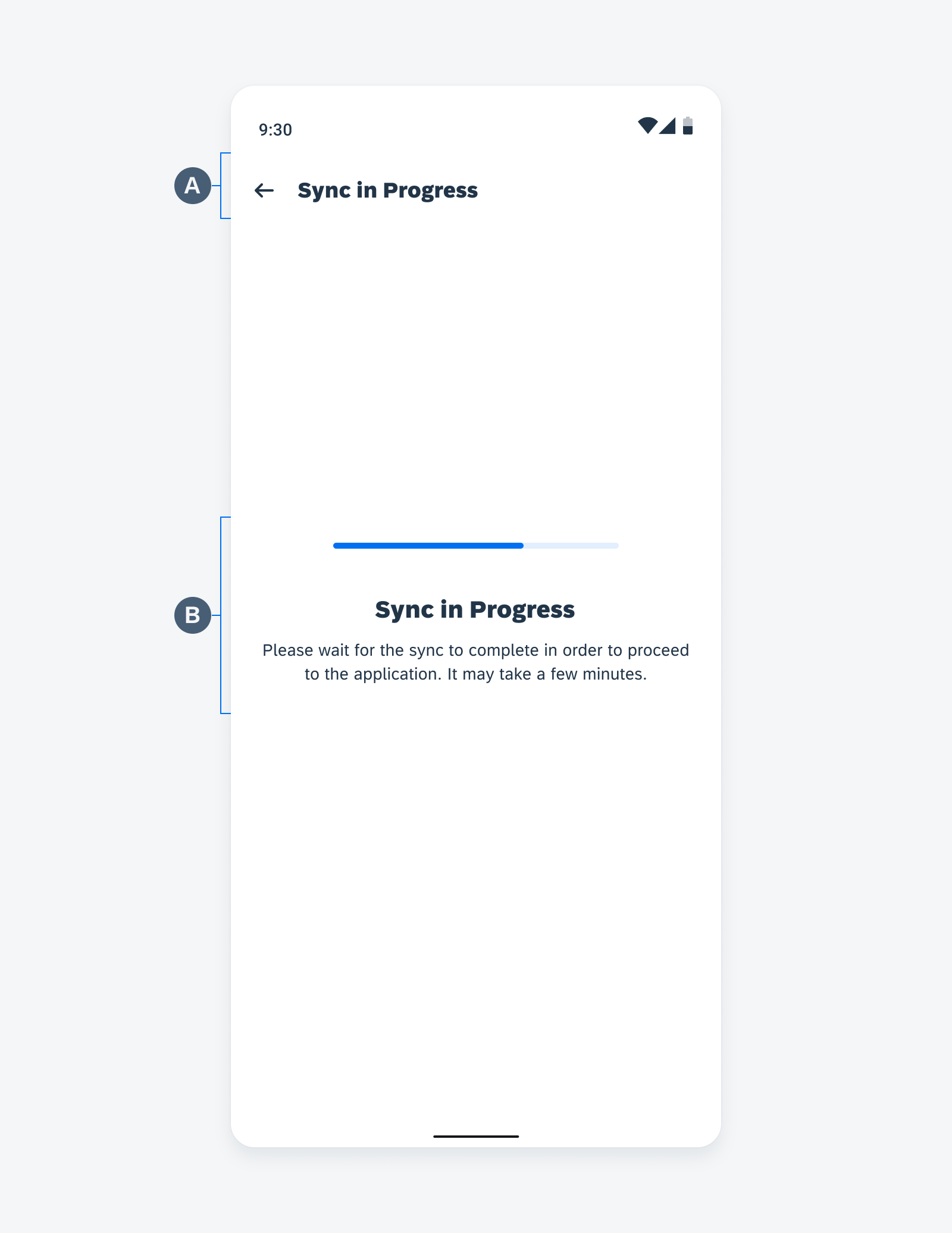
Anatomy of the sync screen
Connection Sync Error
A. App Bar
The app bar contains a back button and screen title.
B. Error Indicator
- Title Area: The title area is used to place the main text content related to the error.
- Description: A description is used to provide supplementary information relating to the error. It is recommended that the description label does not exceed three lines.
- Try Again Button: Allow the user to resync to possibly fix the error.
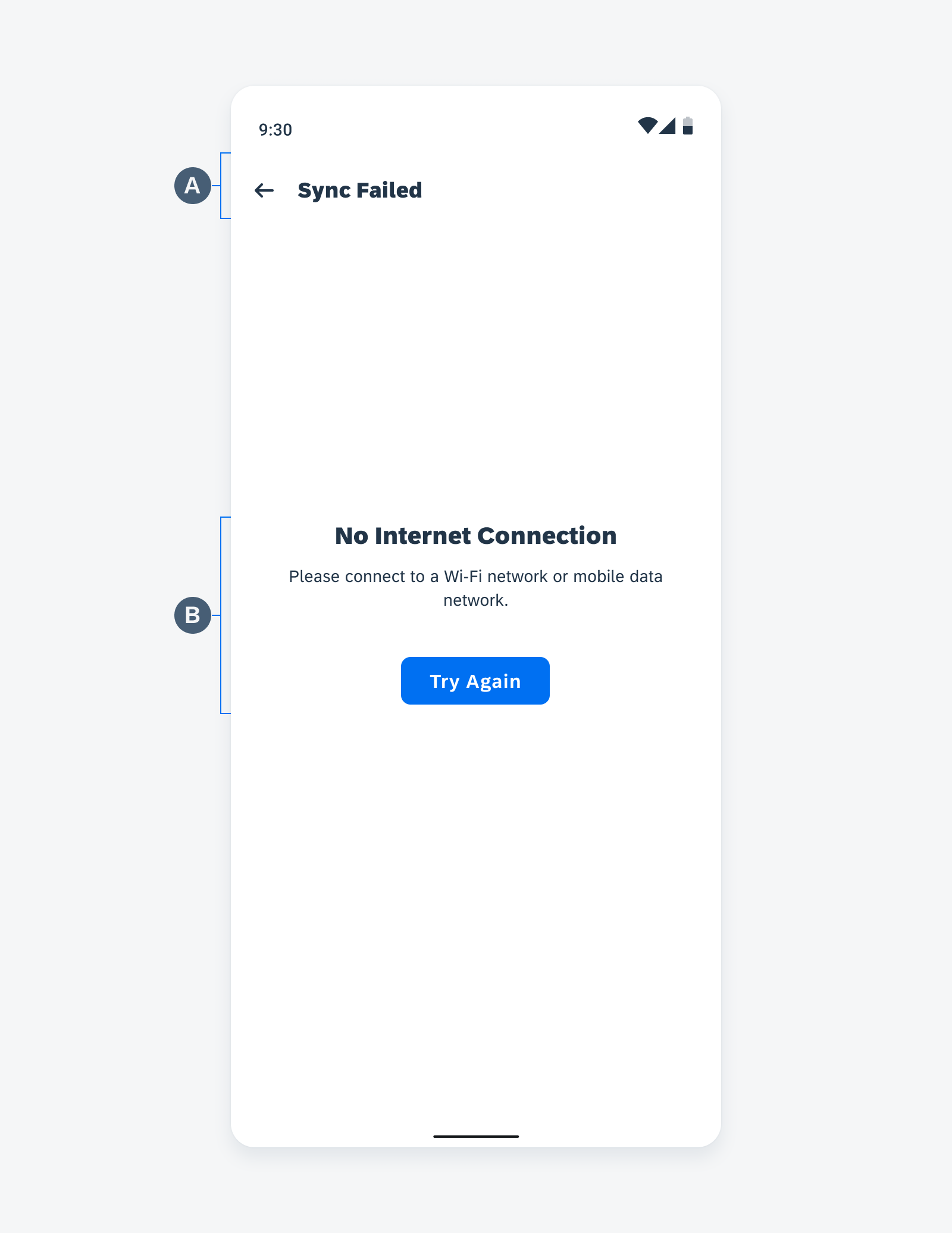
Anatomy of the connection sync error screen
User Sync Error
A. App Bar
The app bar contains a back button and screen title.
B. Error Indicator
- Title Area: The title area is used to place the main text content related to the error.
- Description: A description is used to provide supplementary information relating to the error. It is recommended that the description label does not exceed three lines.
C. Affected User
This section shows the related user that the current user needs to contact to fix the issue.
- User Image (Optional): If a user’s profile image is not available then the user’s initials can replace the image instead.
- User Title: User title is the primary identifier for the user.
- User Subtitle: User subtitle is the secondary identifier for the user.
- Description: A description is used to provide supplementary information relating to the affected user. It is recommended that the description label does not exceed three lines.
D. Return to Login Screen
Allow the user to return to the login screen to allow the related user to login into their account to fix the error.
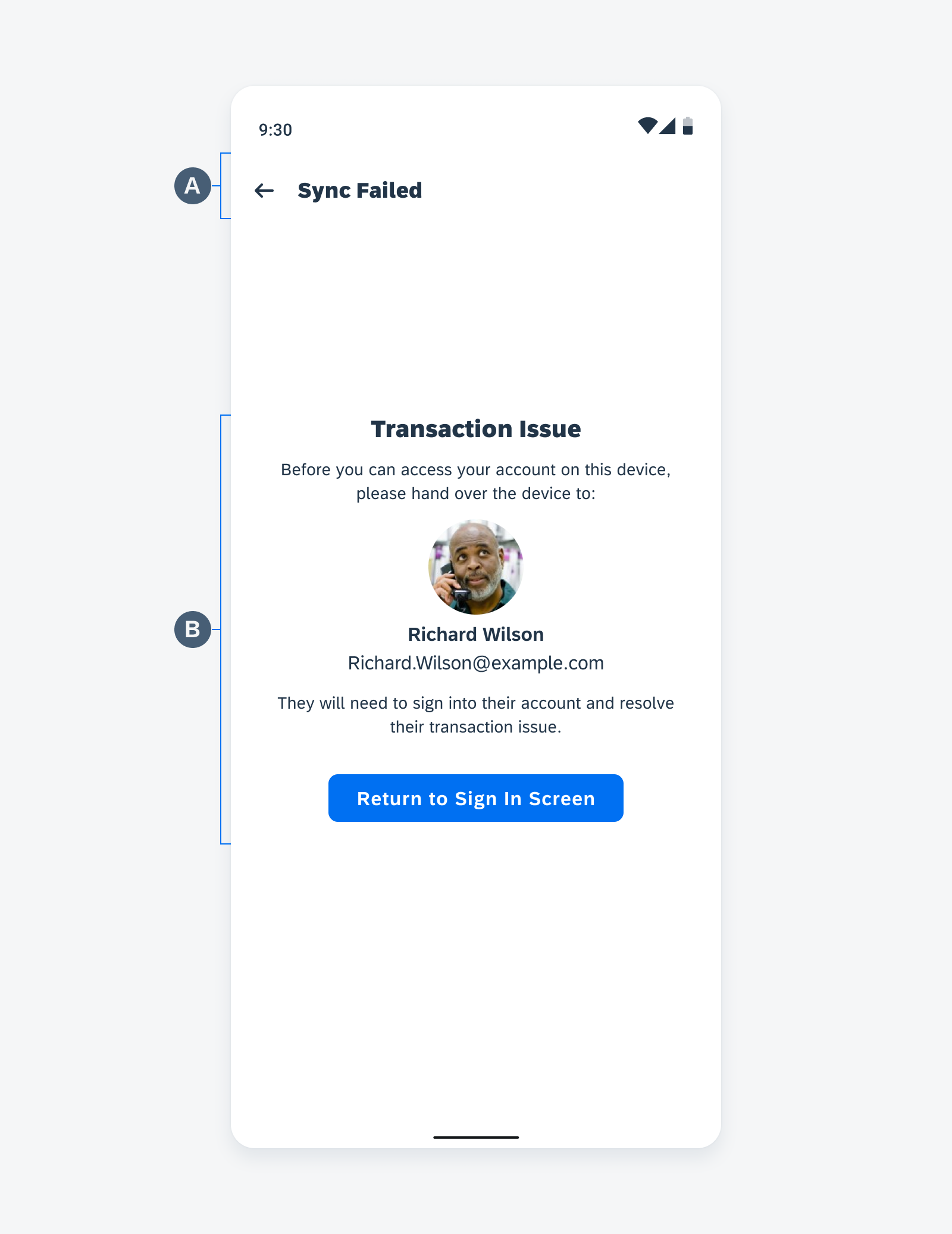
Anatomy of the user sync error screen
Adaptive Design
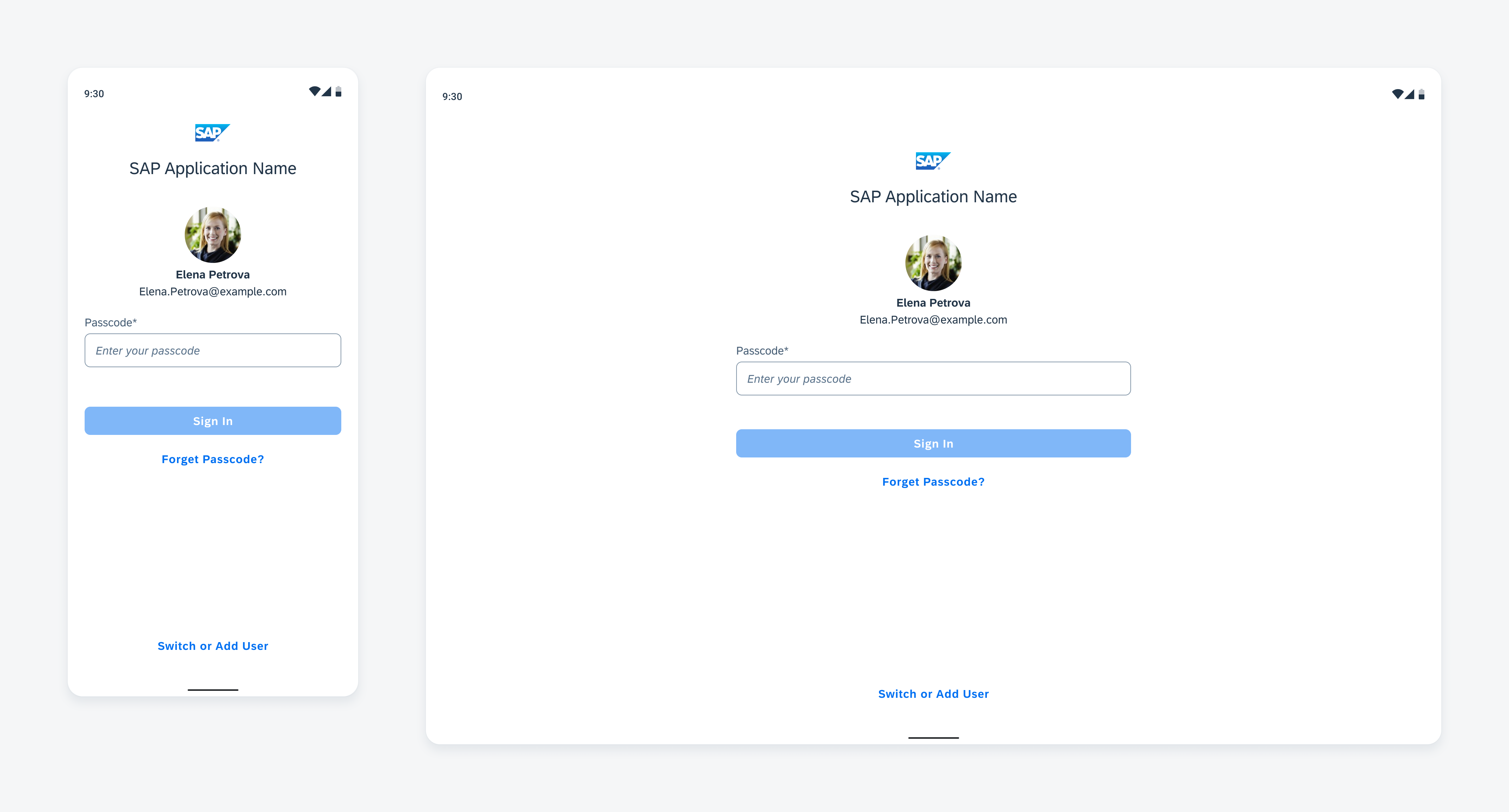
Sign in: Mobile (left) and tablet (right)
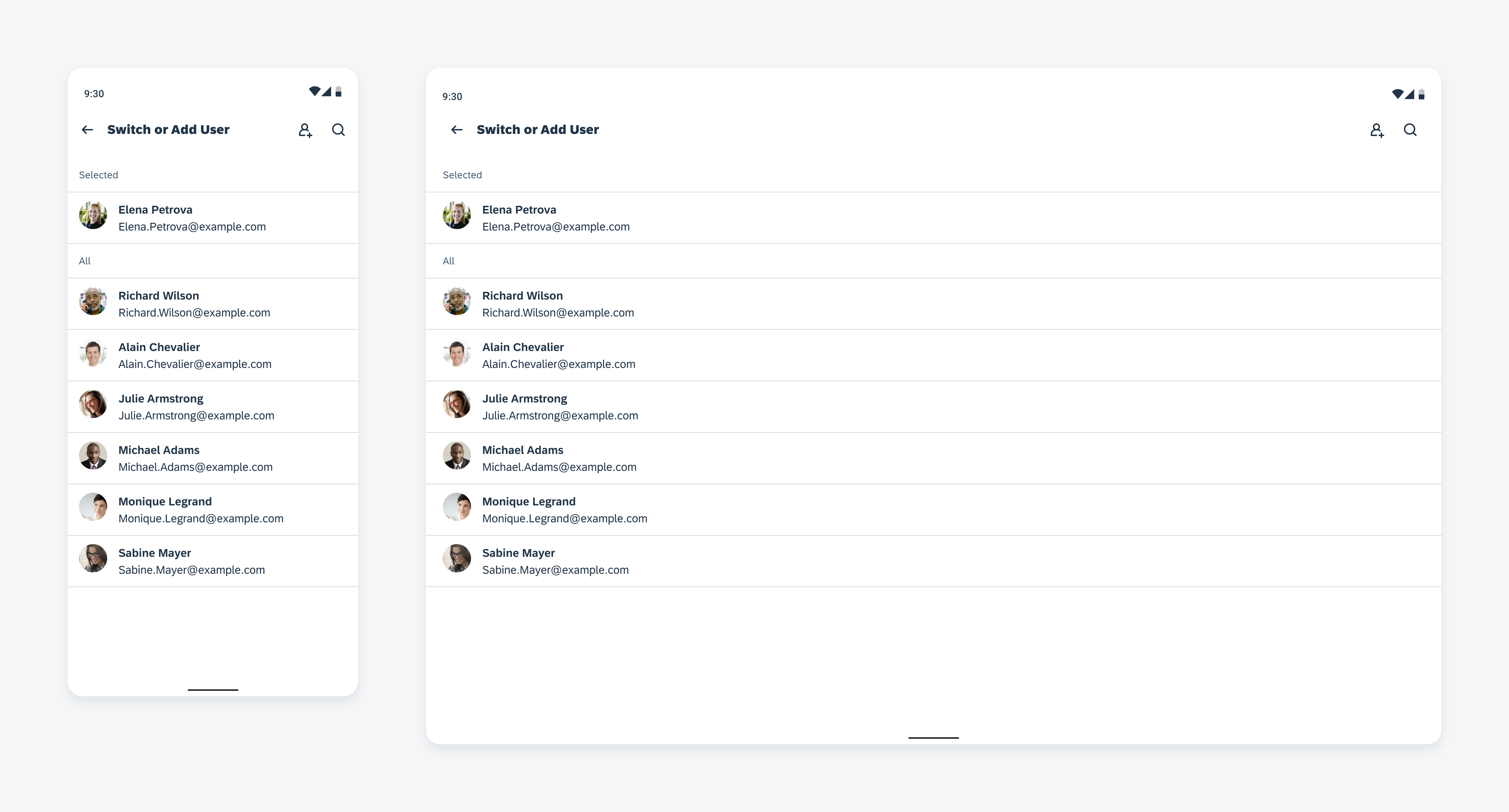
Switch or Add User: Mobile(left) and tablet (right)
Resources
SAP Fiori for iOS: Multi-User Onboarding
Related Components/Patterns: Single-User Onboarding, Search
 Your feedback has been sent to the SAP Fiori design team.