
Multi-User Onboarding
FUIMultiUserPasscodeController
Intro
The multi-user onboarding pattern is used to address onboarding scenarios where more than one users may share a device. Users are able to select from a list of existing accounts on the device to login with or add a new account.
This pattern is an extension of, or additional module to, the general onboarding pattern. For more information, click here.

Multi-user onboarding process flow
Sign In
A. Application Details
• App Logo: Optional, recommended for better branding visuals.
• App Title: Use clear and concise naming conventions for the application’s title. It’s recommended to keep the title length to two rows for compact screens and one row for regular.
B. User Profile
User profile can contain items that provide more information about the user such as a profile image, user’s name, job title, etc. The items are fully customizable to provide admins and developers the flexibility to address any privacy or security concerns.
• User Image: Optional, if a user’s profile image is not available, the user’s initials can replace the image instead.
• User Title: Use as the primary identifier for the user, such as their name.
• User Subtitle: Use as the secondary identifier for the user, such as their job title.
C. Sign In Form
• Passcode Field: Can be set to accept strictly numeric or alphanumeric.
• Sign In Button: The button label should be “Sign In” as the primary call to action. Before a passcode is entered, the Sign In button should remain disabled. When tapped, the credentials are validated and will route the user to the Sync flow.
• Forgot Passcode Link: Takes users to a screen where they can recover their passcode.
D. Switch or Add User Button
Allows the user to either select existing user accounts on the device to sign in with or add a new user and go through the onboarding process

Anatomy of multi-user sign in
Switch or Add User
E. Navigation Bar
The navigation bar contains a “Back” button, screen title, and the “Add New User” action button.
F. Search Field
The search field is located below the navigation bar.
G. Selected User Section
The selected user section sits below the search field and indicates the current user selected on the sign in screen.
H. User List
The user list sits below the search field and displays available users that have already onboarded on that specific device.

Anatomy of switch or add user
Behavior and Interaction
Once the user takes an action on a view to proceed further, the next view in the process is presented. Include a blank white screen as a layer above the launch screen when these modular transitions take place. Once the entire onboarding process is complete, the launch screen transitions into the Home screen of the app.
Sign In
The user profile that is loaded/selected on the “Sign In” screen is the current/previous user’s by default. To sign in with the currently selected user profile, the user needs to first tap on the passcode input field and enter in their passcode.
Passcode Field
Tapping on the passcode field shifts up the content view adjusting for the system keyboard. The placeholder “Passcode” italicized text is replaced with the user’s obfuscated passcode entry.
Sign In Button
Tapping on the enabled “Sign In” button, the user starts the user authentication and sync process.
Forgot Passcode Link
Tapping the “Forgot Passcode?” link triggers a push to another screen where the user can retrieve or change their passcode.
Switch or Add User Button
Tapping “Switch or Add User” pushes to the “Switch or Add User” screen.

Signing into selected user's account
Switch or Add User
Back Button
The “Back” button saves the current user profile selection and closes the modal, returning to the Sign In screen with the updated user profile.
Add User Button
The “Add User” icon button opens to the onboarding flow.
Search
The local search uses a prominent search bar that allows users to search for and select user profiles that onboarded and have been stored on the device. For more information, see Search.
User List
The user list works like the list picker component, the user taps on a listed user profile to select and deselect. A checkmark indicates the user’s selection. List title sections such as “Selected” and “All” are displayed depending on whether the number of user profiles can fit in the view.

Switching users or adding new user

Development: Onboarding Patterns, FUIMultiUserPasscodeController
SAP Fiori for Android: Multi-User Onboarding
Related Components/Patterns: Single-User Onboarding, List Picker, Search
 Your feedback has been sent to the SAP Fiori design team.
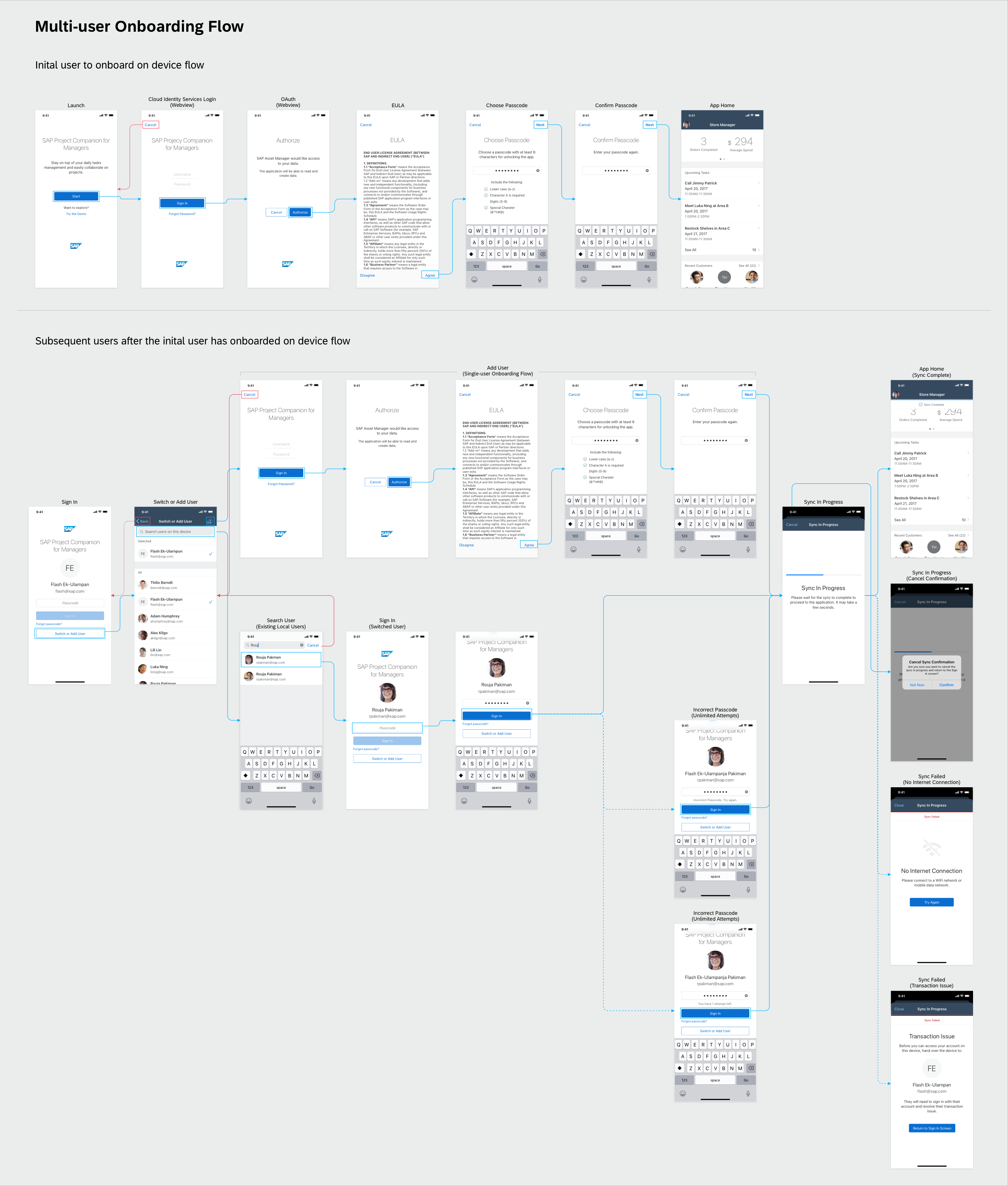