
Navigation Bar
FioriNavigationBar
Intro
The navigation bar provides fast access to two to five core destinations in an app.
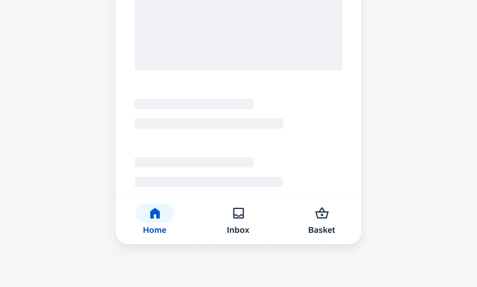
Navigation bar with three destinations
Usage
- Use the navigation bar for two to five core destinations.
- Use the navigation bar on mobile and small tablet interfaces.
- Keep the title of destinations short and concise.
- Don’t use the navigation bar if there is only one destination or if there are more than five, use the navigation drawer instead.
- Don’t use the navigation bar on tablets, use the navigation rail or the standard navigation drawer instead.
- Don’t wrap, truncate or shrink text.
Anatomy
A. Icon
Meaningful icons visualize the app destinations. Use filled icons for the selected destination and unfilled icons for unselected destinations.
B. Active Indicator
The active indicator highlights the selected destination.
C. Label Text
The label text provides a short and concise description of the destination.
D. Large Badge with Value (Optional)
The large badge with value shows a number for status changes.
E. Small Badge (Optional)
The small badge displays a change, for example, a new notification.
F. Container
The container contains all destinations including icons, active indicator, and optional labels.
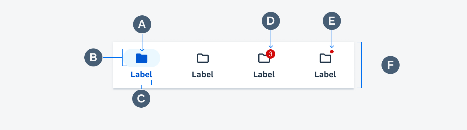
Navigation bar anatomy
Behavior and Interaction
When the user taps on a destination or if one is focused on the navigation bar, the user is directed to the navigation destination associated with that icon. Navigation between destinations is visually highlighted by the active indicator and the filled icon.
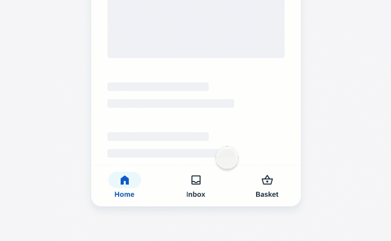
Selecting another destination in the navigation bar
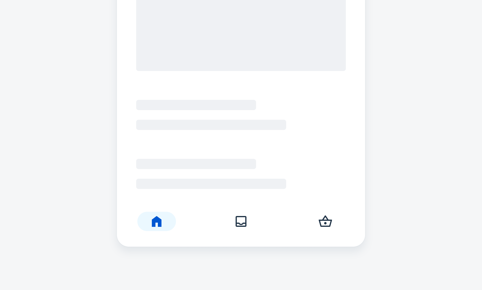
When scrolling up or down on the screen, the navigation bar remains fixed.

Scrolling up and down while the navigation bar remains fixed
Adaptive Design
Use navigation bars on mobile and small tablet interfaces. The navigation bar uses 100% of the screen width and the destinations are equally distributed across the navigation bar.
On tablets, replace the navigation bars with a more appropriate component, such as a navigation rail or navigation drawer.
Variations
There are different variations of destinations to represent the navigation bar:
- Label and icon
- Icon only
- Label and icon for selected destinations and icon only for unselected destinations
Label and Icon
The default navigation bar consists of a label and an icon.
Navigation bar destinations with label and icon
Icon Only
For a simplified navigation bar, you can omit the labels. Icons should always be unique and universally represented for users (e.g., basket, home and favorites).
Navigation bar destinations with icon only
Mixed
The mixed variation is used to emphasize the selected destination with label and icon and the unselected destinations are displayed with icon only. Use this variation only when the icons have a clear meaning to users.
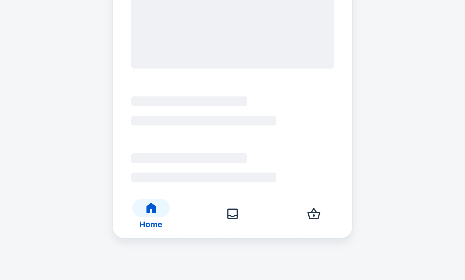
Navigation bar selected destination with label and icon and unselected destinations with icon only
Resources
Development: FioriNavigationBar, BottomNavigationView
SAP Fiori for iOS: Tab Bar
Material Design: Navigation bar
 Your feedback has been sent to the SAP Fiori design team.