
Persistent Footer
Fiori: PersistentFooter
Intro
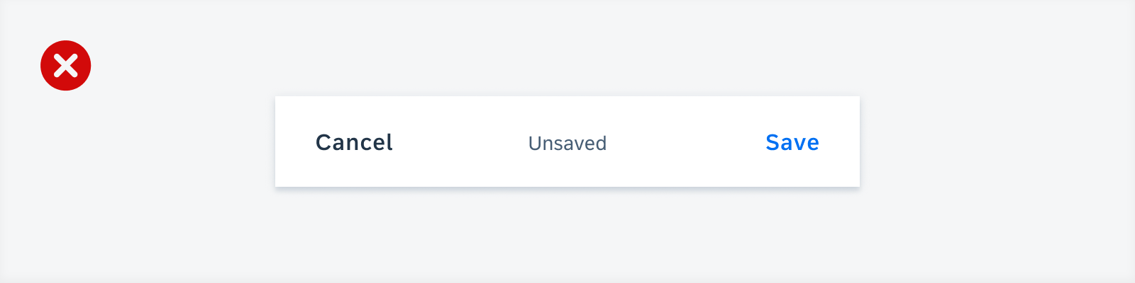
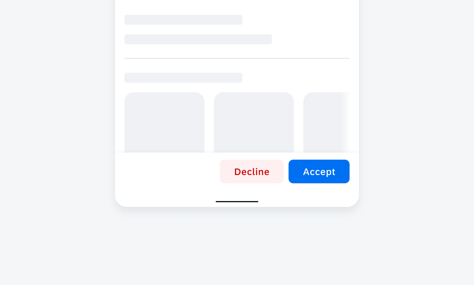
A persistent footer component is used for closing or finalizing actions that impact the current view. It is fixed at the bottom edge of the screen and comes in two different layouts: one for related actions with one or more buttons and one for opposite actions with two buttons and a helper/status text.
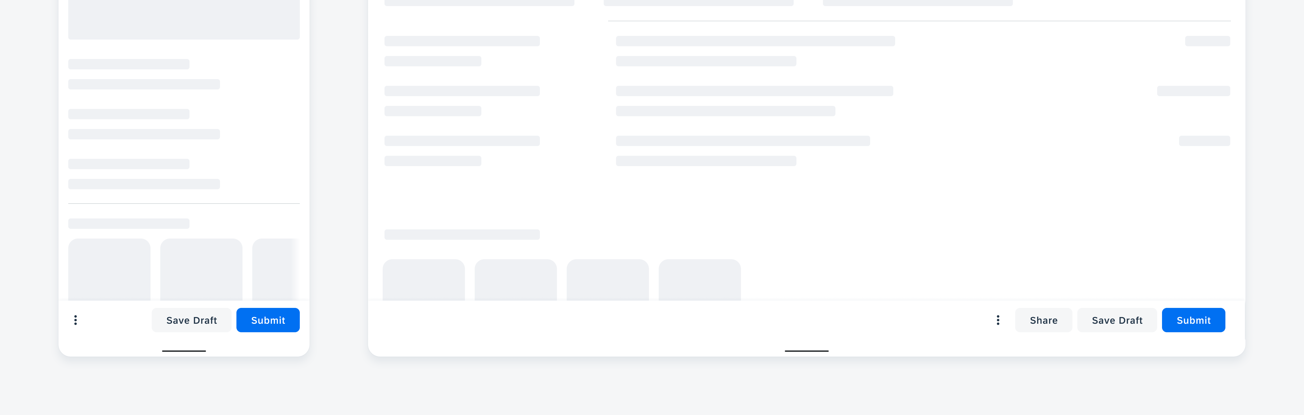
Persistent footer on mobile (left) and tablet (right)
Usage
- Use the persistent footer if you need closing or finalizing actions.
- Use descriptive and concise verbs as button labels.
- Only use a primary button if your app has a clear primary action.
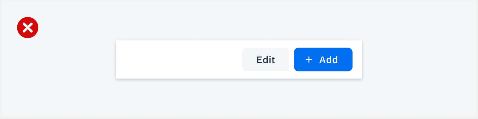
- Use an overflow menu if your persistent footer requires more than two text buttons on mobile devices.
- Use an overflow menu if your persistent footer requires more than three text buttons on tablets.
- Don’t use the persistent footer if its action influences only specific items instead of the entire view.
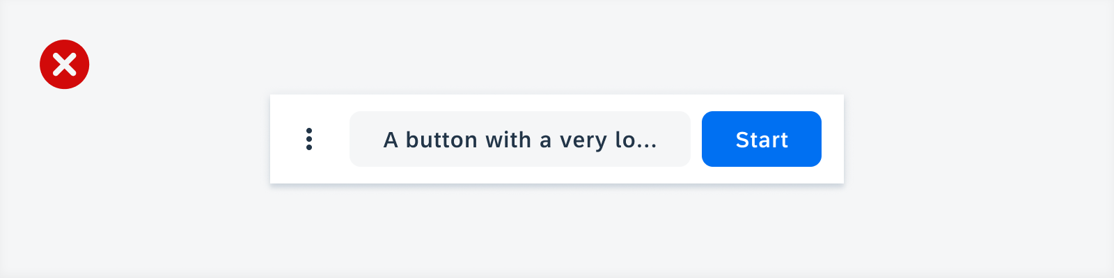
- Don’t wrap, truncate, or scale button labels.
- Don’t combine icon-only and text-only buttons within a persistent footer.
- Don’t combine icons and text in opposite action buttons.
- Don’t use a helper text if your persistent footer has an overflow menu.
- Don’t mix tertiary buttons with secondary or primary buttons within a persistent footer.
Examples

Positive example of using contained buttons with text only for related actions
Negative example of using a contained text button and a contained button with text and an icon for related actions

Positive example of using a contained button that is supposed to be responsive to the container of the persistent footer
Negative example of using a text button that is responsive to the complete width of the persistent footer container

Positive example of using buttons that include text and an icon for opposite actions
Negative example of using contained buttons to display text and an icon for opposite actions

Positive example of combining a primary button with a tonal secondary button
Negative example of using text buttons for primary and secondary actions

Positive example of using only one primary button and moving the secondary button to the overflow menu because the button label would be too long
Negative example of using a secondary button with a truncated text label because it is too long to be displayed
Anatomy
Related Actions
A. Container
The persistent footer container contains one or more buttons. The persistent footer is always visible, even when users scroll down.
B. Overflow Icon
If the persistent footer has more than two text buttons on mobile, the additional text buttons move into an overflow menu.
On tablets, the overflow is displayed if there are more than three text buttons.
The most important actions are displayed first in the overflow menu, which opens at a higher elevation than the persistent footer.
C. Secondary Button
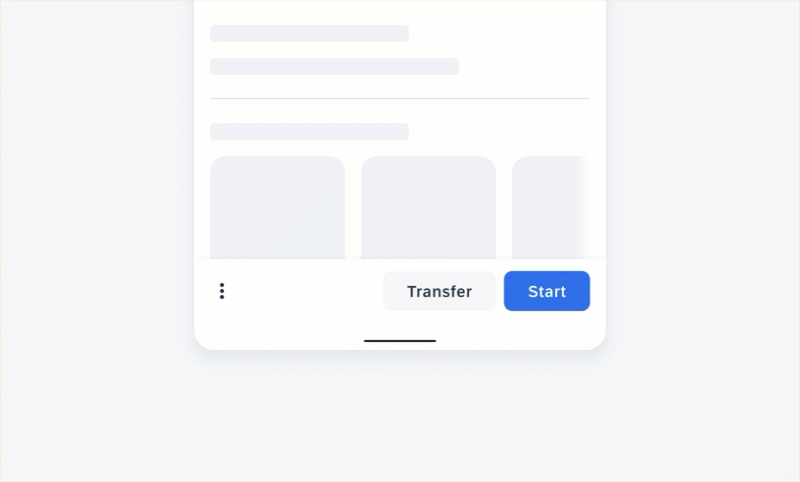
The secondary button should indicate actions that are not the primary action. If the view does not have a clear primary action or if the displayed actions are of equal importance, the persistent footer can consist only of secondary buttons. Use the secondary style only if there are two or more buttons within the persistent footer.
D. Primary Button
The primary button indicates the most important action. Display only one primary action for the entire view. If the persistent footer has only one button, we recommend formatting the button in primary style.
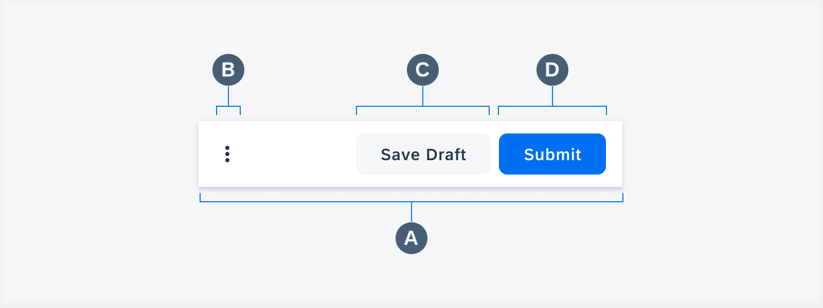
Anatomy of persistent footer with related actions
Opposite Actions
A. Container
The persistent footer contains two buttons.
B. Left Action
The left action is used for an action that is not the primary action.
C. Helper/Status Text
The helper/status text gives contextual information about the opposite actions.
D. Right/Primary Action
The right/primary action indicates the most important action.
Anatomy of persistent footer with opposite actions
Behavior and Interaction
Buttons
Buttons provide short and meaningful text. For maximum legibility, label text should remain on a single line.
Button Styles and States
To help users distinguish between different actions, you can use the Horizon button styles, such as contained tint for positive primary actions and tonal semantic for negative secondary actions. All the different button states are also supported.
Related actions with a right-aligned contained tint button for a positive primary action and a tonal semantic button for a negative secondary action
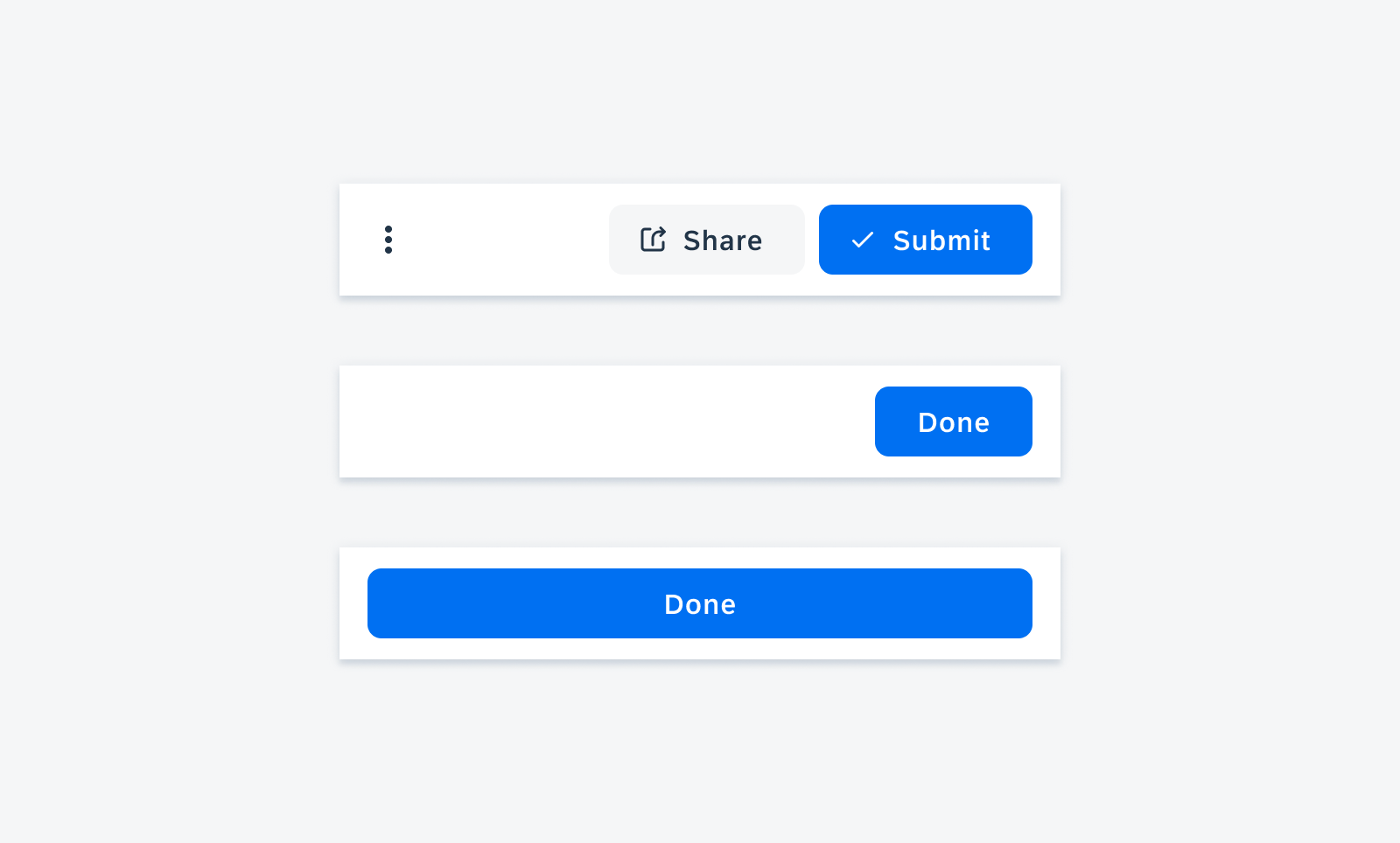
Overflow Menu
Tapping on the overflow button opens a menu with additional actions.
Text Buttons
On mobile devices, a maximum of two text buttons can be displayed in the persistent footer. If the persistent footer has more than two text buttons, the additional text buttons move into an overflow menu, where the most important actions are displayed first.
On tablets, the overflow menu is displayed if there are more than three text buttons.
User interaction of tapping the overflow button which opens a menu with additional actions
Adaptive Design
The toolbar spacing follows the global layout margins of the Android size classes. It uses 100% of the screen width.
On mobile devices, the buttons are equally distributed across the container of the persistent footer. On tablets, the buttons are aligned to the right side of the container to provide convenient access to the buttons.
The persistent footer hides once a keyboard is on screen.
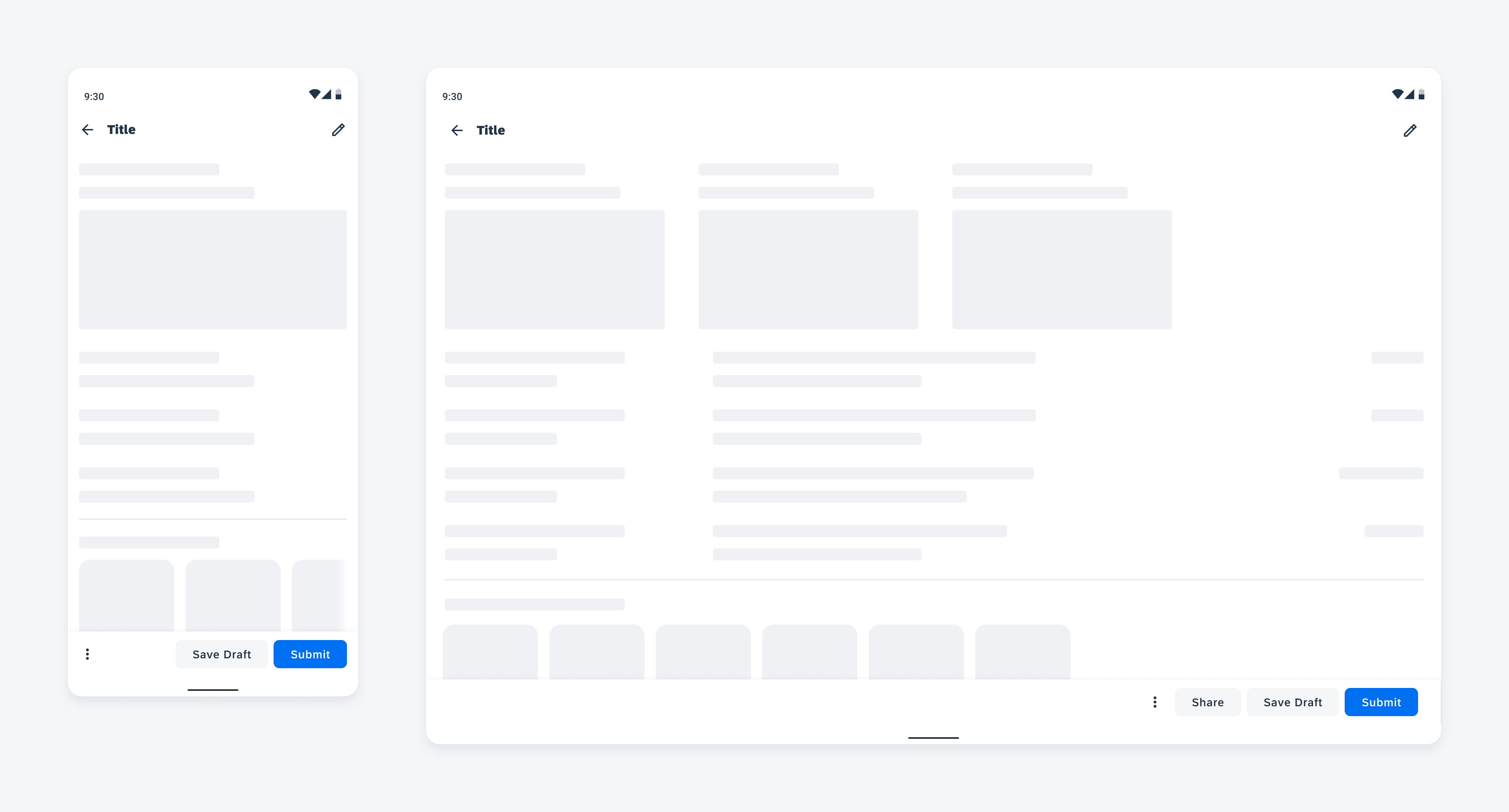
Persistent footer on mobile (left) and on tablet (right)
Variations
Related Actions
Primary Contained Button and Secondary Tonal Button
The primary contained button and the secondary tonal button are best used for two related actions.
The primary action is placed in a contained button to the right of the screen. The secondary action is placed in a tonal button to the left of the primary action.
Optionally, the primary contained and secondary tonal button can be combined with a leading icon and an overflow menu if there are more than two actions on mobile or more than three actions on tablet devices.
Primary Contained Right-Aligned Button
The primary right-aligned button indicates a single primary action and should be formatted as a contained button to the right of the screen.
Optionally, the primary right-aligned button can have a leading icon.
Primary Contained Center-Aligned Button
The primary center-aligned button indicates a single primary action and should be formatted as a contained button that spans across the full width of the screen.
Optionally, the primary center-aligned button can have a leading icon.
Persistent footer with a primary contained button with an icon and secondary tonal button with an icon (top), a primary right-aligned button (middle), and a primary center-aligned button (bottom)
Opposite Actions
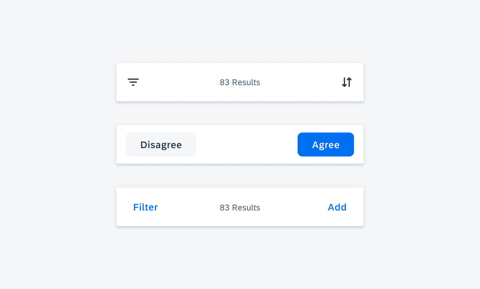
When using two buttons that give users opposite options, the buttons are placed left and right of the persistent footer, with an optional helper/status text in the middle, to emphasize the different opposite actions, such as “Agree” and “Disagree”.
Icon Buttons
Icon buttons indicate two opposite actions and can have an optional helper text in the middle.
Left-Aligned Secondary Tonal Button and Right-Aligned Primary Contained Button
The left-aligned secondary tonal button and the right-aligned primary contained button indicate two opposite actions and can have an optional helper text in the middle.
Text Buttons
Text buttons are used for actions of equal importance and can have an optional helper text in the middle.
Persistent footer with icon buttons (top), left-aligned secondary tonal button and right-aligned primary contained button (middle), and text buttons with helper text (bottom)
Resources
Development: PersistentFooter
SAP Fiori for iOS: Toolbar
SAP Fiori for Web: Footer Toolbar
Related Components/Patterns: Buttons
 Your feedback has been sent to the SAP Fiori design team.