
New Updates
This article provides an overview of the topics that have been added or changed based on the controls available in the SAP BTP SDK for Android.
SAP BTP SDK for Android 24.4
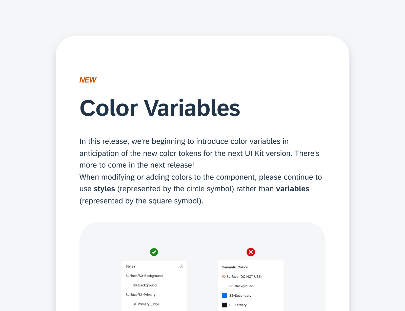
Updates to Guidelines & Design Kit
New Release Naming Convention
Starting in 2024, the SAP BTP SDKs for Android and iOS have changed their release naming from “Major.Minor.Patch” format to “Year.Month.Patch” format. For example, a release in April 2024 is called 24.4.0. The first patch for this release will be named 24.4.1, the second will be named 24.4.2, and so on. If the release gets delayed by a month to May, it will be named 24.5.0.
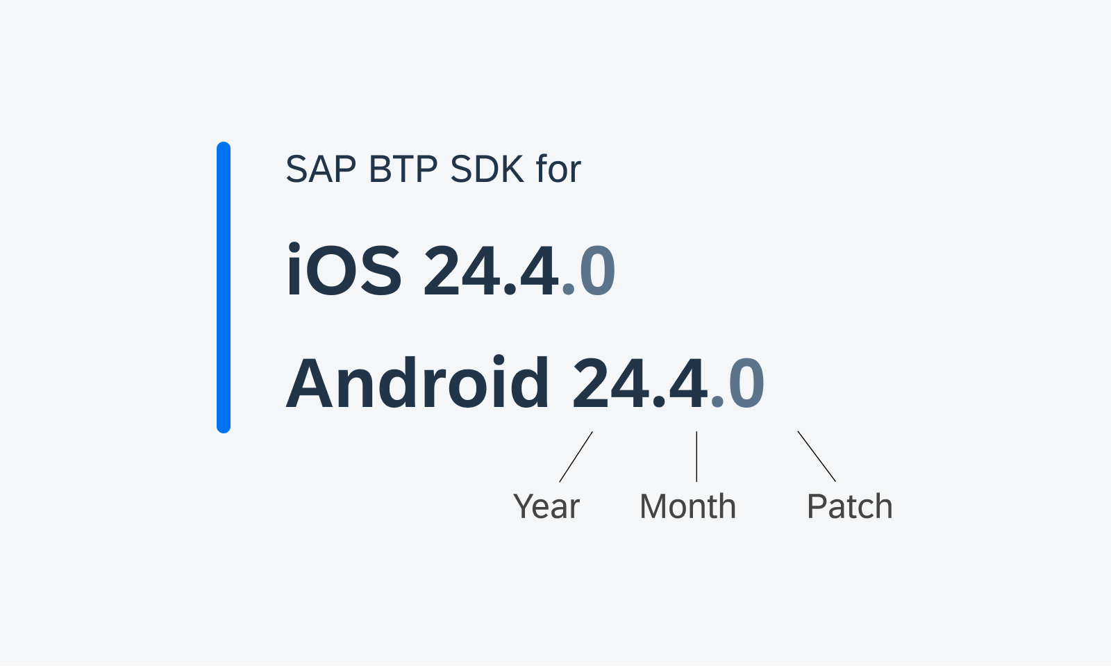
New naming convention for SDK versions
Design Kit Revamp
Updated Design Kit! The SAP Fiori for Android 24.4 Design Kit (formerly known as “UI Kit”) has undergone significant changes, including variables, page hierarchy, in-page layout, and component enhancement.
Enhanced Design Kit
Foundation
Layout – Window Size Classes
New! Following the M3 update, we introduced window size classes to the SAP BTP SDK for SAP Fiori for Android. Window size classes are recommended breakpoints that provide universal responsiveness regardless of the device types and sizes.
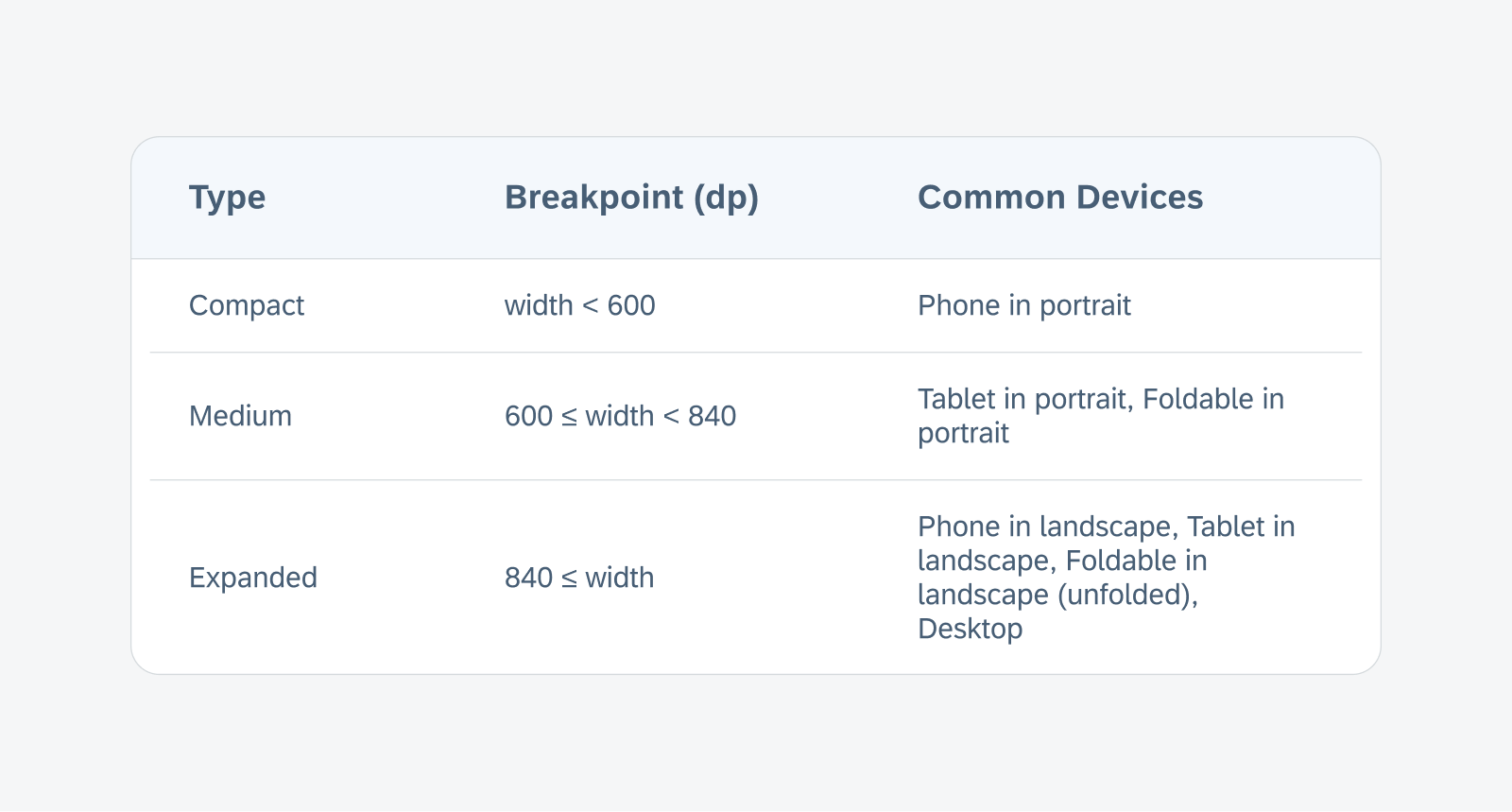
The breakpoints of the window size classes based on the window width
UI Components
Attachment Form Cell
Redesigned Component! The attachment form cell, formerly known as attach, has a redesigned attachment grid view to support additional file information and attribute text below the thumbnail. The enhanced list view now also supports a second line of text for additional file information and attribute label to the right.
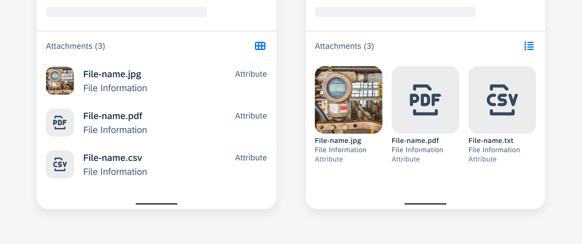
List view (left) and grid view (right)
Calendar
Feature Enhancements! The calendar component now comes with two new features: status indicators and alternate calendar. Status indicators paired with a legend can be used to indicate dates with specific events or a status. An alternate calendar can be displayed with the primary calendar on the same frame. See Status Indicators and Alternate Calendar for more details.
Sample calendar view with alternate calendar
Cards & Layouts
Feature Enhancements! Skeleton loading is now available for cards. There are three sizes based on the card blocks, allowing you to select a card size that approximately reflects the loaded card size. See Skeleton Loading.
To provide better user feedback, a user-triggered feedback indicator (progress indicator) has been added, which provides a response or confirmation after a user takes an action on the card. See User-Triggered Feedback Indicator.
Additionally, we have added scroll snapping behavior to the carousel layout, where cards always snap into place at specific, predefined positions during scrolling, rather than scrolling freely. See Scroll Snapping.
Skeleton loading on a small (top left) and medium card (bottom left), and user-triggered feedback indicator on card (right)
Circular Progress Indicator – Checkout Use Case
Feature Enhancements! Checkout use cases are processing states triggered by user actions. It can be either a full screen loading or partial loading. An indeterminate circular progress indicator and overlay are used to prevent further user actions on the loading content.

Partial loading example with a circular progress indicator on top of a card
Filter Feedback Bar
Feature Enhancements! The filter feedback bar has undergone a major redesign, with updated chip style and functionalities. An optional filter counter chip can be used to indicate the total number of active filters. A filter chip with a down-arrow trailing icon indicates that an extended action is available.
Sample filter feedback bar with new features
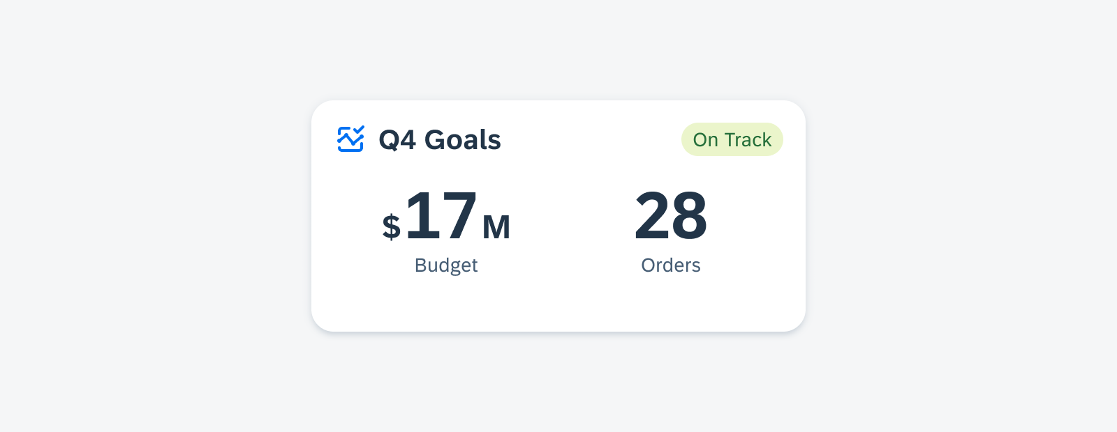
KPIs
Updated Component! The value section can support two values with a combination of numbers, prefixes, and suffixes, such as “15hr12mins”.
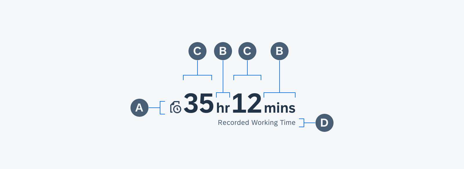
Anatomy of a KPI with icon and two values combined with suffixes
List Picker Form Cell
Feature Enhancements! A reset button can be used to revert the selection to a default value in the list picker selection view. The enhanced section header and button allow for customized actions.
Multiple value lists with custom sections
Patterns
Skeleton Loading
New Pattern! Skeleton loading is a progress indicator that is used when a screen is loading. It is best used when the structure and layout of a container are known, such as a page or card, and when the system requires time to fetch and display the actual data.
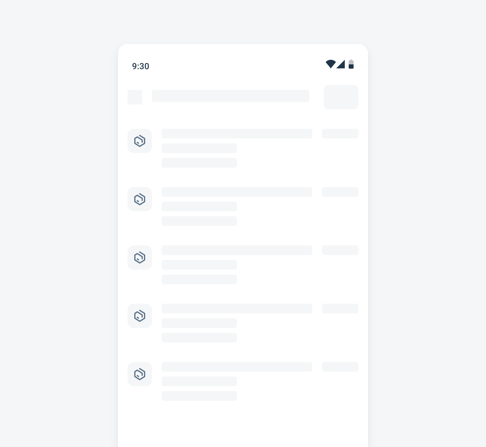
Skeleton loading example for a list
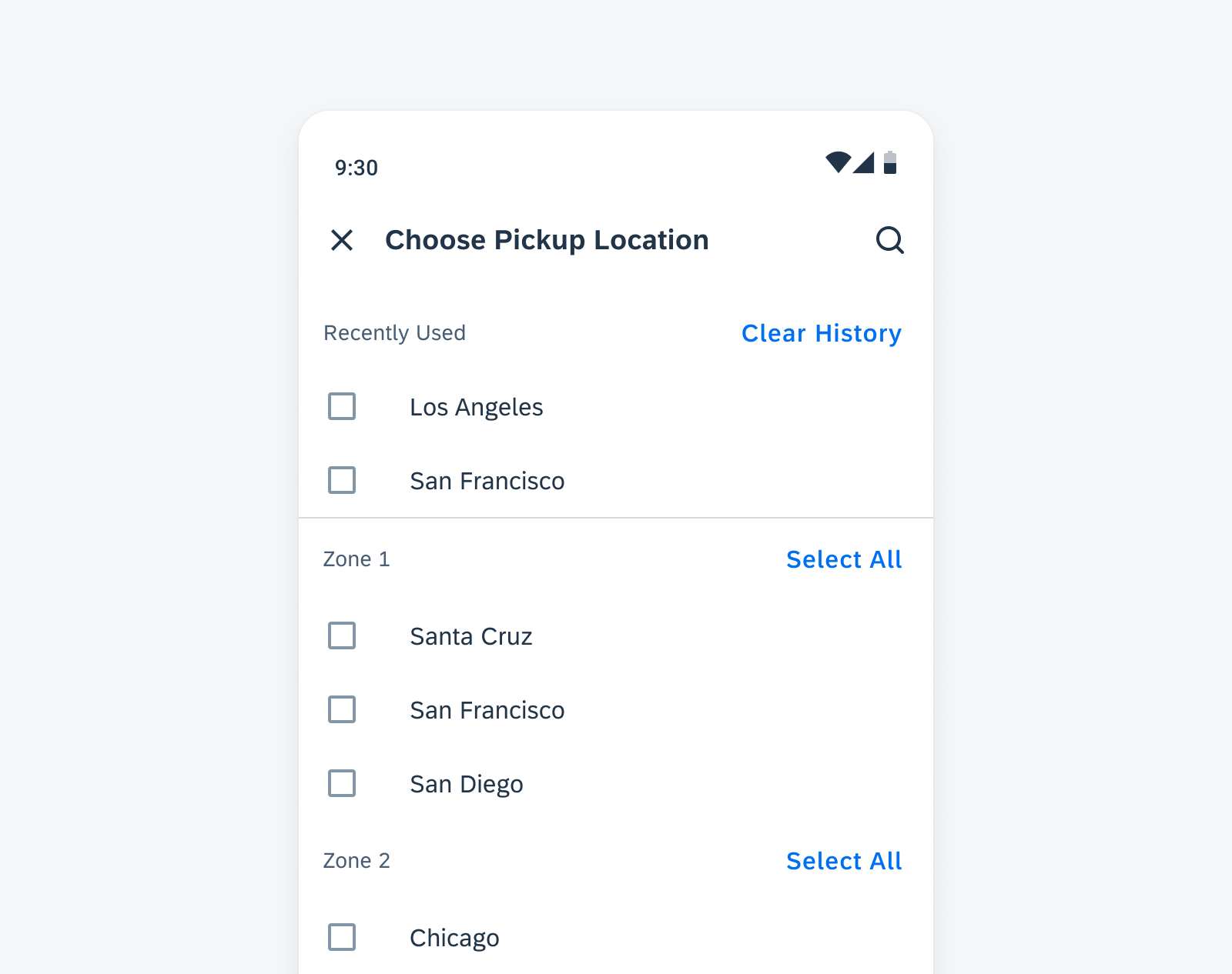
Sort and Filter
Updated Pattern! The updated sort and filter dialog has a new button arrangement that is more consistent with iOS design, with the “Reset” action moved to the top right, and the “Show N Results” button at the bottom left. A subtitle in the top app bar can be used to indicate the number of results based on current filter settings.
Sample sort and filter dialog with updated features
Resources
SAP Fiori for Android
Design Kit 24.4
Updated Figma Design Kit with new components and enhancements for this release, including:
- UI Kit renaming to Design Kit
- Major revamp of Design Kit with enhanced page layout hierarchy, more detailed in-page layouts, improved configurability of component properties, new variables for switching color modes, semantic colors, and accent colors
SAP BTP SDK for Android 7.1
Foundations
Design Tokens
New! Design tokens are our cross-platform solution to managing color across iOS and Android. Design tokens are stored pieces of UI information such as color, spacing, sizing, and typography that collectively make up our design system’s visual identity. Additionally, design tokens help us to maintain visual consistency, scale design decisions, and are simple to maintain and update.
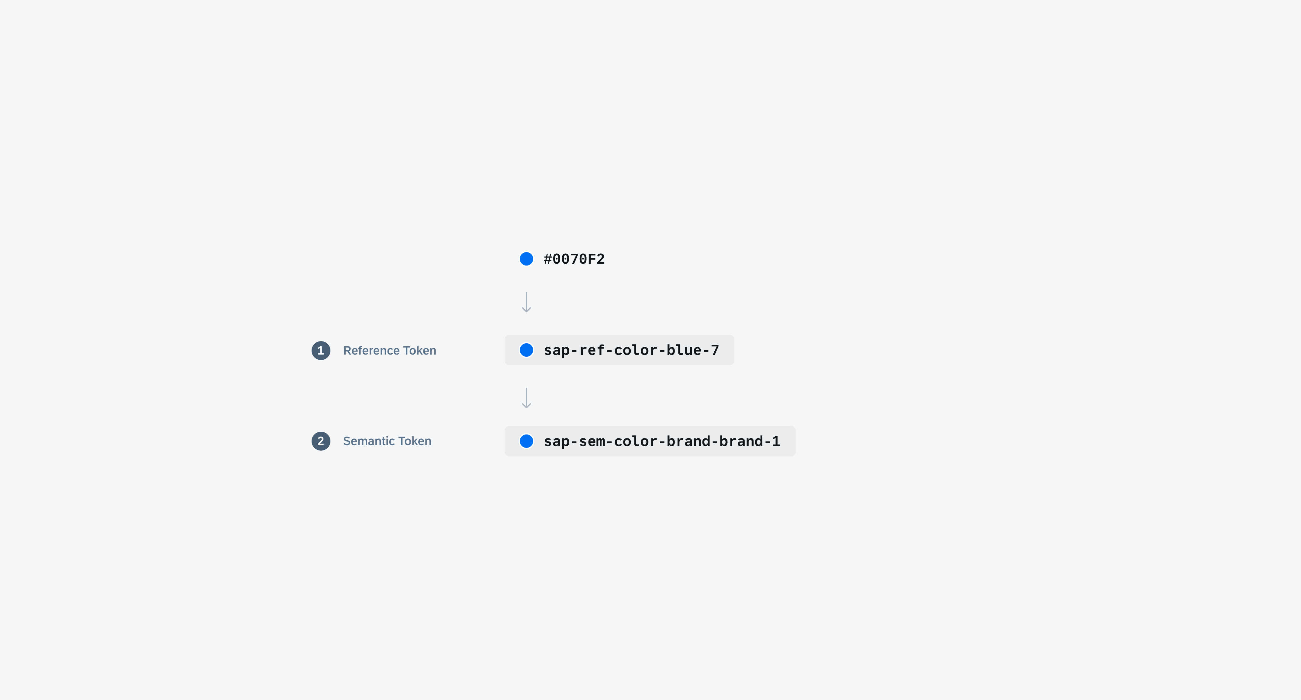
Token hierarchy shows the different levels of design tokens
Typography
Updated Font Styles! 72 Semibold is now added to SAP Fiori for Android typography. Subtitle 1, Subtitle 2, Button, and Caption 2 are updated to Semibold font weight. H5B, H7, and H7 are updated to Bold. Existing SDK components using those font styles are updated accordingly. New font scales have also been added: H4B-Small (Bold, 28sp) and H8 (Bold, 16sp).
Sample card using the new H6 and Subtitle 2 font style
UI Components
Calendar
New Component! The calendar view provides a visual overview of a week, a month, or multiple months. It can filter and display different types of content, such as events, agendas, or schedules, based on the time dimension.
Example of calendar view on mobile
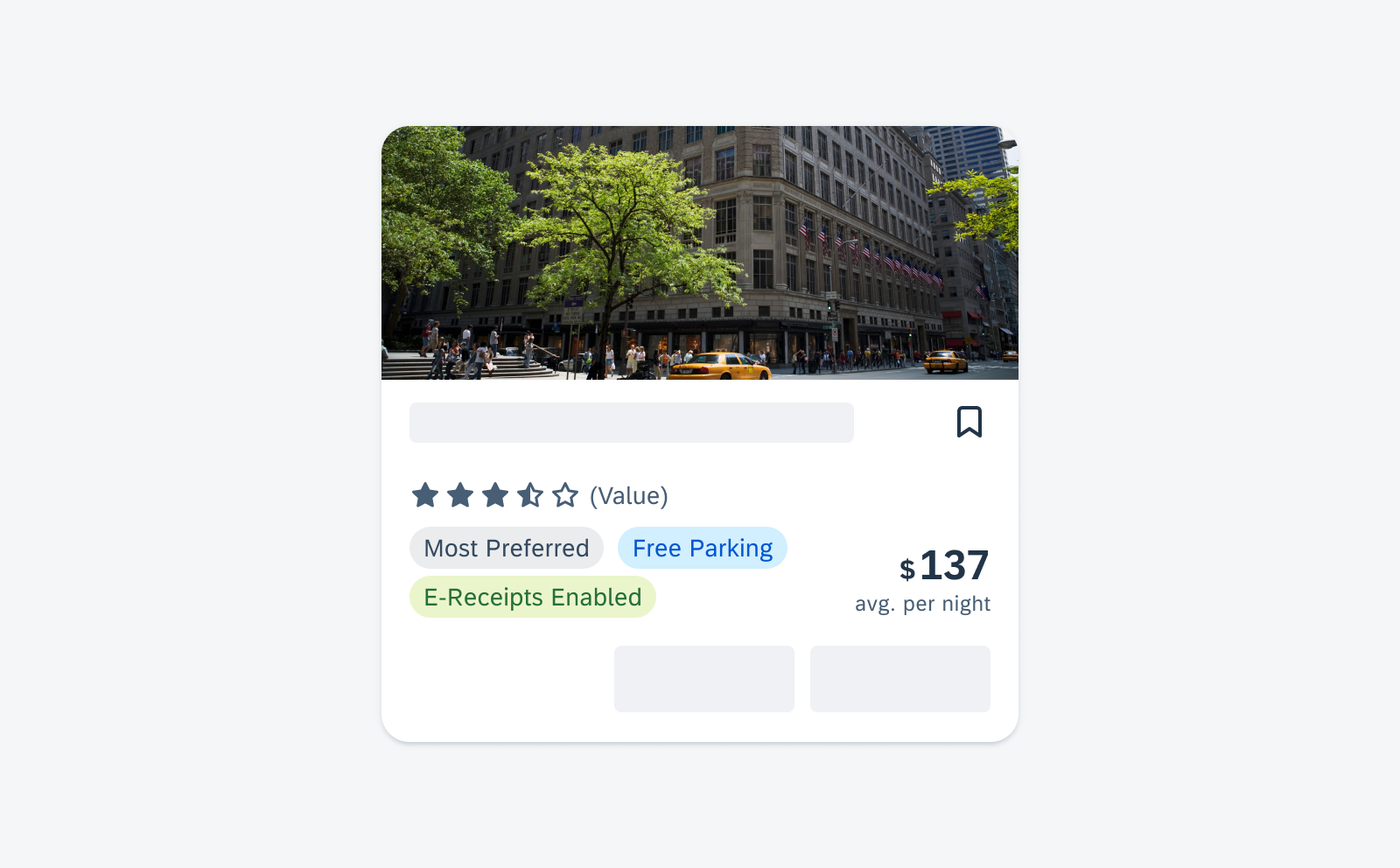
Cards & Layouts
New Component! A card provides brief, related pieces of information and serves as an entry point, teaser, or preview to more detailed content. It consists of a toolkit with nested components that can create a variety of cards that meet SAP product requirements. By pressing on the card, users can select the card and navigate to a dedicated page with more detailed information.
Sample cards in staggered layout on mobile
Input & Selection
Updated Components! The label font style for all Input & Selection components has been updated to Subtitle 2, resulting in improved visual consistency. Additionally, an optional helper text has been included for all types of Input & Selection controls.
Sample Input & Selection components with updated font style
KPIs
New Component! A new KPI component, that is based on the KPI Header component, is now available. It can be used in more types of content areas and comes with more variations.
Sample KPIs in a widget
Rating Control
New Component! The rating control can be used in various contexts to provide insight regarding the opinions and preferences of an object. Currently, the rating control is display-only.
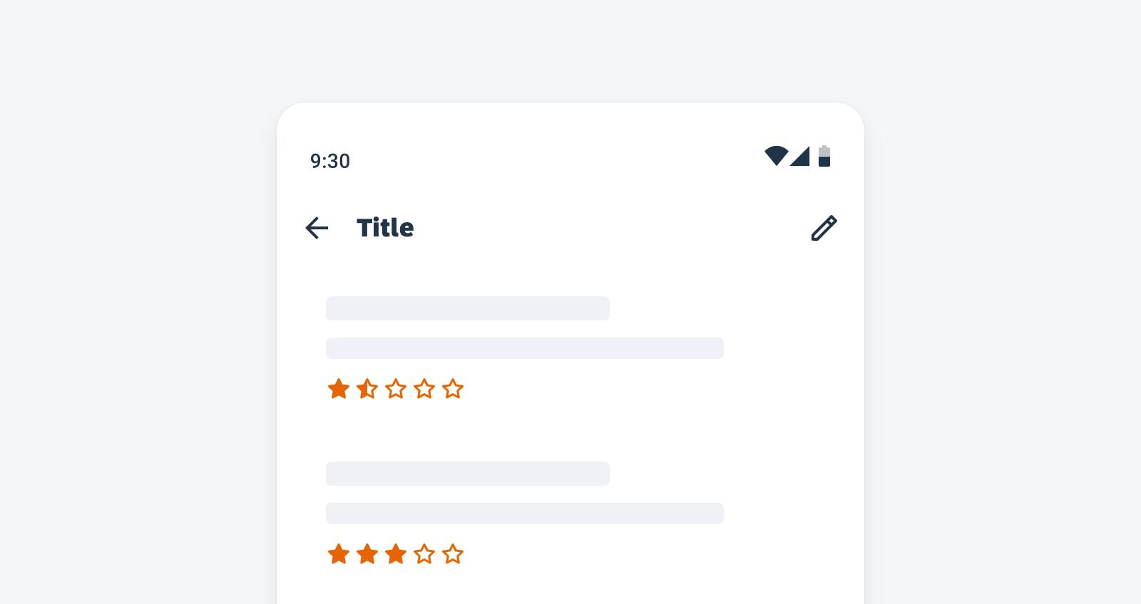
Rating controls in a list
Status Info Label
New Component! The status info label displays complementary information that relates to the object. It is a flexible combination of a text value and an icon.
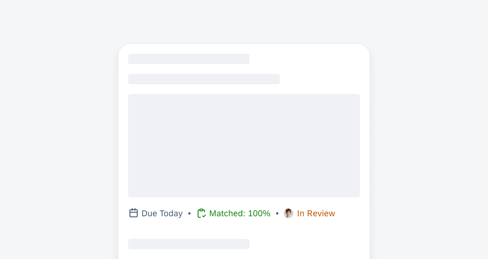
Sample status info labels
Step Progress Indicator
New Component! The step progress indicator is a progress indicator for tracking and displaying a user’s state in a user flow. It allows the user to navigate to another step in both the horizontal view and the vertical “All Steps” view. It also supports dynamic steps such as sub-steps or indeterminate steps.
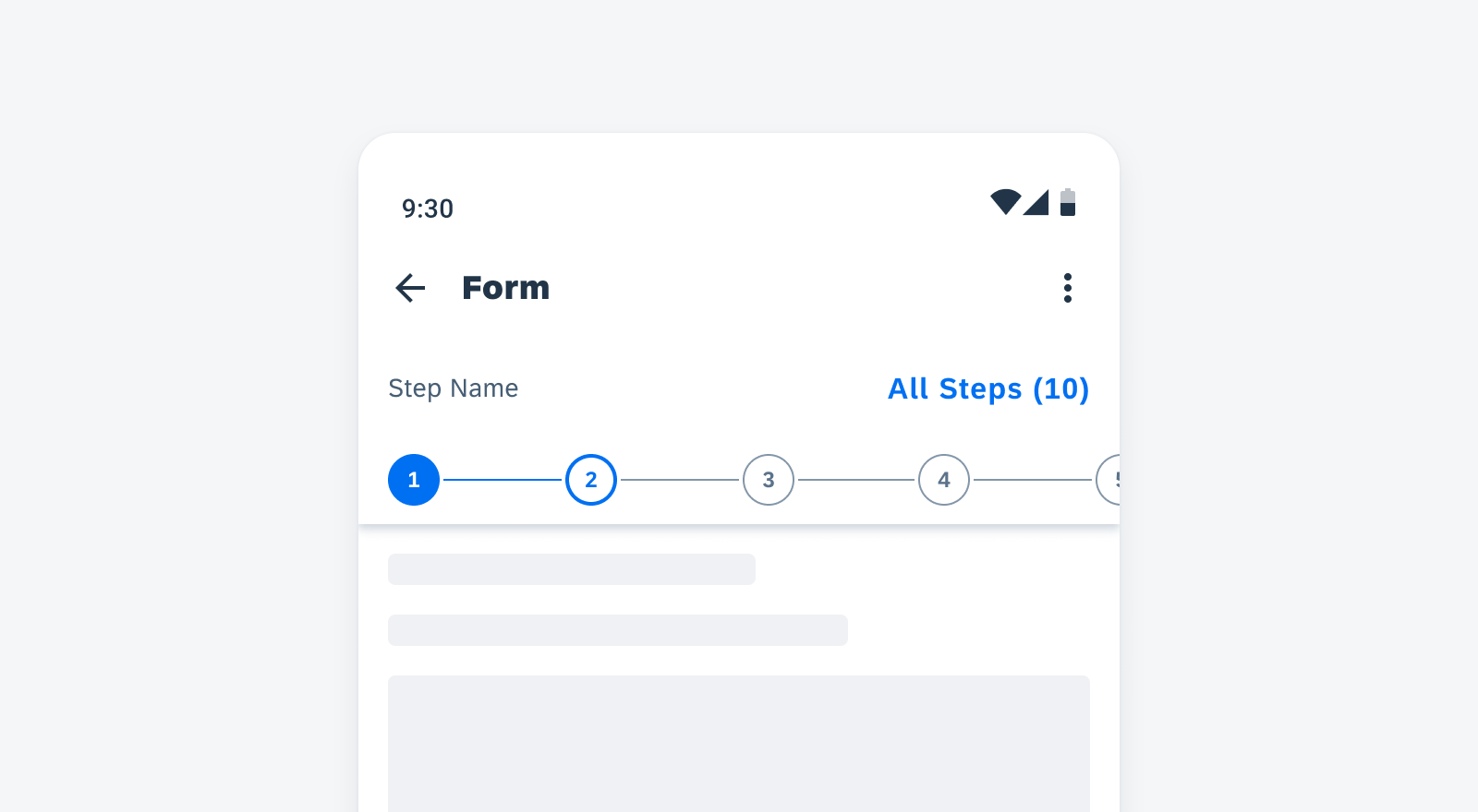
Step progress indicator in horizontal view
Tags
New Component! Tags are used to display quick and useful bits of information to the user, such as keywords, labels, categories, or status. They use a different visual representation than plain text and function as independent bits of information. Tags are not interactive.
Sample tags in a card
Patterns
Illustrated Messages
New Pattern! Illustrated messages communicate empty, error, and success states through a combination of solution-oriented messages, engaging illustrations, and a conversational tone. They are flexible and adaptive. Use an illustrated message when you want to improve the user experience for one or more message states in your application.
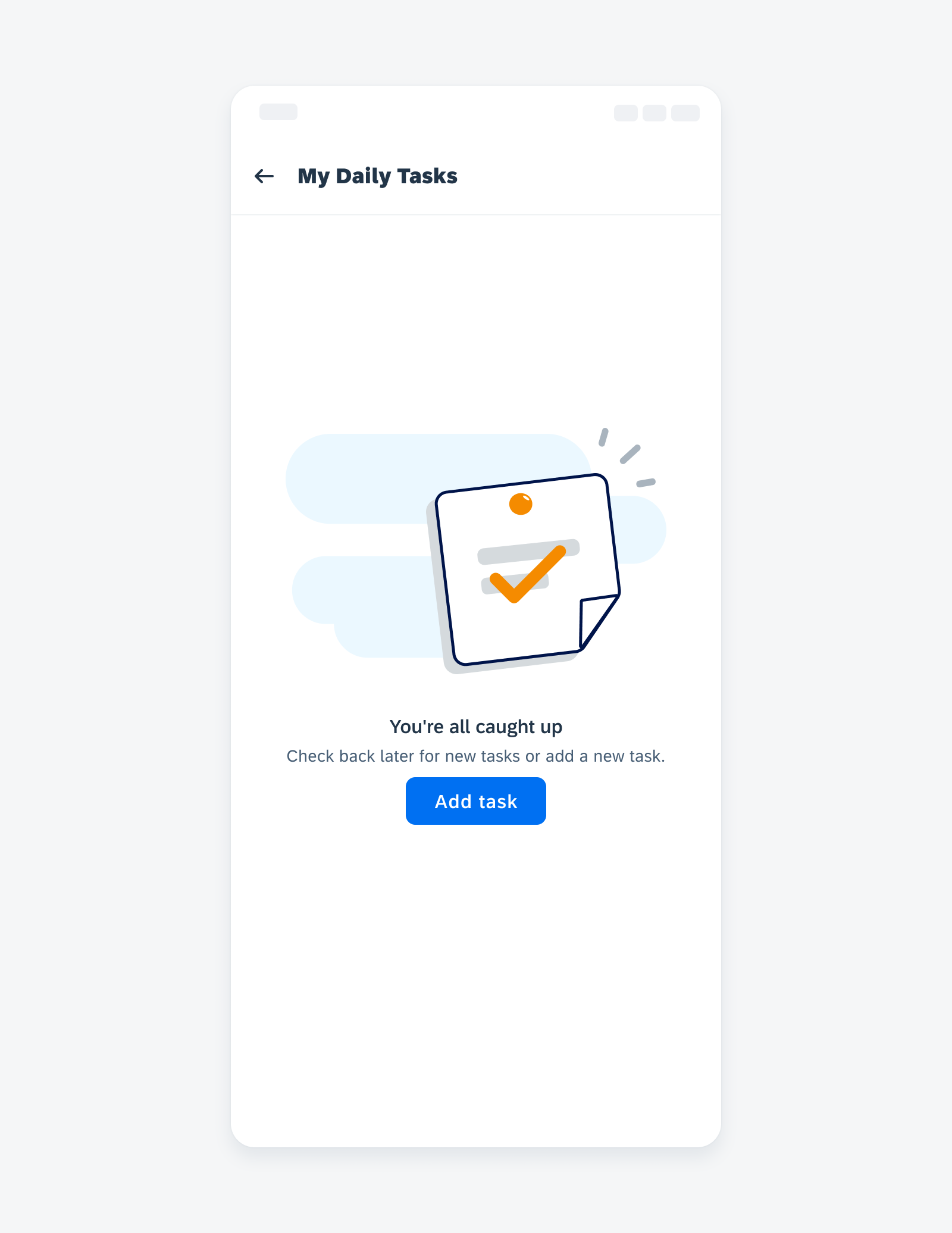
Empty state example on mobile
Widgets
New Pattern! Android widgets provide a quick overview of key information across the user’s home screens. They retain simplicity by showing only the most valuable information and functionality from the application first, guiding users to access more complex data and actions within the app.
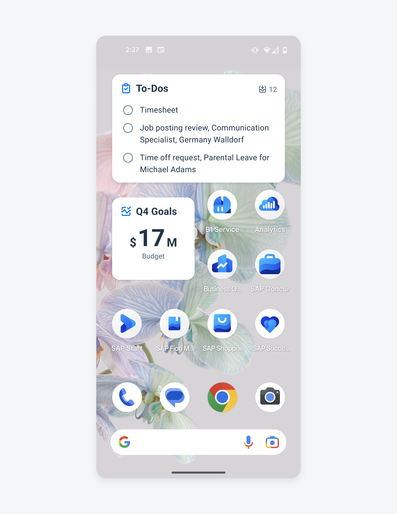
Widgets on an Android device
Resources
SAP Fiori for Android UI Kit 7.1
Updated Figma UI Kit with new components and enhancements for this release, including:
- New Updates page documenting release updates in the UI Kit.
- Instruction on using the new color variables in UI Kit 7.1.
 Your feedback has been sent to the SAP Fiori design team.