
- Latest SAPUI Version 1.124
- SAPUI5 Version 1.122
- SAPUI5 Version 1.120
- SAPUI5 Version 1.118
- SAPUI5 Version 1.116
- SAPUI5 Version 1.114
- SAPUI5 Version 1.112
- SAPUI5 Version 1.108
- SAPUI5 Version 1.106
- SAPUI5 Version 1.104
- SAPUI5 Version 1.102
- SAPUI5 Version 1.100
- SAPUI5 Version 1.98
- SAPUI5 Version 1.96
- SAPUI5 Version 1.94
- SAPUI5 Version 1.92
- SAPUI5 Version 1.90
- SAPUI5 Version 1.88
- SAPUI5 Version 1.86
- SAPUI5 Version 1.84
- SAPUI5 Version 1.82
- SAPUI5 Version 1.80
- SAPUI5 Version 1.78
- SAPUI5 Version 1.76
- SAPUI5 Version 1.74
- SAPUI5 Version 1.72
- SAPUI5 Version 1.70
- SAPUI5 Version 1.68
- SAPUI5 Version 1.66
- SAPUI5 Version 1.64
- SAPUI5 Version 1.62
- SAPUI5 Version 1.60
- SAPUI5 Version 1.58
- SAPUI5 Version 1.56
- SAPUI5 Version 1.54
- SAPUI5 Version 1.52
- SAPUI5 Version 1.50
- SAPUI5 Version 1.48
- SAPUI5 Version 1.46
- SAPUI5 Version 1.44
- SAPUI5 Version 1.42
- SAPUI5 Version 1.40
- SAPUI5 Version 1.38
- SAPUI5 Version 1.36
- SAPUI5 Version 1.34
- SAPUI5 Version 1.32
- SAPUI5 Version 1.30
- SAPUI5 Version 1.28
- SAPUI5 Version 1.26
- Latest SAPUI Version 1.124
- SAPUI5 Version 1.122
- SAPUI5 Version 1.120
- SAPUI5 Version 1.118
- SAPUI5 Version 1.116
- SAPUI5 Version 1.114
- SAPUI5 Version 1.112
- SAPUI5 Version 1.110
- SAPUI5 Version 1.108
- SAPUI5 Version 1.106
- SAPUI5 Version 1.104
- SAPUI5 Version 1.102
- SAPUI5 Version 1.100
- SAPUI5 Version 1.98
- SAPUI5 Version 1.96
- SAPUI5 Version 1.94
- SAPUI5 Version 1.92
- SAPUI5 Version 1.90
- SAPUI5 Version 1.88
- SAPUI5 Version 1.86
- SAPUI5 Version 1.84
- SAPUI5 Version 1.82
- SAPUI5 Version 1.80
- SAPUI5 Version 1.78
- SAPUI5 Version 1.76
- SAPUI5 Version 1.74
- SAPUI5 Version 1.72
- SAPUI5 Version 1.70
- SAPUI5 Version 1.68
- SAPUI5 Version 1.66
- SAPUI5 Version 1.64
- SAPUI5 Version 1.62
- SAPUI5 Version 1.60
- SAPUI5 Version 1.58
- SAPUI5 Version 1.56
- SAPUI5 Version 1.54
- SAPUI5 Version 1.52
- SAPUI5 Version 1.50
- SAPUI5 Version 1.48
- SAPUI5 Version 1.46
- SAPUI5 Version 1.44
- SAPUI5 Version 1.42
- SAPUI5 Version 1.40
- SAPUI5 Version 1.38
- SAPUI5 Version 1.36
- SAPUI5 Version 1.34
- SAPUI5 Version 1.32
- SAPUI5 Version 1.30
- SAPUI5 Version 1.28
- SAPUI5 Version 1.26
Line Micro Chart
sap.suite.ui.microchart.LineMicroChart
Intro
A line chart is a basic type of chart used in many fields. It displays information as a series of data points connected by a line. The chart is often used to visualize a trend over time.
The line micro chart supports up to three lines, but we recommend using only one. You can modify the color of each line using the qualitative color palette or semantic patterns for charts.
Line micro chart - Single line
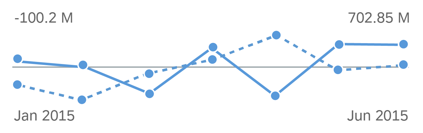
Line micro chart - Multiple lines using semantic chart patterns
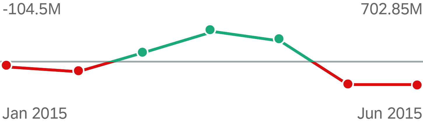
Line micro chart with semantic colors
Usage
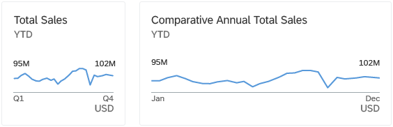
- You want to visualize the shape.
Use this option to show a trend or sparkline. By default, the chart is rendered in blue, but application developers can set any color for the chart using the names for semantic palette or names from the qualitative palette.
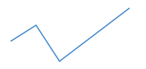
Line micro chart - Sparkline
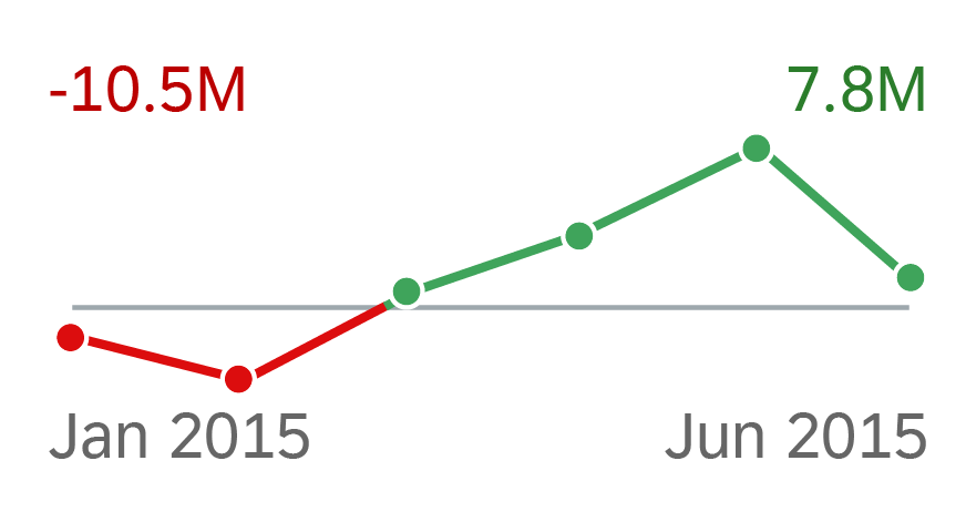
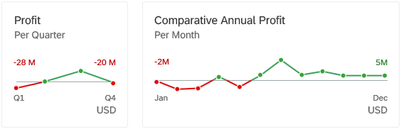
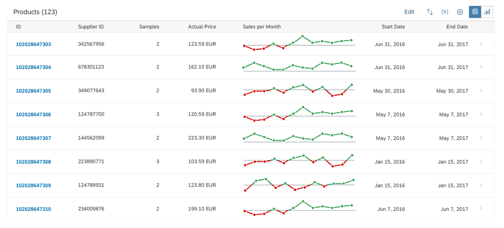
- You want to show data points that are above or below a certain threshold.
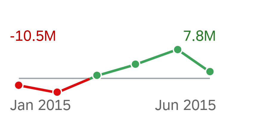
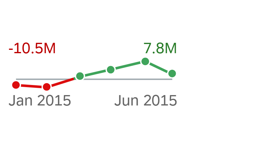
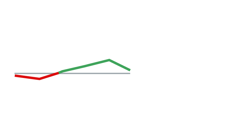
In addition to data points, you can use two different colors for the lines. When the micro chart displays only one line, we recommend that you use only semantic colors, such as green for values above the threshold, and red for values below the threshold. When two or three lines are displayed, on the other hand, we recommended that you use one color per line to ensure clarity and avoid visual clutter. Note that the threshold can also be set to zero.
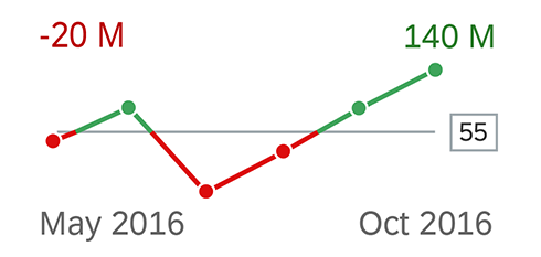
Line micro chart - Data points above and below a threshold
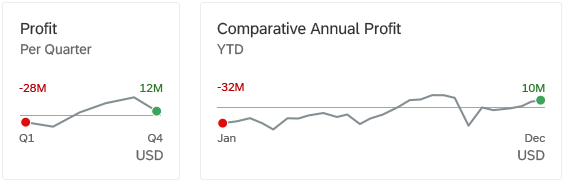
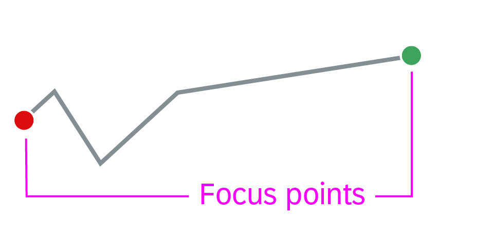
- You want to show focus points.
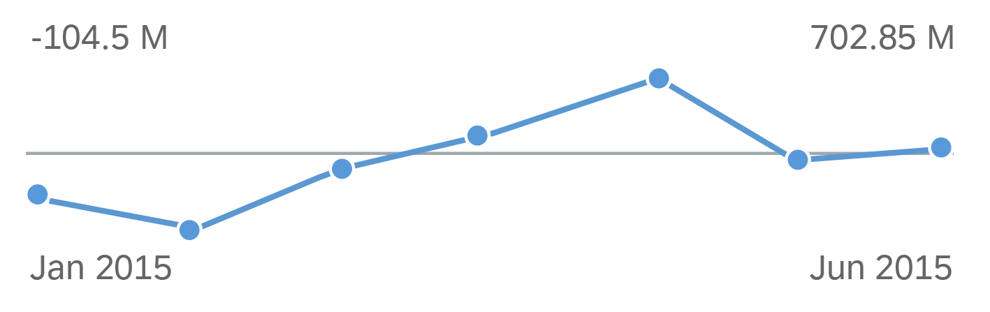
Use this option to display a trend or sparkline to focus on several special values, such as the first and/or last value of the chart. By default, the chart is rendered in blue, but application developers can choose another color for the chart line and data points from the qualitative palette. Note that the threshold can also be set to zero.
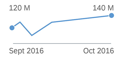
Line micro chart - 2 focus points
- You want to show focus points with semantic colours.
Use this option to display a trend or sparkline to focus on several special values with a semantic meaning, such as the first and/or last value above or below a certain threshold. Note that the threshold can also be set to zero.
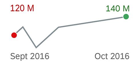
Line micro chart - 2 focus points with semantic colors
Do not use the line micro chart if:
- You have scenarios that do not depict time periods.
- You need to show more than three lines.
Responsiveness
The Line micro chart is fully responsive. The size adjusts dynamically based on the dimensions of the parent container. In addition, there are also four fixed sizes – L, M, S and XS. Each fixed size is a snapshot of the fully responsive micro chart for specific dimensions.
Line micro chart - Size L
Line micro chart - Size M
Line micro chart - Size S
Line micro chart - Size XS
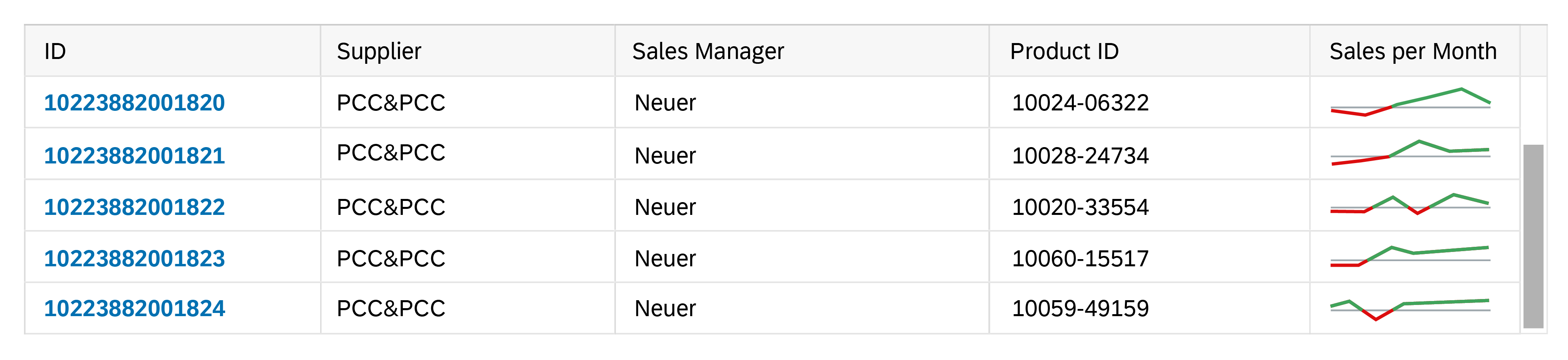
You can use the smallest XS size to embed the line micro chart in table cells of the grid table, analytical table, or tree table (also in condensed mode). When displayed in a table cell, the line micro chart should be left-aligned.
Line micro chart in XS size in the grid table
Maximum and Minimum Sizes
The line micro chart can have the following dimensions:
| Width | Height | |
| Maximum | 320 px | 94 px |
| Minimum | 64 px | 18 px |
If the height of the chart is less than 56 px, the labels are hidden.
Layout
Line Micro Chart in a Tile or Facet
You can embed the line microchart with all its features in a tile or header facet. The chart uses the full height and width of the control.
Note: If the threshold is not zero, the title of the tile or header facet should clearly express the value of the threshold (for example, “Values above/below 50”).
Line micro chart in a tile with data points above and below the zero threshold
Line micro chart (sparkline) in a tile with no semantic meaning
Line micro chart in a tile with focus on first and last data points
Line micro chart in a tile with a semantic focus point and KPI value
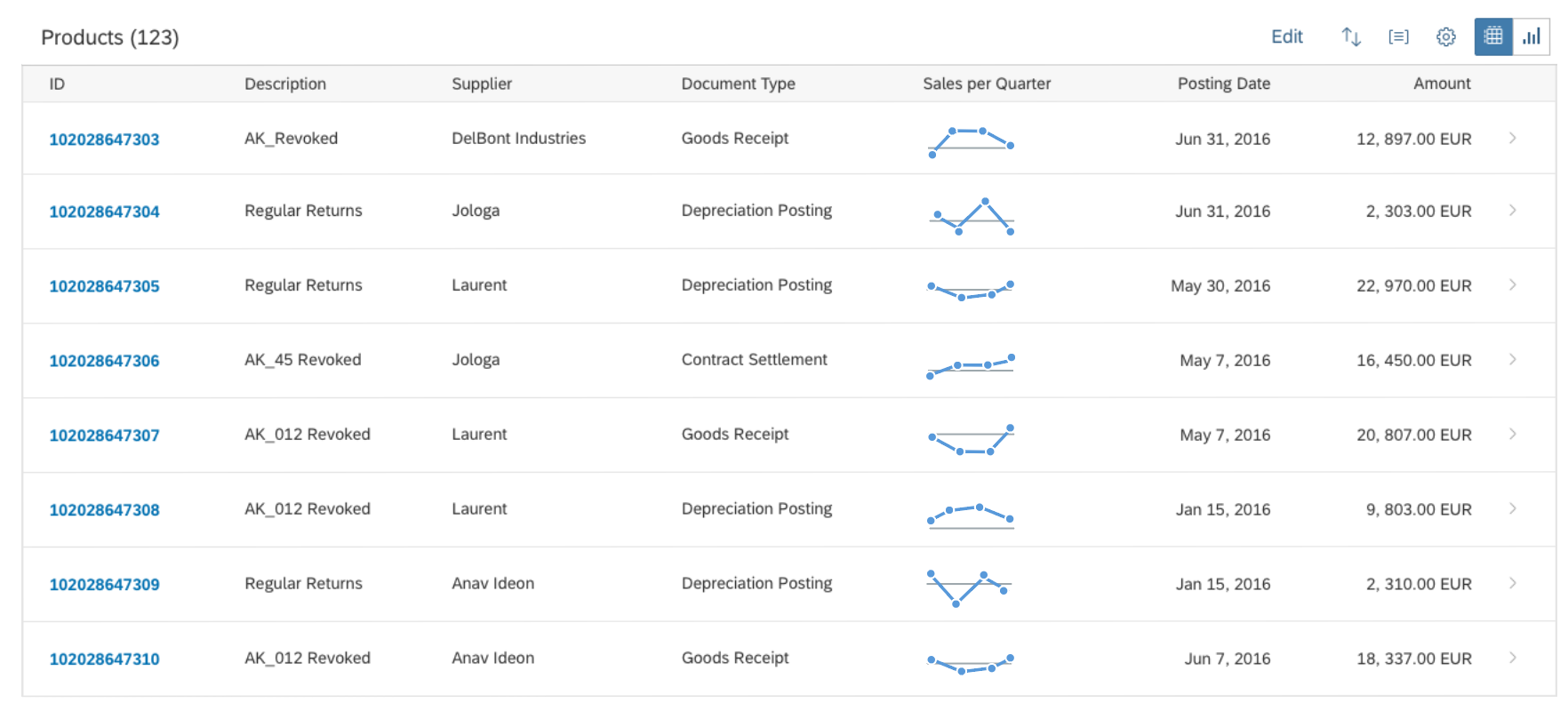
Line Micro Chart in a Table or List
Line micro chart in a table with values above and below a threshold
Line micro chart in a table - Smaller size
Line micro chart in a table with 4 focus points - First/last and min/max value
Line micro chart in a table with data points hidden
Components
To present the line micro chart in the most useful way, application developers can set several properties.
Data points
The line micro chart can display or hide data points. To display data points, we recommend that you use 4 (for quarters) to 12 (for months) data points per chart. The responsive behaviour of the chart hides data points if there is not enough space to display them (for XS size and smaller).
Data points with a semantic meaning can use colors defined by the semantic color palette (green, orange, or red).
If data points do not have a semantic meaning, the line is colored blue by default, but application developers can assign any color from the qualitative palette.
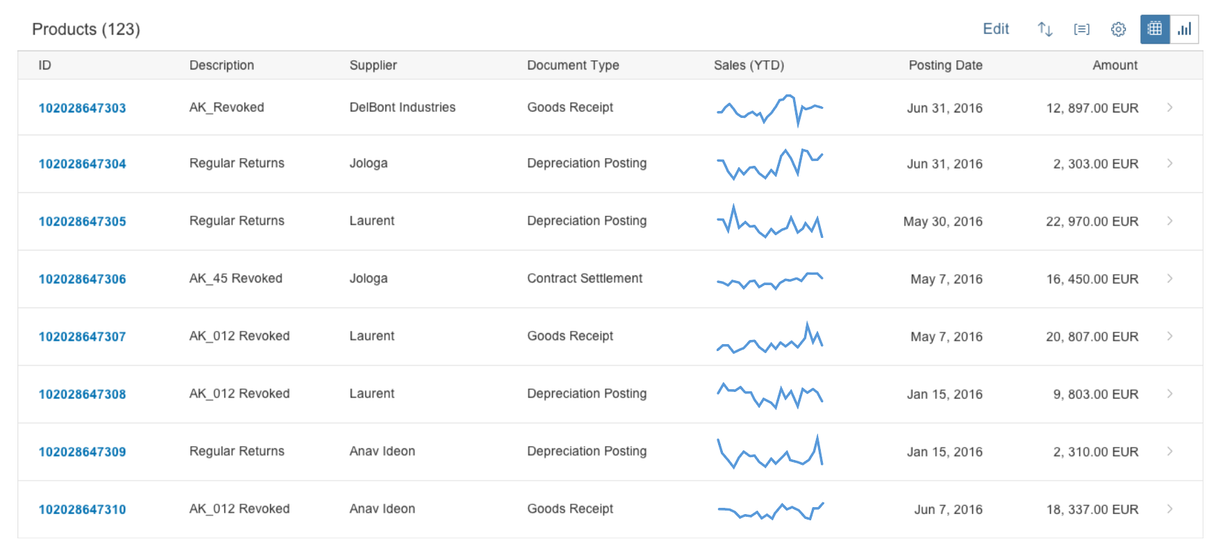
Alternatively, you can show a line-only chart, with all the data points hidden. In this case, you can use up to two colors per line in the chart. If the values relate to a threshold, we recommend using semantic colors for the line to highlight values above or below the threshold.
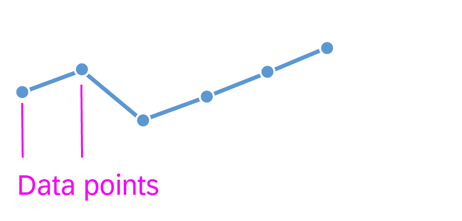
Line micro chart - Data points
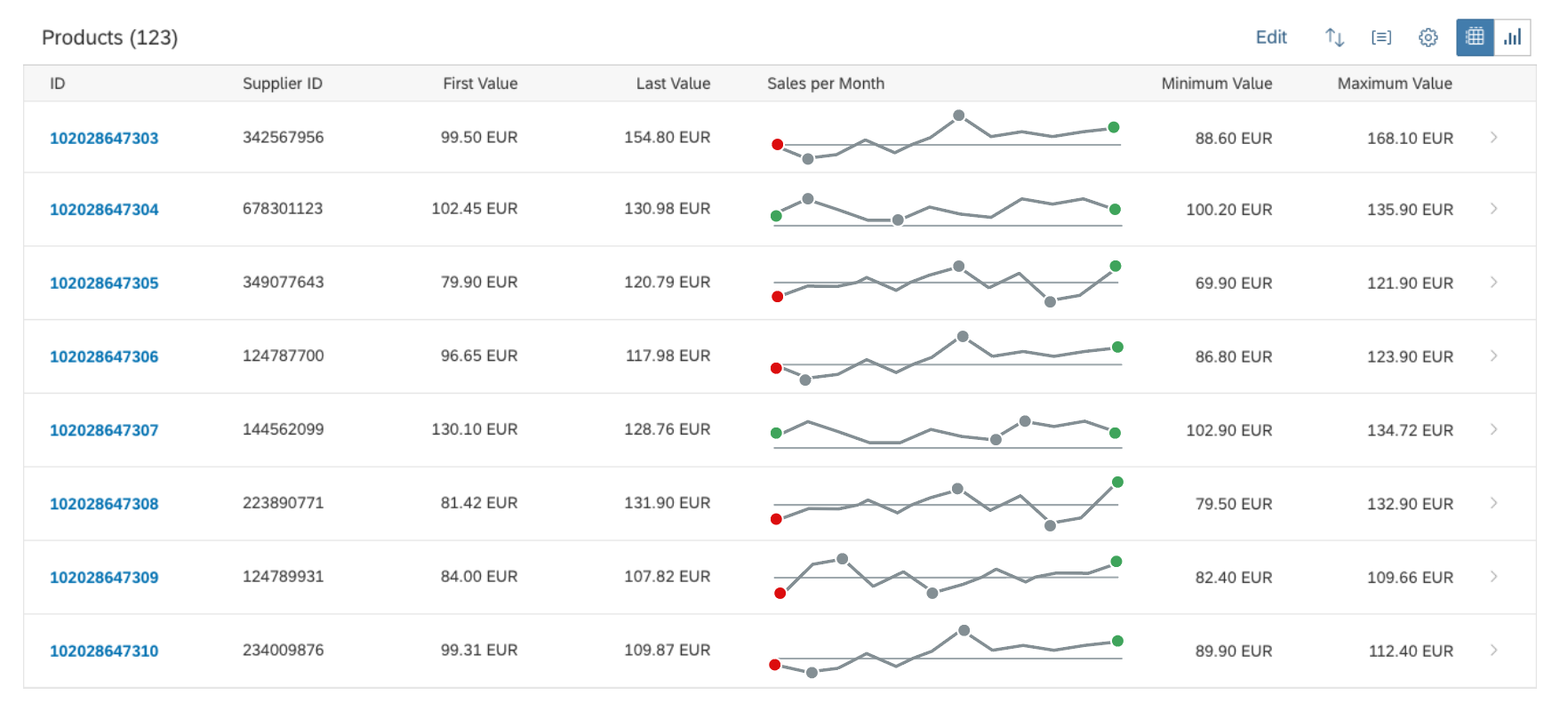
Focus points
Unlike data points, focus points highlight specific values, such as the first and/or last value of a time series. Neutral focus points are coloured blue. Focus points with a semantic meaning can be colored using the semantic colors (green, orange, or red). The responsive behaviour of the chart hides focus points if there is not enough space to display them (for XS size and smaller).
Line micro chart - Focus points
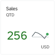
Threshold
You can set a threshold line. If the threshold isn’t zero, include its value in the title of the tile, header facet, or column in lists and tables to ensure that the chart is not misleading for the user.
There is also an optional threshold value label. The threshold value is hidden if it takes more than 50% of the chart’s parent container. The threshold value is shown only when the threshold line is displayed.
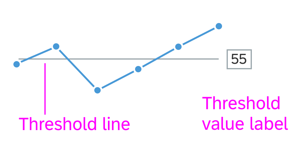
Line micro chart with threshold line and threshold label
Labels
The labels for the line micro chart are optional. Use the bottom labels to indicate the beginning and the end of the time period. Use the top labels to show the corresponding values for the beginning and the end of the chart. When the chart includes more lines, the smallest values appear in the beginning and the largest values at the end of the chart (across lines). The responsive behaviour of the chart hides labels if there is not enough space to display them (for XS size and smaller or if If the chart height is less than 56 px). Ensure that the labels for the values are not truncated.
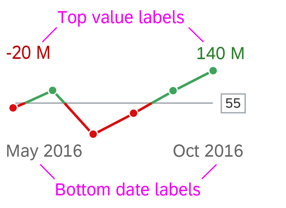
Line micro chart with labels
Resources
Want to dive deeper? Follow the links below to find out more about related controls, the SAPUI5 implementation, and the visual design.
 Your feedback has been sent to the SAP Fiori design team.