
- Latest SAPUI Version 1.124
- SAPUI5 Version 1.122
- SAPUI5 Version 1.120
- SAPUI5 Version 1.118
- SAPUI5 Version 1.116
- SAPUI5 Version 1.114
- SAPUI5 Version 1.112
- SAPUI5 Version 1.110
- SAPUI5 Version 1.108
- SAPUI5 Version 1.106
- SAPUI5 Version 1.104
- SAPUI5 Version 1.102
- SAPUI5 Version 1.100
- SAPUI5 Version 1.98
- SAPUI5 Version 1.96
- SAPUI5 Version 1.94
- SAPUI5 Version 1.92
- SAPUI5 Version 1.90
- SAPUI5 Version 1.88
- SAPUI5 Version 1.86
- SAPUI5 Version 1.84
- SAPUI5 Version 1.82
- SAPUI5 Version 1.80
- SAPUI5 Version 1.78
- SAPUI5 Version 1.76
- SAPUI5 Version 1.74
- SAPUI5 Version 1.72
- SAPUI5 Version 1.70
- SAPUI5 Version 1.68
- SAPUI5 Version 1.66
- SAPUI5 Version 1.64
- SAPUI5 Version 1.62
- SAPUI5 Version 1.60
- SAPUI5 Version 1.58
- SAPUI5 Version 1.54
- SAPUI5 Version 1.52
- SAPUI5 Version 1.50
- SAPUI5 Version 1.48
- SAPUI5 Version 1.46
- SAPUI5 Version 1.44
- SAPUI5 Version 1.42
- SAPUI5 Version 1.40
- SAPUI5 Version 1.38
- SAPUI5 Version 1.36
- SAPUI5 Version 1.34
- SAPUI5 Version 1.32
- SAPUI5 Version 1.30
- SAPUI5 Version 1.28
- SAPUI5 Version 1.26
- Latest SAPUI Version 1.124
- SAPUI5 Version 1.122
- SAPUI5 Version 1.120
- SAPUI5 Version 1.118
- SAPUI5 Version 1.116
- SAPUI5 Version 1.114
- SAPUI5 Version 1.112
- SAPUI5 Version 1.110
- SAPUI5 Version 1.108
- SAPUI5 Version 1.106
- SAPUI5 Version 1.104
- SAPUI5 Version 1.102
- SAPUI5 Version 1.100
- SAPUI5 Version 1.98
- SAPUI5 Version 1.96
- SAPUI5 Version 1.94
- SAPUI5 Version 1.92
- SAPUI5 Version 1.90
- SAPUI5 Version 1.88
- SAPUI5 Version 1.86
- SAPUI5 Version 1.84
- SAPUI5 Version 1.82
- SAPUI5 Version 1.80
- SAPUI5 Version 1.78
- SAPUI5 Version 1.76
- SAPUI5 Version 1.74
- SAPUI5 Version 1.72
- SAPUI5 Version 1.70
- SAPUI5 Version 1.68
- SAPUI5 Version 1.66
- SAPUI5 Version 1.64
- SAPUI5 Version 1.62
- SAPUI5 Version 1.60
- SAPUI5 Version 1.58
- SAPUI5 Version 1.56
- SAPUI5 Version 1.54
- SAPUI5 Version 1.52
- SAPUI5 Version 1.50
- SAPUI5 Version 1.48
- SAPUI5 Version 1.46
- SAPUI5 Version 1.44
- SAPUI5 Version 1.42
- SAPUI5 Version 1.40
- SAPUI5 Version 1.38
- SAPUI5 Version 1.36
- SAPUI5 Version 1.34
- SAPUI5 Version 1.32
- SAPUI5 Version 1.30
- SAPUI5 Version 1.28
- SAPUI5 Version 1.26
Analytical List Page (SAP Fiori Element)
Intro
Analytical list page – Size XL
The analytical list page (ALP) offers a unique way to analyze data step by step from different perspectives, to investigate a root cause through drilldown, and to act on transactional content. All this can be done seamlessly within one page. The purpose of the analytical list page is to identify interesting areas within datasets or significant single instances using data visualization and business intelligence.
Visualizations help users to recognize facts and situations, and reduce the number of interaction steps needed to gain insights or to identify significant single instances. Chart visualization increases the joy of use, and enables users to spot relevant data more quickly.
The main target group are users who work on transactional content. They benefit from fully transparent business object data and direct access to business actions. In addition, they have access to analytical views and functions without having to switch between systems. These include KPIs, a visual filter where filter values are enriched by measures and visualizations, and a combined table/chart view with drill-in capabilities (hybrid view). Users can interact with the chart to dig deep into the data. The visualization enables them to identify spikes, deviations and abnormalities more quickly, and to take appropriate action right away.
Usage
Use the analytical list page if:
- Users need to extract key information to understand the current situation or identify a root cause. The way the data is presented is crucial for giving them the insights they need to take the right action.
- Users need a way to analyze data step by step from different perspectives, investigate a root cause through drilldown, and act on transactional content within one page.
- In addition to the filtered dataset, users need to see the impact of their filter settings in a chart (visual filter).
- Users need to switch between integrated chart and table views (hybrid view).
- Users need to see the impact of their action on a global key performance indicator (KPI).
- Users need to find and act on relevant items out of a large set of items by searching, filtering, sorting, grouping, drilling down, and slicing and dicing.
Do not use the analytical list page if:
- Drilldown is rarely used, not used at all, or is only needed after navigating to another page, rather than as free or flexible drilldown within the page itself. In this case, a list report might be sufficient for your use case.
- Users need different visualizations for the entire dataset (for example, as a table or chart), but don’t need to work with both visualizations on the same page (for example, in a reporting scenario). In this case, a list report might be sufficient.
- Users need to find and act on relevant items from within a large set of items by searching, filtering, sorting, and grouping, without using drilldown or “slice and dice”. In this case, consider using a list report.
- Users need to work with multiple views of the same content, for example on items that are “Open”, “In Process”, or “Completed”. They want to be able to switch views using tabs, segmented buttons, or a select control. In this case, consider using a list report.
- Users need to see or edit a single item with all its details. Use the object page floorplan instead.
- Users need to find a specific item, and the item or an identifying data point is known to the user (such as a barcode). In this case, use the initial page floorplan.
- Users need to work through a comparably small set of items, one by one. In this case, use the worklist floorplan.
- Users have a trivial use case that does require the use of a chart, but that do not involve identifying a root cause, analyzing data, or drilldown. Instead, use a list report with a table/chart switch.
Structure
This section describes the basic layout of the analytical list page, as well as the different layout variants.
Basic Layout
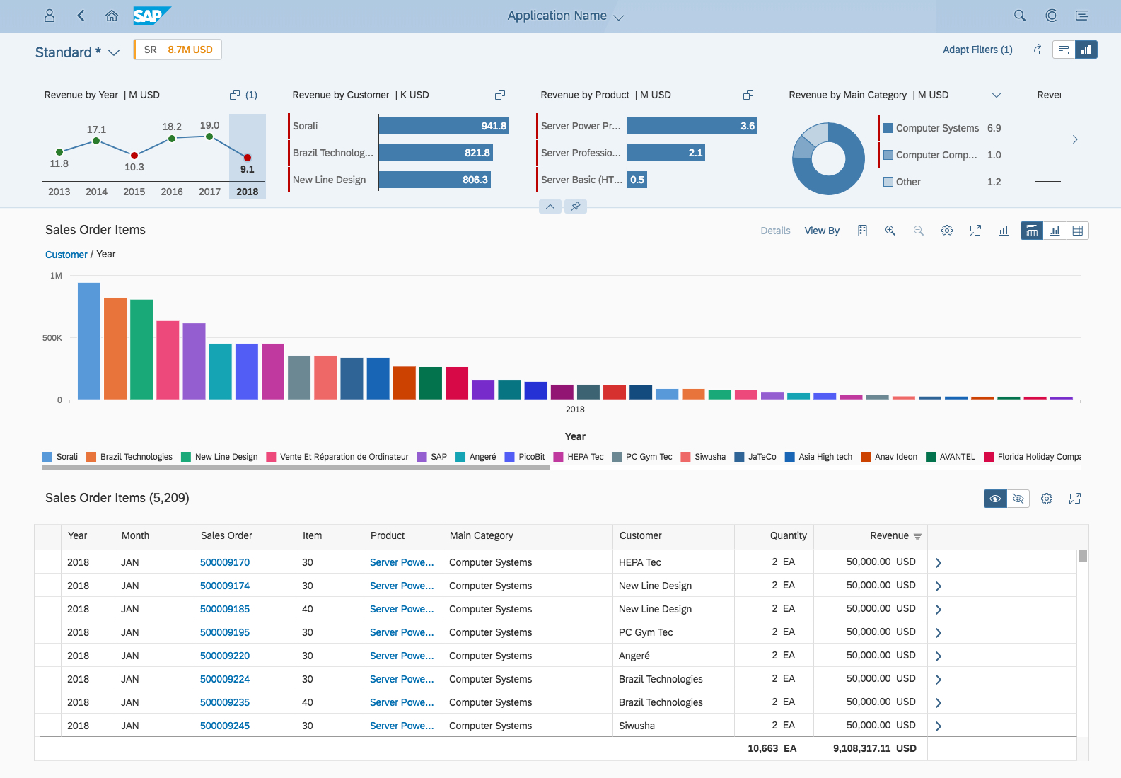
The shell bar is on top of the analytical list page. The page itself uses the dynamic page layout and has two main areas:
- Analytical list page header: The page header has two states: collapsed and expanded. The content shown depends on the state. The user can easily switch the state using the visual indicator.
- Analytical list page content area: This area combines three different views and a view switch:
- Hybrid view (combined chart and table view)
- Chart-only view
- Table-only view
All elements are described in more detail in the Components section below.
Analytical list page - Basic layout
Layout Variants
The layout of the analytical list page is quite flexible. Depending on the state of the analytical page header and the view in the content area, different content is displayed.
For example, the expanded page header allows users to display either the visual filter bar or the filter bar, while the page content area can display either a hybrid view, a chart-only view, or a table-only view.
Analytical List Page Layout Variants

Responsiveness
The analytical list page is responsive, except for the global KPIs. Apps with one or more global KPIs are not supported on screen sizes smaller than size L (desktop).
Likewise, the analytical list page is only fully supported in the flexible column layout if no global KPIs are used. If you use the analytical list page with global KPIs within the flexible column layout, the column should have at least size M.
Size S
On size S, the analytical list page supports both the chart-only and table-only views. The table-only view supports only the responsive table. If no responsive table is available, the chart-only view is displayed without a view switch toggle.
Global KPIs are not supported on size S.
Size M
On size M, the analytical list page supports both the chart-only and table-only views. You can use a responsive table or analytical table in the table-only view.
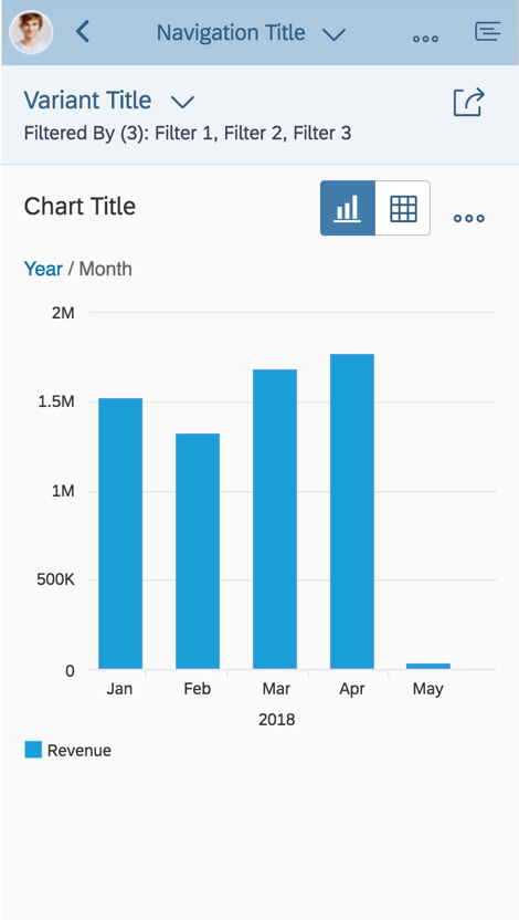
Chart-only view - Size S
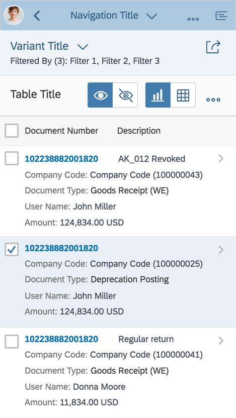
Table-only view - Size S
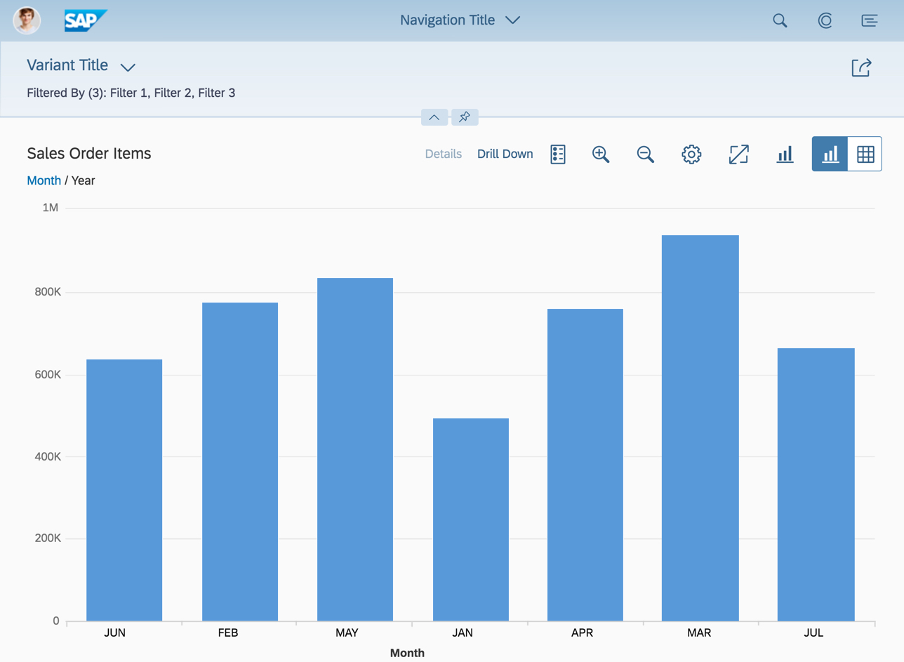
Chart-only view - Size M
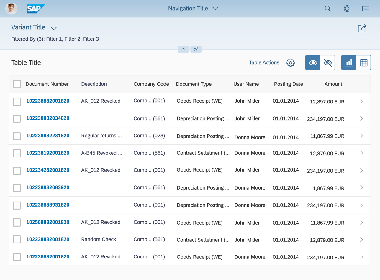
Table-only view - Size M
Component Overview
Analytical List Page Header
The page header can be expanded and collapsed on click/tap. Different content is shown in the expanded and collapsed states. For more information about the basic behavior of the header, see Dynamic Page Header.
Collapsed Header
The collapsed page header contains the following elements:
- Variant management (serves as page variant)
- Global key performance indicator tags (= global KPI tags)
- Global key performance indicator cards (= global KPI cards)
- Filter dialog via the Adapt Filters (x) link
- Header toolbar with global actions
- Summary of applied filters

Collapsed analytical list page header
Expanded Header
The expanded page header contains the following elements:
- Variant management (serves as page variant)
- Global key performance indicator tags (= global KPI tags)
- Global key performance indicator cards (= global KPI cards)
- Filter dialog via the Adapt Filters (x) link
- Header toolbar with global actions
- Filter area, including the visual filter bar and filter bar
- Filter type switch ( | )
Expanded analytical list page header showing the visual filter bar

Expanded analytical page header showing compact filters in the filter bar
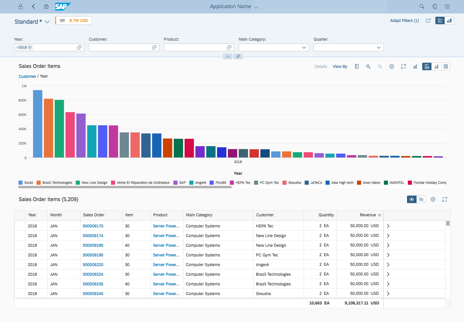
Analytical List Page Content Area
The analytical list page content area contains the following elements:
- View switch ( | | )
- Hybrid view: View with one chart, chart toolbar, one table, and a table toolbar
- Chart-only view: View with one chart and a chart toolbar
- Table-only view: View with one table and a table toolbar
Analytical List Page Content Area
Analytical List Page Header
Variant Management
Variant management in the analytical list page allows users to save a page variant whenever there are changes in the underlying structures of the filter/content area. Variant management for the page is handled by the standard SAPUI5 page variant management.
Currently, the page variant captures the following states across the page:
- Filter view switch state: Visual filter bar or filter bar
- Filter set: The filters set in the visual filter bar and filter bar
- Filter selections: Selected values in the visual filter bar and filter bar
- Content view switch state: hybrid view , chart-only view , or table-only view
- Chart and table configurations, such as measures and dimensions used, sort order, or grouping
- Chart drill-down state, based on the current selections (slice & dice)
- Table entry switch state: Hide ( ) or Show ( ) selected table records
Standard page variant management
Global KPI Tags and Cards
Use a global KPI tag (= global key performance indicator tag) if you would like to show a global KPI related to the task in hand. The global KPI value changes only if an action is executed on the transactional content. For example, the user needs to know the effect of releasing sales orders on a related global KPI, or the effect of posting an accounting document on certain financial global KPIs.
You can display a maximum of three global KPIs. Clicking a global KPI tag opens a global KPI card that displays more details on the KPI.
The global KPI tags and corresponding KPI cards are independent of the filter area. This means that global KPI tags do not react to filters set in the visual filter bar and filter bar.
A global KPI tag has four components:
- Global KPI label
- Global KPI value
- Global KPI color and criticality indicator
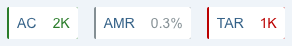
3 KPI tags including KPI labels, KPI values, KPI color, and criticality indicator
Global KPI Label
The global KPI label is an abbreviation of the complete global KPI title. It is formed using the first three letters of the first three words of the global KPI title.
Examples: AMR for Actual Monthly Revenue, TAR for Total Advertising Revenue, or LPC for Landing Page Conversation Rates
If there is only one word in the global KPI title, the first three letters of the word are displayed. Example: CON for Contracts
If the global KPI title has only two words, only the first letters of these two words are displayed. Examples: AC for Actual Costs, SG for Sales Growth

KPI label abbreviation: AC
Global KPI Value
The global KPI value is displayed using a semantic color and a scaling factor. Relative values are shown with a percentage sign and one decimal place.
Examples: 0.3%, 82.9%
Absolute values are shown without decimal places, a currency, or a unit of measure.
Examples: 2K, 75K, 30M, 14B

KPI values: 2K and 0.3%
Global KPI Color and Criticality Indicator
The color of the global KPI value is based on the thresholds defined for the particular KPI in the annotation. The global KPI tag also uses a line to indicate the criticality. The color of the line is the same as that of the global KPI value.

KPI color and criticality indicator
Global KPI Card
Clicking the KPI tag opens the analytical card, which displays more information about the current value of the global KPI, the global KPI target, the deviation from the target, and how the global KPI has evolved over time.
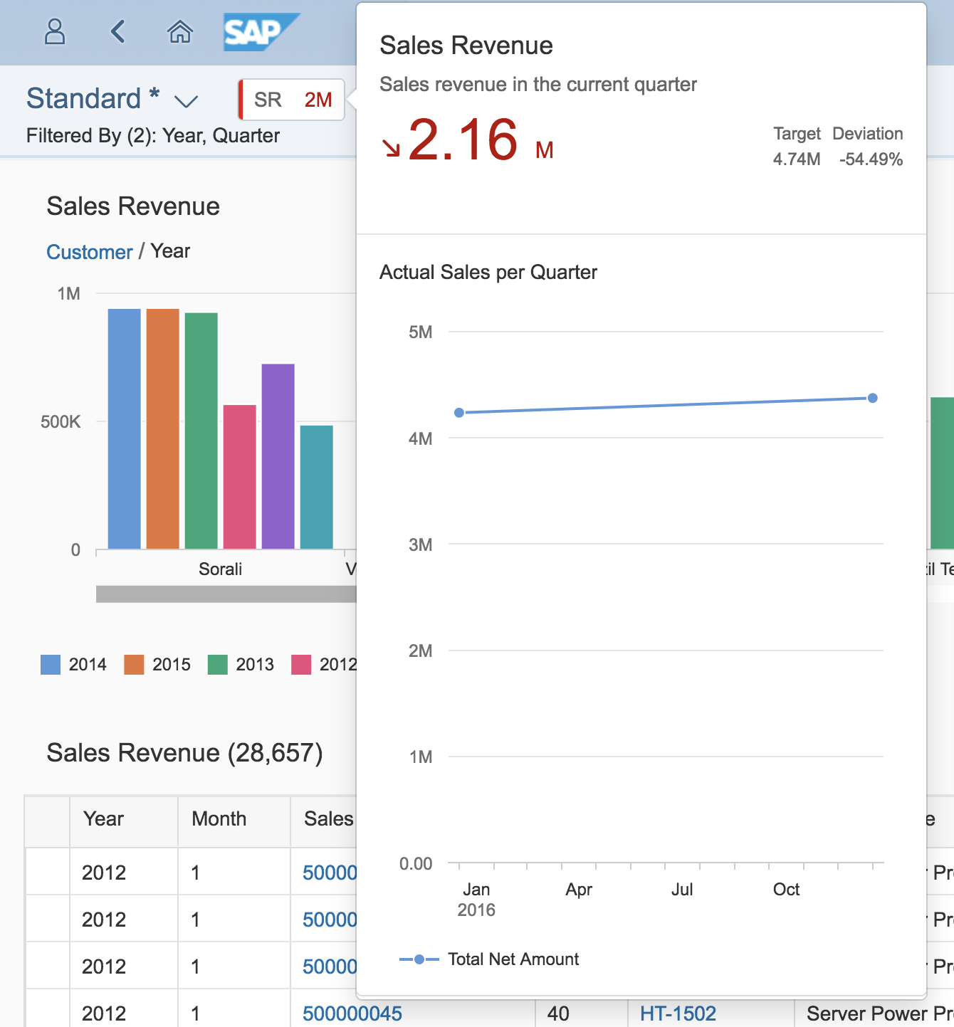
Global KPI card
Filter Area: Visual Filter Bar and Filter Bar
The filter area allows users to filter the result set, which feeds the main content area. The analytical list page comes with two filter types: compact filters in the filter bar, and the visual filter bar. Always design both visual filters and compact filters (filter bar) for your app. We recommend setting the visual filter bar as the default, but this is no longer mandatory. You can opt to use the (compact) filter bar as the default if your app has the required parameter values, if your main use case involves date ranges, or if your users often need to combine multiple filters in different ways.
Currently, any visual filter configured in the visual filter bar must always be displayed as a compact filter in the filter bar as well. By contrast, a filter configured as a compact filter in the filter bar may or may not be configured for display as a visual filter. This means that it’s possible to have a smaller set of visual filters and a larger set of compact filters.
Both filter types supports two different modes: live update and manual update. Use the live update mode for both filter types as the default whenever possible. Apply the same mode to both filter types: the visual filter bar and the filter bar. For example, if you use the live update mode in the visual filter bar, you should also use the live update mode for the filter bar.
Visual filter bar
Filter bar
Filter Type Switch
Users can toggle between the compact filters (filter bar) and (visual filter bar) in the upper-right area of the page header. The filter type switch is a core feature of the analytical list page and is mandatory. The switch is only displayed when the page header is expanded. Once the header collapses, it disappears.
Filter type switch
Carrying Forward Filter Selections
Visual Filter to Compact Filter
Any values selected in the visual filters are always carried forward to the corresponding compact filters.
Compact Filter to Visual Filter
Filter dimensions that are part of a visual filter are synced to the visual filter. If the dimension value(s) chosen in the compact filter are part of a visual filter, they are shown as selected chart dimensions in the visual filter (single or multiple selections).
Filter dimensions that are not part of the visual filter, parameter values, and interval-based dimensions are applied to the filter query and the content is refreshed.
To show complex conditions, click the link for the number of selected items at the top of the visual filter.
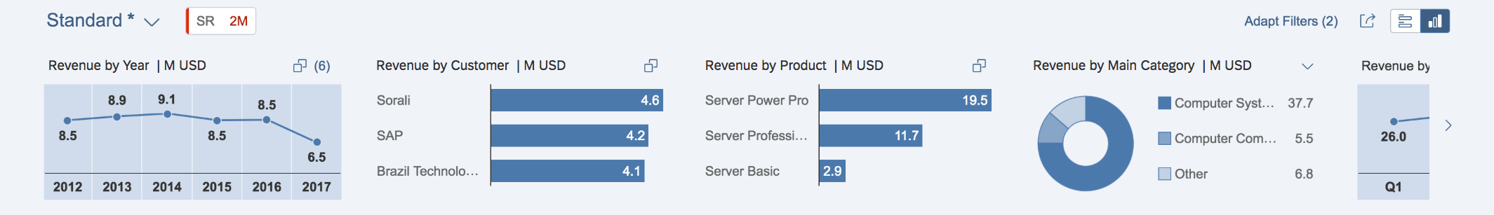
Visual Filter Bar
The visual filter bar combines measures or item counts with filter values. The visual filter bar becomes more powerful if you match measures to the filter dimension instead of just item counts. Use the visual filter bar if you would like to give the user a condensed overview of the data in the dataset. Chart visualization increases the joy of use, and enables users to spot relevant data more quickly.
Chart Types in the Visual Filter Bar
Currently, the visual filter bar supports three interactive chart types:
These interactive charts are also referred to as visual filters.
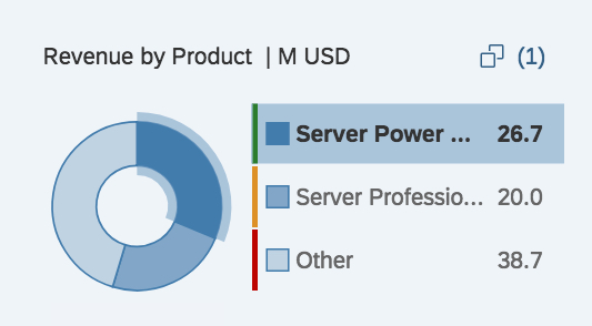
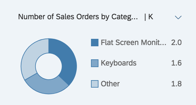
Interactive Donut Chart
The interactive donut chart in the visual filter bar is used for non-time-related data (for example, categories) and displays only the top or bottom two values. The rest are aggregated into the “Other” section.
Interactive donut chart
Interactive donut chart with semantic colors
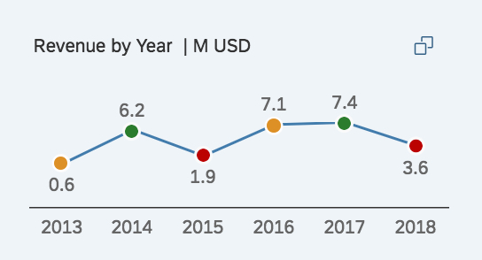
Interactive Line Chart
The interactive line chart is used exclusively for displaying time series data, and can show a maximum of six data points. Always show the first or last six data points (for example, last six days, last six months, first six days, and so on).
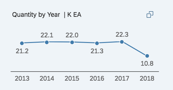
Interactive line chart
Interactive line chart with semantic colors
Interactive Bar Chart
The interactive bar chart can be used for non-time-related data (for example, categories) and has a maximum of three filter values. These filter values show the top three or bottom three entries.
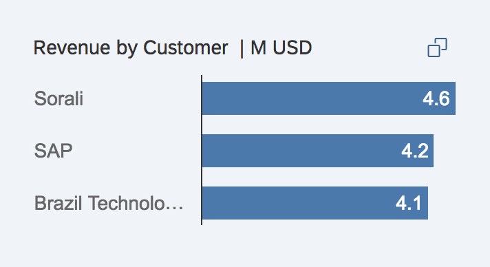
Interactive bar chart
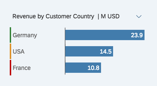
Interactive bar chart with semantic colors
Using Interactive Charts
The interactive charts come with the following features and rules:
- Minimum number of interactive charts: Show at least three visual filters and try to use different chart types.
- Filter title:
- Use the following naming convention for the filter title, using title case:
[Measure Name] by [Dimension Name] | [Scale Factor] [Unit of Measure].
Examples:
Project Costs by Project | K EUR
Sales Volume by Commodity | M PC - For an item count, use the following naming convention for the filter title, using title case:
Number of [Dimension] | [Scale Factor] [Unit of Measure].
Examples:
Number of Products | PC
Number of Contracts by Month - Note that for some use cases, it might be appropriate to replace “Number” with a different expression. Bear in mind that the space for displaying the filter title is limited. If the measure and/or dimension names are longer than the predefined space, the text will be truncated.
- Use the following naming convention for the filter title, using title case:
Filter title with truncation
Filter title without truncation
- Filter-to-filter dependencies: Ideally, the filters depend on each other. By selecting one or several chart data points, users can perform a quick analysis of the dataset.
Examples: Supplier with the lowest supplier performance this year, product with the highest sales volume in March in the EMEA region - Adding additional filter values: All charts have a maximum number of filter values that can be displayed within the chart itself. More filter values can be selected using the value help.
- Selected values: Any data point or segment that is selected in the visual filter’s interactive charts will remain selected even when the user changes the measure, chart type, or sort order in any of the charts. If a selected record falls outside the top/bottom three records being displayed, the number of selected records is shown in parentheses at the top right of the chart.
- Semantic colouring: All interactive charts support semantic colors to indicate the criticality of filter values.
- How to design a visual filter: To design a visual filter, choose a meaningful measure out of the dataset and match it to a filter dimension. If no measures or no meaningful measures are available, use an item count instead. Have a look at the visual filter bar article for more information.
Filter Dialog
In the filter dialog, the user can switch between the visual filter bar filters and the filter bar filters using a toggle button. The standard filter dialog is explained in the Filter Bar article. The part for the visual filter is further explained below.
Filter Dialog for Visual Filters
The filter dialog is launched by clicking the Adapt Filters ([number of applied filters]) link in the page header area. In the filter dialog for visual filters, the user can choose which filter fields are shown in the visual filter bar, and make the following changes:
- Add visual filters
- Delete visual filters
- Hide visual filters in the visual filter bar
- Search for visual filters
- Change the sort order of each visual filter
- Change the chart type of each visual filter
- Switch to other measures in the visual filter display
Analytical List Page Content Area
The content area shows different visualizations of the selected data. In the hybrid view, users can interact with both the chart and table visualizations at the same time. In addition, the analytical list page supports a chart-only view and a table-only view. The analytical list page always comes with all three views. Offering additional views or even tabs would add too much complexity, and is neither supported nor recommended.
Check out the following sections for more details on the hybrid view, chart-only view, and table-only view.
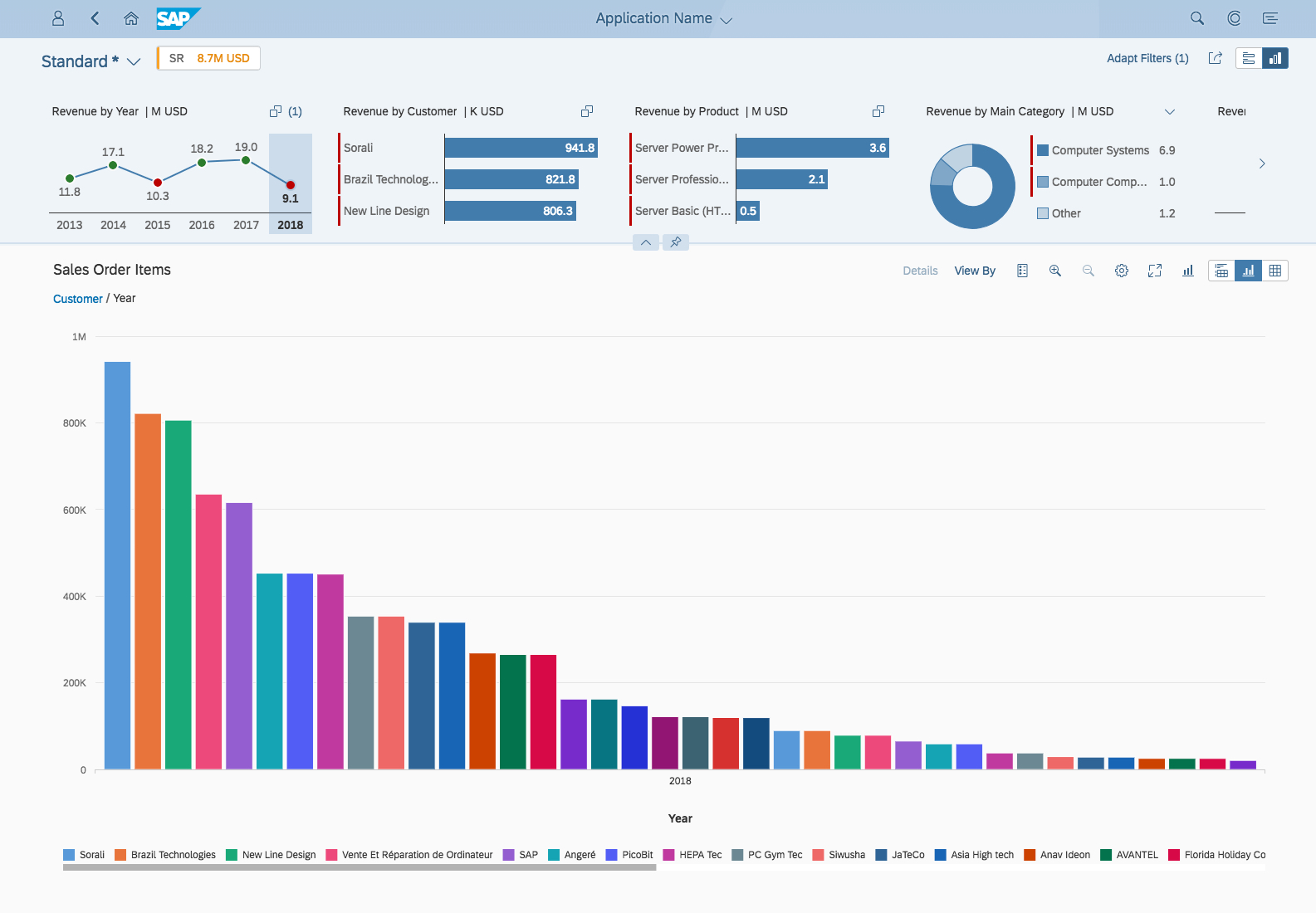
Hybrid View
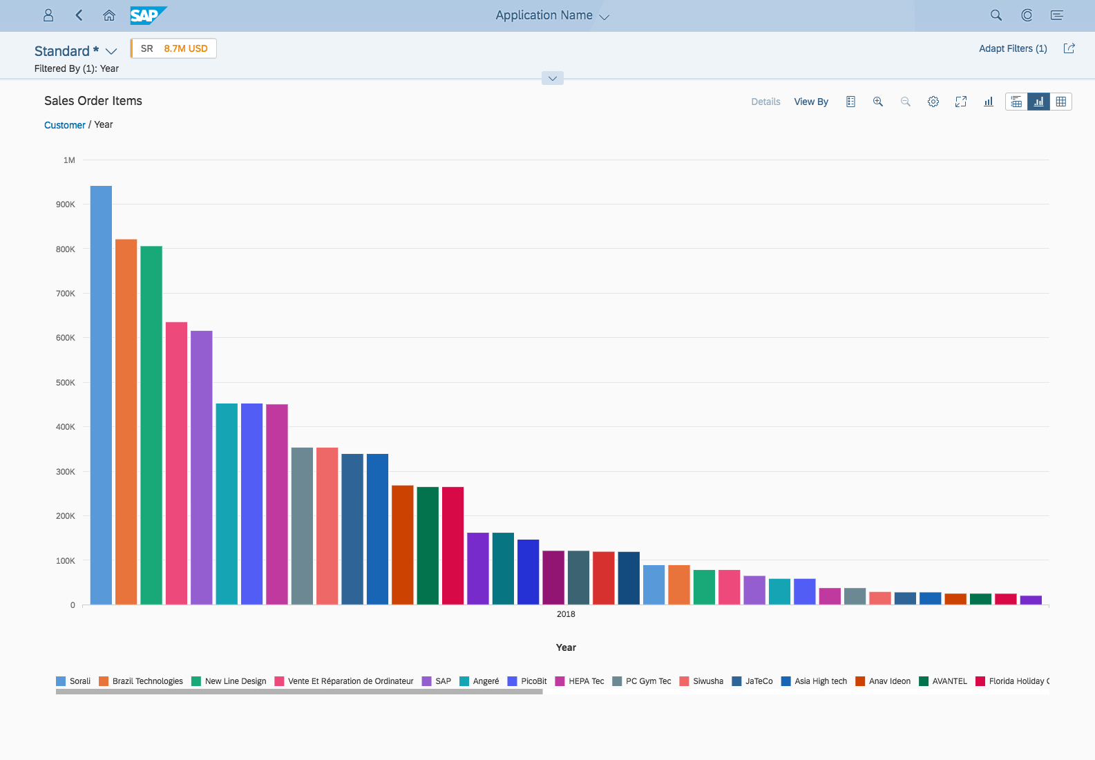
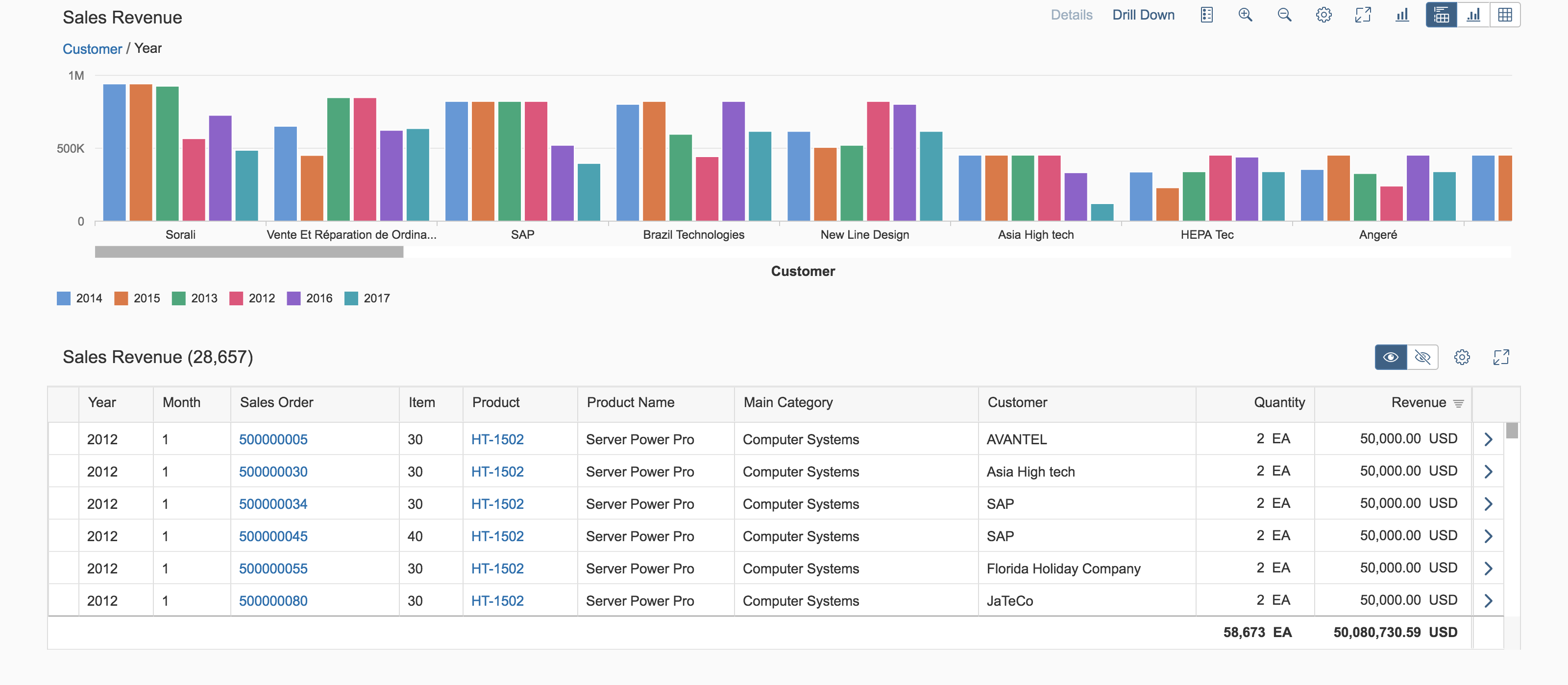
The hybrid view uses both chart and table visualizations at the same time. It enables users to analyze data step by step from different perspectives. Users can interact with both the chart and the table, and drill down through either the smart chart or table entries to investigate a root cause. They can also act directly on transactional content. In the initial view of the chart, visualize the most important aspects of the whole dataset in the chart.
Example: The view shows all the suppliers the user is responsible for, organized by value. By drilling down the material to the plant with the highest/lowest volume, the user can see if materials need to be shifted from one plant to another. The corresponding transactional data is shown in an analytical table below the chart, which might also offer an action for shifting the material.

Analytical list page - Hybrid view
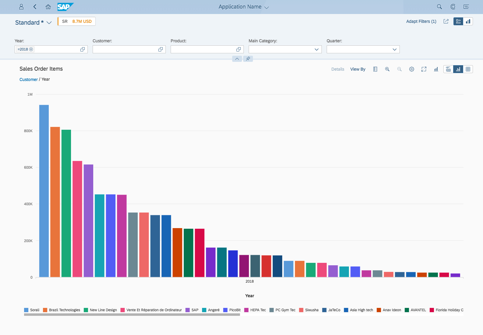
Chart-Only View
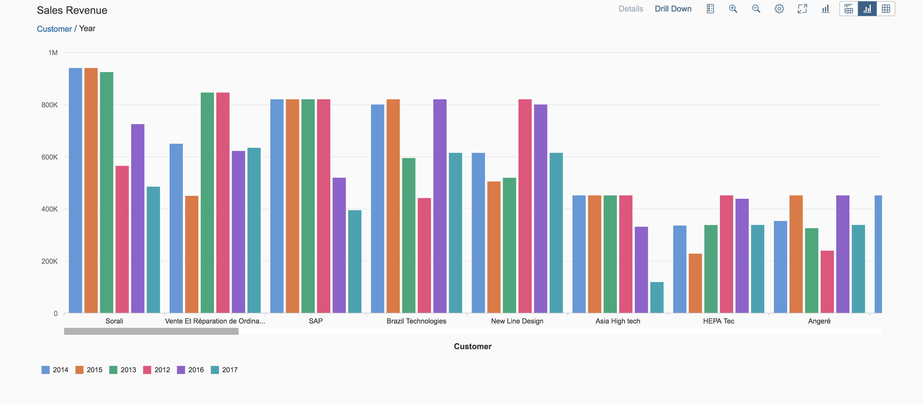
The chart-only view enables users to analyze data step by step from different perspectives, and to investigate a root cause through drilldown, without direct access to transactional content. The smart chart control provides the chart visualization in the chart-only and hybrid views: it is used to display the dataset as a chart. The smart chart drilldown functionality provides a convenient way to analyze the dataset. In addition, the smart chart offers detailed information on the chart data and a breadcrumb that shows the drilldown path. Ensure that you show the most important aspects of the dataset in the chart.
This mode is perfect for applications with analytical data that can easily be represented visually using charts, but doesn’t need to be linked to the transactional dataset.
Analytical list page - Chart-only view
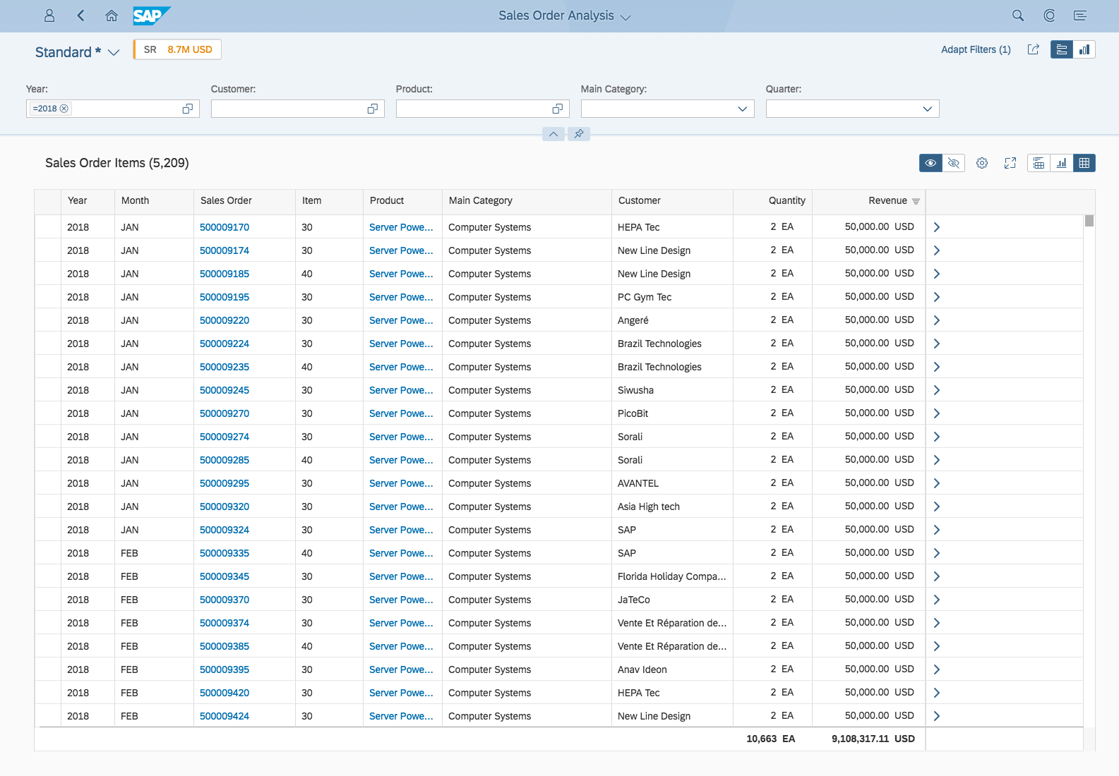
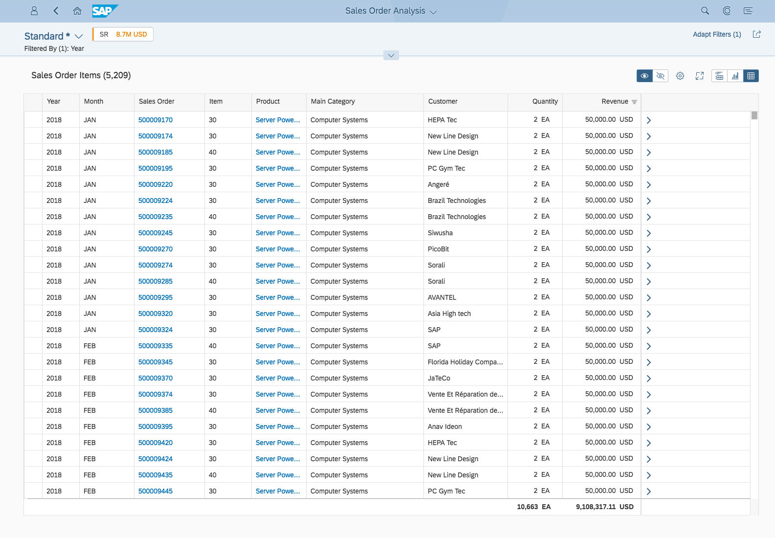
Table-Only View
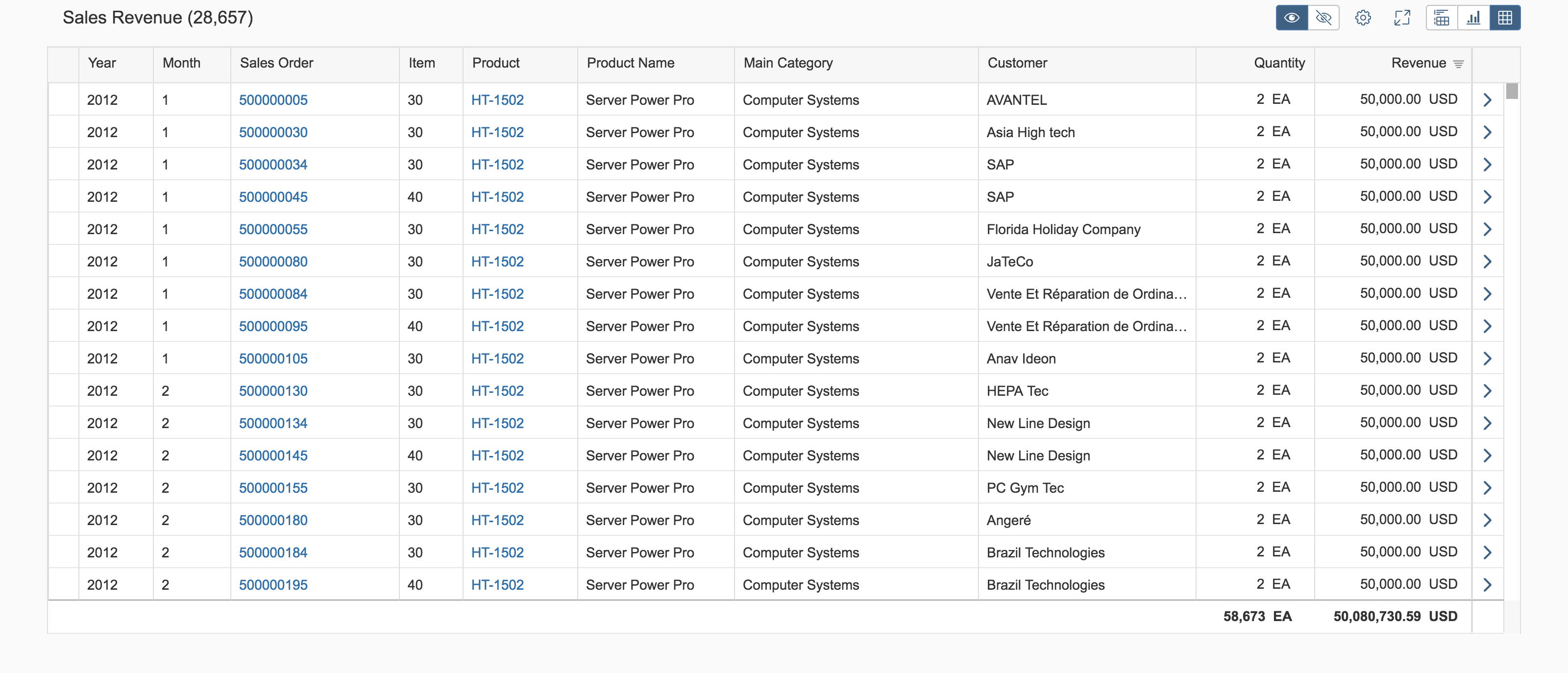
The table view provides access to transactional content. The user can act on single or multiple objects, and navigate to the object details or to other applications.
Depending on the use case, you can opt to use either the analytical table or the responsive table.
Snapping or scrolling is not available for desktop-focused tables, such as the analytical table. The table entries are loaded with lazy loading.
Users can apply filters at table level using the Settings button ( ). For analytical tables, filtering is also available at column level. For more information, see Analytical Table (ALV) – Filter.
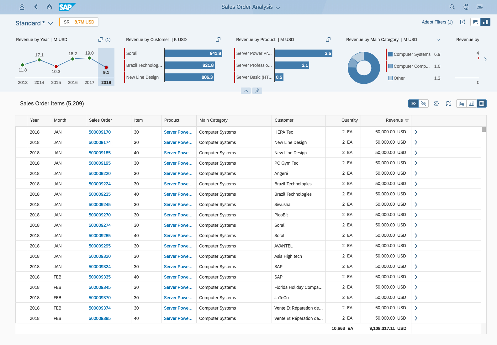
Analytical list page - Table-only view
Behavior and Interaction
Open and View the Global KPI Card via the Global KPI Tag
Clicking/tapping a KPI tag opens the KPI card, which shows the details for the particular KPI.
Select Filters in the Visual Filter
Unlike micro charts, the visual filter charts are interactive. In live search mode, selecting a filter value triggers data filtering in the content area. Both single and multiple selection are supported.
To select a filter value, the user clicks on a value in the chart. The filter can be removed by either clicking on the value help link, or by clicking on the same value in the chart again. The user can select more filter values using the value help.
Any data point that is selected in a chart still remains selected when the user selects a data point in another chart. Filter values react on each other. If a selected record falls outside the top/bottom three records being displayed, the number of selected records is shown in parentheses at the top right of the chart.
Switch Views: Hybrid, Chart-Only, and Table-Only
Users can switch between the hybrid view, chart-only view, and table-only view.
If the user selects values and then switches the view, the selection remains intact. See the table below for more details.
| Switch | Description |
| Hybrid view to table view | Table selection remains intact |
| Hybrid view to chart view | Chart selection remains intact |
| Chart view to hybrid view | Chart selection remains intact; corresponding table selections are displayed |
| Table view to hybrid view | Table selection remains intact |
Show/Hide Table Entries in Hybrid View and Table View
The table toolbar for the analytical list page offers a Show and Hide table entries feature as a toggle switch in the hybrid and table views:
- If the Show icon is active, the table shows all items. These include highlighted entries (where values are selected in the chart) and non-highlighted entries.
- If the Hide icon is active, the table shows only items that are selected in the chart.
For example, if the user selects SAP’s Sales Revenue for 2012 as Customer in the chart, all records relating to SAP’s Sales Revenue for 2012 are highlighted (but not selected) in the table. Note that the record is still highlighted even if Customer not displayed as a column in the table. If the table rows are grouped, the entire grouping is highlighted, even if only one record within the grouped set is affected by the chart selection. All values that are not selected in the chart are “hidden” and are not shown in this table mode.
Guidelines
Show the filter dimension with one measure in the visual filter, not multiple measures
Filter dimensions in the compact filters (filter bar) have exactly one representation in the visual filter bar.
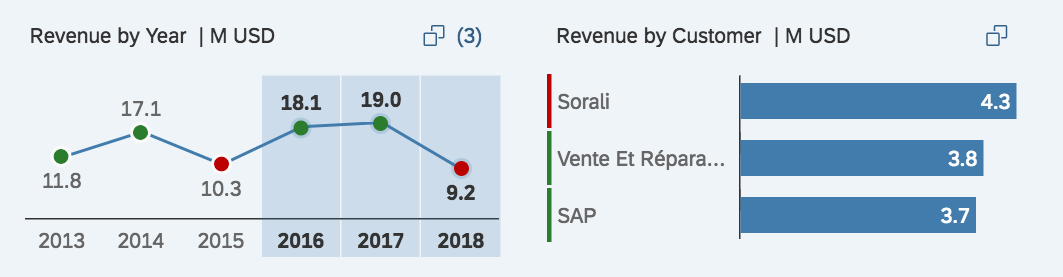
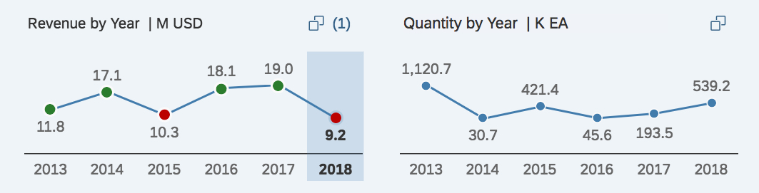
Do not show the same filter dimension with two or more different measures at the same time in the visual filter bar. The example shows the filter Dimension Year with two different measures Revenue and Quantity. Showing the filter dimensionYear twice is not in sync with the compact filter, where it is shown only once. Furthermore, matching between the two filter types will not work.
If the use case requires you to show a dimension with different measures, consider using an overview page instead.
For each dimension display exactly one representation in the visual filter bar.
Do not use the same filter dimension with different measures
Resources
Want to dive deeper? Follow the links below to find out more about related controls, the SAPUI5 implementation, and the visual design.
Elements and Controls
- Visual Filter Bar (guidelines)
- Analytical Card (guidelines)
- Interactive Charts (guidelines)
- Interactive Bar Chart (guidelines)
- Interactive Donut Chart (guidelines)
- Interactive Line Chart (guidelines)
- Value Help Dialog (guidelines)
- Smart Chart (guidelines)
- Analytical Table (guidelines)
- Responsive Table (guidelines)
Implementation
- No links.
 Your feedback has been sent to the SAP Fiori design team.