
- Latest SAPUI Version 1.124
- SAPUI5 Version 1.122
- SAPUI5 Version 1.120
- SAPUI5 Version 1.118
- SAPUI5 Version 1.116
- SAPUI5 Version 1.114
- SAPUI5 Version 1.112
- SAPUI5 Version 1.110
- SAPUI5 Version 1.108
- SAPUI5 Version 1.106
- SAPUI5 Version 1.104
- SAPUI5 Version 1.102
- SAPUI5 Version 1.100
- SAPUI5 Version 1.98
- SAPUI5 Version 1.96
- SAPUI5 Version 1.94
- SAPUI5 Version 1.92
- SAPUI5 Version 1.90
- SAPUI5 Version 1.88
- SAPUI5 Version 1.86
- SAPUI5 Version 1.84
- SAPUI5 Version 1.82
- SAPUI5 Version 1.80
- SAPUI5 Version 1.78
- SAPUI5 Version 1.76
- SAPUI5 Version 1.74
- SAPUI5 Version 1.72
- SAPUI5 Version 1.70
- SAPUI5 Version 1.68
- SAPUI5 Version 1.66
- SAPUI5 Version 1.64
- SAPUI5 Version 1.62
- SAPUI5 Version 1.60
- SAPUI5 Version 1.58
- SAPUI5 Version 1.54
- SAPUI5 Version 1.52
- SAPUI5 Version 1.50
- SAPUI5 Version 1.48
- SAPUI5 Version 1.46
- SAPUI5 Version 1.44
- SAPUI5 Version 1.42
- SAPUI5 Version 1.40
- SAPUI5 Version 1.38
- SAPUI5 Version 1.36
- SAPUI5 Version 1.34
- SAPUI5 Version 1.32
- SAPUI5 Version 1.30
- SAPUI5 Version 1.28
- SAPUI5 Version 1.26
- Latest SAPUI Version 1.124
- SAPUI5 Version 1.122
- SAPUI5 Version 1.120
- SAPUI5 Version 1.118
- SAPUI5 Version 1.116
- SAPUI5 Version 1.114
- SAPUI5 Version 1.112
- SAPUI5 Version 1.110
- SAPUI5 Version 1.108
- SAPUI5 Version 1.106
- SAPUI5 Version 1.104
- SAPUI5 Version 1.102
- SAPUI5 Version 1.100
- SAPUI5 Version 1.98
- SAPUI5 Version 1.96
- SAPUI5 Version 1.94
- SAPUI5 Version 1.92
- SAPUI5 Version 1.90
- SAPUI5 Version 1.88
- SAPUI5 Version 1.86
- SAPUI5 Version 1.84
- SAPUI5 Version 1.82
- SAPUI5 Version 1.80
- SAPUI5 Version 1.78
- SAPUI5 Version 1.76
- SAPUI5 Version 1.74
- SAPUI5 Version 1.72
- SAPUI5 Version 1.70
- SAPUI5 Version 1.68
- SAPUI5 Version 1.66
- SAPUI5 Version 1.64
- SAPUI5 Version 1.62
- SAPUI5 Version 1.60
- SAPUI5 Version 1.58
- SAPUI5 Version 1.56
- SAPUI5 Version 1.54
- SAPUI5 Version 1.52
- SAPUI5 Version 1.50
- SAPUI5 Version 1.48
- SAPUI5 Version 1.46
- SAPUI5 Version 1.44
- SAPUI5 Version 1.42
- SAPUI5 Version 1.40
- SAPUI5 Version 1.38
- SAPUI5 Version 1.36
- SAPUI5 Version 1.34
- SAPUI5 Version 1.32
- SAPUI5 Version 1.30
- SAPUI5 Version 1.28
- SAPUI5 Version 1.26
Group Feed Component
sap.collaboration.components.feed.Component
Intro
You can use the group feed component to offer a social timeline that is integrated with SAP Jam. The group feed enables SAP Jam users to post comments and reply to posts created by other users. You can use it just for collaboration, or offer collaboration alongside application-generated content.
Like the timeline, the group feed component shows a series of entries in chronological order, such as changes to an object, events related to an object, or user-driven updates and comments. The latest entry is always on top.
Usage
Use the group feed component if:
- You need SAP Jam integration.
- You want users to be able to create their own posts.
- You need social interaction, such as replies.
- You expect a long list of posts triggered by the system, the users, or both.
- You want users to be able to create their own posts.
Do not use the group feed component if:
- You don’t need the social features offered by SAP Jam. In this case, use the timeline control.
- You need social collaboration, but without using SAP Jam. In this case, use the timeline control.
- You expect only a few entries. Instead, use a simple feed.
- You want to provide a way to upload files. Use the upload collection control instead. You can still use the group feed component to show automated updates about the user’s uploads.
- You require fully responsive behavior and are not dependent on SAP Jam integration. In this case, use the timeline control.
Placement
The group feed does not have a fixed location on the UI. Where you place it depends on your use case:
- If users need to check the content of the group feed on a regular basis, you can display the group feed component as part of the page content (however, because the responsiveness of the group feed is limited, we advise against placing it in an object page section).
- If the posts and updates are closely related to the content and need to be seen in parallel, you can use the dynamic side content floorplan. Alternatively, you can create a separate page with the feed as the central element and show it next to your main content using the flexible column layout.
- If the group feed component contains only secondary information, or only needs to be accessed occasionally, you can embed it in a tab or trigger it dynamically using the dynamic side content.
Group feed component
Responsiveness
The group feed lacks responsive and adaptive behavior. However, it works well in small spaces, such as the dynamic side panel or on a smartphone. If you require fully responsive behavior and are not dependent on SAP Jam integration, please use the fully responsive timeline instead.
Layout
The group feed component consists of:
- A header (optional, but highly recommended)
- A chronological axis
- Posts/entries
The following optional features can be added:
- Filter
- Group
- Add entries
Header
The title describes the content displayed along the group feed axis.
Axis
Along the axis, the entries are arranged chronologically. The distance does not correspond to the time between each occurrence.
The group feed component always uses a single-sided vertical axis. It can be scrolled along its axis.
By default, the latest entries appear on top. Replies are sorted the other way round.

Vertical feed, single-sided (right)
Vertical feed, single-sided (left)
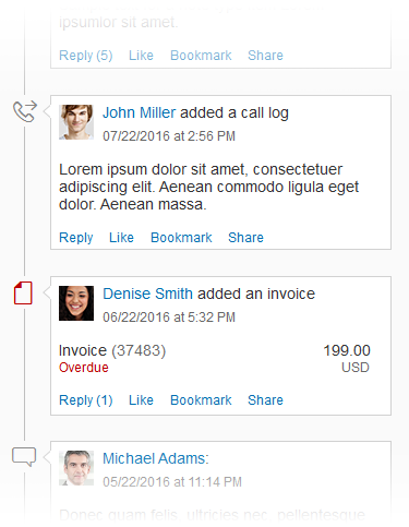
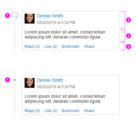
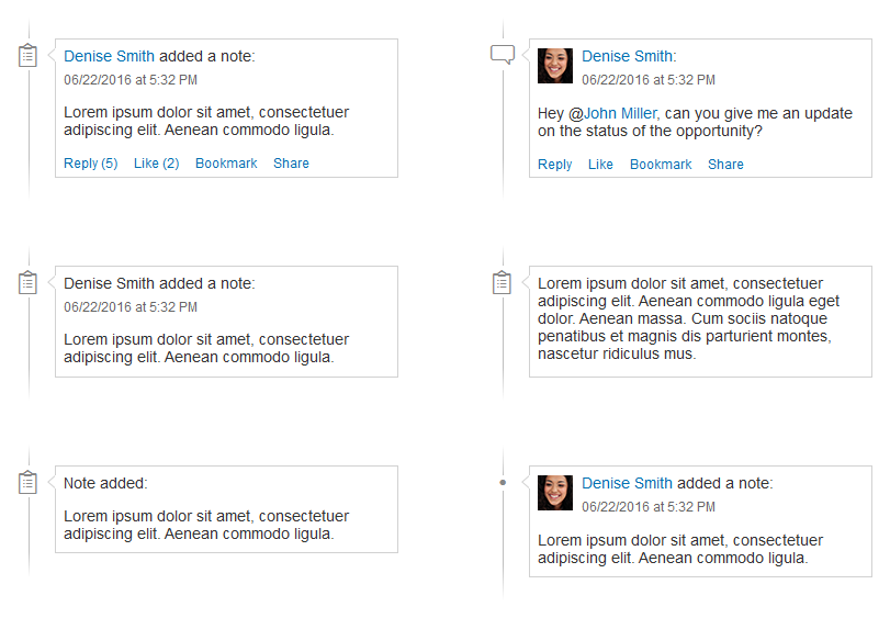
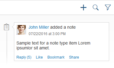
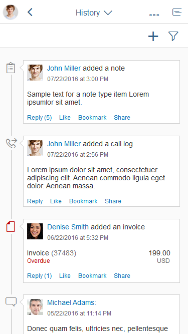
Post (Entry/Feed Update)
Posts can be entered manually or generated by the system (for example, “Object ABC was changed by Mr. X.”). The entry should include information about who changed what, and when (depending on the use case). Typically, posts in the group feed consist of four sections:
- A node
Using icons on a node is optional. Use icons for either all or none of the posts.
- A header section, which can contain:
- An image or an icon
- Text(s) and/or link(s)
- A time stamp (use SAP Fiori formatting)
- An (expandable) content section, which can contain:
- Text(s) and/or link(s)
- Structured or unstructured information
- Images
- An optional action section containing some or all of the actions offered by SAP Jam (such as Reply, Like, Bookmark, or Share). You can also offer application-specific actions (see custom actions).
Note: If a section is not used, it should not take up any space within the bubble.
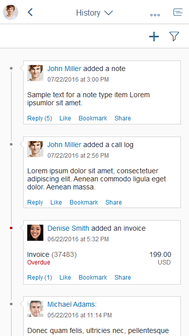
Group feed – Layout
Here are just a few examples of different visualizations. Because the group feed is very flexible, there are also numerous other possibilities.
Group feed – Layout examples
Posts can originate from three sources:
- Manual post: A person actively posts to the group feed (or to another place that supplies updates to the group feed).
Example:
Julie Armstrong: Can someone please have a look at these numbers?
- Post triggered by user action: The post is triggered by something a person does (such as creating an object, adding a note, or uploading an attachment).
Examples:
Julie Armstrong created sales order 4815162342.
(Followed by an optional preview of the header data)
John Miller uploaded the document Sales-Revenue_Q4.xls
(Followed by an optional preview of the document, if available)
Donna Moore added a note:
(Followed by an optional preview of the note)
Julie Armstrong added the picture our_team.jpg
(Followed by an optional preview of the image)
- Post triggered by a technical source: Posts can also originate from a purely technical source (for example, if a threshold has been exceeded, or a deadline has been reached).
Examples:
Boiler BB-258/80 has exceeded its maximum temperature.
Server DS209 is running out of space.
Order #052690 is overdue.
Behavior and Interaction
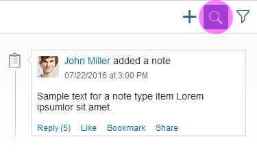
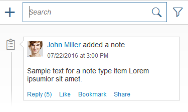
Search
Because a group feed can contain a vast number of entries, always offer a search. A search helps users to find what they are looking for without having to scroll through all the posts and updates.
Initially, the search field is closed and only visualized with a search icon. Clicking the icon opens the search field with the focus in the field so the user can start typing.
Search in the Group Feed
Expand and Collapse
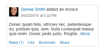
Some updates might be too lengthy to show in full. For these cases, applications can decide to show only a preview and let users expand the post if they want to read it. You can set a limit for the number of lines to be shown (recommended), or for the number of characters.
This example shows a post that previews 3 lines before truncating and showing a More button in the next line. Clicking this button expands the post to its full length and changes the button text to Less. Clicking this button again collapses the post to its previous height.
Group feed interaction – Expand/collapse
Filter (Optional)
For group feeds with several entries or entry types, it makes sense to enable filtering. You can let users filter by entry type and by other useful attributes (such as bookmarked). Users can even filter by time range to find posts between two specific dates, months, quarters, or years.
The filter is triggered with the filter icon icon in the toolbar.
Depending on the complexity of the group feed, you can offer different kinds of filter dialog:
- Single selection
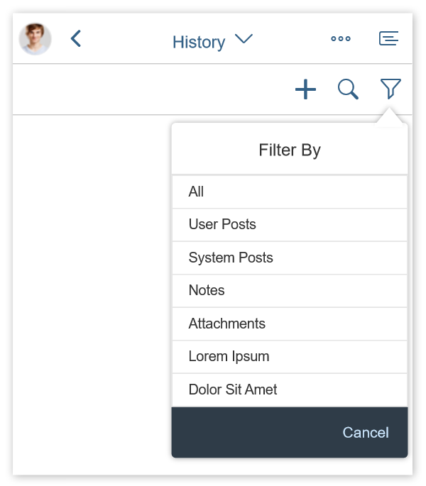
Group feed interaction – Filter with single selection
- Multi-selection
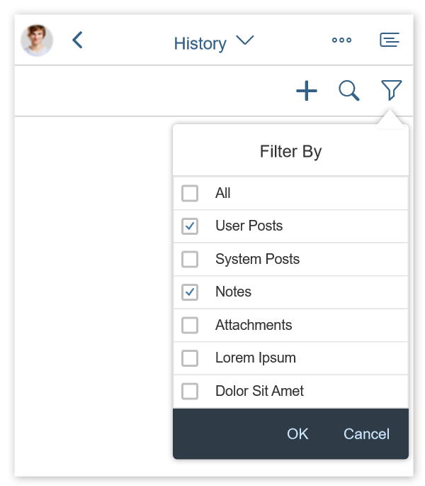
Group feed interaction – Filter with multi-selection
- Multi-faceted filter
To implement this combination of feed source and filter, use the view settings dialog.
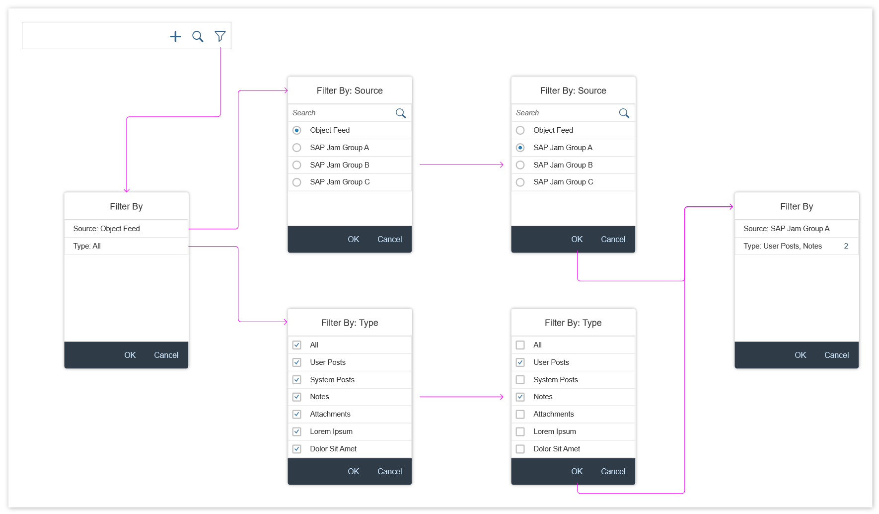
Group feed interaction – Filter with view settings dialog
If a filter is set, inform the user in the infobar.
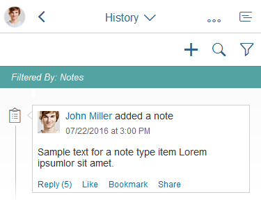
Group feed interaction – Set filter
Refresh
Instead of showing new posts as soon as they arrive (which would interrupt users while they are reading), the group feed offers a very subtle way of notifying users about new posts.
You can place a message strip directly below the toolbar to show how many new posts are waiting to be retrieved from the back end.
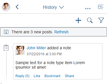
Group feed – Refresh
If a filter is active, the message strip shows alongside the filter infobar.
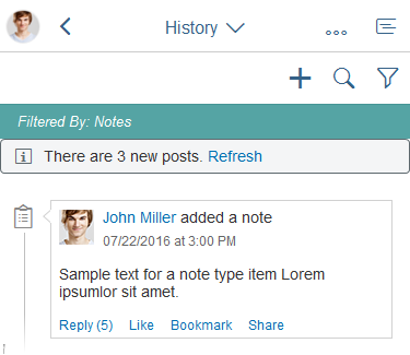
Group feed – Refresh and filter
Social Actions
Adding a Post
In the group feed, users can add new posts by clicking the plus ( ) icon on top of the control. This opens a popover with the focus set inside the text area so the user can start typing right away.
Post sends the user’s text, which then appears in the group feed. To prevent empty posts, the button stays inactive until the user has typed something.
Users can also add @mentions (references) to other users or business objects.
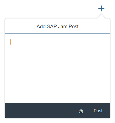
Interaction – Post
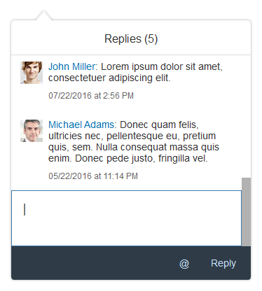
Replying to a Post
Alongside the Post function, Reply is probably the most basic and essential social feature. Unlike feed controls (
sap.m.FeedInput and sap.m.FeedListItem), the group feed control enables communication at item level. Feed controls always add entries to the top of the list; there are no inline replies within the feed. By contrast, the group feed lets users reply directly to a specific entry. The number of replies is shown next to the Reply action, for example, Reply (5).
Clicking the reply link triggers a popover that shows all previous replies, as well as a text area for posting a reply.
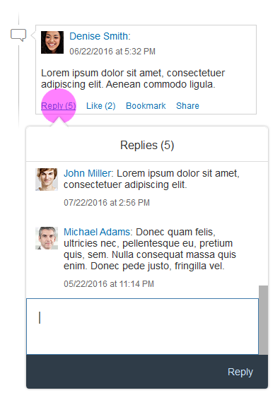
Interaction – Reply
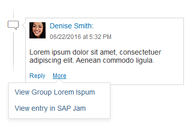
@Mention
This feature is well known from multiple social networks, and allows users to add a reference to another person or a business object. A “mentioned” person usually receives a notification about the respective post.
The @mention feature is available in all areas that allow the user to post something:
- Create new post
- Reply (example in the image)
- Share in SAP Jam dialog
Due to technical restrictions, this feature cannot be used on smartphones.
Interaction – @Mention
Custom Actions
Applications can provide custom actions by using an overflow menu (action sheet).
Interaction – Custom actions
Styles
Icons vs. Bullets
When you design your application, you can chose between two visualizations for listing posts on the group feed: icons or bullet points.
You can use icons if all entry types that will appear in the group feed can be represented by an icon.
If you cannot find icons for all post types, use bullet points instead.
Group feed with icons
Group feed without icons
Colors
You can use colors to highlight entries in the group feed and to convey semantic information (for example, to indicate the status or urgency of an entry).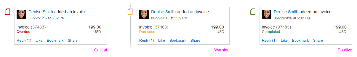
Group feed with icons and semantic colors
Guidelines
- Only use the speech bubble icon for posts entered manually by users:
CSS name: icon-post
HTML Unicode: & # xe 0 a b ; (remove the spaces) - Do not use colors for decoration. Only use colors to convey semantic information (for example, warnings or errors).
Resources
Want to dive deeper? Follow the links below to find out more about related controls, the SAPUI5 implementation, and the visual design.
Implementation
- Group Feed Component (SAPUI5 samples)
- Group Feed Component (SAPUI5 API reference)
- Message Strip (SAPUI5 samples)
 Your feedback has been sent to the SAP Fiori design team.