
- Latest SAPUI Version 1.124
- SAPUI5 Version 1.122
- SAPUI5 Version 1.120
- SAPUI5 Version 1.118
- SAPUI5 Version 1.116
- SAPUI5 Version 1.114
- SAPUI5 Version 1.112
- SAPUI5 Version 1.110
- SAPUI5 Version 1.108
- SAPUI5 Version 1.106
- SAPUI5 Version 1.104
- SAPUI5 Version 1.102
- SAPUI5 Version 1.100
- SAPUI5 Version 1.98
- SAPUI5 Version 1.96
- SAPUI5 Version 1.94
- SAPUI5 Version 1.92
- SAPUI5 Version 1.90
- SAPUI5 Version 1.88
- SAPUI5 Version 1.86
- SAPUI5 Version 1.84
- SAPUI5 Version 1.82
- SAPUI5 Version 1.80
- SAPUI5 Version 1.78
- SAPUI5 Version 1.76
- SAPUI5 Version 1.74
- SAPUI5 Version 1.72
- SAPUI5 Version 1.70
- SAPUI5 Version 1.68
- SAPUI5 Version 1.66
- SAPUI5 Version 1.64
- SAPUI5 Version 1.62
- SAPUI5 Version 1.60
- SAPUI5 Version 1.58
- SAPUI5 Version 1.54
- SAPUI5 Version 1.52
- SAPUI5 Version 1.50
- SAPUI5 Version 1.48
- SAPUI5 Version 1.46
- SAPUI5 Version 1.44
- SAPUI5 Version 1.42
- SAPUI5 Version 1.40
- SAPUI5 Version 1.38
- SAPUI5 Version 1.36
- SAPUI5 Version 1.34
- SAPUI5 Version 1.32
- SAPUI5 Version 1.30
- SAPUI5 Version 1.28
- SAPUI5 Version 1.26
- Latest SAPUI Version 1.124
- SAPUI5 Version 1.122
- SAPUI5 Version 1.120
- SAPUI5 Version 1.118
- SAPUI5 Version 1.116
- SAPUI5 Version 1.114
- SAPUI5 Version 1.112
- SAPUI5 Version 1.110
- SAPUI5 Version 1.108
- SAPUI5 Version 1.106
- SAPUI5 Version 1.104
- SAPUI5 Version 1.102
- SAPUI5 Version 1.100
- SAPUI5 Version 1.98
- SAPUI5 Version 1.96
- SAPUI5 Version 1.94
- SAPUI5 Version 1.92
- SAPUI5 Version 1.90
- SAPUI5 Version 1.88
- SAPUI5 Version 1.86
- SAPUI5 Version 1.84
- SAPUI5 Version 1.82
- SAPUI5 Version 1.80
- SAPUI5 Version 1.78
- SAPUI5 Version 1.76
- SAPUI5 Version 1.74
- SAPUI5 Version 1.72
- SAPUI5 Version 1.70
- SAPUI5 Version 1.68
- SAPUI5 Version 1.66
- SAPUI5 Version 1.64
- SAPUI5 Version 1.62
- SAPUI5 Version 1.60
- SAPUI5 Version 1.58
- SAPUI5 Version 1.56
- SAPUI5 Version 1.54
- SAPUI5 Version 1.52
- SAPUI5 Version 1.50
- SAPUI5 Version 1.48
- SAPUI5 Version 1.46
- SAPUI5 Version 1.44
- SAPUI5 Version 1.42
- SAPUI5 Version 1.40
- SAPUI5 Version 1.38
- SAPUI5 Version 1.36
- SAPUI5 Version 1.34
- SAPUI5 Version 1.32
- SAPUI5 Version 1.30
- SAPUI5 Version 1.28
- SAPUI5 Version 1.26
Menu Button
sap.m.MenuButton
Intro
Unlike a regular button, the menu button features an expand icon that triggers a dropdown menu (sap.ui.unified.Menu). The menu button was introduced to address numerous limitations of the action sheet. By default, the menu is positioned below the button, but it can also be displayed above if there is not enough space.
Usage
Use the menu button if:
- You need a menu that provides more than one option. Wherever possible, always use the menu button instead of the action sheet, as it offers more options.
Do not use the menu button if:
- The menu provides only one option. In this case, consider using a button instead.
- It’s important that the user keeps the context on a phone, and you have only a few actions. In this case, use the action sheet instead.
Responsiveness
On smartphones (size S), the menu opens in a full screen dialog. The button label becomes the title of the dialog. The footer contains a Cancel button. Navigation is available with a Back button.
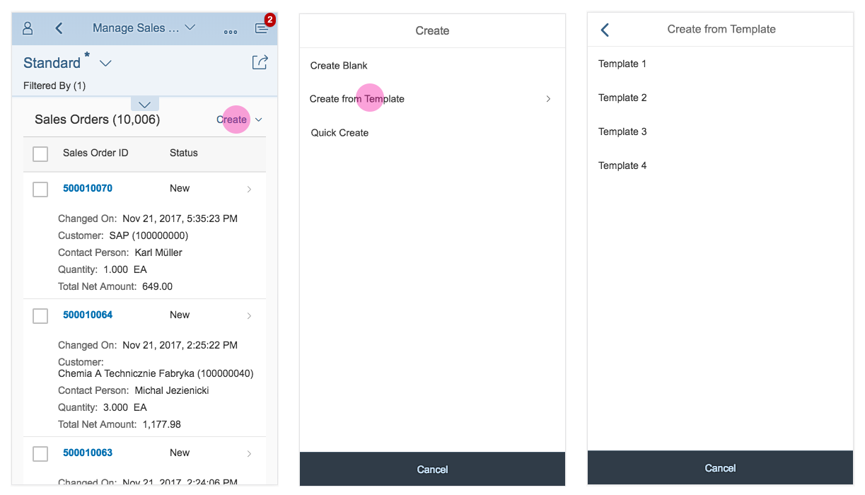
Menu button – Size S
On tablet and desktop devices (Size M/L), the menu button triggers a cascading dropdown menu.
Menu button, regular and split mode - size M/L
Layout
The menu button consists of a button with a label and an expand icon that indicates a menu.
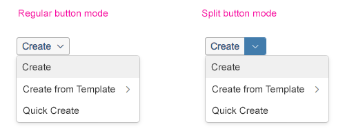
The button has two different modes:
- Regular button mode (default): The menu button appears as a regular button. The user clicks or taps it to open a menu. In regular mode, you can use an icon in front of the label description.
- Split button mode: The menu button appears as a split button. The user clicks or taps the button to fire the menu’s default action, and clicking/tapping the arrow opens the menu.
The split button is separated into two areas: the label and the icon. The separator between them signals that the two areas result in different actions. The split button supports the emphasized, positive, and negative states of the regular button. The split button consolidates a set of command variations, especially when one of the commands is used more often.
In split mode, the label depends on the default action. If the default action is displayed with an icon only, all the menu items must contain icons.
For more information about cozy and compact modes, see content density.
Width and Truncation
If no fixed width is set, the width of the button is set automatically, depending on the text and the container. The maximum width of the menu button is 12 rem (192 px).
If the label is very long, the maximum width ensures that the menu button is consistent with the width of the menu.
After reaching the maximum width or the set fixed width, the text truncates.
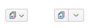
Text-only menu button in compact mode
Text-only menu button in cozy mode
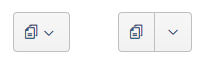
Icon-only menu button in compact mode
Icon-only menu button in cozy mode
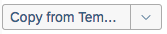
Menu button with truncated text
Types
Regular Menu Button
Regular type (default): The user clicks or taps the button to open the menu.
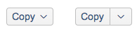
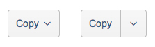
Split Menu Button
The user clicks or taps the button to fire the default action. Clicking or tapping the arrow icon opens a menu.

Regular menu button
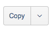
Split menu button
Components
The menu button consists of a button with a label and/or icon and an expanding icon that indicates that a menu is available.
In split mode, the two basic elements – the label and the expanding icon – are separated.
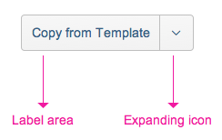
Menu button components
Behavior and Interaction
On Tablets and Desktops
The menu button displays a dropdown menu (sap.ui.unified.Menu) as currently implemented.
- If the user clicks/taps the menu button, it displays a dropdown menu.
- If the user selects a menu item, the action is triggered and the menu closes.
- The menu also closes if the user clicks/taps outside the menu, or if the user clicks/taps the button a second time while the menu is open.
- The dropdown menu must be displayed in direct connection to the menu button.
- The dropdown menu must be positioned below the menu button by default. If there is not enough space below, you may display it above the menu button.
On Smartphones
The menu opens in a full screen dialog. The button’s label becomes the title of the dialog.
- To allow the user to navigate out of the menu, use a Cancel button in the footer.
- Items with submenus become navigable. Navigation is similar to that used in a popover (sap.m.MessagePopover), in which a “back” button is provided.
- When the dialog is reopened, it starts again at the top level.
Split Button
Clicking/tapping the label area triggers one of two types of behavior, which the app developer can configure individually:
- It always triggers the default action set by the app developer. If no default item has been defined, the first item in the menu list becomes the default.
- It triggers the last action chosen by the user. Initially, it is the default action until the user makes a different selection which then becomes default. The button label changes accordingly. The button has a fixed size and truncates the text if the menu item is longer (as with the combo box).
Expand Icon
If the user clicks or taps the expand icon, the dropdown menu opens.
Styles
The menu button supports all states of the button (sap.m.button).

Default

Positive (property: type = accept)

Transparent

Negative (property: type = reject)

Ghost

Emphasized
Resources
Want to dive deeper? Follow the links below to find out more about related controls, the SAPUI5 implementation, and the visual design.
Elements and Controls
- No links
Implementation
- Menu Button (SAPUI5 samples)
- Menu Button (SAPUI5 API reference)
- Menu Button Mode (SAPUI5 API reference)
- Menu (SAPUI5 samples)
 Your feedback has been sent to the SAP Fiori design team.