
- Latest SAPUI Version 1.124
- SAPUI5 Version 1.122
- SAPUI5 Version 1.120
- SAPUI5 Version 1.118
- SAPUI5 Version 1.116
- SAPUI5 Version 1.114
- SAPUI5 Version 1.112
- SAPUI5 Version 1.110
- SAPUI5 Version 1.108
- SAPUI5 Version 1.106
- SAPUI5 Version 1.104
- SAPUI5 Version 1.102
- SAPUI5 Version 1.100
- SAPUI5 Version 1.98
- SAPUI5 Version 1.96
- SAPUI5 Version 1.94
- SAPUI5 Version 1.92
- SAPUI5 Version 1.90
- SAPUI5 Version 1.88
- SAPUI5 Version 1.86
- SAPUI5 Version 1.84
- SAPUI5 Version 1.82
- SAPUI5 Version 1.80
- SAPUI5 Version 1.78
- SAPUI5 Version 1.76
- SAPUI5 Version 1.74
- SAPUI5 Version 1.72
- SAPUI5 Version 1.70
- SAPUI5 Version 1.68
- SAPUI5 Version 1.64
- SAPUI5 Version 1.62
- SAPUI5 Version 1.60
- SAPUI5 Version 1.58
- SAPUI5 Version 1.56
- SAPUI5 Version 1.54
- SAPUI5 Version 1.52
- SAPUI5 Version 1.50
- SAPUI5 Version 1.48
- SAPUI5 Version 1.46
- SAPUI5 Version 1.44
- SAPUI5 Version 1.42
- SAPUI5 Version 1.40
- SAPUI5 Version 1.38
- SAPUI5 Version 1.36
- SAPUI5 Version 1.34
- SAPUI5 Version 1.32
- SAPUI5 Version 1.30
- SAPUI5 Version 1.28
- SAPUI5 Version 1.26
- Latest SAPUI Version 1.124
- SAPUI5 Version 1.122
- SAPUI5 Version 1.120
- SAPUI5 Version 1.118
- SAPUI5 Version 1.116
- SAPUI5 Version 1.114
- SAPUI5 Version 1.112
- SAPUI5 Version 1.110
- SAPUI5 Version 1.108
- SAPUI5 Version 1.106
- SAPUI5 Version 1.104
- SAPUI5 Version 1.102
- SAPUI5 Version 1.100
- SAPUI5 Version 1.98
- SAPUI5 Version 1.96
- SAPUI5 Version 1.94
- SAPUI5 Version 1.92
- SAPUI5 Version 1.90
- SAPUI5 Version 1.88
- SAPUI5 Version 1.86
- SAPUI5 Version 1.84
- SAPUI5 Version 1.82
- SAPUI5 Version 1.80
- SAPUI5 Version 1.78
- SAPUI5 Version 1.76
- SAPUI5 Version 1.74
- SAPUI5 Version 1.72
- SAPUI5 Version 1.70
- SAPUI5 Version 1.68
- SAPUI5 Version 1.66
- SAPUI5 Version 1.64
- SAPUI5 Version 1.62
- SAPUI5 Version 1.60
- SAPUI5 Version 1.58
- SAPUI5 Version 1.56
- SAPUI5 Version 1.54
- SAPUI5 Version 1.52
- SAPUI5 Version 1.50
- SAPUI5 Version 1.48
- SAPUI5 Version 1.46
- SAPUI5 Version 1.44
- SAPUI5 Version 1.42
- SAPUI5 Version 1.40
- SAPUI5 Version 1.38
- SAPUI5 Version 1.36
- SAPUI5 Version 1.34
- SAPUI5 Version 1.32
- SAPUI5 Version 1.30
- SAPUI5 Version 1.28
- SAPUI5 Version 1.26
Colors
Intro
Color plays a significant role in SAP Fiori. Color communicates importance and association, and provides direction to users.
Color Balance
Color balance refers to the recommended mixture of light and dark, colored and non-colored areas of any SAP Fiori app interface.
Approaching the ideal color balance for each page creates a visual rhythm throughout the application. It also helps to draw the user’s attention to the most important information and functions. Furthermore, it promotes a distinct and consistent look and feel throughout all SAP Fiori apps.
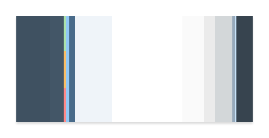
Color balance (considering dark and light UIs)
Primary Colors
The recommended primary colors leverage the uniqueness of SAP Fiori apps. The primary colors represent the overall look and feel.
SAP Fiori Standard Theme Primary Colors
Global Dark Base
#3F5161
RGB 63/81/97
Brand / Highlight
#427CAC
RGB 66/124/172
Brand / Highlight
Dark Theme
#91C8F6
RGB 145/200/246
Global Light Base
#EFF4F9
RGB 239/244/249
Background
#EBEBEB
RGB 250/250/250
SAP Fiori Launchpad Gradients
Top
Dark Theme
#2C4E6C
RGB 44/78/108
Bottom
Dark Theme
#9EC7D8
RGB 158/199/216
Top
Light Theme
#A9C6DE
RGB 169/198/222
Bottom
Light Theme
#E7ECF0
RGB 231/236/240
Semantic Colors
Semantic colors can be used to represent a negative, critical, positive, neutral, or information status. For more information, see How to Use Semantic Colors.
Light Theme Flavor
Negative
#BB0000
RGB 187/0/0
Critical
#E78C07
RGB 231/140/7
Positive
#2B7D2B
RGB 43/125/43
Neutral
#5E696E
RGB 94/105/110
Information
#427cac
RGB 66/124/172
Dark Theme Flavor
Negative
#FF8888
RGB 255/136/136
Critical
#FABD64
RGB 250/189/100
Positive
#ABE2AB
RGB 171/226/171
Neutral
#D3D7D9
RGB 211/215/217
Information
#91c8f6
RGB 145/200/246
Accent Colors
Accent colors can be applied to accentuate important elements. They make a vivid contribution to the overall UI and should be used sparingly.
#E09D00
RGB 224/157/0
#E6600D
RGB 230/96/13
#C14646
RGB 193/70/70
#AB218E
RGB 171/33/142
#678BC7
RGB 103/139/199
#0092D1
RGB 0/146/209
#1A9898
RGB 26 152 152
#759421
RGB 117/148/33
Grayscale
Grayscale areas play an important role in any SAP Fiori user interface. They minimize the risk of over-stimulation and foster simplicity. White and the light grays are mainly used for areas in the background or for borders. While darker gray shades are primarily used for texts.
#333333
RGB 51/51/51
#666666
RGB 102/102/102
#BFBFBF
RGB 191/191/191
#CCCCCC
RGB 204/204/204
#E5E5E5
RGB 229/229/229
#FFFFFF
RGB 255/255/255
Indication Colors
The indication color palette is used to express industry-specific meanings of colors. All values are themeable. Check out more details in how to use semantic and indication colors.
Light Theme Flavor
UI Indication 1
#880000
RGB 124/22/14
UI Indication 2
#bb0000
RGB 171/34/23
UI Indication 3
#E78C07
RGB 219/144/52
UI Indication 4
#2B7C2B
RGB 67/122/54
UI Indication 5
#427CAC
RGB 80/123/168
Dark Theme Flavor
UI Indication 1
#FF8888
RGB 239/142/139
UI Indication 2
#FFBBBB
RGB 245/190/188
UI Indication 3
#FABD64
RGB 250/189/100
UI Indication 4
#ABE2AB
RGB 171/226/171
UI Indication 5
#91c8f6
RGB 145/200/246
 Your feedback has been sent to the SAP Fiori design team.