
- Latest SAPUI Version 1.124
- SAPUI5 Version 1.122
- SAPUI5 Version 1.120
- SAPUI5 Version 1.118
- SAPUI5 Version 1.116
- SAPUI5 Version 1.114
- SAPUI5 Version 1.112
- SAPUI5 Version 1.110
- SAPUI5 Version 1.108
- SAPUI5 Version 1.106
- SAPUI5 Version 1.104
- SAPUI5 Version 1.102
- SAPUI5 Version 1.100
- SAPUI5 Version 1.98
- SAPUI5 Version 1.96
- SAPUI5 Version 1.94
- SAPUI5 Version 1.92
- SAPUI5 Version 1.90
- SAPUI5 Version 1.88
- SAPUI5 Version 1.86
- SAPUI5 Version 1.84
- SAPUI5 Version 1.82
- SAPUI5 Version 1.80
- SAPUI5 Version 1.78
- SAPUI5 Version 1.76
- SAPUI5 Version 1.74
- SAPUI5 Version 1.72
- SAPUI5 Version 1.70
- SAPUI5 Version 1.68
- SAPUI5 Version 1.64
- SAPUI5 Version 1.62
- SAPUI5 Version 1.60
- SAPUI5 Version 1.58
- SAPUI5 Version 1.56
- SAPUI5 Version 1.54
- SAPUI5 Version 1.52
- SAPUI5 Version 1.50
- SAPUI5 Version 1.48
- SAPUI5 Version 1.46
- SAPUI5 Version 1.44
- SAPUI5 Version 1.42
- SAPUI5 Version 1.40
- SAPUI5 Version 1.38
- SAPUI5 Version 1.36
- SAPUI5 Version 1.34
- SAPUI5 Version 1.32
- SAPUI5 Version 1.30
- SAPUI5 Version 1.28
- SAPUI5 Version 1.26
- Latest SAPUI Version 1.124
- SAPUI5 Version 1.122
- SAPUI5 Version 1.120
- SAPUI5 Version 1.118
- SAPUI5 Version 1.116
- SAPUI5 Version 1.114
- SAPUI5 Version 1.112
- SAPUI5 Version 1.110
- SAPUI5 Version 1.108
- SAPUI5 Version 1.106
- SAPUI5 Version 1.104
- SAPUI5 Version 1.102
- SAPUI5 Version 1.100
- SAPUI5 Version 1.98
- SAPUI5 Version 1.96
- SAPUI5 Version 1.94
- SAPUI5 Version 1.92
- SAPUI5 Version 1.90
- SAPUI5 Version 1.88
- SAPUI5 Version 1.86
- SAPUI5 Version 1.84
- SAPUI5 Version 1.82
- SAPUI5 Version 1.80
- SAPUI5 Version 1.78
- SAPUI5 Version 1.76
- SAPUI5 Version 1.74
- SAPUI5 Version 1.72
- SAPUI5 Version 1.70
- SAPUI5 Version 1.68
- SAPUI5 Version 1.66
- SAPUI5 Version 1.64
- SAPUI5 Version 1.62
- SAPUI5 Version 1.60
- SAPUI5 Version 1.58
- SAPUI5 Version 1.56
- SAPUI5 Version 1.54
- SAPUI5 Version 1.52
- SAPUI5 Version 1.50
- SAPUI5 Version 1.48
- SAPUI5 Version 1.46
- SAPUI5 Version 1.44
- SAPUI5 Version 1.42
- SAPUI5 Version 1.40
- SAPUI5 Version 1.38
- SAPUI5 Version 1.36
- SAPUI5 Version 1.34
- SAPUI5 Version 1.32
- SAPUI5 Version 1.30
- SAPUI5 Version 1.28
- SAPUI5 Version 1.26
Avatar
sap.f.Avatar
Intro
The avatar is a control that has various display options for representing images, icons, and initials.
Usage
Use the avatar if:
- You want to display an image in a circular shape.
- You want to use predefined sizes.
- You want to display icons or initials.
- You want to have placeholder images in case no image is provided.
Do not use the avatar if:
Responsiveness
The avatar control has predefined sizes which are the same for both form factors – compact and cozy.
Types
Shapes
The avatar control can be set to a circular or square shape.
Avatar with both circular and squared shape
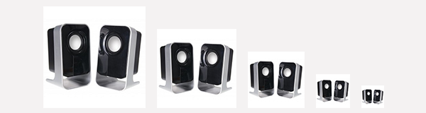
Content
The control can show images, icons, or initials.
Avatar showing an image, initials and an icon
Initials
The control can only display up to 2 Latin letters. If more or non-Latin letters are present, a placeholder will be shown.
Avatar with initials
Placeholder
If there is no image, icon, or initials provided, the avatar will show a default placeholder. There are two types of placeholders that can be shown. If the avatar is circular, a person icon will be shown. If the avatar is square, a product icon will be shown.
Avatar default placeholders for person and product
Custom Size
You can also set a custom size for the avatar.
Avatar with custom size
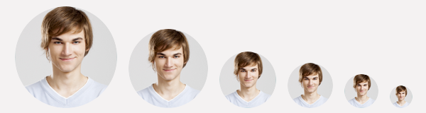
Predefined Sizes
The avatar control has five predefined sizes:
- XL – 7 rem
- L – 5 rem
- M – 4 rem
- S – 3 rem
- XS – 2 rem
The predefined sizes are the same for both form factors – compact and cozy.
Predefined sizes - XL, L, M, S, XS
Predefined sizes - XL, L, M, S, XS
Fitting Images
With the imageFitType property, the avatar can fit images in two ways: Cover and Contain. The default value of the property is Cover.
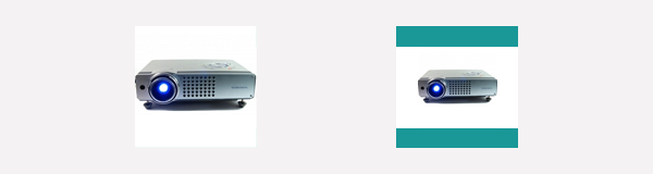
Avatar with Cover and Contain property
Fallback Behavior for Missing Images
If the image source path provided for the avatar leads to a non-existent image, the fallback mechanism is as follows:
- If initials are provided, the avatar displays initials.
- If no initials are provided, the avatar displays a default icon. You can choose which icon from the SAP icon font is displayed (property: fallbackIcon).
Image fallback for avatar: initials, default icon, or custom icon
Guidelines
- Use the circular shape to display images of a person or contact.
- Use the square shape to display images of a product, logo, and so on.
- If you need to define a size different from the predefined one, make sure that the font size is consistent with the size of the control itself.
- If you use initials or icons and want to display a custom size for the avatar that is between two predefined sizes, use the predefined font size for the smaller one. For example, if your avatar is 5.5 rem, between sizes L and XL, then you should use the font size for size L: 2 rem.
- For accessibility reasons, provide each image in the avatar with an alternative text in case the image is not available or cannot be displayed.
- High-resolution images that are unnecessarily large in file size can drastically slow down page speed. Optimize your images in this case.
Resources
Want to dive deeper? Follow the links below to find out more about related controls, the SAPUI5 implementation, and the visual design.
 Your feedback has been sent to the SAP Fiori design team.