
- Latest SAPUI Version 1.124
- SAPUI5 Version 1.122
- SAPUI5 Version 1.120
- SAPUI5 Version 1.118
- SAPUI5 Version 1.116
- SAPUI5 Version 1.114
- SAPUI5 Version 1.112
- SAPUI5 Version 1.110
- SAPUI5 Version 1.108
- SAPUI5 Version 1.106
- SAPUI5 Version 1.104
- SAPUI5 Version 1.102
- SAPUI5 Version 1.100
- SAPUI5 Version 1.98
- SAPUI5 Version 1.96
- SAPUI5 Version 1.94
- SAPUI5 Version 1.92
- SAPUI5 Version 1.90
- SAPUI5 Version 1.88
- SAPUI5 Version 1.86
- SAPUI5 Version 1.84
- SAPUI5 Version 1.82
- SAPUI5 Version 1.80
- SAPUI5 Version 1.78
- SAPUI5 Version 1.76
- SAPUI5 Version 1.74
- SAPUI5 Version 1.72
- SAPUI5 Version 1.70
- SAPUI5 Version 1.68
- SAPUI5 Version 1.64
- SAPUI5 Version 1.62
- SAPUI5 Version 1.60
- SAPUI5 Version 1.58
- SAPUI5 Version 1.56
- SAPUI5 Version 1.54
- SAPUI5 Version 1.52
- SAPUI5 Version 1.50
- SAPUI5 Version 1.48
- SAPUI5 Version 1.46
- SAPUI5 Version 1.44
- SAPUI5 Version 1.42
- SAPUI5 Version 1.40
- SAPUI5 Version 1.38
- SAPUI5 Version 1.36
- SAPUI5 Version 1.34
- SAPUI5 Version 1.32
- SAPUI5 Version 1.30
- SAPUI5 Version 1.28
- SAPUI5 Version 1.26
- Latest SAPUI Version 1.124
- SAPUI5 Version 1.122
- SAPUI5 Version 1.120
- SAPUI5 Version 1.118
- SAPUI5 Version 1.116
- SAPUI5 Version 1.114
- SAPUI5 Version 1.112
- SAPUI5 Version 1.110
- SAPUI5 Version 1.108
- SAPUI5 Version 1.106
- SAPUI5 Version 1.104
- SAPUI5 Version 1.102
- SAPUI5 Version 1.100
- SAPUI5 Version 1.98
- SAPUI5 Version 1.96
- SAPUI5 Version 1.94
- SAPUI5 Version 1.92
- SAPUI5 Version 1.90
- SAPUI5 Version 1.88
- SAPUI5 Version 1.86
- SAPUI5 Version 1.84
- SAPUI5 Version 1.82
- SAPUI5 Version 1.80
- SAPUI5 Version 1.78
- SAPUI5 Version 1.76
- SAPUI5 Version 1.74
- SAPUI5 Version 1.72
- SAPUI5 Version 1.70
- SAPUI5 Version 1.68
- SAPUI5 Version 1.66
- SAPUI5 Version 1.64
- SAPUI5 Version 1.62
- SAPUI5 Version 1.60
- SAPUI5 Version 1.58
- SAPUI5 Version 1.56
- SAPUI5 Version 1.54
- SAPUI5 Version 1.52
- SAPUI5 Version 1.50
- SAPUI5 Version 1.48
- SAPUI5 Version 1.46
- SAPUI5 Version 1.44
- SAPUI5 Version 1.42
- SAPUI5 Version 1.40
- SAPUI5 Version 1.38
- SAPUI5 Version 1.36
- SAPUI5 Version 1.34
- SAPUI5 Version 1.32
- SAPUI5 Version 1.30
- SAPUI5 Version 1.28
- SAPUI5 Version 1.26
Dynamic Page Layout – Semantic Page
Intro
The semantic page is recommended for freestyle applications. By predefining where elements such as titles, global actions, and finalizing actions are placed, the semantic page helps designers and developers to implement and comply with the SAP Fiori Design Guidelines more easily. Based on the dynamic page and possessing its functionalities, the semantic page also adds semantic meaning to specific elements on the page.
Semantic page layout
Usage
Use the semantic page if:
- You are building a freestyle application.
- You want to use a predefined layout to reduce development time.
Do not use the semantic page if:
- You are planning to use SAP Fiori elements, such as the list report, analytical list page, overview page, object page.
- You want to implement an initial page or object page floorplan, as these already incorporate the snapping header and footer toolbar features, but with a different technical base.
- You only need to display a small amount of information. In this case, use a dialog. If you must use the dynamic page layout, use letterboxing to mitigate the issue.
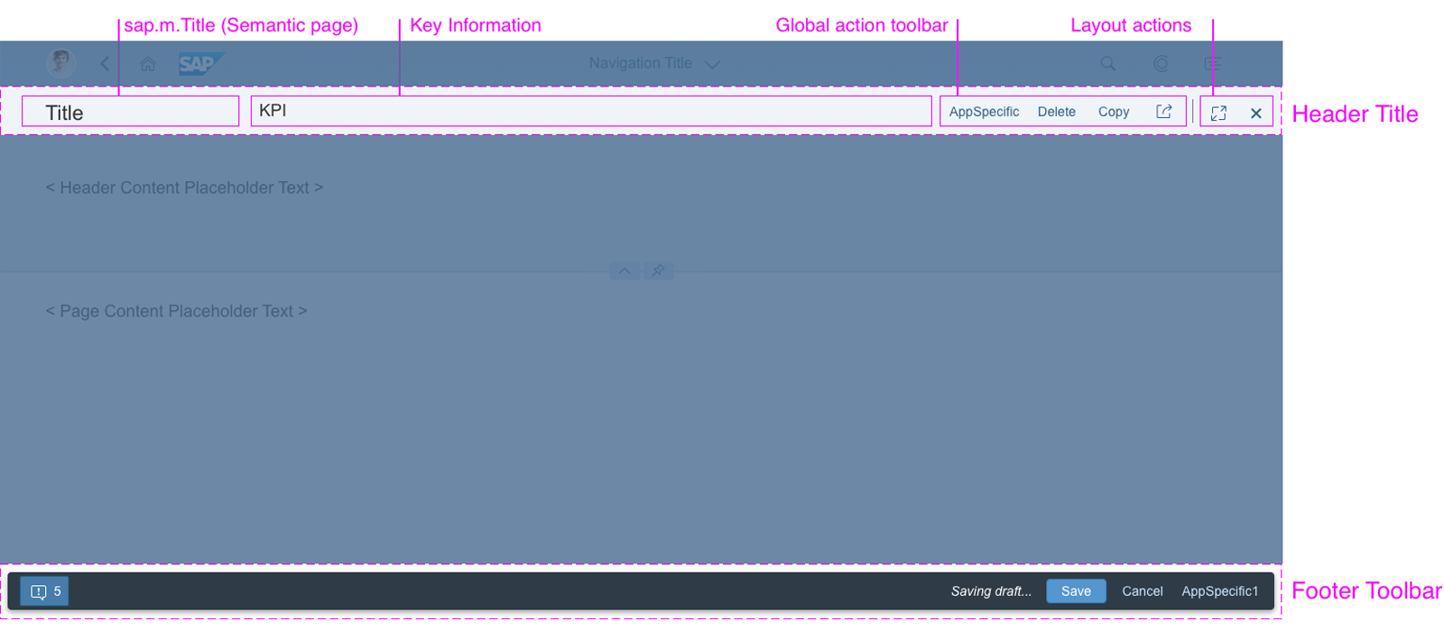
Structure
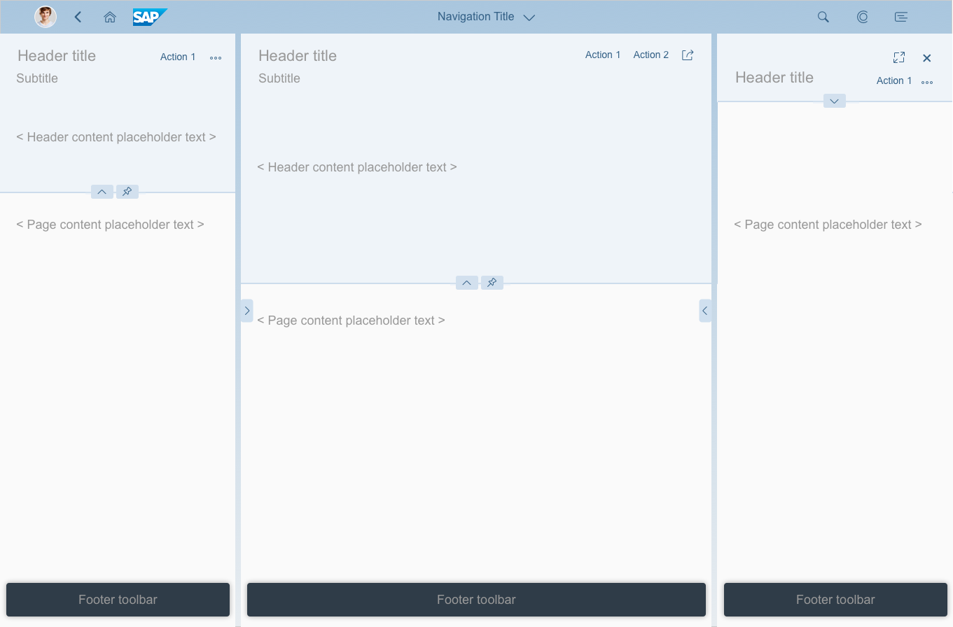
The semantic page is based on the structure of the dynamic page layout. The semantic page consists of:
- The header title with global actions (always visible).
- The content of the page with a footer toolbar and finalizing actions (optional).
The control’s semantics determine whether content specified in the control will appear in the header toolbar or footer toolbar.
Semantic page structure
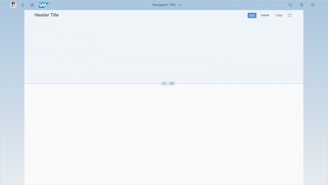
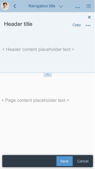
Header Title
The header title bar contains the following elements:
- Title (mandatory): The title is located on the left-hand side of the header title bar (sap.m.Title) and is always visible.
- Key information (optional): Key information is located in the middle area, and is left aligned. This can be text, mini facets, or KPI tags, for example.
- Global actions toolbar (optional): The global actions toolbar for the entire floorplan is located on the right-hand side. Always use buttons for global actions, visualized either as text or icons. For more information, see Header Toolbar.
- Overflow menu: Actions move into the overflow from right to left. Icons are shown in the overflow menu with a corresponding text.
- Layout actions: These are actions like the Close or Full Screen / Exit Full Screen icons, which are mainly offered by the flexible column layout. Depending on the screen size, layout actions are placed either to the right of the global actions toolbar, separated by a divider line, or above the global actions. Layout actions never move into the overflow and are always last in the header toolbar.
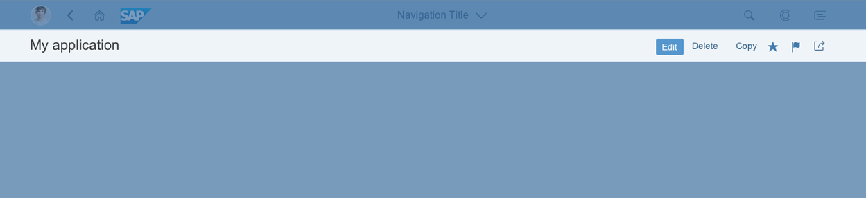
Semantic page header title
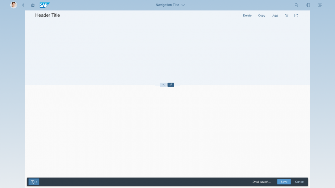
Footer Toolbar
The footer toolbar is optional and contains the following components:
- Message indicator (containing message popover) on the left-hand side
- Draft indicator on the right-hand side, just before the finalizing actions
- Finalizing actions on the right-hand side
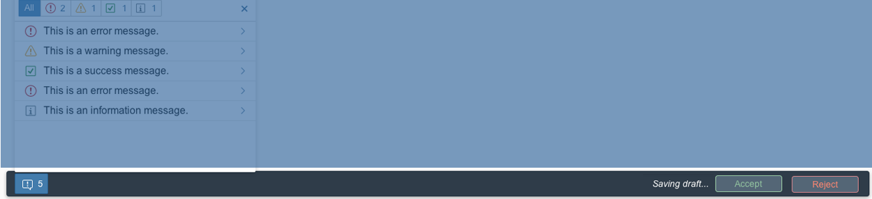
Semantic page footer toolbar
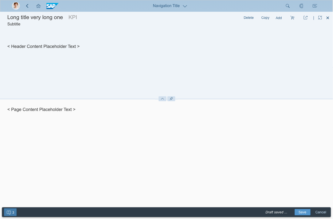
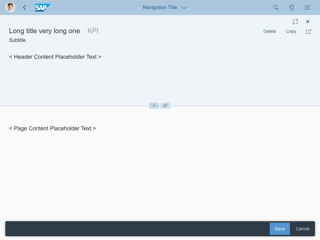
Actions
Actions in the Header Toolbar
The following actions are available in the semantic page:
- App-specific actions determined by the use case
- Global actions
- Layout actions – mainly in flexible column layout
In the semantic page, the order of the actions is predefined:
- Emphasized button: App-specific or semantic text button
- Text buttons: App-specific actions precede semantic (generic) actions
- Icon buttons: App-specific buttons precede semantic icons, such as Favorite, Flag and Share
- Layout actions with vertical separator: Close, Full Screen or Exit Full Screen
Order of Semantic Actions
Ensure that the semantic actions reflect the following order:
- Text buttons
- Edit
- Delete
- Copy
- Add
- Icon buttons
- Layout actions
- Full Screen or Exit Full Screen
- Close
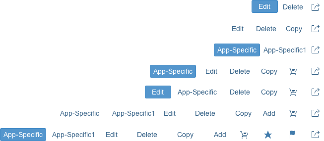
Example for the order of actions in semantic header
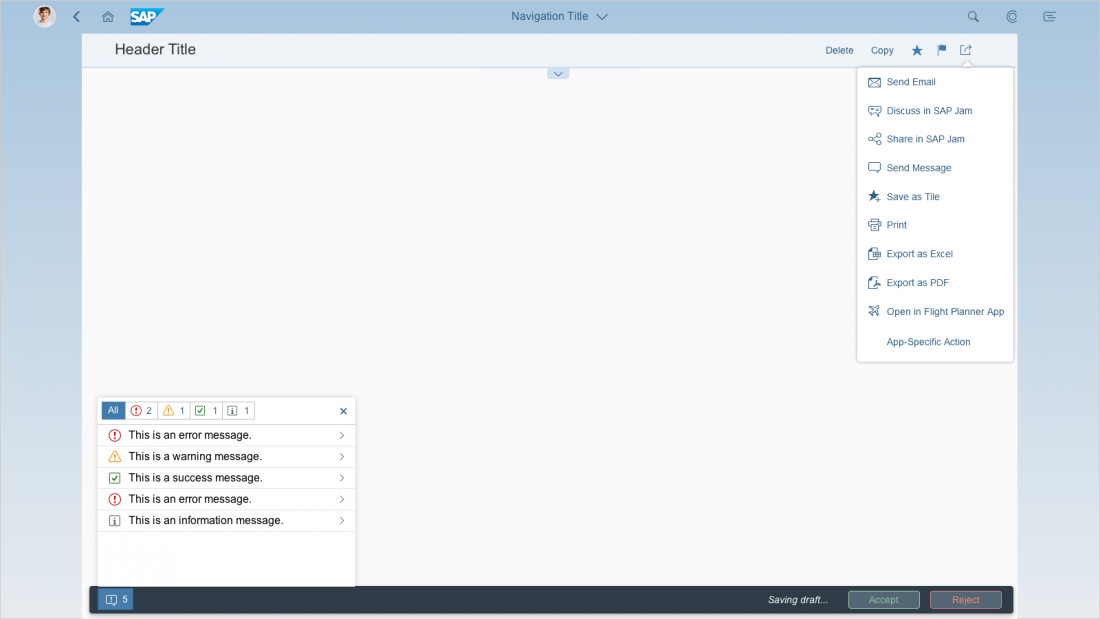
Actions in the Footer Toolbar
In the semantic page, the order of the actions is predefined.
- The leftmost button is emphasized or positive/negative. Only one button can be emphasized at a time. The default actions for these buttons are Save, Accept, and Reject. If your header toolbar contains an emphasized button (excluding the message handling button), try to avoid using emphasized buttons in the footer toolbar.
- The transparent buttons appear next. They can include some of the actions below:
- Post
- Start Process
- Send
- Release
- Create
- Save
- Submit
- Cancel
- Forward
- Confirm
A transparent button can also include custom application-specific actions. These will appear on the right-hand side of the footer toolbar.
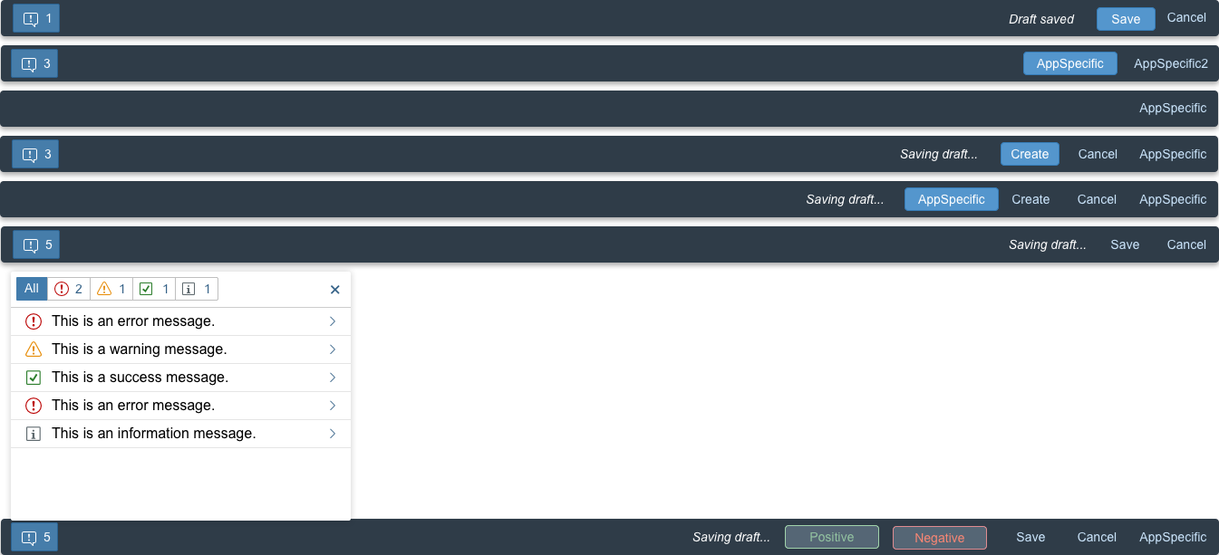
Examples of actions in the footer toolbar
Responsiveness and Adaptiveness
The responsive behavior of the semantic page depends on the behavior of the content being displayed.
- The title truncates in collapsed mode and wraps in expanded mode. This behavior comes from the title control (sap.m.Title).
- Key information stays as long as possible.
- Global actions have a predefined width depending on the available space. If there is no key information available, then the title and global actions automatically get more space. The toolbar follows the standard toolbar overflow guidelines, adding buttons to the overflow menu from right to left.
- Layout actions are shown to the right of the global actions if there is enough space, or above them on smaller screens.
Size L
Size M
Size S
Guidelines
Please see the Guidelines section in the toolbar overview and dynamic page layout article.
Resources
Want to dive deeper? Follow the links below to find out more about related controls, the SAPUI5 implementation, and the visual design.
Elements and Controls
- Dynamic Page Layout (guidelines)
- Flexible Column Layout (guidelines)
- Floorplan Overview (guidelines)
- Header Toolbar (guidelines)
- Footer Toolbar (guidelines)
Implementation
- Semantic Page – Freestyle Sample (SAPUI5 samples)
- Semantic Page using Draft Indicator (SAPUI5 samples)
- Semantic Page (SAPUI5 API reference)
 Your feedback has been sent to the SAP Fiori design team.