
- Latest SAPUI Version 1.124
- SAPUI5 Version 1.122
- SAPUI5 Version 1.120
- SAPUI5 Version 1.118
- SAPUI5 Version 1.116
- SAPUI5 Version 1.114
- SAPUI5 Version 1.112
- SAPUI5 Version 1.110
- SAPUI5 Version 1.108
- SAPUI5 Version 1.106
- SAPUI5 Version 1.104
- SAPUI5 Version 1.102
- SAPUI5 Version 1.100
- SAPUI5 Version 1.98
- SAPUI5 Version 1.96
- SAPUI5 Version 1.94
- SAPUI5 Version 1.92
- SAPUI5 Version 1.90
- SAPUI5 Version 1.88
- SAPUI5 Version 1.86
- SAPUI5 Version 1.84
- SAPUI5 Version 1.82
- SAPUI5 Version 1.78
- SAPUI5 Version 1.76
- SAPUI5 Version 1.74
- SAPUI5 Version 1.72
- SAPUI5 Version 1.70
- SAPUI5 Version 1.68
- SAPUI5 Version 1.66
- SAPUI5 Version 1.64
- SAPUI5 Version 1.62
- SAPUI5 Version 1.60
- SAPUI5 Version 1.58
- SAPUI5 Version 1.56
- SAPUI5 Version 1.54
- SAPUI5 Version 1.52
- SAPUI5 Version 1.50
- SAPUI5 Version 1.48
- SAPUI5 Version 1.46
- SAPUI5 Version 1.44
- SAPUI5 Version 1.42
- SAPUI5 Version 1.40
- SAPUI5 Version 1.38
- SAPUI5 Version 1.36
- SAPUI5 Version 1.34
- SAPUI5 Version 1.32
- SAPUI5 Version 1.30
- SAPUI5 Version 1.28
- SAPUI5 Version 1.26
- Latest SAPUI Version 1.124
- SAPUI5 Version 1.122
- SAPUI5 Version 1.120
- SAPUI5 Version 1.118
- SAPUI5 Version 1.116
- SAPUI5 Version 1.114
- SAPUI5 Version 1.112
- SAPUI5 Version 1.110
- SAPUI5 Version 1.108
- SAPUI5 Version 1.106
- SAPUI5 Version 1.104
- SAPUI5 Version 1.102
- SAPUI5 Version 1.100
- SAPUI5 Version 1.98
- SAPUI5 Version 1.96
- SAPUI5 Version 1.94
- SAPUI5 Version 1.92
- SAPUI5 Version 1.90
- SAPUI5 Version 1.88
- SAPUI5 Version 1.86
- SAPUI5 Version 1.84
- SAPUI5 Version 1.82
- SAPUI5 Version 1.80
- SAPUI5 Version 1.78
- SAPUI5 Version 1.76
- SAPUI5 Version 1.74
- SAPUI5 Version 1.72
- SAPUI5 Version 1.70
- SAPUI5 Version 1.68
- SAPUI5 Version 1.66
- SAPUI5 Version 1.64
- SAPUI5 Version 1.62
- SAPUI5 Version 1.60
- SAPUI5 Version 1.58
- SAPUI5 Version 1.56
- SAPUI5 Version 1.54
- SAPUI5 Version 1.52
- SAPUI5 Version 1.50
- SAPUI5 Version 1.48
- SAPUI5 Version 1.46
- SAPUI5 Version 1.44
- SAPUI5 Version 1.42
- SAPUI5 Version 1.40
- SAPUI5 Version 1.38
- SAPUI5 Version 1.36
- SAPUI5 Version 1.34
- SAPUI5 Version 1.32
- SAPUI5 Version 1.30
- SAPUI5 Version 1.28
- SAPUI5 Version 1.26
Quartz Dark Colors
Intro
Quartz Dark is an additional theme created for SAP Fiori applications to work in environments where low light is necessary or unavoidable. The dark theme also ensures a clean and lightweight design that is consistent and coherent across all SAP Fiori applications.
Usages of the Quartz Dark theme could be working at night, low-lighted factory or other environments, or working outside at night using portable devices.
Be aware that Quartz Dark does not replace high-contrast themes and supports the minimal contrast requirements of the Web Contrast Accessibility Guidelines (WCAG) 2.1.
Color Balance
Color balance refers to the recommended mixture of light and dark, and colored and non-colored areas of any SAP Fiori app interface.
Approaching the ideal color balance for each page creates a visual rhythm throughout the application. It also helps to draw the user’s attention to the most important information and functions. Furthermore, it promotes a distinct and consistent look and feel throughout all SAP Fiori apps.
- The Quartz Dark theme background colors are subtle, calm, reduced, and minimalistic.
- A reduced background color scheme ensures a stable base for any application content. Foreground colors support the importance, prominence, and visual connection of the information displayed.
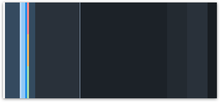
Color balance (Quartz Dark)
Color Usage
Each theme is based on a set of individual base reference values. These are:
Primary (main user interface colors)
Secondary (accent colors)
Grayscale (neutral values)
Semantic (value state colors)
The reference colors listed on this page give a helpful indication as to where they are used in the UI controls and layouts. However, it is extremely important that reference values are not used directly in the control styling. The Quartz Dark reference color values are specific to this particular theme, but are assigned to control parameters.
The reference colors are used as base values, which are then distributed into the UI controls via a stable set of theme control parameters that are available in each theme. Theme control parameters represent semantically named parts of the controls. They are decoupled from the actual color values so that the color values can be easily replaced. The theming guideline explains how these reference values are mapped to the user interface controls.
Primary Colors
The recommended primary colors leverage the uniqueness of SAP Fiori apps. The primary colors represent the overall look and feel.
SAP Quartz Dark Theme Primary Colors
Primary 1
Home/ Shell Header
#354a5f
rgb(53, 74, 95)
Primary 2
Brand / Links
#91C8F6
rgb(145, 200, 246)
Primary 3
App Headers and Containers
#29313A
rgb(41, 49, 58)
Primary 4
Home/ Shell Background Base
#232A31
rgb(35, 42, 49)
Primary 5
Borders and Derived Controls
#8696A9
rgb(134, 150, 169)
Primary 6
Text and Titles
#FAFAFA
rgb(250, 250, 250)
Primary 7
Subtitles and Labels
#D3D7D9
rgb(211, 215, 217)
SAP Fiori Launchpad Gradient
The gradient is mainly applied to launchpad or dashboard overview page types.
Top
#181D22
rgb(24, 29, 34)
Bottom
#272F37
rgb(39, 47, 55)
Accent Colors
Secondary colors can be applied to accentuate important elements. They make a vivid contribution to the overall UI and should be used sparingly.
Accent 1
#FFC847
rgb(255, 200, 71)
Accent 2
#E7A1A1
rgb(231, 161, 161)
Accent 3
#F37AA2
rgb(243, 122, 162)
Accent 4
#E269C9
rgb(226, 105, 201)
Accent 5
#8CA7D5
rgb(140, 167, 213)
Accent 6
#6BD3FF
rgb(107, 211, 255)
Accent 7
#7FC6C6
rgb(127, 198, 198)
Accent 8
#B2E484
rgb(178, 228, 132)
Accent 9
#B995E0
rgb(185, 149, 224)
Accent 10
#B0BCC5
rgb(176, 188, 197)
Grayscale
Grayscale areas play an important role in any SAP Fiori user interface. They minimize the risk of over-stimulation and foster simplicity. White and the light grays are mainly used for areas in the background or for borders. Darker gray shades are primarily used for text.
Text and Titles
#FAFAFA
rgb(250, 250, 250)
Subtitles and Labels
#D3D7D9
rgb(211, 215, 217)
Prompt / Placeholder Text
#B8BEC1
rgb(184, 190, 193)
Borders and Derived Controls
#8696A9
rgb(134, 150, 169)
Header / Container / List / Table Borders
#3A4552
rgb(58, 69, 82)
Column Header Background
#232931
rgb(35, 41, 49)
Application Content Background
#1C2228
rgb(28, 34, 40)
Header / Card / Container Background
#29313A
rgb(35, 41, 49)
Semantic Colors
Semantic colors can be used to represent a negative, critical, positive, neutral, or information status. For more information, see How To Use Semantic Colors / Industry-Specific Colors.
Negative
#FF8888
rgb(255, 136, 136)
Critical
#FABD64
rgb(250, 189, 100)
Positive
#ABE2AB
rgb(171, 226, 171)
Neutral
#D3D7D9
rgb(211, 215, 217)
Information
#91C8F6
rgb(145, 200, 246)
Semantic Background Colors
Negative
#3B0000
rgb(59, 0, 0)
Critical
#2B1A01
rgb(43, 26, 1)
Positive
#153C15
rgb(21, 60, 21)
Neutral
#5C666B
rgb(92, 102, 107)
Information
#062E4F
rgb(6, 46, 79)
Indication Colors
The indication color palette is used to follow the color conventions in a line of business or industry. All values are themeable and the meaning of each color depends on the business context. For more information, see How To Use Semantic Colors / Industry-Specific Colors.
UI Indication 1
#FF5555
rgb(255, 85, 85)
UI Indication 2
#FF8888
rgb(255, 136, 136)
UI Indication 3
#FABD64
rgb(250, 189, 100)
UI Indication 4
#ABE2AB
rgb(171, 226, 171)
UI Indication 5
#91C8F6
rgb(145, 200, 246)
UI Indication 6
#7fc6c6
rgb(127, 198, 198)
UI Indication 7
#b995e0
rgb(185, 149, 224)
UI Indication 8
#e269c9
rgb(226, 105, 201)
Accessibility
Color Contrast
Controls and colors are carefully selected to fulfill the minimum contrast requirements. Contrast ratios vary for different controls due to variations in size, weight, fill, or structure.
The minimum contrast thresholds for the standard SAP Fiori theme are as follows:
- 4.5:1 for text and icons in normal size or smaller.
- 3.0:1 for text and icons in large size (and normal size bold).
- 3.0:1 for graphical objects (like charts) as well as visual details that identify a UI element and its state.
Goals of Good Color Contrast
The user must be able to see everything that is needed to understand and operate the screen.
- Texts are readable.
- Icons are recognizable and distinguishable (unless they are purely decorative).
- UI elements can be identified visually (not by trial and error).
- Active elements can be recognized as such.
- The focus indicator can be found quickly (on a 15″ monitor, a user with good vision should find it in less than a second from a distance of 2.5 meters).
- Emphasized and selected controls are recognizable.
- Scroll indicators are recognizable.
- Groups and other structure elements can be recognized.
- All other visual information can be recognized.
For the last two points, you can also use other options to make the visual elements easier to recognize, such as layout, spacing, or additional texts.
Resources
SAP Fiori uses a variety of colors. They are mapped to control parameters, thus allowing you to overwrite them easily in the UI Theme Designer.
Quartz Light is the standard theme for SAP Fiori applications.
 Your feedback has been sent to the SAP Fiori design team.