
- Latest SAPUI Version 1.124
- SAPUI5 Version 1.122
- SAPUI5 Version 1.120
- SAPUI5 Version 1.118
- SAPUI5 Version 1.116
- SAPUI5 Version 1.114
- SAPUI5 Version 1.112
- SAPUI5 Version 1.110
- SAPUI5 Version 1.108
- SAPUI5 Version 1.106
- SAPUI5 Version 1.104
- SAPUI5 Version 1.102
- SAPUI5 Version 1.100
- SAPUI5 Version 1.98
- SAPUI5 Version 1.96
- SAPUI5 Version 1.94
- SAPUI5 Version 1.92
- SAPUI5 Version 1.90
- SAPUI5 Version 1.88
- SAPUI5 Version 1.86
- SAPUI5 Version 1.84
- SAPUI5 Version 1.82
- SAPUI5 Version 1.78
- SAPUI5 Version 1.76
- SAPUI5 Version 1.74
- SAPUI5 Version 1.72
- SAPUI5 Version 1.70
- SAPUI5 Version 1.68
- SAPUI5 Version 1.66
- SAPUI5 Version 1.64
- SAPUI5 Version 1.62
- SAPUI5 Version 1.60
- SAPUI5 Version 1.58
- SAPUI5 Version 1.56
- SAPUI5 Version 1.54
- SAPUI5 Version 1.52
- SAPUI5 Version 1.50
- SAPUI5 Version 1.48
- SAPUI5 Version 1.46
- SAPUI5 Version 1.44
- SAPUI5 Version 1.42
- SAPUI5 Version 1.40
- SAPUI5 Version 1.38
- SAPUI5 Version 1.36
- SAPUI5 Version 1.34
- SAPUI5 Version 1.32
- SAPUI5 Version 1.30
- SAPUI5 Version 1.28
- SAPUI5 Version 1.26
- Latest SAPUI Version 1.124
- SAPUI5 Version 1.122
- SAPUI5 Version 1.120
- SAPUI5 Version 1.118
- SAPUI5 Version 1.116
- SAPUI5 Version 1.114
- SAPUI5 Version 1.112
- SAPUI5 Version 1.110
- SAPUI5 Version 1.108
- SAPUI5 Version 1.106
- SAPUI5 Version 1.104
- SAPUI5 Version 1.102
- SAPUI5 Version 1.100
- SAPUI5 Version 1.98
- SAPUI5 Version 1.96
- SAPUI5 Version 1.94
- SAPUI5 Version 1.92
- SAPUI5 Version 1.90
- SAPUI5 Version 1.88
- SAPUI5 Version 1.86
- SAPUI5 Version 1.84
- SAPUI5 Version 1.82
- SAPUI5 Version 1.80
- SAPUI5 Version 1.78
- SAPUI5 Version 1.76
- SAPUI5 Version 1.74
- SAPUI5 Version 1.72
- SAPUI5 Version 1.70
- SAPUI5 Version 1.68
- SAPUI5 Version 1.66
- SAPUI5 Version 1.64
- SAPUI5 Version 1.62
- SAPUI5 Version 1.60
- SAPUI5 Version 1.58
- SAPUI5 Version 1.56
- SAPUI5 Version 1.54
- SAPUI5 Version 1.52
- SAPUI5 Version 1.50
- SAPUI5 Version 1.48
- SAPUI5 Version 1.46
- SAPUI5 Version 1.44
- SAPUI5 Version 1.42
- SAPUI5 Version 1.40
- SAPUI5 Version 1.38
- SAPUI5 Version 1.36
- SAPUI5 Version 1.34
- SAPUI5 Version 1.32
- SAPUI5 Version 1.30
- SAPUI5 Version 1.28
- SAPUI5 Version 1.26
Switch
sap.m.Switch
Intro
The toggle switch mimics a physical switch. It allows users to set individual features (such as personalization or display settings) to either active or inactive.
Label, optional text, and switch
Usage
Use the switch if:
- You want to enable users to set something as active or inactive (for example, within a dialog).
- You need to clearly show the mode or state of a setting.
- The change takes immediate effect.
Do not use the switch if:
- The user has to choose several options or perform extra steps for changes to become effective.
- It’s not clear if the control is showing a state or an action. In this case, use a checkbox instead.
Types
There are three switch types: basic, semantic, and with optional text.
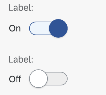
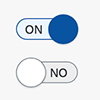
Basic Switch (Default)
The basic switch changes something to active or inactive. This is the default switch.
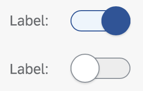
Default switch
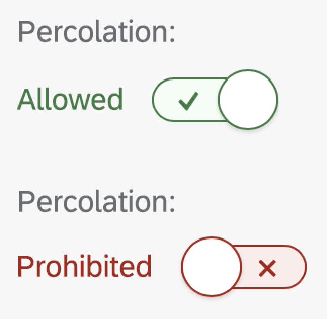
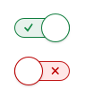
Semantic Switch
The semantic switch changes something to ‘positive’ or ‘negative’. An icon is displayed automatically for each semantic state and cannot be changed.
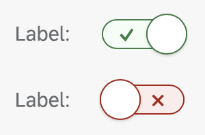
Semantic switch
Switch with Optional Text
You can display a text (sap.m.text or sap.m.objectstatus) next to the switch to indicate what the ‘active’ and ‘inactive’ states mean in your specific use case. Keep the text succinct.
Position the text next to the switch:
- Left of the switch in left-to-right writing systems
- Right of the switch in right-to-left writing systems
Switch with optional text
Semantic switch with optional text
On/Off Switch
Technically, the switch can also display 2-3 letters within the switch.
This design is obsolete. To avoid localization issues, never use text inside a switch.
Switch containing text
Behavior and Interaction
The control supports mouse, touch, keyboard and screen reader interaction.
The user can switch between two states: active or inactive. The state is changed by moving the toggle from one side to another or by clicking the empty side. The toggle then moves over.
Styles
Switches can have different states and markups, but are always ‘active’ or ‘inactive’. The control supports an enabled, hovered, and disabled state.
Enabled semantic switch
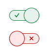
Hovered semantic switch
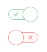
Disabled semantic switch
Resources
Want to dive deeper? Follow the links below to find out more about related controls, the SAPUI5 implementation, and the visual design.
 Your feedback has been sent to the SAP Fiori design team.