
- Latest Version 1.128
- Version 1.126
- SAPUI Version 1.124
- SAPUI5 Version 1.122
- SAPUI5 Version 1.120
- SAPUI5 Version 1.118
- SAPUI5 Version 1.116
- SAPUI5 Version 1.114
- SAPUI5 Version 1.112
- SAPUI5 Version 1.110
- SAPUI5 Version 1.108
- SAPUI5 Version 1.106
- SAPUI5 Version 1.104
- SAPUI5 Version 1.102
- SAPUI5 Version 1.100
- SAPUI5 Version 1.98
- SAPUI5 Version 1.96
- SAPUI5 Version 1.94
- SAPUI5 Version 1.92
- SAPUI5 Version 1.90
- SAPUI5 Version 1.88
- SAPUI5 Version 1.86
- SAPUI5 Version 1.84
- SAPUI5 Version 1.82
- SAPUI5 Version 1.78
- SAPUI5 Version 1.76
- SAPUI5 Version 1.74
- SAPUI5 Version 1.72
- SAPUI5 Version 1.70
- SAPUI5 Version 1.68
- SAPUI5 Version 1.66
- SAPUI5 Version 1.64
- SAPUI5 Version 1.62
- SAPUI5 Version 1.60
- SAPUI5 Version 1.58
- SAPUI5 Version 1.56
- SAPUI5 Version 1.54
- SAPUI5 Version 1.52
- SAPUI5 Version 1.50
- SAPUI5 Version 1.48
- SAPUI5 Version 1.46
- SAPUI5 Version 1.44
- SAPUI5 Version 1.42
- SAPUI5 Version 1.40
- SAPUI5 Version 1.38
- SAPUI5 Version 1.36
- SAPUI5 Version 1.34
- SAPUI5 Version 1.32
- SAPUI5 Version 1.30
- SAPUI5 Version 1.28
- SAPUI5 Version 1.26
- Latest Version 1.128
- Version 1.126
- SAPUI Version 1.124
- SAPUI5 Version 1.122
- SAPUI5 Version 1.120
- SAPUI5 Version 1.118
- SAPUI5 Version 1.116
- SAPUI5 Version 1.114
- SAPUI5 Version 1.112
- SAPUI5 Version 1.110
- SAPUI5 Version 1.108
- SAPUI5 Version 1.106
- SAPUI5 Version 1.104
- SAPUI5 Version 1.102
- SAPUI5 Version 1.100
- SAPUI5 Version 1.98
- SAPUI5 Version 1.96
- SAPUI5 Version 1.94
- SAPUI5 Version 1.92
- SAPUI5 Version 1.90
- SAPUI5 Version 1.88
- SAPUI5 Version 1.86
- SAPUI5 Version 1.84
- SAPUI5 Version 1.82
- SAPUI5 Version 1.80
- SAPUI5 Version 1.78
- SAPUI5 Version 1.76
- SAPUI5 Version 1.74
- SAPUI5 Version 1.72
- SAPUI5 Version 1.70
- SAPUI5 Version 1.68
- SAPUI5 Version 1.66
- SAPUI5 Version 1.64
- SAPUI5 Version 1.62
- SAPUI5 Version 1.60
- SAPUI5 Version 1.58
- SAPUI5 Version 1.56
- SAPUI5 Version 1.54
- SAPUI5 Version 1.52
- SAPUI5 Version 1.50
- SAPUI5 Version 1.48
- SAPUI5 Version 1.46
- SAPUI5 Version 1.44
- SAPUI5 Version 1.42
- SAPUI5 Version 1.40
- SAPUI5 Version 1.38
- SAPUI5 Version 1.36
- SAPUI5 Version 1.34
- SAPUI5 Version 1.32
- SAPUI5 Version 1.30
- SAPUI5 Version 1.28
- SAPUI5 Version 1.26
Select
sap.m.Select
Intro
The select control (also known as a dropdown) is commonly used to enable users to select an item from a predefined list.
Usage
Use select if:
- Users need to select one item exclusively from a short list of options (for example, fewer than 12 items).
- The values of the option list are of secondary importance and do not need to be displayed right away.
Do not use select if:
- Users need to choose between two options, such as On or Off and Yes or No. In this case, consider using a switch control instead.
- Users need to pick one item from a very large set of options. In this case, consider using the combo box instead.
- You need to display more than one attribute. In this case, consider using the input field with a select dialog or a value help dialog instead.
- The user needs to search on multiple attributes. In this case, consider using the input field with select dialog or value help dialog instead.
- Your use case requires all available options to be displayed right away, without any user interaction. In this case, consider using radio buttons or a radio button group instead.
Responsiveness
The display of the select control depends on the device. On smartphones, the selection list takes up the whole screen. On desktop and tablet devices, it appears as a popover.
Size S
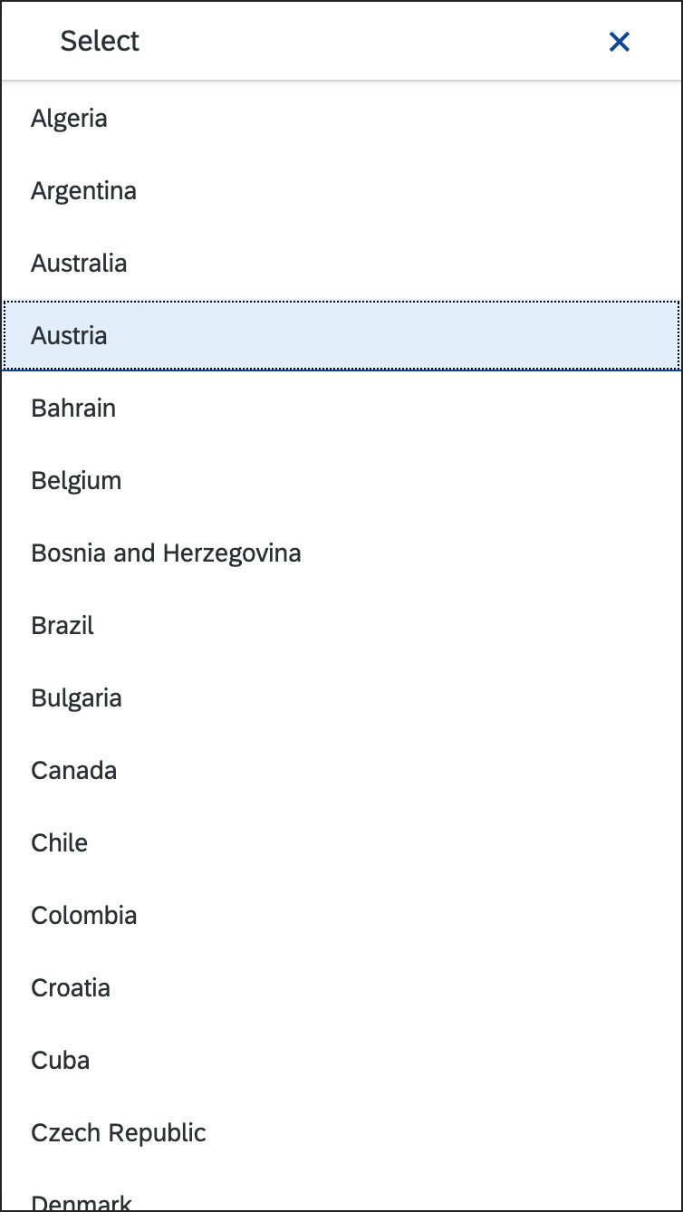
Select option list in full screen - Size S
Size M
Select option list – The option list opens above the field if there is not enough space below it - Size M
Size L
Select option list – The option list opens above the field if there is not enough space below it - Size L
Layout
The select control can be placed in toolbars, such as chart toolbars, footer toolbars, or header toolbars, as well as in forms or tables:
Components
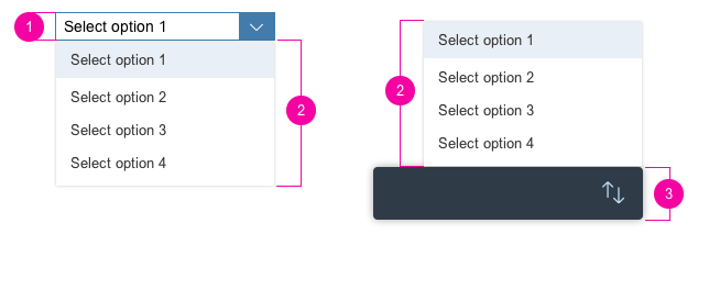
Select Trigger
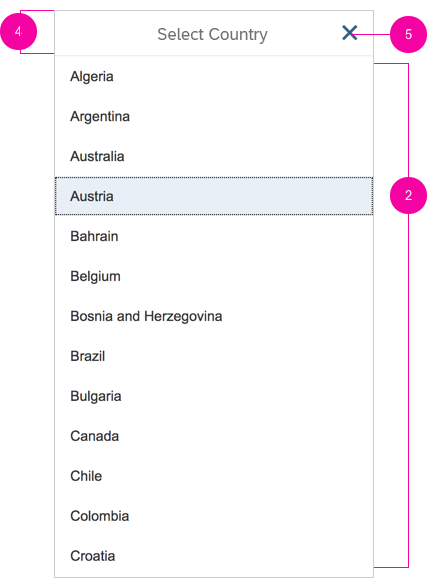
The trigger to open the option list is either the Select field (1), which also displays the current selection, or an icon (3).
Option List
The option list (2) displays all the items available to the user. The selection is always highlighted. Selecting another option from the list moves the highlight to the selected option.
Full Screen Title Bar for Size S
Opening the select control on a smartphone brings up the option list in full screen mode. The full screen mode can be closed using the icon on the top right corner (5).
You need to set a title for the full screen mode (4). We recommend the following format:
Single selection
Select [Entity]
Example: Select Product
Multi-selection
Select [Entities]
Example: Select Products
Anatomy of the select control
Anatomy of the select control - Size S
Behavior and Interaction
Clicking
The Select field always displays the current selection. The user clicks the field to display a list of options to choose from. Once the user selects an option, the list box closes and the selected option is displayed in the field. If there is no Select field but an icon, the user clicks the icon to open the list of options. The currently selected item is always highlighted in the list to help the user identify what has been selected.
Guidelines
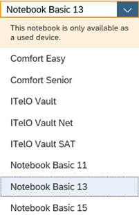
Option List
The option list can contain either text-only values (a) or text values with an icon in front (b). Keep the text values as short as possible because the list uses single lines only. Values that are too long may be truncated. This is especially important when you use icons.
Only use icons if they help users better identify or understand the presented options. To set icons, use the icon property for each list entry.
If you need to indicate that none of the selection options are selected, or you need to allow the user not to select an option, provide (None) (1) as an option and place it at the beginning of the list.
If you need to indicate that all items apply, for example, as a list filter, provide All as an option and place it at the beginning of the list.
If your use case requires a blank input field instead of (None), use a combo box instead.
If the select control is placed in a toolbar with an icon as a trigger for sorting, grouping or filtering a set of items, consider the following guideline:
Sort, Group, and Filter:
- (Not sorted)
Note: In most cases, this option is not necessary; just show the default sort settings instead. - (Not filtered)
- (Not grouped)
For more information about the toolbar, see toolbar overview.
Define a default selection whenever possible (2). If the selected item is not specified, the first one is selected.
(a) Text-only version; (b) icon and text
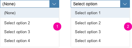
(1) Selection option list with (None); (2) first value selected
Label
The select control can be displayed with or without a label. If the field is attached to another field, you do not need to define a second label.
Sorting
The sort option list contains all the items that are available to the user. Choose one of the following styles to order the content:
Logical: Sort items into a meaningful order. Group related options together and show the most common options first, followed by less common options. Sort the options alphabetically if more than eight select options are available. This helps the user find the right option quickly.
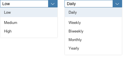
Example of logical sorting
Alphabetical: Sort currencies, names, and similar content alphabetically.
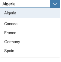
Example of alphabetical sorting
Numeric: Sort numeric values into a sequential order, with the lowest number first.
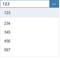
Example of numeric sorting
Chronological: Sort time-related information into chronological order, with the most recent first.
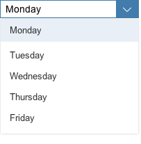
Example of chronological sorting
Width
The select control is usually used in forms, where the width is determined by the form element or container in which the select control is embedded.
If you need to restrict the width to a defined value, you can set the width accordingly. However, we do not recommend defining a fixed width. Where possible, use layout containers (such as a form, simple form, or responsive grid layout), and define the width via the layout data property.
Do not allow the control to auto-adjust based on the selection.
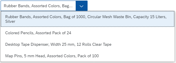
Width of the Option List
By default, the width of the option list adapts to the width of the longest entry. The maximum width of the option list is set to 600 px.
Maximum width of the option list
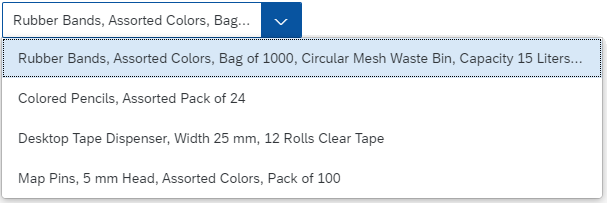
Text Wrap in the Option List
The option list doesn’t support horizontal scrolling. By default, entries that exceed the maximum width of 600 px for the dropdown are truncated. If you expect the dropdown to contain longer entries, we recommend wrapping items in the option list to enable users to read the full text, (property: wrapItemsText). If wrapping is enabled, the text can wrap to multiple lines.
Option list with wrapped text
Unit of Measurement
You can use the layout options of the form to can add the unit of measurement (UoM) after select. Apps can use the label-field ratio to show the UoM after the field. However, you must make sure that the UoM is properly visualized and doesn’t wrap to the next row.
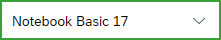
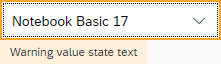
Semantic Colors
Different value states or meanings can be indicated by using semantic colors. The visual states are shown below in their regular state (left) and focused (right). Note that the positive/success state does not show a message on focus.
For more details on the correct usage, see How To Use Semantic Colors.
Neutral
Neutral (focus)
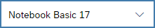
Information
Information (focus)
Success

Success (focus)
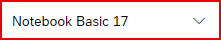
Error
Error (focus)
Warning
Warning (focus)
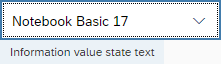
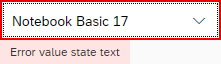
Value State Text
The select control can display the value state text even if the dropdown is open. This ensures that the value states are shown in all situations and on all devices. When the user opens the dropdown, the value state sticks to the top and does not scroll away. The control also supports multi-line text for the value state.
Value state text displayed when the dropdown is open
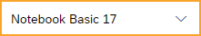
Read-Only
The select control can be displayed as read-only (property: editable, default = “true”). If the editable property is set to “false”, interaction with the control is disabled. The control remains focusable, but the background and border are changed to indicate that it is read-only.
Select read-only
Resources
Want to dive deeper? Follow the links below to find out more about related controls, the SAPUI5 implementation, and the visual design.
Elements and Controls
- Combo Box (guidelines)
- Multi-Combo Box (guidelines)
- Input Field (guidelines)
- Form (guidelines)
- Radio Button (guidelines)
- Checkbox (guidelines)
- Toolbar (guidelines)
- How To Use Semantic Colors (guidelines)
 Your feedback has been sent to the SAP Fiori design team.