 Redesigning Entry into Applications
Explicit Selection of the Processing Object from a List / Tree
The objective here is to allow the user to select the processing object from a list or a tree on the left (as docking control with splitter or as dynpro element). In this approach, the processing objects can be displayed in different views.
To accomplish this, an area is defined on the left side of the window (screen) that allows the processing object to be selected directly from one or more lists or from a tree (object selection area). Note that the docking control does not necessarily have to be used.
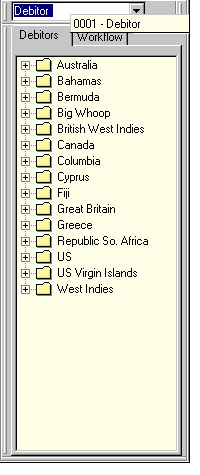
The following example illustrates a single-screen transaction. The processing object can be selected from the tree on the left side. An object is created by triggering the "Create" function in the application toolbar and then entering a vendor (not required) in the corresponding fields (which are ready for input) in the initial area to the right.

Figure 1: Explicit Selection of the Processing Object from a List / Tree
Click image to enlarge it!
Function Selection
Functions that can be applied to objects in the list, such as "Change", "Display", etc., must appear in the context menu (right mouse button menu) in addition to the "Purchase order" object menu. A default function (see below) must be assigned and appears in bold type in the context menu.
A double-click on an object in the list triggers the user-specific default function - that is, "Change" or "Display" (assuming "Create" was not selected). The prior processing status (if any) can be taken into account. For example, if the user is in "Change" mode, then double-clicking on the newly selected object will also open it in "Change" mode, regardless of whether "Change" is the default function or not.
Note: Another area - in initial area above the data input area - can be provided to enter the object directly. In particular, this area may contain key fields that have to be filled when you "Create" an object. It would also be feasible to have the "Create" function - particularly in the "Create with reference..." (icon_create_object) case - display a dialogue window in which the object has to be specified. As shown in the above example, "Create" can appear in the application toolbar.
 Setting a Filter to a List
Input fields can be placed above the list/tree area (currently only technically possible if you do not use split bars). The values in the fields filter the objects displayed in the list or tree. After filtering, the list display should retain the context by also displaying the next-highest node. The filter is activated with a "Filter" pushbutton (with a corresponding icon), which appears to the right and below the lowest filter field. Of course, you can also supply a field to enter an interval (compare to selection screens), or use the "More" button to display a dialogue window in which the complete query can be entered (the generated hit list can be used as a new, user-specific view in the list). The values entered in the filter fields should also be persistent for each respective user.
The adjacent diagram illustrates one option for selecting predefined filter conditions from a drop-down listbox plus views on tabstrips.
Finding a String in a List
You can also provide a "Find" function (input field plus pushbutton with the corresponding icon), which allows the user to enter a search string to position the cursor on the corresponding entry.
Different Views of the Objects
To visualize different views of the processing object, the list or tree can be set in a tabstrip. The tab strips allow the user to toggle the view (see diagram). Alternatively, you can also use a drop-down list box to select a view.
Another option is available when the ALV tree is used. This element allows you to create a toolbar with its own defined functions in a new status. Different views can be implemented through a menu button (compare diagram when tree is hidden). It is also possible to have the user generate their own view - through a query for example - which is then dynamically added as a menu button in the menu.
Note: If the docking control is used, you can currently only switch between views by placing an appropriate pushbutton (with text) in the application toolbar and/or defining one pushbutton for each view (the pushbutton of the selected view is displayed in gray).
Template Objects
In addition to the possibility of entering a template in a separate dialogue window, the templates can also be added directly to the left-hand list, or be displayed when the "Create with reference" function is selected.
Last Used or Flagged [ Objects ]
It is worth considering offering an additional view, "Last used [ objects ]" or "Flagged [ objects ]", that contains the last N (e.g. 20) used/flagged objects. These objects are also available for selection. If it does not cause the tree to become too large, you can also add these objects to a new node "Last used [ objects ]" or "Flagged [ objects ]".
This list should be independent of the respective user and must currently be programmed manually.
Hiding the Tree / List
The first button in the application toolbar should be the "[ View ] on/off" function. [ View ] describes the display in the list/tree, such as "Purchase orders". Pressing the button hides/displays (toggle) the left-hand area (Text button are better than icons).
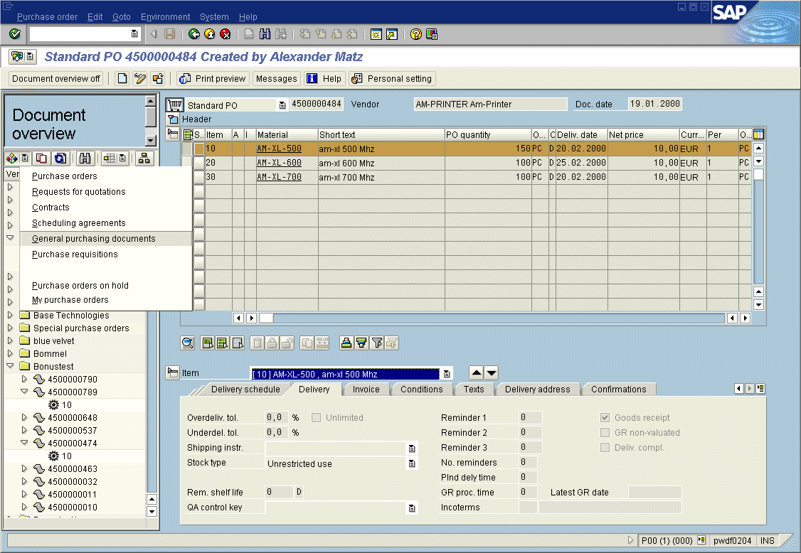
Figure 3: Object Selection with Show/Hide Toggle, ALV Tree, and Different Views
Click image to enlarge it!
Source: SAP R/3 Style Guide