
Switches
FioriSwitch
Intro
The switch control mimics a physical switch that allows users to turn on/off individual settings, such as personalization or display settings. When users change a switch to “on”, they expect an instantaneous action as soon as the switch changes state.
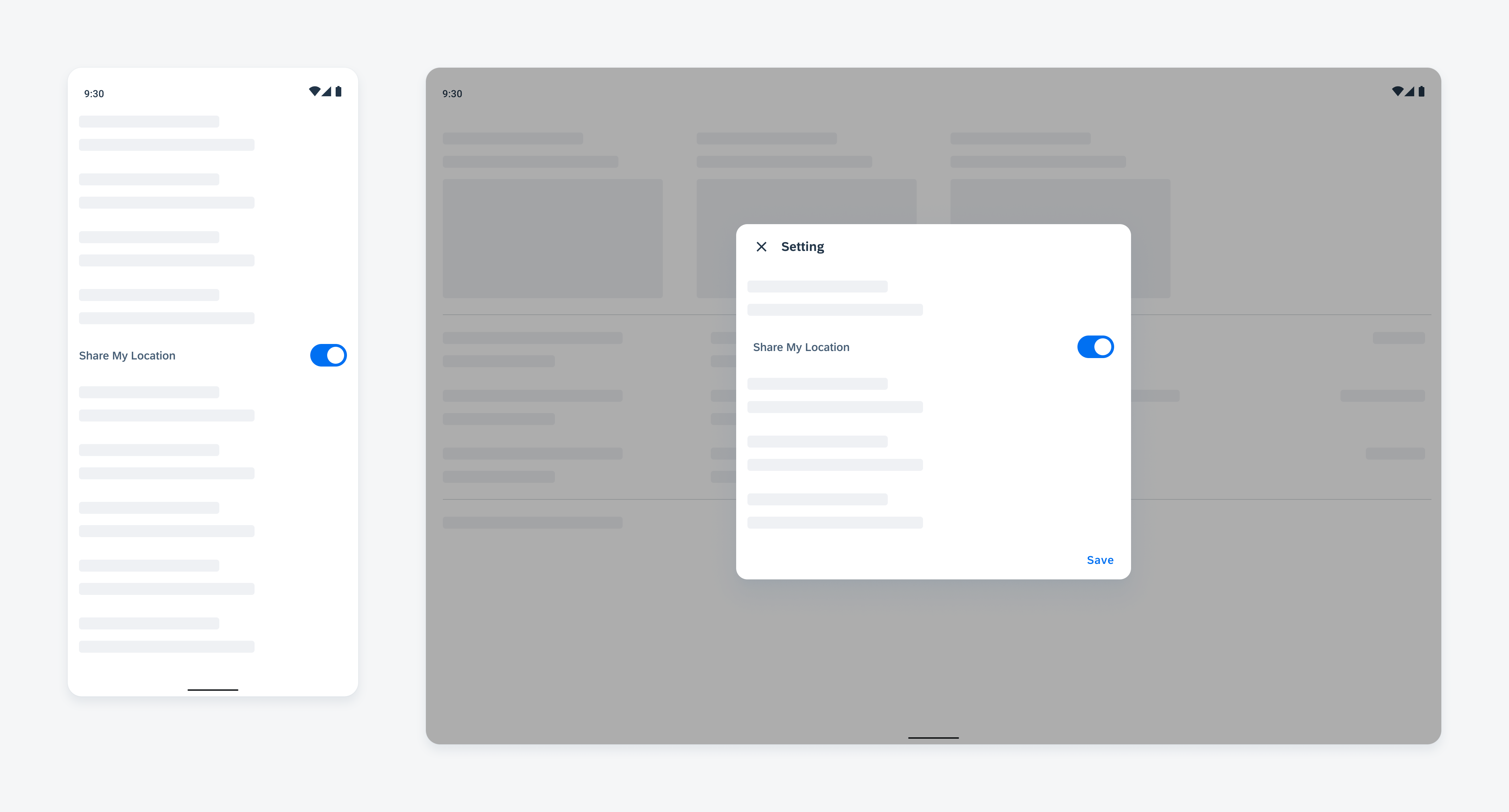
Switch on mobile (left) and on tablet (right)
Usage
- Use switches in a switch form cell only.
- Use switches to control the availability of related UI elements on the current screen.
- Don’t use switches for selecting states other than on and off.
- Don’t use switches without a form cell container.
Anatomy
A. Text Label
The text label describes the object this switch is controlling.
B. Helper Text
The helper text provides additional information about the form cell.
C. Switch
The switch control is located on the right side of the cell.
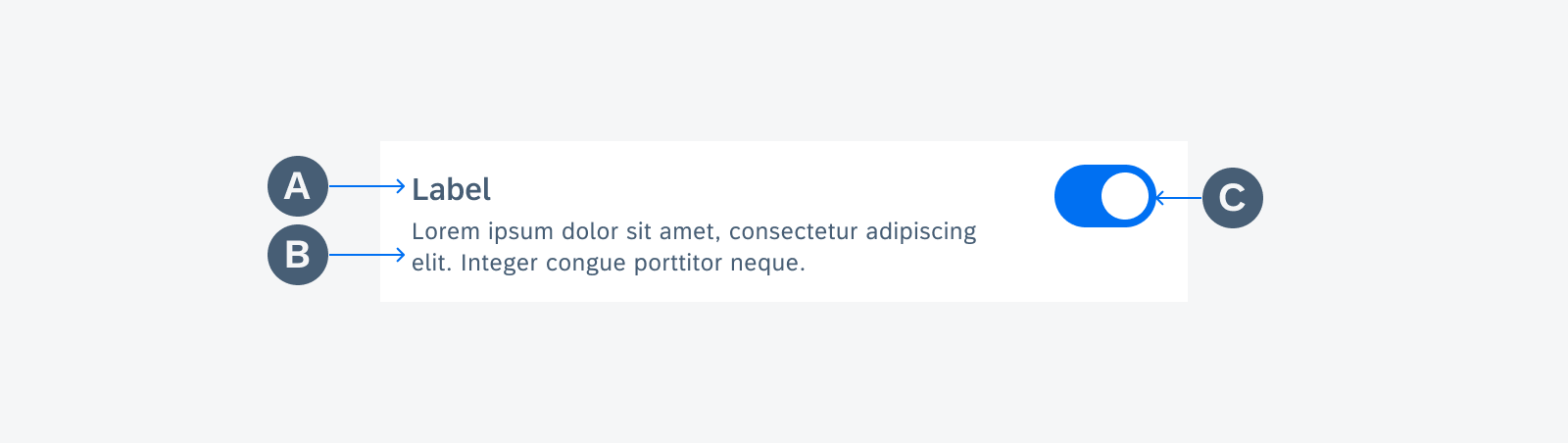
Anatomy of switch form cell
Behavior and Interaction
States
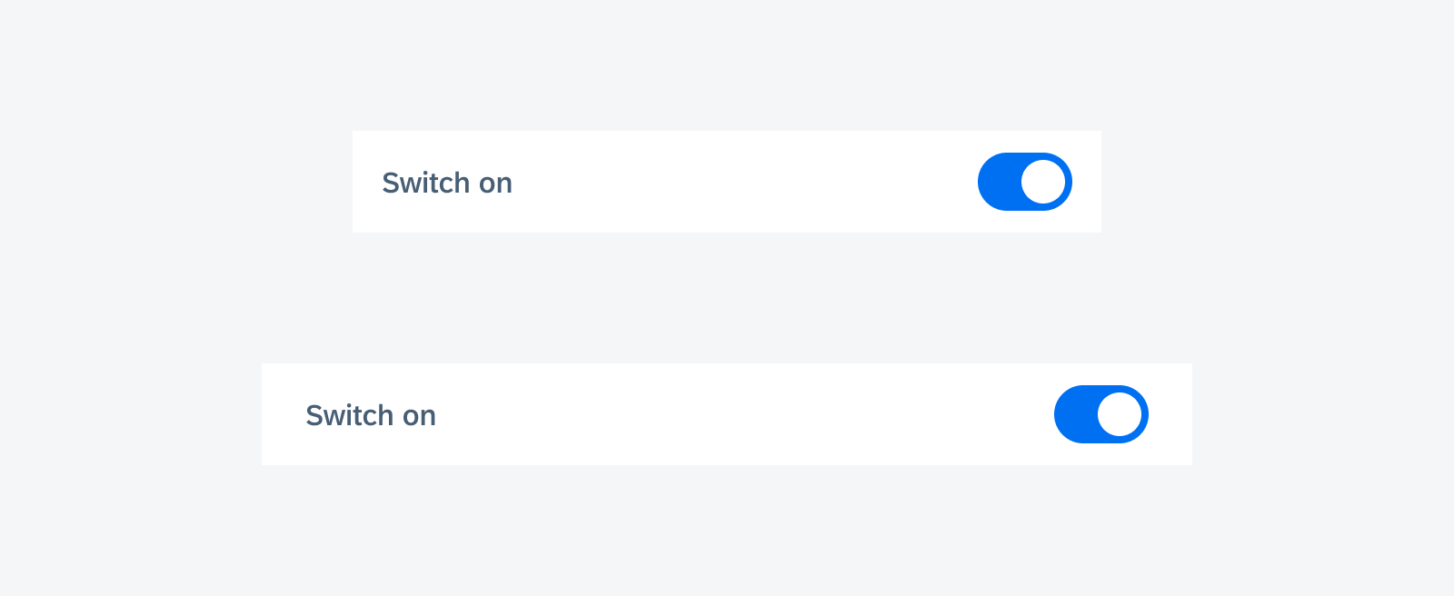
Enabled State
Each switch form cell is one touch target. To change the state of a switch, the user can tap anywhere within the cell to toggle.
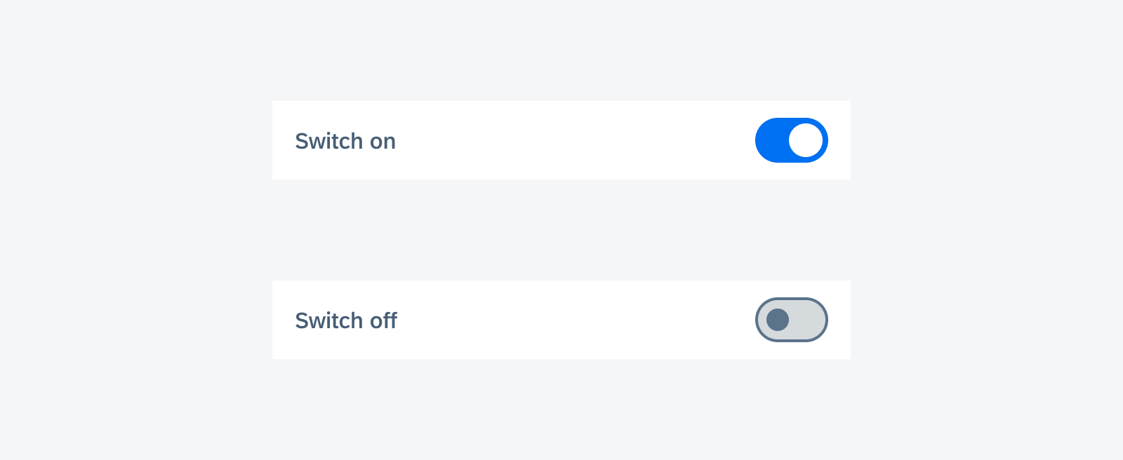
Enabled switch form cells
Disabled State
When a switch is disabled, apply 50% opacity to the whole cell. Disabled cells are not interactive.
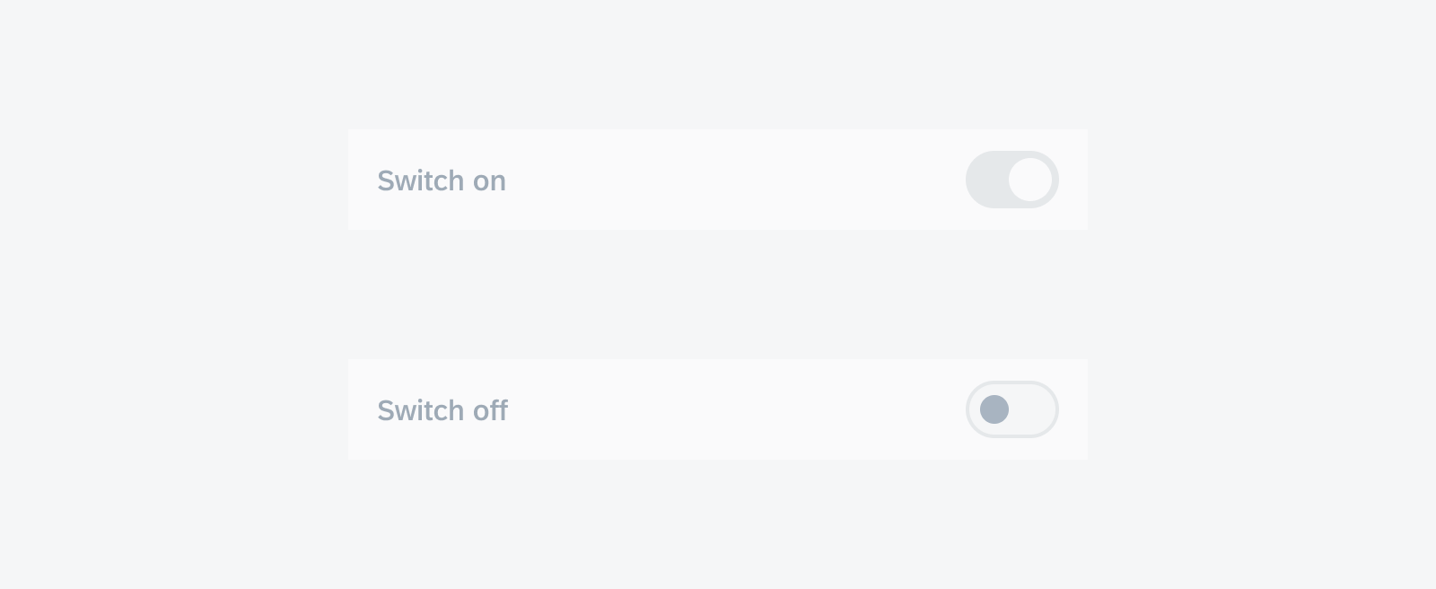
Disabled switch form cells
Error State
Use an error message only when necessary. Don’t distract users with unimportant information. For page level feedback, use a snackbar instead.
The error message should be concise. We recommend using one line of text for the error message.
By default, there is no error message. When the error message is triggered, insert the message with padding below the label text before the divider line if used. The content under it will be pushed down.
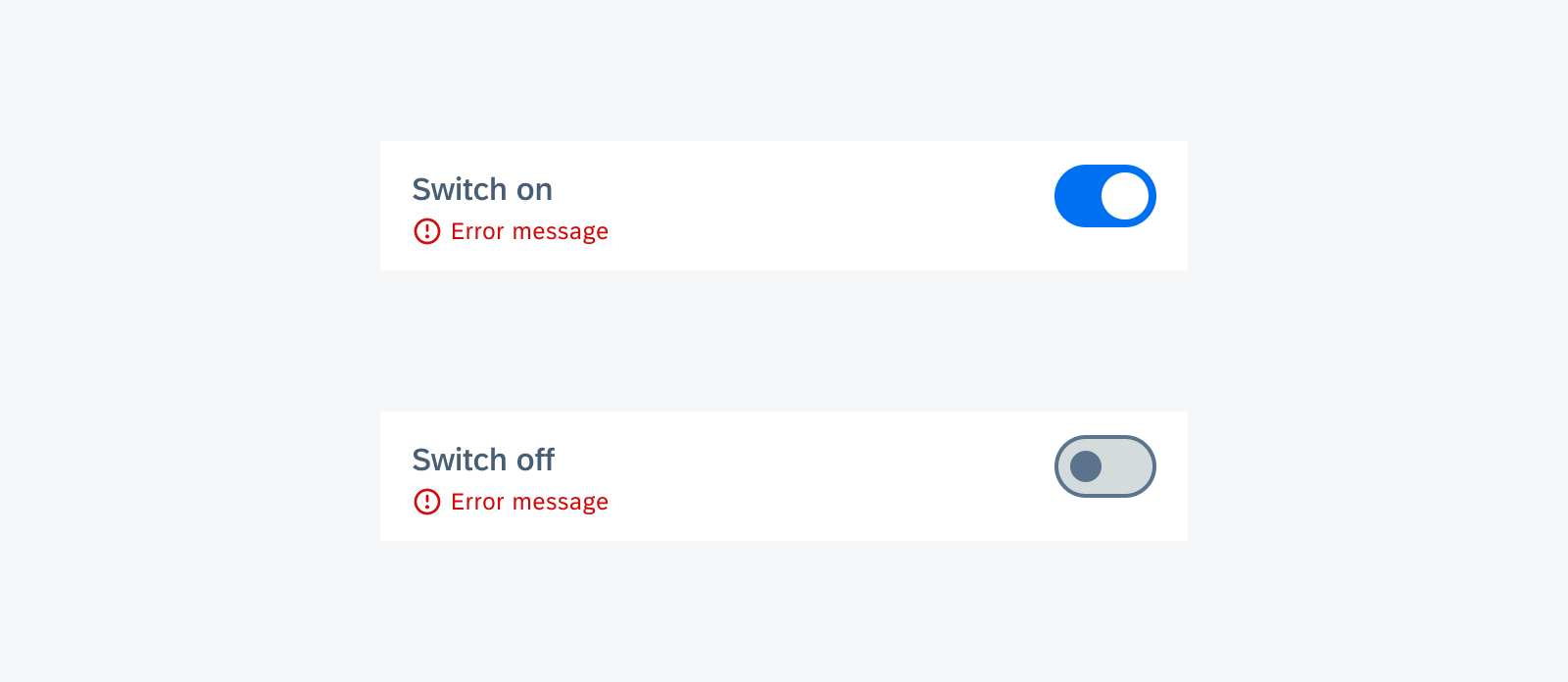
Switch form cell with error message
Adaptive Design
The full width of switch form cells adapts to different screen sizes.
 Your feedback has been sent to the SAP Fiori design team.