
Attachment Form Cell
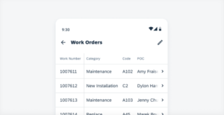
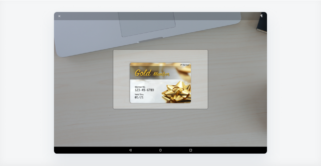
The attachment form cell is usually part of the create or editing work flow, located at the end of the form. All the attached files should be associated with a certain business object. In general, users can only add/delete attachments in edit mode. After the changes have been saved, users can view the attached files [...]
Category: UI Components
Type: -

 Your feedback has been sent to the SAP Fiori design team.