
Buttons
FioriTonalButton, FioriFilledButton, FioriTextButton, FioriFilledIconButton, FioriTonalIconButton, FioriStandardIconButton
Intro
Buttons allow users to perform actions, make decisions, or begin a process. The label of a button communicates the action that it is going to initiate.
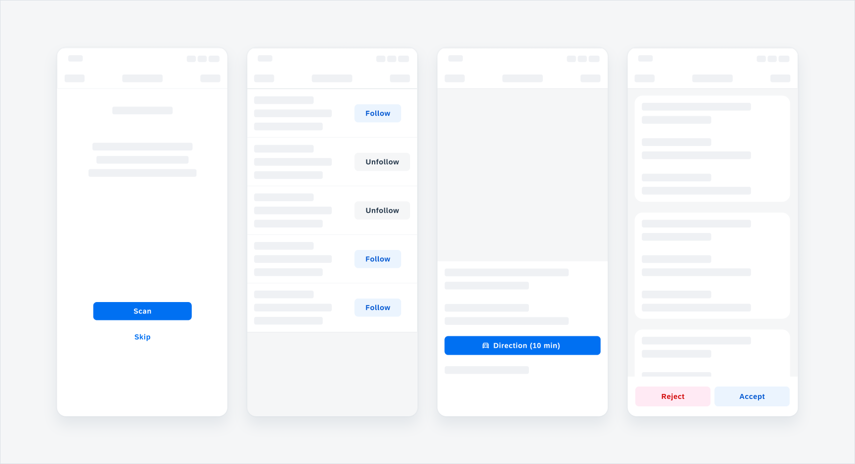
Examples of different buttons
Usage
Buttons should only be used for actions. Avoid using too many buttons – if users have too many options, it is difficult for them to decide. If you want the user to select one option from a small group or to provide access to specific categories, offer a segmented control instead of a button.
- Buttons should be easy to find within the UI.
- Use simple and concise wording to describe a button’s action.
- Use a button type in accordance with its visual hierarchy.
- Do not wrap text inside a button, as a text label should remain on a single line.
- Do not stack buttons above each other. Place them side by side.
- Avoid text labels that are too long. They need to be concise.
Anatomy
A button consists of an icon (optional), a label, and a container.
A. Icon (Optional)
The Icon is a visual glyph that supplements text in instances where additional context is needed.
B. Label
The label is the textual content that describes the button’s action to the user.
C. Container
The container is a rectangular shape that wraps the button’s contents.
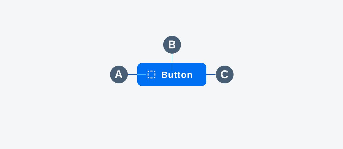
Anatomy of a button
Behavior and Interaction
Button States
Buttons have several states that provide visual feedback on a button’s interaction.
A. Enabled State
Communicates a button’s default state.
B. Hover State
Indicates that the button is a hover target when the cursor is over the button.
C. Focus State
Indicates that the button is focused when navigating with a keyboard.
D. Pressed State
Communicates that the button has been pressed.
E. Disabled State
Discloses that the button has been disabled.
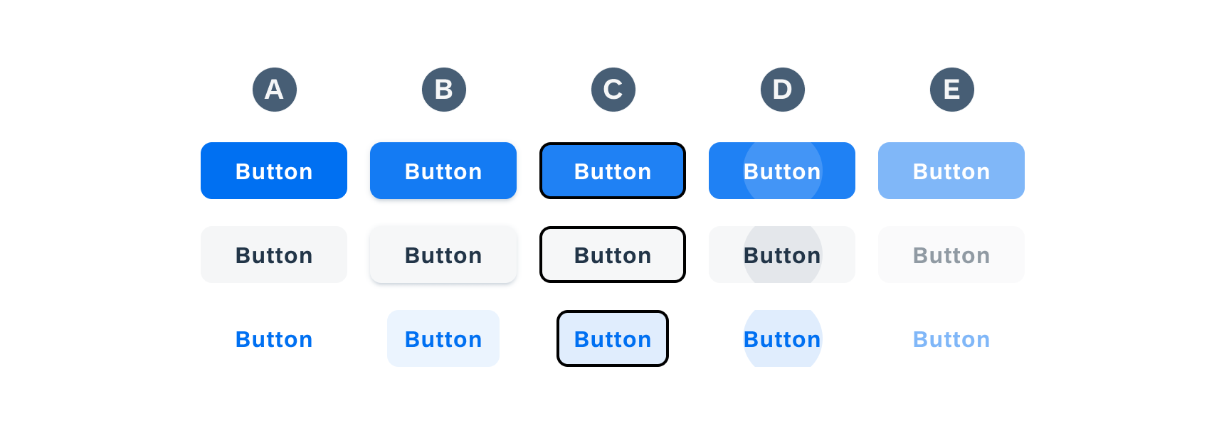
Button states from left to right: enabled (A), hover (B), focus (C), pressed (D), disabled (E)
Variations
There are three different variations of buttons that provide different levels of visual hierarchy. The following are three button variations:
A. Contained
B. Tonal
C. Text
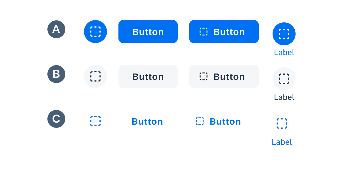
Example showing contained (A), tonal (B), and text (C) button variations
Contained Buttons
Contained buttons have a saturated background color making them the buttons with the highest prominence. Use contained buttons for the most important actions in a user’s workflow.
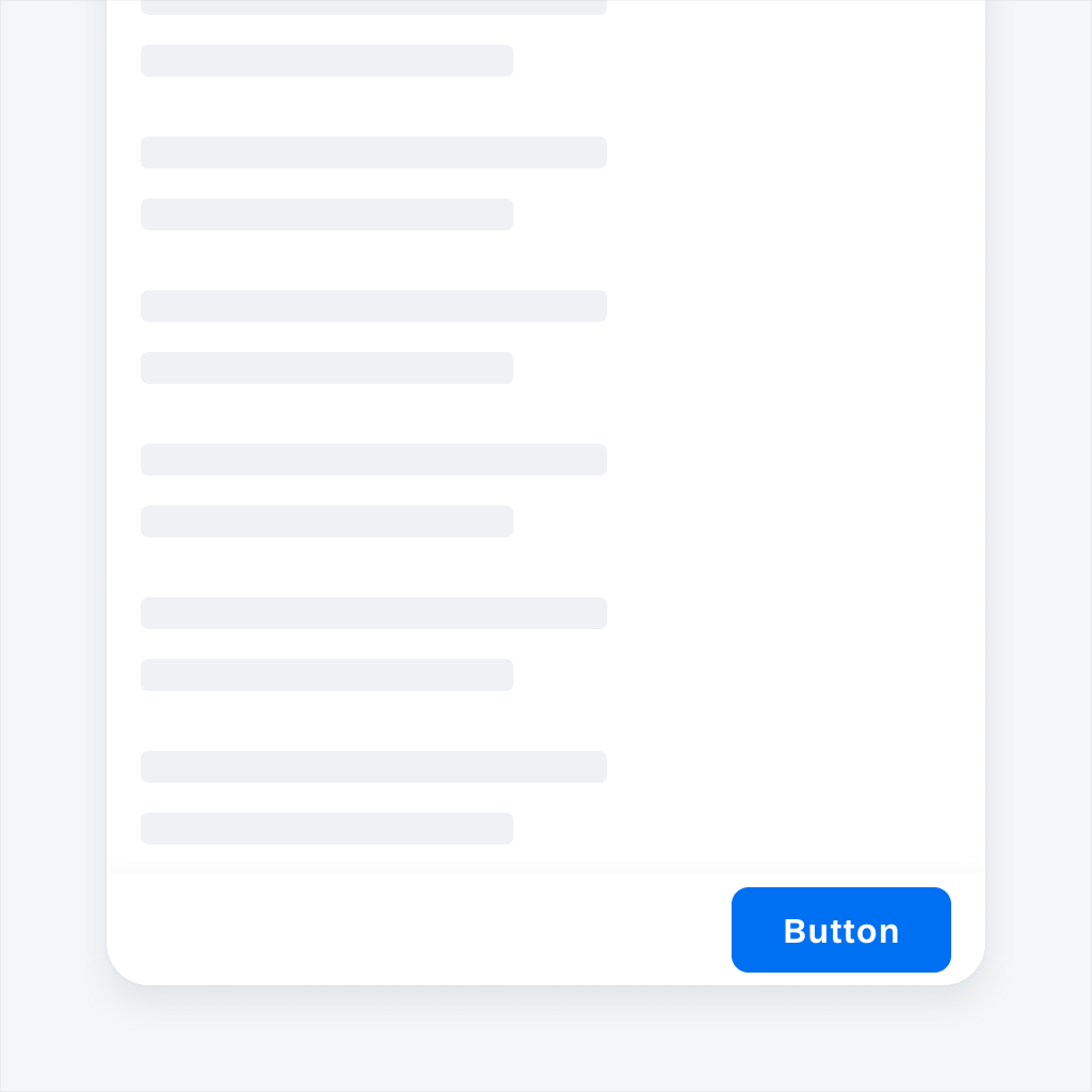
Contained button in the persistent footer
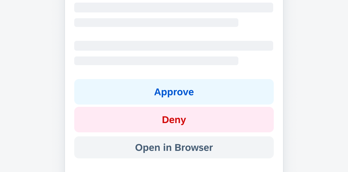
Tonal Buttons
Tonal buttons are used to add more emphasis than text buttons without the visual prominence of a contained button. Use tonal buttons to represent actions that are significant in a user’s workflow.
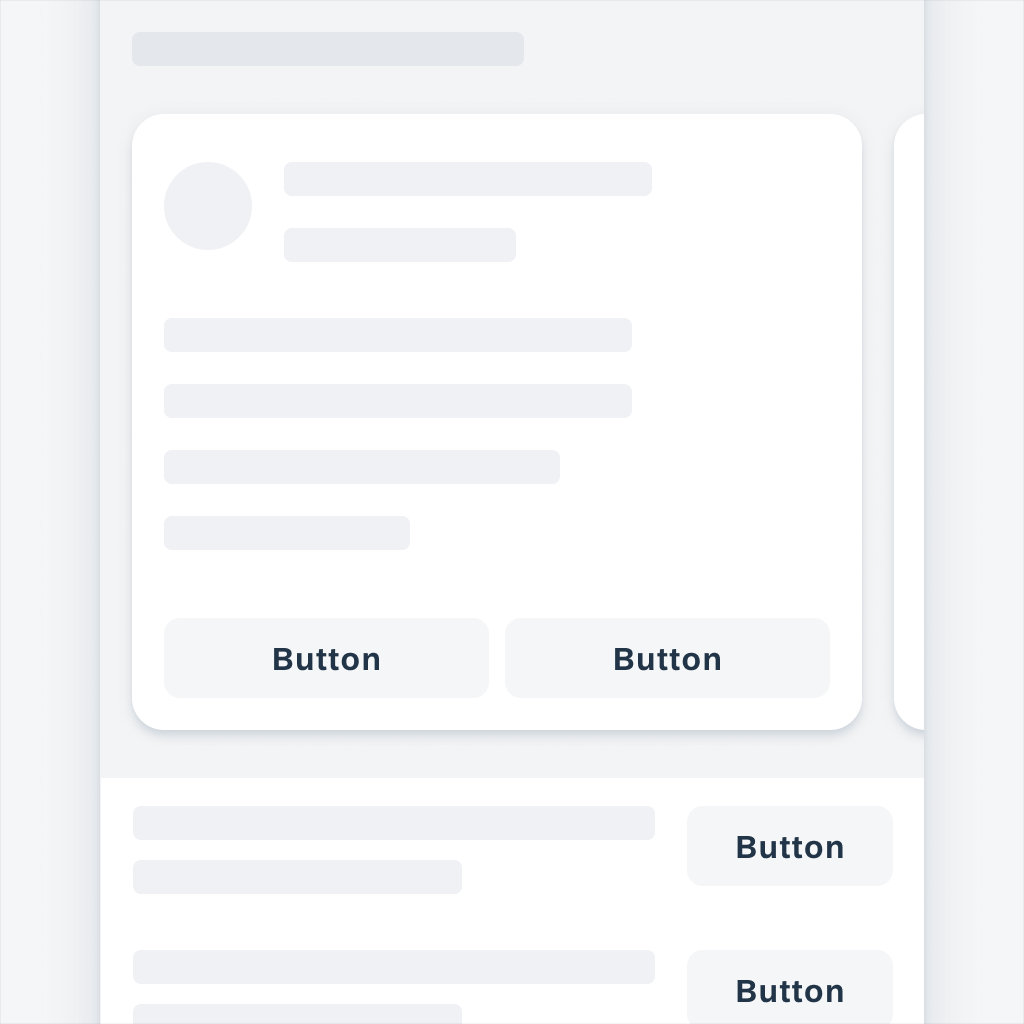
Tonal buttons used in a card and table preview
Text Buttons
Text buttons are used for less important actions in the UI. Use text buttons for secondary actions that supplement a user’s workflow.
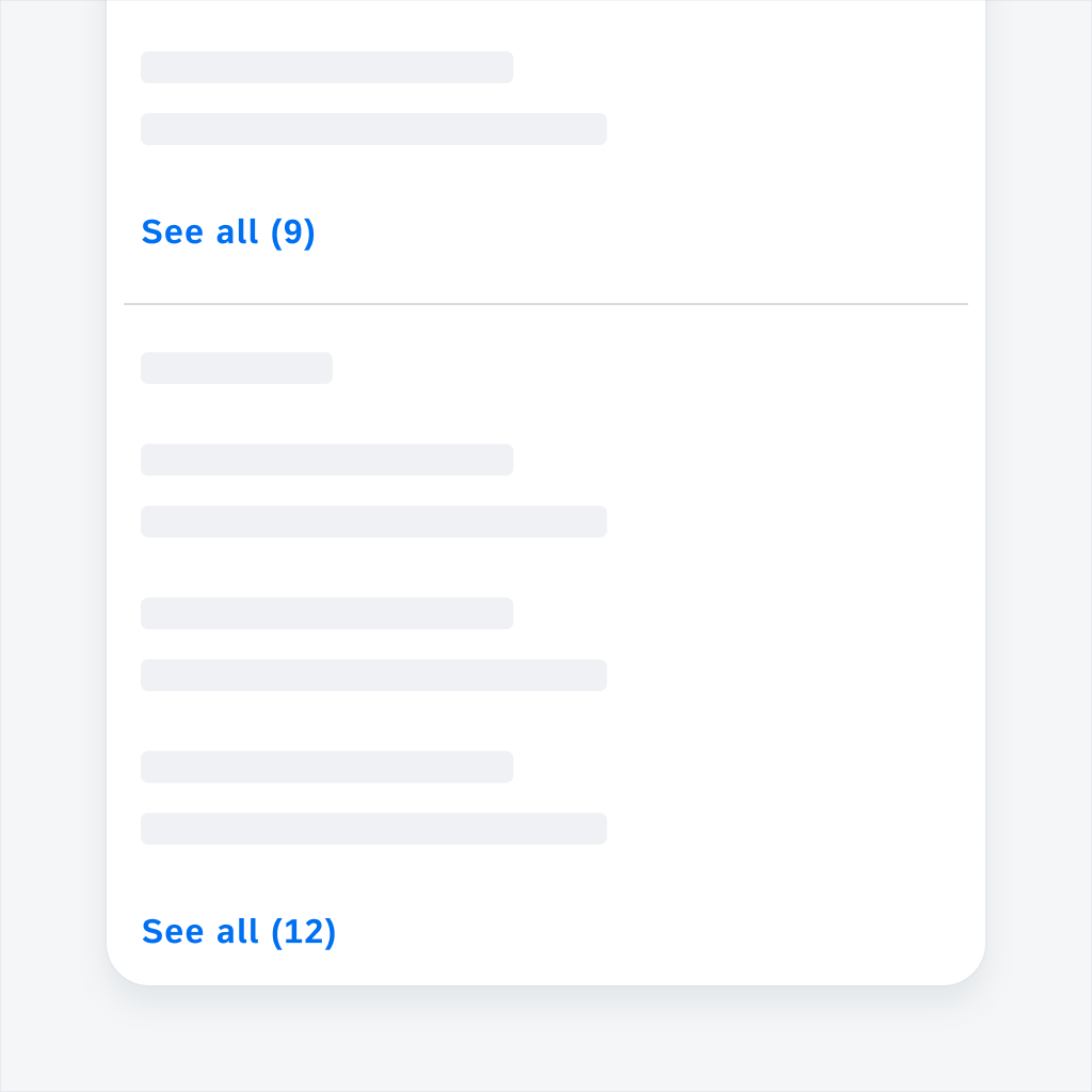
Text button used in a section footer
Size Variations
Buttons are by default dynamic in width and are dependent on the container they are placed in, but they can also be set to a fixed width and height. The touch area of a button should not be less than 48dp.
A. Auto-Width Buttons
The button container of an auto-width button grows automatically to fit the size of the text. Auto-width buttons have by default a fixed height of 48dp. We recommend using auto-width buttons within components, for example, within the object cell.
B. Standalone Buttons
We recommend buttons with a fixed width of 201pt and 48dp height for standalone pages, such as onboarding or sign-in screens.
C. Full-Width Buttons
For vertical button stacks we recommend using full-width buttons which lead to a padding of 16pt on the left and right side of the button. Per default, full-width buttons have a width of 343pt and a height of 48dp
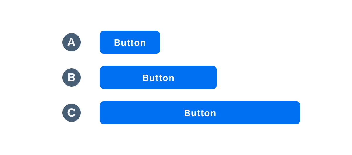
Auto-width button (A), standalone button (B), and full-width button (C)
Button Styles
Button styles play alongside the button types to add another layer of complexity to the UI. The following are the Horizon button styles:
A. Tint
B. Neutral
C. Negative (Semantic)
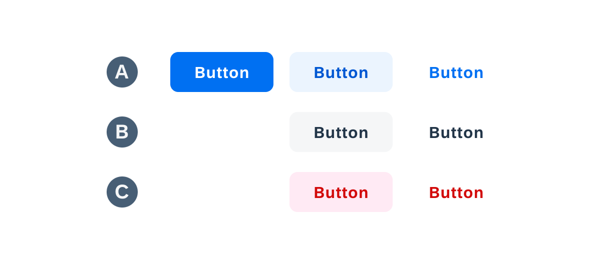
Tint (A), neutral (B), and negative buttons (C)
A. Tint
The tint button style can emphasize available actions and encourage users to interact with them. The primary button’s default style is not different from the tint one.
1. Usage Contained
Use contained tint for primary actions. Only one action on the screen should be styled in the primary style.
2. Usage Tonal
Use tonal tint if there are several actions with the same importance. If it is used in combination with negative actions, it can be used for positive actions.
3. Usage Text
Use the text tint style if the action is placed within the navigation bar or if it has the lowest priority compared to other actions on the screen.
B. Neutral
The neutral button style reflects an intermediate level of visual hierarchy. The neutral button style can be used for actions that have a medium priority.
1. Usage Tonal
Use tonal neutral style if you have multiple buttons within a view and want to visually highlight the priority of the different actions. Tint style always reflects a higher importance than neutral style. The usage depends on the context of the app and needs to be decided on app level.
2. Usage Text
Use text neutral for actions with a low importance. However, the usage depends on the context of the app and needs to be decided on app level.
C. Semantic (Negative)
The negative button style indicates destructive actions and warns users to take extra precautions when interacting with the buttons.
1. Usage Tonal
Use tonal negative if there are several actions with the same importance and one or more of them are negative, app designers can style the negative button in the tonal negative style.
2. Usage Text
Use text negative style if there are several negative actions within the page, for example, within several object cells, or if the negative button has the lowest importance.
Button examples for a positive, negative, and neutral action
Resources
Development: FioriTonalButton, FioriFilledButton, FioriTextButton, FioriFilledIconButton, FioriTonalIconButton, FioriStandardIconButton, MaterialButton
SAP Fiori for iOS: Buttons
SAP Fiori for Web: Button
Material Design: Buttons
Related Components/Patterns: Persistent Footer
 Your feedback has been sent to the SAP Fiori design team.