
Object Header
FioriObjectHeader
Intro
The object header is the topmost area in the object’s detail page that provides a detailed glimpse of that object. The object header provides an area that contains information such as object title, subtitle, and description amongst other supplementary information.
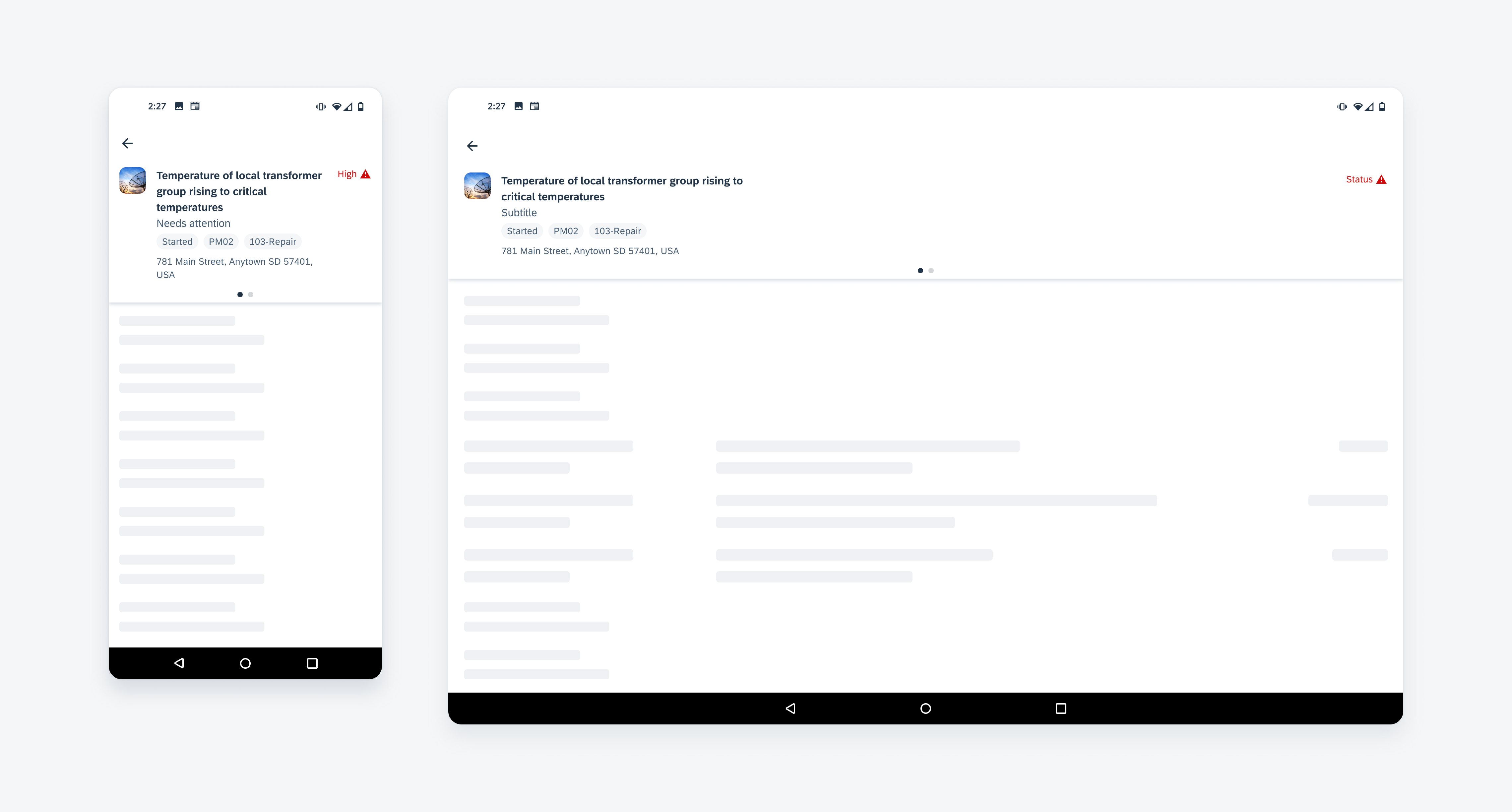
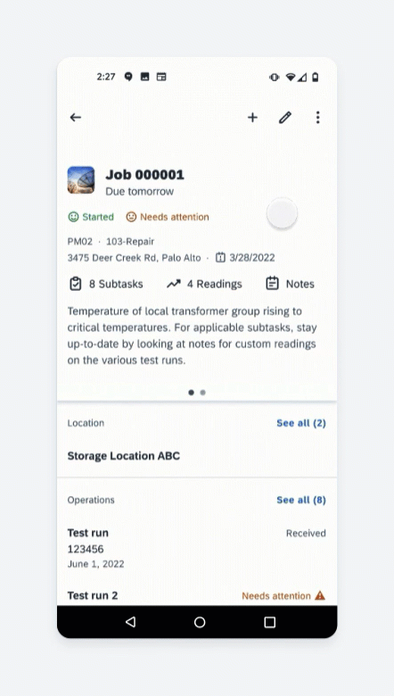
Object header with two pages on mobile (left) and tablet (right)
Usage
Use concise wording.
Don’t use wordy or lengthy content in the object header.
Anatomy
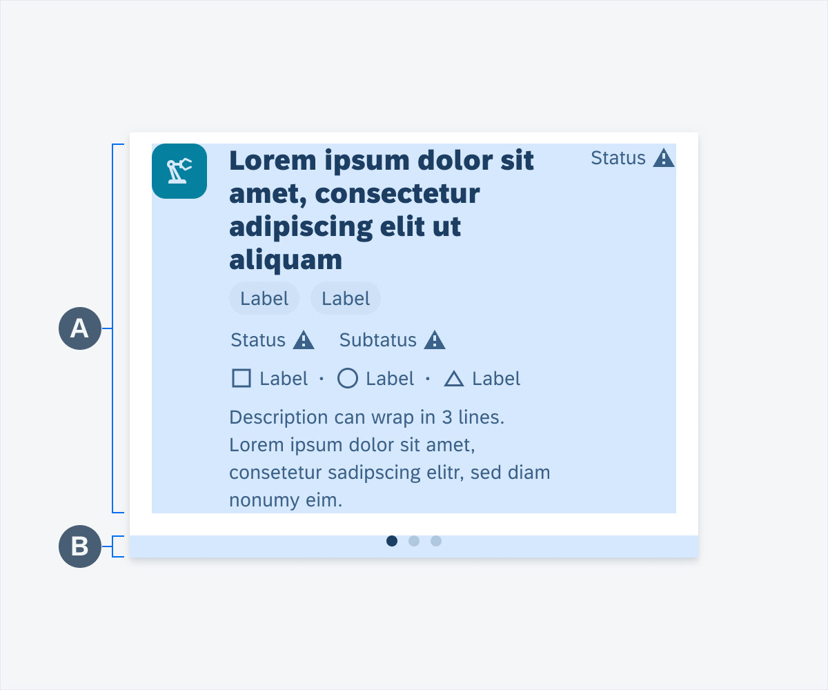
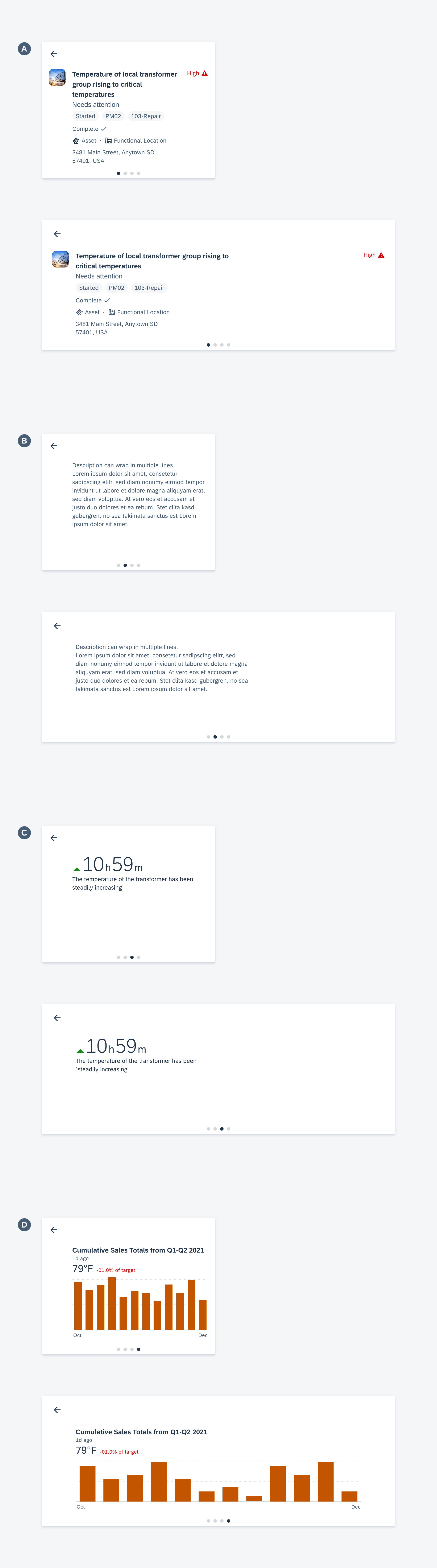
Object Header Structure
A. Main Content Area
The main content area contains information about the object such as image, title, status, and supporting attributes. Additional information such as description and header chart may be placed on other pages based on space.
B. Pagination
Pagination is a non-interactive visual indicator consisting of inline dots indicating the number of pages on the object header and the user’s position on the page. Use pagination as an overflow if the object header must support multiple content types such as description, charts, or KPI.
Anatomy of the object header
Content Types
A. Image (Optional)
An image is a 40dp x 40dp area that represents the object through an image or avatar.
B. Title
The title points to the object or product’s name which allows it to be identified amongst other objects. The title should be descriptive.
C. Status Label (Optional)
Shows a brief pertinent description of the object, for example, it can show the priority or urgency of the object’s status. When using a status, the wording should be concise. Maintain wording to a maximum of two words.
D. Subtitle (Optional)
Subtitles may provide additional context for the object with information such as ID, type, etc.
E. Tags (Optional)
Tags are data about the object such as identifiers, groupings, or categorizations that allow users to easily identify these characteristics. When using tags, the wording should be concise. Maintain wording to a maximum of two words.
F. Status Row (Optional)
The Status row is an additional area in the object header, where you can display one or two status labels. You can create an additional layout using both the status label and the status row. Status items should be concise. When using status items, the wording should concise. Maintain wording to a maximum of two words.
G. Label Items (Optional)
Label items consist of a text label and an icon, which are used as supplementary information about the object, such as location, due date, or type. When using label items, the wording should be concise. Maintain wording to a maximum of two words.
H. Description (Optional)
A description allows for lengthier information about the object.
I. KPI (Optional)
Shows relevant trends or status about the object.
J. Header Chart (Optional)
Shows chart visualizations of the object.
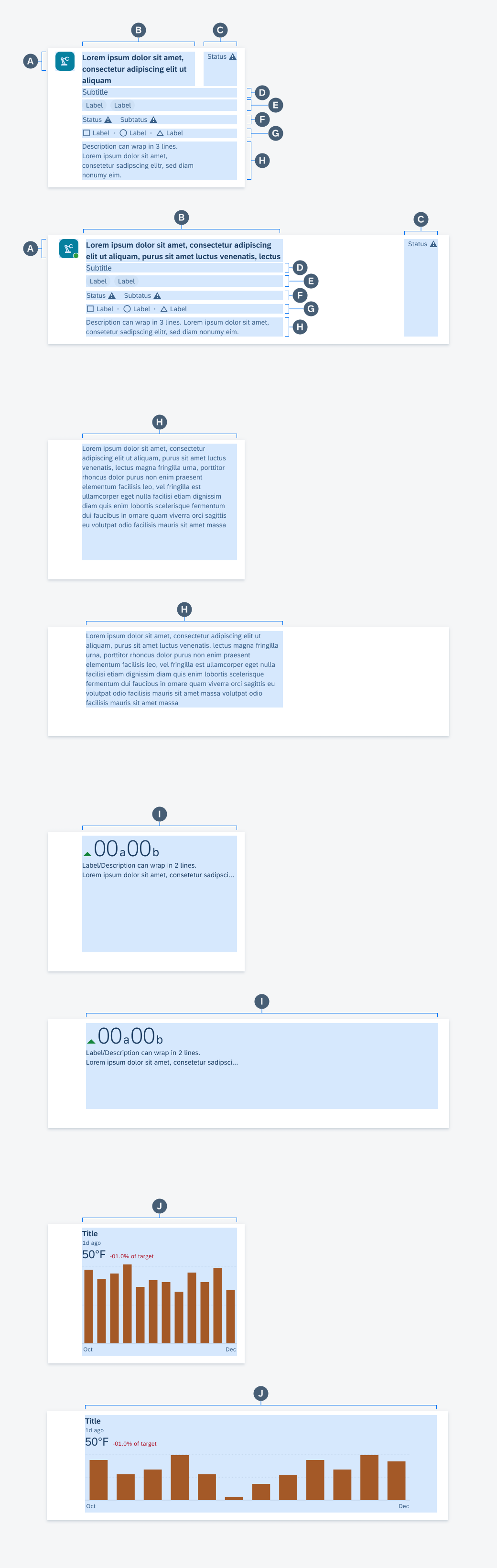
Content types from A–J
Behavior and Interaction
Scroll Collapse
If the user scrolls up, the object header collapses to show more vertical areas. If the user scrolls back, the object header returns to its default height.
Scroll collapse
Horizontal Swipe
To fit different content types, app teams may distribute content into a collection of slides. To navigate, the user horizontally swipes to navigate between slides. A pagination indicator is displayed at the bottom of the object header to indicate the total number of slides and the user’s current position in the collection of slides.
Horizontal swipe
Push Navigation
Tappable header chart titles can be enabled to allow the user to push navigate from the object header to the full-screen chart and vice versa. Tappable header chart titles are tinted in CTA colors to indicate their interactivity.
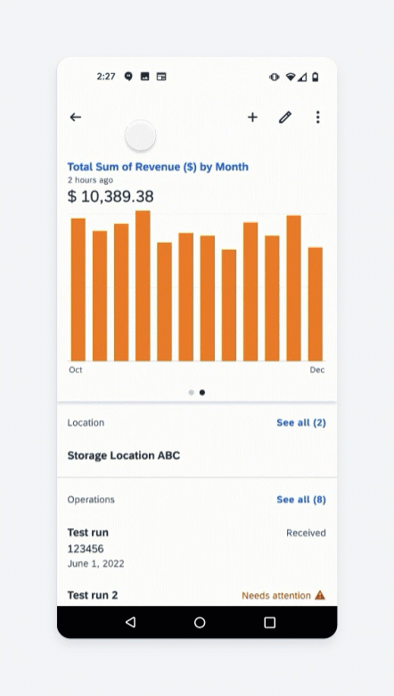
Push navigation
Variations
Mobile and Tablet
If there are space limitations, the object header content can be separated into two or more slides. All the slides of a specific object header must match the height of the tallest slide to keep the UX consistent and prevent content from shifting.
A. Main Information
B. Description
C. KPI
D. Chart
 Your feedback has been sent to the SAP Fiori design team.