
Chart Types
Fiori: LineChart, DonutChart, ColumnChart, ScatterChart
Intro
SAP Fiori for Android supports different chart types. Each chart type visualizes data differently and emphasizes various aspects of the data. Choose a chart type based on the data type and purpose of the chart to best fulfill users’ needs.
Line chart (left), column chart (center left), stacked column chart (center right), horizontal bar chart (right)
Variations
Line Chart
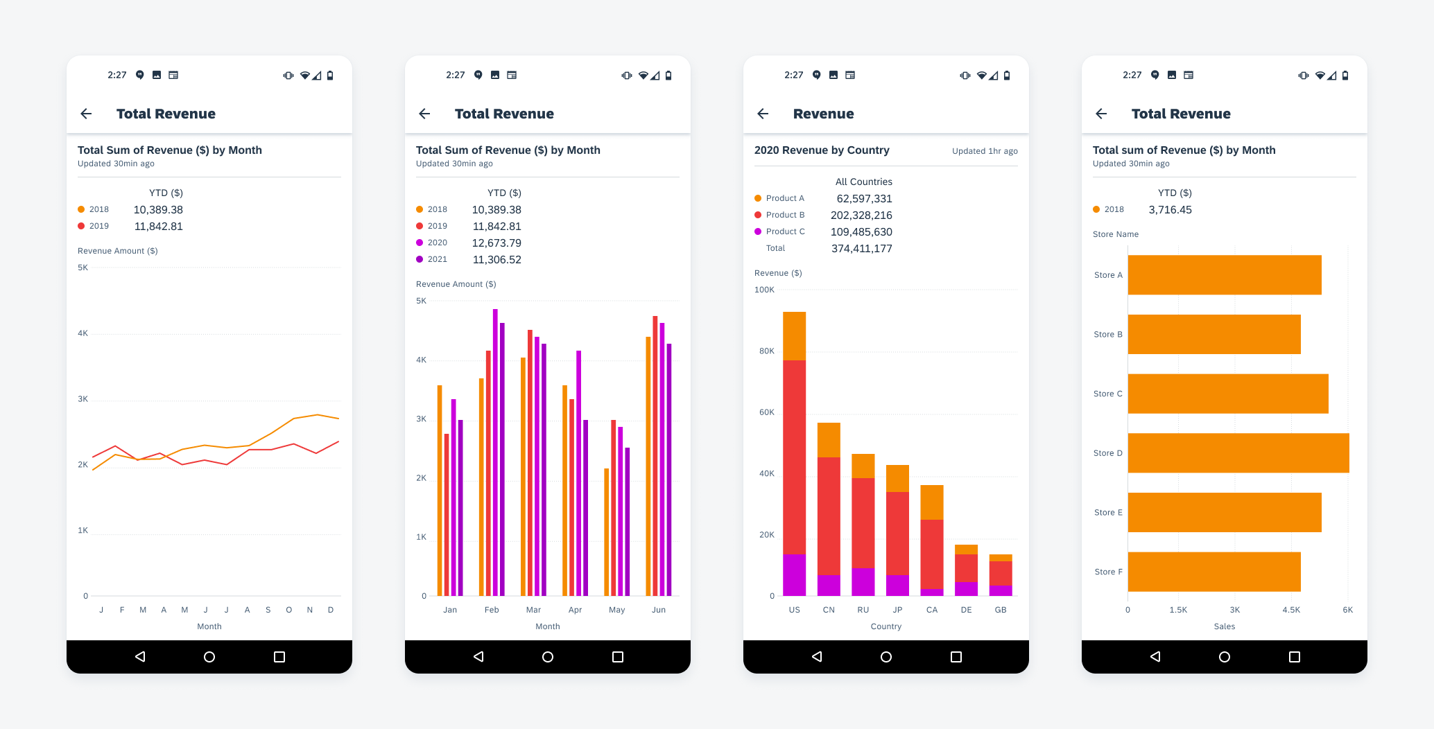
The line chart represents data points using dots connected by lines to show peaks and falls of the data set. This chart type is useful for showing changes in values (continuous or discrete) over time. We support up to four series of data on one chart.
Use a line chart to display a trend in the data, because the connections between the data points provide an overall shape to the dataset.
Don’t use a line chart when the dataset is missing several values, because breaks will appear in the line; use a column chart instead.
Column Chart
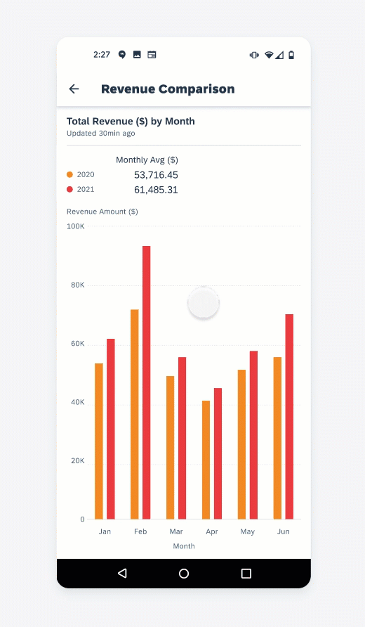
Column charts use vertical bars to display discrete data. The height of each bar represents the value of that data point based on the scale of the y-axis. With their side-by-side arrangement of columns, this type of chart can be used to compare values across categories and show changes over time. We support up to four series of data on one chart.
- Use a column chart for comparing non-time series data.
- Can be used instead of a line chart for time series data when it is either 1) more important to see individual data points than the overall trend or 2) the data set has missing values which would create gaps and make a line chart less effective.
- Use abbreviations of x-axis labels when possible. Due to limited screen space, x-axis labels may be truncated. To make the chart meaningful for users, please choose short labels that could differentiate each data set.
Don’t use a column chart to visualize extremely large data sets, users may get lost in scrolling. Filter down the data to a reasonable range that users can analyze in a column chart or use line chart instead if the purpose is to show the overall shape of data.
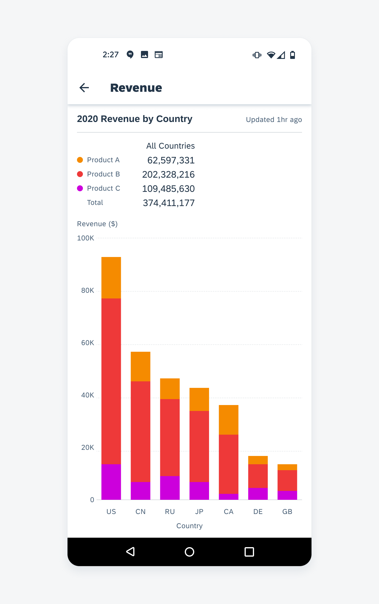
Stacked Column Chart
A stacked column chart is best used for part-to-whole comparisons over time or across categories. Like the column chart, stacked column chart uses the height of each bar to represent the value of each data point. But instead of the side-by-side arrangement, it stacks data series on top of each other to form one column.
Types
There are two types of stacked column chart:
Regular Stacked Column Chart
A regular stacked column chart displays the numeric value of each data point. Thus, the height of the column represents the whole of this group or category. The columns usually vary in height, representing the trend of the whole. A regular stacked column chart supports both positive and negative data.
100% Stacked Column Chart
In the 100% stacked column chart, the height of individual bar represents the percentage of that data point in relation to the whole instead of the actual value. Thus, the total height of each column will always be 100%. It is best used to show how proportions change over time or across categories, such as population distribution across countries. A 100% stacked column chart cannot be used to present negative data.
Regular stacked column chart
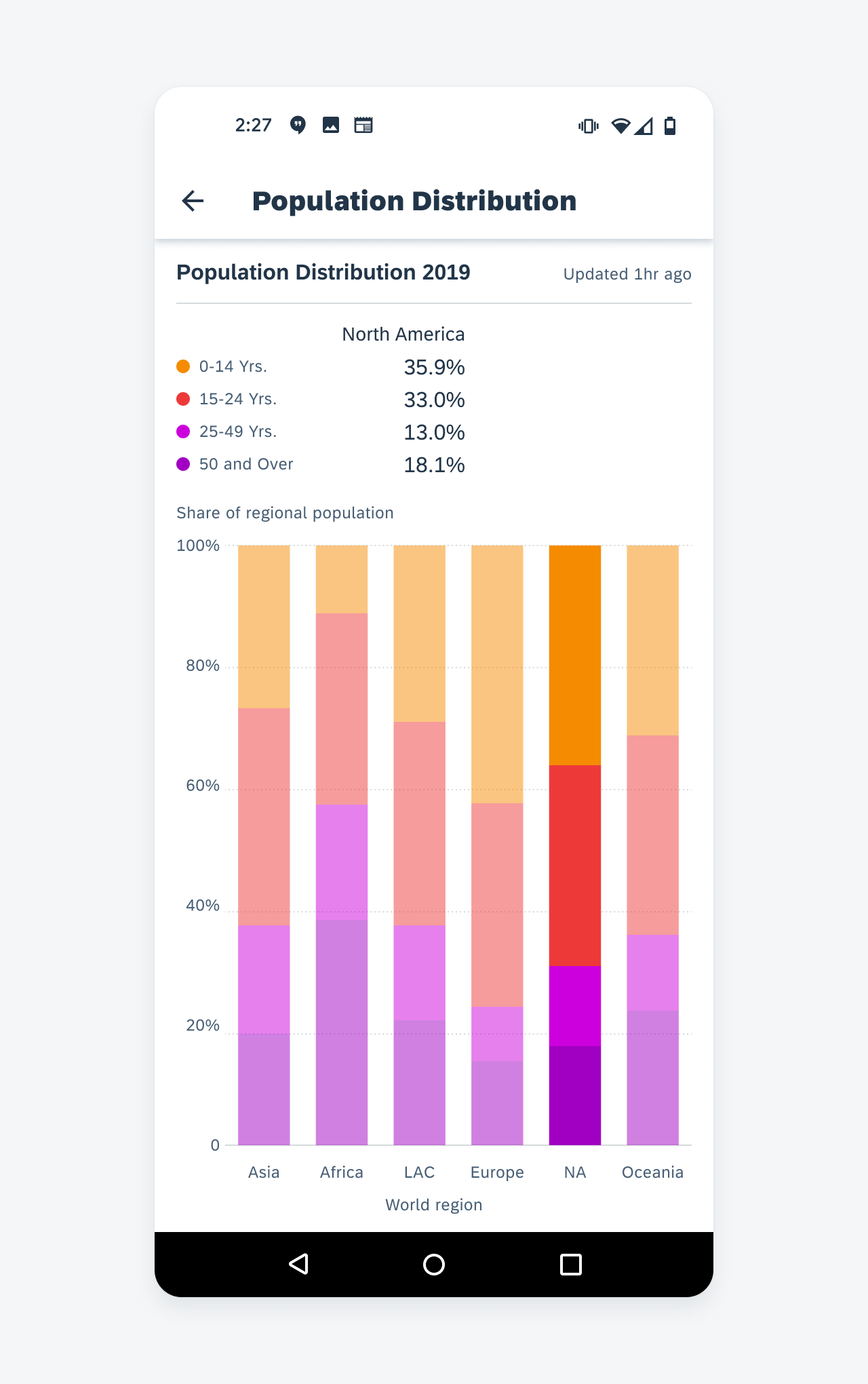
100% stacked column chart
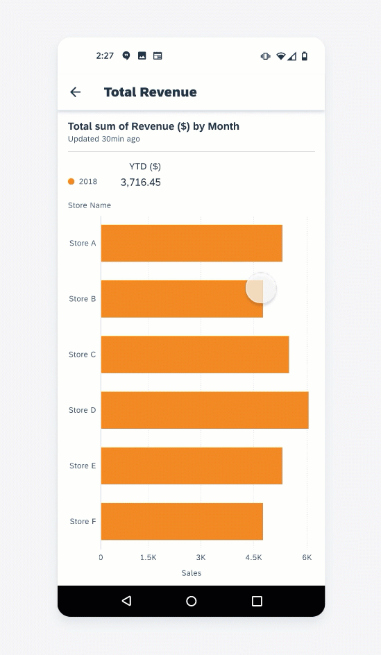
Horizontal Bar Chart
A horizontal bar chart uses horizontal bars to express the value of a variable. Much like the column chart, horizontal bar chart’s bar length represents the value of the data point based on the scale of the x-axis. Data in a horizontal bar chart can be sorted from the highest to the lowest value and vice versa. Up to four series of data are supported.
- Use it to compare the differences between nominal variables and to sort data in a way that is meaningful for the user.
- Use it as an alternative for sequential data whose y-axis label width is too long for column chart.
- Make sure that the chart plot remains above the fold to prevent the user from vertically scrolling to see the x-axis.
Don’t use it for negative values in horizontal bar chart. Column chart is better suited for that.
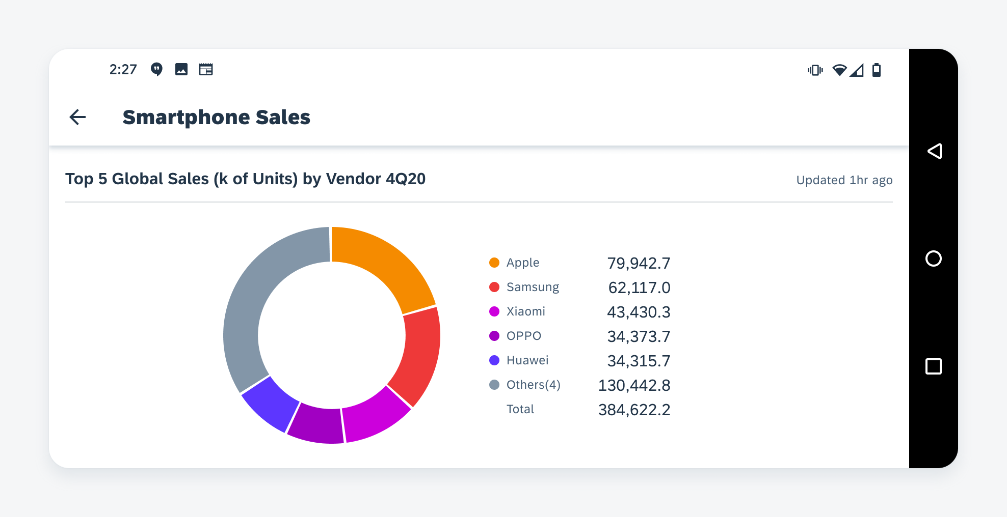
Donut Chart
Donut charts are best used to show proportions of categorical data for a part-to-whole analysis. A donut chart takes one data set and visualizes the ratio of the data in a circular form. The arc length of each segment represents the proportion of each category, while the full circle represents the sum (equal to 100%). We recommend showing both the actual value and the percentage of each category for easy comparison, though the actual choice depends on the data type and context.
A donut chart follows the same layout as other chart types: the legend and summary at the top and the chart at the bottom. However, there is one exception: when the screen is in landscape orientation, the donut chart should be displayed on the right with the legend and summary on the left to better utilize the space.
Donut chart in landscape
- Limit the number of categories in one donut chart. We recommend having no more than eight segments in one chart. Focus on the categories with the biggest values, while grouping the rest of the data points into the “Others” category. Use a column chart or horizontal bar chart instead of showing all data points is important.
- Rank the data from largest to smallest (with the “Others” group at the end) and display them clockwise for easier data consumption. Do with caution: you can choose a different order if the sequence of categories has a semantic meaning, for example, Strongly Agree, Agree, Neutral, Disagree, Strongly Disagree.
Don’t use multiple donut charts for one dataset to show trends over time or compare proportions across different areas. It is difficult to compare between two donut charts and it takes up too much screen space. Use a 100% stack column chart instead.
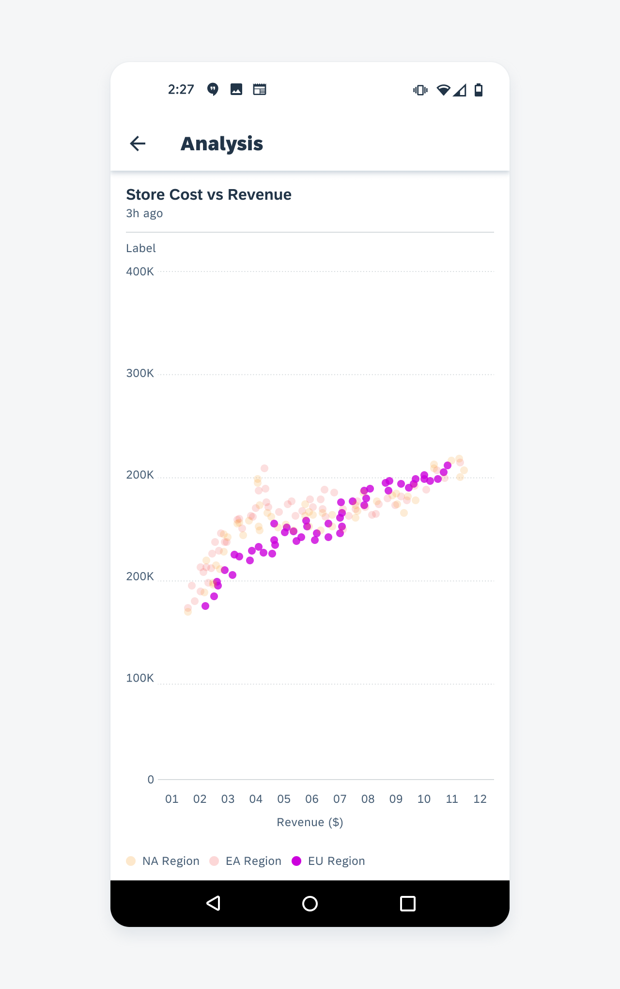
Scatter Chart
Scatter chart is a collection of points where each point represents two values from two variables. Scatter charts show the correlation between these two variables to convey a trend.
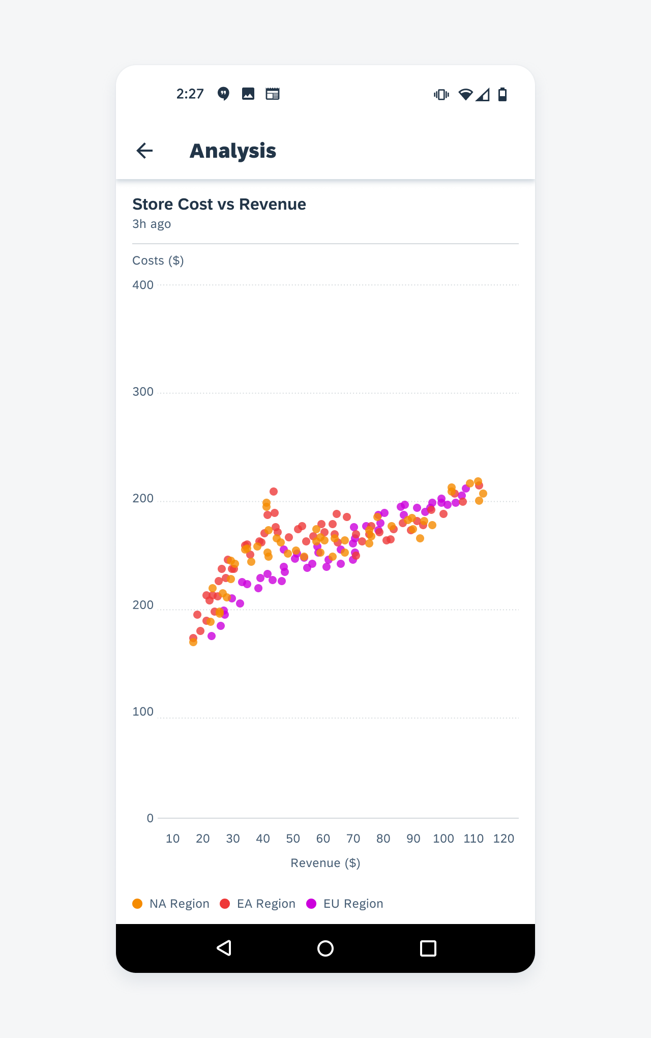
Scatter chart
- Do use to view the correlation between two variables. If there are more than two variables, use a bubble chart instead.
- Do use to visualize many data points to view a trend. A large data set will provide a clearly defined trend.
Don’t use to visualize chronological or continuous data. Use a line chart or bar chart instead.
Behavior and Interaction
Horizontal Bar Chart
Single Selection
Users can tap on a horizontal bar to view the exact value of the selected data point in the summary section. All other bars will fade when one data set is selected. Tap on the selected data set again to deselect.
Vertical Scroll
Due to the limited screen size of mobile devices, users can vertically scroll to reveal the horizontal bars found below the chart plot fold.
Single-selecting horizontal bar chart
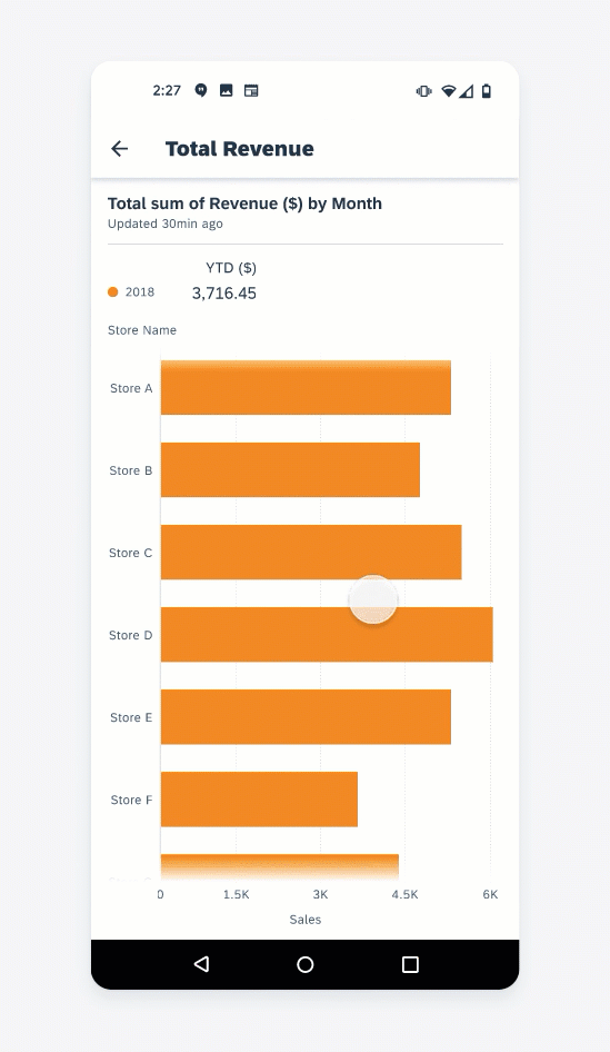
Vertical scrolling in a horizontal bar chart
Label Expansion
Labels can take up the majority of the screen real estate however if the y-label is at its maximum, users can tap on the y-axis labels to further expand and reveal the entirety of the labels.
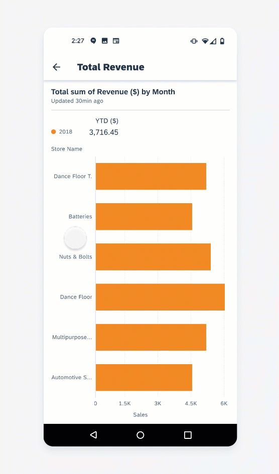
Label expansion in a horizontal bar chart
Line Chart
The line chart allows user to select a single point or a range of points by tapping and dragging.
Selection
When the user selects an item in the chart plot, the ruler indicates the selections’ position on the x-axis. To reposition ruler, the user drags accordingly to move to another point.
Multi Selection
Users can select a data range by tapping and holding with one finger and subsequently tapping another point on the chart plot. Users can also perform this interaction by tapping on the chart plot with both fingers at the same time. While holding the position, users can adjust the data range by sliding their fingers across the chart plot. Doing so, the data will be updated on the summary section in response to the user’s input.
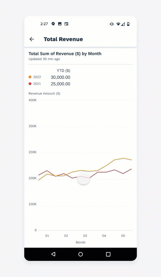
Single selecting in a line chart
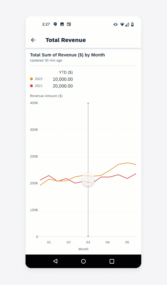
Multi-selecting in a line chart
Column Chart
Selection
User can tap on a column (or a cluster of columns for multi-series) to view the exact value of selected data point(s) in the summary section. All other columns will fade out when one data set is selected. Tap on the selected data set again to deselect.
Horizontal Scroll
Due to the limited screen size of mobile devices, we limit the number of columns displayed on one screen, so the text labels and columns are legible.
Single selecting in a column chart
Horizontal scrolling in a column chart
On mobile devices, the limit for one-series data is 12 columns. For more than 12 data points, the first 12.5 columns will be shown, and user can scroll horizontally to see the rest of data points. A gradient at the end of chart plot area indicates users can scroll to see more columns.
For multi-series data set on mobile, the limit is 6 clusters of columns. The horizontal scroll starts at the middle of the seventh data point. The limit doubles on tablet devices (24 for one-series, 12 for multi-series).
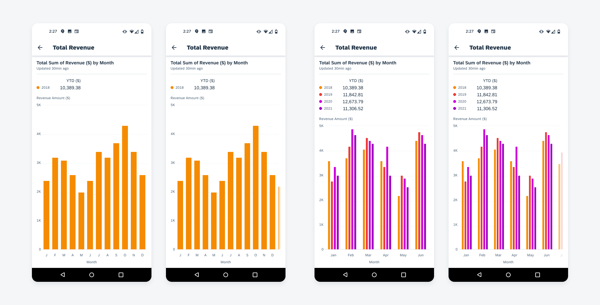
Default column chart (left), scrolled column chart (right)
Donut Chart
Selection
Each segment of the donut chart is interactive. The user can tap on one segment to select and tap again to deselect. The selected segment will be highlighted, while unselected ones are faded out. The user can select one or more segments in one donut chart. The value of selected segments will be shown in the summary area and the total value will be updated to reflect the total of selected segments.
Clear Selection
At any point in time, the user can tap outside the donut chart area (not in the legend and summary area) to clear the selection. This will bring the donut chart to the default state where all values are displayed in the summary area and no segments are selected.
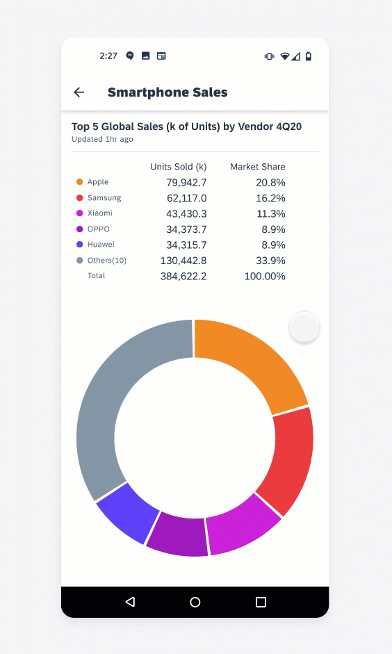
Single selection in a donut chart
Clearing a selection in a donut chart
Scatter Chart
Selection
Users can tap on a point to view the exact value of that selection in a popover. All other points will fade when one selection is made. Tap on the selected point again to deselect.
Focus
If a scatter chart has multiple series, the user can tap on the legend to focus on one series. During this focus mode, the user will only be able to select data points within that series.
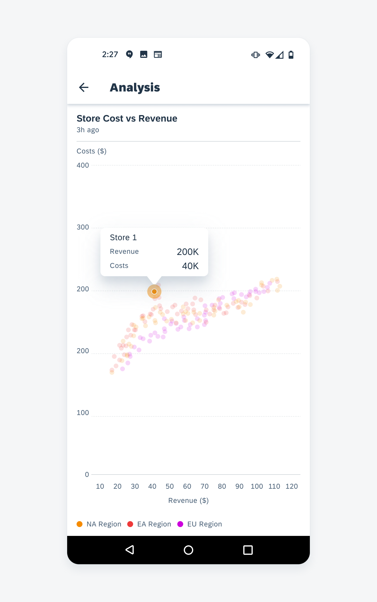
Selecting a point in scatter chart
Tapping on a legend item focuses on a series
Resources
Development: LineChart, ColumnChart(including stacked), HorizontalBarChart, ScatterChart, DonutChart
SAP Fiori for iOS: Chart Types
 Your feedback has been sent to the SAP Fiori design team.