
Chart Types
FUIChartFloorplanView
Intro
SAP Fiori for iOS supports multiple chart types. Depending on the type of data in your app and how users will use the chart, it is important to select a chart type that will best meet users’ needs.
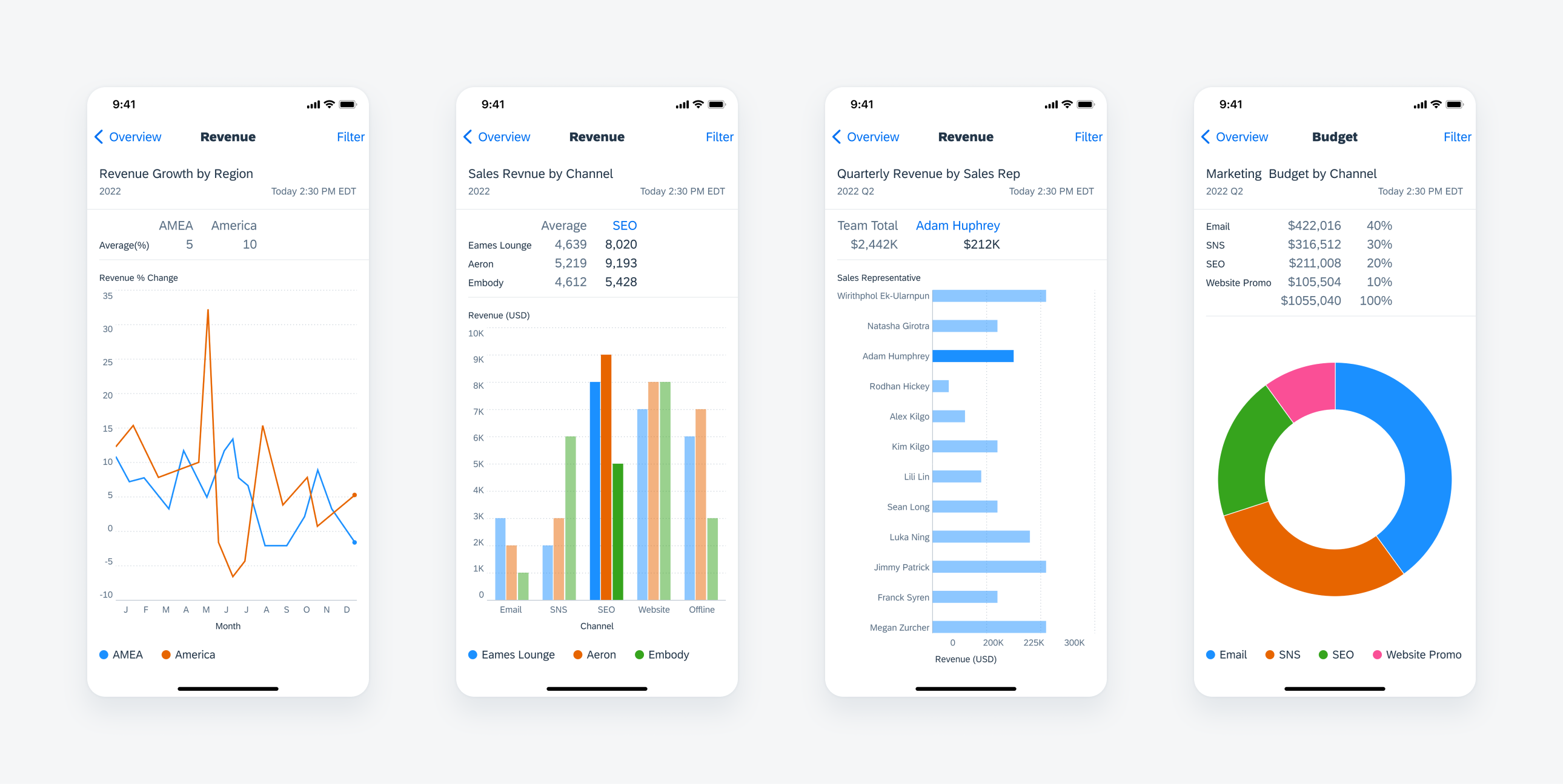
From left to right: line chart, column chart, horizontal bar chart, and donut chart floorplans in compact mode
Horizontal Bar Chart
The horizontal bar chart displays horizontal bars aligned to the y-axis. The bars are used to represent discrete quantities or amounts.
Compared with column charts, horizontal bar charts have more space available for their item labels so they’re great for visualizing discrete values when data labels are long, for example, for product names.
- Use to represent measurements for discrete items.
- Use for items that have long label names, because the y-axis labels can expand.
Don’t use horizontal bar charts to display time-based data, because time values are usually demarcated from left-to-right along the x-axis, but here the x-axis is used to show the value of each chart item.
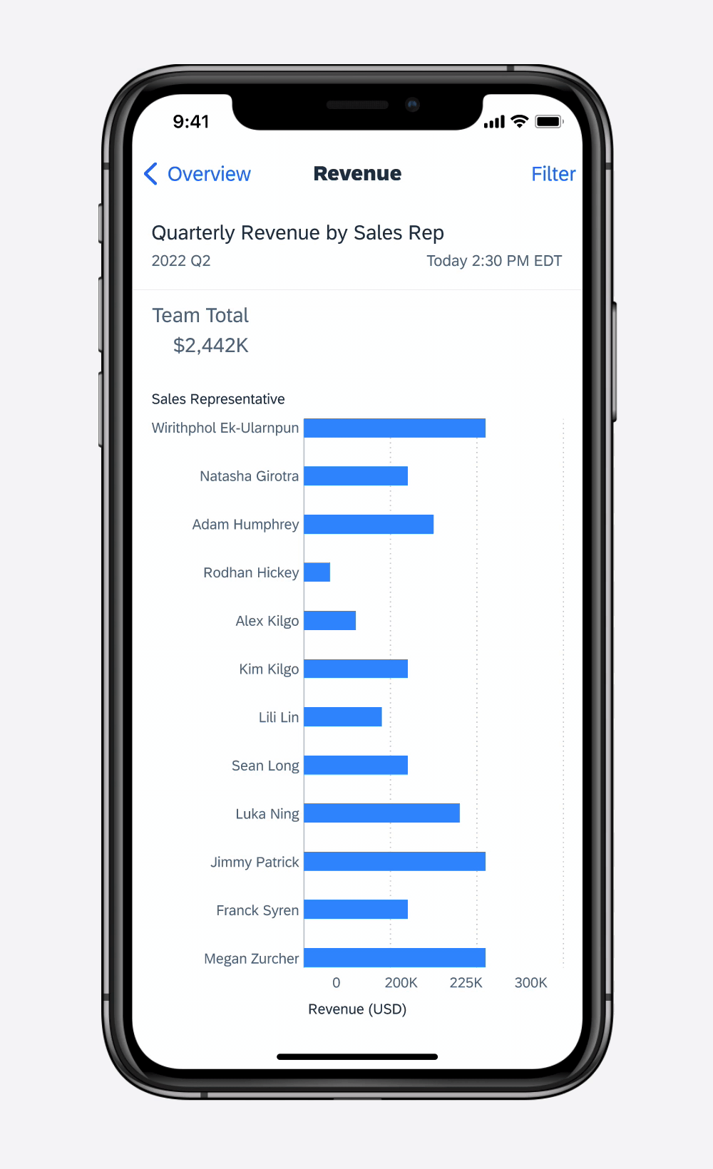
Horizontal bar chart
Column Chart
Column charts use vertical bars to represent quantities and amounts. With their side-by-side arrangement of columns, they can be used to illustrate changes in values over time. The horizontal spacing between each column or cluster serves to reinforce the distinctness of each chart item or group. Please note that the y-axis baseline always starts at 0, with positive values appearing above and negative values below.
- Use for comparing values from non-time series datasets.
- Can be used instead of a line chart for time series data when it is either more important to see the value of each item than the overall shape of the data or the dataset is missing values, which would create gaps in a line chart.
- Don’t use with extremely large data sets, because the columns will be too narrow to accurately differentiate or easily select; use a line chart instead.
- Don’t use when the x-axis labels become truncated; use a horizontal bar chart instead (only for non-time series datasets).
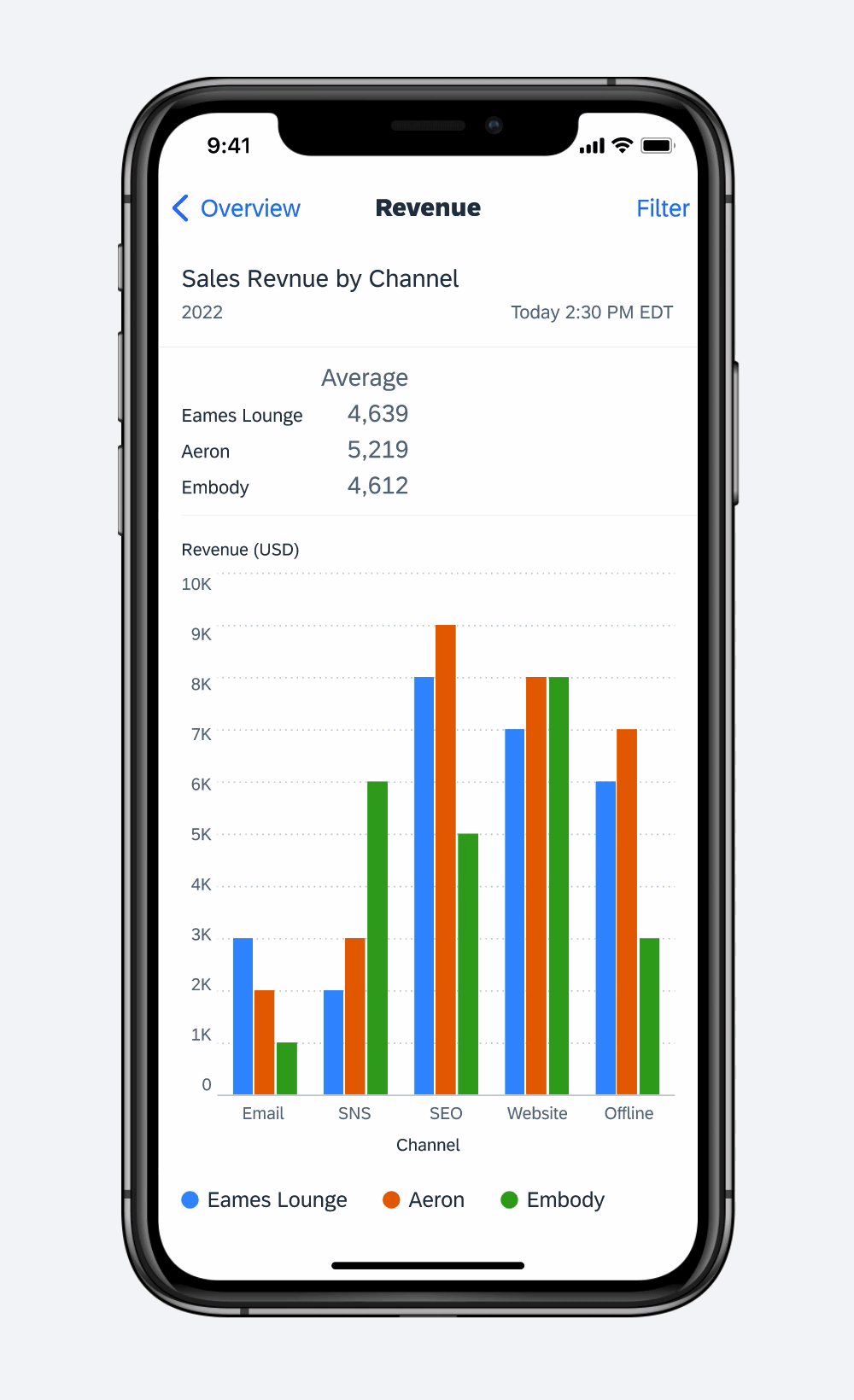
3 series column chart
Stacked Column Chart
The stacked column chart is an extension of the column chart, and is great for showing the total of a group as well as the different categories within the whole that make up the total. This chart works well when the focus of the chart is to compare the totals and one part, or category, of the total.
Single Selection
There are two selection variations for the stacked column chart. Single selection is where a single column can be selected as a whole to view the total sum along with the total of each category.

Three-series stacked column chart
Series Selection
This variation allows for one category, or series, of the column to be selected and compared. App teams should select which option works best for their data set and use case.
- Use when it is important to compare individual groups that are part of a whole.
- Use to show how a larger category is divided into smaller categories and what the relationship of each part has on the total amount.
- Don’t use with large data sets, because the categories within the column will be too small to effectively see the patterns in the data.
- Don’t use this chart when you can have negative values as there is no way to show negative spaces in a positive column.
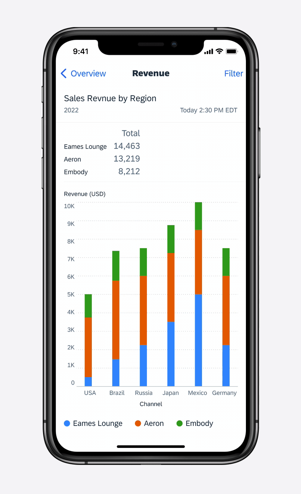
3 series stacked column chart
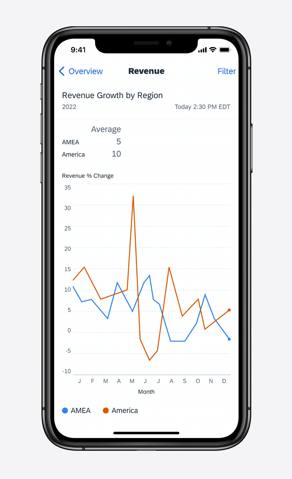
Line Chart
Line charts use straight lines connecting points plotted in 2-D space to represent data and trends. They are useful for showing the change in values (continuous or discrete) over time.
Use to display a trend in the data, because the connections between the data points provides an overall shape to the dataset.
- Don’t use for data sets when the values along the x-axis are unrelated, because the line may imply a trend that does not exist.
- Don’t use when the dataset is missing several values, because breaks will appear in the line; use a column chart instead.
2 series line chart
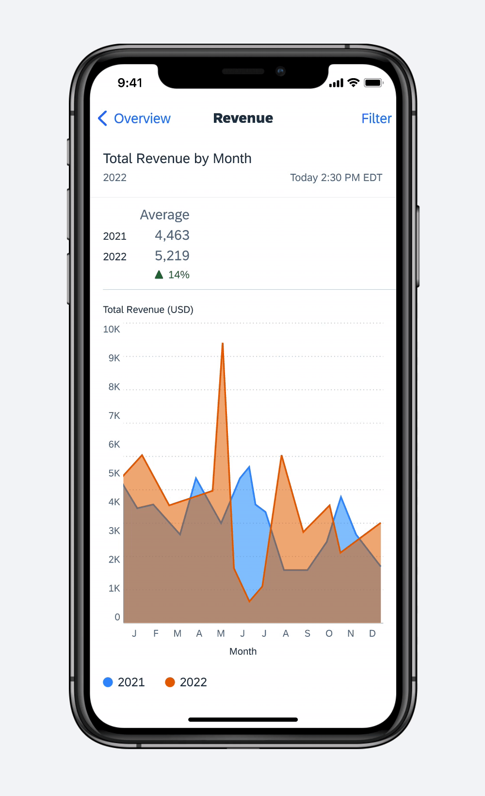
Area Charts
Area charts depict data and trends with straight lines connecting points plotted in 2D space, and emphasize volume with color filled in the space between the lines and the axis. They can be used for highlighting changes on volume of data over time.
Use to display and emphasize quantitative progression over time.
- Don’t use when x-axis data and y-axis data are unrelated.
- Don’t use when there are values missing in your data set. It will cause breaks in the area chart; use a column chart instead.
2 series area chart
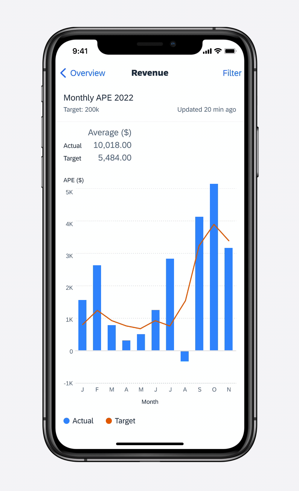
Combination Charts
Combination (or “combo”) charts are a combination of column and line charts. They can be used to display changes in discrete values over time compared to a measurement such as a mean, target, or expected value.
- Use when it is important to directly compare two different series that use the same measure (y-axis). A two-series column or horizontal bar chart can also be used, depending on the dataset.
- Because combo charts rely on line charts, the dataset should either be a time series or involve the ranking of items.
Don’t use for data sets when the values along the x-axis are unrelated, because the line chart may imply a trend that does not exist.
Combination chart
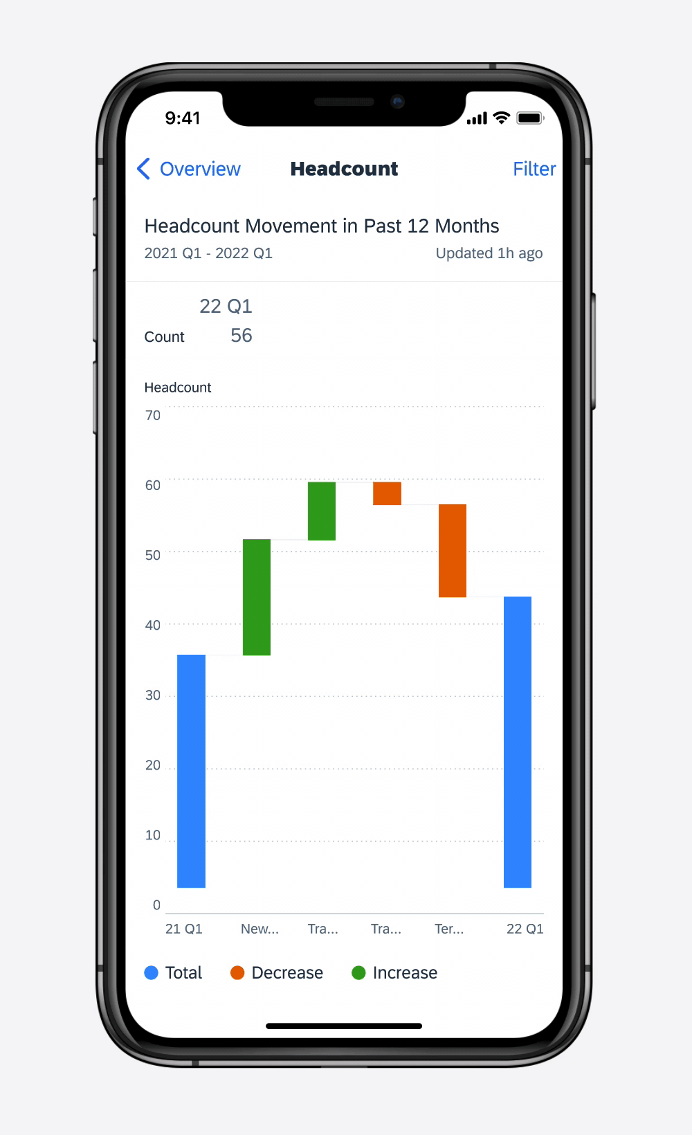
Waterfall Chart
A waterfall chart uses columns to visualize the cumulative effect of increases and decreases of a set of data. The height and color of the columns are determined by the values. The value is displayed by selecting a single column. The legend of a waterfall chart always displays the corresponding colors to indicate an increase, decrease or total.
-
Use to display a sequential data set.
-
Use contrasting colors to highlight differences in values.
Waterfall chart
Scatter Chart
Scatter charts have a specific purpose. They allow you to show the correlation and relationship between two variables. The data visualization uses dots to represent the values obtained for two different variables, x and y, and shows how much one variable is affected by another. It is used to show trends. Additional colors of the dots allow you to add a third dimension or series to the plot.
Series Selection
If there are multiple series, users can select one series by tapping on the corresponding item in the legend. The series they have selected is displayed as the most prominent in the plot area.
Data Point Selection
If users want to see the x and y values for one single data point variable, they can tap on a point. A vertical and horizontal guide appears allowing them to slide their finger from point to point. Their values are reflected in the summary section.
Use this chart when you need to show a correlation between two variables.
Don’t use a scatter chart if the variables do not have a direct relationship with each other.
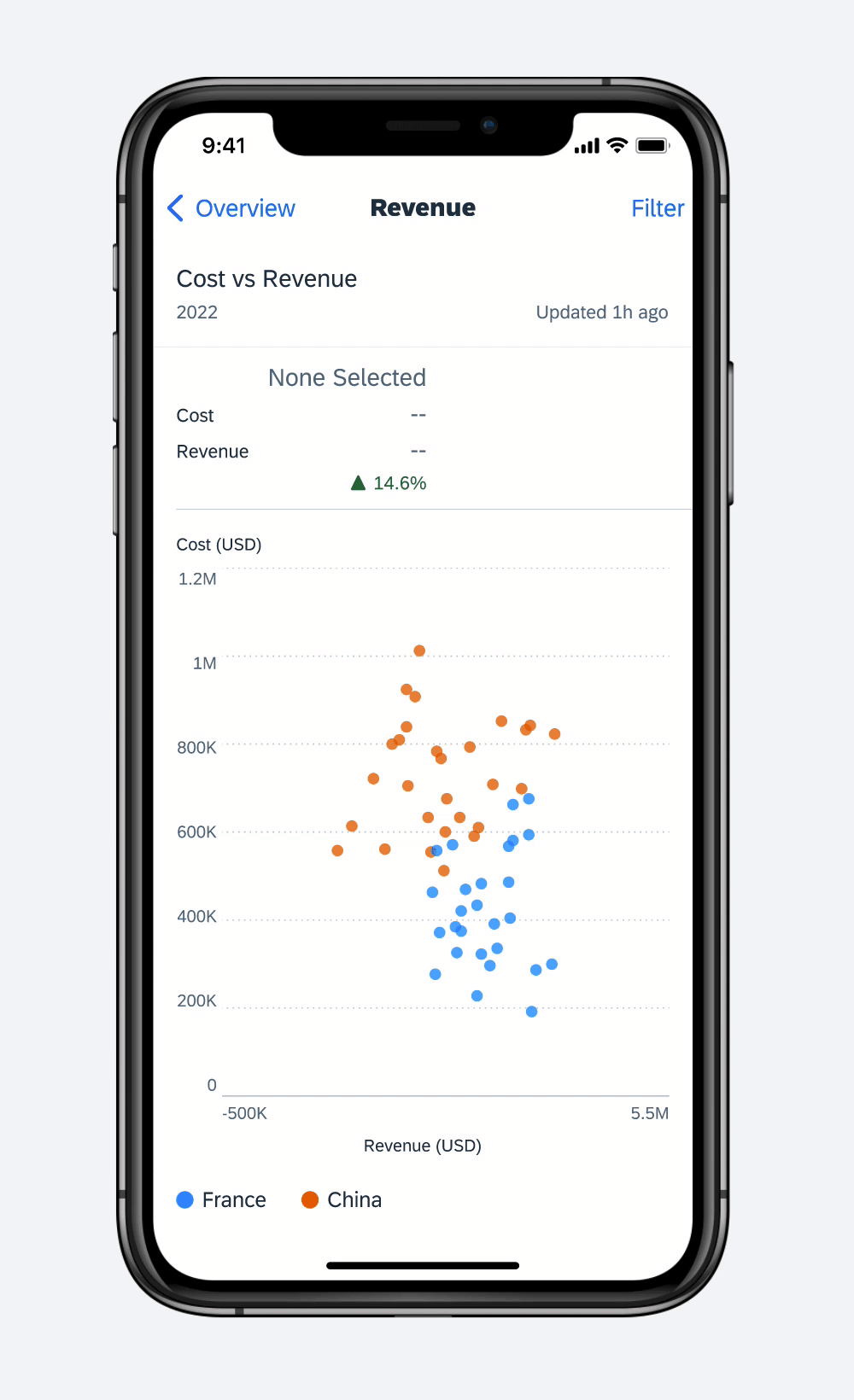
Scatter chart
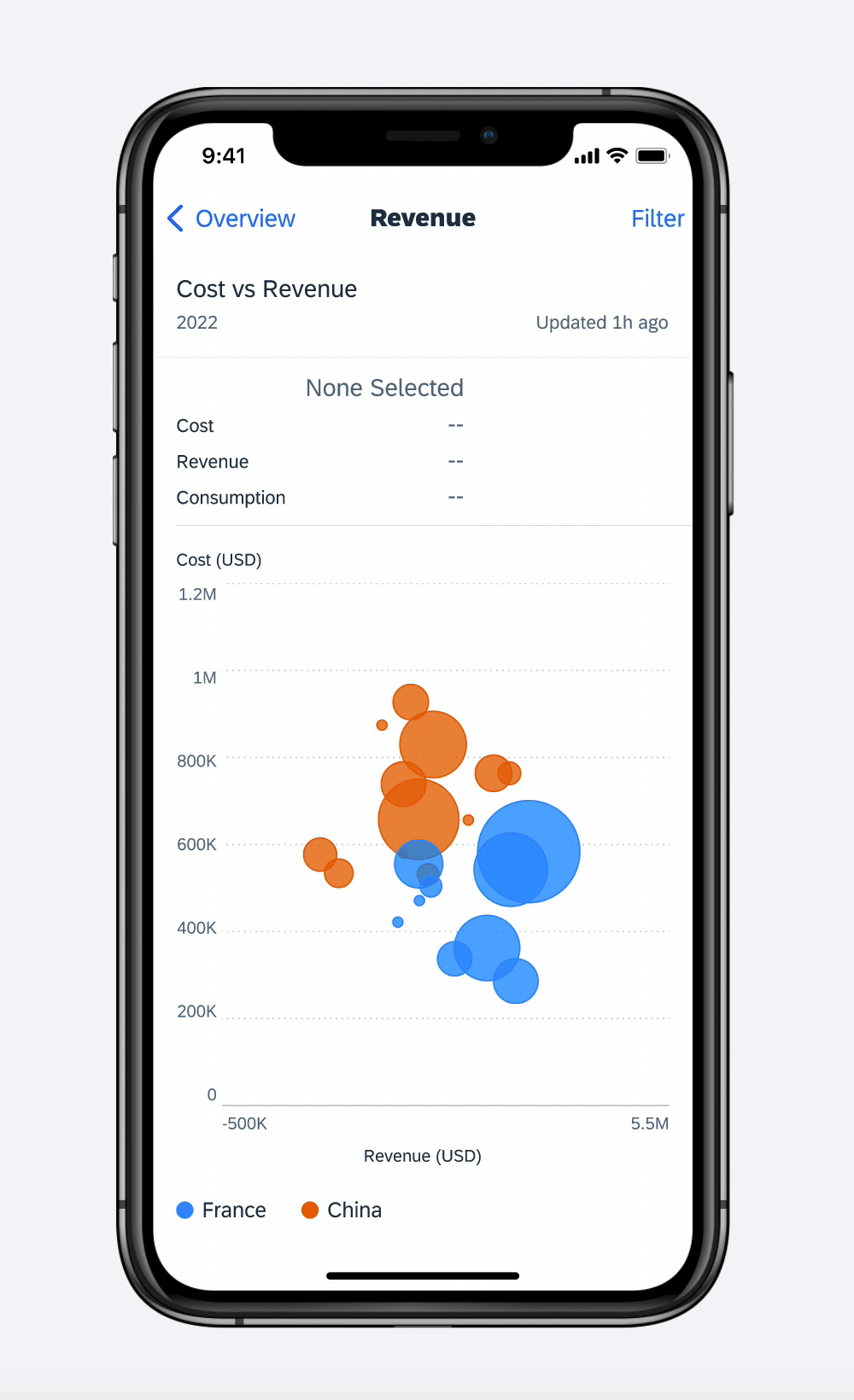
Bubble Chart
Bubble charts are similar to scatter charts in that they show correlation between data but they add a third dimension which is visualized by the size of the circle. Both the scatter and bubble charts are useful when showing trends, clusters, patterns, and relationships. Additional colors of the circles allow you to add a fourth dimension or series to the plot.
Series Selection
When there are multiple series, users can isolate and view a single series by tapping on the series in the legend. The series they have selected is displayed as the most prominent in the plot area.
Data Point Selection
Like the scatter chart, users can select one single data point (circle) by tapping directly on it. A vertical and horizontal guide appears allowing them to slide their finger from point to point. Their values are reflected in the summary section.
- Use this chart when you need to show a correlation between the variables in your data set.
- Size bubbles appropriately by scaling the size of the bubble by area and not diameter.
- Avoid using odd shapes.
- Avoid too many sizes in a plot as it may look chaotic.
Bubble chart
Stock Charts
Stock charts are similar to line charts in that they show trends of data with straight lines connecting points. To provide complete information to users, we recommend not omitting any essential data when designing a stock chart.
A stock chart is interactive. A user can tap and slide their finger on the trend line to see how prices change over time.
Ticker Name
A ticker name identifies the company on the stock exchange.
Current Trading Price (Spot Price)
The value of the stock at this moment in time.
Open/High/Low/Close (OHLC)
- Open: The value of the stock at market open
- High: The stock’s highest value during the day’s trading session
- Low: The stock’s lowest value during the day’s trading session
- Close: The final price
Volume
The number of shares traded during the day’s trading session.
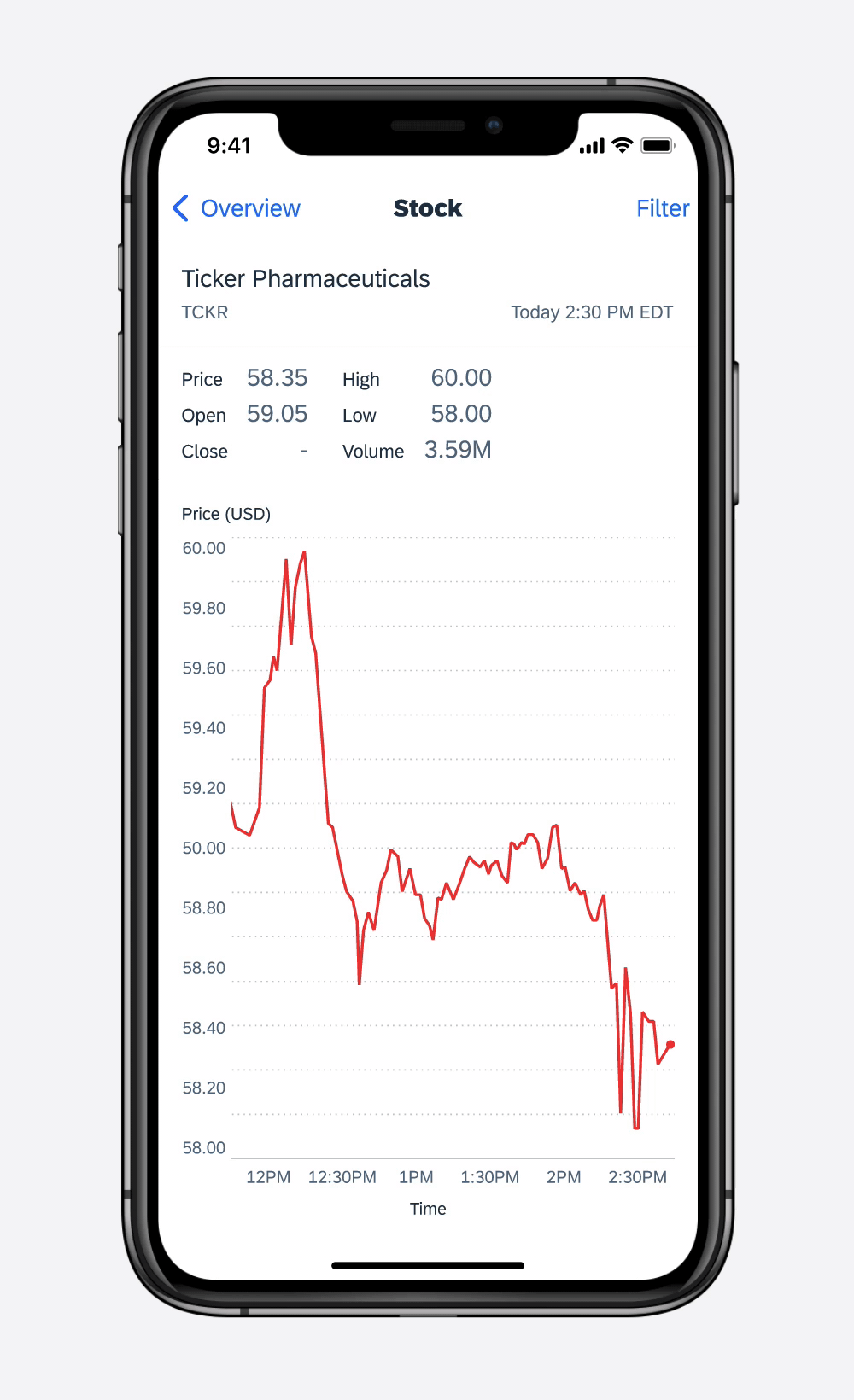
Stock chart
Donut Chart
Donut charts are ideal for a part-to-whole data analysis. A donut chart shows how a total amount is divided between levels of a categorical variable as a circle divided into radial segments.
Chart segments are interactive. A user can select one or multiple segments by tapping them to see the percentage and metric value of the selected segments.
- Use a unique color for each segment.
- Sort segments from the largest segment to the smallest segment in the clockwise direction. However, when the segment labels have an inherent ordering, then plotting the segments in that order. e.g. Strongly Agree, Agree, Disagree, Strongly Disagree
Avoid using more than five segments. A donut chart becomes difficult to understand when there are many segments.
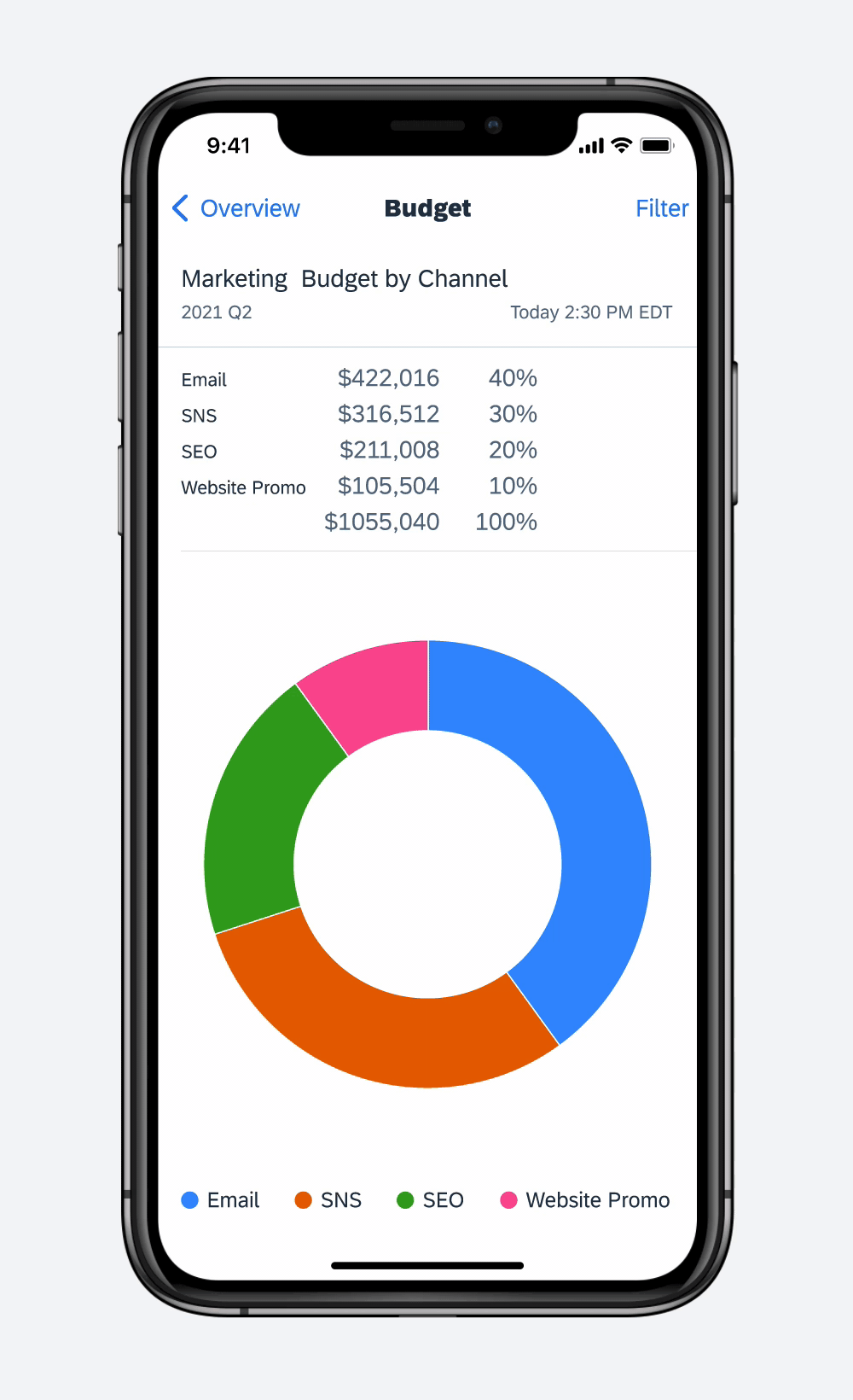
Donut chart
Development: FUIChartFloorplanView
SAP Fiori for Android: Chart Types
Related Components/Patterns: Chart Overview
 Your feedback has been sent to the SAP Fiori design team.