
List Picker Form Cell
List Picker, Fiori: GenericListPickerFormCell
Intro
The list picker form cell allows for the selection of one or more options among values within a defined category. It serves as the entry point to a list of available values for that category and summarizes the selected value.
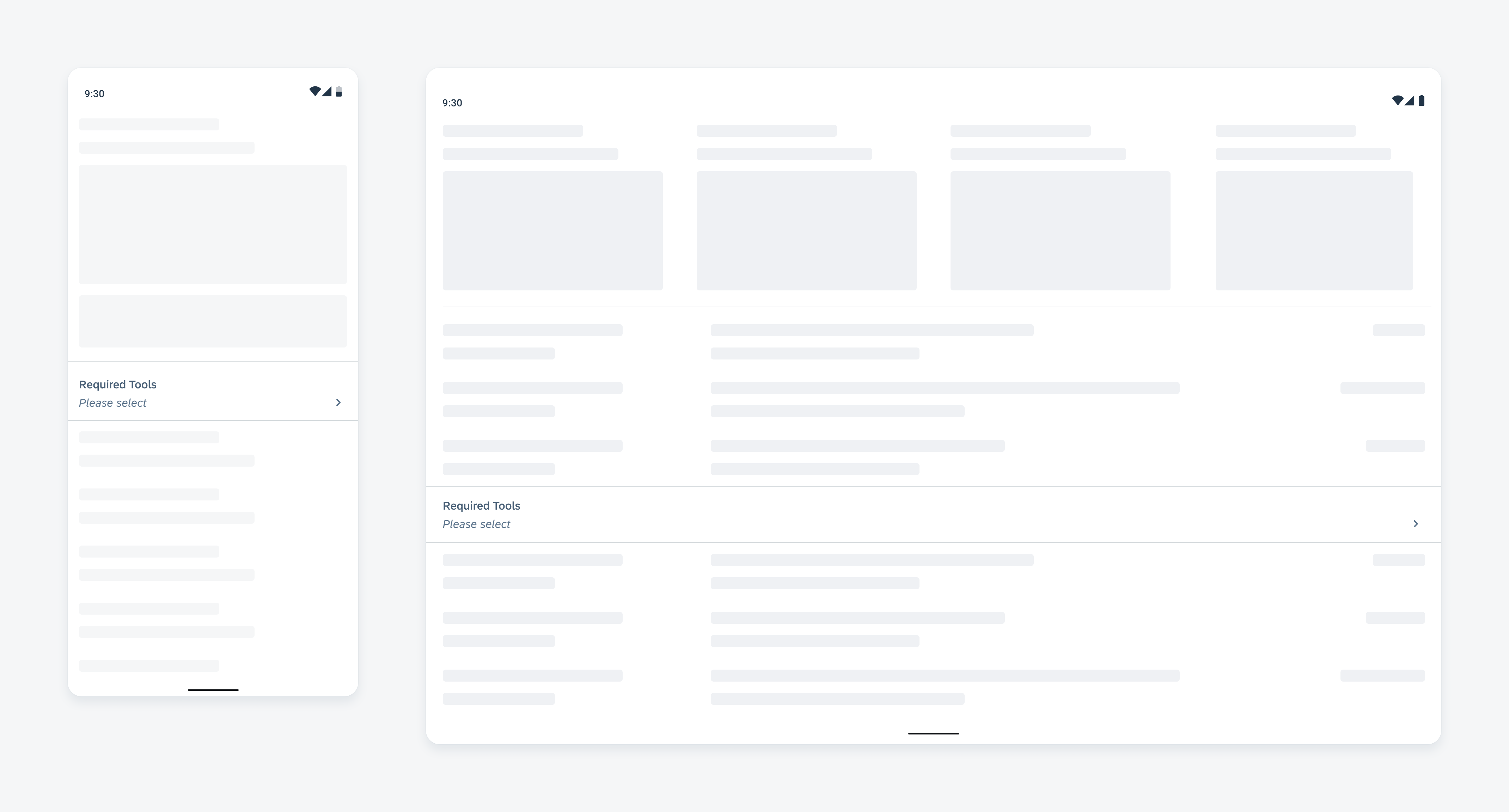
List picker form cell on a compact (left) and expanded screen (right)
Usage
- Use a list picker form cell when the size and nature of available options are unknown or dynamic, for example, data from a database.
- Use a list picker form cell when the available options have or can be displayed with a consistent structure, for example, text or object cells.
- Don’t use the list picker form cell for boolean options (e.g., true/false or yes/no), use the switch instead.
- Don’t use a list picker if the selection requires complex input, for example, entering text, manipulating sliders, or interacting with multiple elements simultaneously.
Anatomy
List Picker Form Cell
A. Label
The label defines the topic or the name of the list.
B. Selected Values
This area shows an overview of the selected values. When it’s empty, the area could display prompt text.
C. Helper Text (Optional)
The helper text provides additional information about the selection, such as hints, requirements, etc.
D. Chevron Button
The chevron button indicates the tapping and drilling-down capability of the form cell.
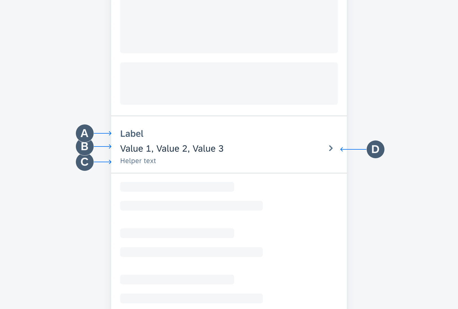
List picker form cell anatomy
List Picker Selection View
A. Value Lists
The value list displays a list of items within a specific category. Each value list contains a section header, an optional button, and list items.
B. Section Header
The section header describes all values within the grouped list and gives users the ability to select or deselect all values at once. The title, button label, and button functionality can be customized based on users’ needs.
C. “Close” Button
The “Close” button discards the changes and quits the selection view.
D. Reset & Search (Optional)
The search function helps the user quickly find a specific value from the list. The reset button can revert the selection to a default state.
E. Anchor Button
The anchor button appears in the selection view during scrolling and floats over the value list. It can take users back to the top of the list.
This feature is applicable to multi-select only.
F. Prompt Text (Optional)
The prompt text is a short and brief instruction for users.
G. “Apply” Button
The “Apply” button saves a user’s selection to the list picker form cell. It’s optional for the single-select list picker.
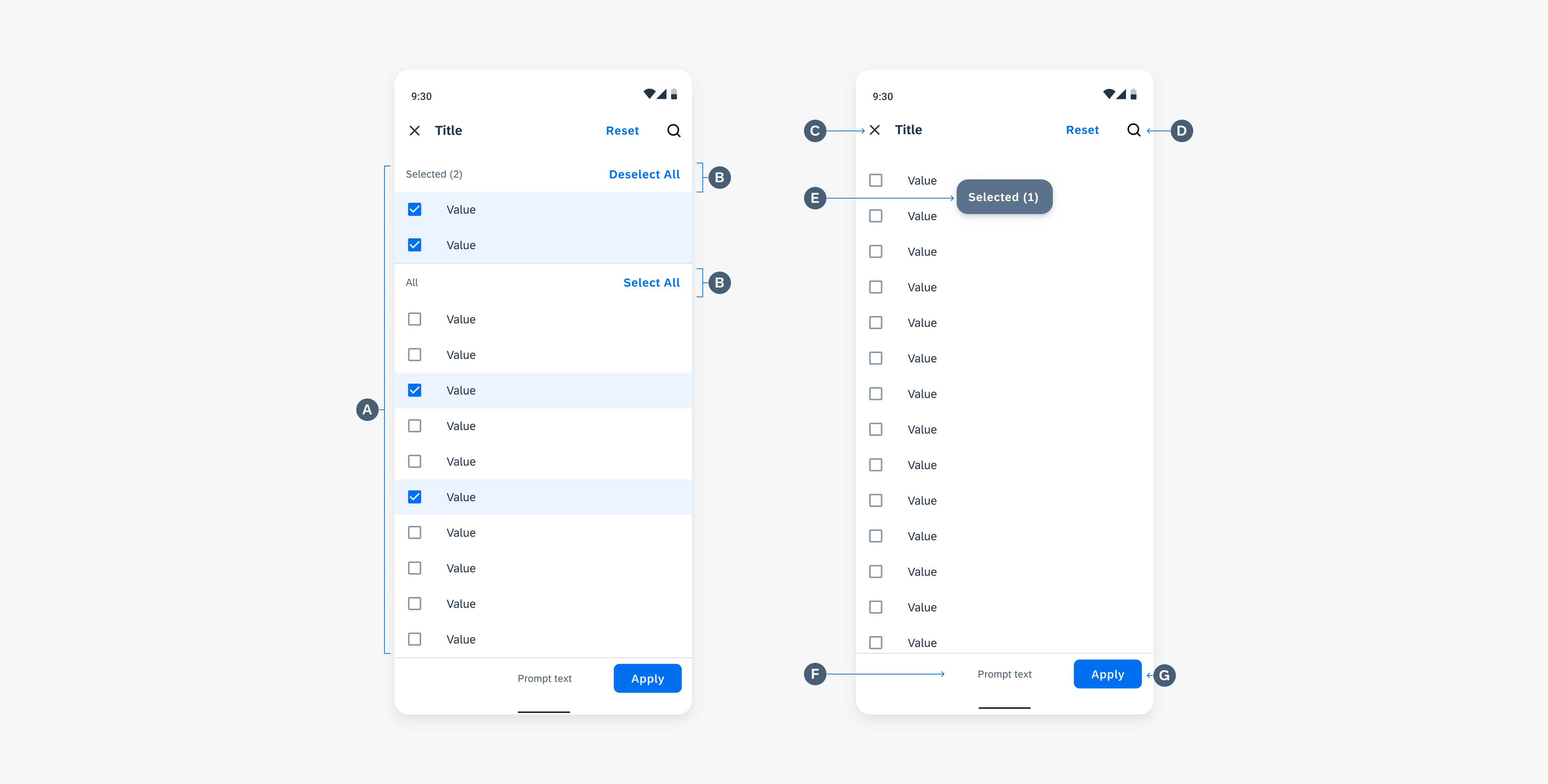
List picker selection view anatomy
Behavior and Interaction
Select and Apply
To select and apply values from a list, users can tap on the list picker form cell and drill down to the list picker selection view, where they can tap on values to select or deselect them.
- If the value list is long, users can scroll down and view more options in the expanded bottom sheet.
- To quickly review their selections, users can use the anchor button to go back to the top.
Once users have made their selections, they can save the changes by tapping the “Apply” button. The selected values are displayed in the list picker form cell, giving users an overview of their selection.

Interaction of selecting and applying values
Discard Changes
Users may exit the selection view by tapping on the “Close” button. To prevent users from accidentally losing their changes, consider adding an additional confirmation dialog.
Please refer to List Picker Detailed User Flow to learn more about the existing options and behaviors.

Interaction of discarding changes
Validation Message
Use a validation message only when necessary, such as to warn users that input fields must not be empty. Avoid providing users with irrelevant or unimportant information that may distract them. For page-level feedback, use a snackbar instead.
The validation message should be concise. We recommend using one line of text only.
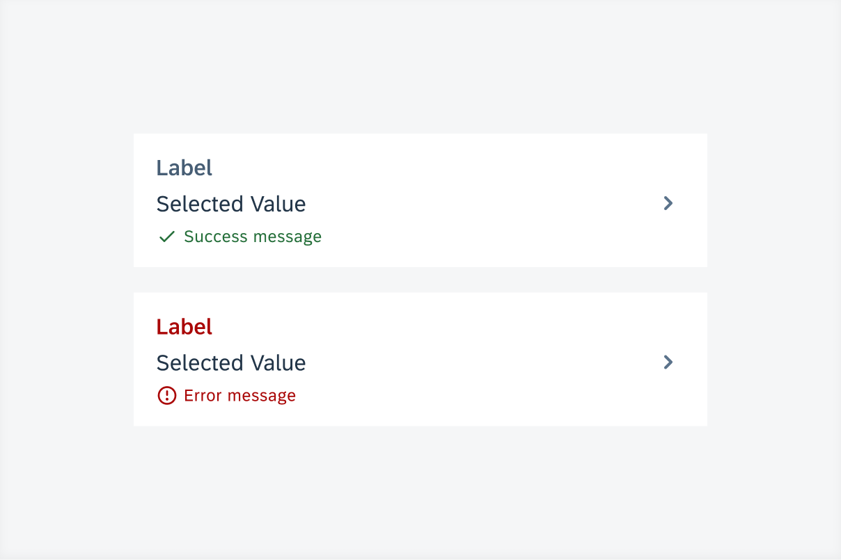
List picker form cell with success message (top) and error message (bottom)
Variations
Selection Type
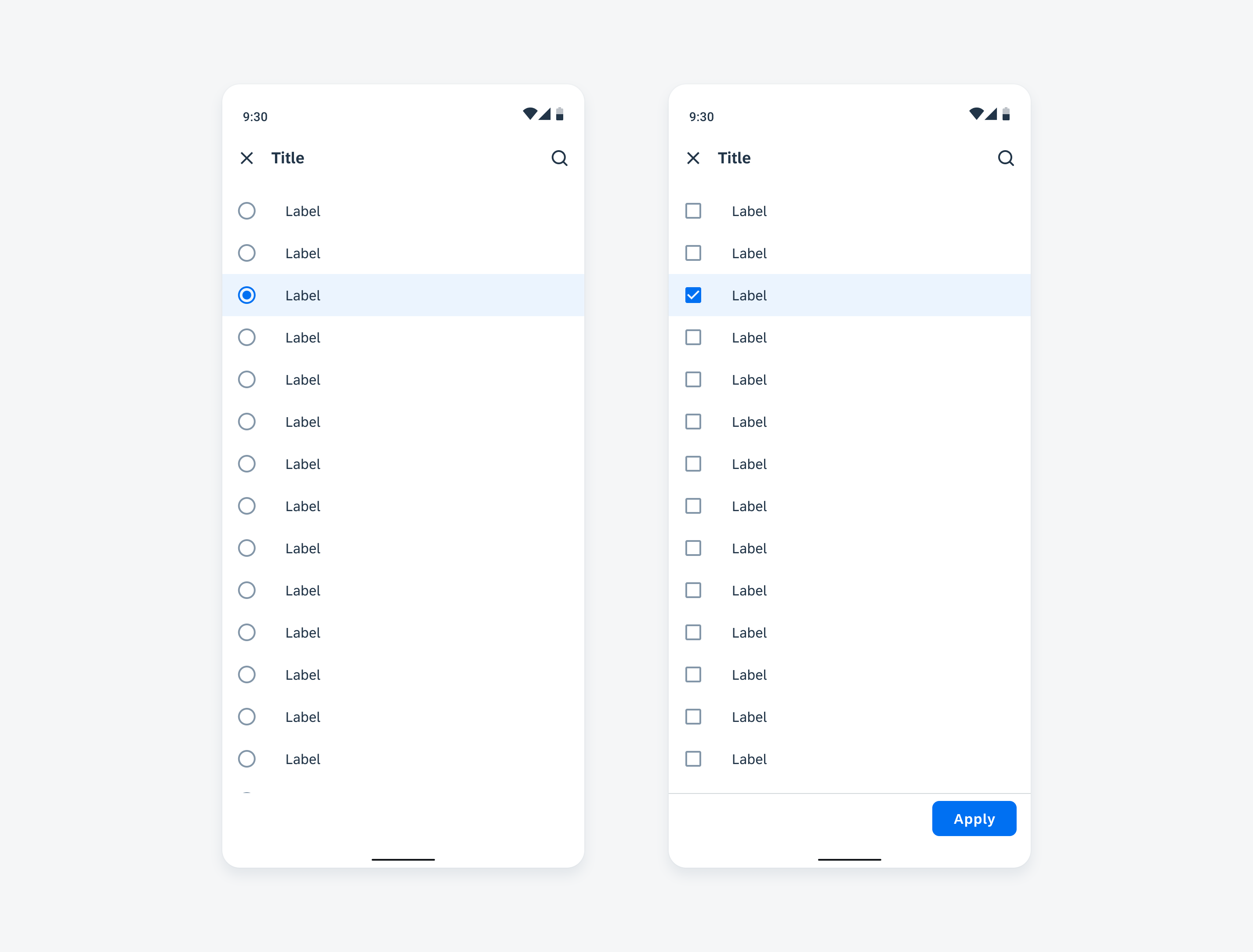
The list of values can be either single-select (radio buttons) or multi-select (checkboxes).
Single Selection
To enable rapid selection, consider hiding the “Apply” button.
Multi-Selection
To display all selected values, consider enabling the “Selected Value” list.
Single selection without “Apply” button (left) and multi-selection without “Selected Value” list (right)
Value Type
Text Value
Text value is a common type of data to be displayed in the list.
By default, the text is displayed on the right side of the selection control and can be wrapped in several lines.
Custom Contents
Users can insert self-defined contents such as the object cell and contact cells into a list picker item when additional information is needed to be shown.
When displaying object cells in a list, make sure the layout is simple to make the checkbox / radio buttons prominent.
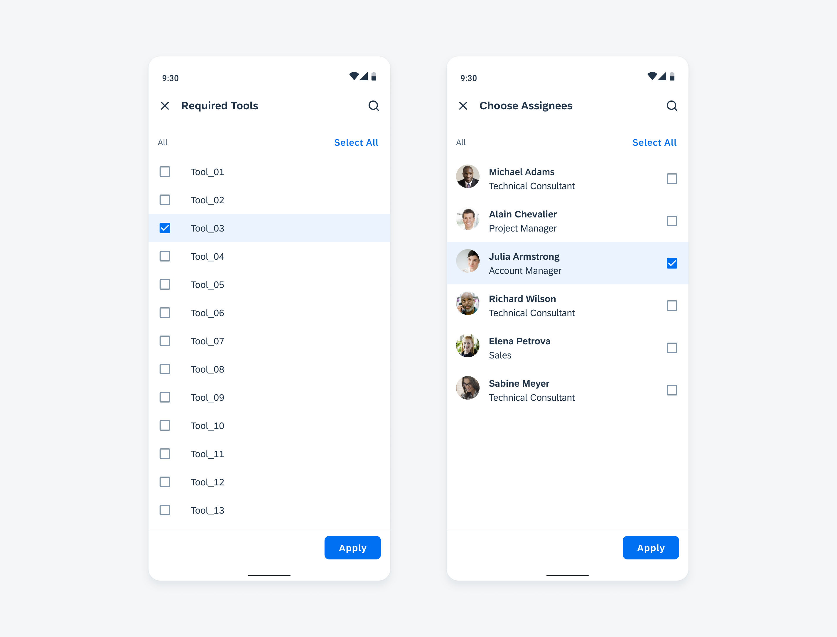
Multi-selection in text format (left) and in object cell format (right)
Value List
In a list picker, there could be one or multiple value lists. The section header and button are customizable based on product needs. For multi-selection, there are two default value lists:
- “Selected” Value List (Optional): The “Selected” value list summarizes the values that have been selected and appears at the top of the list. Users can deselect all values at once by tapping the “Deselect All” button.
- “All” Value List: The “All” value list contains all available values inside the list picker. Users can select all values at once by tapping the “Select All” button.
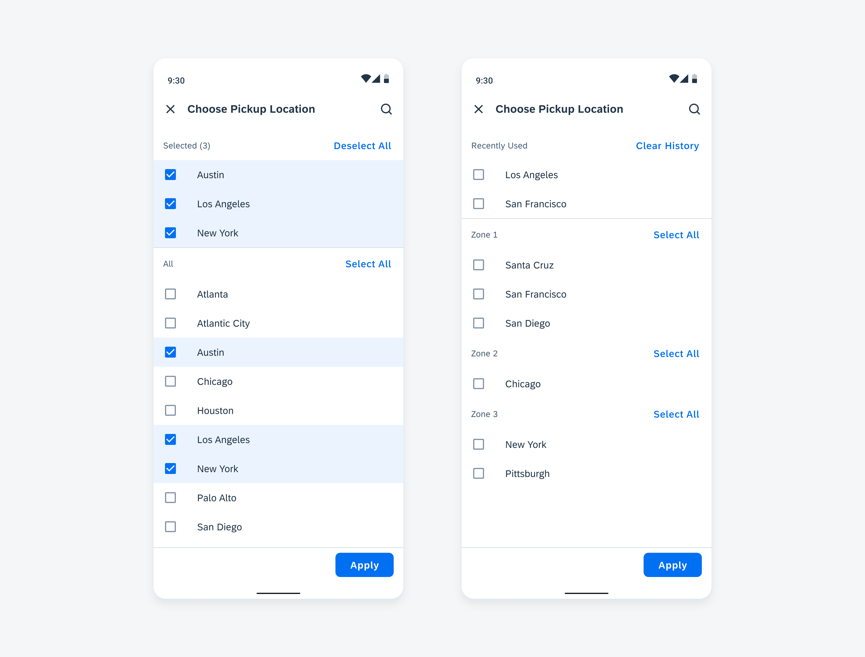
"Selected” value list and “All” value list (left) and multiple value lists with custom sections (right)
Selection View
There are two options a list picker selection view can be displayed. Depending on the size and nature of the value list, choose the option that best fits your app’s use case. If the value list is large, the half-screen view can be expanded to the full-screen view naturally while the user scrolls.
Half-Screen View (Default)
The half-screen view is a modal bottom sheet that occupies half of the screen height and overlays the background. It’s best used when the value list is expected to be short and simple, for example, such as when it contains only three to six values.
Full-Screen View
The full-screen view occupies the full screen height like a page. When the value list is expected to be long or unknown, choosing the full-screen view will help users to browse.
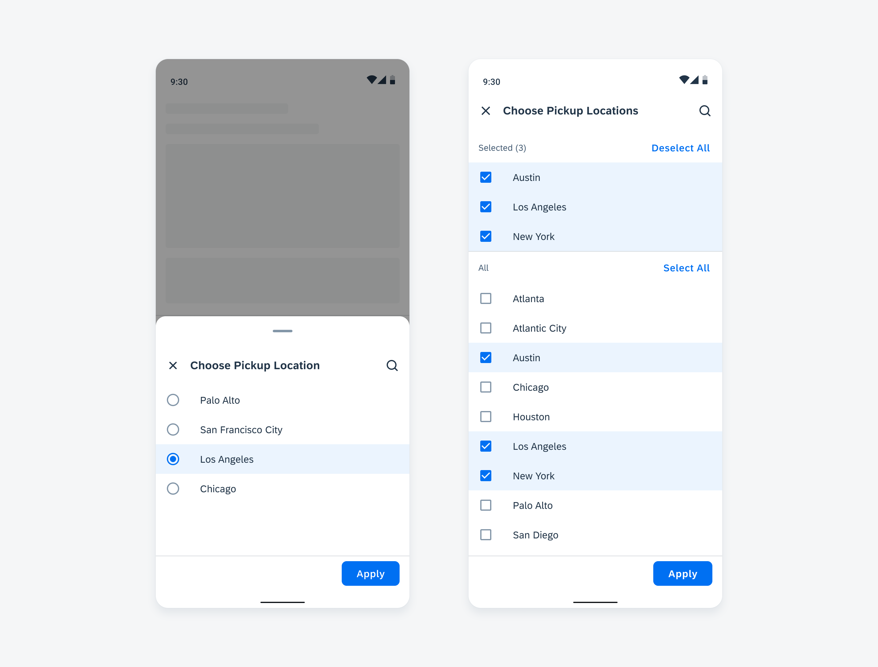
Half-screen view (left) and full-screen view (right)
Adaptive Design
The selection view adapts to different screen sizes. On compact windows, the list picker selection view appears as a bottom sheet. On medium or expanded windows, the list picker selection view appears as a dialog. The other features remain the same on all window size classes.
List picker selection view on a compact (left) and medium/expanded screen (right)
Resources
Development: List Picker, GenericListPickerFormCell
SAP Fiori for iOS: List Picker Form Cell
 Your feedback has been sent to the SAP Fiori design team.