
KPI Header
Fiori: KpiView
Intro
The KPI header displays a quick summary of KPI data to the user. It is typically used in an overview pattern to provide the user with contextual information at a glance

KPI header on mobile (left) and tablet (right)
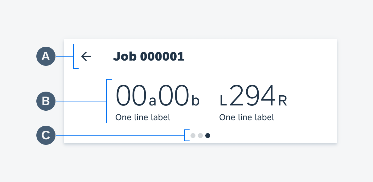
Anatomy
The KPI header is a container that includes multiple KPIs that are important to the user. KPIs in the KPI header are laid out horizontally with fixed padding. To maintain legibility, a limited number of KPIs may be displayed side-by-side in the KPI header depending on the device’s maximum width.
A. App Bar
The app bar content varies depending on the architecture, but the KPI header must always have an app bar to allow users to navigate and identify the title of the screen.
B. KPI
The KPI metric is always the most prominent element of the KPI header component. See KPIs.
C. Pagination
If the content must use two or more slides, pagination is represented using dots to indicate the number of slides and is being displayed. The pagination dots are non-interactive and solely act as indicators.
KPI anatomy
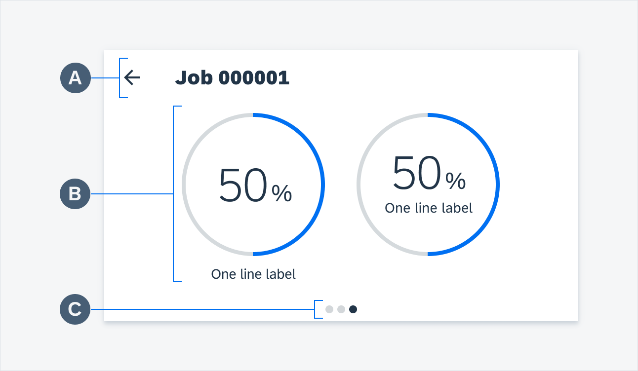
KPI progress view anatomy
Adaptive Design
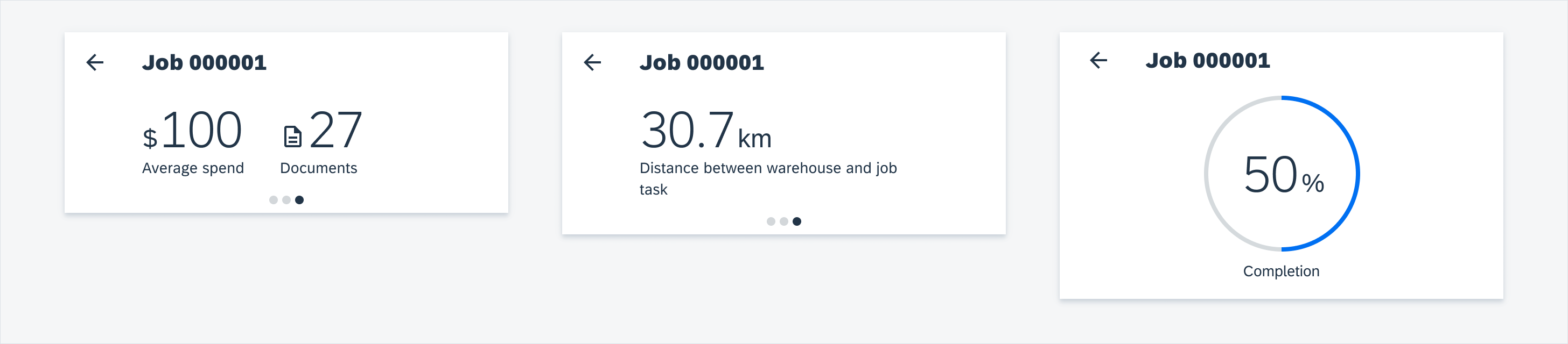
Mobile
On mobile, only up to two standard KPIs may appear in one slide together as long as they do not exceed the maximum width for the header area of the device. There may only be one KPI progress view per slide.
KPIs on mobile
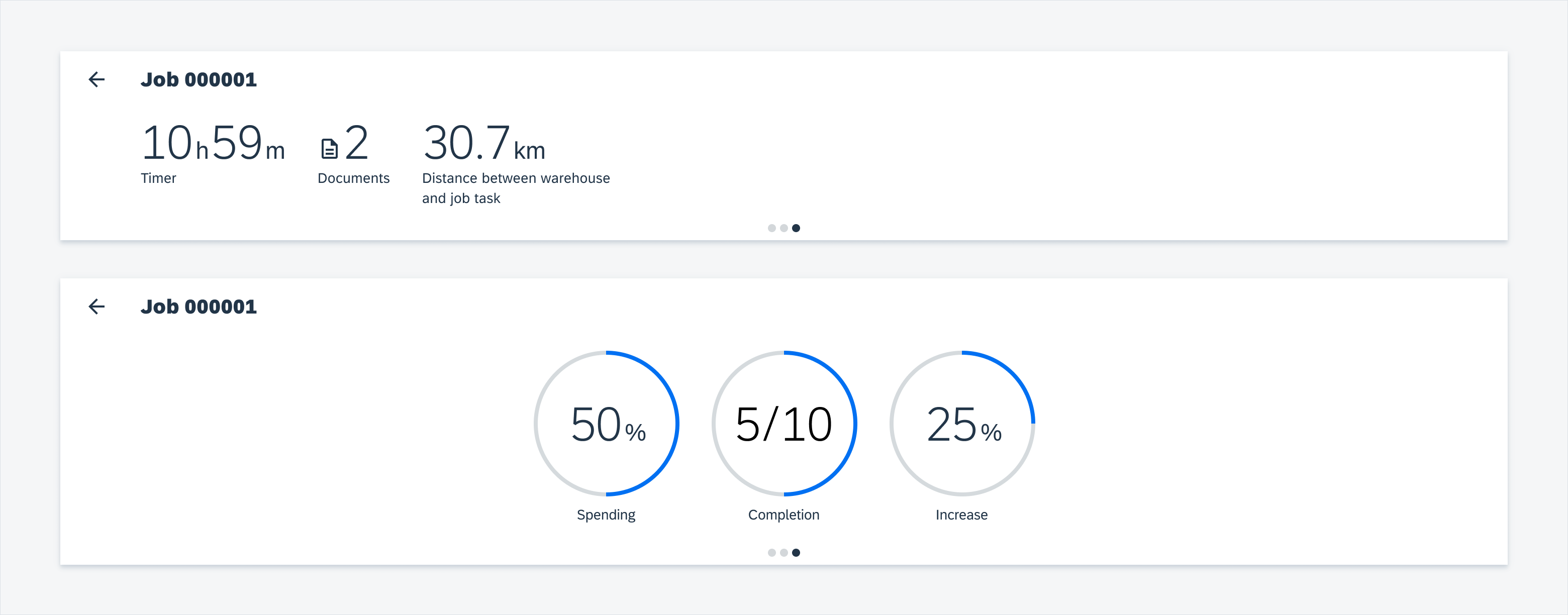
Tablet
On tablet, only up to three standard KPIs or KPI progress views may appear in one slide together as long as they do not exceed the maximum width for the header area of the device.
 Your feedback has been sent to the SAP Fiori design team.