
KPIs
FUIKPIView
Intro
Key performance indicators (KPIs) are measurable values that are used to evaluate the success of an organization, an individual, a group, or a particular activity. KPIs are also used to highlight the current value of an object or as a summary of the object.
KPIs can be used in a header, in the content area of an object, in an object cell, or in a modal window.
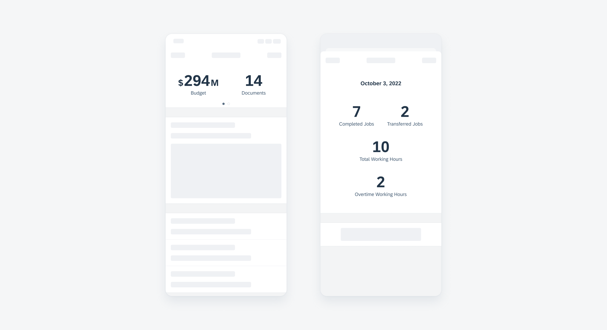
KPI header on compact (left) and KPI modal on regular (right)
KPIs in the Header or Content Area
In the header or content area, KPIs are arranged horizontally with a fixed padding between each KPI. The number of KPIs that can appear in the header depends on the width of the KPIs themselves, and the entire KPI collection should be center-aligned. The KPIs in a header or content area may be tappable.
KPIs in a Modal
In a modal window, KPIs are vertically-stacked. A maximum of two KPIs are allowed in each row, depending on their overall width. KPIs in a cell are not tappable.
A. KPI
The KPI metric is always the most prominent element of the component. The metric may show a single value or a range, for example 1 of 2. A numeric value is mandatory for a KPI.
B. KPI Unit Label
The KPI can include a unit label, for example, $, h (hours), M (miles)) if it helps to clarify its meaning. It can be placed on either the right or left of the KPI metric.
C. KPI Label
The label tells the user what the KPI represents. It is mandatory to include, and should clearly communicate the KPI’s meaning without being overly long and descriptive. For the KPI progress view, the label can be placed inside the progress indicator or below.
D. Progress View
The progress view displays an amount or percentage of completeness in a visual way, ranging from 0 – 100%.
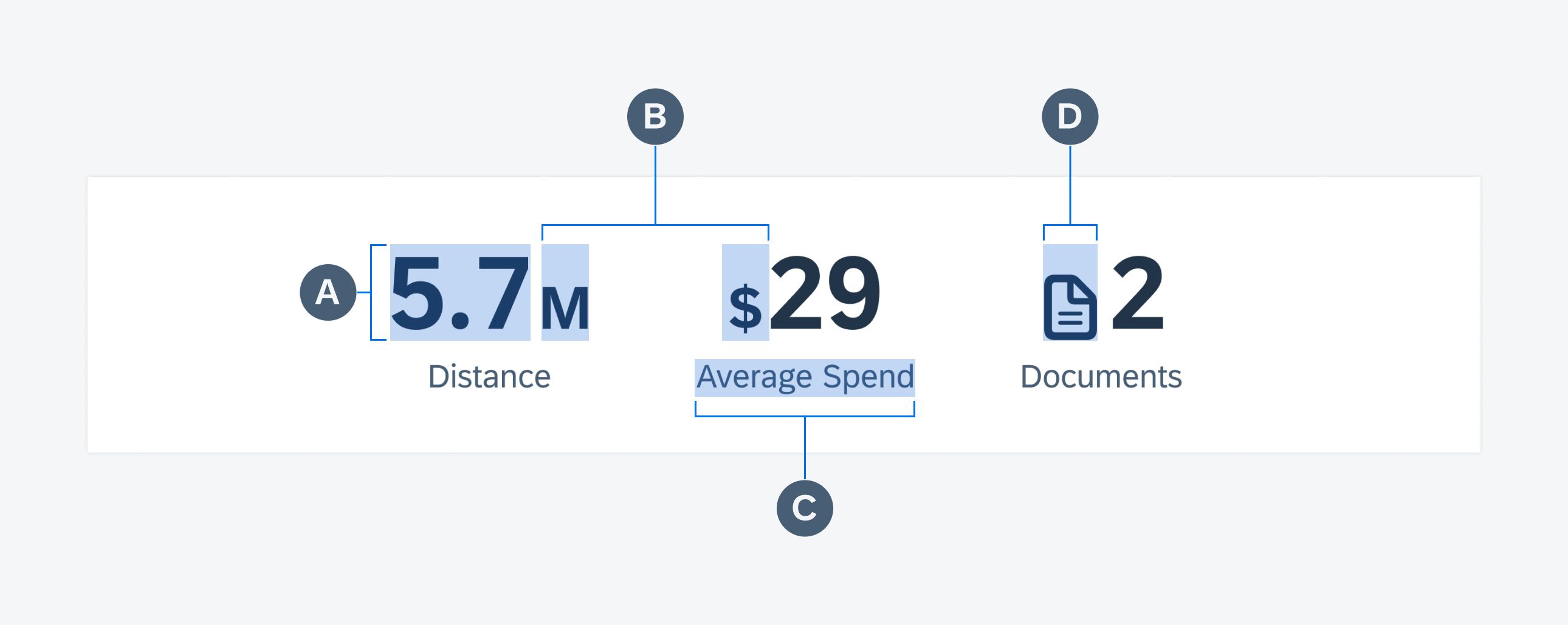
Example of three KPIs
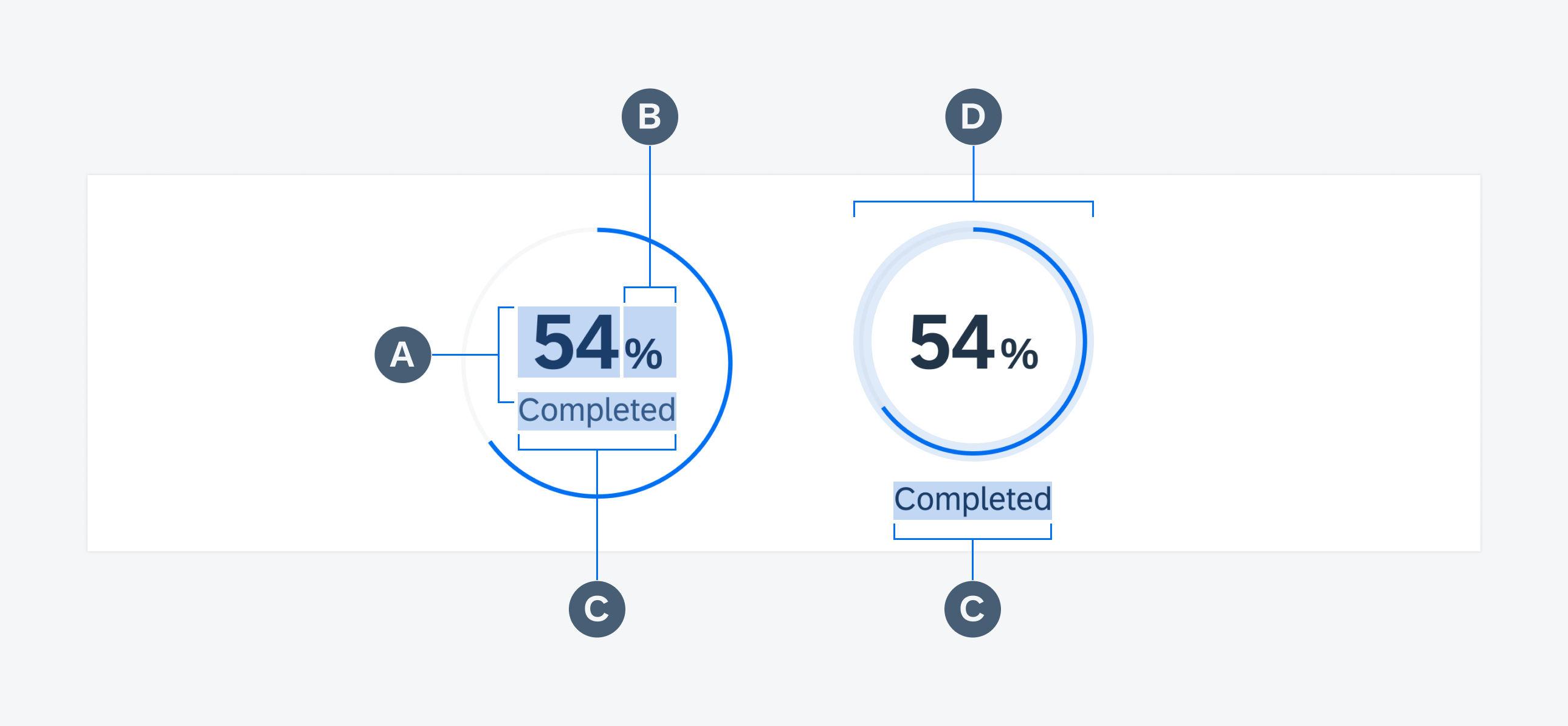
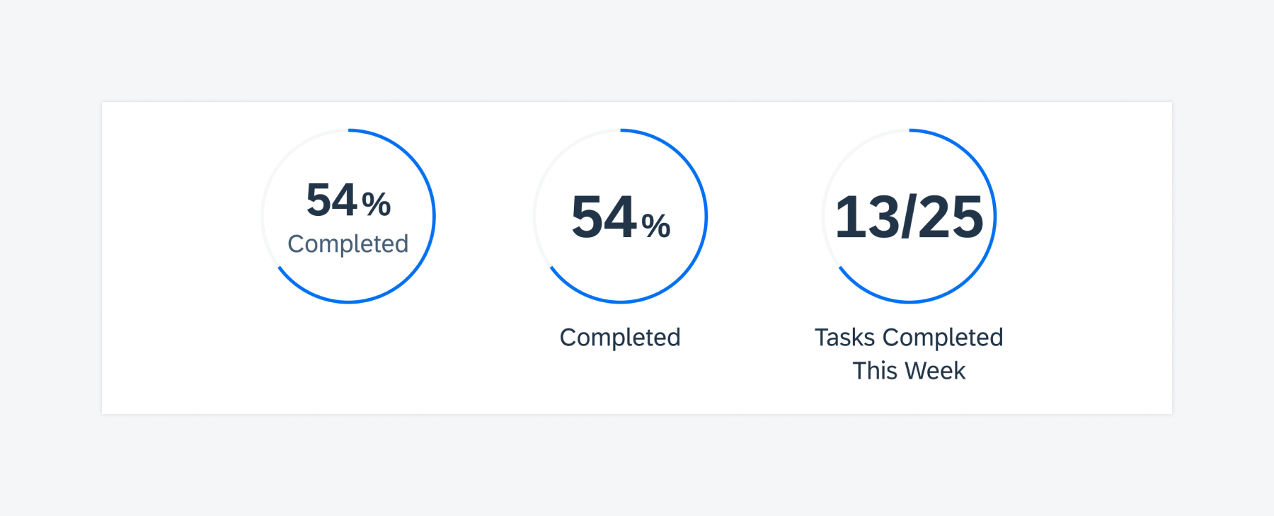
Example of two progress charts
The KPIs in a header or content area can be read-only or it can allow for tappable interaction to a show modal or a filtered list. When the tapping on a number is enabled, the KPIs should appear in tint color.
The KPIs in a cell area is not tappable.
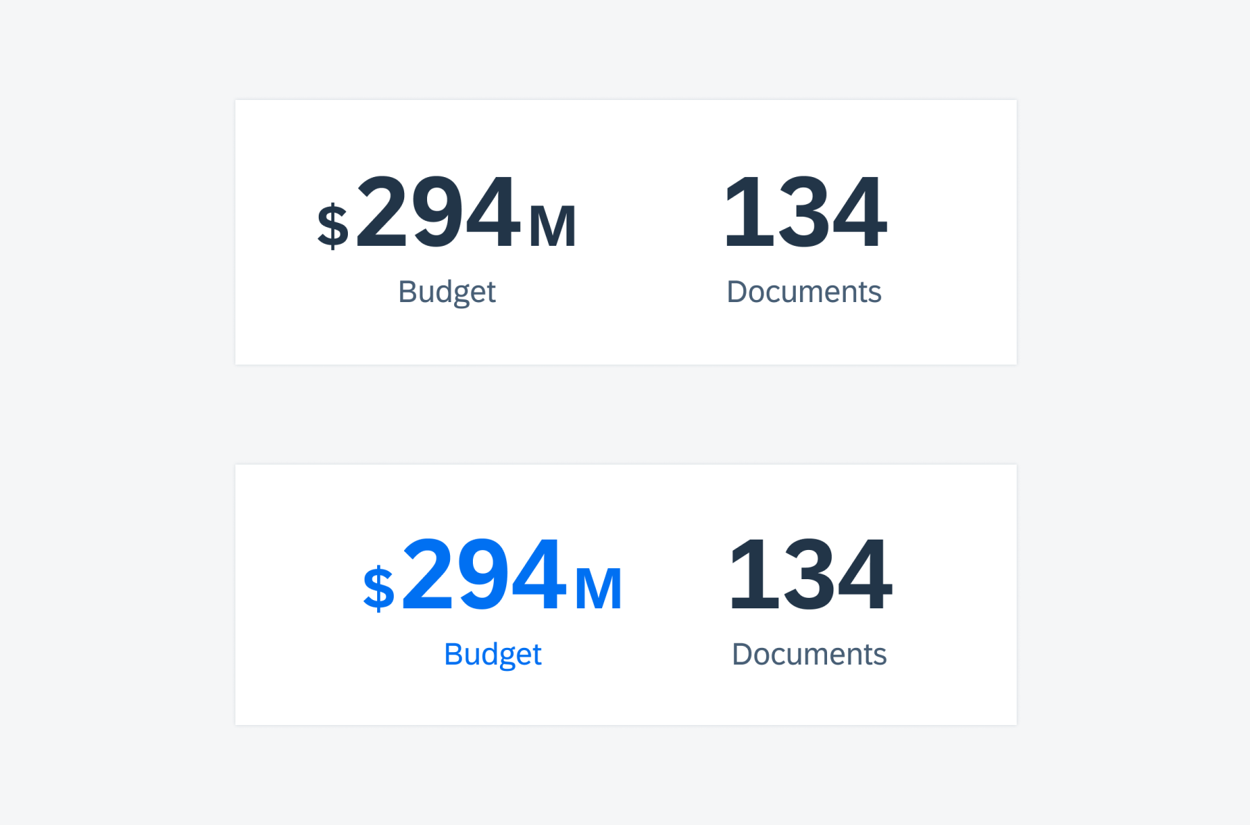
KPI in regular state (top) and in tap state (bottom)
The KPI component is supported in both compact and regular widths.
KPIs have a defined minimum and maximum width, and how they are displayed depends on the following:
- Dynamic width size of the KPI container
- Where they are found, be it the header, content area, table view, or modal
The header, for example, can display one or two KPIs in compact width or four to five KPIs in regular width, depending on the width of the KPIs themselves. In compact, when more than two KPIs are required, the header will take the overflow state and show all KPIs on multiple pages.
Standard KPI
This is the most prevalent KPI type, which is used to indicate quantity, percentage, or value. It may or may not have a unit label, for example, $, with a maximum of two unit labels allowed.
Time KPI
The time KPI is used to show a detailed breakdown of time. For clarity reasons, we recommend including a unit label, such as h for hours.
KPI with an Icon
The KPI with an icon allows the user to add a visual identifier to a KPI. The icon sits to the left of the numeric value, and a maximum of one unit label is allowed.
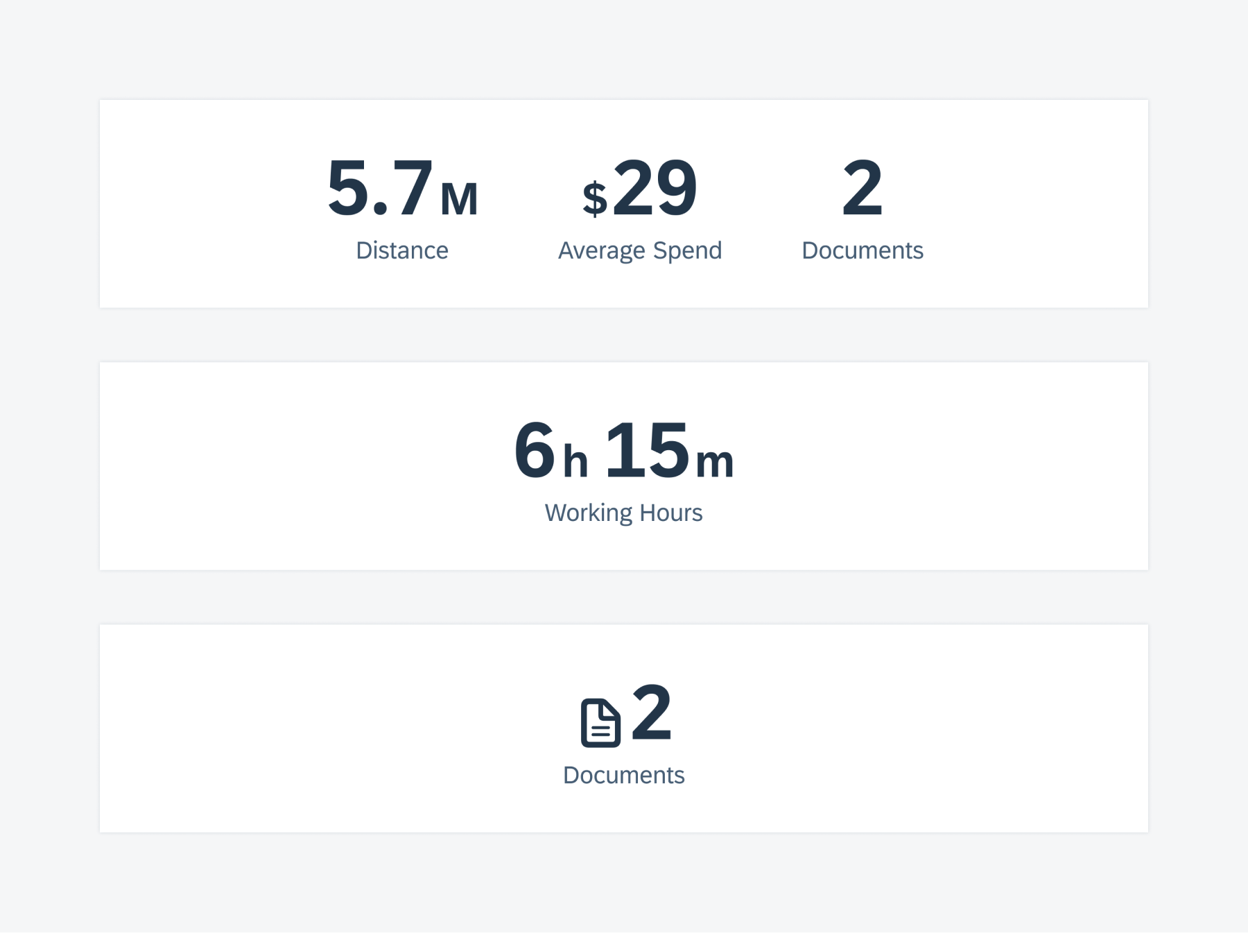
Standard KPI (top), time KPI (middle), and KPI with icon (bottom)
KPI Progress View
The KPI progress view shows a visual representation of the progress of an object. The numeric value (KPI metric) maybe in the form of a percentage value or may display the completed vs total value. It comes in two sizes – small and large.
The small variation is designed to be used in cards or other content areas
the large variation is designed to be used in headers or other content area.
Progress chart with title inside (left), title outside (middle), and title outside that wraps two lines (right)
 Your feedback has been sent to the SAP Fiori design team.