
List Picker Form Cell
FUIListPickerFormCell
Intro
A list picker allows for the selection of one or more options among values within a defined category. Use a list picker when there are more than eight values to select from within a single category or when the size and nature of the available options are dynamic and unpredictable.
List picker on compact (left) and regular (right)
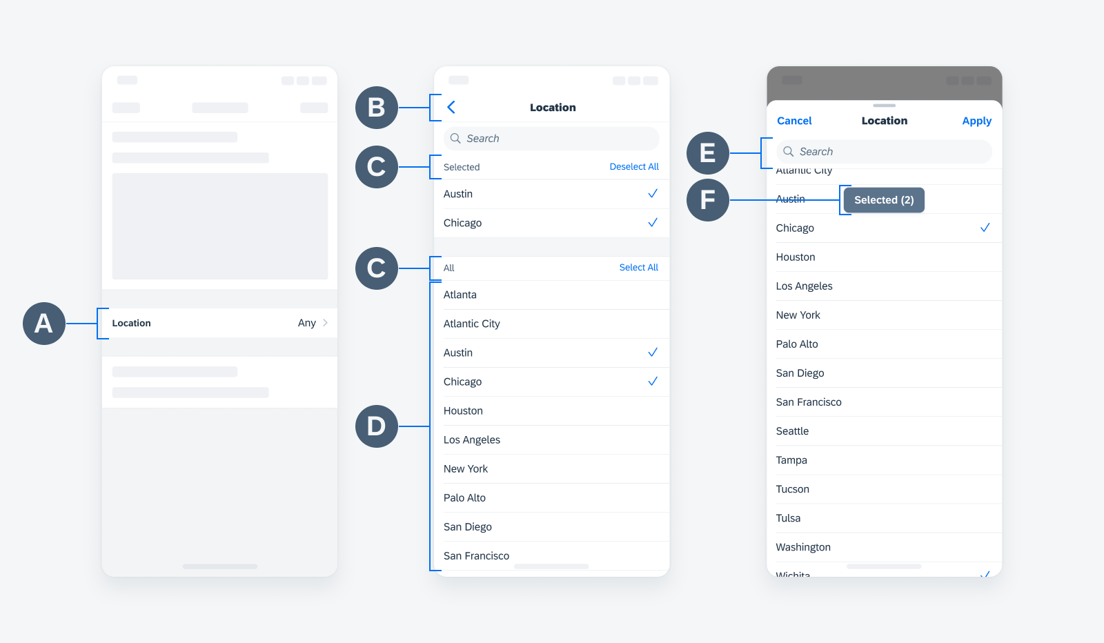
List picker anatomy
A. List Picker Cell
Comprised of a label and value.
B. Navigation Bar
Contains page/sheet-level control actions such as “Cancel” and “Apply”.
C. Section Header
Describes all values within the grouped list and gives users the ability to select or deselect all values at once from the value list. It can be visually customized by you if needed.
D. Value List
Displays a list of items within a specific category.
E. Search
Recommended when there is a large number of items in the value list.
F. Anchor Button (Optional)
Provides additional help to the user by showing the number of selected items from the value list, as well as helping the user reach the top of the list with ease.
This feature is only applicable to multi-selection and modal sheet view.
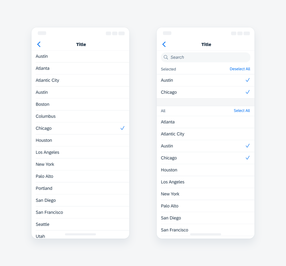
To navigate into the value list, a user taps on a list picker cell.
In the value list, a user taps on a value to select and deselect. A checkmark indicates a selection.
- Modal sheets are useful for requesting information in a simple and quick manner.
- To let users review the number of selected values and reach the top of the list faster, use the anchor button.
To save the selection(s), a user will tap on “Apply.”
Selected values are displayed in the list picker cell after selection.
User interaction of selecting and applying values
Discard Changes
Users may discard their selections by tapping on the “Cancel” button. To prevent users from accidentally discarding their changes, consider adding an additional action sheet.
Please refer to the List Picker Detailed User Flow to learn more about the existing options and behaviors.
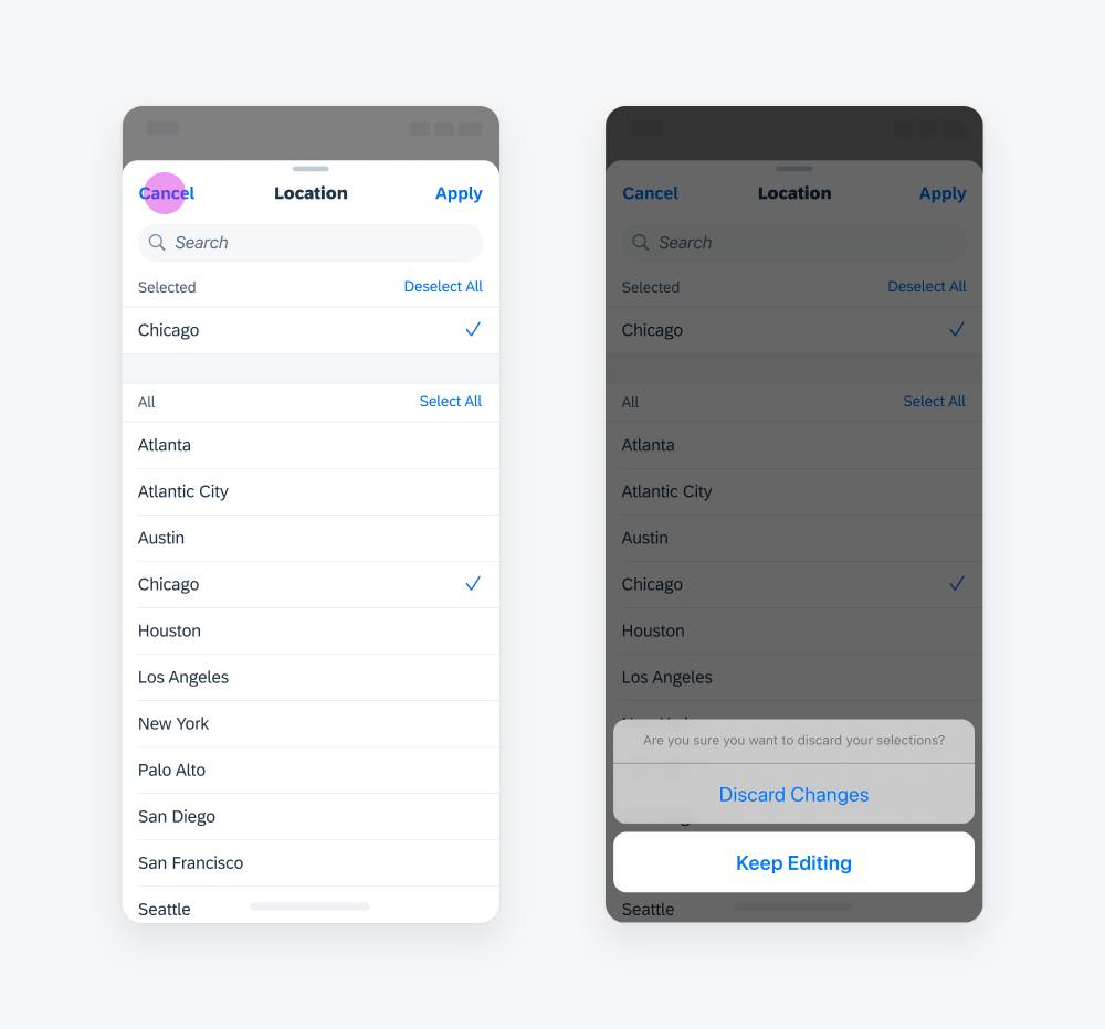
User interaction of discarding changes
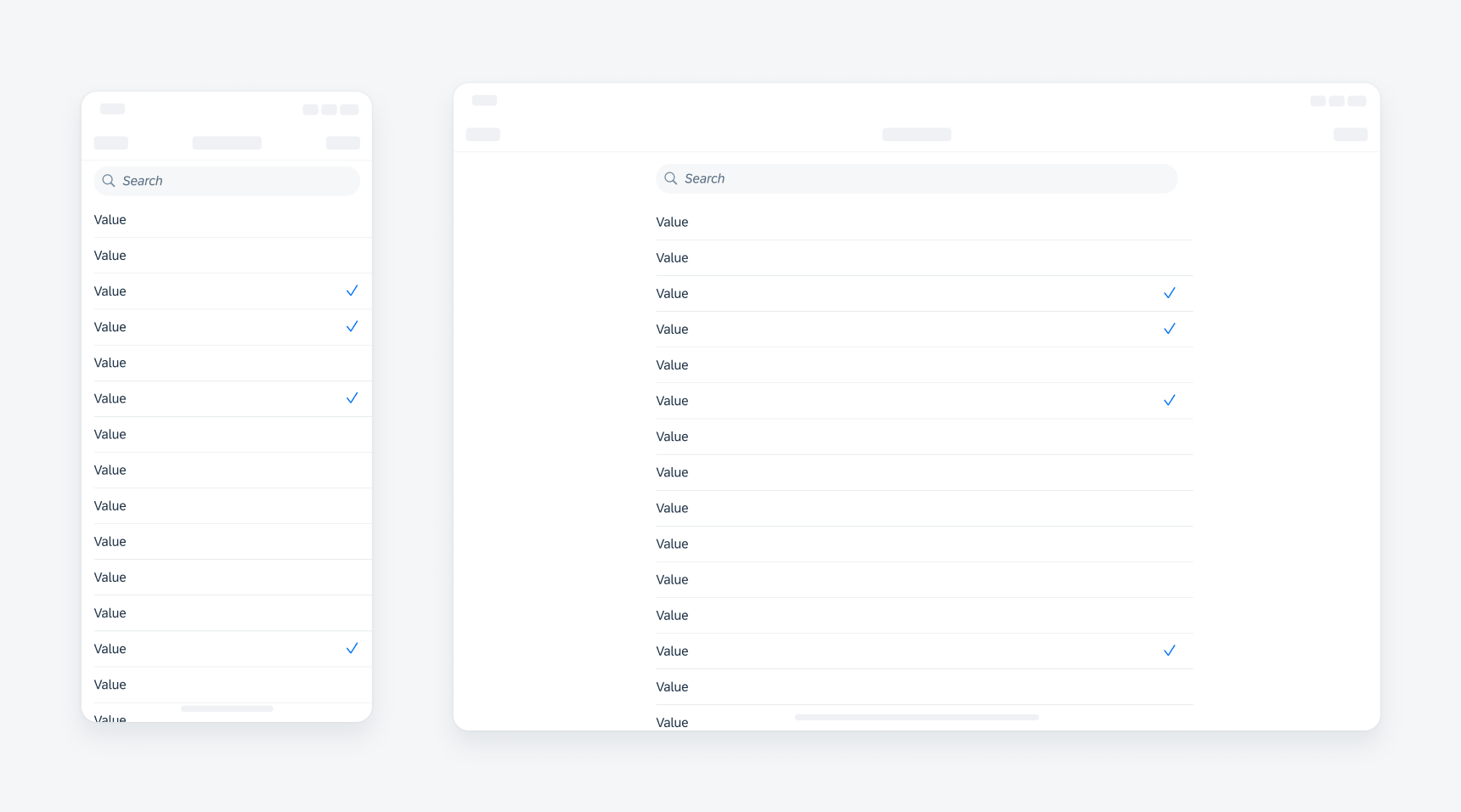
Selection Type
Single Selection
Single selection allows for the selection of one option from a value list.
Values in the list can also be grouped by sections if this will help users to make their selection more quickly.
Multi-Selection
Multi-selection allows for the selection of one or more options from a value list.
“Selected” grouping is recommended to minimize scrolling down a large list to deselect.
If search will be used frequently to find results, we recommended using the search to select pattern.
Single selection (left), multi-selection right)
Value Type
Text Values
The type of data in the list depends on context. Text value is a common type of data to be displayed in the list.
When the body text in the cell is long, the body should be placed on a second line below the title. If the body content is still too long, it should then be truncated.
Object Cells
The other type of data we support is object cell. Only use object cells instead of text values when additional information is important for users to make the selection.
When displaying object cells in a list, do not include the attributes and the accessory view. Instead, display the radio button on the left side of the object cell.

Text value (left), object cell (right)
Selection View
Full View
When using a list picker, the default behavior to navigate into the value list will be a push transition into a full view screen.
Half / Full Modal
This resizable sheet expands to full modal when the user scrolls its contents or drags the grabber (small horizontal indicator at the top edge of the sheet). This view allows some of the parent view screen to remain visible, helping people retain their original context as they interact with the sheet.
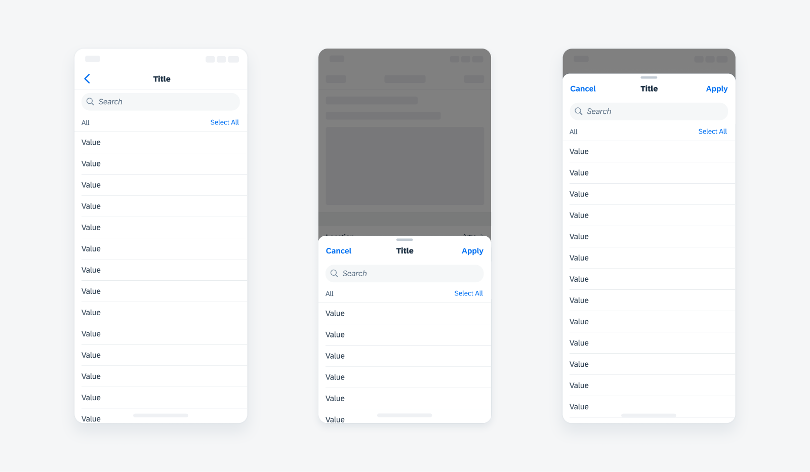
Full view (left), half modal (center), full modal (right)
Development: FUIListPickerFormCell
SAP Fiori for Android: List Picker Form Cell
 Your feedback has been sent to the SAP Fiori design team.