
- Latest Version 1.128
- Version 1.126
- SAPUI Version 1.124
- SAPUI5 Version 1.122
- SAPUI5 Version 1.120
- SAPUI5 Version 1.116
- SAPUI5 Version 1.114
- SAPUI5 Version 1.112
- SAPUI5 Version 1.110
- SAPUI5 Version 1.108
- SAPUI5 Version 1.106
- SAPUI5 Version 1.104
- SAPUI5 Version 1.102
- SAPUI5 Version 1.100
- SAPUI5 Version 1.98
- SAPUI5 Version 1.96
- SAPUI5 Version 1.94
- SAPUI5 Version 1.92
- SAPUI5 Version 1.90
- SAPUI5 Version 1.88
- SAPUI5 Version 1.86
- SAPUI5 Version 1.84
- SAPUI5 Version 1.82
- SAPUI5 Version 1.80
- SAPUI5 Version 1.78
- SAPUI5 Version 1.76
- SAPUI5 Version 1.74
- SAPUI5 Version 1.72
- SAPUI5 Version 1.70
- SAPUI5 Version 1.68
- SAPUI5 Version 1.66
- SAPUI5 Version 1.64
- SAPUI5 Version 1.62
- SAPUI5 Version 1.60
- SAPUI5 Version 1.58
- SAPUI5 Version 1.56
- SAPUI5 Version 1.54
- SAPUI5 Version 1.52
- SAPUI5 Version 1.50
- SAPUI5 Version 1.48
- SAPUI5 Version 1.46
- SAPUI5 Version 1.44
- SAPUI5 Version 1.42
- SAPUI5 Version 1.40
- SAPUI5 Version 1.38
- SAPUI5 Version 1.36
- SAPUI5 Version 1.34
- SAPUI5 Version 1.32
- SAPUI5 Version 1.30
- SAPUI5 Version 1.28
- SAPUI5 Version 1.26
- Latest Version 1.128
- Version 1.126
- SAPUI Version 1.124
- SAPUI5 Version 1.122
- SAPUI5 Version 1.120
- SAPUI5 Version 1.118
- SAPUI5 Version 1.116
- SAPUI5 Version 1.114
- SAPUI5 Version 1.112
- SAPUI5 Version 1.110
- SAPUI5 Version 1.108
- SAPUI5 Version 1.106
- SAPUI5 Version 1.104
- SAPUI5 Version 1.102
- SAPUI5 Version 1.100
- SAPUI5 Version 1.98
- SAPUI5 Version 1.96
- SAPUI5 Version 1.94
- SAPUI5 Version 1.92
- SAPUI5 Version 1.90
- SAPUI5 Version 1.88
- SAPUI5 Version 1.86
- SAPUI5 Version 1.84
- SAPUI5 Version 1.82
- SAPUI5 Version 1.80
- SAPUI5 Version 1.78
- SAPUI5 Version 1.76
- SAPUI5 Version 1.74
- SAPUI5 Version 1.72
- SAPUI5 Version 1.70
- SAPUI5 Version 1.68
- SAPUI5 Version 1.66
- SAPUI5 Version 1.64
- SAPUI5 Version 1.62
- SAPUI5 Version 1.60
- SAPUI5 Version 1.58
- SAPUI5 Version 1.56
- SAPUI5 Version 1.54
- SAPUI5 Version 1.52
- SAPUI5 Version 1.50
- SAPUI5 Version 1.48
- SAPUI5 Version 1.46
- SAPUI5 Version 1.44
- SAPUI5 Version 1.42
- SAPUI5 Version 1.40
- SAPUI5 Version 1.38
- SAPUI5 Version 1.36
- SAPUI5 Version 1.34
- SAPUI5 Version 1.32
- SAPUI5 Version 1.30
- SAPUI5 Version 1.28
- SAPUI5 Version 1.26
Value Help Dialog
sap.ui.comp.valuehelpdialog.ValueHelpDialog
Intro
The value help dialog is a UI pattern that helps the user search and select single and multiple values. The user can also define conditions.
The value help dialog is generally called from an input field or a multi-input field by clicking the selection icon (value help icon) of the input field.
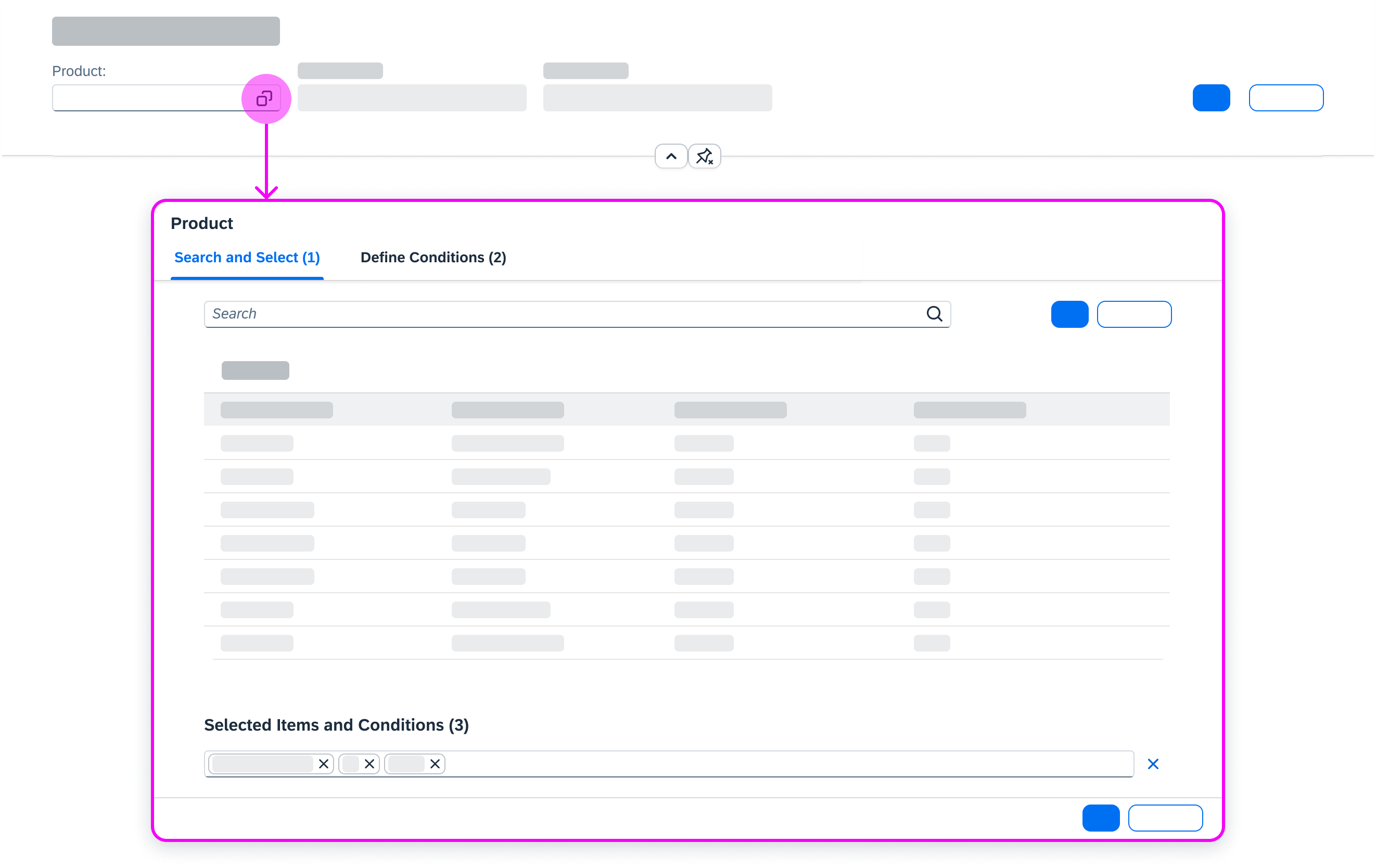
Clicking the value help icon opens the value help dialog
Usage
Use the value help dialog if:
- The user is searching within a dataset that contains more than 1,000 items.
- The user needs to use different attributes to find an object (such as city, company name, and so on).
- The user needs to define conditions, such as ranges and exclusions.
Do not use the value help dialog if:
- There is a simpler control that fits the use case. Always start with the least complex control. For example, use the select control if the user needs to select only one item from a short list.
Responsiveness
The behavior of the value help dialog on a phone differs from its behavior on a tablet or desktop device. Both the navigation and the positioning of the selection area differ depending on the device.
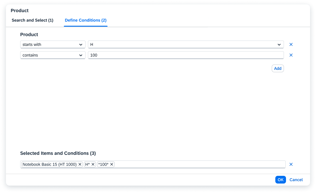
Value help dialog - Sizes L and XL
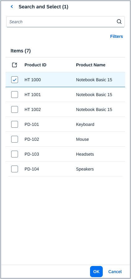
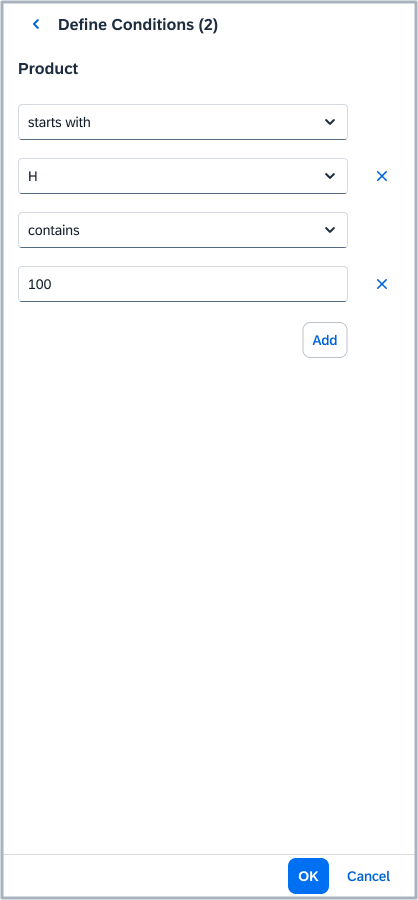
Value help dialog - Size M
Value help dialog - Size S
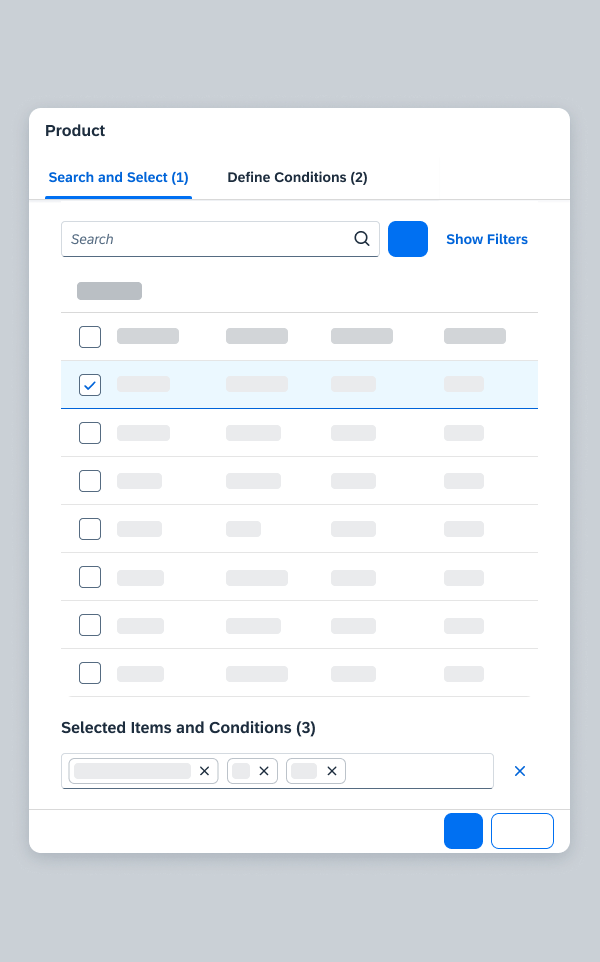
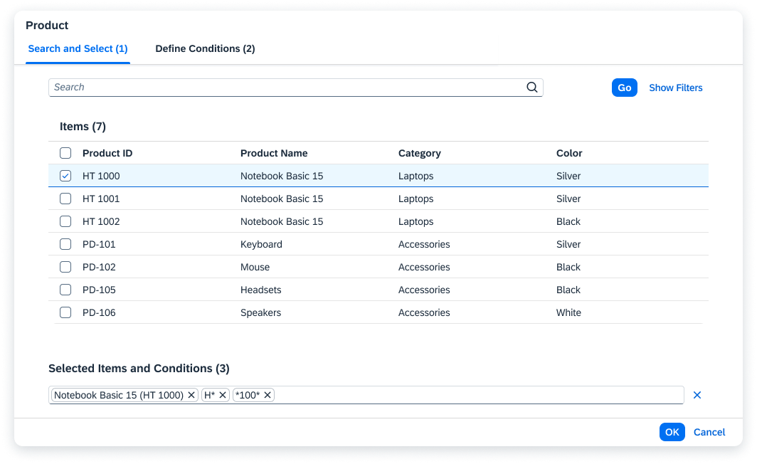
Components
The value help dialog contains the following components:
1) Header
2) Icon tab bar / list control (phone)
3) Search template (optional)
4) Basic search
5) Go button
6) Result list
7) Selected items and conditions
8) Footer toolbar
9) Filters
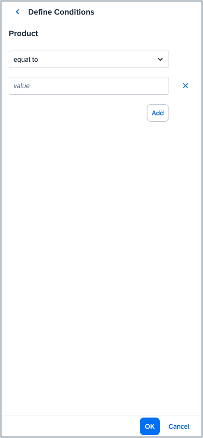
10) Area for defining conditions, such as ranges and exclusions
Components of the Value Help Dialog
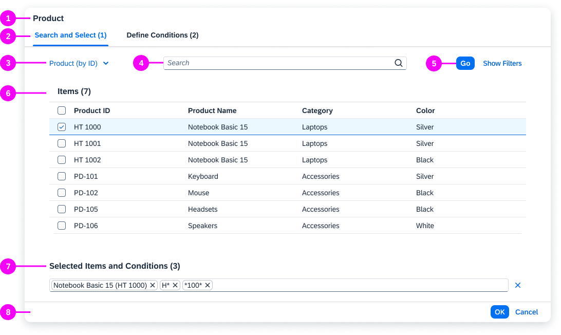
Header (1)
The header bar contains the dialog title. See the Guidelines section below.
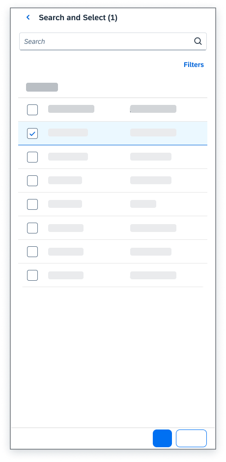
Icon Tab Bar / List Control (Phone) (2)
Depending on the device, the following controls are used to display the content of the value help dialog:
- Smartphones: The start dialog provides a list (sap.m.List) with the standard list items (sap.m.StandardListItem), Search and Select, and Define Conditions to navigate between the different dialogs.
- Tablet and desktop devices: The value help dialog contains an icon tab bar (sap.m.IconTabBar) to navigate between the Search and Select and the Define Conditions tab.
- Both controls have a counter in the title that indicates the number of items/conditions selected.
Search Template (3)
Search templates allow the user to display different or additional fields in the filter area and result list. Depending on the use case, the user can switch between the different search templates in order to use different fields when searching. For example, the search template “Customer (by Company Code)” displays the additional field “Company Code” in the filter area and result list.
Basic Search (4)
The basic search finds all results that are somehow related to the input. For example, the search term “A” returns all the results containing the letter “A”.
Always offer the basic search in the value help dialog. Position the basic search to the right of the search template control. If there is no search template control, left-align the basic search.
Go Button (5)
The Go button triggers the search and filters the result list.
Result List (6)
- The result list is populated on initial load by default.
- If you transferred values from the input field to the basic search field of the value help dialog, the results are filtered accordingly. Only the entered (or modified) value is transferred to the basic search. Type-ahead suggestions are ignored. The search is triggered automatically when the dialog opens.
- If available, display the ID and description of the business object in the first and second columns. Display additional information in the next columns.
- We recommend a maximum of five columns in the result list.
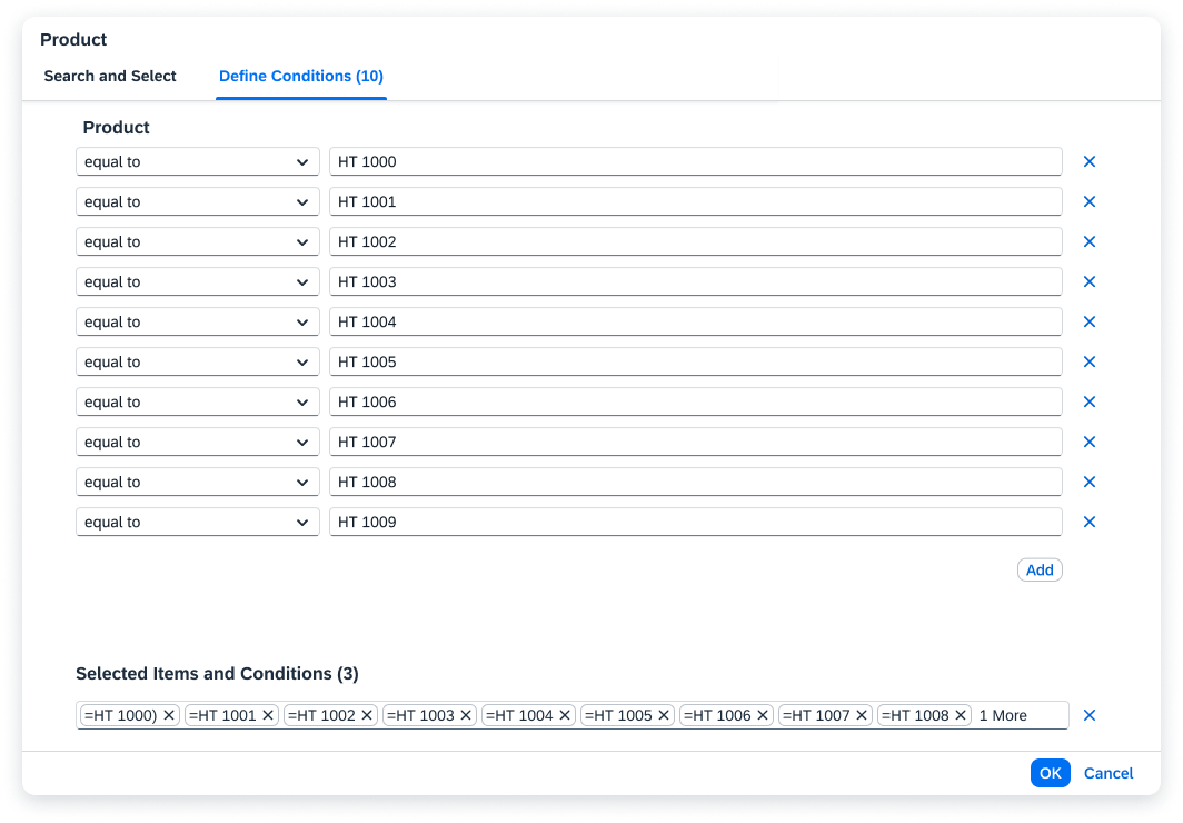
Selected Items and Conditions (7)
The selected items and conditions are displayed in a tokenizer (see Token for more information). Each selected item or condition is displayed as one token.
There is no longer a visual difference between included and excluded items and conditions. They are now differentiated using operators (see Using the Filters).
Footer Toolbar (8)
The footer bar offers the OK and Cancel buttons.
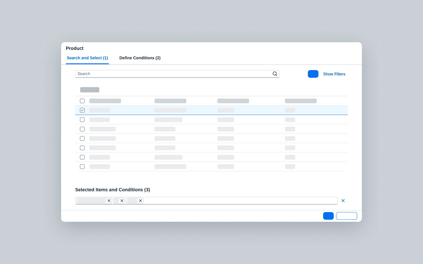
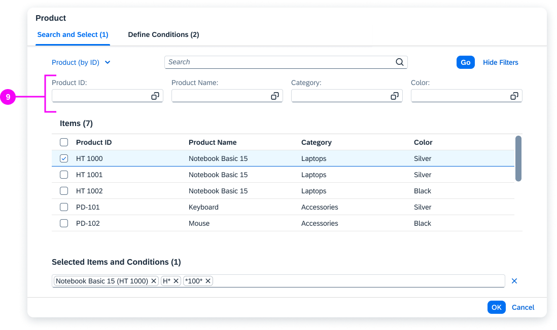
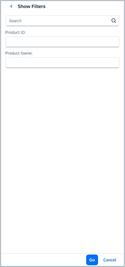
Filters (9)
The filter area offers a filter field for each column in the result list. In some cases, there can be specific filter fields that do not have a corresponding column on the UI. These fields typically come from the back-end service. Initially, the filter area is hidden.
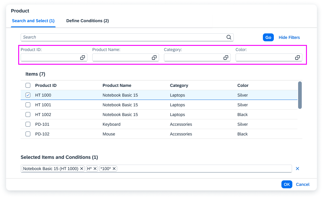
Value help dialog - Filters
For the basic search with filters, the filter bar (sap.ui.comp.filterbar.FilterBar) is implemented in advanced mode. Advanced mode differs from the basic mode in the following ways:
- There is no Filters link or a dialog to make additional filter fields visible. All filter fields are added automatically to the filter area.
- There is a toggle button to show and hide the filters.
- In each of the filter fields, users can use operators like “between” or “lower than” to define conditions.
Always hide the filter area in the value help dialog by default. Only show the filter area by default if the basic search can’t be provided.
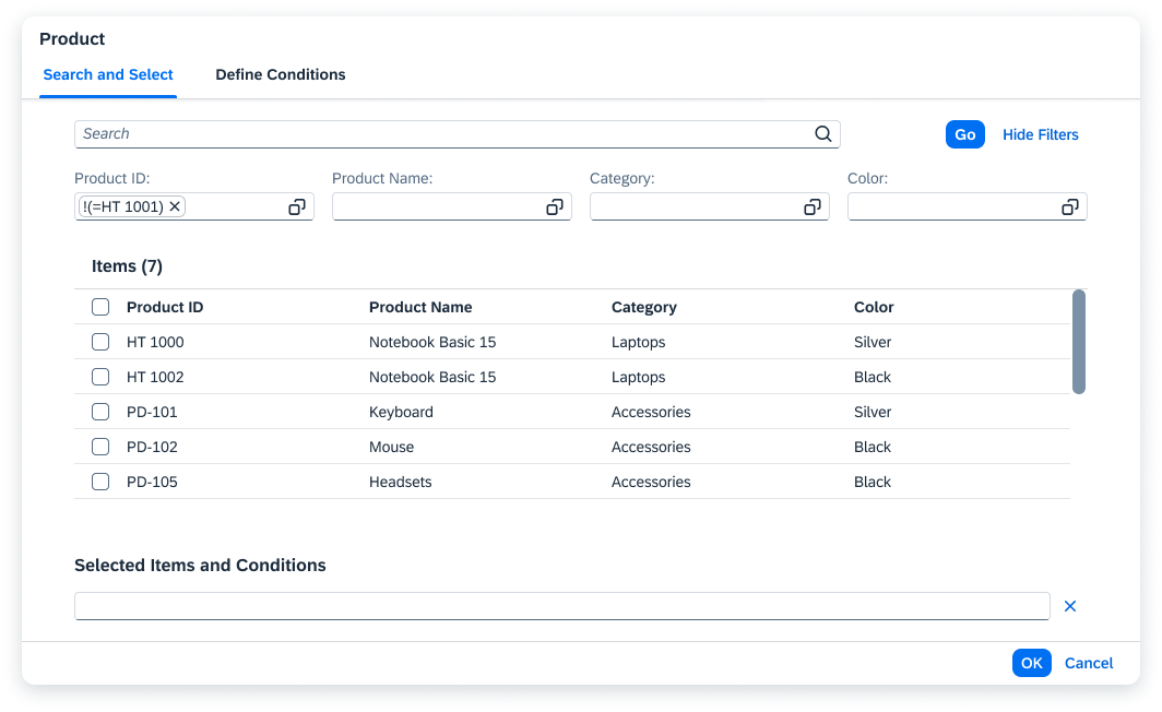
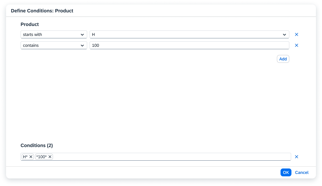
Note that the value help icon of the Product ID field in the current value help dialog will open only the Define Conditions screen. The full value help dialog is not shown in order to prevent endless loops. For example, the value help icon of the Product Name or Category field in the value help for a Product field will navigate directly to the Define Conditions: Product screen.
Using the Filters
Users can enter operators (such as “=“) to define the conditions directly within the field without opening the Define Conditions tab.
| Operator | Input Notation | Example |
| between | value…value | 000…100 |
| equal to | =value | =0001 |
| contains | *value* | *1* |
| starts with | value* | 001* |
| ends with | *value | *5 |
| less than | <value | <100 |
| less than or equal to | <=value | <=200 |
| greater than | >value | >0300 |
| greater than or equal to | >=value | >=0500 |
| not between | !(value…value) | !(000…100) |
| not equal to | !(=value) | !(=0) |
| does not contain | !(*value*) | !(*1*) |
| does not start with | !(value*) | !(001*) |
| does not end with | !(*value) | !(*5) |
| not less than | !(<value) | !(<100) |
| not less than or equal to | !(<=value) | !(<=200) |
| not greater than | !(>value) | !(>0300) |
| not greater than or equal to | !(>=value) | !(>=0500) |
| empty | <empty> | <empty> |
| not empty | !(<empty>) | !(<empty>) |
Note:
Depending on the underlying field, the operators may be labeled differently in the Define Conditions area. This doesn’t affect the input notation, which is based on the operator logic and remains constant.
Example: Operators for Date Fields
| Operator Label | Input Notation |
| before | <value |
| before or on | <=value |
| after | >value |
| after or on | >=value |
Users must use the following notation to get results:
Using an operator to filter the result list
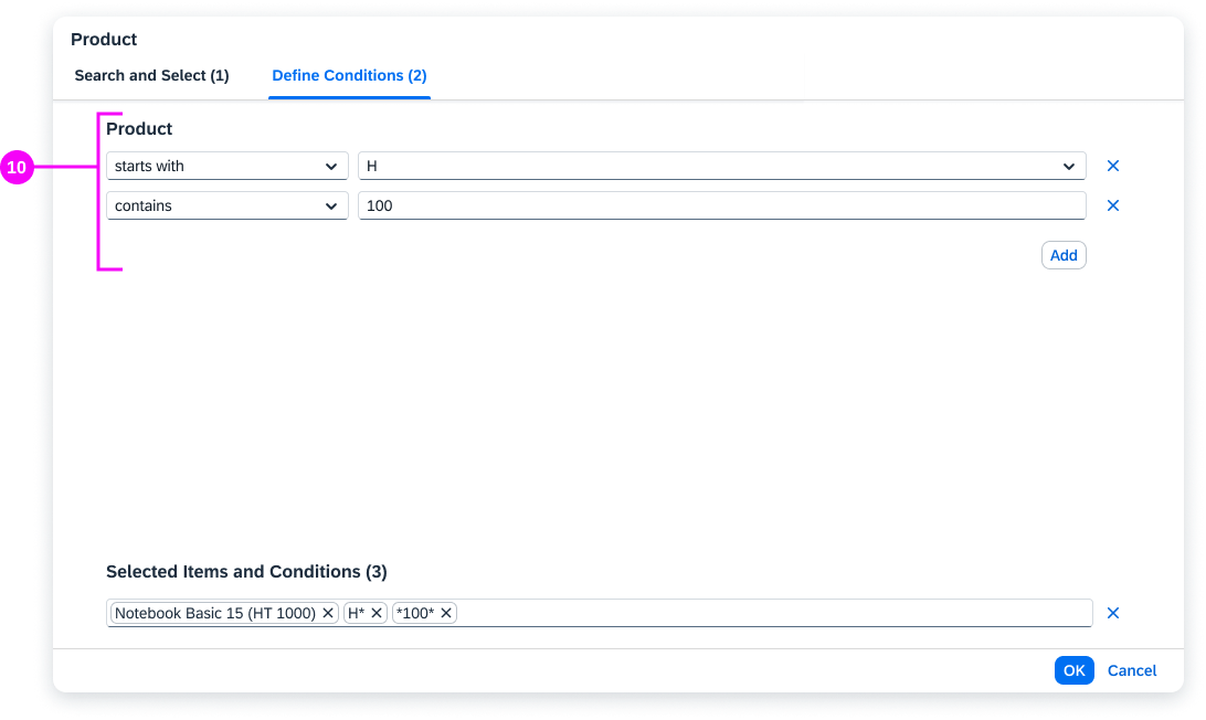
Area for Defining Conditions (10)
In the Define Conditions tab, you can use the following operators to define single and multiple conditions:
- between
- equal to
- contains
- starts with
- ends with
- less than
- less than or equal to
- greater than
- greater than or equal to
- empty
- not between
- not equal to
- does not contains
- does not start with
- does not end with
- not less than
- not less than or equal to
- not greater than
- not greater than or equal to
- not empty
For convenience, the operators are grouped into two categories: Include and Exclude.
For Boolean attributes, where only two values are available, the operator dropdown in the condition panel is disabled. Users can pick one of the values from the combo box.
You can also use a combo box if the possible values for a condition are fixed. Users can then choose the value they need from the list.
Each condition is displayed as a token in the Selected Items and Conditions tokenizer.
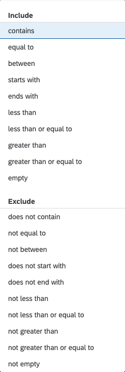
'Define Conditions' - List of operators
Defining a condition for a Boolean attribute
Behavior and Interaction
Basic Search and Filters
- The basic search (mandatory) and filters (optional) are triggered by clicking the Go button. The search results are shown in the result list.
- If data was already entered in input field from which the user triggered the value help, this data is transferred to the basic search and the results are then filtered accordingly.
- The basic search performs a search across all fields that are displayed in the filter area and the result list.
Selecting Items and Defining Conditions
Depending on your use case, the value help dialog can offer different selection options:
- Select a single item
- Define a single condition
- Select multiple items
- Define multiple conditions
- Select multiple items and define multiple conditions
Users open the value help dialog by clicking the value help icon in the input field. The next steps depend on the use case and form factor (smartphone or desktop/tablet).
The different use cases are described in the sections below.
Select a Single Item (Smartphone)
Tapping the value help icon opens the dialog. As soon as an item is selected, the value help dialog closes automatically.
Single item selection on a smartphone
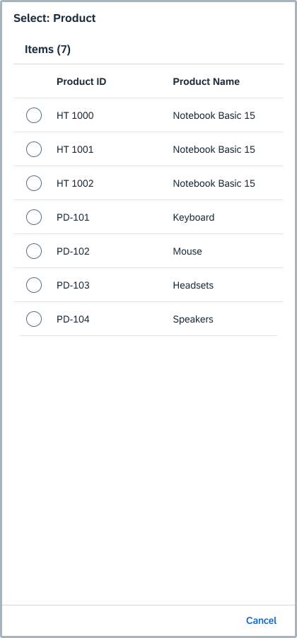
Select a Single Item (Desktop/Tablet)
Clicking the value help icon opens the value help dialog for single selection. The icon tab bar and the Selected Items and Conditions are hidden. As soon as an item is selected, the value help dialog closes automatically.
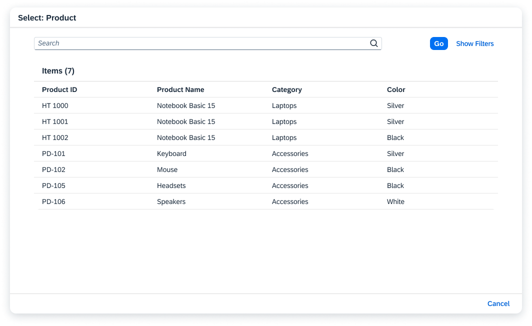
Single item selection on a desktop/tablet device
Define a Single Condition (Smartphone)
Tapping the value help icon opens the Define Condition tab. Users define a condition by choosing the relevant operator and entering the value or values in the corresponding input field(s).
In this example, we have defined a range.
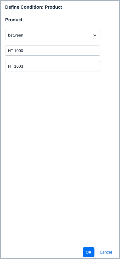
Defining a single condition on a smartphone
Define a Single Condition (Desktop/Tablet)
Clicking the value help icon opens the Define Condition tab. Users define a condition by choosing the relevant operator and entering the value or values in the corresponding input field(s).
In this example, we have defined a range.
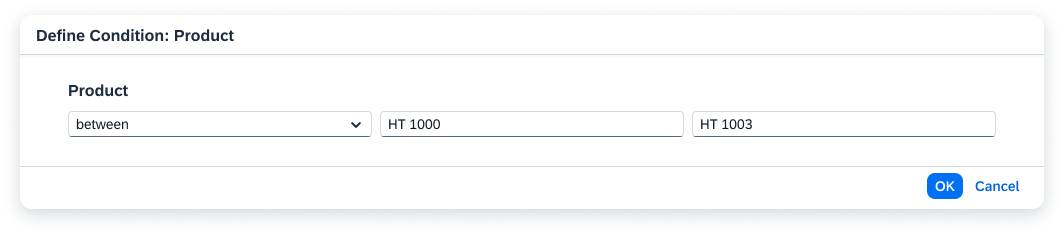
Defining a single condition (desktop/tablet)
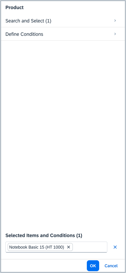
Select Multiple Items and Define Multiple Conditions (Smartphone)
Tapping the value help icon displays the start dialog.
- The Search and Select tab is used to select multiple items.
- The Define Conditions tab is used to define multiple conditions.
- The counters in the titles of both tabs represent the number of selected items/defined conditions.
All selected items and conditions are added as tokens to the Selected Items and Conditions (n) field at the bottom of the start dialog. The counter n indicates the combined number of items selected and conditions defined.
Start dialog
Selecting multiple items on a smartphone
Defining multiple conditions (smartphone)
Filters on a smartphone
Select Multiple Items and Define Multiple Conditions (Desktop/Tablet)
Clicking the value help icon displays the icon tab bar with the Search and Select and Define Conditions tabs.
- The Search and Select tab is used to select multiple items
- The Define Conditions tab is used to define multiple conditions.
All selected items and conditions are added as tokens to the Selected Items and Conditions (n) field at the bottom of the dialog. The counter n indicates the combined number of items selected and conditions defined.
Selecting multiple items and conditions on a desktop
Selecting multiple items and conditions on a desktop
Define Multiple Conditions (Smartphone)
Tapping the value help icon opens the start dialog with the Define Conditions tab.
The selected values are added as tokens to the Selected Conditions at the bottom of the start dialog.

Start dialog
Defining multiple conditions on a smartphone
Define Multiple Conditions (Desktop/Tablet)
Clicking the value help icon opens the Define Conditions tab.
The selected values are added as tokens to the Selected Conditions at the bottom of the start dialog.
Defining multiple conditions on a desktop
Copying and Pasting Multiple Values
The area for defining conditions allows the user to enter multiple values at once (copied from the clipboard).
Users can paste more than one value into the value input field. In this case, the condition row repeats with the previously selected condition and shows one value per row.
If there is no vertical space for the conditions, vertical scrolling is added to the top of the dialog.
Copying and pasting multiple values
Guidelines
Dialog Title
The dialog title differs depending on the device and whether multiple or single selection is used.
For smartphones:
- Start dialog: [Object] (for example, Company)
- Search and Select Dialog: Search and Select
- Filters dialog: Show Filters
- Define single condition: Define Condition
- Define multiple conditions: Define Conditions
For tablet and desktop devices:
- Selection of multiple items combined with selection of multiple conditions: [Object] (for example, Company)
- Single item selection: Select: [Object] (for example, Select: Company)
- Define single condition: Define Condition: [Object] (for example, Define Condition: Company)
- Define multiple conditions: Define Conditions: [Object] (for example, Define Conditions: Company)
Filtering
If necessary, also provide value help for fields offered in the filters. However, do not provide the full value help dialog for the ID and description fields of the business object that is being selected. For these two fields, make sure that the value help icon opens only the Define Conditions screen.
For example, in a value help dialog for selecting the customer, do not offer full value help for the Customer ID and Customer Name fields. Instead, try to use the value help in combination with a helpful suggestion.
Constant Parameters
You can use constant parameters to pre-filter suggestion lists, dropdowns, and the value help results list. Users can’t change these parameters.
Do not show parameters with constant values as filterable fields in the filter bar of the value help dialog or in the result table columns. Constant values should not be visible to users in any way.
Related Links
Elements and Controls
- Combo Box (guidelines)
- Filter Bar (guidelines)
- Input Field (guidelines)
- Multi Input Field (guidelines)
- Token (guidelines)
- Icon Tab Bar (guidelines)
- List (guidelines)
- Which Selection Control Should I Use (guidelines)
Implementation
- Value Help Dialog (SAPUI5 samples)
- Smart Filter Bar with value help dialog (SAPUI5 samples)
- Value Help Dialog (SAPUI5 API reference)
 Your feedback has been sent to the SAP Fiori design team.