
- Latest SAPUI Version 1.124
- SAPUI5 Version 1.122
- SAPUI5 Version 1.120
- SAPUI5 Version 1.118
- SAPUI5 Version 1.116
- SAPUI5 Version 1.114
- SAPUI5 Version 1.112
- SAPUI5 Version 1.110
- SAPUI5 Version 1.108
- SAPUI5 Version 1.106
- SAPUI5 Version 1.104
- SAPUI5 Version 1.102
- SAPUI5 Version 1.100
- SAPUI5 Version 1.98
- SAPUI5 Version 1.96
- SAPUI5 Version 1.94
- SAPUI5 Version 1.92
- SAPUI5 Version 1.90
- SAPUI5 Version 1.88
- SAPUI5 Version 1.86
- SAPUI5 Version 1.84
- SAPUI5 Version 1.82
- SAPUI5 Version 1.80
- SAPUI5 Version 1.78
- SAPUI5 Version 1.74
- SAPUI5 Version 1.72
- SAPUI5 Version 1.70
- SAPUI5 Version 1.68
- SAPUI5 Version 1.66
- SAPUI5 Version 1.64
- SAPUI5 Version 1.62
- SAPUI5 Version 1.60
- SAPUI5 Version 1.58
- SAPUI5 Version 1.56
- SAPUI5 Version 1.54
- SAPUI5 Version 1.52
- SAPUI5 Version 1.50
- SAPUI5 Version 1.48
- SAPUI5 Version 1.46
- SAPUI5 Version 1.44
- SAPUI5 Version 1.42
- SAPUI5 Version 1.40
- SAPUI5 Version 1.38
- SAPUI5 Version 1.36
- SAPUI5 Version 1.34
- SAPUI5 Version 1.32
- SAPUI5 Version 1.30
- SAPUI5 Version 1.28
- SAPUI5 Version 1.26
- Latest SAPUI Version 1.124
- SAPUI5 Version 1.122
- SAPUI5 Version 1.120
- SAPUI5 Version 1.118
- SAPUI5 Version 1.116
- SAPUI5 Version 1.114
- SAPUI5 Version 1.112
- SAPUI5 Version 1.110
- SAPUI5 Version 1.108
- SAPUI5 Version 1.106
- SAPUI5 Version 1.104
- SAPUI5 Version 1.102
- SAPUI5 Version 1.100
- SAPUI5 Version 1.98
- SAPUI5 Version 1.96
- SAPUI5 Version 1.94
- SAPUI5 Version 1.92
- SAPUI5 Version 1.90
- SAPUI5 Version 1.88
- SAPUI5 Version 1.86
- SAPUI5 Version 1.84
- SAPUI5 Version 1.82
- SAPUI5 Version 1.80
- SAPUI5 Version 1.78
- SAPUI5 Version 1.76
- SAPUI5 Version 1.74
- SAPUI5 Version 1.72
- SAPUI5 Version 1.70
- SAPUI5 Version 1.68
- SAPUI5 Version 1.66
- SAPUI5 Version 1.64
- SAPUI5 Version 1.62
- SAPUI5 Version 1.60
- SAPUI5 Version 1.58
- SAPUI5 Version 1.56
- SAPUI5 Version 1.54
- SAPUI5 Version 1.52
- SAPUI5 Version 1.50
- SAPUI5 Version 1.48
- SAPUI5 Version 1.46
- SAPUI5 Version 1.44
- SAPUI5 Version 1.42
- SAPUI5 Version 1.40
- SAPUI5 Version 1.38
- SAPUI5 Version 1.36
- SAPUI5 Version 1.34
- SAPUI5 Version 1.32
- SAPUI5 Version 1.30
- SAPUI5 Version 1.28
- SAPUI5 Version 1.26
Value Help Dialog
sap.ui.comp.valuehelpdialog.ValueHelpDialog
Intro
The value help dialog is a UI pattern that helps the user find and select single and multiple values. The user can also define and select multiple ranges. The value help dialog is generally called from an input field or a multi-input field by clicking the selection icon (value help icon) of the input field.
Usage
Use the value help dialog if:
- The user needs to use different attributes (such as city, company name, and so on) to find an object.
- The user is searching within a dataset containing more than 200 items.
- The user needs to define and select ranges and exclusions.
Do not use the value help dialog if:
- There is a simpler control that fits the use case. Always start with the least complex control (for example, use select instead of value help if the user needs to select only one item from a short list). For more information on when to use which control, see Selection Controls – Overview.
Responsiveness
The behavior of the value help dialog on a phone differs from its behavior on a tablet or desktop device. Both the navigation and the positioning of the selection area differ depending on the device.

Value help dialog - Size S
Value help dialog - Size M
Value help dialog - Size L
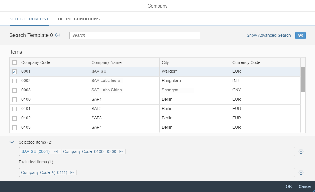
Components
The value help dialog contains the following components:
1) Header bar
2) Icon tab bar / list control (phone)
3) Search template (optional)
4) Basic search
5) Advanced search
6) Result list
7) Items row (selected items, excluded items)
8) Footer toolbar
9) Include/exclude areas for range selection
Components of the Value Help Dialog
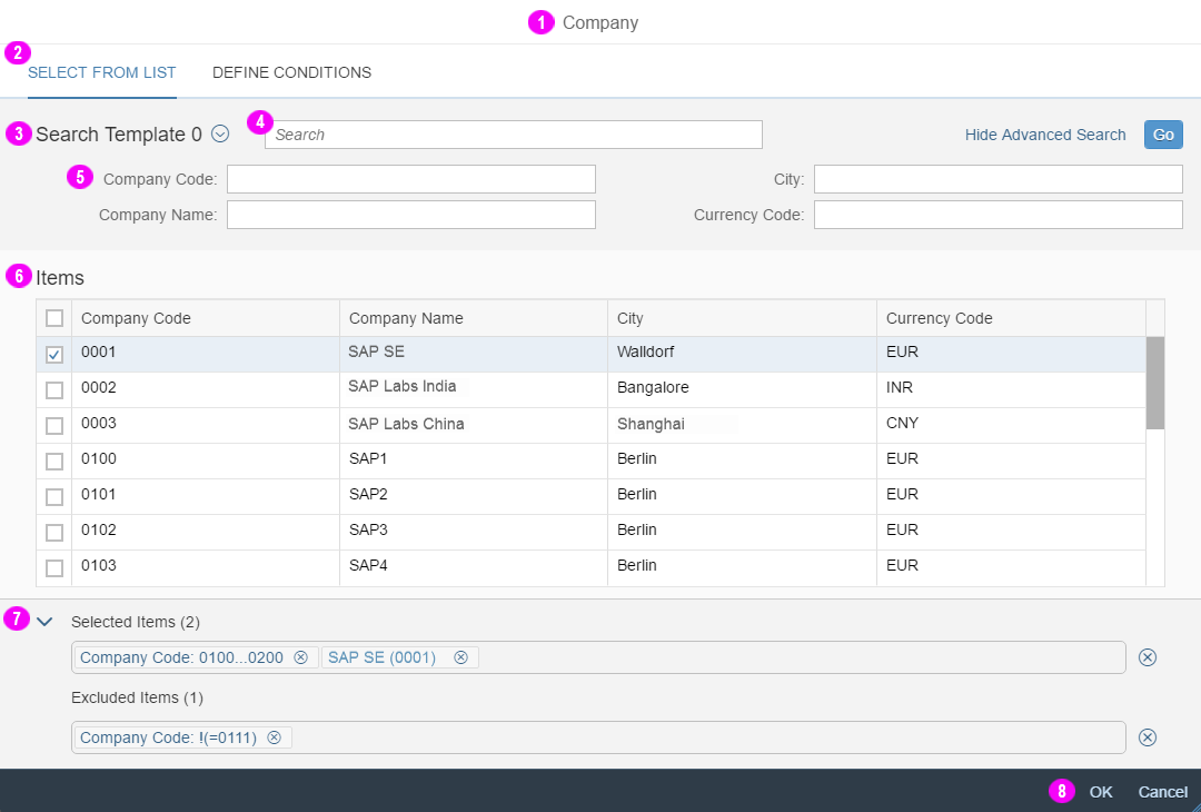
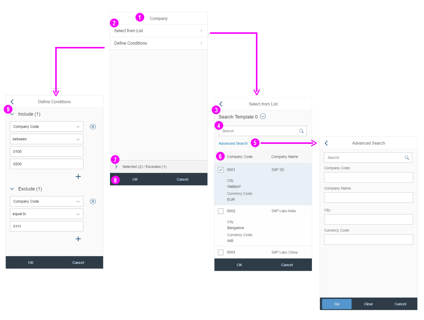
Header Bar (1)
The header bar contains the dialog title. For guidelines on the dialog title, see the Guidelines section of this article.
Icon Tab Bar on Tablet/Desktop and List Control on Phone (2)
Depending on the device, the following controls are used to display the content of the value help dialog:
- Smartphones: The start dialog provides a list (sap.m.List) with the standard list items (sap.m.StandardListItem) Select from List and
Define Conditions to navigate between the different dialogs. - Tablet and desktop devices: The value help dialog contains an icon tab bar (sap.m.IconTabBar) to navigate between the Select from List and the Define Conditions tab.
Search Template (3)
Search templates allow the user to display different or additional fields in the advanced search field and the results list. Depending on the use case, the user can switch between the different search templates in order to use different fields when searching. For example, the search template “Customer (by company code)” displays the additional field “Company code” in the advanced search and result list.
Basic Search (4)
The basic search finds all results that are somehow related to the input. For example, the search term “A” returns all the results containing the letter “A”.
Always offer the basic search in the value help dialog. Position the basic search to the right of the search template control. If there is no search template control, left-align the basic search.
Advanced Search (5)
The advanced search offers a search field for each column in the result list.
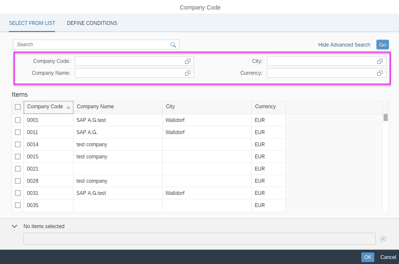
Value help dialog - Advanced search
For implementation of the basic and advanced search, the filter bar (sap.ui.comp.filterbar.FilterBar) is used in advanced mode. Advanced mode differs from basic mode in the following ways:
- There is no Filters link or a dialog to make additional filter fields visible. All filter fields/advanced search fields are added automatically to the advanced search area.
- There is a toggle link to show and hide the advanced search.
- In each of the filter fields, users can use operators like “between” or “lower than” to define ranges.
Always collapse the advanced search by default.
Note that the value help icon of the business object ID field and description field for the business object that opened the current value help dialog will open only the Define Conditions screen. The entire value help dialog is not shown in order to prevent endless loops. For example, the value help icon of the customer ID or description field in a Select: Customer value help dialog will navigate directly to the Define Conditions screen.
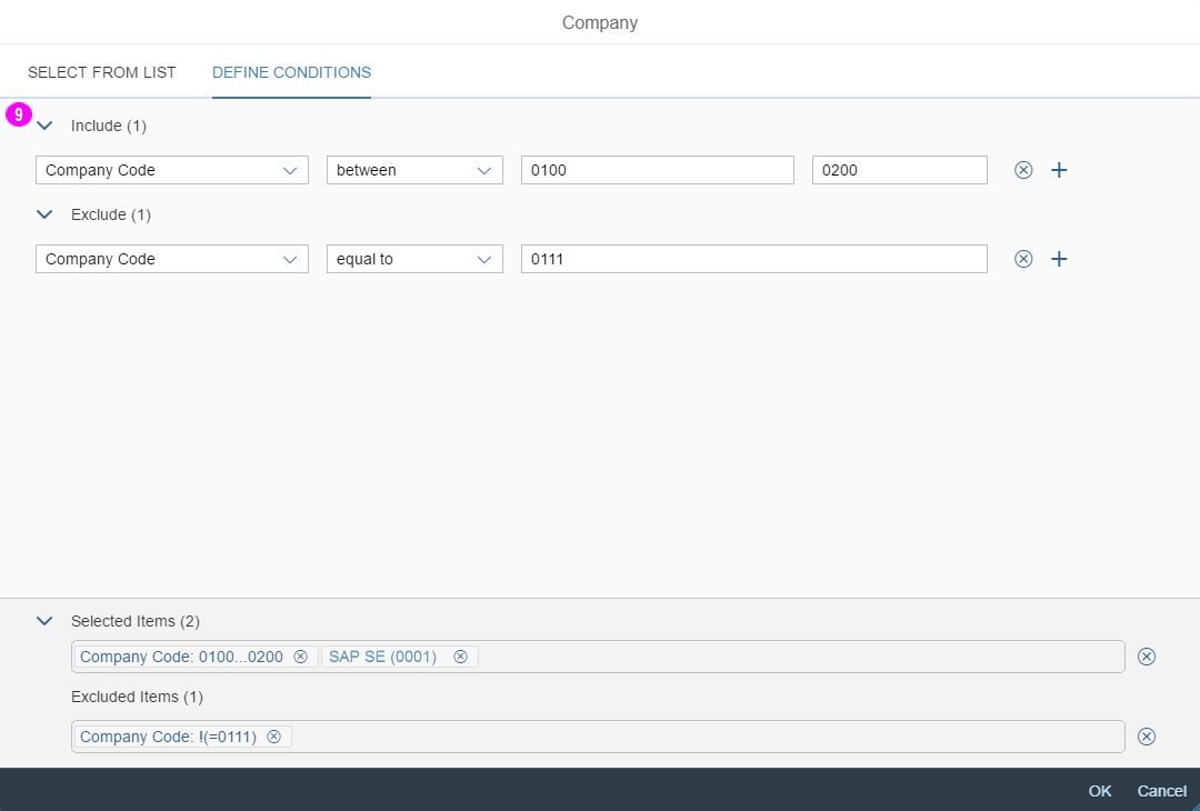
How the Advanced Search Works
The user can include operators (such as “=“) to define the ranges directly within the field without moving to the fields of the Define Conditions tab.
The user must type the following to get results:
| Operator | Input Notation | Example |
| between | value…value | 000…100 |
| equal to | =value | =0001 |
| contains | *value* | *1* |
| starts with | value* | 001* |
| ends with | *value | *5 |
| less than | <value | <100 |
| less than or equal to | <=value | <=200 |
| greater than | >value | >0300 |
| greater than or equal to | >=value | >=0500 |
| not equal to* | !(=value) | !(=0) |
* Note that there isn’t an explicit “not equal to” operator. Instead, you need to use “Exclude” (!) in conjunction with the “equal to” operator (=).
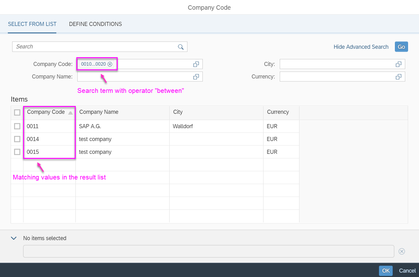
Advanced search using operator
Result List (6)
- You can prefill the result list of the value help dialog by default.
- If you transferred values from the input field to the basic search field of the value help dialog, the results are filtered accordingly.
- If available, display the ID and description of the business object in the first and second columns. Display additional information in the next columns.
- We recommend a maximum of five columns in the results list.
Selected/Excluded Items Row (7)
The row for Selected Items / Excluded Items is displayed in the panel container (see panel for more information). Each item or range that is selected or excluded is displayed as a token in the selected or excluded item row.
- On desktops, the selection area with the selected and excluded items row is initially expanded.
- On tablets and phones, the selection area with the selected and excluded item row is initially collapsed.
Footer Toolbar (8)
The footer bar offers the OK and Cancel buttons.
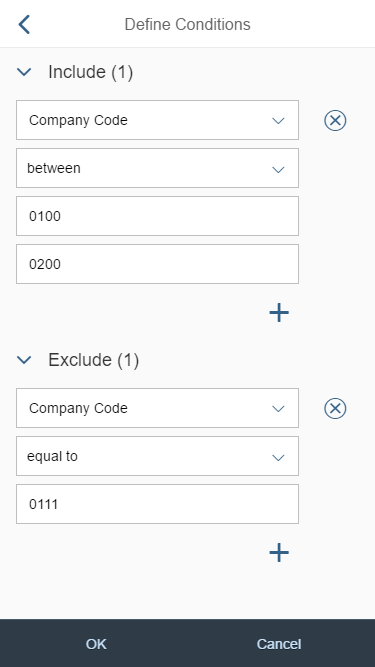
Include/Exclude Areas for Range Selection (9)
In the Include and Exclude areas of the Define Conditions tab, you can define single and multiple ranges with the following operators:
- equal to
- between
- less than
- less than or equal to
- greater than
- greater than or equal to
Each range is displayed as a token in the selected or excluded item row.
Behavior and Interaction
Basic and Advanced Search
- The basic search (mandatory) and advanced search (optional) are triggered by clicking the Go button. The search results are shown in the result list.
- If the input field where the user is coming from contains data, this data is transferred to the basic search of the value help dialog and the results are then filtered accordingly.
- The basic search performs a search across all fields that are displayed in the advanced search and the result list.
Item and Range Selection
Depending on your use case, the value help dialog can offer different selection options:
- Select a single item
- Select a single range
- Select multiple items
- Select/exclude multiple ranges
Users open the value help dialog by clicking the value help icon of the input field. The next steps depend on the use case and form factor (smartphone or desktop/tablet).
The different use cases are described in the sections below.
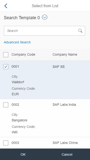
Select a Single Item (Smartphone)
Tapping the value help icon opens the Select from List tab. As soon as an item is selected, the value help dialog closes automatically.
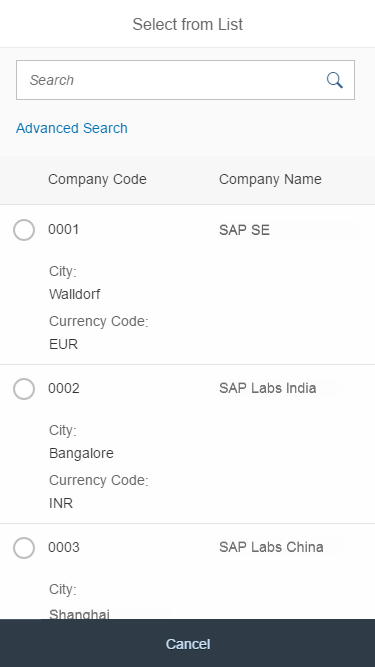
Single item selection on a smartphone
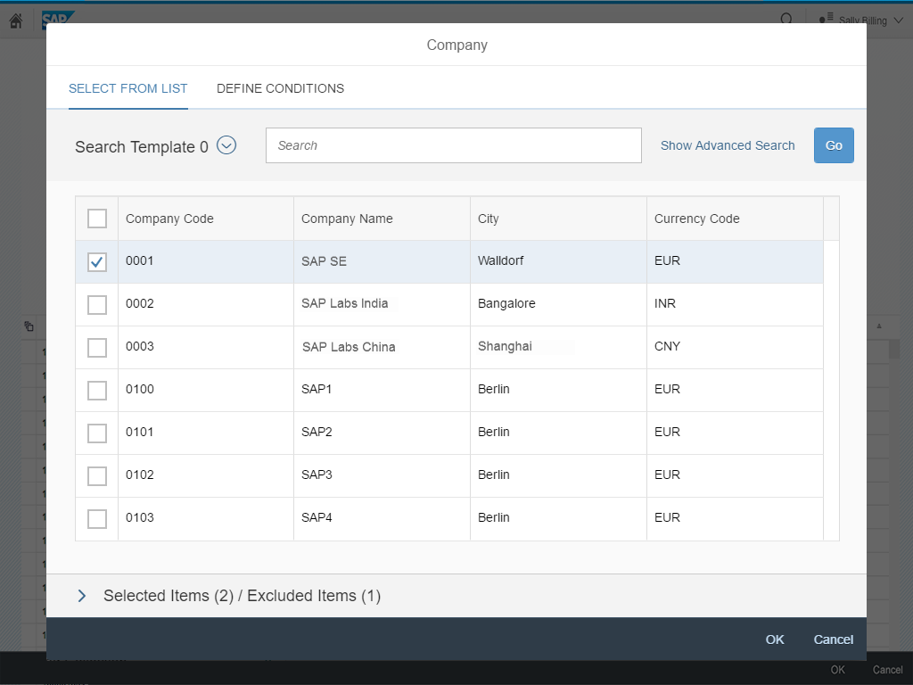
Select a Single Item (Desktop/Tablet)
Clicking the value help icon opens the Select: [Object] screen (for example, Select: Company). The icon tab bar and the Selected Items / Excluded Items row are hidden. As soon as an item is selected, the value help dialog closes automatically.
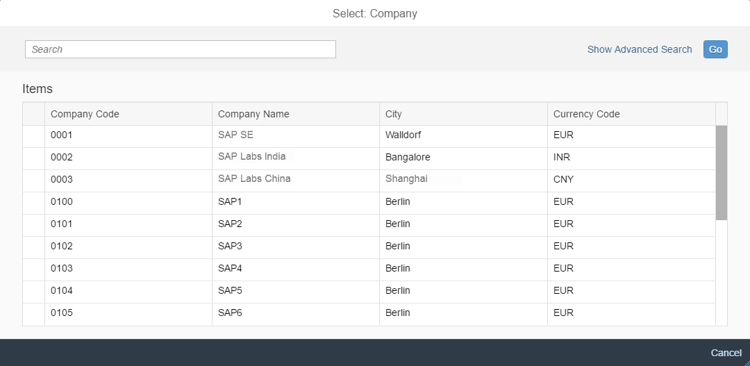
Single item selection on a desktop/tablet device
Select a Single Range (Smartphone)
Tapping the value help icon opens the Define Condition tab.
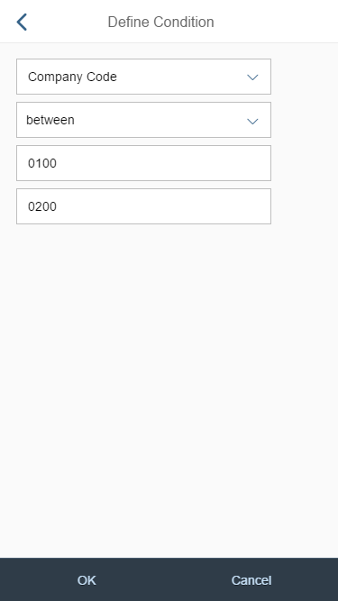
Single range selection on a smartphone
Select a Single Range (Desktop/Tablet)
Clicking the value help icon opens the Define Condition: [Object] tab (for example, Define Condition: Company).
The icon tab bar and the Selected Items / Excluded Items row are hidden. The Add and Delete icons for adding and deleting ranges are also hidden.
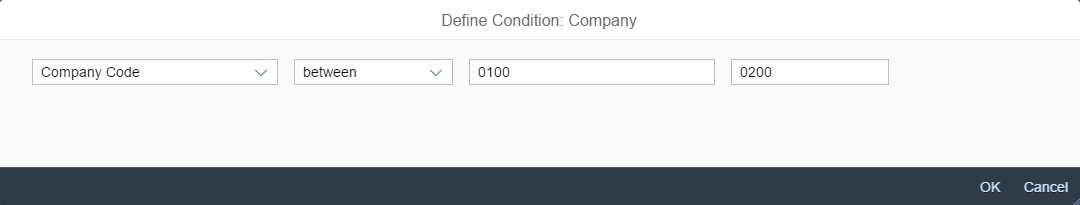
Single range selection on a desktop/tablet device
Select Multiple Items | Select/Exclude Multiple Ranges (Smartphone)
Tapping the value help icon displays the start dialog.
- The Select from List tab is used to select multiple items
- The Define Conditions tab is used to select and exclude ranges.
Both are added as tokens to the Selected Items / Excluded Items row at the bottom of the start dialog.
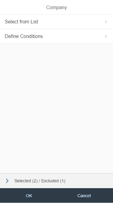
Start dialog for multi-item and multi-range selection on a smartphone
Multi-range selection on a smartphone
Multi-item selection on a smartphone
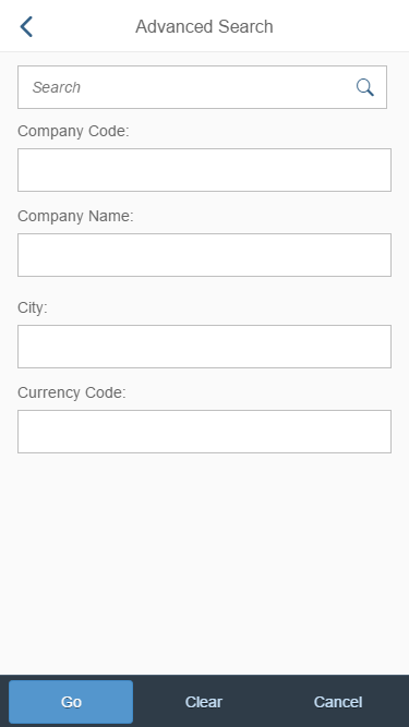
Advanced search on a smartphone
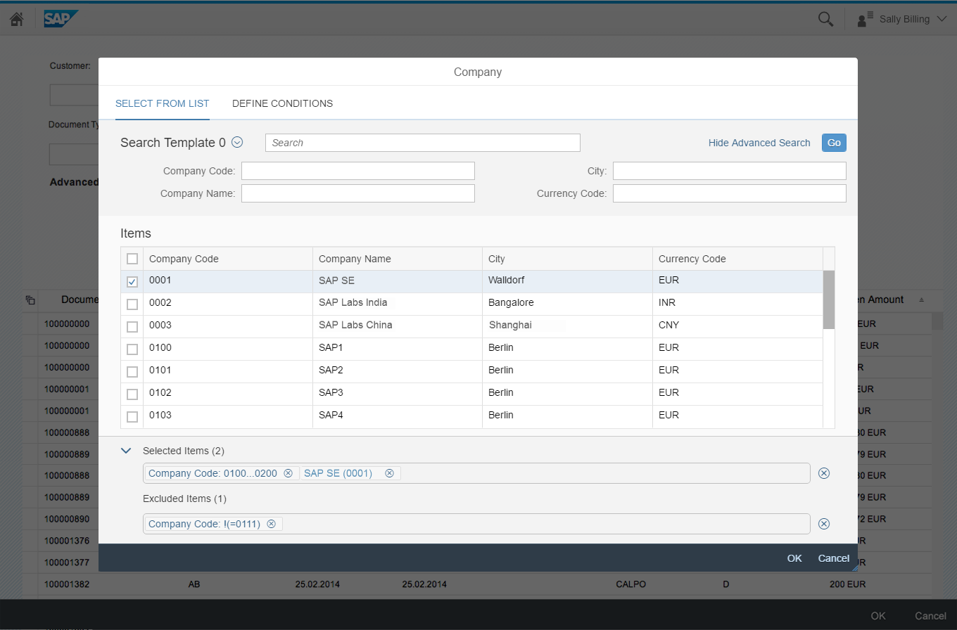
Select Multiple Items | Select/Exclude Multiple Ranges (Desktop/Tablet)
Clicking the value help icon displays the icon tab bar with the Select from List and Define Conditions tabs.
- The Select from List tab is used to select multiple items
- The Define Conditions tab is used to select and exclude ranges.
Both are added as tokens to the Selected Items / Excluded Items row at the bottom of the screen.
Multi-item and multi-range selection on a desktop/tablet device
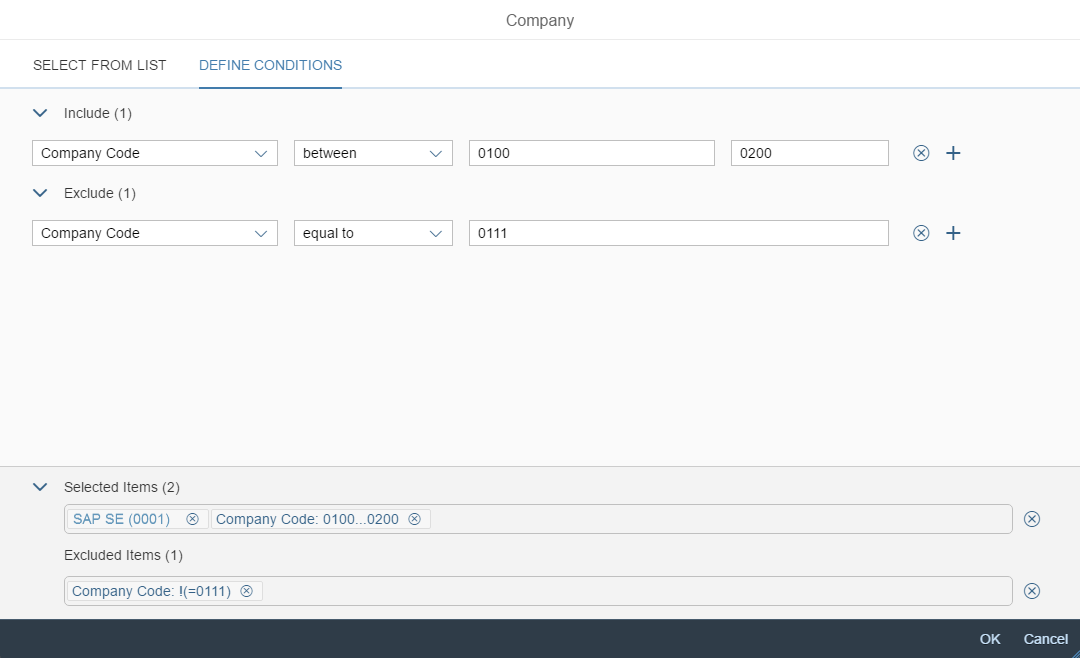
Multi-item and multi-range selection on a desktop/tablet device
Select/Exclude Multiple Ranges (Smartphone)
Tapping the value help icon opens the start dialog with the Define Conditions tab.
The selected values are added as tokens to the Selected Items / Excluded Items row at the bottom of the start dialog.
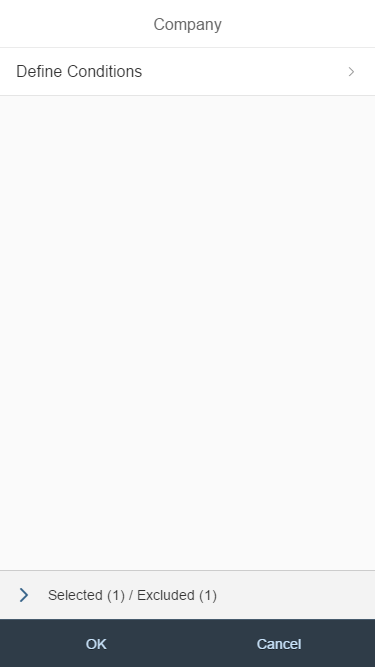
Start dialog for multi-range selection on a smartphone

Multi-range selection on a smartphone
Select/Exclude Multiple Ranges (Desktop/Tablet)
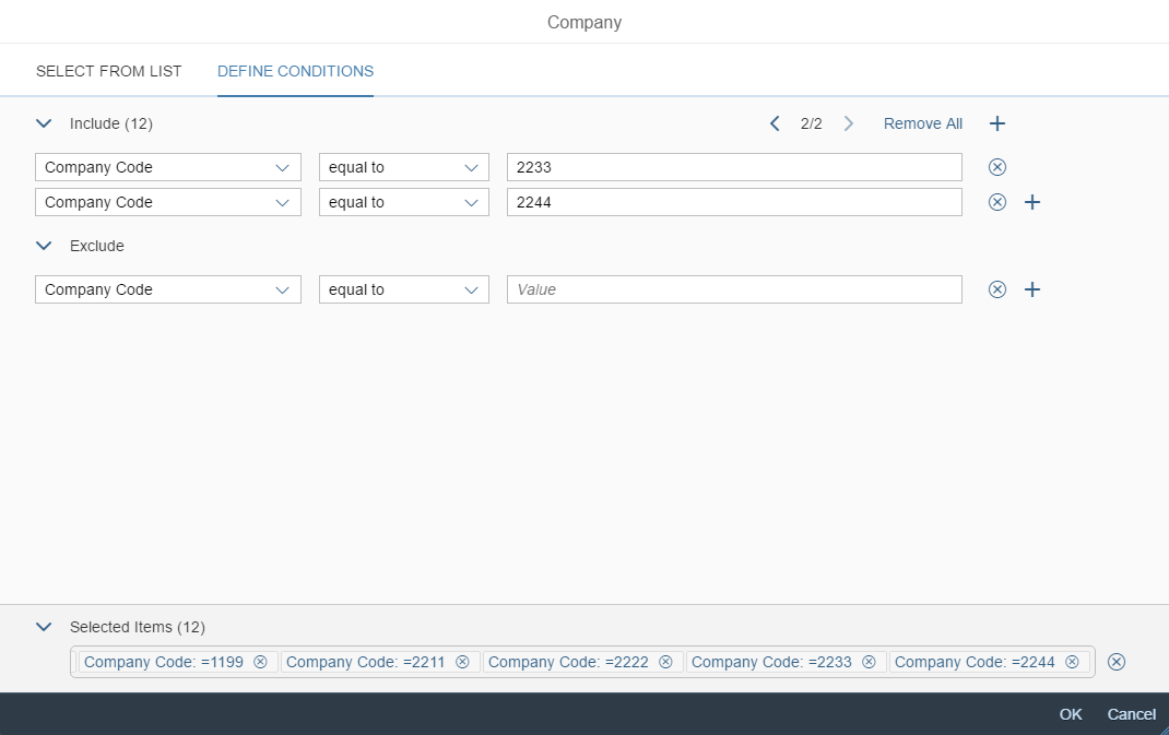
Clicking the value help icon opens the Define Conditions: [Object] tab (for example, Define Conditions: Company). The icon tab bar is hidden and the Selected Items / Excluded Items row is displayed.
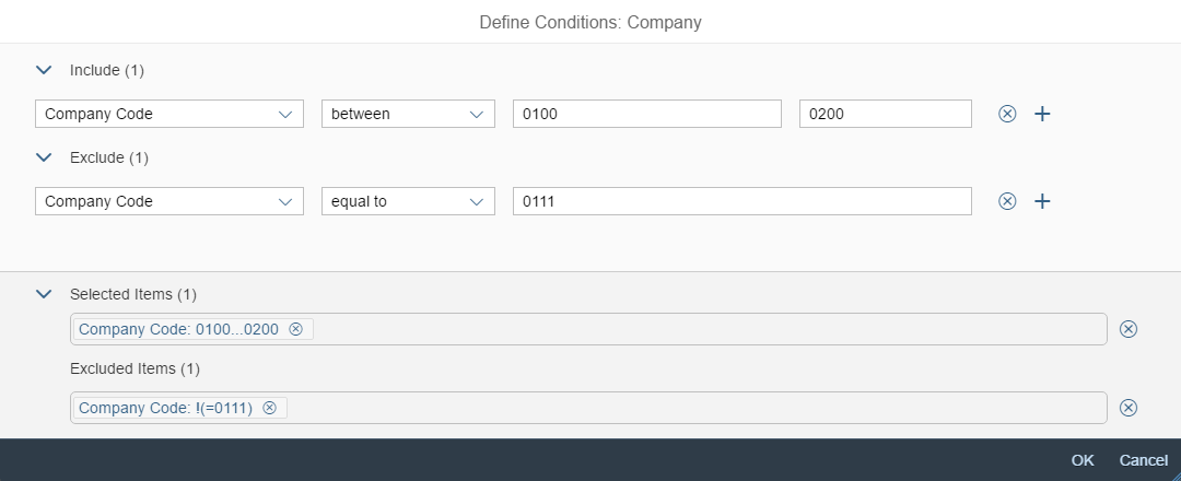
Multi-range selection on a desktop/tablet device
Selected Items / Excluded Items
- Each item that is selected from the result list on the Select from List tab is displayed as a token in the Selected Items row.
- Each range that is selected or excluded on the Define Conditions tab is displayed as a token in the Selected Items / Excluded Items row.
Copying and Pasting Multiple Values
The Include and Exclude areas on the Define Conditions tab allow the user to enter multiple values at once (copied from the clipboard) .
In both areas, users can paste more than one value into the value input field. In this case, the condition row repeats with the previously selected condition and shows one value per row.
If there are more than 10 rows of conditions in either the Include or Exclude area, pagination is added to top of the respective area. A token appears next to each pasted value on the Selected Items / Excluded Items row at the bottom of the value help dialog.
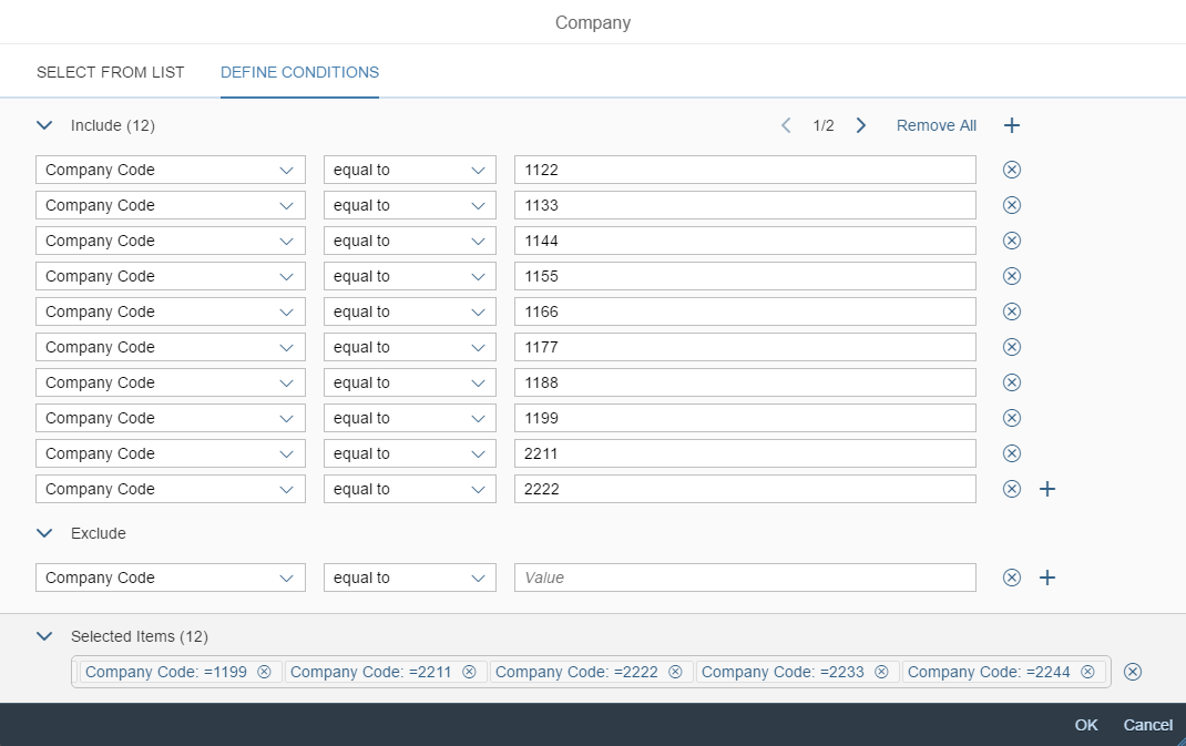
Copying and pasting multiple values
Copying and pasting multiple values
Guidelines
Dialog Title
The dialog title differs depending on the device and whether multiple or single selection is used.
For smartphones:
- Starting dialog: [Object] (for example, Company)
- Select from list dialog: Select from List
- Advanced search dialog: Advanced Search
- Single range selection: Define Condition
- Multiple range selection: Define Conditions
For tablet and desktop devices:
- Multiple items combined with selection of multiple ranges: [Object] (for example, Company)
- Single item selection: Select: [Object] (for example, Select: Company)
- Single range selection: Define Condition: [Object] (for example, Define Condition: Company)
- Multiple range selection: Define Conditions: [Object] (for example, Define Conditions: Company)
Advanced Search
If necessary, also provide value help for fields offered in the advanced search. However, do not provide the full value help dialog for the ID and description fields of the business object that is being selected. For these two fields, make sure that the value help icon opens only the Define Conditions screen (range selection).
For example, in a value help dialog for selecting the customer, do not offer full value help for the Customer ID and Customer Name fields. Instead, try to use the value help in combination with a helpful suggestion.
Resources
Want to dive deeper? Follow the links below to find out more about related controls, the SAPUI5 implementation, and the visual design.
Elements and Controls
- Input Field (guidelines)
- Multi Input Field (guidelines)
- Token (guidelines)
- Icon Tab Bar (guidelines)
- List (guidelines)
- Panel (guidelines)
Implementation
- Smart Filter Bar with value help dialog (SAPUI5 samples)
- Value Help Dialog (SAPUI5 API reference)
 Your feedback has been sent to the SAP Fiori design team.