- Latest SAPUI5 Version 1.122
- SAPUI5 Version 1.120
- SAPUI5 Version 1.118
- SAPUI5 Version 1.116
- SAPUI5 Version 1.114
- SAPUI5 Version 1.112
- SAPUI5 Version 1.110
- SAPUI5 Version 1.108
- SAPUI5 Version 1.106
- SAPUI5 Version 1.104
- SAPUI5 Version 1.102
- SAPUI5 Version 1.100
- SAPUI5 Version 1.98
- SAPUI5 Version 1.96
- SAPUI5 Version 1.94
- SAPUI5 Version 1.92
- SAPUI5 Version 1.90
- SAPUI5 Version 1.88
- SAPUI5 Version 1.86
- SAPUI5 Version 1.84
- SAPUI5 Version 1.82
- SAPUI5 Version 1.80
- SAPUI5 Version 1.78
- SAPUI5 Version 1.76
- SAPUI5 Version 1.74
- SAPUI5 Version 1.72
- SAPUI5 Version 1.70
- SAPUI5 Version 1.68
- SAPUI5 Version 1.66
- SAPUI5 Version 1.64
- SAPUI5 Version 1.62
- SAPUI5 Version 1.60
- SAPUI5 Version 1.58
- SAPUI5 Version 1.56
- SAPUI5 Version 1.54
- SAPUI5 Version 1.52
- SAPUI5 Version 1.50
- SAPUI5 Version 1.48
- SAPUI5 Version 1.46
- SAPUI5 Version 1.44
- SAPUI5 Version 1.42
- SAPUI5 Version 1.40
- SAPUI5 Version 1.38
- SAPUI5 Version 1.36
- SAPUI5 Version 1.34
- SAPUI5 Version 1.32
- SAPUI5 Version 1.30
- SAPUI5 Version 1.26
- Latest SAPUI5 Version 1.122
- SAPUI5 Version 1.120
- SAPUI5 Version 1.118
- SAPUI5 Version 1.116
- SAPUI5 Version 1.114
- SAPUI5 Version 1.112
- SAPUI5 Version 1.110
- SAPUI5 Version 1.108
- SAPUI5 Version 1.106
- SAPUI5 Version 1.104
- SAPUI5 Version 1.102
- SAPUI5 Version 1.100
- SAPUI5 Version 1.98
- SAPUI5 Version 1.96
- SAPUI5 Version 1.94
- SAPUI5 Version 1.92
- SAPUI5 Version 1.90
- SAPUI5 Version 1.88
- SAPUI5 Version 1.86
- SAPUI5 Version 1.84
- SAPUI5 Version 1.82
- SAPUI5 Version 1.80
- SAPUI5 Version 1.78
- SAPUI5 Version 1.76
- SAPUI5 Version 1.74
- SAPUI5 Version 1.72
- SAPUI5 Version 1.70
- SAPUI5 Version 1.68
- SAPUI5 Version 1.66
- SAPUI5 Version 1.64
- SAPUI5 Version 1.62
- SAPUI5 Version 1.60
- SAPUI5 Version 1.58
- SAPUI5 Version 1.56
- SAPUI5 Version 1.54
- SAPUI5 Version 1.52
- SAPUI5 Version 1.50
- SAPUI5 Version 1.48
- SAPUI5 Version 1.46
- SAPUI5 Version 1.44
- SAPUI5 Version 1.42
- SAPUI5 Version 1.40
- SAPUI5 Version 1.38
- SAPUI5 Version 1.36
- SAPUI5 Version 1.34
- SAPUI5 Version 1.32
- SAPUI5 Version 1.30
- SAPUI5 Version 1.28
- SAPUI5 Version 1.26
Chart – Color Palettes
Intro
This article explains how to use the three chart color palettes: semantic, sequential and qualitative. For color names and HEX values, see palette colors – values and names.
Palette Overview
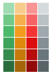
Semantic Color Palette
Used to visualize the notion of good or bad.
Sequential Color Palette
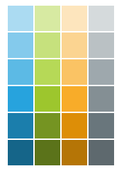
Used to visualize increases and decreases.
Qualitative Color Palette
Used to differentiate data points.

Default Colors
By default every chart type comes with built in colors which are automatically applied according to your dataset. Here are three examples:
1. When only one series is displayed, the first color from the qualitative palette is automatically applied to each item.
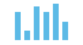
Column chart: One series
2. When a multiple series is displayed, more colors from the qualitative palette are automatically applied to each item in the predetermined sequence.
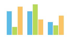
Column chart: Three series
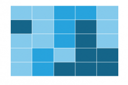
3. Colors from the sequential palette are automatically applied to the heatmap.
Changing the Colors
There are three main reasons why you might want to change the colors in charts:
Highlight A Category
In this example, one category has been highlighted using the second color from the qualitative palette.
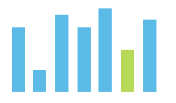
Column chart with one color for one specific category
Compare Series
In this example, two series use different shades of the same color hue.
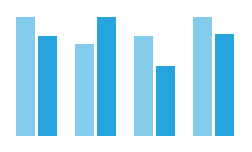
Column chart with two series with two different colors.
Encode Values
In this example, the semantic color palette has been applied to the chart so that the data points are now red if their value is below a certain threshold, green if their value is above another threshold, and orange if their value is between the two.
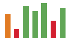
Column chart with colors based on values
Rules
1) Only use colors contained in the Fiori chart palettes
You should only use colors from the SAP Fiori color palettes to ensure that we maintain visual design consistency across all charts used in all SAP Fiori applications.
2) Only use one palette per chart
Each palette has been carefully designed to serve a distinct purpose. If you combine colors from different palettes in the same chart, you will the defeat their purpose.
3) Use color names – Don’t use HEX values!
Colors are defined by names in order to support our theming capabilities. This means that the HEX values of the colors may not be exactly the same in past, present and future SAP Fiori visual design themes. This flexibility is made possible by the fact that the color names will stay the same across all past, present and future SAP Fiori visual design themes. You can get the color names and corresponding HEX values from the article on color palettes – values and names.
Qualitative Palette
There are are eleven colors in the qualitative color palette which are used to differentiate data points without carrying any semantic meaning. The palette has been carefully designed so that each colour is visually distinct from each other.
This means that you should not choose to use a particular color simply because you would prefer it over the others. We recommend that you use the colors in the sequence illustrated above.
Below are two examples of how the qualitative color palette can be used.
Highlight Category Items
By default all the categories will use the first color from the qualitative palette. However, you can use other colors from the qualitative palette if you want to highlight category items.

Using the qualitative palette to focus on a category item
Group Items by Color
You can use the qualitative palette to group items into categories. In this example, we use orange for Europe, blue for America, and green for Asia.
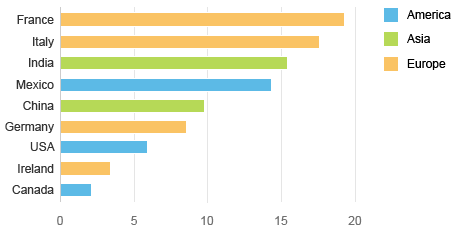
Using the qualitative palette to show a hierarchy
Semantic Palette
The semantic color palette is used to visualize the notion of good or bad through three universally-recognized semantic color hues in six shades. These shades allow you to express degrees (such as good or bad, safe or critical, and so on). Gray can be applied to neutral values.
Here some ways that you can use the semantic color palette:
Illustrate the Top Three Values
This column chart uses the semantic palette to display sales revenue per month. The color green is used to highlight the top three months with the highest revenue.

Column chart: Top three values
Show Positive and Negative Series
These stacked bars represent the availability of materials. The available series is green, the inspection series is orange, and the blocked series is red.
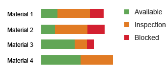
Stacked bars: Good and bad values
Vizualize Good or Bad Values
Each data point has a color based on its value. Data points are now red if their value is below a certain threshold, green if their value is above another threshold, and orange if their value is between the two.

Column chart: Good and bad values
Visualize Degrees
In this geomap, green is used to indicate states with good performance, and red is used to indicate states with bad performance. The different shades of each color hue express different levels of good and bad performance.
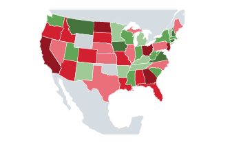
Geomap: Levels of performance
Default Shades
The default shades are:
- sapUiChartPaletteSemanticNeutral
- sapUiChartPaletteSemanticGood
- sapUiChartPaletteSemanticBad
- sapUiChartPaletteSemanticCritical

Column chart: Level 1 of the semantic palette
Picking the Correct Shade
Please note that the system described below also applies to the other color hues in the semantic palette.
Number of Degrees
Shades to Use
Color Names
Sequential Palette
The sequential color palette consists of four color hues: blue, green, yellow and gray.
The first three color hues carry no semantic meaning. The semantic meaning is purely communicated through six shades that can be used to express different values. The gray hue does carry semantic meaning of neutral.
Indeed, even if customers change the color hues, there will always be six shades in their new palette. This means that you should not choose to use a particular color simply because you prefer it over the others. Therefore, we recommend that you use blue for one sequence, with green if you have two sequences, and yellow if you have three sequences.
Here some ways you can use the sequential color palette:
Distinguish Past and Present
These two series use the same hue (the first hue of the sequential palette). Use different gradations of brightness to distinguish between last year and the current year.

Column chart: Two series
Show Time Gradation
These stacked bars represent payable aging by country. The different gradations of brightness are used to represent different time periods.
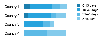
Stacked bars: Time gradation
Show Different Levels
This bullet chart shows direct costs in a dark shade and indirect costs in a light shade.
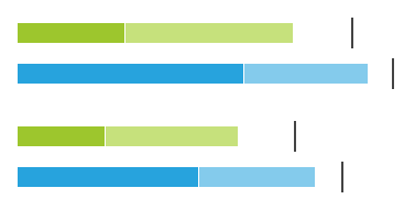
Bullet chart: Different levels
Ranked Values
In this bubble chart, the size of the bubbles represents future sales deals. The probability of converting these deals is expressed using different shades of blue.

Bubble chart: Ranked values
Multiple Levels in Two Groups
In this geomap, one color hue from the palette is used for some of the states and different color hue is used for all the other states. The different shades express different levels.
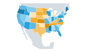
Geomap: Multiple levels in two groups
Choosing the Correct Shade for Multiple Levels
Please note that the system described below also applies to the other color hues in the sequential palette.
Number of Levels
Shades to Use
Color Names
Resources
Want to dive deeper? Follow the links below to find out more about related controls, the SAPUI5 implementation, and the visual design.



 Your feedback has been sent to the SAP Fiori design team.