
- Latest SAPUI Version 1.124
- SAPUI5 Version 1.122
- SAPUI5 Version 1.120
- SAPUI5 Version 1.118
- SAPUI5 Version 1.116
- SAPUI5 Version 1.114
- SAPUI5 Version 1.112
- SAPUI5 Version 1.110
- SAPUI5 Version 1.108
- SAPUI5 Version 1.106
- SAPUI5 Version 1.104
- SAPUI5 Version 1.102
- SAPUI5 Version 1.100
- SAPUI5 Version 1.98
- SAPUI5 Version 1.96
- SAPUI5 Version 1.94
- SAPUI5 Version 1.92
- SAPUI5 Version 1.90
- SAPUI5 Version 1.88
- SAPUI5 Version 1.86
- SAPUI5 Version 1.84
- SAPUI5 Version 1.82
- SAPUI5 Version 1.80
- SAPUI5 Version 1.78
- SAPUI5 Version 1.76
- SAPUI5 Version 1.74
- SAPUI5 Version 1.72
- SAPUI5 Version 1.70
- SAPUI5 Version 1.68
- SAPUI5 Version 1.66
- SAPUI5 Version 1.64
- SAPUI5 Version 1.62
- SAPUI5 Version 1.60
- SAPUI5 Version 1.58
- SAPUI5 Version 1.56
- SAPUI5 Version 1.54
- SAPUI5 Version 1.52
- SAPUI5 Version 1.50
- SAPUI5 Version 1.48
- SAPUI5 Version 1.46
- SAPUI5 Version 1.44
- SAPUI5 Version 1.42
- SAPUI5 Version 1.40
- SAPUI5 Version 1.38
- SAPUI5 Version 1.36
- SAPUI5 Version 1.34
- SAPUI5 Version 1.32
- SAPUI5 Version 1.30
- SAPUI5 Version 1.26
- Latest SAPUI Version 1.124
- SAPUI5 Version 1.122
- SAPUI5 Version 1.120
- SAPUI5 Version 1.118
- SAPUI5 Version 1.116
- SAPUI5 Version 1.114
- SAPUI5 Version 1.112
- SAPUI5 Version 1.110
- SAPUI5 Version 1.108
- SAPUI5 Version 1.106
- SAPUI5 Version 1.104
- SAPUI5 Version 1.102
- SAPUI5 Version 1.100
- SAPUI5 Version 1.98
- SAPUI5 Version 1.96
- SAPUI5 Version 1.94
- SAPUI5 Version 1.92
- SAPUI5 Version 1.90
- SAPUI5 Version 1.88
- SAPUI5 Version 1.86
- SAPUI5 Version 1.84
- SAPUI5 Version 1.82
- SAPUI5 Version 1.80
- SAPUI5 Version 1.78
- SAPUI5 Version 1.76
- SAPUI5 Version 1.74
- SAPUI5 Version 1.72
- SAPUI5 Version 1.70
- SAPUI5 Version 1.68
- SAPUI5 Version 1.66
- SAPUI5 Version 1.64
- SAPUI5 Version 1.62
- SAPUI5 Version 1.60
- SAPUI5 Version 1.58
- SAPUI5 Version 1.56
- SAPUI5 Version 1.54
- SAPUI5 Version 1.52
- SAPUI5 Version 1.50
- SAPUI5 Version 1.48
- SAPUI5 Version 1.46
- SAPUI5 Version 1.44
- SAPUI5 Version 1.42
- SAPUI5 Version 1.40
- SAPUI5 Version 1.38
- SAPUI5 Version 1.36
- SAPUI5 Version 1.34
- SAPUI5 Version 1.32
- SAPUI5 Version 1.30
- SAPUI5 Version 1.28
- SAPUI5 Version 1.26
Toolbar Overview
sap.m.Toolbar
Intro
A toolbar enables the user to change the UI or trigger an action.
The table and chart toolbar always appears above the relevant table or chart and has a transparent background. The control is used for key actions that impact entirewhole table or chart. Note that this toolbar scrolls away. In contrast, the footer toolbar has a dark background, appears at the bottom of the page, and remains visible when the user scrolls.
Actions and Layout
Actions can be used as follows:
- They can be independent of the current selection and not related to a specific item or object.
- They can be specific to the current object (user selects one item).
- They can apply to a set of items (user selects two or more items).
- They can control the settings of the UI, which affects all items.
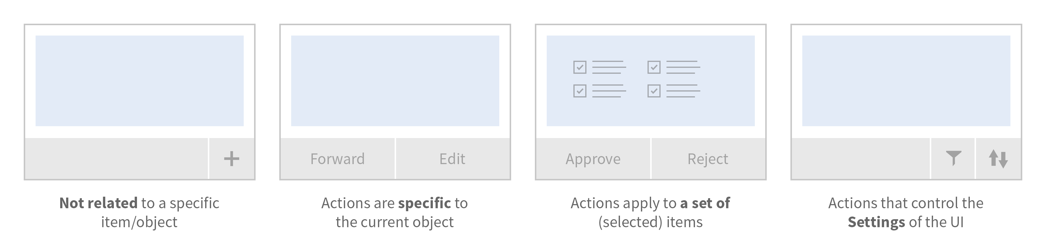
Types of actions (from left to right): Not related to a specific item/object; actions are specific to the current object; actions apply to a set of (selected) items; actions that control the settings of the UI
Sort your buttons according to their importance for the user, with the most frequently used action first and the most seldom-used action last. All buttons go into the overflow from right to left, thus ensuring that the most important buttons are the last to be moved into the overflow menu.
The toolbar is mostly used for buttons (with an icon or text) and should be right-aligned.
Responsiveness
In order to enable responsiveness, use the OverflowToolbar control. It is a container based on sap.m.Toolbar that provides overflow when its content does not fit in the visible area. At the moment only buttons can move into the overflow; all other controls can shrink.
Only allow important actions to shrink and stay outside of the overflow, since truncated text on infrequently used actions is not helpful for the user. This has to be done by the app itself.
The height of the toolbar changes on desktop (compact mode), tablet, and smartphone (cozy mode).
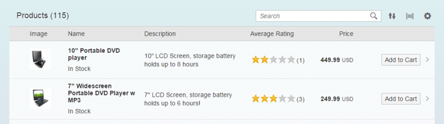
Responsive table toolbar (Tablet)
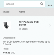
Responsive table toolbar (Phone)
Behavior and Interaction
App teams should implement overflow behavior to ensure that all actions can be accessed at any time. Buttons are sorted by usage, with the most frequently used action first (on the left) and the most seldom-used action last (on the right). This ensures that the most important buttons are the last to be moved into the overflow menu. Our general guideline is to use only icon buttons or text buttons. Do not combine an icon and text into one button. Buttons are always right-aligned.
Overflow (Generic)
The overflow should be activated either when there is not enough space for all actions, or if some actions are less important than others. In this case, the app team might decide to have certain actions only appear in the overflow. Furthermore, the app team can also decide that some (important) actions should never be moved into the overflow.
- By implementing the overflow toolbar, the overflow behavior is generated automatically.
- Only buttons can move into the overflow.
- An action sheet opens by clicking on the overflow button. In this action sheet, all text buttons are displayed without an icon, and all icon buttons are labeled with text.
- All buttons go from right to the left into the overflow. This ensures that the most important buttons go last into the overflow.
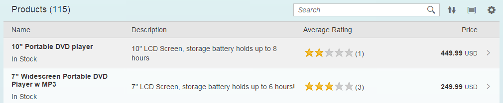
Table toolbar on desktop without overflow
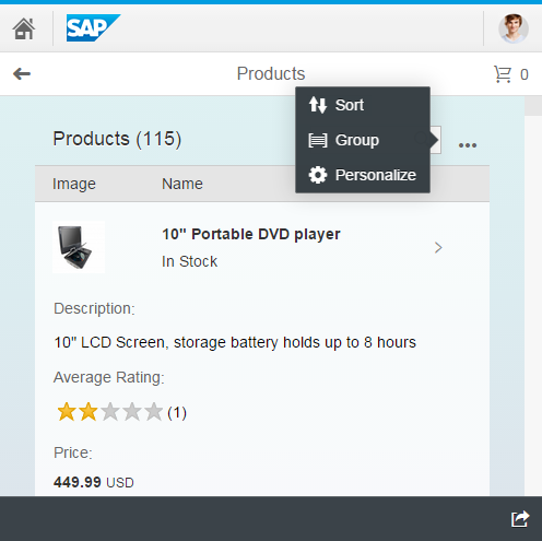
Table toolbar on desktop or tablet with overflow
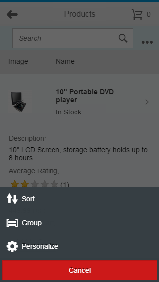
Table toolbar on smartphone with overflow
Styles
The footer toolbar has a dark background, while content toolbars have a transparent style. Buttons are always transparent, and the styles accept, reject, and emphasized are reserved for key actions in the footer toolbar.
For more information, see buttons.
Types
A variety of toolbars exist for different use cases (see examples below). The following types are used:
- Footer toolbar: Contains only closing and finalizing actions
- Table toolbar: Toolbar that is positioned above a table and contains table-specific actions
- Chart toolbar: Toolbar that is positioned above a chart and contains chart-specific actions
- Infobar: Blue toolbar that indicates what filters have been set, and how many items have been selected

Footer toolbar with emphasized, favorite, flag, and share buttons
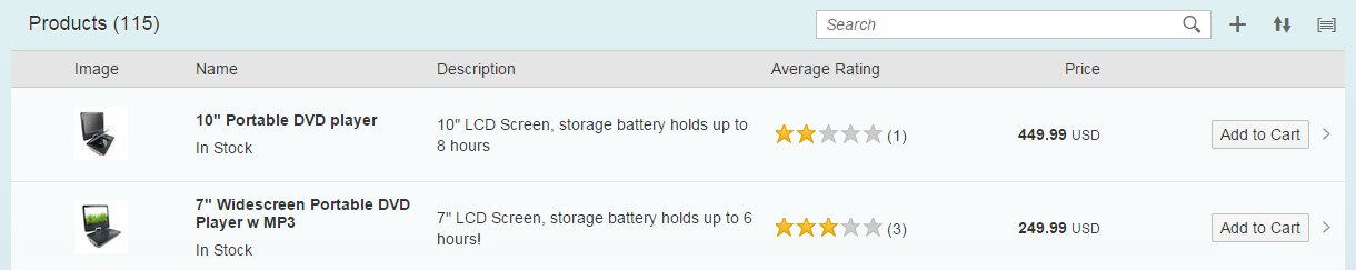
Table toolbar with title, search, add, sort, and group

Chart toolbar with perspective switch, view switch, legend, personalize, and full screen

Infobar in filtered master list
Guidelines
Order of Buttons
To provide a consistent user experience in each app, we highly recommend using the following alignment for generic actions:
- All buttons are right-aligned.
- Text buttons should be grouped together, as should icon buttons.
- App-specific text-only buttons and generic text-only buttons can be combined and arranged in a sequence defined by the app team. Remember to place the most frequently used actions furthest to the left of the group of buttons. This ensures that these actions are the last to be moved into the overflow menu or are visible at all times.
General Guidelines
- Do not overload the toolbar with actions.
- Place actions as close to the corresponding content as possible.
- Place commands in the same location throughout the app. Each page should contain only the commands that are relevant to that page. If commands are shared between pages, they should be placed as close to the same location as possible on each page so that users can predict where the commands can be found when navigating.
- Separate navigation and commands. Put commands as close to their corresponding items as possible.
- Do not put Settings, Logout, or other account management commands in the footer toolbar. All these actions are shown in the shell bar.
- On pages with tables: Do not put actions in the footer toolbar if the table does not extend very far down. Otherwise, the user may overlook the footer toolbar. Instead, place the action in the table toolbar.
- Use only icon buttons or text buttons. Do not combine an icon and text into one button. Buttons are always right-aligned.
- If you want to group buttons us a menu button
UI Text Guidelines
Use tooltips such as Sort, Filter, and Group to label the icons in the footer toolbar. In the case of Sort, Group, and Filter, use the following text for the no selection made option:
- (Not sorted)
Note: In most cases, (Not sorted) is not necessary. Simply show the default sort settings instead:
- (Not filtered)
- (Not grouped)
Resources
Want to dive deeper? Follow the links below to find out more about related controls, the SAPUI5 implementation, and the visual design.
Elements and Controls
- Button (guidelines)
- Footer Toolbar (guidelines)
- Table Toolbar (guidelines)
- Chart Toolbar (guidelines)
Implementation
- Toolbar (SAPUI5 samples)
- Overflow Toolbar (SAPUI5 samples)
- Toolbar (SAPUI5 API reference)
- Overflow Toolbar (SAPUI5 API reference)
 Your feedback has been sent to the SAP Fiori design team.