
- Latest SAPUI Version 1.124
- SAPUI5 Version 1.122
- SAPUI5 Version 1.120
- SAPUI5 Version 1.118
- SAPUI5 Version 1.116
- SAPUI5 Version 1.114
- SAPUI5 Version 1.112
- SAPUI5 Version 1.110
- SAPUI5 Version 1.108
- SAPUI5 Version 1.106
- SAPUI5 Version 1.104
- SAPUI5 Version 1.102
- SAPUI5 Version 1.100
- SAPUI5 Version 1.98
- SAPUI5 Version 1.96
- SAPUI5 Version 1.94
- SAPUI5 Version 1.92
- SAPUI5 Version 1.90
- SAPUI5 Version 1.88
- SAPUI5 Version 1.86
- SAPUI5 Version 1.84
- SAPUI5 Version 1.82
- SAPUI5 Version 1.80
- SAPUI5 Version 1.78
- SAPUI5 Version 1.76
- SAPUI5 Version 1.74
- SAPUI5 Version 1.72
- SAPUI5 Version 1.70
- SAPUI5 Version 1.68
- SAPUI5 Version 1.66
- SAPUI5 Version 1.64
- SAPUI5 Version 1.62
- SAPUI5 Version 1.60
- SAPUI5 Version 1.58
- SAPUI5 Version 1.56
- SAPUI5 Version 1.54
- SAPUI5 Version 1.52
- SAPUI5 Version 1.50
- SAPUI5 Version 1.48
- SAPUI5 Version 1.46
- SAPUI5 Version 1.44
- SAPUI5 Version 1.42
- SAPUI5 Version 1.40
- SAPUI5 Version 1.38
- SAPUI5 Version 1.36
- SAPUI5 Version 1.34
- SAPUI5 Version 1.32
- SAPUI5 Version 1.30
- SAPUI5 Version 1.26
- Latest SAPUI Version 1.124
- SAPUI5 Version 1.122
- SAPUI5 Version 1.120
- SAPUI5 Version 1.118
- SAPUI5 Version 1.116
- SAPUI5 Version 1.114
- SAPUI5 Version 1.112
- SAPUI5 Version 1.110
- SAPUI5 Version 1.108
- SAPUI5 Version 1.106
- SAPUI5 Version 1.104
- SAPUI5 Version 1.102
- SAPUI5 Version 1.100
- SAPUI5 Version 1.98
- SAPUI5 Version 1.96
- SAPUI5 Version 1.94
- SAPUI5 Version 1.92
- SAPUI5 Version 1.90
- SAPUI5 Version 1.88
- SAPUI5 Version 1.86
- SAPUI5 Version 1.84
- SAPUI5 Version 1.82
- SAPUI5 Version 1.80
- SAPUI5 Version 1.78
- SAPUI5 Version 1.76
- SAPUI5 Version 1.74
- SAPUI5 Version 1.72
- SAPUI5 Version 1.70
- SAPUI5 Version 1.68
- SAPUI5 Version 1.66
- SAPUI5 Version 1.64
- SAPUI5 Version 1.62
- SAPUI5 Version 1.60
- SAPUI5 Version 1.58
- SAPUI5 Version 1.56
- SAPUI5 Version 1.54
- SAPUI5 Version 1.52
- SAPUI5 Version 1.50
- SAPUI5 Version 1.48
- SAPUI5 Version 1.46
- SAPUI5 Version 1.44
- SAPUI5 Version 1.42
- SAPUI5 Version 1.40
- SAPUI5 Version 1.38
- SAPUI5 Version 1.36
- SAPUI5 Version 1.34
- SAPUI5 Version 1.32
- SAPUI5 Version 1.30
- SAPUI5 Version 1.28
- SAPUI5 Version 1.26
Feed List Item
sap.m.FeedListItem
Intro
The sap.m.FeedListItem is capable of displaying unformatted text accompanied by an optional user image. Together with the sap.m.FeedInput control, it makes a simple feed or notes control.
Responsiveness & Adaptiveness
Its responsive behavior allows the feed list item to appear in both, small and large containers, or screens.
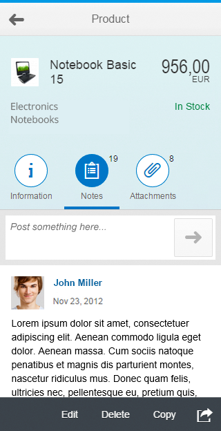
Feed - Size S

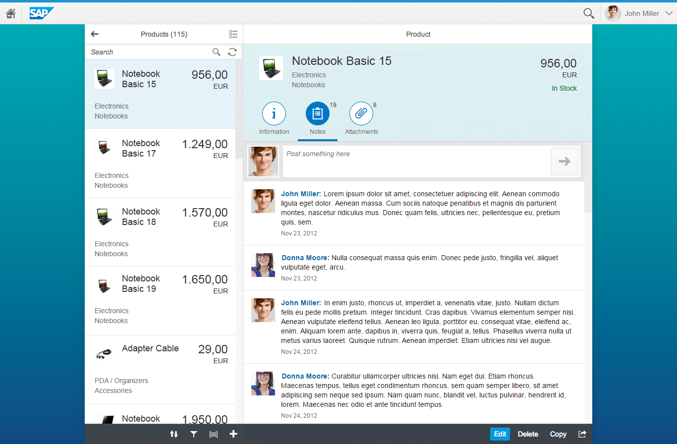
Feed - Size M
Feed - Size L
When the width of the available space falls below 25 rem (e.g. portrait mode on smartphones), the feed list item responds as follows.
The user’s name, image, and the time stamp move on top of the text. If there is no image, the name and time stamp are left-aligned together with the text.
Feed list item - Responsiveness - With image
Feed list item - Responsiveness - Without image
Layout
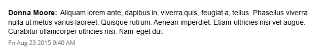
The feed list item consists of the user’s name and an optional picture of the user who wrote the note/ update (optional). The name can contain a link that triggers a quick overview of the user’s profile data. The actual text written by the user follows the name. Below is separate byline that can hold a time stamp and an attribute in the form of free text. This allows apps to put in their own attribute (e.g. approval etc.). Both time stamp and attribute are optional.
In case the name is a link, the picture should also be linked with the same attributes.
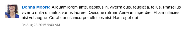
Feed list item_01
If the user does not have a picture assigned, a placeholder is shown instead:
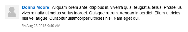
Feed list item_02
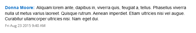
Name (and picture) can also be read-only, i.e. without a link:
Feed list item_03
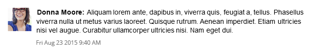
In case the app does not support user images at all, they can be omitted:
Feed list item_04
Here, too, the name can be read-only:
Feed list item_05
Components
The feed list item itself does not contain multiple components. However, to create a simple feed or notes container, it can be combined with the sap.m.FeedInput control.
Behavior & Interaction
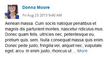
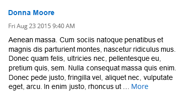
Show More Text
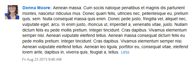
When the text exceeds a certain amount of characters (default value can be overwritten by apps), the rest of the text is truncated and a More link appears after the truncated section.
Initially the More link is grey, so it does not divert attention from the actual text.
When the user moves the mouse over the feed chunk, the More link is highlighted.
Hovering over the link underlines it.
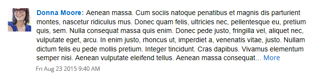
Feed list item - More_01
Feed list item - More_02
Feed list item - More_03
Show Less Text
Clicking the link expands the text and the link is relabeled to less.
The link still behaves the same way as before.
Feed list item - More_04
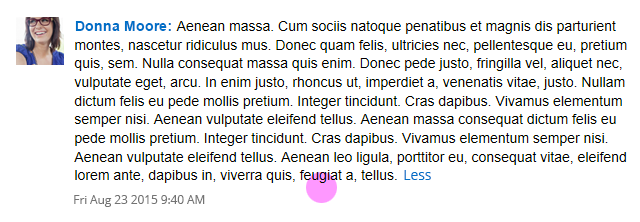
Feed list item - More_05
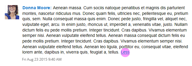
Feed list item - More_06
Usage
Use the feed list item if…
… you need to show unformatted text with a user’s name in front, e.g. for a feed control or notes control.
Do not use the feed list item if…
… you need to display formatted text.
… you need to display large amounts of text.
Resources
Want to dive deeper? Follow the links below to find out more about related controls, the SAPUI5 implementation, and the visual design.
 Your feedback has been sent to the SAP Fiori design team.