- Latest Version 1.128
- Version 1.126
- SAPUI Version 1.124
- SAPUI5 Version 1.122
- SAPUI5 Version 1.120
- SAPUI5 Version 1.118
- SAPUI5 Version 1.116
- SAPUI5 Version 1.114
- SAPUI5 Version 1.112
- SAPUI5 Version 1.110
- SAPUI5 Version 1.108
- SAPUI5 Version 1.106
- SAPUI5 Version 1.104
- SAPUI5 Version 1.102
- SAPUI5 Version 1.100
- SAPUI5 Version 1.98
- SAPUI5 Version 1.96
- SAPUI5 Version 1.94
- SAPUI5 Version 1.92
- SAPUI5 Version 1.90
- SAPUI5 Version 1.88
- SAPUI5 Version 1.86
- SAPUI5 Version 1.84
- SAPUI5 Version 1.82
- SAPUI5 Version 1.80
- SAPUI5 Version 1.78
- SAPUI5 Version 1.76
- SAPUI5 Version 1.74
- SAPUI5 Version 1.72
- SAPUI5 Version 1.70
- SAPUI5 Version 1.68
- SAPUI5 Version 1.66
- SAPUI5 Version 1.64
- SAPUI5 Version 1.62
- SAPUI5 Version 1.60
- SAPUI5 Version 1.58
- SAPUI5 Version 1.56
- SAPUI5 Version 1.54
- SAPUI5 Version 1.52
- SAPUI5 Version 1.50
- SAPUI5 Version 1.48
- SAPUI5 Version 1.46
- SAPUI5 Version 1.44
- SAPUI5 Version 1.42
- SAPUI5 Version 1.40
- SAPUI5 Version 1.38
- SAPUI5 Version 1.36
- SAPUI5 Version 1.34
- SAPUI5 Version 1.32
- SAPUI5 Version 1.30
- SAPUI5 Version 1.26
- Latest Version 1.128
- Version 1.126
- SAPUI Version 1.124
- SAPUI5 Version 1.122
- SAPUI5 Version 1.120
- SAPUI5 Version 1.118
- SAPUI5 Version 1.116
- SAPUI5 Version 1.114
- SAPUI5 Version 1.112
- SAPUI5 Version 1.110
- SAPUI5 Version 1.108
- SAPUI5 Version 1.106
- SAPUI5 Version 1.104
- SAPUI5 Version 1.102
- SAPUI5 Version 1.100
- SAPUI5 Version 1.98
- SAPUI5 Version 1.96
- SAPUI5 Version 1.94
- SAPUI5 Version 1.92
- SAPUI5 Version 1.90
- SAPUI5 Version 1.88
- SAPUI5 Version 1.86
- SAPUI5 Version 1.84
- SAPUI5 Version 1.82
- SAPUI5 Version 1.80
- SAPUI5 Version 1.78
- SAPUI5 Version 1.76
- SAPUI5 Version 1.74
- SAPUI5 Version 1.72
- SAPUI5 Version 1.70
- SAPUI5 Version 1.68
- SAPUI5 Version 1.66
- SAPUI5 Version 1.64
- SAPUI5 Version 1.62
- SAPUI5 Version 1.60
- SAPUI5 Version 1.58
- SAPUI5 Version 1.56
- SAPUI5 Version 1.54
- SAPUI5 Version 1.52
- SAPUI5 Version 1.50
- SAPUI5 Version 1.48
- SAPUI5 Version 1.46
- SAPUI5 Version 1.44
- SAPUI5 Version 1.42
- SAPUI5 Version 1.40
- SAPUI5 Version 1.38
- SAPUI5 Version 1.36
- SAPUI5 Version 1.34
- SAPUI5 Version 1.32
- SAPUI5 Version 1.30
- SAPUI5 Version 1.28
- SAPUI5 Version 1.26
Message Page
sap.m.MessagePage
Intro
Message pages give feedback to the user when an app or list is empty, or when an error has occurred. There are different use cases in which a message page can be shown. The layout is the same, but the text and icon can change depending on the use case. You can use the message page in the following situations:
- Filtering with no results
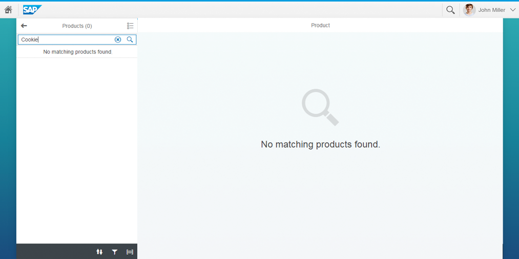
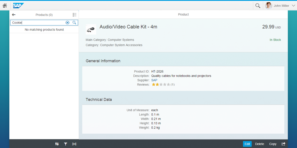
- Searching with no results
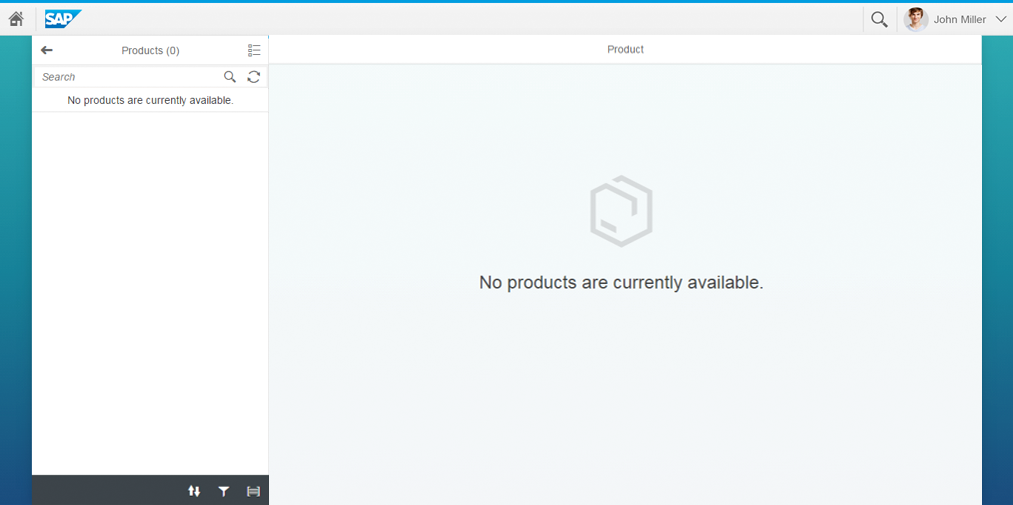
- Empty app
- Too many items
- Item saved as tile that is not longer available
- Error
Responsiveness
The size of the message page is adjusted to the amount of space available.
Types
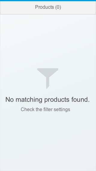
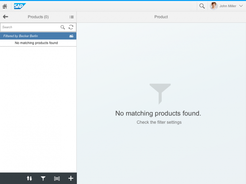
Filter
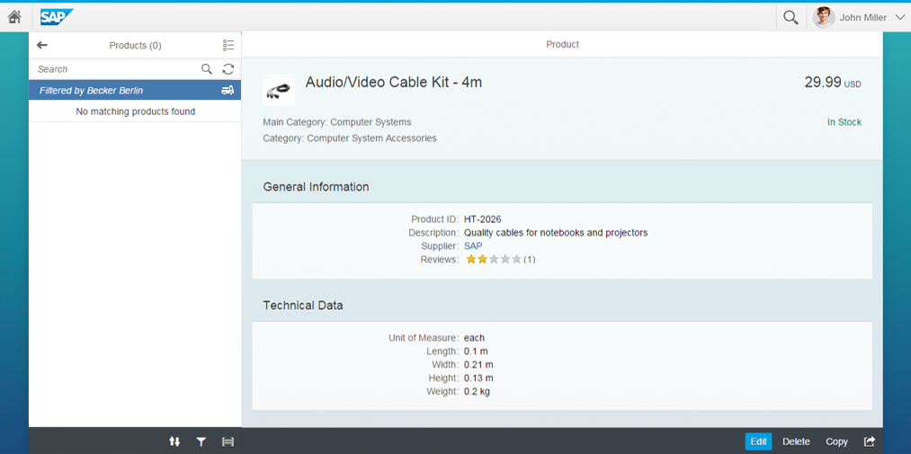
- Display the following text in the master list: No matching <entity> found. For example: “No matching items found.”
- The details page or full screen shows the item selected last.
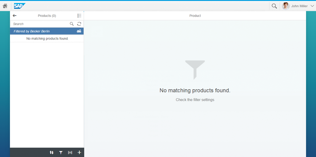
- Display the following text in the master list: No matching <entity> found. For example: “No matching items found.”
- Display the following text on the details page or full screen: No matching <entity> found. Check the filter settings. For example: “No matching items found. Check the filter settings.”
- Show the filter icon.
Search
- Display the following text in the master list: No matching <entity> found. For example: “No matching items found.”
- The details page or full screen shows the item selected last.
- Display the following text in the master list: No matching <entity> found. For example: “No matching items found.”
- The details page or full screen shows the last empty page use case.
Too Many Items
- Display the following text in the master list or on the details page or full screen: Search for <business object (plural)>. For example: “Search for opportunities.” Show the search icon.
Save as Tile
- No item is selected in the master list.
- Display the following text on the details page or full screen and specify the entity. Where relevant, you can also include the ID: This <entity> is no longer available. or <Entity> <ID> is no longer available. Examples: “This product is no longer available.” or “Purchase order 123456 is no longer available.” Show the product icon or an icon that matches your use case.
Error
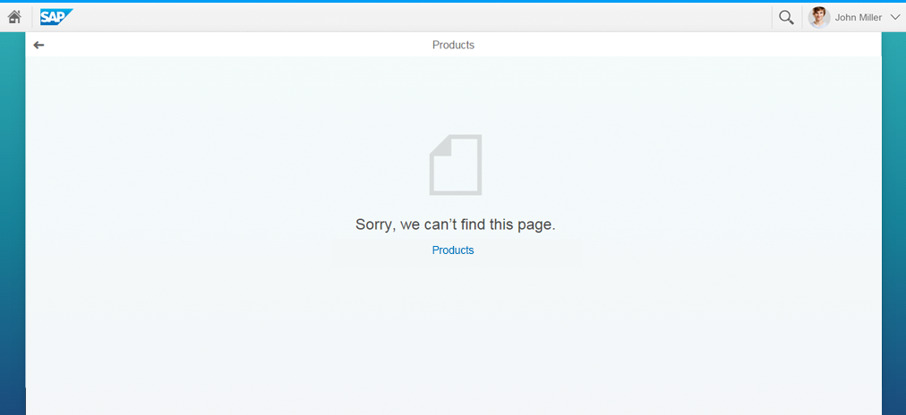
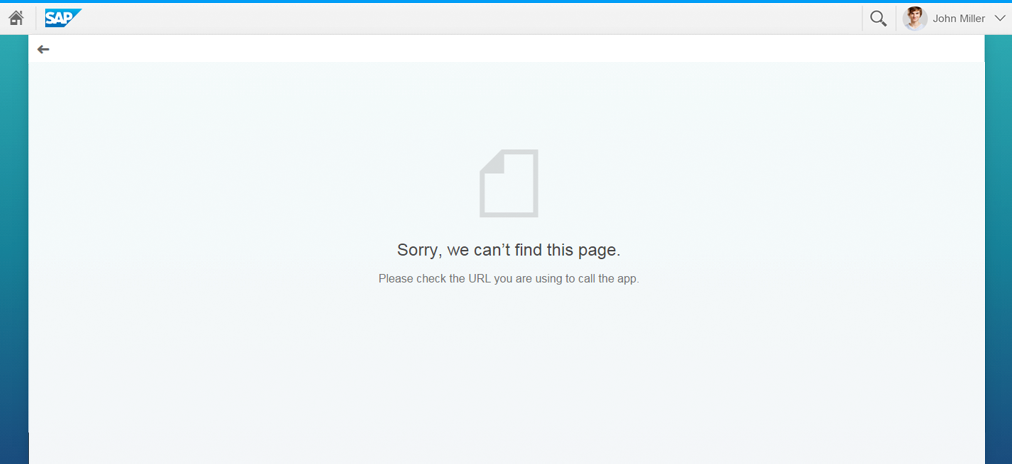
- Display the following text in the master list: Sorry, we can’t find this page.
- If you can provide a link to the app start screen, display the following text on the details page or full screen: Sorry, we can’t find this page. <Link to app start page>. Show the document icon.
- Otherwise, display the following text on the details page or full screen: Sorry, we can’t find this page. Please check the URL you are using to call the app. Show the document icon.
Components
The following UI elements can be placed on the message page:
- Icon
- Text or link
Guidelines
- Replace <business object (plural)> with the business object in the plural form and in lowercase.
- Sometimes your app will simply be loading. In that case, use the busy state without any explanatory text. Do not show the message No Data because this could be misleading.
Resources
Want to dive deeper? Follow the links below to find out more about related controls, the SAPUI5 implementation, and the visual design.

 Your feedback has been sent to the SAP Fiori design team.