
- Latest SAPUI Version 1.124
- SAPUI5 Version 1.122
- SAPUI5 Version 1.120
- SAPUI5 Version 1.118
- SAPUI5 Version 1.116
- SAPUI5 Version 1.114
- SAPUI5 Version 1.112
- SAPUI5 Version 1.110
- SAPUI5 Version 1.108
- SAPUI5 Version 1.104
- SAPUI5 Version 1.102
- SAPUI5 Version 1.100
- SAPUI5 Version 1.98
- SAPUI5 Version 1.96
- SAPUI5 Version 1.94
- SAPUI5 Version 1.92
- SAPUI5 Version 1.90
- SAPUI5 Version 1.88
- SAPUI5 Version 1.86
- SAPUI5 Version 1.84
- SAPUI5 Version 1.82
- SAPUI5 Version 1.80
- SAPUI5 Version 1.78
- SAPUI5 Version 1.76
- SAPUI5 Version 1.74
- SAPUI5 Version 1.72
- SAPUI5 Version 1.70
- SAPUI5 Version 1.68
- SAPUI5 Version 1.66
- SAPUI5 Version 1.64
- SAPUI5 Version 1.62
- SAPUI5 Version 1.60
- SAPUI5 Version 1.58
- SAPUI5 Version 1.56
- SAPUI5 Version 1.54
- SAPUI5 Version 1.52
- SAPUI5 Version 1.50
- SAPUI5 Version 1.48
- SAPUI5 Version 1.46
- SAPUI5 Version 1.44
- SAPUI5 Version 1.42
- SAPUI5 Version 1.40
- SAPUI5 Version 1.38
- SAPUI5 Version 1.36
- SAPUI5 Version 1.34
- SAPUI5 Version 1.32
- SAPUI5 Version 1.30
- SAPUI5 Version 1.28
- SAPUI5 Version 1.26
- Latest SAPUI Version 1.124
- SAPUI5 Version 1.122
- SAPUI5 Version 1.120
- SAPUI5 Version 1.118
- SAPUI5 Version 1.116
- SAPUI5 Version 1.114
- SAPUI5 Version 1.112
- SAPUI5 Version 1.110
- SAPUI5 Version 1.108
- SAPUI5 Version 1.106
- SAPUI5 Version 1.104
- SAPUI5 Version 1.102
- SAPUI5 Version 1.100
- SAPUI5 Version 1.98
- SAPUI5 Version 1.96
- SAPUI5 Version 1.94
- SAPUI5 Version 1.92
- SAPUI5 Version 1.90
- SAPUI5 Version 1.88
- SAPUI5 Version 1.86
- SAPUI5 Version 1.84
- SAPUI5 Version 1.82
- SAPUI5 Version 1.80
- SAPUI5 Version 1.78
- SAPUI5 Version 1.76
- SAPUI5 Version 1.74
- SAPUI5 Version 1.72
- SAPUI5 Version 1.70
- SAPUI5 Version 1.68
- SAPUI5 Version 1.66
- SAPUI5 Version 1.64
- SAPUI5 Version 1.62
- SAPUI5 Version 1.60
- SAPUI5 Version 1.58
- SAPUI5 Version 1.56
- SAPUI5 Version 1.54
- SAPUI5 Version 1.52
- SAPUI5 Version 1.50
- SAPUI5 Version 1.48
- SAPUI5 Version 1.46
- SAPUI5 Version 1.44
- SAPUI5 Version 1.42
- SAPUI5 Version 1.40
- SAPUI5 Version 1.38
- SAPUI5 Version 1.36
- SAPUI5 Version 1.34
- SAPUI5 Version 1.32
- SAPUI5 Version 1.30
- SAPUI5 Version 1.28
- SAPUI5 Version 1.26
Toolbar Overview
sap.m.OverflowToolbar
Intro
The toolbar enables the user to change the UI or trigger an action. For example, the toolbar allows the user to change views, manipulate data or objects, navigate to another page, perform generic actions, and so on.
This article gives an overview of what kind of different toolbars exist and when to use which one.
Actions and Layout
Actions can be used as follows:
- They can be independent of the current selection and not related to a specific item or object.
- They can be specific to the current object (user selects one item).
- They can apply to a set of items (user selects two or more items).
- They can control the settings for parts of the UI content. For example, an action can affect all items in a table.
The toolbar is mostly used for buttons (with an icon or text). You can also place a title in the toolbar. The alignment of the title (left, center, right) depends on the settings for the theme.
The buttons are always right-aligned. Sort your buttons according to their importance for the user, with the most frequently-used action first and the most seldom-used action last. All buttons go into the overflow from right to left, thus ensuring that the most important buttons are the last to be moved into the overflow menu. For more information, see Action Placement.
Responsiveness
To enable responsiveness, use the OverflowToolbar control. Based on the sap.m.Toolbar control, the OverflowToolbar control is a container that provides overflow when its content does not fit in the visible area. Controls that can overflow include the segmented button, select, toggle button, checkbox, input, search field, combo box, and date/time input.
Only allow important actions to shrink and stay outside the overflow. The app team itself must decide which actions it considers to be sufficiently important.
The height of the toolbar changes on desktops (compact mode), tablets, and smartphones (cozy mode). For more information, see the article on content density.

Responsive toolbar – Size L
Responsive toolbar – Size S
Behavior and Interaction
App teams should implement overflow behavior to ensure that all actions can be accessed at any time. Buttons are sorted by usage, with the most frequently used action first (on the left) and the most seldom-used action last (on the right). This ensures that the most important buttons are the last to be moved into the overflow menu. Our general guideline is to use only icon buttons or text buttons. Do not combine an icon and text into one button. Buttons are always right-aligned.
The overflow should be activated either when there is not enough space for all actions, or if some actions are less important than others. In this case, the app team might decide to have certain actions only appear in the overflow. Furthermore, the app team can also decide that some (important) actions should never be moved into the overflow.
When you implement the overflow toolbar, the overflow behavior is generated automatically. The “…” (overflow) button is a toggle button and can be used to switch the overflow menu on and off.
The user clicks the overflow button to open a popover. In this action sheet, all icon buttons are labeled with text. Overflow is supported for the following controls:
- sap.m.SegmentedButton – When in the overflow, the segmented button is in select mode and looks like a select, although it is technically still a segmented button.
- sap.m.Select – When in the overflow, it is always in default mode to take advantage of the extra space, even if it was set to icon-only mode in the toolbar.
- sap.m.ToggleButton
- sap.m.Checkbox
- sap.m.Input
- sap.m.SearchField
- sap.m.ComboBox
- sap.m.DateTimeInput
- sap.ui.comp.smartfield.SmartField
- sap.m.Label
- sap.m.MenuButton
- sap.m.GenericTag
All buttons go into the overflow from right to the left. This ensures that the most important buttons are the last to be moved into the overflow menu.
The sap.m.ToolbarSeparator can also go into the overflow. The separator then changes from a vertical line into a horizontal line. If the control happens to be the first or the last item of the overflow area, the separator isn’t displayed.
Prioritization
You can also prioritize the actions in the toolbar by applying one of five statuses:
- Always overflow: The action always goes into the overflow.
- Disappear: An action that is not so relevant for the user can disappear if the space is limited (for example, a title).
- Low: Assign the priority “Low” to an action if the user seldom needs it; this action will overflow first.
- High: Actions set to “High” remain visible in the toolbar until all lower-priority actions have moved to the overflow. Lower-priority actions are those with the priorities “Disappear” or “Low”, and all unprioritized actions.
- Never overflow: These actions are always visible in the toolbar.
The priority of each item is high by default. If two items have equal priority, the item on the right side overflows first.
Grouping
Items can overflow together even if they are in different positions. This can be achieved using the group property in the overflow toolbar layout data. When the value of the property is 0, the element does not belong to any group. When two or more elements are given the same property value, they belong to the same group and will go into the overflow together. Elements that belong to a group are not allowed to have “always overflow” or “never overflow” as priorities, since these priorities force the items to remain either in the toolbar or in the overflow area. When group elements have different priorities, the priority of the group is defined by the maximum priority of its elements.
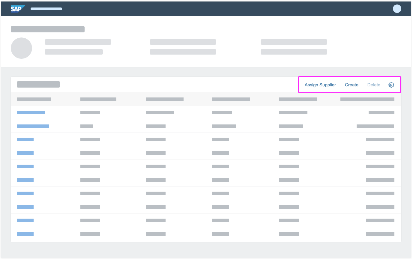
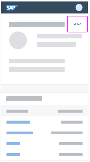
Table toolbar on desktop without overflow
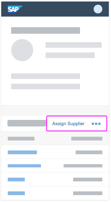
Table toolbar on smartphone with overflow
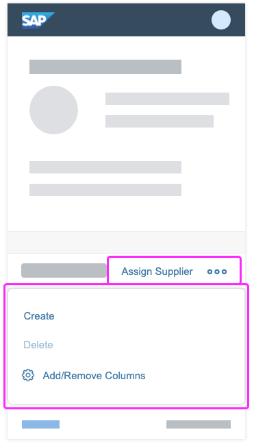
Table toolbar on smartphone with open overflow
Styles
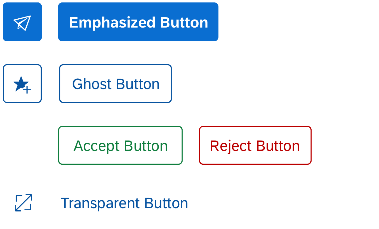
Button Styles
Header and Footer Toolbars
Use the following button styles for the different action types in the header and footer toolbars:
- Primary action: Use the emphasized button style.
- Secondary action: Use the ghost button style. Note that the ghost button has a transparent background.
- Semantic action: Use the semantic buttons for positive and negative actions. Use the “accept” style for positive actions, and the “reject” one for negative actions. Semantic actions must always be text buttons.
- Negative path action: Use the transparent button style.
Do not use any other style types.
Content Toolbars
Use the following button styles for the different action types in content toolbars (for example, in tables, forms, or charts):
- Primary action: Use the emphasized button style. Usually, the primary action is positioned in the header or footer toolbar. Note that there can only be one primary action per page. If a page already has a primary action, but you also need to highlight the most important action in a content toolbar, use the ghost style for this one button in the content toolbar.
- Secondary action: Use the transparent button style.
The different button styles are designed to give appropriate feedback to users. Do not use them for decoration purposes.
Button with different styles
Styles and Toolbars
Apply the following menu button styles for the different toolbars:
- Header and footer toolbars: Use the ghost style.
- Content toolbars: Use the transparent button style.
Do not use any other style types.
Emphasized and Semantic Buttons
- Use a maximum of 1 emphasized button per toolbar.
- Never mix emphasized and semantic buttons.
- Ideally, there should be only one emphasized action per page. There can be valid exceptions, but we generally recommend using only one emphasized button.
- For more information, see Buttons.
Enumeration
The toolbar style is an enumeration with two properties: Standard (default) and Clear.
- Standard style results in linear design (with border) and is intended for standalone usage of the toolbar.
- Clear style appears as a plain color without borders. This style visually groups the toolbar with a nearby control or controls.
The toolbar style property is combined with the toolbar design property to create various visual styles.
Types
A variety of toolbars exist for different use cases (see examples below). The following types are used:
- Header toolbar: Contains global actions that are important for the whole page
- Footer toolbar: Contains only closing and finalizing actions
- Table toolbar: Toolbar that is positioned above a table and contains table-specific actions
- Chart toolbar: Toolbar that is positioned above a chart and contains chart-specific actions
- Infobar: Toolbar that indicates what filters have been set, and how many items have been selected
- Tree toolbar: Toolbar that appears above a tree or tree table, and is used for actions that impact the entire tree.

Header toolbar with primary action (emphasized style) and secondary actions (ghost style)


Table toolbar with search field, text buttons (ghost and transparent style), icon buttons (transparent style), and segmented button
Chart toolbar
Inactive infobar (not clickable)
Active infobar (clickable)
Tree toolbar
Guidelines
Order of Buttons
To provide a consistent user experience for each app, we highly recommend using the following alignment for generic actions:
- All buttons are right-aligned.
- Text buttons should be grouped together, as should icon buttons.
- Place semantic buttons side by side (for example, Accept and Reject).
- App-specific text-only buttons and generic text-only buttons can be combined and arranged in a sequence defined by the app team. Remember to place the most frequently-used actions furthest to the left of the group of buttons. This ensures that these actions are the last to be moved into the overflow menu or are visible at all times.
General Guidelines
- Do not overload the toolbar with actions.
- Place actions as close to the corresponding content as possible.
- Place commands in the same location throughout the app. Each page should contain only the commands that are relevant to that page. If commands are shared between pages, they should be placed as close to the same location as possible on each page so that users can predict where the commands can be found when navigating.
- Separate navigation and commands. Place commands as close to their corresponding items as possible.
- Do not place Settings, Logout, or other account management commands in the footer toolbar. All these actions are shown in the Me Area.
- Do not use icon buttons for app-specific actions (neither icon-only buttons, nor icon+text buttons).
- Use only icon buttons or text buttons. Do not combine an icon and text into one button. Buttons are always right-aligned.
- If you want to group buttons, use a menu button.
- Actions that impact the entire page are placed in the header area.
- Only closing or finalizing actions are placed in the footer toolbar (for example, Submit or Post).
UI Text Guidelines
Use tooltips such as Sort, Filter, and Group to label the icons in the footer toolbar. In the case of Sort, Group, and Filter, use the following text for the no selection made option:
- (Not sorted)
Note: In most cases, (Not sorted) is not necessary. Simply show the default sort settings instead:
- (Not filtered)
- (Not grouped)
Resources
Want to dive deeper? Follow the links below to find out more about related controls, the SAPUI5 implementation, and the visual design.
Elements and Controls
- Button (guidelines)
- Chart Toolbar (guidelines)
- Footer Toolbar (guidelines)
- Header Toolbar (guidelines)
- Table Toolbar (guidelines)
- Tree Toolbar (guidelines)
Implementation
- Toolbar (SAPUI5 samples)
- Overflow Toolbar (SAPUI5 samples)
- Toolbar (SAPUI5 API reference)
- Overflow Toolbar (SAPUI5 API reference)
 Your feedback has been sent to the SAP Fiori design team.