
- Latest SAPUI Version 1.124
- SAPUI5 Version 1.122
- SAPUI5 Version 1.120
- SAPUI5 Version 1.118
- SAPUI5 Version 1.116
- SAPUI5 Version 1.114
- SAPUI5 Version 1.112
- SAPUI5 Version 1.110
- SAPUI5 Version 1.108
- SAPUI5 Version 1.106
- SAPUI5 Version 1.104
- SAPUI5 Version 1.102
- SAPUI5 Version 1.100
- SAPUI5 Version 1.98
- SAPUI5 Version 1.96
- SAPUI5 Version 1.94
- SAPUI5 Version 1.92
- SAPUI5 Version 1.90
- SAPUI5 Version 1.88
- SAPUI5 Version 1.86
- SAPUI5 Version 1.84
- SAPUI5 Version 1.82
- SAPUI5 Version 1.80
- SAPUI5 Version 1.78
- SAPUI5 Version 1.76
- SAPUI5 Version 1.74
- SAPUI5 Version 1.72
- SAPUI5 Version 1.70
- SAPUI5 Version 1.68
- SAPUI5 Version 1.66
- SAPUI5 Version 1.64
- SAPUI5 Version 1.62
- SAPUI5 Version 1.60
- SAPUI5 Version 1.58
- SAPUI5 Version 1.56
- SAPUI5 Version 1.54
- SAPUI5 Version 1.52
- SAPUI5 Version 1.50
- SAPUI5 Version 1.48
- SAPUI5 Version 1.46
- SAPUI5 Version 1.44
- SAPUI5 Version 1.42
- SAPUI5 Version 1.40
- SAPUI5 Version 1.38
- SAPUI5 Version 1.36
- SAPUI5 Version 1.34
- SAPUI5 Version 1.32
- SAPUI5 Version 1.28
- SAPUI5 Version 1.26
- Latest SAPUI Version 1.124
- SAPUI5 Version 1.122
- SAPUI5 Version 1.120
- SAPUI5 Version 1.118
- SAPUI5 Version 1.116
- SAPUI5 Version 1.114
- SAPUI5 Version 1.112
- SAPUI5 Version 1.110
- SAPUI5 Version 1.108
- SAPUI5 Version 1.106
- SAPUI5 Version 1.104
- SAPUI5 Version 1.102
- SAPUI5 Version 1.100
- SAPUI5 Version 1.98
- SAPUI5 Version 1.96
- SAPUI5 Version 1.94
- SAPUI5 Version 1.92
- SAPUI5 Version 1.90
- SAPUI5 Version 1.88
- SAPUI5 Version 1.86
- SAPUI5 Version 1.84
- SAPUI5 Version 1.82
- SAPUI5 Version 1.80
- SAPUI5 Version 1.78
- SAPUI5 Version 1.76
- SAPUI5 Version 1.74
- SAPUI5 Version 1.72
- SAPUI5 Version 1.70
- SAPUI5 Version 1.68
- SAPUI5 Version 1.66
- SAPUI5 Version 1.64
- SAPUI5 Version 1.62
- SAPUI5 Version 1.60
- SAPUI5 Version 1.58
- SAPUI5 Version 1.56
- SAPUI5 Version 1.54
- SAPUI5 Version 1.52
- SAPUI5 Version 1.50
- SAPUI5 Version 1.48
- SAPUI5 Version 1.46
- SAPUI5 Version 1.44
- SAPUI5 Version 1.42
- SAPUI5 Version 1.40
- SAPUI5 Version 1.38
- SAPUI5 Version 1.36
- SAPUI5 Version 1.34
- SAPUI5 Version 1.32
- SAPUI5 Version 1.30
- SAPUI5 Version 1.28
- SAPUI5 Version 1.26
Message Box
sap.m.MessageBox
Intro
The message box (sap.m.MessageBox) is a special dialog that allows you to display messages to the user. Compared to the message popover (sap.m.MessagePopover), you can use the message box to display messages that are not related to a field on the UI, such as technical errors.
Formulate messages in plain language (no code), describe the issue precisely, and suggest a constructive solution. Always help your user to recognize, diagnose, and recover from messages. Bear in mind that no message is always preferable to even a good message. When you design your apps, aim to prevent problems from occurring in the first place.
Usage
Use the message box if:
- You want to display non-field-related messages.
- You want to interrupt the user while he or she performs an action.
- You want to display error, warning, success, confirmation, or information messages.
- You need to interrupt the user for some other reason.
- You need the user to acknowledge the message.
- You need the user to make a decision.
Do not use the message box if:
- You want to display a short success message. (Use a toast instead. For more information, see message toast.)
- You can show the message directly in a form field.
Responsiveness
The sap.m.MessageBox control has the same responsive behavior as the sap.m.Dialog control. The message box should only be opened in modal mode. Its basic width is 25 em. For more information, see dialog.
Types
The following categories of messages are available:
- Error
- Warning
- Success
- Information
- Confirmation
Error Message
Error messages can be triggered after the user has entered incorrect data or a system error has occurred. They should interrupt the user by displaying a dialog. A final action such as Submit cannot be carried out until the user has rectified the error.
Control: sap.m.MessageBox
Icon: sap-icon://message-error
Title: Error
Stretch: false (no full screen on all devices)
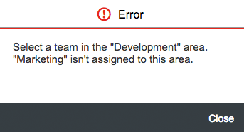
Error message box with one action
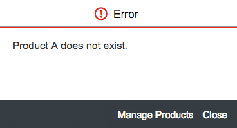
Error message box with two actions
Text guidelines for an error message:
- Do not just describe the problem; tell the user how to resolve it.
- In the short text, speak the language of the end user. Do not include system or configuration details.
- If the solution is more involved or technical, add a long text.
- Do not repeat the short text in the long text. (They both appear together on the screen.)
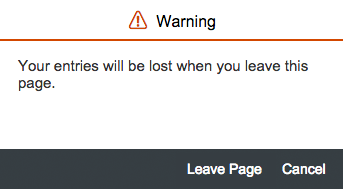
Warning Message
Warning messages highlight potential issues, but the user can still continue. This includes unintended data loss scenarios.
Control: sap.m.MessageBox
Icon: sap-icon://message-warning
Title: Warning
Stretch: false (no full screen on all devices)
Use cases for warnings
a) No decision required: formulate the message as a statement.
Button(s): OK
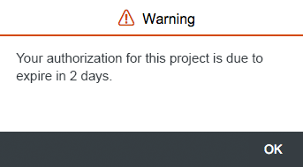
Warning message box with OK button
b) Decision to continue required: formulate the message as a statement.
Button(s): OK, Cancel
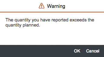
Warning message with OK and Cancel buttons
c) Specific decision requried with one action
Use a relevant action button. The message may also be formulated as a question.
Button(s): <Action1>, Cancel
Warning message with action and Cancel buttons
Success Message
Success messages give feedback to the user that an action has been executed. The user needs to acknowledge the message.
Control: sap.m.MessageBox
Icon: sap-icon://message-success
Title: Success
Stretch: false (no full screen on all devices)
Button(s): OK
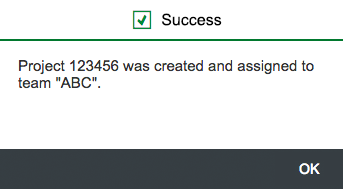
Success message box
Information Message
Information messages provide information the user needs to acknowledge, but that does not involve a decision. The message provides information that is useful and relevant, but never critical.
Control: sap.m.MessageBox
Icon: sap-icon://message-information
Title: Information
Stretch: false (no full screen on all devices)
Button(s): OK
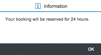
Information message box
Confirmation Message
Confirmation messages prompt users to confirm an action that they have triggered. The title of the message box already includes the action that has to be confirmed, such as an intended deletion or an approval.
Control: sap.m.MessageBox
Icon: sap-icon://message-question
Title: <action> (such as “Approve”, “Reject”, or “Delete”)
Stretch: false (no full screen on all devices)
Button(s): <Action>, Cancel
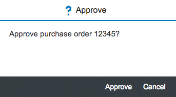
Confirmation message box – Approve
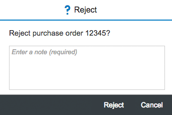
Confirmation message box – Reject
Delete Message
If the user clicks or taps Delete, display a “Delete” dialog that confirms the delete action.
Control: sap.m.MessageBox
Icon: sap-icon://message-warning
Title: Delete
Stretch: false (no full screen on all devices)
Button(s): Delete, Cancel
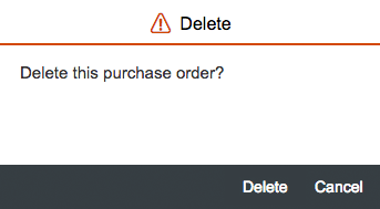
Delete message box
Components
Show Details button
The message displayed for the user should provide sufficient information to ensure that the user knows what happened.
A message box without an explicit details section should be sufficient.
Therefore, the Show Details link is only shown if detailed information is available that differs from the message text and is important for the user.
If details are available, they appear in a text area as part of the message box.
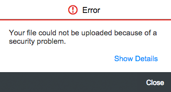
Show details button on a message dialog
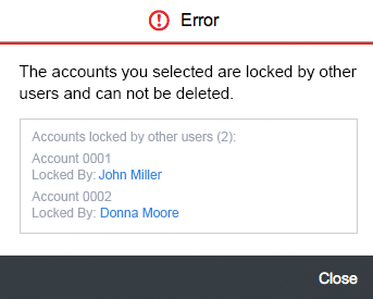
Message details within an sap.m.MessageBox
Resources
Want to dive deeper? Follow the links below to find out more about related controls, the SAPUI5 implementation, and the visual design.
Elements and Controls
- Message Handling (guidelines)
- Message Popover (guidelines)
- Dialog (guidelines)
 Your feedback has been sent to the SAP Fiori design team.