
- Latest SAPUI Version 1.124
- SAPUI5 Version 1.122
- SAPUI5 Version 1.120
- SAPUI5 Version 1.118
- SAPUI5 Version 1.116
- SAPUI5 Version 1.114
- SAPUI5 Version 1.112
- SAPUI5 Version 1.110
- SAPUI5 Version 1.108
- SAPUI5 Version 1.106
- SAPUI5 Version 1.104
- SAPUI5 Version 1.102
- SAPUI5 Version 1.100
- SAPUI5 Version 1.98
- SAPUI5 Version 1.96
- SAPUI5 Version 1.94
- SAPUI5 Version 1.92
- SAPUI5 Version 1.90
- SAPUI5 Version 1.88
- SAPUI5 Version 1.86
- SAPUI5 Version 1.84
- SAPUI5 Version 1.82
- SAPUI5 Version 1.80
- SAPUI5 Version 1.78
- SAPUI5 Version 1.76
- SAPUI5 Version 1.74
- SAPUI5 Version 1.72
- SAPUI5 Version 1.70
- SAPUI5 Version 1.68
- SAPUI5 Version 1.66
- SAPUI5 Version 1.64
- SAPUI5 Version 1.62
- SAPUI5 Version 1.60
- SAPUI5 Version 1.58
- SAPUI5 Version 1.56
- SAPUI5 Version 1.54
- SAPUI5 Version 1.52
- SAPUI5 Version 1.50
- SAPUI5 Version 1.48
- SAPUI5 Version 1.46
- SAPUI5 Version 1.44
- SAPUI5 Version 1.42
- SAPUI5 Version 1.40
- SAPUI5 Version 1.38
- SAPUI5 Version 1.36
- SAPUI5 Version 1.34
- SAPUI5 Version 1.32
- SAPUI5 Version 1.28
- SAPUI5 Version 1.26
- Latest SAPUI Version 1.124
- SAPUI5 Version 1.122
- SAPUI5 Version 1.120
- SAPUI5 Version 1.118
- SAPUI5 Version 1.116
- SAPUI5 Version 1.114
- SAPUI5 Version 1.112
- SAPUI5 Version 1.110
- SAPUI5 Version 1.108
- SAPUI5 Version 1.106
- SAPUI5 Version 1.104
- SAPUI5 Version 1.102
- SAPUI5 Version 1.100
- SAPUI5 Version 1.98
- SAPUI5 Version 1.96
- SAPUI5 Version 1.94
- SAPUI5 Version 1.92
- SAPUI5 Version 1.90
- SAPUI5 Version 1.88
- SAPUI5 Version 1.86
- SAPUI5 Version 1.84
- SAPUI5 Version 1.82
- SAPUI5 Version 1.80
- SAPUI5 Version 1.78
- SAPUI5 Version 1.76
- SAPUI5 Version 1.74
- SAPUI5 Version 1.72
- SAPUI5 Version 1.70
- SAPUI5 Version 1.68
- SAPUI5 Version 1.66
- SAPUI5 Version 1.64
- SAPUI5 Version 1.62
- SAPUI5 Version 1.60
- SAPUI5 Version 1.58
- SAPUI5 Version 1.56
- SAPUI5 Version 1.54
- SAPUI5 Version 1.52
- SAPUI5 Version 1.50
- SAPUI5 Version 1.48
- SAPUI5 Version 1.46
- SAPUI5 Version 1.44
- SAPUI5 Version 1.42
- SAPUI5 Version 1.40
- SAPUI5 Version 1.38
- SAPUI5 Version 1.36
- SAPUI5 Version 1.34
- SAPUI5 Version 1.32
- SAPUI5 Version 1.30
- SAPUI5 Version 1.28
- SAPUI5 Version 1.26
Footer Toolbar
sap.m.Toolbar
Intro
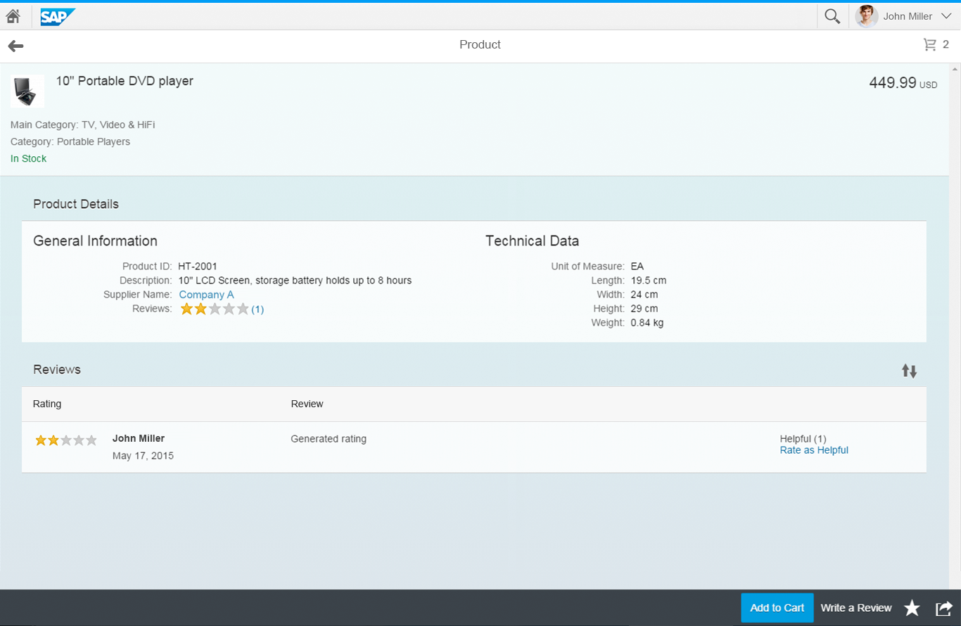
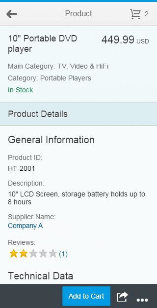
The footer bar always appears at the bottom edge of the screen.
The control is used for main actions that impact the whole page and is always visible except in the home screen and if the empty page is shown. One main advantage of the footer bar is, that this bar is always visible and will not scroll away.
Our general guideline is to use only icon buttons or text buttons. Icon and text should not be combined into one button. Buttons are always right aligned.
Buttons are sorted from very often used to seldom used. This ensures that the most important buttons will go last into the overflow.
Usage
Use the footer toolbar:
- If you have several controls on your page and the actions are valid for the whole page.
Do not use the footer toolbar:
- If you have different containers on your page (such as charts, tables, and forms) and the action influences only certain items. In this case, put the action as close to the corresponding item(s) as possible.
Responsiveness
To enable responsiveness, use the OverflowToolbar control. For more information, please refer to the corresponding section in the toolbar overview article.
The height of the toolbar changes on desktops (compact mode), tablets, and smartphones (cozy mode). For more information about cozy and compact modes, see content density.
Split-screen layout footer toolbar (top: desktop; bottom: smartphone)
Full screen footer toolbar (top: desktop; bottom: smartphone)
Components
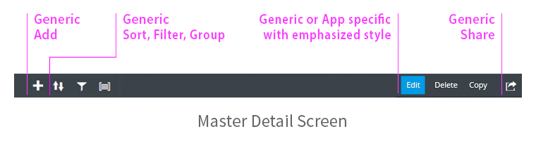
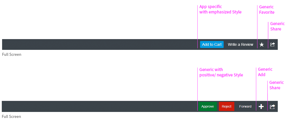
The footer toolbar can contain the following components:
- App-specific actions
- Generic actions
The following actions count as generic:
- Add
- Sort, Filter, and Group
- Multi Select
- Approve, Reject, and Forward
- Open In…
- Favorite and Flag
- Share menu
- Overflow
Examples of possible components
Examples of possible components
Examples of possible components
Behavior and Interaction
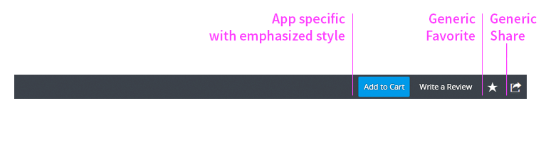
App-Specific Actions
If needed, the app team can define their own actions for the app. In this case, the text buttons should contain a short, unambiguous text that explains what action the button performs. A button text is usually a single-word verb (for example, Share). Note that translated UIs may increase the length of the text string.
Only use icon buttons if you are sure that the user will be able to interpret the meaning of the icon easily and without the aid of a tooltip. Use standard and easily recognizable icons, such as a paper clip for an attachment.

App-specific text, icon button, and generic Share button
Add (Generic)
The Add item or row action can be presented by a generic icon button or a text that describes the action in more detail. Place the action as close to the content as possible.
If the Add action is a main function, the action should never be moved into the overflow.
If the app uses more than two Add actions, or if the meaning of the icon is not entirely clear, use text buttons.

Add as icon button in the master list

Add as icon button in the details area
Sort, Filter, Group (Generic)
Sort, Filter, and Group can be shown in the footer toolbar of the master list. They can appear in any combination or as a single action. Be sure to use the order suggested (Sort, Filter, and Group) if you use more than one of these actions.
The Sort, Filter, and Group buttons can trigger a select if only basic actions are available. In this case, however, note that the user can select only one option.
Otherwise, the view settings dialog appears. The app team must put all these actions into the overflow if more space is needed for other actions.
A combination of both is also possible: some buttons can trigger a select and some can open a dialog.
For more information about Sort, Filter, Group, and the view settings dialog, see responsive table.
Master list with Add, Sort, Filter, and Group

Master list with basic filtering actions – Select is used instead of the View settings dialog
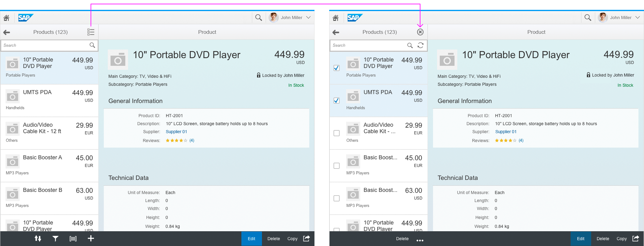
Multi-Select (Generic)
Multiple items can also be selected for processing in the master. The user activates multi-select mode by clicking or tapping the multi-select icon in the master header.
The actions in the footer toolbar change by switching to this mode. If you enable the user to Sort, Filter or Group, these actions should also be visible in multi-select mode.
For more information about multi-select mode, see master list.
Split-screen layout with multi-select icon in master header
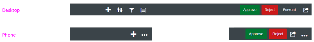
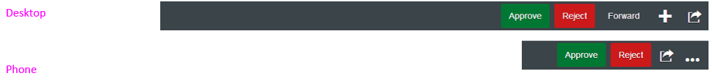
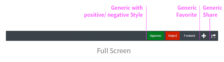
Approve, Reject, Forward (Generic)
Approve, Reject, and Forward are displayed as text buttons. They can appear in any combination. For more information about the behavior of the Forward action, see forward. Ensure that the Approve and Reject buttons are visible in your app on smartphones. Otherwise, users have to open the overflow whenever they want to select an action.
Approve, Reject, and Forward on full screen
Open In… (Generic)
The Open In… action takes the user outside the current app. App teams can choose whether they use the Share button or use a text button with Open In… . The text button opens an action sheet with the possible actions. For example, if the app navigates to another app, the icon and name of the new app are displayed.
Use a text button with Open In… if you expect the user to use this action frequently. Otherwise, put the action in the Share menu. An example is shown in the Share section.
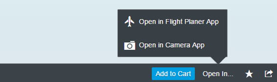
Open In... as text button

Open In... within the Share menu
Favorite and Flag (Generic)
Users can mark objects as a favorite or flagged for quick subsequent retrieval. The user does this by clicking or tapping the relevant generic Favorite or Flag button in the footer toolbar. For more information, see flag and favorite.

Flag and Favorite on full screen
Share (Generic)
The Share menu allows users to work with content outside the app they are currently using. It can include a variety of actions. All the buttons contain either text only or a combination of an icon and text. The following actions can be used and complemented by each app:
- Send Email (icon: email)
- Discuss in SAP Jam (icon: discussion-2)
- Share in SAP Jam (icon: share-2)
- Send Message (icon: post)
- Save as Tile (icon: add favorite)
- Print (icon: print)
- Export as Excel (icon: Excel attachment)
- Export as PDF (icon: pdf attachment)
- Export As… <filetype>
- Open In… <apptype>
If you expect the user to use the Open In… functionality frequently, place it directly in the footer toolbar. This is described in detail in the Open In… section.
The Share action can appear on the full screen or details screen, and is never moved into the overflow menu. It is always right-aligned. The overflow starts on the right side of the Share icon.
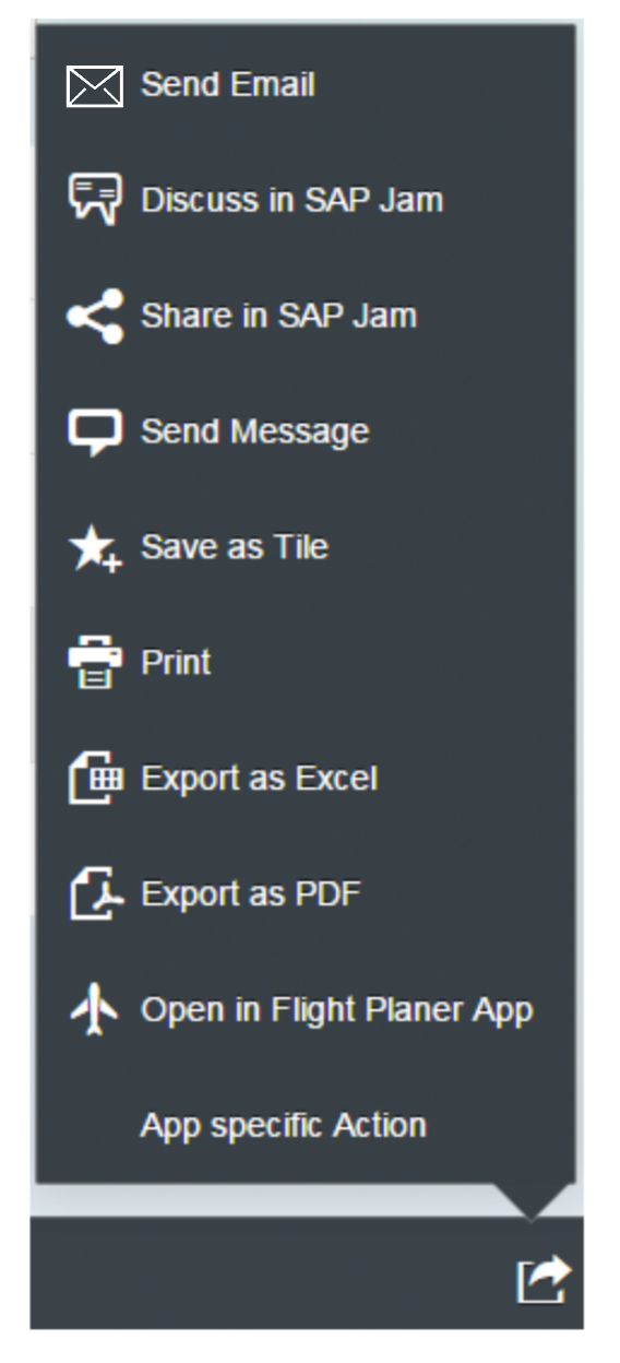
Possible actions in the Share menu
Overflow (Generic)
If apps use the overflow toolbar, the overflow is generated automatically. The overflow is activated if there is not enough space for all the actions on the footer toolbar, or if some actions are considered less important than others. In this case, the app team decides that only certain actions appear in the overflow.
The app team also decides whether some actions are so important that they should never move into the overflow.
Since release 1.30, new features have been added to the overflow toolbar. The “…” (overflow) button is now a toggle button and can be used to switch the overflow menu on and off.
The user clicks or taps the overflow button to open a popover. In this action sheet, all icon buttons are labeled with text and the user can overflow the following controls:
- sap.m.SegmentedButton – when in the overflow, the segmented button is in select mode and looks like a select button, although it is technically still a segmented button
- sap.m.Select – when in the overflow, it is always in default mode to take advantage of the extra space, even if it was set to icon-only mode in the toolbar
- sap.m.ToggleButton
- sap.m.Checkbox
- sap.m.Input
- sap.m.SearchField
- sap.m.ComboBox
- sap.m.DateTimeInput
Split-screen layouts have their own overflow menus.
All buttons go into the overflow from right to left. This ensures that the most important buttons are the last to be moved into the overflow menu.
Footer toolbar on desktop without overflow
Footer toolbar on smartphone with overflow

Footer toolbar on smartphone with overflow
Styles
Button styles should be used to help the user and not for decoration.
They should be defined for actions that a user will use mostly, such as Edit, Create, and Save.
Actions within (modal) dialogs have no highlighting.
Exception 1: Multi-select mode on a master or details screen
Exception 2: Message button appears
Exception 3: Object is marked as flag/favorite
For more information, see button.
Guidelines
Please see the Guidelines section in the toolbar overview article.
Resources
Want to dive deeper? Follow the links below to find out more about related controls, the SAPUI5 implementation, and the visual design.
Elements and Controls
- Action Sheet (guidelines)
- Button (guidelines)
- Flag and Favorite (guidelines)
- Forward (guidelines)
Implementation
- Overflow Toolbar (SAPUI5 samples)
- Footer Toolbar (SAPUI5 API reference)
- Action Sheet (SAPUI5 API reference)
 Your feedback has been sent to the SAP Fiori design team.