
- Latest SAPUI Version 1.124
- SAPUI5 Version 1.122
- SAPUI5 Version 1.120
- SAPUI5 Version 1.118
- SAPUI5 Version 1.116
- SAPUI5 Version 1.114
- SAPUI5 Version 1.112
- SAPUI5 Version 1.110
- SAPUI5 Version 1.108
- SAPUI5 Version 1.106
- SAPUI5 Version 1.104
- SAPUI5 Version 1.102
- SAPUI5 Version 1.100
- SAPUI5 Version 1.98
- SAPUI5 Version 1.96
- SAPUI5 Version 1.94
- SAPUI5 Version 1.92
- SAPUI5 Version 1.90
- SAPUI5 Version 1.88
- SAPUI5 Version 1.86
- SAPUI5 Version 1.84
- SAPUI5 Version 1.82
- SAPUI5 Version 1.80
- SAPUI5 Version 1.78
- SAPUI5 Version 1.76
- SAPUI5 Version 1.74
- SAPUI5 Version 1.72
- SAPUI5 Version 1.70
- SAPUI5 Version 1.68
- SAPUI5 Version 1.66
- SAPUI5 Version 1.64
- SAPUI5 Version 1.62
- SAPUI5 Version 1.60
- SAPUI5 Version 1.58
- SAPUI5 Version 1.56
- SAPUI5 Version 1.54
- SAPUI5 Version 1.52
- SAPUI5 Version 1.50
- SAPUI5 Version 1.48
- SAPUI5 Version 1.46
- SAPUI5 Version 1.44
- SAPUI5 Version 1.42
- SAPUI5 Version 1.40
- SAPUI5 Version 1.38
- SAPUI5 Version 1.36
- SAPUI5 Version 1.34
- SAPUI5 Version 1.32
- SAPUI5 Version 1.28
- SAPUI5 Version 1.26
- Latest SAPUI Version 1.124
- SAPUI5 Version 1.122
- SAPUI5 Version 1.120
- SAPUI5 Version 1.118
- SAPUI5 Version 1.116
- SAPUI5 Version 1.114
- SAPUI5 Version 1.112
- SAPUI5 Version 1.110
- SAPUI5 Version 1.108
- SAPUI5 Version 1.106
- SAPUI5 Version 1.104
- SAPUI5 Version 1.102
- SAPUI5 Version 1.100
- SAPUI5 Version 1.98
- SAPUI5 Version 1.96
- SAPUI5 Version 1.94
- SAPUI5 Version 1.92
- SAPUI5 Version 1.90
- SAPUI5 Version 1.88
- SAPUI5 Version 1.86
- SAPUI5 Version 1.84
- SAPUI5 Version 1.82
- SAPUI5 Version 1.80
- SAPUI5 Version 1.78
- SAPUI5 Version 1.76
- SAPUI5 Version 1.74
- SAPUI5 Version 1.72
- SAPUI5 Version 1.70
- SAPUI5 Version 1.68
- SAPUI5 Version 1.66
- SAPUI5 Version 1.64
- SAPUI5 Version 1.62
- SAPUI5 Version 1.60
- SAPUI5 Version 1.58
- SAPUI5 Version 1.56
- SAPUI5 Version 1.54
- SAPUI5 Version 1.52
- SAPUI5 Version 1.50
- SAPUI5 Version 1.48
- SAPUI5 Version 1.46
- SAPUI5 Version 1.44
- SAPUI5 Version 1.42
- SAPUI5 Version 1.40
- SAPUI5 Version 1.38
- SAPUI5 Version 1.36
- SAPUI5 Version 1.34
- SAPUI5 Version 1.32
- SAPUI5 Version 1.30
- SAPUI5 Version 1.28
- SAPUI5 Version 1.26
Object Page (Floorplan + SAP Fiori Element)
Intro
Object page floorplan
The object page floorplan is the new way to represent objects in SAP Fiori. The object page floorplan is set to replace the flat object view floorplan and, looking further ahead, the object view floorplan. New features in the object page, like a flexible header, alternative anchor or tab navigation, and a flexible responsive layout, make it adaptable for a wide range of use cases.
Usage
Use the object page floorplan if:
- You need to display, create, or edit an object, regardless of its complexity level. You can use the object page with either a facet (tabs) or flat (anchors) approach.
Do not use the object page floorplan if:
- You want to provide guided data entry in several related steps.
- You need a progressive disclosure approach for the creation process.
- You need to guide the user through a series of steps.
- The user is not familiar with the creation task.
- The creation process is not linear, but can have different paths depending on the information selected.
In all these cases, consider using the wizard floorplan instead.
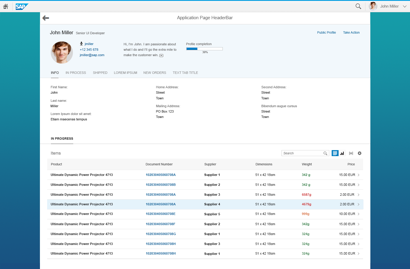
Responsiveness
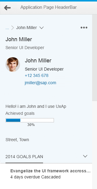
Object page – Size S
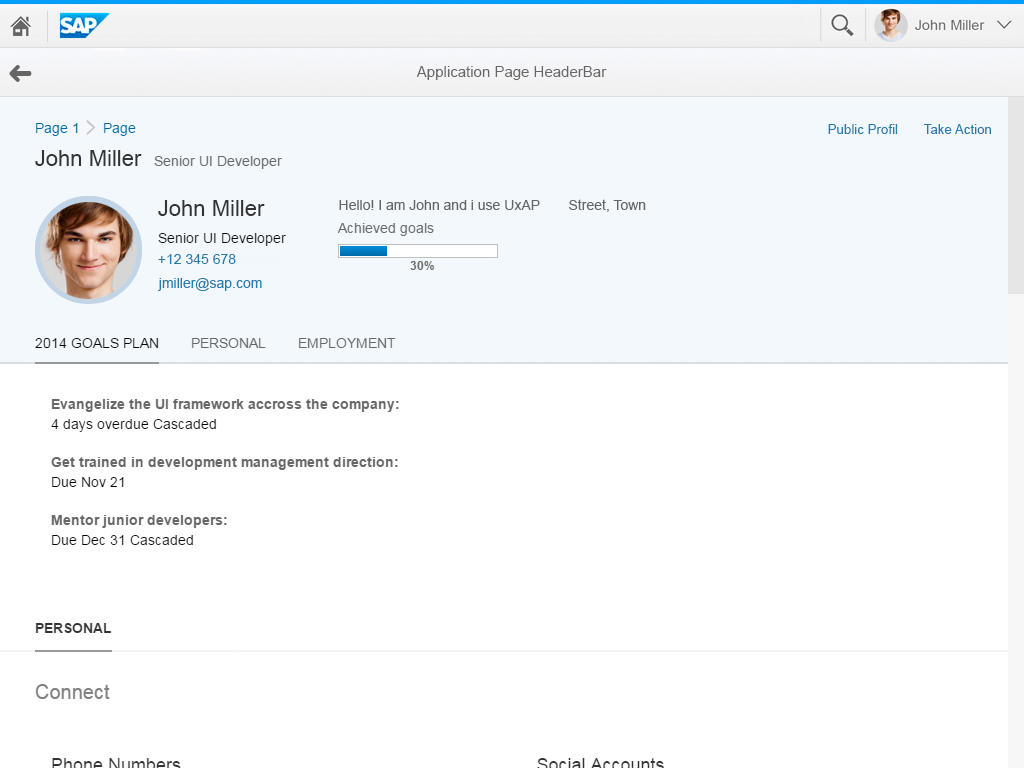
Object page – Size M
Object page – Size L
The object page floorplan supports all three SAP FIori responsive sizes: small, medium, and large.
In size L, the object page has a three-column layout. The breakpoint is 1024 px.
Object page – Size L
In size M, the object page has a two-column layout. The breakpoint is between
600 px and 1023 px.
Object page – Size M
In size S, the object page has a single-column layout. The break point is 600 px.

Object page – Size S
Structure
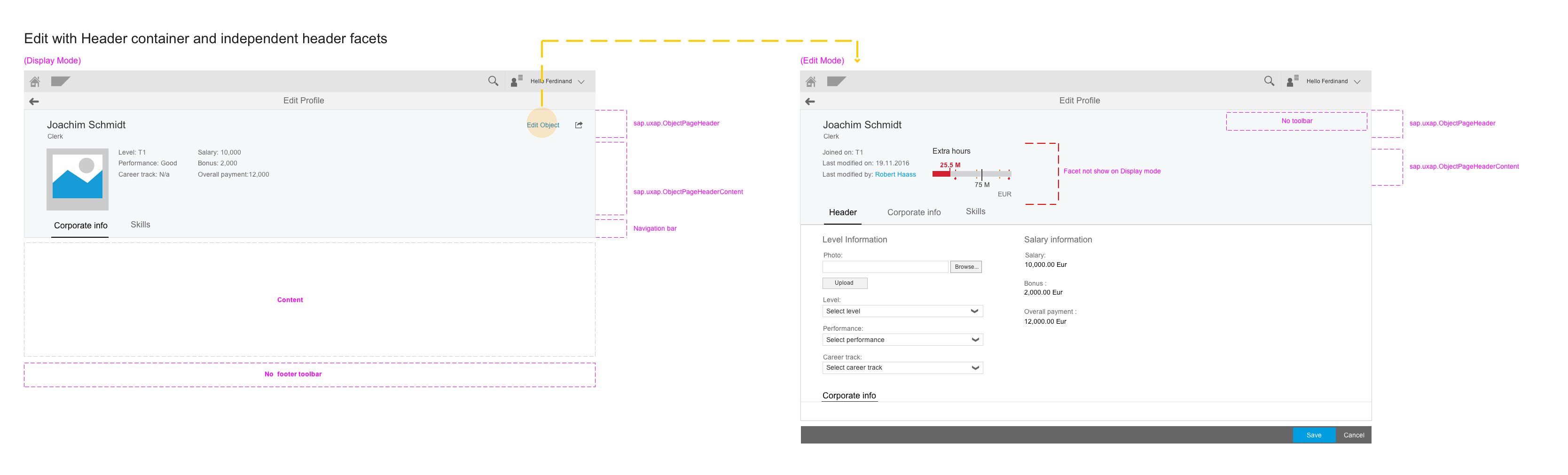
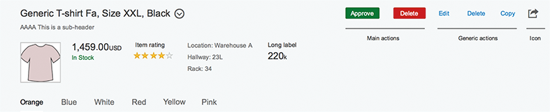
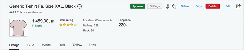
The object page is a full-page floorplan with a display mode, a create mode, and an edit mode.
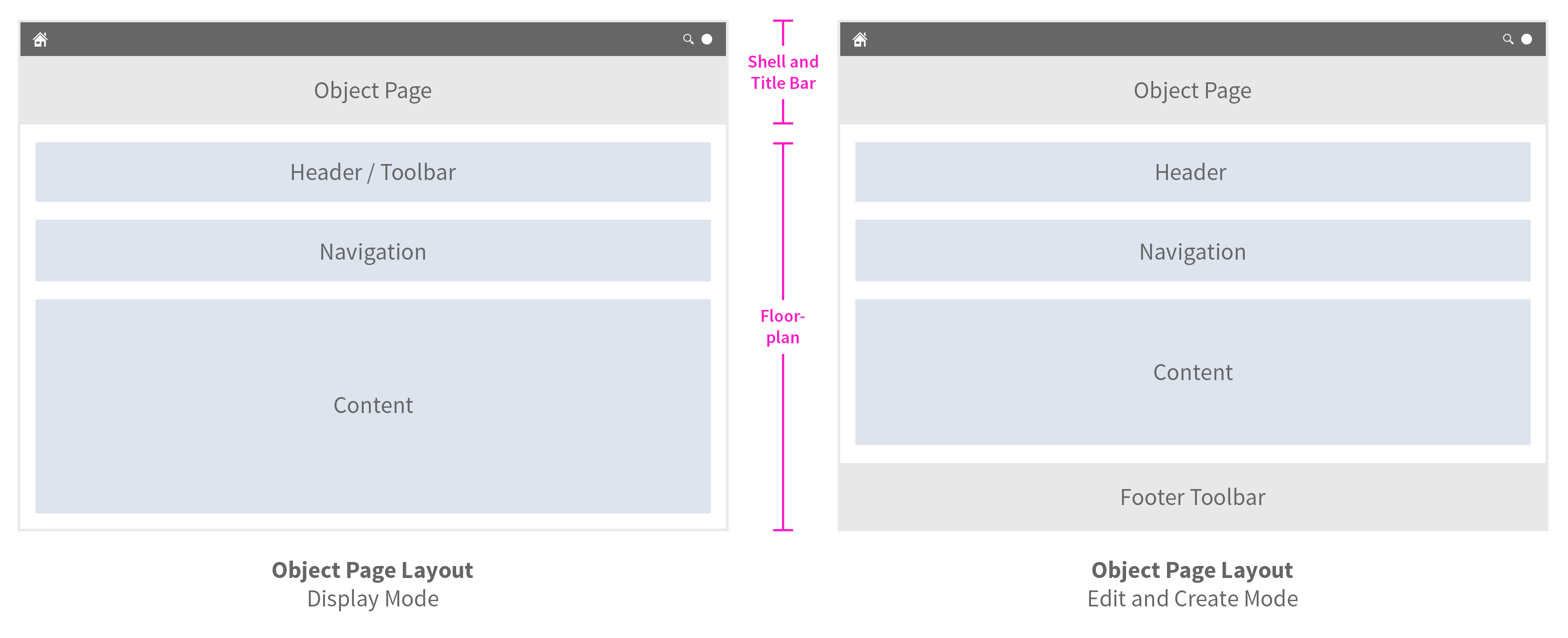
Object page – Schematic visualization of name
The display mode comprises:
- Header with a toolbar for global actions
- Navigation bar
- Content area
The edit and create modes differ in two respects:
- The header in these two modes does not contain a toolbar.
- A footer toolbar is provided instead for actions and messaging.
Header
The object page floorplan uses the SAP Fiori header.
The header is the uppermost element of a floorplan layout. Its purpose is to provide the user with context and relevant information about the document it represents. The header can have a title, a subtitle, and a content area for important information about the object.
For this content area, several object header facets have been defined. These are the form facet, for displaying data in a form structure, a plain text facet to display continuous texts, an image facet to display an image or placeholder, and a key-value facet to display important data. You can also use an address facet to display short addresses or contact data, a quick view facet to display related objects, a micro chart facet to display different micro charts or a rating indicator, and a numeric value facet to display trends. You can use the related apps facet to offer a way to quickly access apps that are related to the object.
The header also contains a toolbar for global actions.
Header responsiveness
The SAP Fiori header responsiveness is independent of the column layout approach of the content area.
For more information, see the Snapping Header article.
Toolbar
In the object page header and subsection, the responsive overflow toolbar allows the action buttons to move into a popover when the toolbar is resized. Regular and transparent buttons become transparent when they move into the overflow. When a segmented button (text/icon) moves into the overflow, it is shown as a select button. Search, select, variant management, positive, negative, and emphasized buttons stay as they are.
Navigation

Responsive overflow toolbar
The object page has two navigation options:
- The anchor bar is the default navigation for the object page.
- The icon tab bar is optionally available to provide faceted navigation to the object page.
Object page – Navigation
General Points
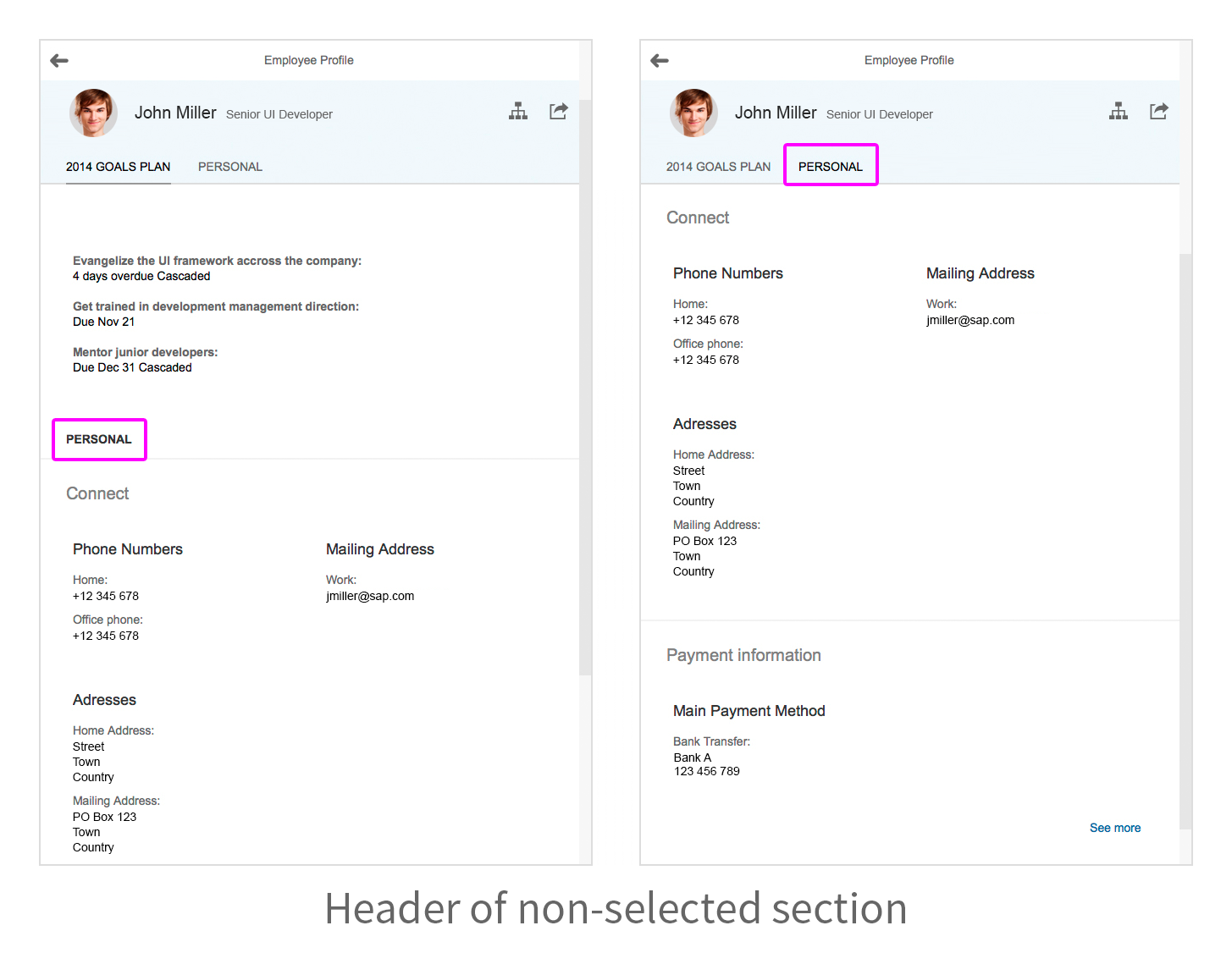
The navigation bar becomes part of the header when the header content is folded.
To avoid title duplication, the object page hides the title of the uppermost section (active or selected). Instead, the selected anchor link in the anchor bar represents the header of the uppermost section. If a section contains only one subsection, the title of the subsection is used as the name of the section. In this case, there is no subsection submenu.
Anchor Bar
The anchor bar arranges anchor links horizontally. These anchor links allow the user to be directed to a specific place on a page. They represent sections or subsections of the floorplan content.
When a section contains more than one subsection, a counter showing the number of subsections and an arrow indicating a dropdown menu are shown next to the section’s title.
You can enable a lazy loading mechanism (enableLazyLoading) to mitigate loading time if the content is extensive.
The anchor bar is set to display items in uppercase by default. If the upperCaseAnchorBar property is set to “false”, the text is left as it is used in the title data.
The anchor bar can be hidden for simple content cases that do not require navigation.

Object page – Anchor bar
Overflow
If there are too many anchor links to be displayed on the screen, the anchor bar uses an overflow mechanism. When the user scrolls down the page, the anchor links scroll horizontally to ensure that the active anchor is always visible.
If anchor links are hidden in the overflow, clicking the overflow arrow button scrolls the content of the anchor bar horizontally to show any content that may be hidden. An overflow overview button provides a hierarchical dropdown list of all sections and subsections, including any that are hidden in the overflow.
Responsiveness
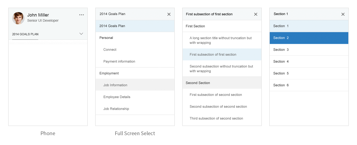
The anchor bar becomes a dropdown list when displayed on small screens. The value in the text field of the dropdown list is the currently selected section. When the user clicks it, a dropdown list with all the content is displayed. The list is hierarchical, showing all the sections and subsections of the document.
Behavior and Interaction
Clicking an anchor link scrolls the page to the selected section.
Clicking a section anchor that contains more than one subsection opens a subsection menu.
Clicking a subsection scrolls the page to the selected subsection. The keyboard left and right arrows allow the user to move between the anchor links.
Hovering (compact mode only) over the fade area to the left or right of the anchor bar causes an overflow arrow button to appear. The overflow arrow button is always visible in cozy mode.
Clicking the overflow arrow button scrolls the anchors horizontally to bring into view any anchors that are hidden in the overflow.
Clicking the overflow overview button displays a hierarchical dropdown list with all the content, showing all the sections and subsections of the document. Clicking any item in the overflow overview dropdown list scrolls to the respective content.
Clicking the Small size dropdown version of the anchor bar displays a hierarchical dropdown list, showing all the sections and subsections of the document. Clicking any item in the overflow overview dropdown list scrolls to the respective content.
Object page – Behavior and interaction
Icon Tab Bar
The icon tab bar offers users an alternative means of navigation on the object page.
By setting the useIconTabBar property to “true”, the navigation bar displays tabs instead of anchors.
The object page only uses the text-only version of the icon tab bar. Other icon tab bar types, like icons, tabs as process steps, or tabs as filters, cannot be used on the object page.
The object page content is based on sections and subsections, which is reflected in the use of the icon tab bar: Sections of the object page become the tabs, and subsections become the internal content of the tab.
The icon tab bar can have subnavigation in tabs. The subnavigation is optional and the default state is false. If the state is set to true, a dropdown arrow is shown next to the section’s title.
The icon tab bar has its own responsive behavior. The control uses a horizontal carousel overflow, which differs from the anchor bar dropdown approach.
For more information about the icon tab bar responsive behavior, see Icon Tab Bar.
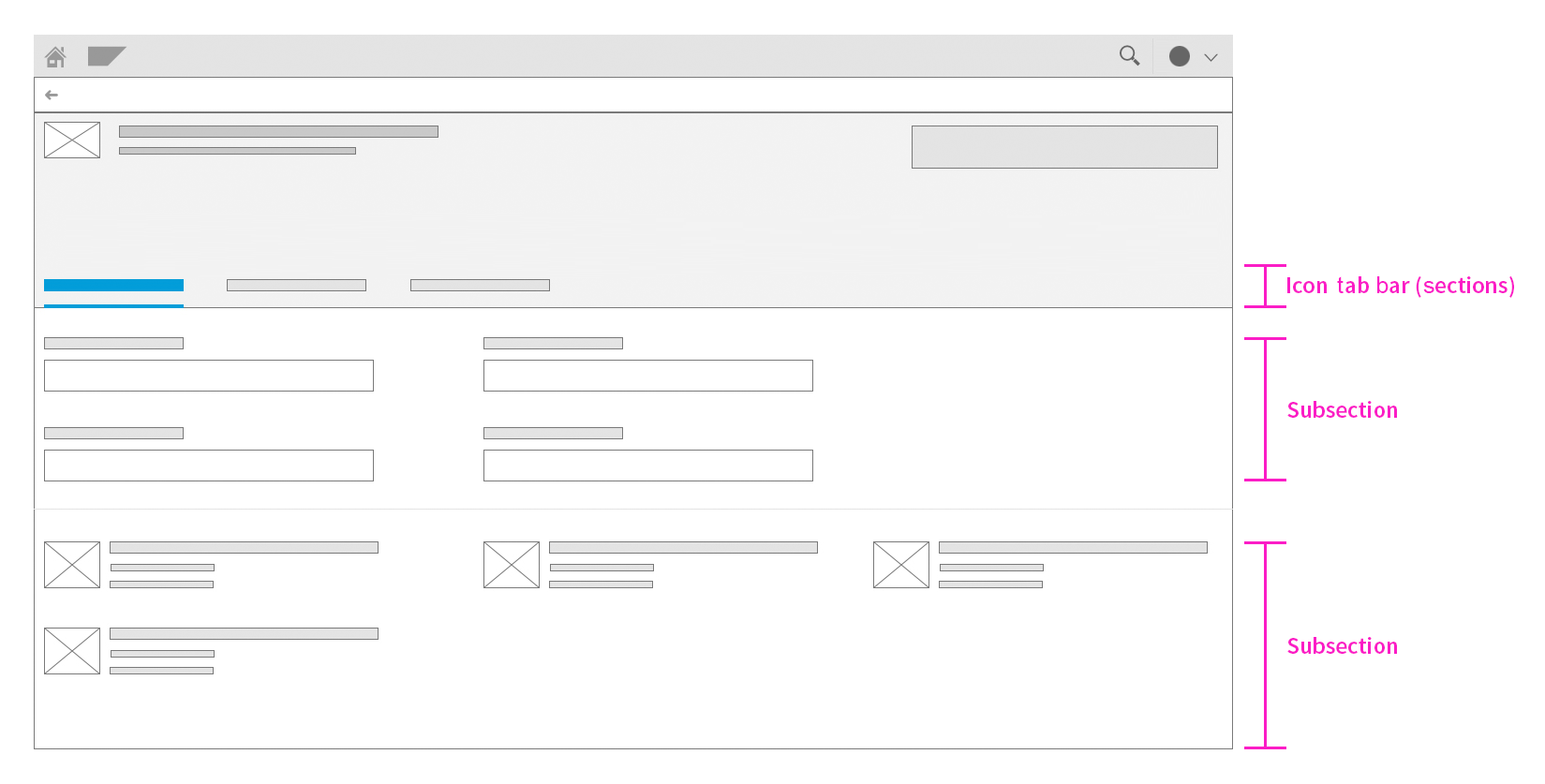
Object page – Behavior and interaction
Breadcrumbs
For the use case of hierarchical drilldown on an object page, a breadcrumb navigation pattern was introduced on the object page. You can only use this if a parent-child drilldown exists on the object page.
The breadcrumb is part of the SAP Fiori header. For more information about breadcrumb navigation, see the Header section.
Content area
The object page content consists of sections and subsections.
Sections
Sections are containers for subsections. They cannot have controls as content. Sections also provide the basic structure for the navigation.
The sections can only include a title and subsections. The section title can be set to be uppercase (titleUppercase).
If a section contains only one subsection, the title of the subsection is used as the name of the section. In this case, there is no subsection submenu in the anchor bar.
If a section contains more than one subsection, a counter showing the number of subsections is shown next to the section’s title.
Subsections
Subsections are the containers for actual content. Individual controls are placed inside the subsections.
Subsection content is arranged according to the column layout approach of the respective screen size. A subsection can include containers for different controls. Subsections have a progressive disclosure mechanism to show content by means of tags.
When the page loads, only the content at block level is shown. Users can click a Show More button to access any content that is hidden with the blockMore tag (sap.uxap.ObjectPageSubSection, aggregation blockMore).
They can hide the information again by clicking the Show Less button.
Each subsection can have a toolbar, which is placed on the right of the layout at subsection header level. The toolbar contains actions that affect the content of the subsection.
Form
Forms follow the standard layout of the object page:
- Large size: three columns
- Medium size: two columns
- Small size: one column
Forms should follow the column design of the object page, whereby each column has its own form (sap.ui.comp.smartform). Avoid using form groups; use layout columns and individual forms instead. These allow the object page to flow smoothly in response to priorities or screen size changes. The title of the form is given by the subsection header. Each individual group of forms within the subsection can use the form title. Avoid using the group form titles.
Labels
Considering the range of columns on the object page, top-aligned is the optimal way to represent labels in forms. Top-aligned labels are known to generally reduce completion times, are the best approach for forms that require localization or long labels, and avoid the spacing between form and label that occurs on left and right-aligned labels. The layout should be fluid and react to the change in screen size, aligning the form content perfectly within the object page column layout.
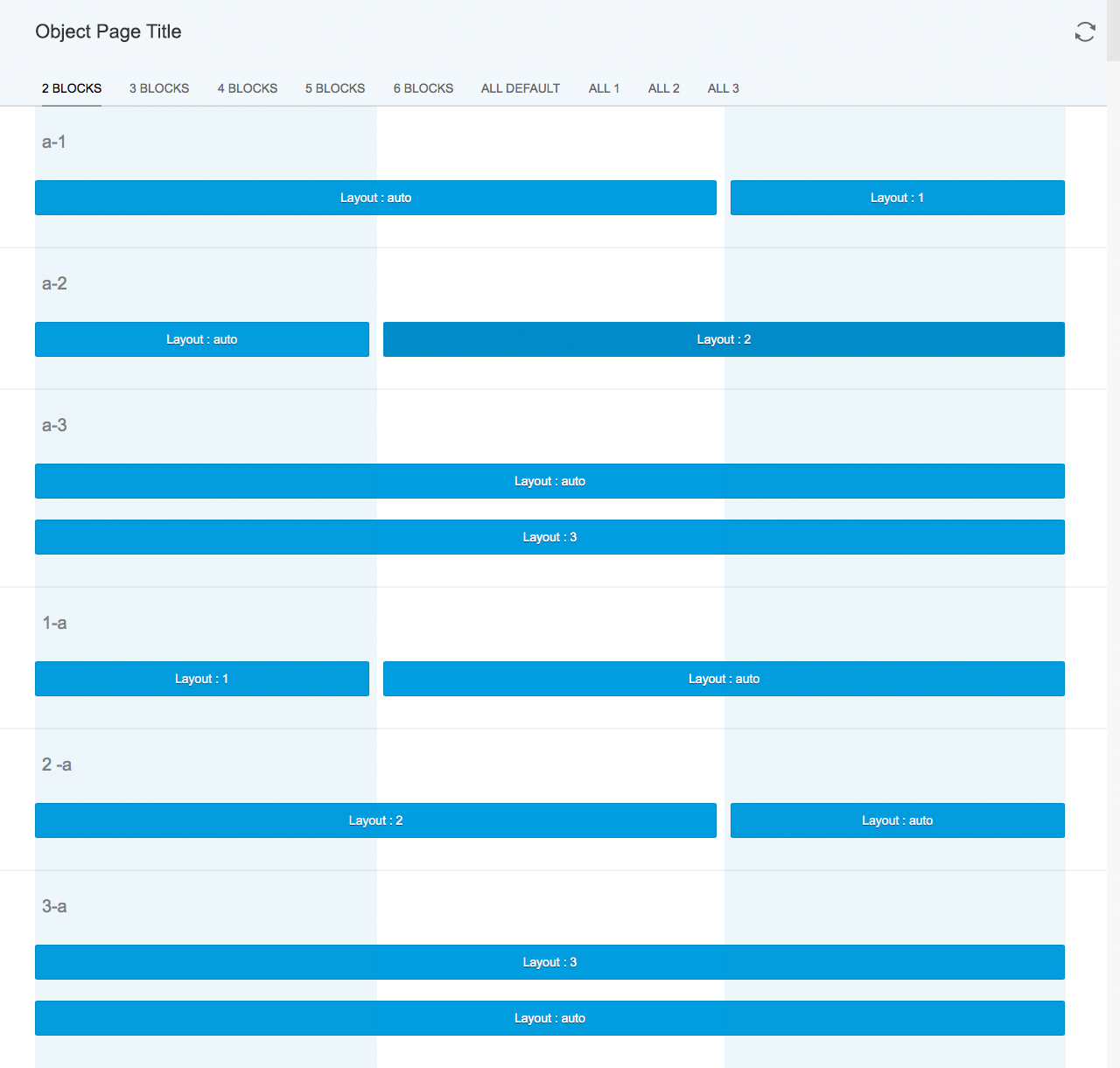
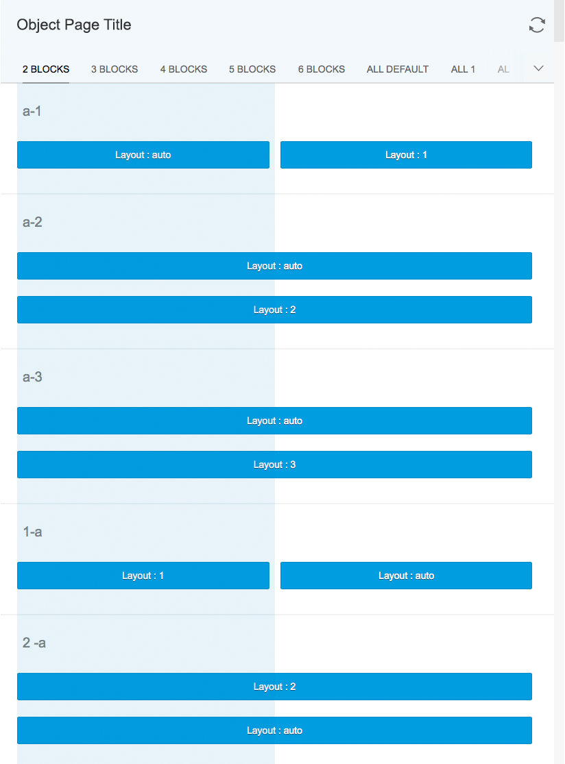
Blocks
Following the column layout of the object page, the layout blocks allow content to be aligned within the columns as follows:
- Layout: auto occupies the maximum available horizontal space.
- Layout:1 occupies only the horizontal space of one column.
- Layout:2 occupies only the horizontal space of two columns. If there is only one column available, it occupies one column.
- Layout:3 occupies only the horizontal space of three columns. If there is only one column available, it occupies one column. If there are only two columns available, it occupies two columns.
The content to be shown is defined in a tag. The hidden content that appears when the user clicks the Show More button is defined by the tag.
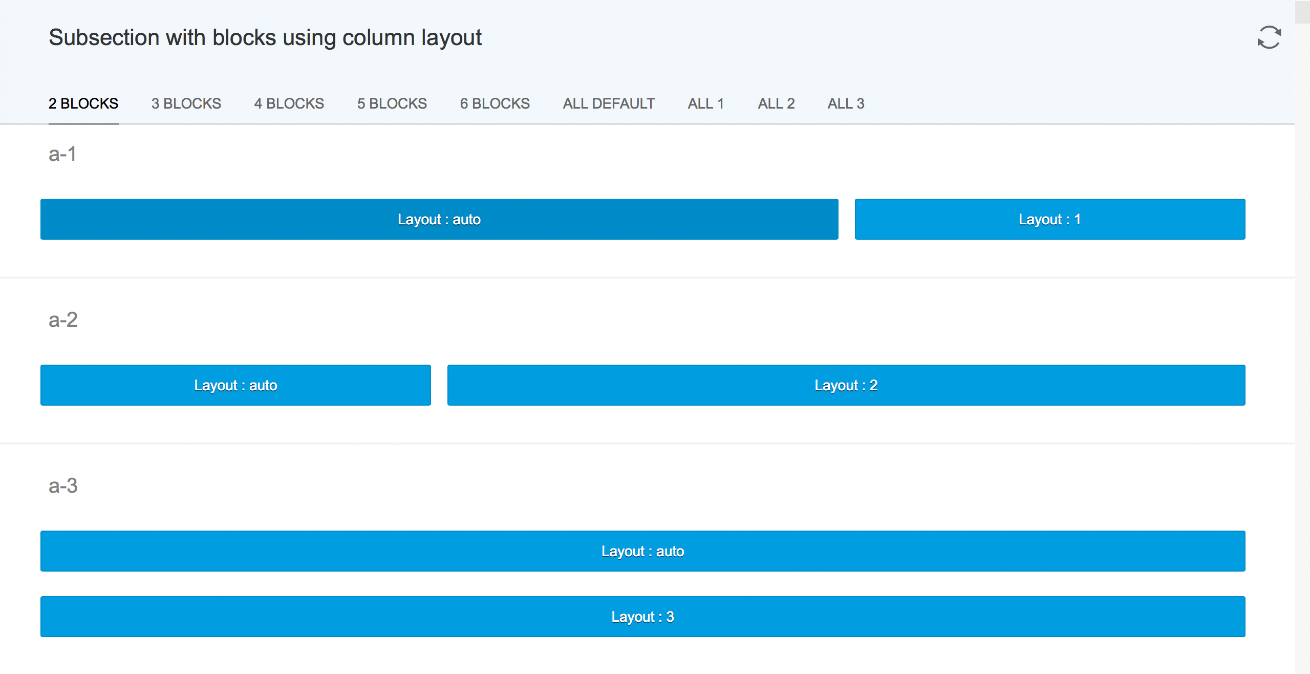
Object page – Blocks
Contacts
The contacts on the object page are technically a list, but they can be represented visually as a card.
The cards can contain:
- An image (optional)
- A title (mandatory)
- A subtitle (optional)
- A text snippet consisting of max. 2 lines (optional)
A single card covers the column’s entire horizontal space.
All cards have the same height to avoid alignment problems. The card with the most content defines the overall height for all cards.
The image can be rectangular or round. It is placed in the top left-hand corner of the card. The content of the card never truncates. If there is not enough space to display the information, it wraps onto the next line.
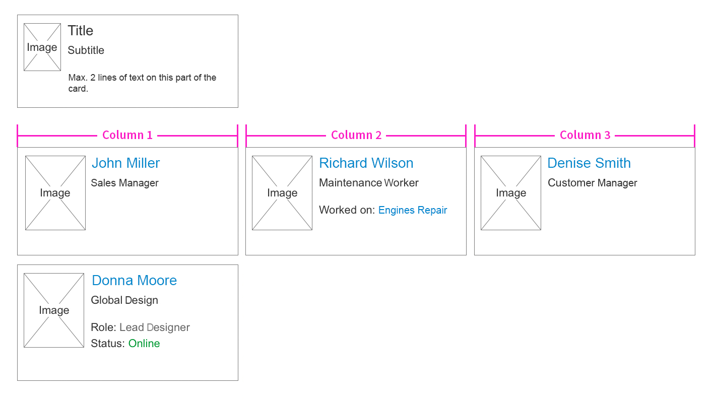
Content type – Contacts
Responsiveness
Content in the subsections is displayed in a line according to the column layout of the screen size. If there is not enough space for the content block to be displayed, it wraps onto the line below.
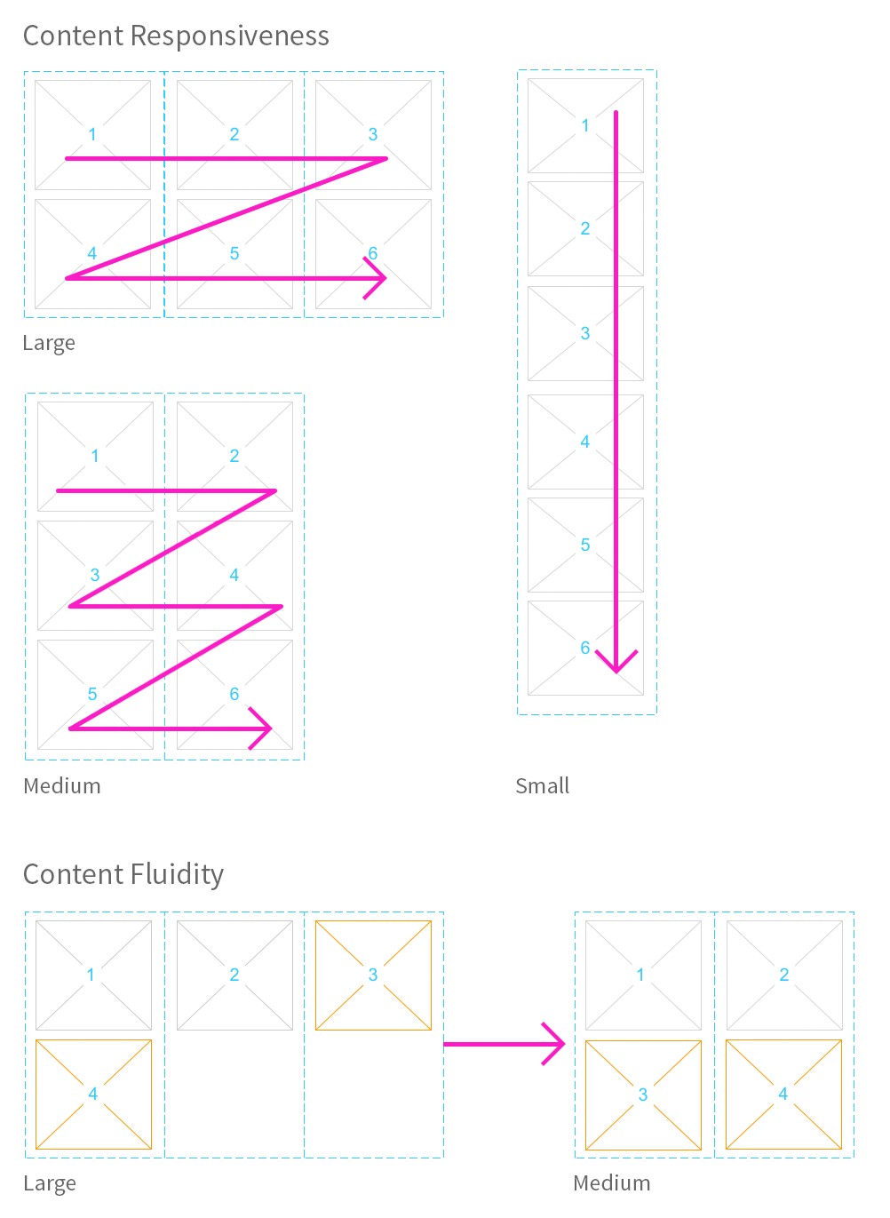
Object page – Content responsiveness
Behavior and Interaction
Edit
Besides display mode, a create mode and an edit mode have been defined for the object page. The object page layout remains the same in terms of the header, navigation, and content.
There is an important difference between using the toolbar in display mode and using it in edit/create mode: In create and edit mode, the actions are placed in a footer toolbar instead of the header toolbar as there is no toolbar in the header. Edit mode can display either forms or read-only information if it is not editable.
If the user needs to edit elements in the header, a header section is added in the content area for edit mode to enable editing.
The layout of information must be the same in display mode and in edit mode. Information should not change location between edit and create mode to avoid confusing the user.
Editing the header
The object page header can be edited in two ways:
- Global edit
- Partial edit
Global edit
The header can be edited when the entire object page is in edit mode.
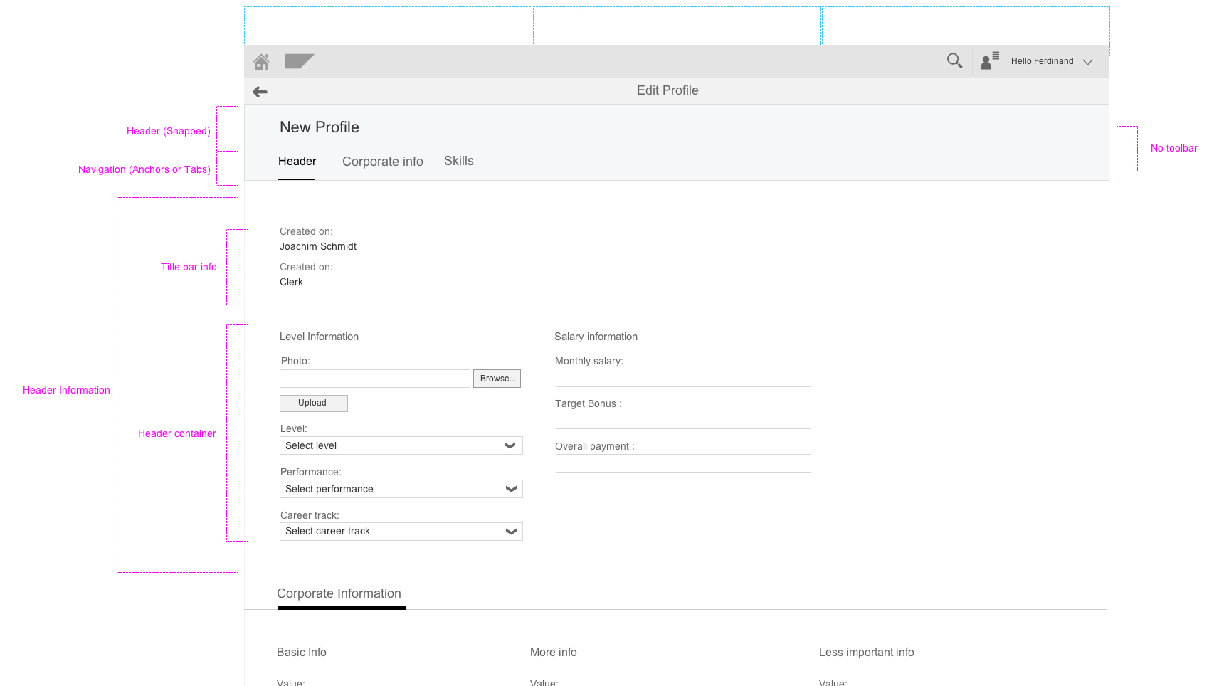
There are no editable forms in the header itself, as it continuously snaps on scroll. A temporary ‘header’ section is added before the other sections of the page instead. The title bar information and all editable fields from the header container in display mode move from the header to the new ‘header’ section.
Non-editable information from the header container in display mode is also shown in the ‘header’ section as read-only. It can be left out if keeping it in does not make sense (in cases of aggregation, like net values that are calculated from several sources, KPIs, micro charts, and so on).
If only a few fields in the header are editable and they match an existing section, they are moved to that section. No ‘header’ section appears.
Object page – Global edit
The header container in edit mode may contain independent facets that are not included in the header content in display mode. They provide information to assist editing and are displayed in the header in edit mode.
When the entire object page is in edit mode but there is no editable information in the header, no ‘header’ section is added. Facets that assist editing can be displayed in the header container in edit mode.
Any changes made to the header are not reflected until the user saves them.
Object page – Global edit with independent facets
Partial edit
The user can edit the header separately by pressing the Edit Header button.
If there are only a few elements to edit, the partial edit triggers a dialog.
If many elements can be edited, a dialog would be too cluttered. So to allow more space, the partial edit triggers a subpage.
The subpage contains all editable information from the header. However, it differs from the ‘header’ section in global edit mode in that it has no action buttons in the toolbar, no navigation, and no breadcrumbs.
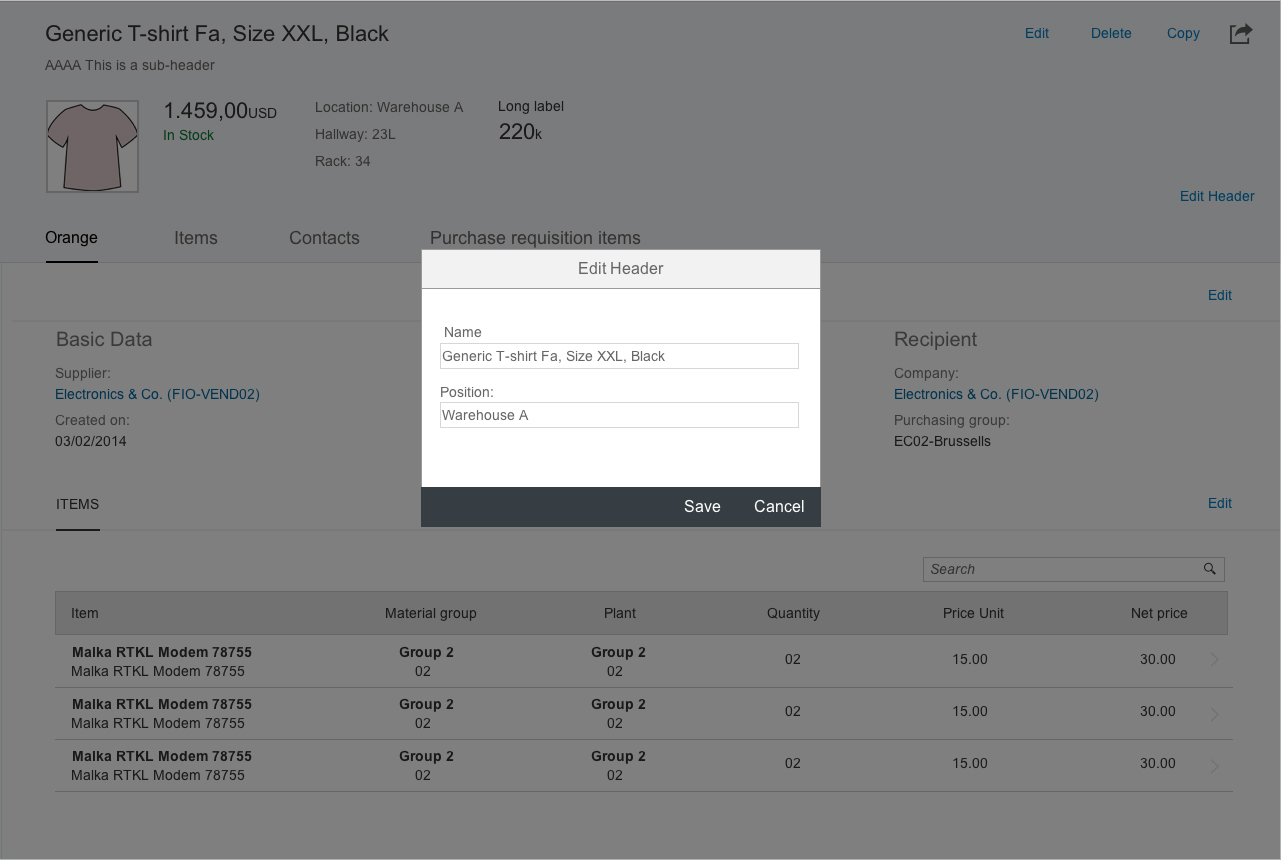
Object page – Partial edit with dialog
Unsaved changes
As part of the draft handling, when a document is not saved, a draft is made instead. This draft indicates that there are still changes that have not yet been saved. The unsaved changes may have been made by the user or by other users in cases of collaborative editing. An icon on the right of the object title in the object page header warns the user. The icon should not be shown if no draft infrastructure is available. The icon should only be shown if there are unsaved changes.
Clicking the icon presents an action sheet with more information about the unsaved changes. This normally states:
- Who made the changes
- When the last changes were made
Clicking the close icon on the action sheet or outside the action sheet closes it.
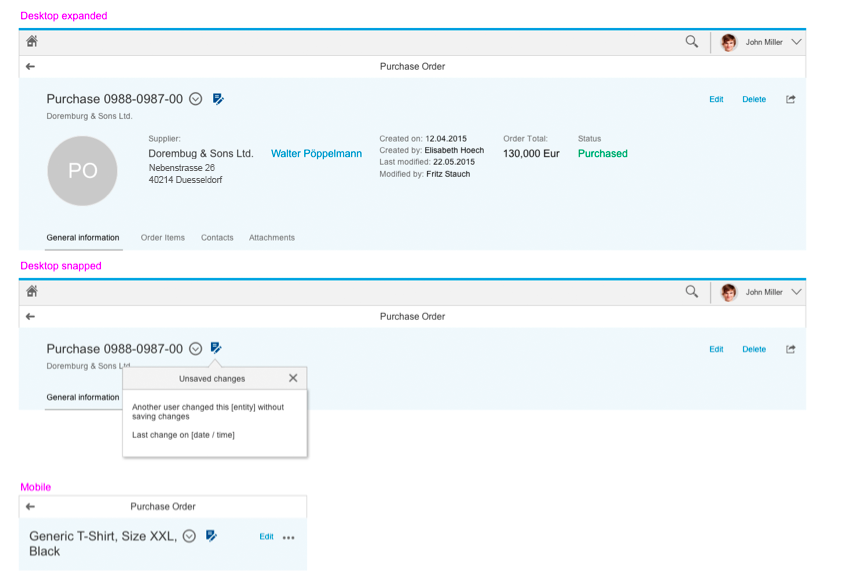
Unsaved changes action sheet
Create
Create mode is similar to edit mode but differs in that the user creates a new object and defines a title for it. Instead, you can also use a placeholder, such as “New Order” or “New Object”.
The user can use an object page or a wizard floorplan to create a new object.
Use the object page if:
- You want to display your forms in a flat view.
Use the wizard if:
- You need a progressive disclosure approach for the create process.
- You need to guide the user from a series of steps.
- The create task is unfamiliar to the user.
- The creation mode is not linear, but it can have different paths depending on the information selected.
You should not use the wizard for editing flows, but only for creation purposes.
Guidelines
Header
The header should provide the user with context and relevant information. Therefore, you must ensure that it is clearly structured and has only essential information. Too much information impedes the main purpose of providing a clear context.
Actions
Arrange the actions in the header toolbar with care, and consider what is most important for the user:
- Highlight actions that are common or most important.
- Differentiate between secondary and generic actions.
- You can have either a button or an icon for an action, but not both.
- Place the most important actions on the left as the actions go into the overflow from right to left.
- Establish a coherent visual approach:
Object page floorplan – Do
Object page floorplan – Do not
Icon Tab Bar
Use the icon tab bar if you need a facet approach to your content. This could be because of performance issues in a flat view or in response to specific use case user preference.
If you need to use icons, tabs as process steps, or tabs as filters, use the object view floorplan.
Content Dump
Avoid using the object page as a universal container for masses of information. You should use the object page in accordance with the SAP Fiori principles: role-based, coherent, simple, and responsive.
Simplify Content for Your Users
Give them the information they need – do not give them the task of finding what they need. Keep it clear so your users can find information quickly and easily.
Use a progressive disclosure strategy to keep your interface clean. Role-based: Provide your users with only the information they need to complete the task at hand. You can always provide additional information on request.
Coherent
Present your users with information that makes sense for their industry, role, activity, and task.
Responsiveness
Consider how your content would fit smaller screens and devices.
Consider the performance and data transfer cost of consuming your information on mobile devices.
If you need to use icons, tabs as process steps, or tabs as filters, use the object view floorplan.
If you need to, create an object when:
- You need a progressive disclosure approach for the create process.
- You need to guide the user from a series of steps.
- When the create task is unfamiliar to the user.
- When the creation mode is not linear, but it can have different paths depending on the information selected.
Wizard Floorplan
The object page floorplan can be used with the dynamic side panel floorplan under the following considerations:
When you choose a side panel, it occupies the whole right side of the screen. The side panel cannot extend below the header and anchor bar. Use the side panel only for contextual content. You cannot place finalizing or global actions in the side panel.
Do not place object information in the side panel. This information should always be in the content area of the object page.
Resources
Want to dive deeper? Follow the links below to find out more about related controls, the SAPUI5 implementation, and the visual design.
Elements and Controls
- Fiori Header (guidelines)
- Object View (guidelines)
- Flat View (guidelines)
- Wizard (guidelines)
Implementation
- No Links.
 Your feedback has been sent to the SAP Fiori design team.