
- Latest SAPUI Version 1.124
- SAPUI5 Version 1.122
- SAPUI5 Version 1.120
- SAPUI5 Version 1.118
- SAPUI5 Version 1.116
- SAPUI5 Version 1.114
- SAPUI5 Version 1.112
- SAPUI5 Version 1.110
- SAPUI5 Version 1.108
- SAPUI5 Version 1.106
- SAPUI5 Version 1.104
- SAPUI5 Version 1.102
- SAPUI5 Version 1.100
- SAPUI5 Version 1.98
- SAPUI5 Version 1.96
- SAPUI5 Version 1.94
- SAPUI5 Version 1.92
- SAPUI5 Version 1.90
- SAPUI5 Version 1.88
- SAPUI5 Version 1.86
- SAPUI5 Version 1.84
- SAPUI5 Version 1.82
- SAPUI5 Version 1.80
- SAPUI5 Version 1.78
- SAPUI5 Version 1.76
- SAPUI5 Version 1.74
- SAPUI5 Version 1.72
- SAPUI5 Version 1.70
- SAPUI5 Version 1.68
- SAPUI5 Version 1.66
- SAPUI5 Version 1.64
- SAPUI5 Version 1.62
- SAPUI5 Version 1.60
- SAPUI5 Version 1.58
- SAPUI5 Version 1.56
- SAPUI5 Version 1.54
- SAPUI5 Version 1.52
- SAPUI5 Version 1.50
- SAPUI5 Version 1.48
- SAPUI5 Version 1.46
- SAPUI5 Version 1.44
- SAPUI5 Version 1.42
- SAPUI5 Version 1.40
- SAPUI5 Version 1.38
- SAPUI5 Version 1.36
- SAPUI5 Version 1.34
- SAPUI5 Version 1.30
- SAPUI5 Version 1.28
- SAPUI5 Version 1.26
- Latest SAPUI Version 1.124
- SAPUI5 Version 1.122
- SAPUI5 Version 1.120
- SAPUI5 Version 1.118
- SAPUI5 Version 1.116
- SAPUI5 Version 1.114
- SAPUI5 Version 1.112
- SAPUI5 Version 1.110
- SAPUI5 Version 1.108
- SAPUI5 Version 1.106
- SAPUI5 Version 1.104
- SAPUI5 Version 1.102
- SAPUI5 Version 1.100
- SAPUI5 Version 1.98
- SAPUI5 Version 1.96
- SAPUI5 Version 1.94
- SAPUI5 Version 1.92
- SAPUI5 Version 1.90
- SAPUI5 Version 1.88
- SAPUI5 Version 1.86
- SAPUI5 Version 1.84
- SAPUI5 Version 1.82
- SAPUI5 Version 1.80
- SAPUI5 Version 1.78
- SAPUI5 Version 1.76
- SAPUI5 Version 1.74
- SAPUI5 Version 1.72
- SAPUI5 Version 1.70
- SAPUI5 Version 1.68
- SAPUI5 Version 1.66
- SAPUI5 Version 1.64
- SAPUI5 Version 1.62
- SAPUI5 Version 1.60
- SAPUI5 Version 1.58
- SAPUI5 Version 1.56
- SAPUI5 Version 1.54
- SAPUI5 Version 1.52
- SAPUI5 Version 1.50
- SAPUI5 Version 1.48
- SAPUI5 Version 1.46
- SAPUI5 Version 1.44
- SAPUI5 Version 1.42
- SAPUI5 Version 1.40
- SAPUI5 Version 1.38
- SAPUI5 Version 1.36
- SAPUI5 Version 1.34
- SAPUI5 Version 1.32
- SAPUI5 Version 1.30
- SAPUI5 Version 1.28
- SAPUI5 Version 1.26
Checkbox
Intro
A checkbox lets the user set a binary value (such as “true/false”). When the user clicks or taps the checkbox, it toggles between checked and unchecked.
Checked means that the state described by the checkbox text applies, or that the item has been chosen.
The checkbox text describes the positive action (as in “true” or “yes”).
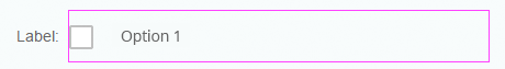
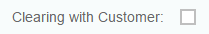
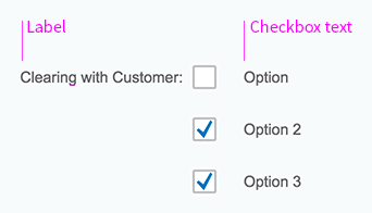
The text can be either a label control to the left of the checkbox, or a checkbox text that appears to the right of the box.
- If there is only one checkbox, you can use a label or text depending on the form format.
- If there is more than one checkbox, the label describes the whole group of checkboxes. In this case, use the text property of the checkbox to describe the individual checkboxes.
Within a group of checkboxes, each checkbox can be checked or unchecked. The user can check multiple options.
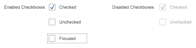
Enabled/Disabled checkboxes
Usage
Use the checkbox control if:
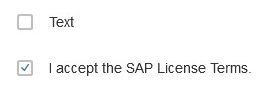
- Only one option can be selected or deselected, for example to accept terms of use. Use it only if the meaning is obvious (single checkbox).
- You have a group or a list of options that can be selected independently of each other (checkbox group).
- Your use case requires all available options to be displayed right away without any user interaction (also in read-only cases).
- The values of the option list are primary information and need to be displayed right away.
Do not use the checkbox control if:
- The user needs to choose multiple options from a large list. Use a multi-combo box instead.
- The user can choose only one option from a list. For a small list, use a radio button group instead. For a large list, use the select control or a list with multi-selection functionality.
- You want to offer two options for a “yes/no” or “on/off” type of decision. Consider using a switch control instead.
- There is not enough space available on the screen. Use the combo box control instead.
Responsiveness
A checkbox can appear in two different sizes. In cozy mode, it is bigger than it is in compact mode. This makes the checkbox easier to select on touch devices. For more information on cozy and compact modes, see the article on content density.
Compact mode
Cozy mode
In both sizes, the touch/click area around the checkbox is bigger than the checkbox itself, making the checkbox easier to select. Touching/clicking inside this area toggles the checkbox.
Note: Because the touch/click area does not include the label on the left, clicking this label will not toggle the checkbox.
Checkbox click area in compact mode
Checkbox touch/click area in cozy mode

Checkbox click area within form in compact mode
Checkbox touch/click area within form in cozy mode
Layout
The checkbox control consists of a box and a text that describes the purpose of the checkbox.
If the checkbox is checked, an indicator is shown inside the box.
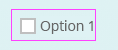
Although the clickable area to select/deselect a checkbox covers a wider area than the box (see the Responsiveness section), the focus is indicated by a dotted line that surrounds only the box.
If the checkbox appears alone inside a form, the text can be omitted if the label in front of the checkbox takes over its function.
Note: Because the touch/click area does not include the label on the left, clicking this label does not toggle the checkbox.
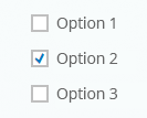
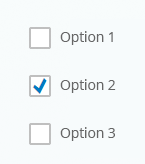
If there are several options to choose from in a form, the label describes the entire checkbox group, and the texts describe the individual checkboxes.
Checkbox texts are also a type of label, so they should be written in title case to be consistent with other labels.
Exception: If one or several of the checkbox texts is very long, or is formulated as a phrase, use sentence style and appropriate ending punctuation.
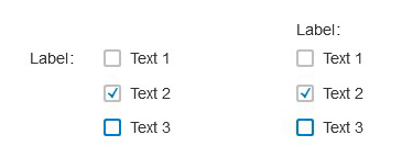
For forms with labels above the fields, place the label above the checkbox group, or do not use a label. For a single checkbox, use only a checkbox text.
For forms with labels on the left of the field, place the label next to the group, aligned with the first checkbox field, or do not use a label. For a single checkbox, use only a label, or only a checkbox text.
Do not use empty labels to arrange the checkboxes. Creating a label in front of each checkbox and leaving the text empty looks fine – nobody sees the label, and the checkboxes are aligned correctly underneath each other. However, the screen reader will notice these labels and read each of them as “label”. Instead, use the layout data property (layoutData) for the checkbox. In this property, force a line break (linebreak) and set the value of the indents in sizes L and M (indentL, indentM) according to the value of the label span in the simple form (labelSpanL, labelSpanM).

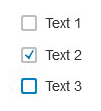
Unchecked checkbox
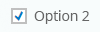
Checked checkbox
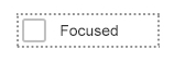
Focused checkbox
Checkbox with label
Checkbox group with label
Checkbox 1: Short text in title case; Checkbox 2: Long text in sentence style
Checkbox group with label on top or to the left
Checkbox group without label

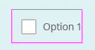
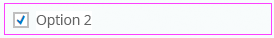
Single checkbox with label

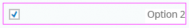
Single checkbox with text
Behavior and Interaction
Clicking or tapping a checkbox toggles the state of the checkbox between checked and unchecked.
Properties
You can set the width of the element containing the checkbox and the text manually (property: width).
If the text exceeds the available width, it is truncated. The touchable area for toggling the checkbox ends where the text ends.

Checkbox not as wide as required by the text length
If the width allows more space than the text requires, white space is added. The touchable area for toggling the checkbox is increased according to the manually-set width.
Checkbox wider than is required by text length
The text can be positioned manually in this space (property: textAlign). However, we do not recommend using the right-align option, which can result in a large amount of white space between the checkbox and the checkbox text.
Checkbox wider than is required by text length and text is right-aligned
If a checkbox is part of an editable form, but you don’t want users to edit the checkbox setting, disable the checkbox (enabled = false).

Disabled checkbox
If the checkbox appears in a read-only form, set the checkbox to read-only (editable = false).

Read-only checkbox
Do not combine the settings “disabled” and “read-only”. This is technically possible, but does not make any sense.

Disabled read-only checkbox
Resources
Want to dive deeper? Follow the links below to find out more about related controls, the SAPUI5 implementation, and the visual design.
Elements and Controls
- Label (guidelines)
- Combo Box (guidelines)
- Multi-Combo Box (guidelines)
- Radio Button (guidelines)
- Select (guidelines)
- Switch (guidelines)
 Your feedback has been sent to the SAP Fiori design team.