
- Latest SAPUI5 Version 1.120
- Version 1.118
- SAPUI5 Version 1.116
- SAPUI5 Version 1.114
- SAPUI5 Version 1.112
- SAPUI5 Version 1.110
- SAPUI5 Version 1.108
- SAPUI5 Version 1.106
- SAPUI5 Version 1.104
- SAPUI5 Version 1.102
- SAPUI5 Version 1.100
- SAPUI5 Version 1.98
- SAPUI5 Version 1.96
- SAPUI5 Version 1.94
- SAPUI5 Version 1.92
- SAPUI5 Version 1.90
- SAPUI5 Version 1.88
- SAPUI5 Version 1.86
- SAPUI5 Version 1.84
- SAPUI5 Version 1.82
- SAPUI5 Version 1.80
- SAPUI5 Version 1.78
- SAPUI5 Version 1.76
- SAPUI5 Version 1.74
- SAPUI5 Version 1.72
- SAPUI5 Version 1.70
- SAPUI5 Version 1.68
- SAPUI5 Version 1.66
- SAPUI5 Version 1.64
- SAPUI5 Version 1.62
- SAPUI5 Version 1.60
- SAPUI5 Version 1.58
- SAPUI5 Version 1.54
- SAPUI5 Version 1.52
- SAPUI5 Version 1.50
- SAPUI5 Version 1.48
- SAPUI5 Version 1.46
- SAPUI5 Version 1.44
- SAPUI5 Version 1.42
- SAPUI5 Version 1.40
- SAPUI5 Version 1.38
- SAPUI5 Version 1.36
- SAPUI5 Version 1.34
- SAPUI5 Version 1.32
- SAPUI5 Version 1.30
- SAPUI5 Version 1.28
- SAPUI5 Version 1.26
- Latest SAPUI5 Version 1.120
- Version 1.118
- SAPUI5 Version 1.116
- SAPUI5 Version 1.114
- SAPUI5 Version 1.112
- SAPUI5 Version 1.110
- SAPUI5 Version 1.108
- SAPUI5 Version 1.106
- SAPUI5 Version 1.104
- SAPUI5 Version 1.102
- SAPUI5 Version 1.100
- SAPUI5 Version 1.98
- SAPUI5 Version 1.96
- SAPUI5 Version 1.94
- SAPUI5 Version 1.92
- SAPUI5 Version 1.90
- SAPUI5 Version 1.88
- SAPUI5 Version 1.86
- SAPUI5 Version 1.84
- SAPUI5 Version 1.82
- SAPUI5 Version 1.80
- SAPUI5 Version 1.78
- SAPUI5 Version 1.76
- SAPUI5 Version 1.74
- SAPUI5 Version 1.72
- SAPUI5 Version 1.70
- SAPUI5 Version 1.68
- SAPUI5 Version 1.66
- SAPUI5 Version 1.64
- SAPUI5 Version 1.62
- SAPUI5 Version 1.60
- SAPUI5 Version 1.58
- SAPUI5 Version 1.56
- SAPUI5 Version 1.54
- SAPUI5 Version 1.52
- SAPUI5 Version 1.50
- SAPUI5 Version 1.48
- SAPUI5 Version 1.46
- SAPUI5 Version 1.44
- SAPUI5 Version 1.42
- SAPUI5 Version 1.40
- SAPUI5 Version 1.38
- SAPUI5 Version 1.36
- SAPUI5 Version 1.34
- SAPUI5 Version 1.32
- SAPUI5 Version 1.30
- SAPUI5 Version 1.28
- SAPUI5 Version 1.26
SAP CoPilot
Intro
SAP CoPilot intelligently surfaces the power of SAP’s enterprise systems. Built upon SAP Cloud Platform and tightly integrated with SAP S/4HANA, CoPilot liberates users from applications and transactions and enables them to do work in a way that is more natural to them.
Responsiveness
When opened on a desktop or tablet, CoPilot opens as a panel that floats on top of the SAP Fiori launchpad. The CoPilot panel can be moved anywhere on the screen or can be docked on either the left or right. When opened on a smartphone, CoPilot opens as a full screen and must be closed to access the SAP Fiori launchpad.
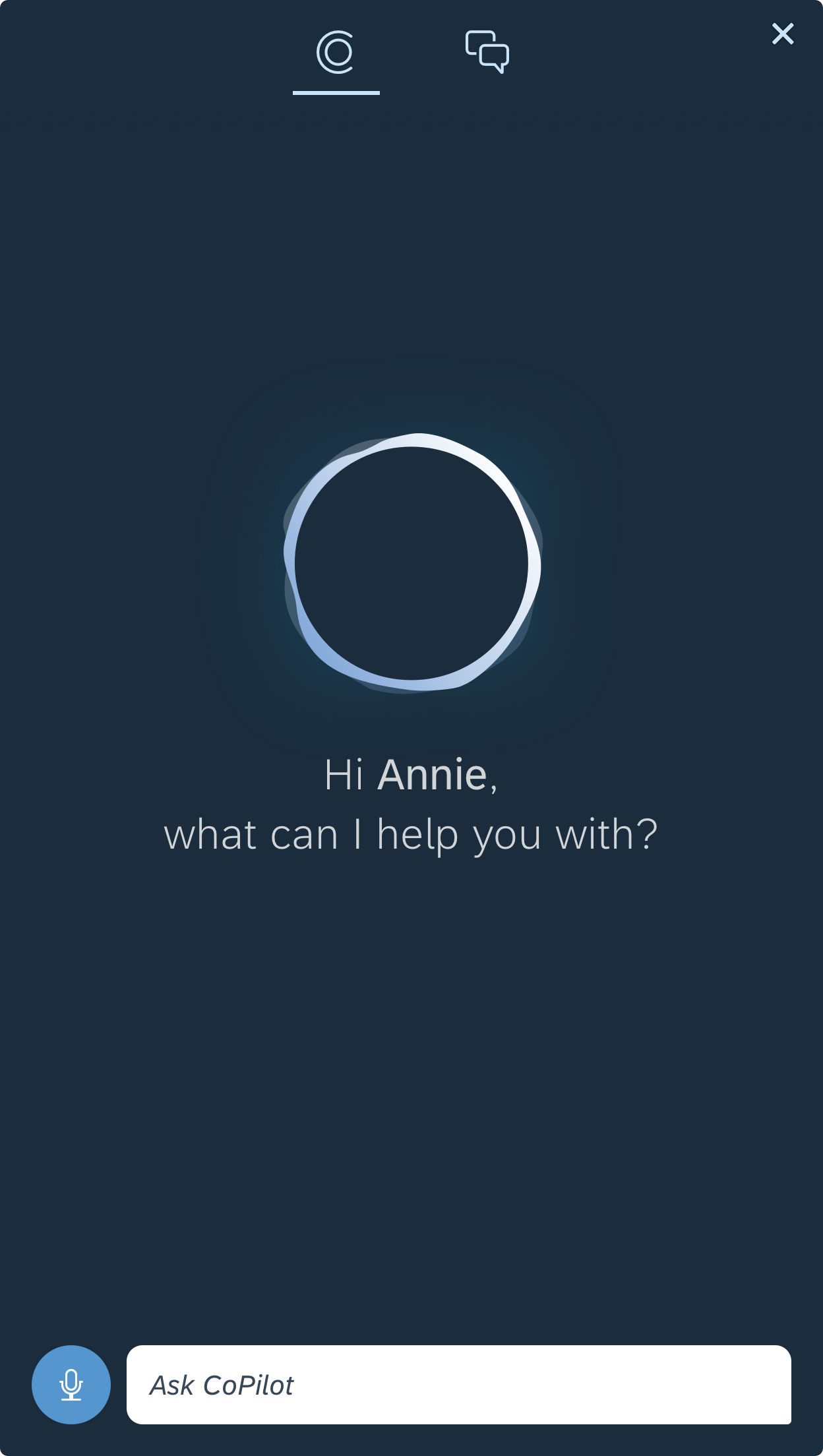
CoPilot - Size S (smartphone)
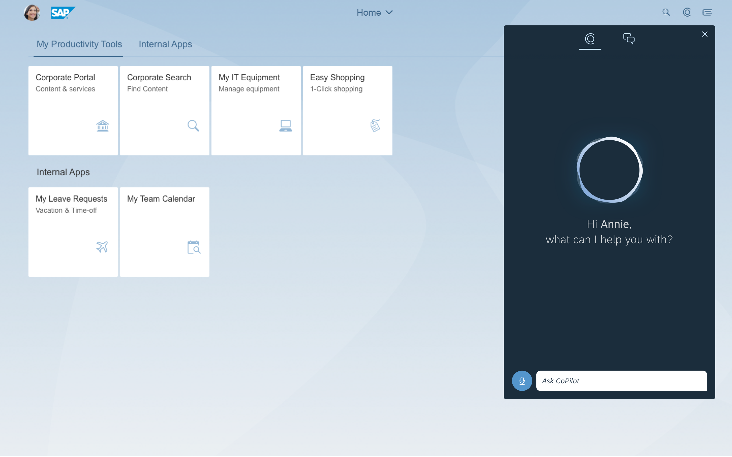
CoPilot - Size L (desktop)
Structure
Upon launching SAP CoPilot using the Open CoPilot icon on the top right corner of the SAP Fiori launchpad, the user sees a welcome screen from the digital assistant. On top of the panel, there two tabs: a digital assistant tab and a chat list tab. The digital assistant tab is selected by default and user can switch to the chat list by clicking the chat list tab. On the chat list screen, the user can manage and enter a specific chat.
Digital Assistant View
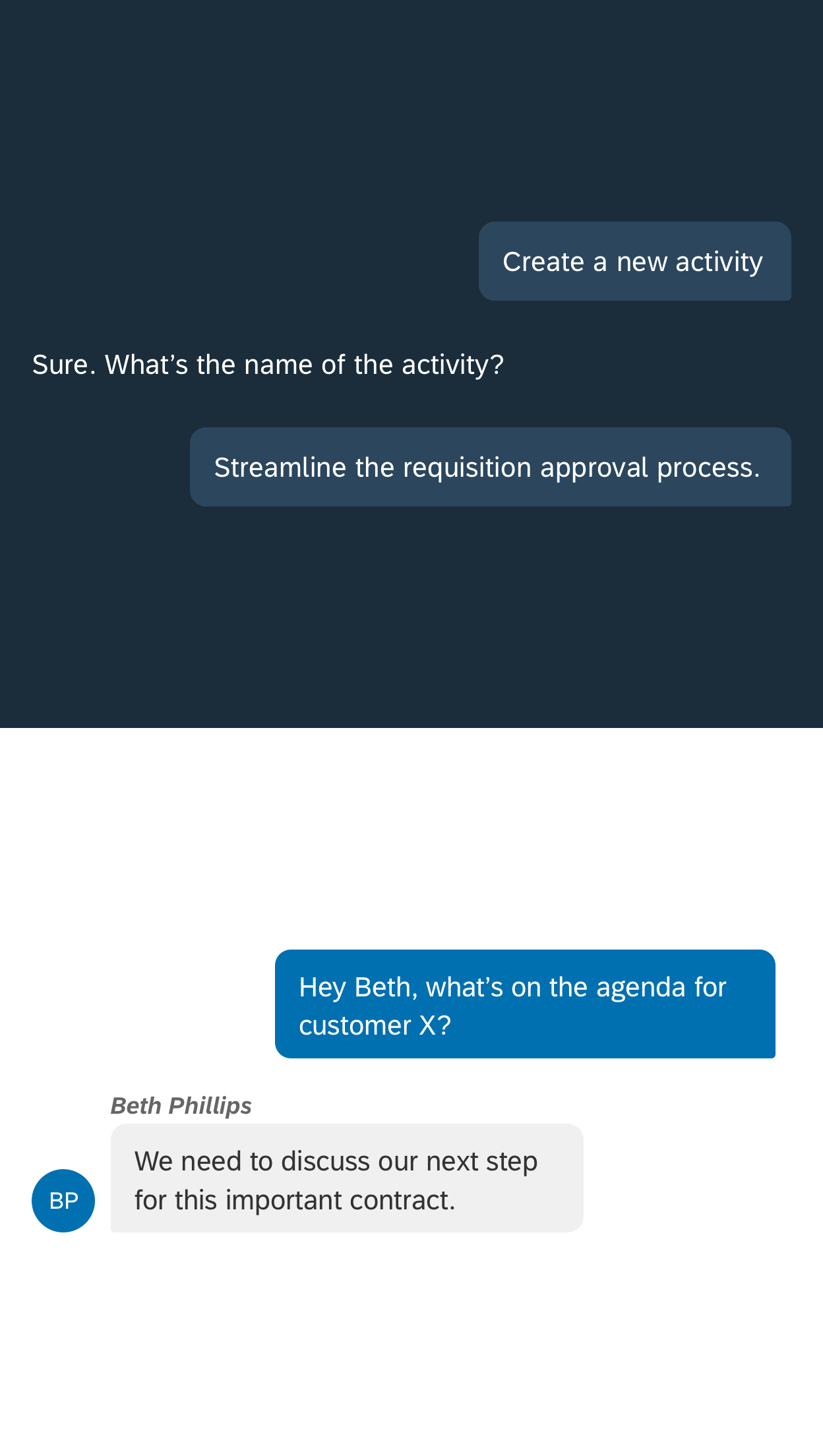
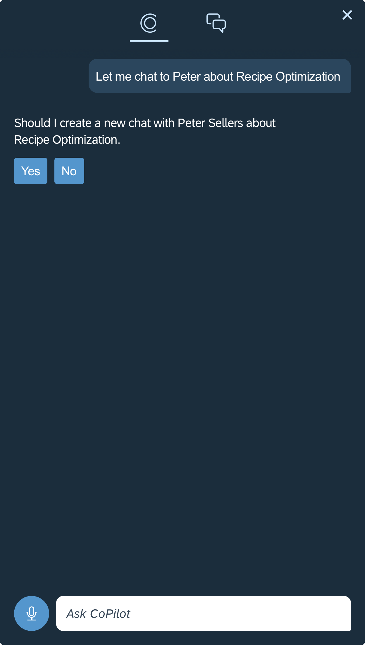
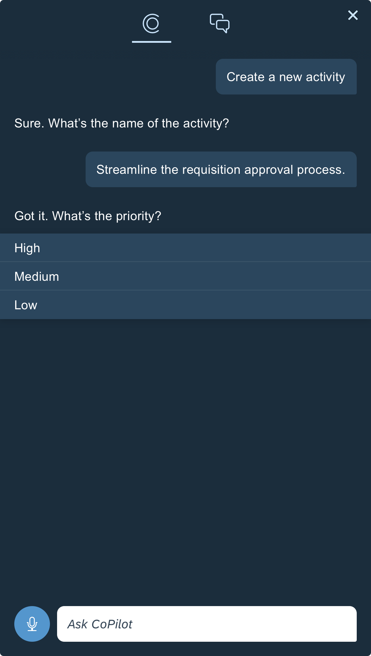
The digital assistant tab is the default tab upon opening. Inside the digital assistant tab, the user can interact with the digital assistant by speaking or typing. Messages from the user show on the right side wrapped inside chat bubble, and the response from CoPilot appears on the left without a chat bubble. CoPilot can also respond with cards for richer information, or actions to prompt subsequent steps by the user.
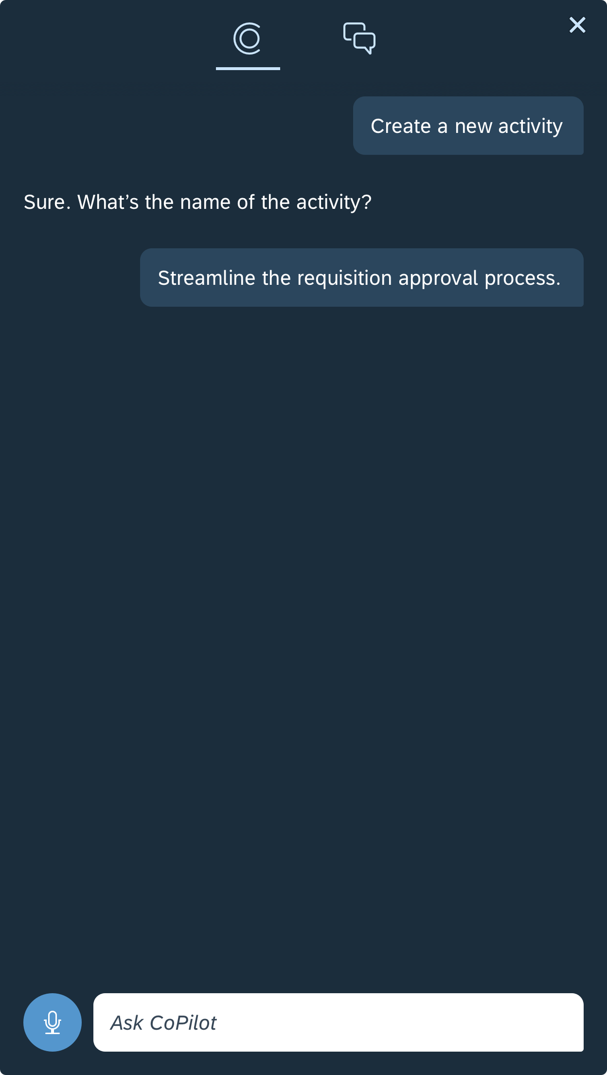
Digital assistant view
Chat List View
Chats appear grouped under two tabs: All and Linked to Current Screen. Chats in the Linked to Current Screen tab are chats that were created while on the current screen that is open in SAP Fiori. Chats in both tabs are sorted by the most recently updated. The user can search, filter, and sort the list to locate a particular chat.

Chat list view
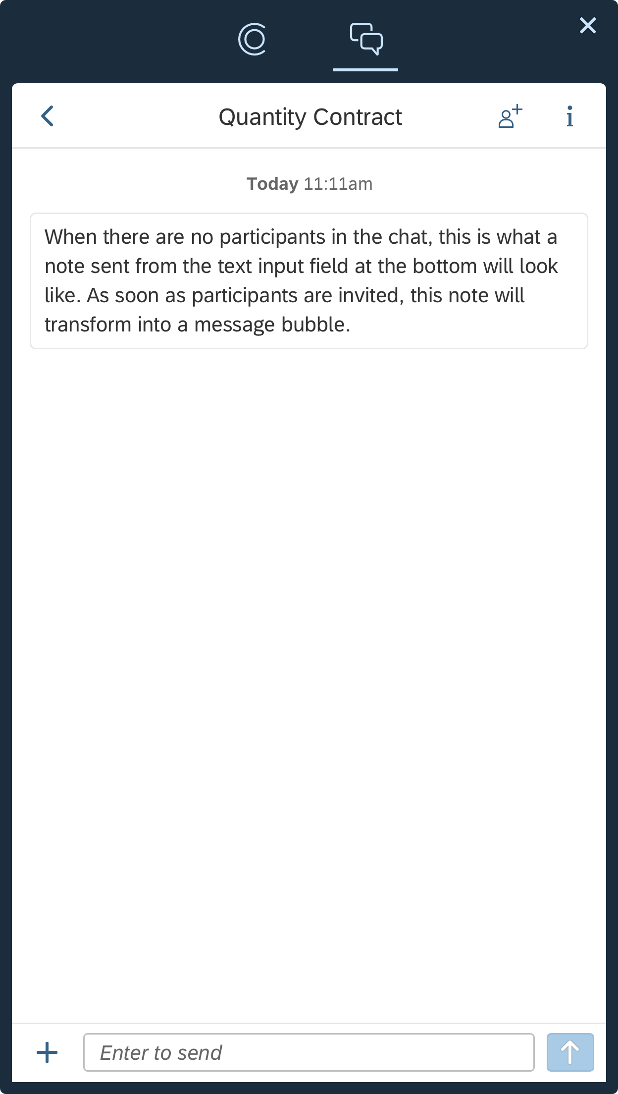
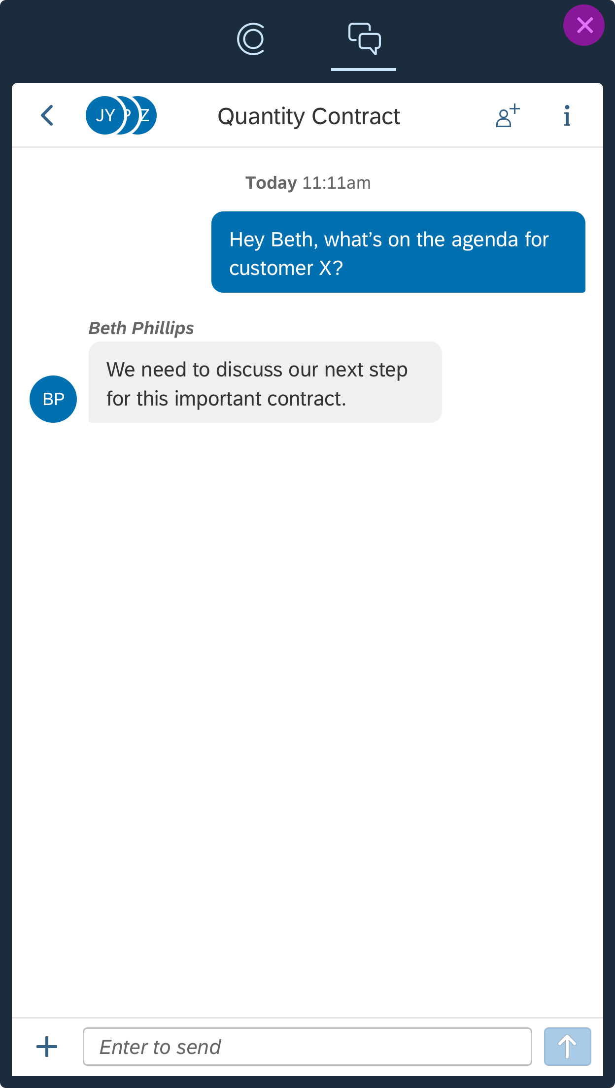
Chat View
A chat is a container for the users to collect business-relevant information from various sources and to collaborate on that information with their colleagues.
- Chats are in the format of a thread so that information is chronological and traceable.
- Each chat is automatically linked to the SAP Fiori screen that it was created on. Users can easily navigate to the linked screen to gain context. The linked screen can also be reset and the chat linked to another screen.
- A chat can have no participants, or it can have multiple participants. When a chat has no participants, it becomes a place for users to make notes.
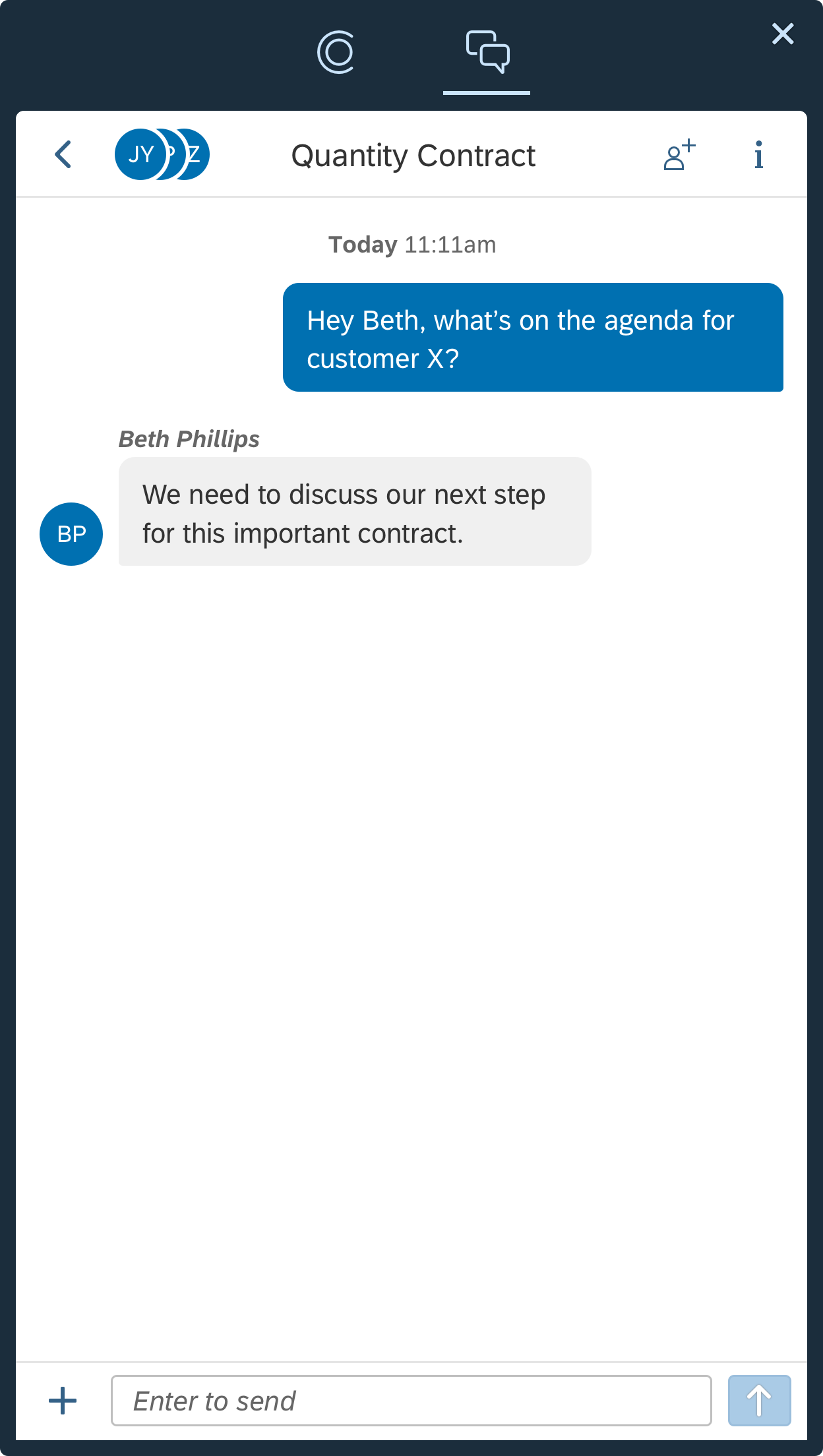
Chat view
Text Message
The message is the fundamental element of the conversational interface. A message is a chunk of plain text sent by or to the user.
In the digital assistant view, the user can use voice or keyboard to type a message to CoPilot. The response from CoPilot is also a mix of messages and other elements (if necessary).
In the chat view, a chat message is added via the input field at the bottom of the window. Any notes that are added by the owner before inviting participants become chat messages. A chat message cannot be edited or deleted to maintain the integrity of the conversation thread.
Chat Thread Content
When new participants are added to a chat, they are able to see all content that has previously been added. This is so they can easily understand the context and begin participating in the collaboration. When the owner invites the first participants, thereby transforming his or her notes to chat messages, the participants can see everything that was added before they were invited.
Chat message in digital assistant view / chat view
Note
A note is text that is added to a chat before the owner has added participants. A note is added via the input field at the bottom of the window. Notes can be edited or deleted, but as soon as participants are added to the chat, the notes become chat messages and can no longer be edited or deleted.
Note Detail View
In the note detail view, the user can edit the text and can either confirm the changes made or delete the note. The detail view is only available for notes. It is not available for chat messages.
Note
Images
Images appear inline with chat messages, rather than as cards. An image (including screenshots) can be added either to the digital assistant thread or to a chat.
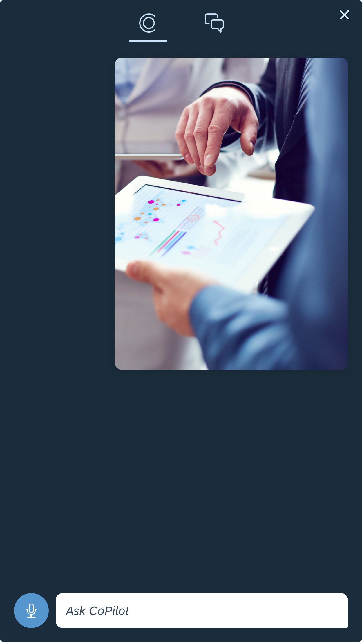
Image in digital assistant view

Image in chat view
Quick Reply Buttons
The quick reply buttons are predefined responses that provide a quicker way for users to proceed to the next steps. They also educate users on the capabilities CoPilot has.
Quick reply buttons only exist in the digital assistant tab and only come from CoPilot. Once a button has been selected, or CoPilot receives another response from the user, the buttons disappear. Use quick reply buttons for short and quick responses instead of offering selection from a list of values.
Quick reply buttons
Selection Menu
The selection menu is used to present a set of values from the server for the user to choose from. For example, it’s perfect to select a supplier from a list. The selection menu can display up to 2 lines of text in a single cell, and up to 5 cells upfront. If necessary, the user can expand the selection menu to a full list with search enabled.
Selection menu
The card is a flexible container that reveals extensive content to enrich the basic messages. Cards share a standard structure that enables various types of cards depending on the way they are assembled.
Inside the card, the user can view and share content, take actions, or navigate to SAP Fiori for the information source.
There are two basic types of cards: single item card and list card. In digital assistant view, the cards are on a dark background. In the chat view, they are on a light background.

Card in digital assistant view / chat view
Business Object Card
Business objects can be added to a chat. The user can add an existing object or create a new object (quick create). In a collaborative chat, the user can collaborate with other participants to create a new business object. When an object is created, its status is In Progress. It can be saved and returned to for further editing until final creation.
CoPilot can show the business object with basic information or with detailed information. The user can also take actions from the card if actions are enabled.
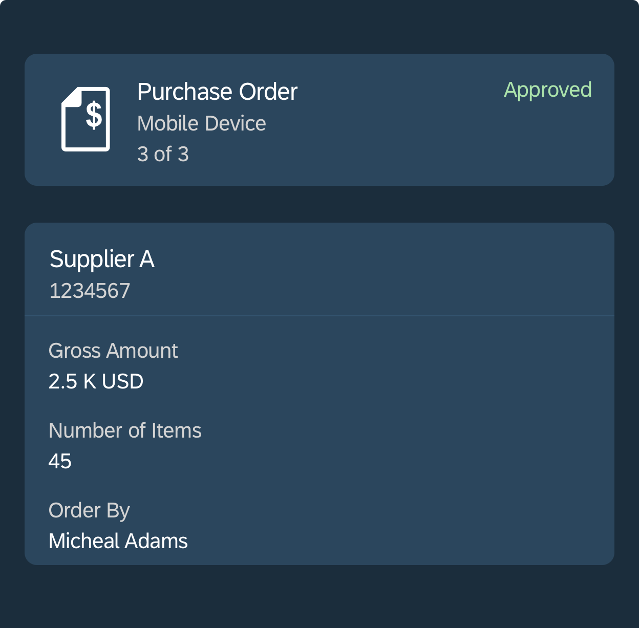
Business object card
Link & Video Card
When sending or receiving an external web link, CoPilot will convert it into a link or video card that is easier for the user to consume. In the link card, the card shows a preview of the website or a video player if the link contains video content.

Link and video card
List Card
A single card presents a single item (such as an object, link, or video) and its optional details. A list card is used to display a list of items on the same level inside one card. Hierarchically, a single item inside a list can be a single card.
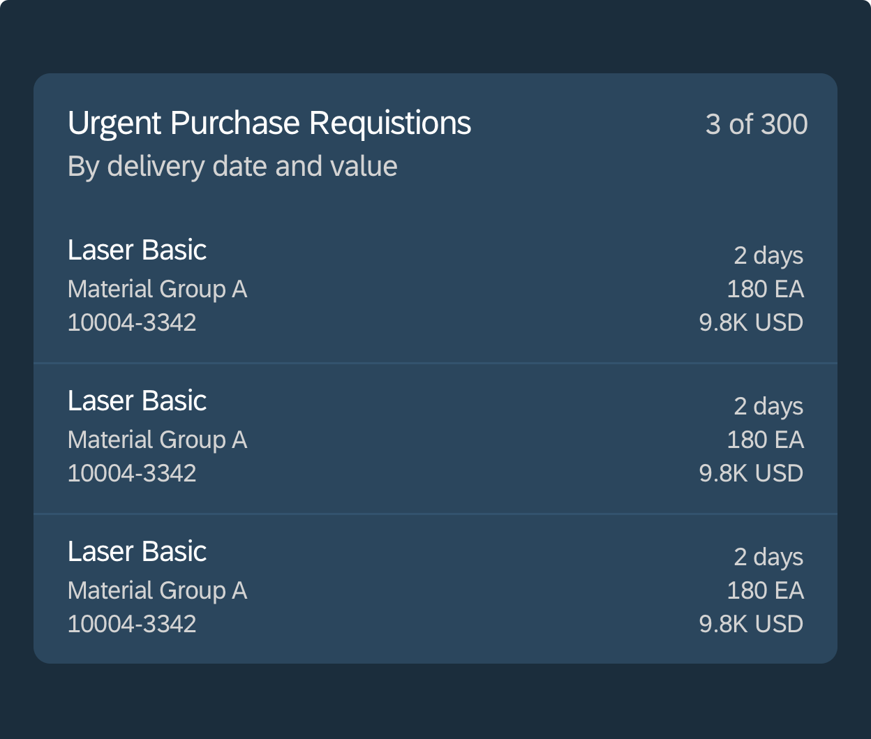
List card
Behavior and Interaction
Accessing SAP CoPilot
SAP CoPilot can be opened from any page in SAP Fiori. Whether on the SAP Fiori launchpad or in an app, it can be called by the Open CoPilot icon in the SAP Fiori launchpad shell bar.
After clicking the icon in the shell bar, CoPilot opens in a floating panel. This panel can be dragged to any desired position and the system memorizes the position for the next time SAP CoPilot is launched. It can also be docked on either the right or left of the SAP Fiori launchpad.

Access SAP CoPilot from SAP Fiori launchpad home page

Access SAP CoPilot from any app
Starting a New Chat / Accessing an Existing Chat
After launching SAP CoPilot, the user can select New Chat to begin a new chat. The user is directed to an empty chat view where they can add a note by typing in the input field.
To access existing chats, the user can choose a chat from the list on the chat list view.
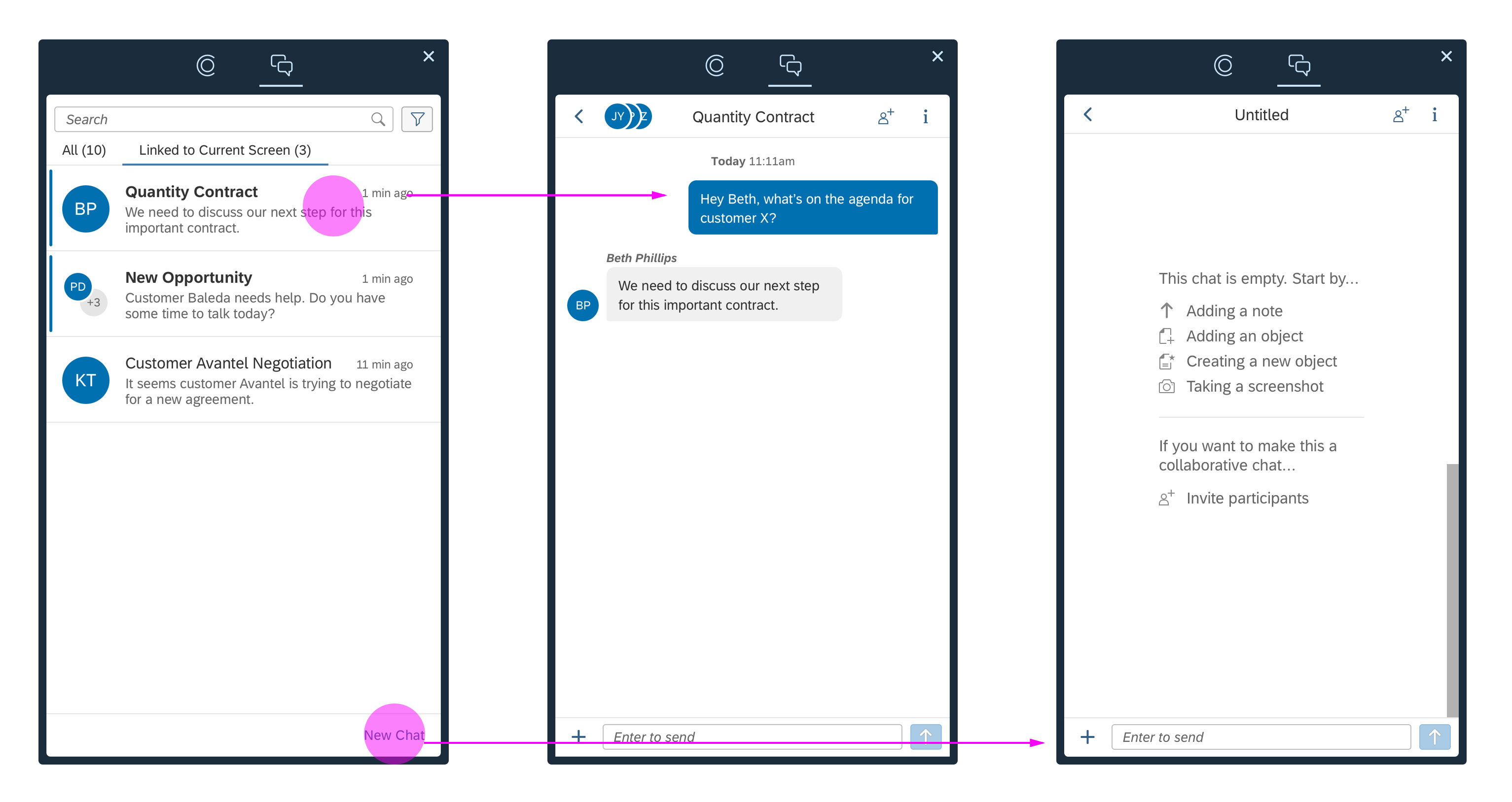
Start a new conversation / access an existing conversation
Actions within a Chat
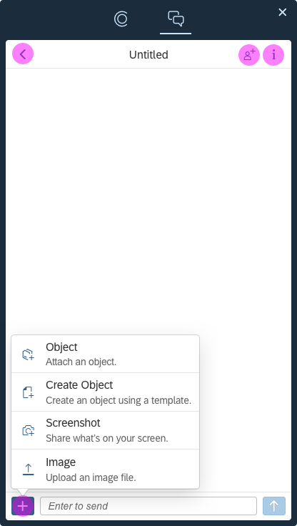
Once in a chat, the user can perform the following actions: add objects, create new objects, take screenshots, upload images via the Add icon (which will bring up a popover), invite participants via the Invite icon, and communicate with participants by sending a chat message via the input field.
The user can navigate back to the chat list using the Back icon, and view the chat details using the Information icon.
Actions in a conversation
Adding Objects
To add an existing object in the chat view, the user clicks or taps the (Add) menu button next to the input field and selects the Add Object option.
The view for adding existing objects has 3 tabs:
- The Current Screen tab shows a list of objects related to the application the user is currently working on.
- The Recent tab shows a list of recently-viewed objects.
- The All Objects allows the user to choose from all objects by navigating down through a list of categories.
Adding objects
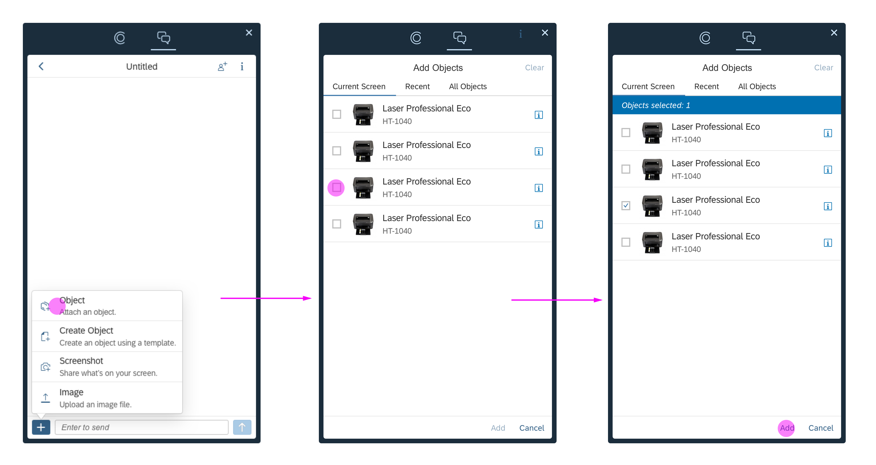
Object Detail View
To open the object detail view, the user can click on an object in either the chat view or the chat detail view. Once there, the user can see a brief summary of the object, but not edit it. The owner can remove the object from the chat, and all participants can copy the object to either an existing chat or a new chat.
Object detail view
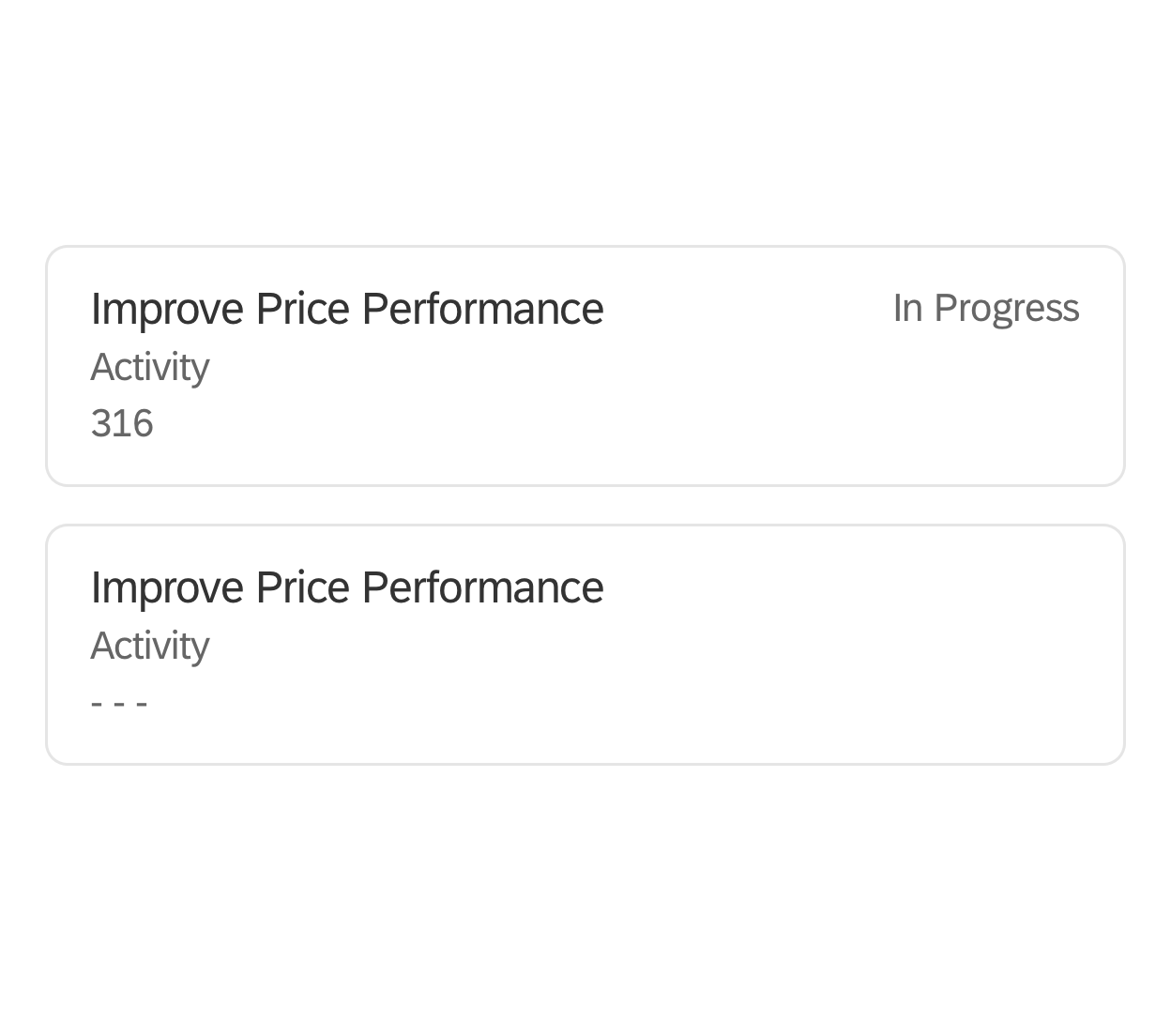
Quick Create
The quick create feature allows users to create new business objects from within SAP CoPilot. To create a new object, the user goes to the chat view and chooses Create New Object from the Add menu next to the input field. Selecting one of the objects listed in the next screen opens the corresponding form. SAP CoPilot can autofill parts of the form by detecting the object references discovered in notes and chat messages, and by examining the context of the current screen.

Quick create
Quick Create Lifecycle
Objects are In Progress while they are still being drafted. Once the object has been created, it is no longer editable in SAP CoPilot. To edit an existing object, the user must open the corresponding SAP Fiori app. In CoPilot, users can navigate to the SAP Fiori app from the Details view for the object.
Quick create lifecycle
Adding a Screenshot
Users can add a screenshot to a chat by clicking or tapping the Add icon next to the input field, and selecting Screenshot. SAP CoPilot temporarily closes, the cursor transforms into a crosshairs tool, and the user can click and drag to indicate which portion of the screen should be captured. Once the picture is taken, SAP CoPilot reappears and the screenshot is added to the chat. Only the owner of the chat can delete the screenshot. However, all participants can copy a screenshot to either a new or existing chat.
Screenshot Tool
The screenshot tool can be used to edit a picture that the user has taken of their screen. It is only available immediately after the screenshot is captured. The actions are located at the top right of the tool screen, starting with the square icon . Users can also edit the screenshot name by hovering on the screenshot name and clicking or tapping the pencil icon or link.
The following actions are available:
| Icon | Label / Tooltip | Action |
| Draw a rectangle | Draw a rectangle on the image. The user can drag to change the size. | |
| Draw a circle | Draw a circle on the image. The user can drag to change the size. | |
| Draw on screenshot | Draw lines freely on the image. | |
| Draw an arrow | Draw an arrow by setting a start and end point. | |
| Hide an area | Draw a square with a solid fill color to block content. | |
| Add a comment | Add text to the image. | |
| Choose a shape outline color | A color picker for all drawings. The user can choose from red, black, or white. Red is chosen by default. | |
| Zoom in | View the image in a different scale. A tooltip shows when scale changes. | |
| Zoom out | View the image in a different scale. A tooltip shows when scale changes. | |
| n/a | Reset | Remove all edits and reset to the initial state. |
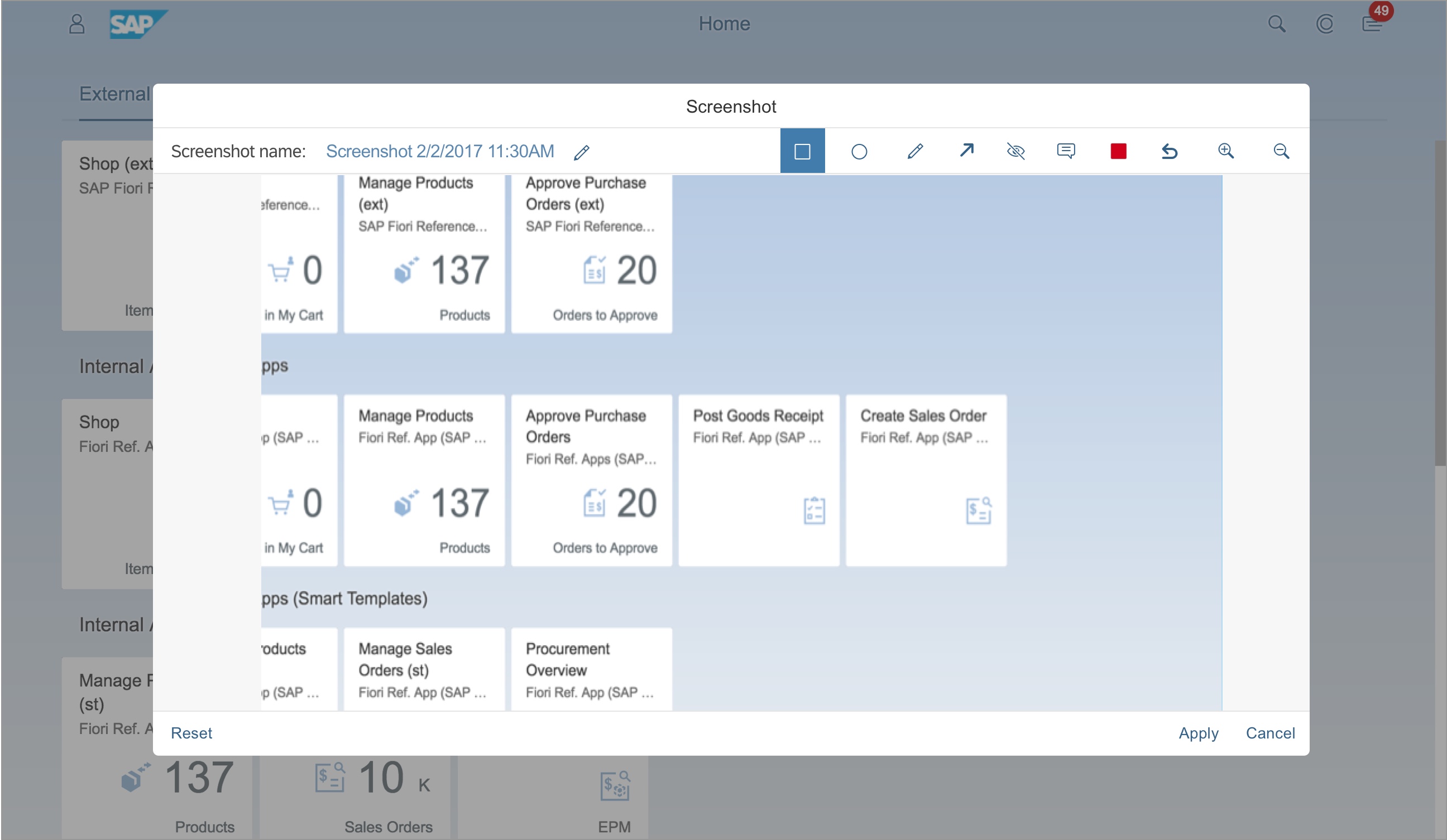
Screenshot tool
Uploading Images
Users can add images to a chat by clicking or tapping the Add icon next to the input field and selecting Image. In the Image Upload dialog, users can either select an image from their computer, drag and drop an image, or past an image files to the input field. Multiple images can be uploaded at once. Within the dialog, the user can also remove or edit the title of an image.
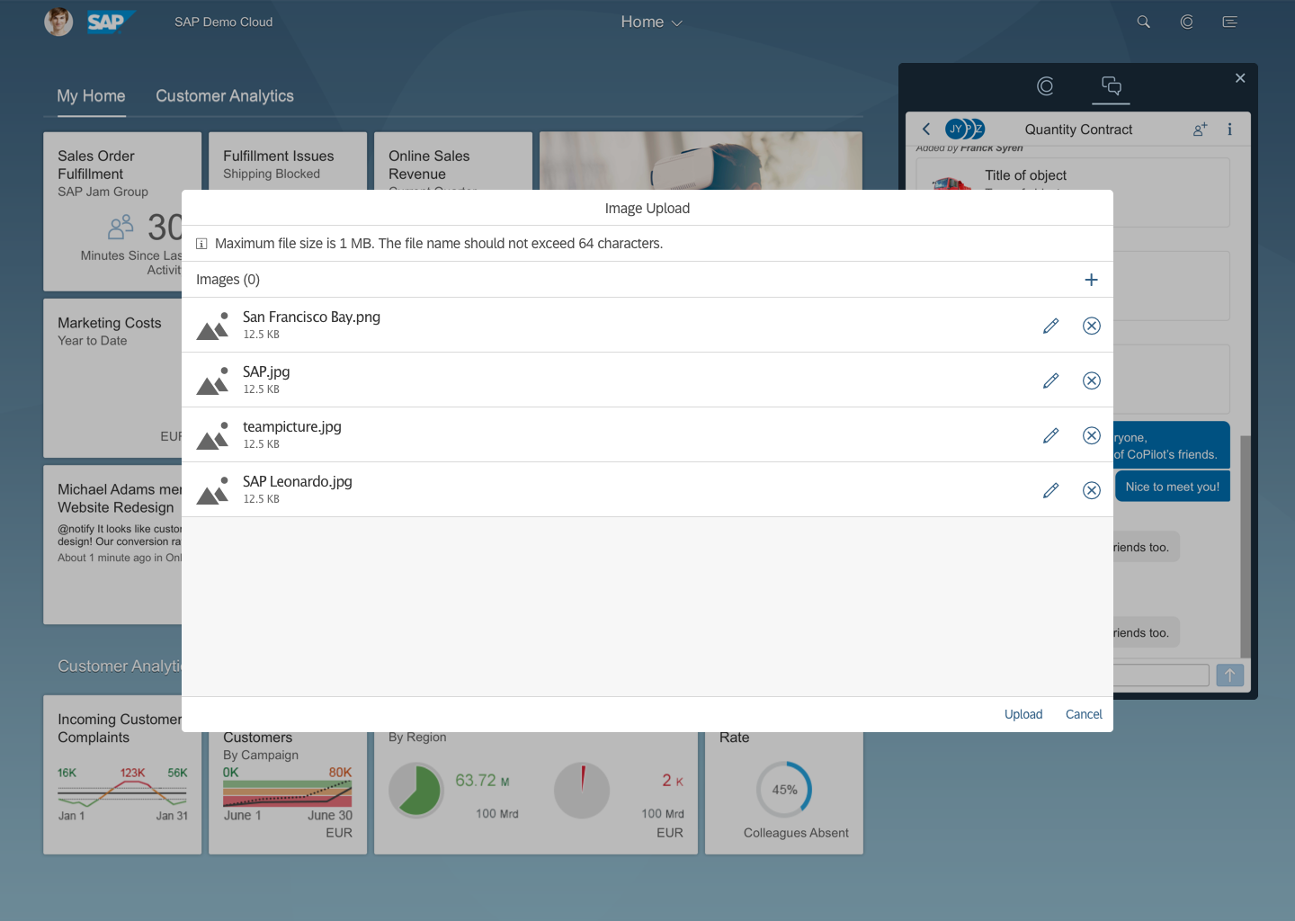
Upload image
Inviting Participants
A participant is a user who is in a collaborative chat. Participants can add other participants by clicking on Invite or through the chat detail view by clicking on the Details icon in a chat at any time. The participant list is sorted by suggested users based on the context of the chat and the users most recently added to chats. Users may also search by name to find specific participants. Participants who create a chat (owners) can remove participants.
You can view a list of all participants included in a chat using the details icon in the chat details view. The avatars below the header in the chat view also show up to 8 participants. Chast with more than 8 participants will indicate an avatar with “+X” (X being the number of additional participants). Each avatar is an image of the participant. If no image has been provided, it shows the person’s initials.
After a participant has been invited to a chat, CoPilot adds a message to the thread indicating who has been invited, and by whom. Participants added to a chat can see the entire chat history.
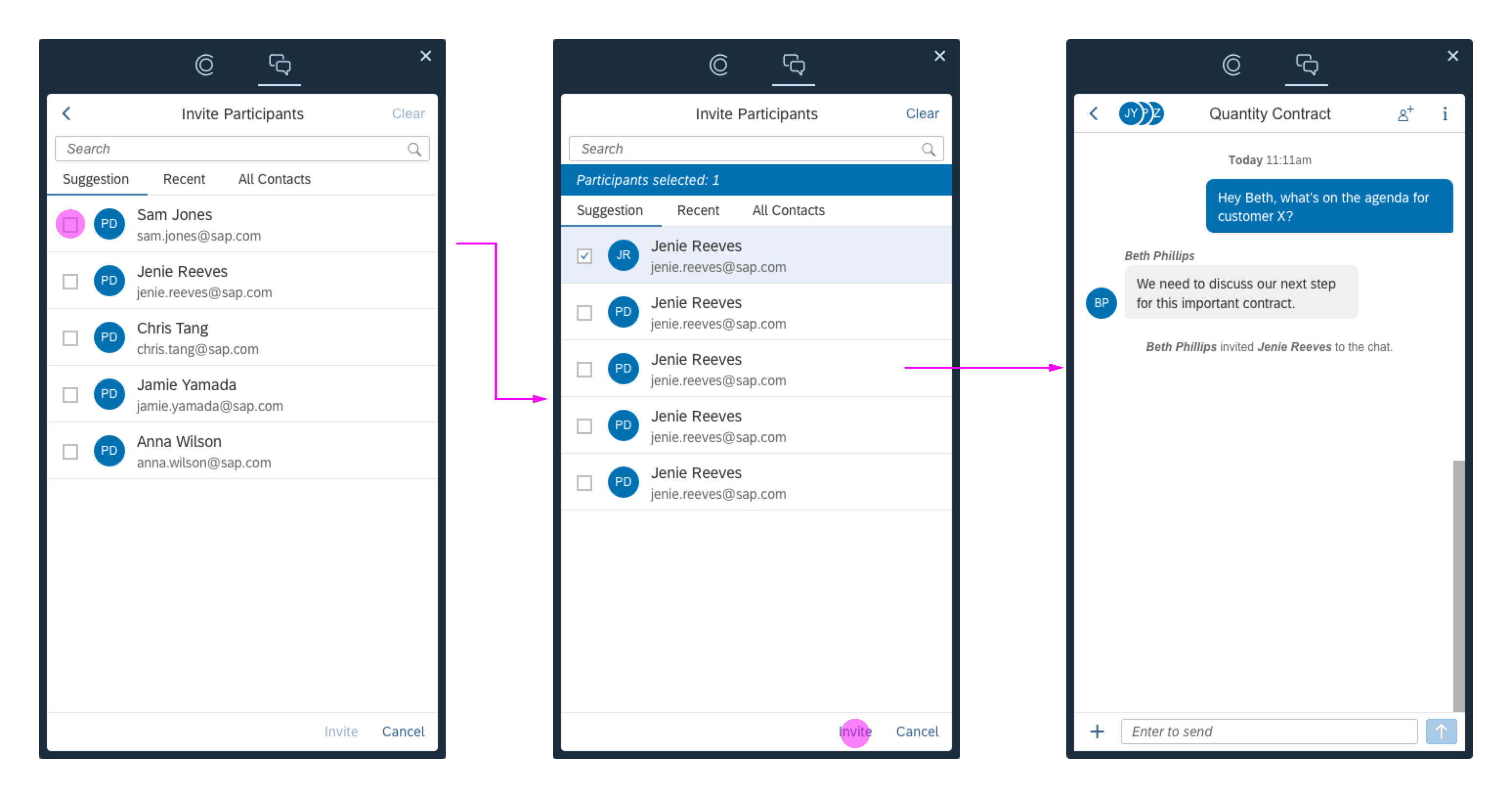
Invite participants
Cross-App Functionality and Context Awareness
If installed, SAP CoPilot is available across all SAP Fiori apps and can be called up at any time using the CoPilot icon on the SAP Fiori launchpad shell bar. SAP CoPilot can help the user collect information from various sources within SAP Fiori. It knows the business context of a chat by automatically linking it to the screen the user was on when the chat was created. The user can easily navigate to this linked screen or link the chat to another screen.
SAP CoPilot can pull information from the current screen to help the user create new business objects. Once an object has been created and added to a chat, the user can also open the object in the underlying app (such as an object page).
Interaction with Notifications
SAP CoPilot acts like any other notification provider. Once it has been attached to the notification service, the user is able to receive notifications regarding SAP CoPilot activities in the notifications area embedded on the right-hand side of the viewport.
Every time a notification from SAP CoPilot is provided, the user can navigate directly to the specific content or chat by clicking the notification item. High priority situations can also be displayed as a banner on the UI to get the user’s attention. Notifications for SAP CoPilot are available across floorplans and devices.
Closing SAP CoPilot
To close SAP CoPilot, you can either click or tap the Close icon on the top right of the popup window, or just click on the CoPilot icon in the shell bar again.
Close SAP CoPilot
Resources
Want to dive deeper? Follow the links below to find out more about related controls, the SAPUI5 implementation, and the visual design.
 Your feedback has been sent to the SAP Fiori design team.