- Latest Version 1.128
- Version 1.126
- SAPUI Version 1.124
- SAPUI5 Version 1.122
- SAPUI5 Version 1.120
- SAPUI5 Version 1.118
- SAPUI5 Version 1.116
- SAPUI5 Version 1.114
- SAPUI5 Version 1.112
- SAPUI5 Version 1.110
- SAPUI5 Version 1.108
- SAPUI5 Version 1.106
- SAPUI5 Version 1.104
- SAPUI5 Version 1.102
- SAPUI5 Version 1.100
- SAPUI5 Version 1.98
- SAPUI5 Version 1.96
- SAPUI5 Version 1.94
- SAPUI5 Version 1.92
- SAPUI5 Version 1.90
- SAPUI5 Version 1.88
- SAPUI5 Version 1.86
- SAPUI5 Version 1.84
- SAPUI5 Version 1.82
- SAPUI5 Version 1.80
- SAPUI5 Version 1.78
- SAPUI5 Version 1.76
- SAPUI5 Version 1.74
- SAPUI5 Version 1.72
- SAPUI5 Version 1.70
- SAPUI5 Version 1.68
- SAPUI5 Version 1.66
- SAPUI5 Version 1.64
- SAPUI5 Version 1.62
- SAPUI5 Version 1.60
- SAPUI5 Version 1.58
- SAPUI5 Version 1.54
- SAPUI5 Version 1.52
- SAPUI5 Version 1.50
- SAPUI5 Version 1.48
- SAPUI5 Version 1.46
- SAPUI5 Version 1.44
- SAPUI5 Version 1.42
- SAPUI5 Version 1.40
- SAPUI5 Version 1.38
- SAPUI5 Version 1.36
- SAPUI5 Version 1.34
- SAPUI5 Version 1.32
- SAPUI5 Version 1.30
- SAPUI5 Version 1.28
- SAPUI5 Version 1.26
- Latest Version 1.128
- Version 1.126
- SAPUI Version 1.124
- SAPUI5 Version 1.122
- SAPUI5 Version 1.120
- SAPUI5 Version 1.118
- SAPUI5 Version 1.116
- SAPUI5 Version 1.114
- SAPUI5 Version 1.112
- SAPUI5 Version 1.110
- SAPUI5 Version 1.108
- SAPUI5 Version 1.106
- SAPUI5 Version 1.104
- SAPUI5 Version 1.102
- SAPUI5 Version 1.100
- SAPUI5 Version 1.98
- SAPUI5 Version 1.96
- SAPUI5 Version 1.94
- SAPUI5 Version 1.92
- SAPUI5 Version 1.90
- SAPUI5 Version 1.88
- SAPUI5 Version 1.86
- SAPUI5 Version 1.84
- SAPUI5 Version 1.82
- SAPUI5 Version 1.80
- SAPUI5 Version 1.78
- SAPUI5 Version 1.76
- SAPUI5 Version 1.74
- SAPUI5 Version 1.72
- SAPUI5 Version 1.70
- SAPUI5 Version 1.68
- SAPUI5 Version 1.66
- SAPUI5 Version 1.64
- SAPUI5 Version 1.62
- SAPUI5 Version 1.60
- SAPUI5 Version 1.58
- SAPUI5 Version 1.56
- SAPUI5 Version 1.54
- SAPUI5 Version 1.52
- SAPUI5 Version 1.50
- SAPUI5 Version 1.48
- SAPUI5 Version 1.46
- SAPUI5 Version 1.44
- SAPUI5 Version 1.42
- SAPUI5 Version 1.40
- SAPUI5 Version 1.38
- SAPUI5 Version 1.36
- SAPUI5 Version 1.34
- SAPUI5 Version 1.32
- SAPUI5 Version 1.30
- SAPUI5 Version 1.28
- SAPUI5 Version 1.26
Switch
sap.m.Switch
Intro
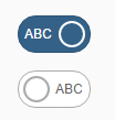
The toggle switch mimics a physical switch that allows users to turn individual settings (such as personalization or display settings) “on” or “off”. The initial state of the control (On or Off) is indicated by the inline label. When users change a switch to On, they expect an instantaneous action as soon as the label appears.
Usage
Use the switch if:
- You need to emphasize the On/Off characteristic within a dialog.
- You need to clearly show the mode or state that a setting is in.
- You need a toggle switch for binary settings when changes become effective immediately after the user changes them. For example, if the user needs to set data transmission or accept/reject business objects.
- The change in the setting takes effect instantaneously.
Do not use the switch if:
- The user has to choose several options or perform extra steps for changes to become effective. In this case, provide checkboxes to choose options and a Submit or Next button to apply the changes. Also use checkboxes or a list view if the user can select multiple items.
- The setting that requires a confirmation action or Submit button before it can take effect. In this case, use a checkbox instead.
Inline Label
The default type allows custom text input. We recommend that you avoid labels comprising more than 3 letters. Otherwise, the text truncates and loses its meaning.
Behavior and Interaction
Switch
The user can switch between two values, such as On and Off.
Guidelines
Replace the On and Off labels if there are more specific labels for the setting. Use any short labels (3–4 characters) that represent binary opposites if they are more appropriate for a particular setting. For example, you might use Show and Hide if the setting is “Show images.”
Do not replace the On or Off label unless you really have to. Use the default labels unless there are other labels that are more specific for the setting.
Do not use labels that are longer than three or four characters. Otherwise, the text becomes truncated and loses its meaning.
Resources
Want to dive deeper? Follow the links below to find out more about related controls, the SAPUI5 implementation, and the visual design.


 Your feedback has been sent to the SAP Fiori design team.