
- Latest SAPUI Version 1.124
- SAPUI5 Version 1.122
- SAPUI5 Version 1.120
- SAPUI5 Version 1.118
- SAPUI5 Version 1.116
- SAPUI5 Version 1.114
- SAPUI5 Version 1.112
- SAPUI5 Version 1.110
- SAPUI5 Version 1.108
- SAPUI5 Version 1.106
- SAPUI5 Version 1.104
- SAPUI5 Version 1.102
- SAPUI5 Version 1.100
- SAPUI5 Version 1.98
- SAPUI5 Version 1.96
- SAPUI5 Version 1.94
- SAPUI5 Version 1.92
- SAPUI5 Version 1.90
- SAPUI5 Version 1.88
- SAPUI5 Version 1.86
- SAPUI5 Version 1.84
- SAPUI5 Version 1.82
- SAPUI5 Version 1.80
- SAPUI5 Version 1.76
- SAPUI5 Version 1.74
- SAPUI5 Version 1.72
- SAPUI5 Version 1.70
- SAPUI5 Version 1.68
- SAPUI5 Version 1.66
- SAPUI5 Version 1.64
- SAPUI5 Version 1.62
- SAPUI5 Version 1.60
- SAPUI5 Version 1.58
- SAPUI5 Version 1.56
- SAPUI5 Version 1.54
- SAPUI5 Version 1.52
- SAPUI5 Version 1.50
- SAPUI5 Version 1.48
- SAPUI5 Version 1.46
- SAPUI5 Version 1.44
- SAPUI5 Version 1.42
- SAPUI5 Version 1.40
- SAPUI5 Version 1.38
- SAPUI5 Version 1.36
- SAPUI5 Version 1.34
- SAPUI5 Version 1.32
- SAPUI5 Version 1.30
- SAPUI5 Version 1.28
- SAPUI5 Version 1.26
- Latest SAPUI Version 1.124
- SAPUI5 Version 1.122
- SAPUI5 Version 1.120
- SAPUI5 Version 1.118
- SAPUI5 Version 1.116
- SAPUI5 Version 1.114
- SAPUI5 Version 1.112
- SAPUI5 Version 1.110
- SAPUI5 Version 1.108
- SAPUI5 Version 1.106
- SAPUI5 Version 1.104
- SAPUI5 Version 1.102
- SAPUI5 Version 1.100
- SAPUI5 Version 1.98
- SAPUI5 Version 1.96
- SAPUI5 Version 1.94
- SAPUI5 Version 1.92
- SAPUI5 Version 1.90
- SAPUI5 Version 1.88
- SAPUI5 Version 1.86
- SAPUI5 Version 1.84
- SAPUI5 Version 1.82
- SAPUI5 Version 1.80
- SAPUI5 Version 1.78
- SAPUI5 Version 1.76
- SAPUI5 Version 1.74
- SAPUI5 Version 1.72
- SAPUI5 Version 1.70
- SAPUI5 Version 1.68
- SAPUI5 Version 1.66
- SAPUI5 Version 1.64
- SAPUI5 Version 1.62
- SAPUI5 Version 1.60
- SAPUI5 Version 1.58
- SAPUI5 Version 1.56
- SAPUI5 Version 1.54
- SAPUI5 Version 1.52
- SAPUI5 Version 1.50
- SAPUI5 Version 1.48
- SAPUI5 Version 1.46
- SAPUI5 Version 1.44
- SAPUI5 Version 1.42
- SAPUI5 Version 1.40
- SAPUI5 Version 1.38
- SAPUI5 Version 1.36
- SAPUI5 Version 1.34
- SAPUI5 Version 1.32
- SAPUI5 Version 1.30
- SAPUI5 Version 1.28
- SAPUI5 Version 1.26
Avatar
sap.m.Avatar
Intro
The avatar is a control for displaying images. These can be user profiles, user initials, placeholder images, icons, or business-related images, such as product pictures.
Usage
Use the avatar to display:
- An image, initials, or placeholder for a user
- Standardized images for business-related content (such as products, parts, product and company logos, ad campaign images, …)
- Icons
- Images with a transparent background
- Placeholder images
Do not use the avatar if:

Examples of a user image, user initials, and standard user placeholder icon

Potential product image and product image placeholder

Icon
Responsiveness
The avatar control is adaptive and has five predefined sizes. These are the same for both compact and cozy form factors:
| Size | rem | Use for images in… |
| XS | 2 rem | Table list items Card list items |
| S | 3 rem | Card headers Card list items |
| M | 4 rem | App headers for small screen sizes |
| L | 5 rem | App headers for normal screen sizes |
| XL | 7 rem | App headers for large screen sizes |
If your use case requires it, you can also set a custom size.
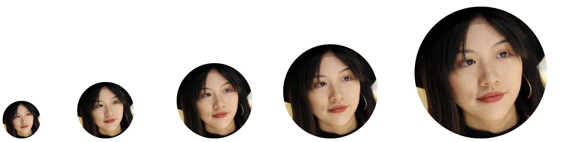
Predefined sizes: XS, S, M, L, XL
Predefined sizes: XS, S, M, L, XL
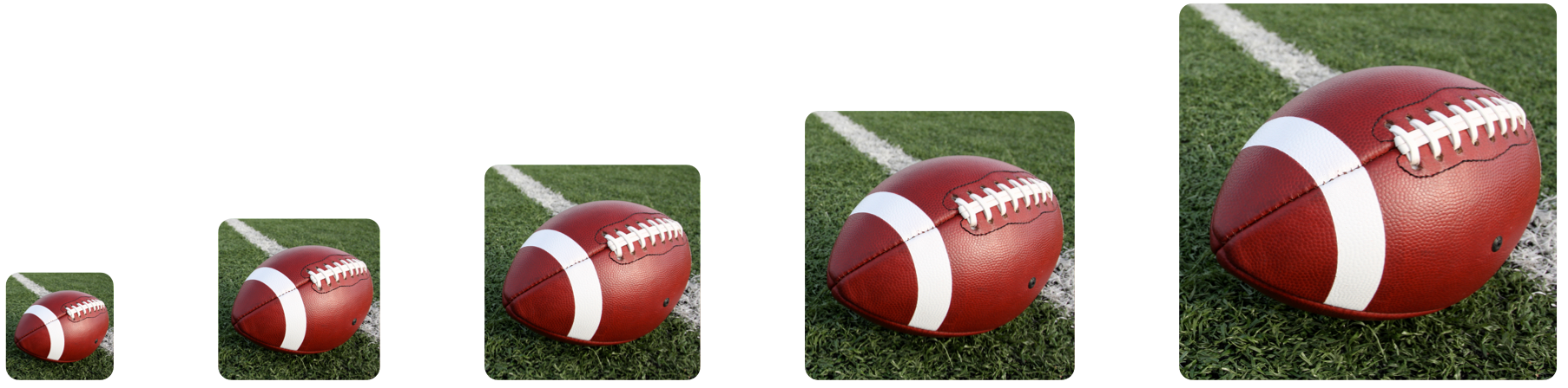
Image Fit
You can use the imageFitType property to specify how images fit to the avatar. There are two options: Cover (default) and Contain.
Cover
The size of the image is scaled up to completely cover the control area. As a result, parts of the image may be outside the shape.
Use the Cover fit type if the focal point is in the center of the image.
Contain
The image is scaled down to fit into the control area. The entire image is displayed, but might not fully fill the shape. In this case, the control displays a default background color. The image itself is always centered inside the shape.
Use the Contain fit type for product pictures that need to be displayed in full.

Product image with the fit type 'cover' (left) and 'contain' (right)
Types
Avatar – User Image, Initials, or Placeholder
An avatar is a visual representation of a user in the digital space. Usually, an avatar displays the user in one of the following ways:
- A user photo
- The user’s initials
- A placeholder icon instead of the user’s personal data (photo or initials)
Always display avatars in a circle. This ensures that all users are represented equally on the user interface.
Initials

User image, user initials, and standard user placeholder icon
The initials stand for the first name(s) and last name(s) of a person – for example, JD for Jane Doe, or MvV for Marjolein van Veen. Which name comes first depends on the language-specific settings.
Initials can have up to three alphabetical characters (A-Z, a-z). If more than 3 initials are required for longer names (such as Anna María Agustí Suárez), the gender-neutral placeholder icon is displayed instead. The placeholder is also used if the three letters don’t fit into the circle (for example, WWW).
Some languages don’t build on an alphabet, or don’t use initials at all. In such cases, the gender-neutral person icon is displayed instead.

User initials with 1, 2, and 3 characters
Business Images
Business images display a product, company, object, logo, or other business-related content.
Always use a square for business images.

Examples of product images
Placeholder for Avatar and Business Images
Placeholder images are used for both avatar and business images when no other image is available.
- The default placeholder for an avatar is a gender-neutral person icon inside a circle.
- The default placeholder for a business image is a neutral product icon inside a square.

Default person and product placeholders
You can specify your own the default placeholder icon for business images.
Always replace the default product icon if there is a more suitable icon for your use case and industry.

Product placeholder images with custom icons
Placeholder Background
By default, the placeholder background color is set to blue (accent color 6). However, to add more visual variety to the UI, you can change the background color using one of the following options:
- Accent colors – You can specify one of 10 different accent colors as the placeholder background color.
- Random color – The control automatically picks a random color from the accent color palette.
All accent colors can be themed.
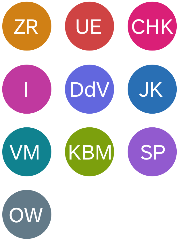
User initials in all ten accent colors
Placeholder for Decorative Images in the Content Area
Use the background color ‘placeholder’ for decorative images in the content area, such as images in articles or longer descriptions. In these use cases, the primary focus is on the text and the image content is secondary.
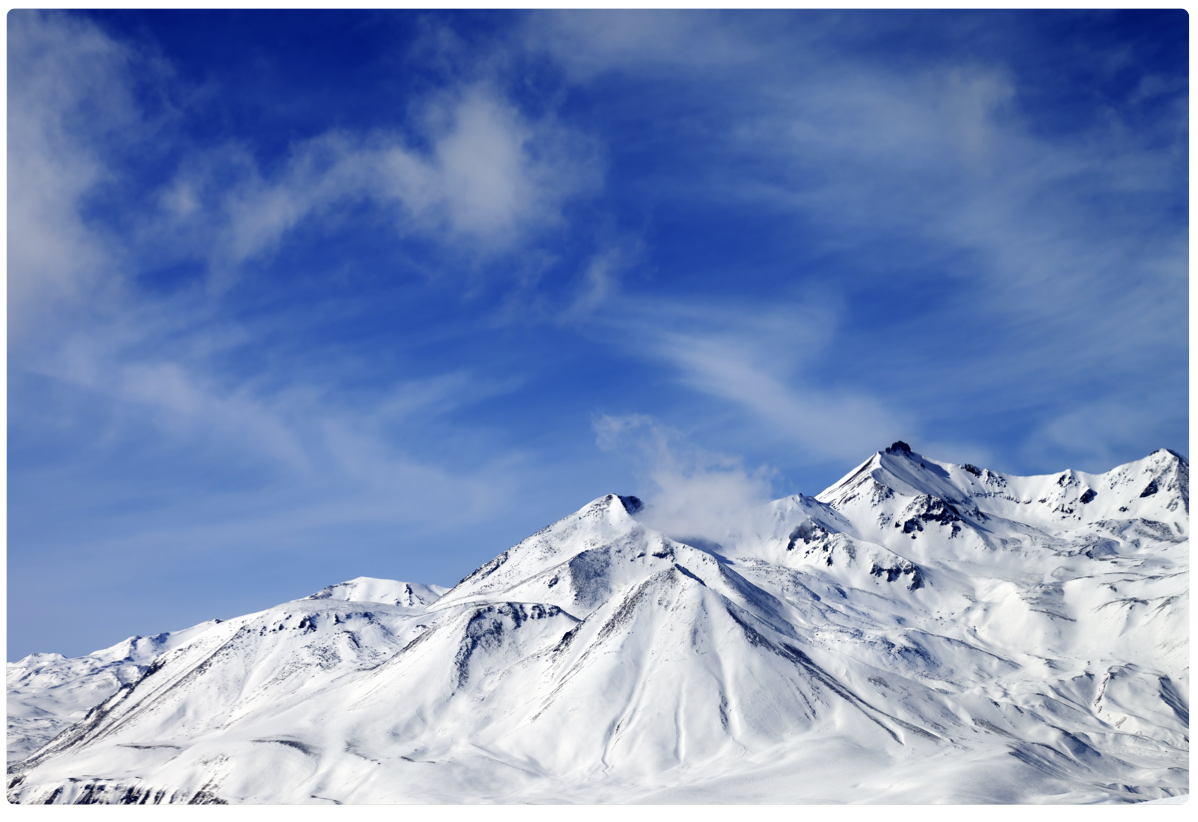
Decorative image in the content area

Placeholder image for secondary content
Images with Transparent Background
You can display images with a transparent background. This can be useful for displaying descriptive illustrations and decorative pictures, for example.

Image with transparent background
Icons
You can use the avatar to display non-interactive display icons. Use the background color ‘placeholder’ to display the icon.
If you want to put an action on the icon, use the button with an icon inside instead.

Exemplary icons
Badge
If an avatar is clickable, you can show an optional badge and icon.
- Use a badge to indicate that the avatar is interactive.
- Use an icon to indicate the action triggered by clicking the avatar.
This feature gives users visual affordance of the available action, and is particularly useful for images.
When you use a badge and icon, always provide a corresponding tooltip for your avatar to indicate the action.
Use the following standard icons and tooltip texts:
| Icon | Tooltip | Action |
| Edit Image | Edit the image. This can include multiple options, such as replacing an image, cropping, visual effects, or taking a new picture. | |
| Take a Picture | Take a photo. | |
| Zoom In | Zoom into the image. |

Avatars with badges

Avatars with badges and edit (left), camera (middle), and zoom in (right)
Guidelines
- If you use a custom avatar size with initials or icons:
- Make sure that the font size is consistent with the size of the control itself.
- If your custom size is between two predefined sizes, use the font size for the smaller predefined size.
Example: If your avatar is 5.5 rem (between sizes L and XL), use the font size for size L (2 rem).
- Accessibility: Provide an alternative text for each avatar image for cases when the image is not available or can’t be displayed.
- If the avatar is interactive, provide a tooltip to indicate the action (for example, Edit Image or Take a Picture).
- Optimize high-resolution images to avoid unnecessarily large files. Large image files can severely impede page performance.

Custom placeholder size with appropriate custom font size

Custom placeholder size, but icon is too small
Styles
You can add a very subtle border to the avatar (property: ShowBorder).

Images with optional borders
Resources
Want to dive deeper? Follow the links below to find out more about related controls, the SAPUI5 implementation, and the visual design.
 Your feedback has been sent to the SAP Fiori design team.