
- Latest SAPUI Version 1.124
- SAPUI5 Version 1.122
- SAPUI5 Version 1.120
- SAPUI5 Version 1.118
- SAPUI5 Version 1.116
- SAPUI5 Version 1.114
- SAPUI5 Version 1.112
- SAPUI5 Version 1.110
- SAPUI5 Version 1.108
- SAPUI5 Version 1.106
- SAPUI5 Version 1.104
- SAPUI5 Version 1.102
- SAPUI5 Version 1.100
- SAPUI5 Version 1.98
- SAPUI5 Version 1.96
- SAPUI5 Version 1.94
- SAPUI5 Version 1.92
- SAPUI5 Version 1.90
- SAPUI5 Version 1.88
- SAPUI5 Version 1.86
- SAPUI5 Version 1.84
- SAPUI5 Version 1.82
- SAPUI5 Version 1.80
- SAPUI5 Version 1.78
- SAPUI5 Version 1.76
- SAPUI5 Version 1.74
- SAPUI5 Version 1.72
- SAPUI5 Version 1.70
- SAPUI5 Version 1.68
- SAPUI5 Version 1.64
- SAPUI5 Version 1.62
- SAPUI5 Version 1.60
- SAPUI5 Version 1.58
- SAPUI5 Version 1.56
- SAPUI5 Version 1.54
- SAPUI5 Version 1.52
- SAPUI5 Version 1.50
- SAPUI5 Version 1.48
- SAPUI5 Version 1.46
- SAPUI5 Version 1.44
- SAPUI5 Version 1.42
- SAPUI5 Version 1.40
- SAPUI5 Version 1.38
- SAPUI5 Version 1.36
- SAPUI5 Version 1.34
- SAPUI5 Version 1.32
- SAPUI5 Version 1.30
- SAPUI5 Version 1.28
- SAPUI5 Version 1.26
- Latest SAPUI Version 1.124
- SAPUI5 Version 1.122
- SAPUI5 Version 1.120
- SAPUI5 Version 1.118
- SAPUI5 Version 1.116
- SAPUI5 Version 1.114
- SAPUI5 Version 1.112
- SAPUI5 Version 1.110
- SAPUI5 Version 1.108
- SAPUI5 Version 1.106
- SAPUI5 Version 1.104
- SAPUI5 Version 1.102
- SAPUI5 Version 1.100
- SAPUI5 Version 1.98
- SAPUI5 Version 1.96
- SAPUI5 Version 1.94
- SAPUI5 Version 1.92
- SAPUI5 Version 1.90
- SAPUI5 Version 1.88
- SAPUI5 Version 1.86
- SAPUI5 Version 1.84
- SAPUI5 Version 1.82
- SAPUI5 Version 1.80
- SAPUI5 Version 1.78
- SAPUI5 Version 1.76
- SAPUI5 Version 1.74
- SAPUI5 Version 1.72
- SAPUI5 Version 1.70
- SAPUI5 Version 1.68
- SAPUI5 Version 1.66
- SAPUI5 Version 1.64
- SAPUI5 Version 1.62
- SAPUI5 Version 1.60
- SAPUI5 Version 1.58
- SAPUI5 Version 1.56
- SAPUI5 Version 1.54
- SAPUI5 Version 1.52
- SAPUI5 Version 1.50
- SAPUI5 Version 1.48
- SAPUI5 Version 1.46
- SAPUI5 Version 1.44
- SAPUI5 Version 1.42
- SAPUI5 Version 1.40
- SAPUI5 Version 1.38
- SAPUI5 Version 1.36
- SAPUI5 Version 1.34
- SAPUI5 Version 1.32
- SAPUI5 Version 1.30
- SAPUI5 Version 1.28
- SAPUI5 Version 1.26
Line Chart
Intro
A line chart displays information as a series of data points connected by straight lines. It is a basic type of chart that is common in many areas. Line charts are typically used to visualize a data trend over intervals of time, so the line is often drawn chronologically.
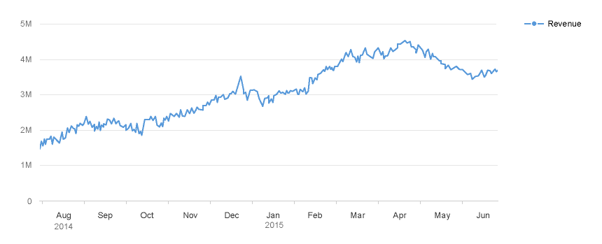
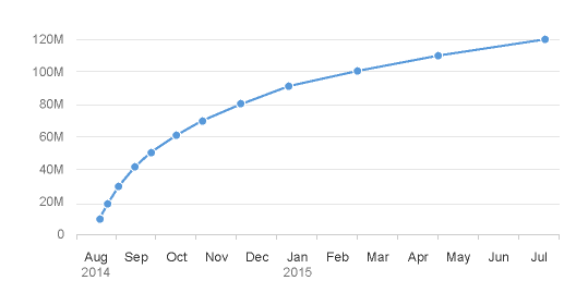
Line chart with time axis
Usage
Use the line chart if:
- You want to display trends over time, where the focus is on the trend, not on the individual values.
- You want to help users see dependencies between two or more variables.
- You want to show higher and lower values (like prices or workloads).
Do not use the line chart if:
- The y axis has a set of distinct (not successive) categories (not a timeline). In this case, use a bar chart, or a line chart with separate horizontal lines.
Color Palette
By default, the line chart automatically uses colors from the qualitative palette. However, you can also customize the colors (for example, if you want to differentiate between categories).
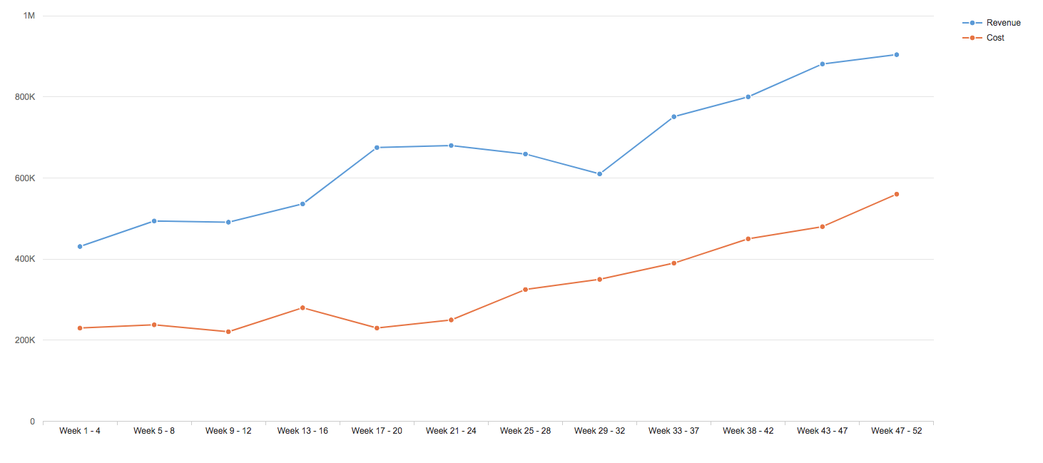
Line chart using the qualitative palette
Selection and Popover
When the user clicks on a data point in the line chart, the associated value is displayed in the popover. The popover can also be customized to display other information and actions.
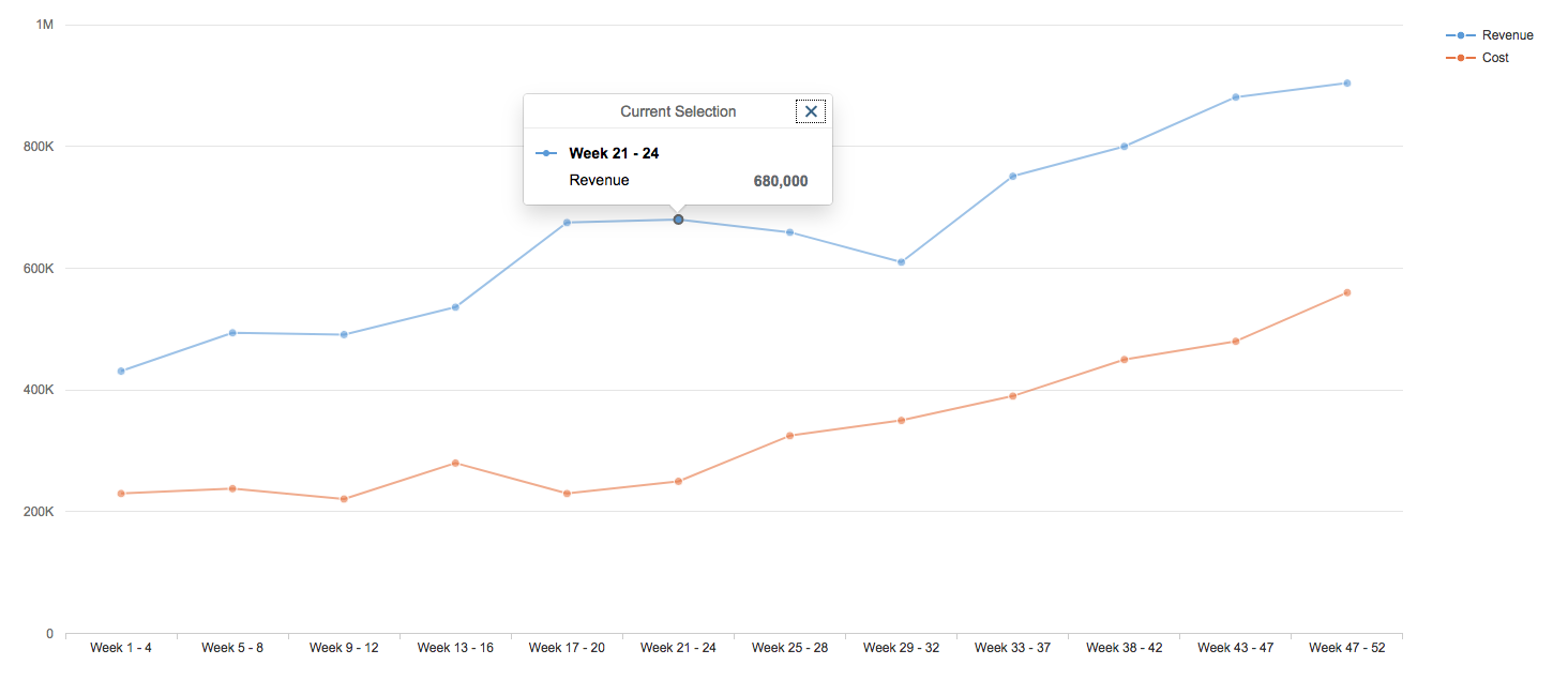
Popover is displayed when you select a data point
Axes
Line charts can be used with 3 types of axes:
- Time axis
- Categorical axis
- Dual axis
Using the Time Axis
If the horizontal axis represents time and you want to show the variation of values over time, you can use the time axis.
It can display years, quarters, months, weeks, days, hours, minutes, and seconds.
The time axis has three main advantages:
- It allows you to display dates and times in a responsive manner.
- All the complexity involved with formatting the axis labels is automatically taken care of.
- The physical spacing between the data points accurately represents the time scale, as opposed to being equidistant.
If you do not need the advantages offered by the time axis, you can use a horizontal categorical axis instead.
Line chart with time axis
Choosing the Corrects Axis
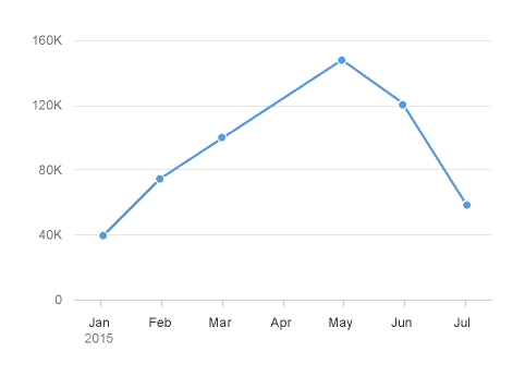
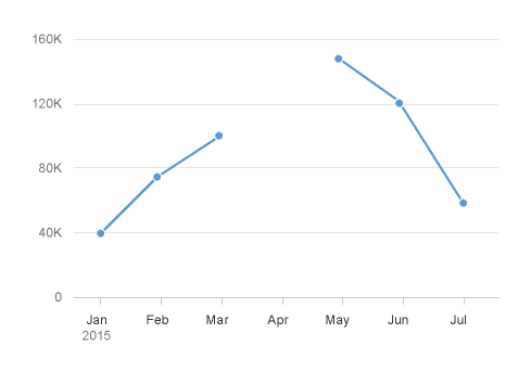
For certain chart types, the physical spacing between your data points accurately reflects the time scale being displayed, as opposed to just rendering all your data points equidistantly. We can see what a difference this makes by comparing the charts below. The chart on the left uses the categorical axis, and the chart on the right uses the time axis. Even though both charts were generated from exactly the same dataset, the high concentration of early data points means they tell completely different stories about how the values have increased over time.
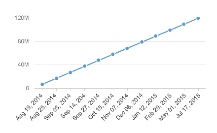
Categorical axis (misleading)
Time axis (accurate)
Customization
Managing Null or Missing Values in a Line Chart
If you expect to have null values or missing values in your dataset, you can connect the available data points, or show a clear break between them.
Ignore missing values
Break missing values
Resources
Want to dive deeper? Follow the links below to find out more about related controls, the SAPUI5 implementation, and the visual design.
Elements and Controls
- Chart (guidelines)
- Chart – Time Axis (guidelines)
- Chart – Popover (guidelines)
Implementation
- Line Chart (SAPUI5 samples)
- Time Axis (SAPUI5 samples)
- Chart Popover (SAPUI5 samples)
 Your feedback has been sent to the SAP Fiori design team.