
- Latest SAPUI Version 1.124
- SAPUI5 Version 1.122
- SAPUI5 Version 1.120
- SAPUI5 Version 1.118
- SAPUI5 Version 1.116
- SAPUI5 Version 1.114
- SAPUI5 Version 1.112
- SAPUI5 Version 1.110
- SAPUI5 Version 1.108
- SAPUI5 Version 1.106
- SAPUI5 Version 1.104
- SAPUI5 Version 1.102
- SAPUI5 Version 1.100
- SAPUI5 Version 1.98
- SAPUI5 Version 1.96
- SAPUI5 Version 1.94
- SAPUI5 Version 1.92
- SAPUI5 Version 1.90
- SAPUI5 Version 1.88
- SAPUI5 Version 1.86
- SAPUI5 Version 1.84
- SAPUI5 Version 1.82
- SAPUI5 Version 1.80
- SAPUI5 Version 1.78
- SAPUI5 Version 1.76
- SAPUI5 Version 1.74
- SAPUI5 Version 1.70
- SAPUI5 Version 1.68
- SAPUI5 Version 1.66
- SAPUI5 Version 1.64
- SAPUI5 Version 1.62
- SAPUI5 Version 1.60
- SAPUI5 Version 1.58
- SAPUI5 Version 1.56
- SAPUI5 Version 1.54
- SAPUI5 Version 1.52
- SAPUI5 Version 1.50
- SAPUI5 Version 1.48
- SAPUI5 Version 1.46
- SAPUI5 Version 1.44
- SAPUI5 Version 1.42
- SAPUI5 Version 1.40
- SAPUI5 Version 1.38
- SAPUI5 Version 1.36
- SAPUI5 Version 1.34
- SAPUI5 Version 1.32
- SAPUI5 Version 1.30
- SAPUI5 Version 1.28
- SAPUI5 Version 1.26
- Latest SAPUI Version 1.124
- SAPUI5 Version 1.122
- SAPUI5 Version 1.120
- SAPUI5 Version 1.118
- SAPUI5 Version 1.116
- SAPUI5 Version 1.114
- SAPUI5 Version 1.112
- SAPUI5 Version 1.110
- SAPUI5 Version 1.108
- SAPUI5 Version 1.106
- SAPUI5 Version 1.104
- SAPUI5 Version 1.102
- SAPUI5 Version 1.100
- SAPUI5 Version 1.98
- SAPUI5 Version 1.96
- SAPUI5 Version 1.94
- SAPUI5 Version 1.92
- SAPUI5 Version 1.90
- SAPUI5 Version 1.88
- SAPUI5 Version 1.86
- SAPUI5 Version 1.84
- SAPUI5 Version 1.82
- SAPUI5 Version 1.80
- SAPUI5 Version 1.78
- SAPUI5 Version 1.76
- SAPUI5 Version 1.74
- SAPUI5 Version 1.72
- SAPUI5 Version 1.70
- SAPUI5 Version 1.68
- SAPUI5 Version 1.66
- SAPUI5 Version 1.64
- SAPUI5 Version 1.62
- SAPUI5 Version 1.60
- SAPUI5 Version 1.58
- SAPUI5 Version 1.56
- SAPUI5 Version 1.54
- SAPUI5 Version 1.52
- SAPUI5 Version 1.50
- SAPUI5 Version 1.48
- SAPUI5 Version 1.46
- SAPUI5 Version 1.44
- SAPUI5 Version 1.42
- SAPUI5 Version 1.40
- SAPUI5 Version 1.38
- SAPUI5 Version 1.36
- SAPUI5 Version 1.34
- SAPUI5 Version 1.32
- SAPUI5 Version 1.30
- SAPUI5 Version 1.28
- SAPUI5 Version 1.26
Button
sap.m.Button | sap.m.ToggleButton | sap.m.SegmentedButton
Intro
Buttons allow users to trigger an action. There are 3 button types:
- Simple button for one action
- Toggle button to switch between different states
- Segmented button with a group of options
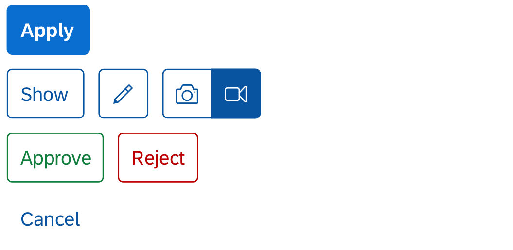
Common button types
Usage
Use the button types as follows:
- Use simple buttons for specific actions, such as:
- Create, Edit, Save
- Approve, Reject
- Accept, Decline
- OK, Cancel
- Use toggle buttons in a toolbar to activate or deactivate an object or element. You can also use toggle buttons to switch between different states.
- If you want the user to select one option from a small group, offer a segmented button in the toolbar. For example:
- Year, Month, Day
- Small, Medium, Large
Do not use buttons if:
- You want to link to a different page or object. Use the link instead.
- You want to display several similar actions or a group of actions at once. Use the menu button instead.
- You want to let users upload content. Use the upload collection control instead.
Responsiveness
The button usually grows to fit the size of the text. If you set a fixed size for the button, the text truncates.
If the button is used in a responsive container or toolbar, it follows the responsive behavior defined for that element. For example, the button can move to another line.
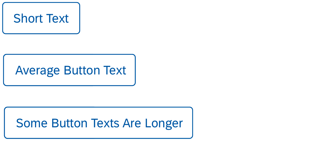
Buttons with different lengths
Types
Button
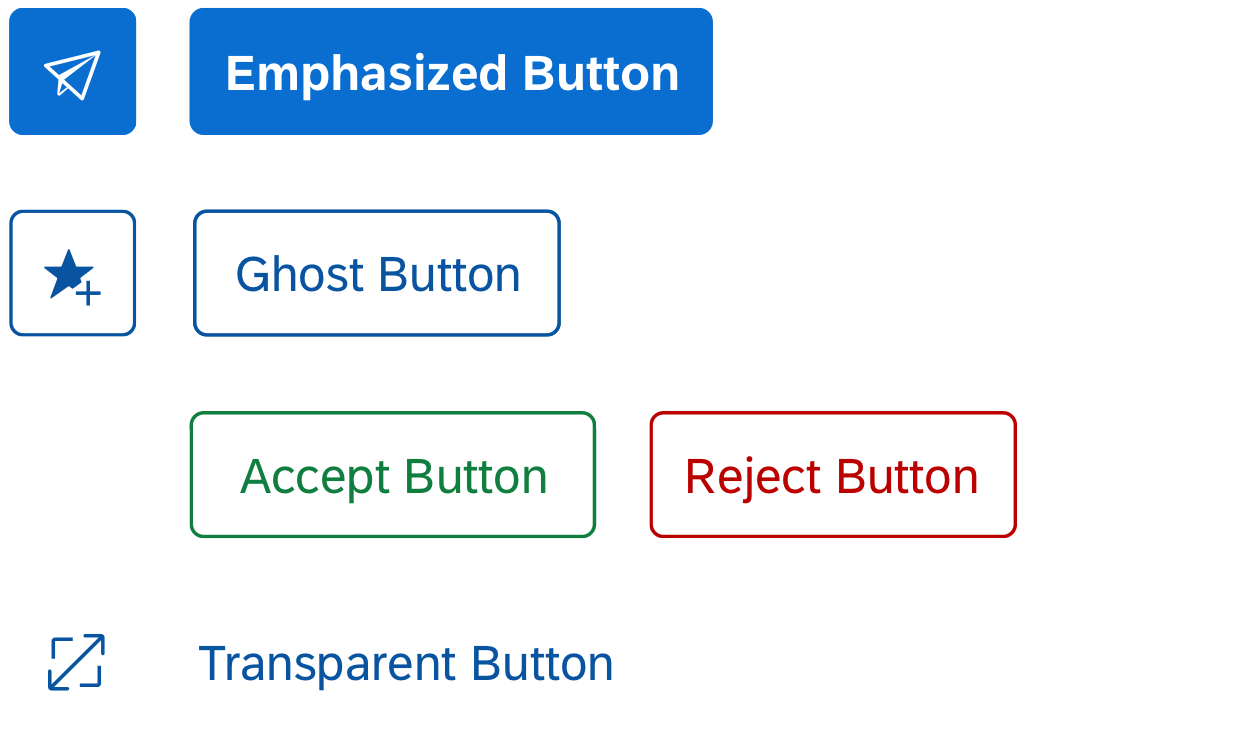
Buttons can trigger primary, secondary, semantic, and negative path actions. Find out more about the different action types in the action placement article.
Header and Footer Toolbars
Use the following button styling for the different action types in the header and footer toolbar:
- Primary action: Use the emphasized button style.
- Secondary action: Use the ghost button style.
- Semantic action: Use the semantic buttons for positive and negative actions. Use the “accept” style for positive actions, and “reject” for negative actions. Semantic actions must always be text buttons.
- Negative path action: Use the transparent button style.
Content Toolbars
Use the following button styling for the different action types in the content toolbars such as table, form, or chart toolbar:
- Primary action: Use the emphasized button style. Please note that there can only be one primary action per page. Usually, the primary action is positioned in the header or footer toolbar. If a page already has a primary action, but you also need to highlight the most important action in a content toolbar, use the ghost styling for this one button in the content toolbar.
- Secondary action: Use the transparent button style.
The different button styles are designed to give appropriate feedback to users. Don’t use them for decoration purposes.
Button with different styles
Toggle Button
A toggle button switches between two actions. One of the actions is always active, one is inactive. Use the toggle button for secondary actions.
Apply the following button styles for the different toolbars:
- Header and footer toolbars: Use the ghost button style.
- Content toolbars: Use the transparent button style.

Toggle buttons
Segmented Button
A segmented button shows a group of options. Only one of the options can be active, the others remain or become inactive. Pressing an option activates it. By default, the control for segmented buttons calculates the button width and applies it to all buttons within the group. You can change this by setting the width for individual buttons.
The segmented button is comparable to a radio button group control.
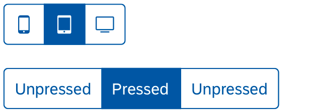
Segmented buttons
Components
A button can contain an icon OR a text.
Always use a text button for primary, secondary, semantic and negative path actions.
Use icon buttons only if the icon metaphor is easily recognizable. Ideally, it should have same meaning worldwide. For more information about icons in general, check out the article on iconography.
Behavior and Interaction
To trigger the action, the user clicks, taps, or activates the button, toggle button, or segmented button via the keyboard or screen reader. The button provides visual feedback for “hover” and “press-down” states.
The toggle button remains in the pressed state until it is pressed again. In the segmented button, the chosen option stays active until the user presses one of the other other options.
If an action cannot be triggered, disable the corresponding button.
All three button types support the cozy and compact form factors. The compact form factor is used for apps running on device operated with a keyboard and mouse. For more information, check out the article on content density.

Regular state

Hover state

Press-down state

Disabled state
Guidelines
Button Text
- Choose a button text that is short and meaningful.
- Use a verb in the imperative for all actions (for example: Save, Cancel, Edit).
Note: The grammatical form for actions can differ for other languages. For example, German action labels use the infinitive (Speichern, Abbrechen, Bearbeiten). - Keep in mind that the text can be up to 300% longer in other languages.
- If you need to show the number of items that will be affected by the action of the button, you can add the number in parentheses. For example, Edit (3).
Icon Buttons
- For icon buttons, make sure the default accessibility text for the icon is correct for your use case. If not, define an app-specific accessibility text.
- Offer a tooltip to show the label for icon buttons.
- Don’t use the icon control for buttons. Use the icon property for the button instead.
Temporarily Inactive Buttons
- If an action button is temporarily inactive, use the disabled status.
Examples

Header toolbar with primary action (emphasized styling) and secondary actions (ghost styling)

Table toolbar with search field, segmented button, text buttons (ghost and transparent styling), and icon buttons (transparent styling)

Footer toolbar with standard actions: 'Save' (emphasized) and 'Cancel' (transparent)
Resources
Want to dive deeper? Follow the links below to find out more about related controls, the SAPUI5 implementation, and the visual design.
Elements and Controls
- No links
Implementation
- No links
 Your feedback has been sent to the SAP Fiori design team.