
- Latest SAPUI5 Version 1.120
- Version 1.118
- SAPUI5 Version 1.116
- SAPUI5 Version 1.114
- SAPUI5 Version 1.112
- SAPUI5 Version 1.110
- SAPUI5 Version 1.108
- SAPUI5 Version 1.106
- SAPUI5 Version 1.104
- SAPUI5 Version 1.102
- SAPUI5 Version 1.100
- SAPUI5 Version 1.98
- SAPUI5 Version 1.96
- SAPUI5 Version 1.94
- SAPUI5 Version 1.92
- SAPUI5 Version 1.90
- SAPUI5 Version 1.88
- SAPUI5 Version 1.86
- SAPUI5 Version 1.84
- SAPUI5 Version 1.82
- SAPUI5 Version 1.80
- SAPUI5 Version 1.78
- SAPUI5 Version 1.76
- SAPUI5 Version 1.74
- SAPUI5 Version 1.70
- SAPUI5 Version 1.68
- SAPUI5 Version 1.66
- SAPUI5 Version 1.64
- SAPUI5 Version 1.62
- SAPUI5 Version 1.60
- SAPUI5 Version 1.58
- SAPUI5 Version 1.56
- SAPUI5 Version 1.54
- SAPUI5 Version 1.52
- SAPUI5 Version 1.50
- SAPUI5 Version 1.48
- SAPUI5 Version 1.46
- SAPUI5 Version 1.44
- SAPUI5 Version 1.42
- SAPUI5 Version 1.40
- SAPUI5 Version 1.38
- SAPUI5 Version 1.36
- SAPUI5 Version 1.34
- SAPUI5 Version 1.32
- SAPUI5 Version 1.30
- SAPUI5 Version 1.28
- SAPUI5 Version 1.26
- Latest SAPUI5 Version 1.120
- Version 1.118
- SAPUI5 Version 1.116
- SAPUI5 Version 1.114
- SAPUI5 Version 1.112
- SAPUI5 Version 1.110
- SAPUI5 Version 1.108
- SAPUI5 Version 1.106
- SAPUI5 Version 1.104
- SAPUI5 Version 1.102
- SAPUI5 Version 1.100
- SAPUI5 Version 1.98
- SAPUI5 Version 1.96
- SAPUI5 Version 1.94
- SAPUI5 Version 1.92
- SAPUI5 Version 1.90
- SAPUI5 Version 1.88
- SAPUI5 Version 1.86
- SAPUI5 Version 1.84
- SAPUI5 Version 1.82
- SAPUI5 Version 1.80
- SAPUI5 Version 1.78
- SAPUI5 Version 1.76
- SAPUI5 Version 1.74
- SAPUI5 Version 1.72
- SAPUI5 Version 1.70
- SAPUI5 Version 1.68
- SAPUI5 Version 1.66
- SAPUI5 Version 1.64
- SAPUI5 Version 1.62
- SAPUI5 Version 1.60
- SAPUI5 Version 1.58
- SAPUI5 Version 1.56
- SAPUI5 Version 1.54
- SAPUI5 Version 1.52
- SAPUI5 Version 1.50
- SAPUI5 Version 1.48
- SAPUI5 Version 1.46
- SAPUI5 Version 1.44
- SAPUI5 Version 1.42
- SAPUI5 Version 1.40
- SAPUI5 Version 1.38
- SAPUI5 Version 1.36
- SAPUI5 Version 1.34
- SAPUI5 Version 1.32
- SAPUI5 Version 1.30
- SAPUI5 Version 1.28
- SAPUI5 Version 1.26
Range Slider
sap.m.RangeSlider
Intro
A range slider is a user interface control that enables the user to select a value range within a predefined numerical interval.
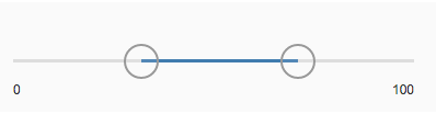
Range slider
Usage
Use the range slider if you want to select a value range within a predefined numerical interval. If you want to specify only a single value within a predefined numerical interval, use the slider instead.
Responsiveness
The range slider itself is not responsive. It adjusts to the responsiveness of its parent container by recalculating and resizing the width of the control. The range slider supports the cozy and compact form factors.
Types
Only a horizontal range slider is available.
Components
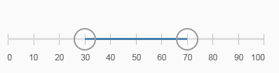
The range slider consists of:
- Progress line
- Minimum and maximum value
- Grips
- Tooltips or input fields
Range slider components
Behavior and Interaction
Changing Values
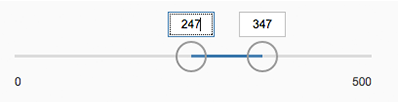
If the range slider is editable, the hand cursor appears when hovering over the range slider with the mouse. A tooltip also appears when hovering, displaying the current values of each grip. The grips move together with the corresponding tooltips.
The user can change the value range on the slider in two ways:
- By using drag and drop to adjust the grips
- By clicking the bar outside the value range. The corresponding grip then moves to the new position.
The grips can be moved with or without increments based on the predefined steps.

Range slider on hover
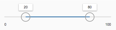
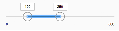
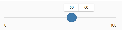
Range Slider with Input Fields
The range slider can be used with input fields instead of tooltips.
Range slider with input fields
Moving the Entire Range
Users can move the entire value range by dragging and dropping the progress line.
Range slider - Moving the entire range
Equal Values
The grips of the range slider can be positioned on the same value.
Range slider with equal values
Overlapping
The grips of the range slider can be moved across each other. The minimum can become the maximum, and vice versa.
Tick Marks
You can apply tick marks to the range slider. The tick marks are related to the step property. For example, if you have a range from 1 to 100 and a step of 10, the range slider will have 11 tick marks. The tick marks are responsive. If the distance between 2 tick marks is less than 8 px, all tick marks except for the first and last disappear.

Range slider with tick marks
Tick Marks and Labels
If tick marks are set, you can define labels for the tick marks. The labels are displayed below the tick marks and show the corresponding value of the tick mark. The labels must never overlap. You can also define labels only for specific tick marks if you don’t need a label for every tick mark on the slider. The application developer is responsible for defining a reasonable set of tick marks.
If there is not enough horizontal space to display all the labels, a responsive mechanism is activated. The first and the last label are always visible.
Range slider with tick marks and labels
Custom Values
You can define custom values as labels. This can be useful if your scenario requires descriptive intervals, such as as dates. Always keep the values as short and meaningful as possible.
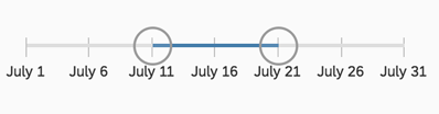
Range slider with custom values as labels
Properties
- The step property must be positive. If a negative number is provided, the default value 1 is used instead.
- The minimum, maximum, and value properties can be decimals (float values). The slider automatically sets the minimum value to 0 and the maximum value to 100 by default.
- The width of the control can be provided in percentage (%), em, px, and all possible CSS units. The slider automatically sets the width of the slider to 100% by default.
- The range property determines the range in which the user can select values. If the value is lower/higher than the allowed minimum/maximum, a warning message is displayed.
- The inputsAsTooltips property indicates whether input fields are being used as tooltips for the grips.
Resources
Want to dive deeper? Follow the links below to find out more about related controls, the SAPUI5 implementation, and the visual design.
 Your feedback has been sent to the SAP Fiori design team.