
- Latest SAPUI Version 1.124
- SAPUI5 Version 1.122
- SAPUI5 Version 1.120
- SAPUI5 Version 1.118
- SAPUI5 Version 1.116
- SAPUI5 Version 1.114
- SAPUI5 Version 1.112
- SAPUI5 Version 1.110
- SAPUI5 Version 1.108
- SAPUI5 Version 1.106
- SAPUI5 Version 1.104
- SAPUI5 Version 1.102
- SAPUI5 Version 1.100
- SAPUI5 Version 1.98
- SAPUI5 Version 1.96
- SAPUI5 Version 1.94
- SAPUI5 Version 1.92
- SAPUI5 Version 1.90
- SAPUI5 Version 1.88
- SAPUI5 Version 1.86
- SAPUI5 Version 1.84
- SAPUI5 Version 1.82
- SAPUI5 Version 1.80
- SAPUI5 Version 1.78
- SAPUI5 Version 1.76
- SAPUI5 Version 1.74
- SAPUI5 Version 1.70
- SAPUI5 Version 1.68
- SAPUI5 Version 1.66
- SAPUI5 Version 1.64
- SAPUI5 Version 1.62
- SAPUI5 Version 1.60
- SAPUI5 Version 1.58
- SAPUI5 Version 1.56
- SAPUI5 Version 1.54
- SAPUI5 Version 1.52
- SAPUI5 Version 1.50
- SAPUI5 Version 1.48
- SAPUI5 Version 1.46
- SAPUI5 Version 1.44
- SAPUI5 Version 1.42
- SAPUI5 Version 1.40
- SAPUI5 Version 1.38
- SAPUI5 Version 1.36
- SAPUI5 Version 1.34
- SAPUI5 Version 1.32
- SAPUI5 Version 1.30
- SAPUI5 Version 1.28
- SAPUI5 Version 1.26
- Latest SAPUI Version 1.124
- SAPUI5 Version 1.122
- SAPUI5 Version 1.120
- SAPUI5 Version 1.118
- SAPUI5 Version 1.116
- SAPUI5 Version 1.114
- SAPUI5 Version 1.112
- SAPUI5 Version 1.110
- SAPUI5 Version 1.108
- SAPUI5 Version 1.106
- SAPUI5 Version 1.104
- SAPUI5 Version 1.102
- SAPUI5 Version 1.100
- SAPUI5 Version 1.98
- SAPUI5 Version 1.96
- SAPUI5 Version 1.94
- SAPUI5 Version 1.92
- SAPUI5 Version 1.90
- SAPUI5 Version 1.88
- SAPUI5 Version 1.86
- SAPUI5 Version 1.84
- SAPUI5 Version 1.82
- SAPUI5 Version 1.80
- SAPUI5 Version 1.78
- SAPUI5 Version 1.76
- SAPUI5 Version 1.74
- SAPUI5 Version 1.72
- SAPUI5 Version 1.70
- SAPUI5 Version 1.68
- SAPUI5 Version 1.66
- SAPUI5 Version 1.64
- SAPUI5 Version 1.62
- SAPUI5 Version 1.60
- SAPUI5 Version 1.58
- SAPUI5 Version 1.56
- SAPUI5 Version 1.54
- SAPUI5 Version 1.52
- SAPUI5 Version 1.50
- SAPUI5 Version 1.48
- SAPUI5 Version 1.46
- SAPUI5 Version 1.44
- SAPUI5 Version 1.42
- SAPUI5 Version 1.40
- SAPUI5 Version 1.38
- SAPUI5 Version 1.36
- SAPUI5 Version 1.34
- SAPUI5 Version 1.32
- SAPUI5 Version 1.30
- SAPUI5 Version 1.28
- SAPUI5 Version 1.26
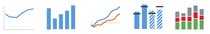
Choosing the Correct Chart Type
Intro
Charts are used to visually represent how numeric values relate to each other. Therefore, it’s crucial to define the type of relationship you want to illustrate when choosing the correct chart type.
Ranking
Rank items from highest to lowest, or vice versa.
For example: Rank countries by market share.
Use: Bar chart or column chart
For more information, see Chart – Ranking.

Comparison
Compare values of items in a list that has no particular order.
For example: Compare revenues in a list of products, or transaction volumes in a list of banks.
Use: Bar chart, stacked bar chart, bullet chart, heatmap.
For more information, see Chart – Comparison.

Variation Over Time
Show the variation of values over time.
For example: Show the stock level over time, or expenses by month compared to budget.
Use: Line chart, column chart, stacked column chart, bullet chart.
For more information, see Chart – Variation Over Time.
Part to Whole
Display the contribution of individual values to the whole.
For example: Show the percentage of sales attributed to various regions.
Use: Pie chart, bar chart, line chart, stacked bar chart.
For more information, see Chart – Part to Whole.

Deviation
Show the deviation, difference, or gap between two sets of values.
For example: Show the deviation between actual revenue and target revenue by product.
Use: Bar chart, bullet chart, column chart, line chart.
For more information, see Chart – Deviation.

Distribution
Show the distribution within a set of values.
For example: Show how exam scores are spread or grouped around the median score.
Use: Bar chart, column chart, stacked column chart, line chart.
For more information, see Chart – Distribution.

Correlation
Show the correlation between two or three sets of values.
For example: Show how sales revenues are impacted by customer age.
Use: Scatter chart, bubble chart, bar chart.
For more information, see Chart – Correlation.

Cumulation
Show the accumulation of successive values.
For example: Show cumulation of stock day by day, or cumulation of revenues and cost for profit and loss.
Use: Waterfall chart
For more information, see Cumulation (Waterfall Chart).

Geographical Values
Use a map to show the values associated with geographical areas.
For example: Show revenues by country or region on a map.
For more information, see maps.

Recources
Want to dive deeper? Follow the links below to find out more about related controls, the SAPUI5 implementation, and the visual design.
 Your feedback has been sent to the SAP Fiori design team.