
- Latest SAPUI Version 1.124
- SAPUI5 Version 1.122
- SAPUI5 Version 1.120
- SAPUI5 Version 1.118
- SAPUI5 Version 1.116
- SAPUI5 Version 1.114
- SAPUI5 Version 1.112
- SAPUI5 Version 1.110
- SAPUI5 Version 1.108
- SAPUI5 Version 1.106
- SAPUI5 Version 1.104
- SAPUI5 Version 1.102
- SAPUI5 Version 1.100
- SAPUI5 Version 1.98
- SAPUI5 Version 1.96
- SAPUI5 Version 1.94
- SAPUI5 Version 1.92
- SAPUI5 Version 1.90
- SAPUI5 Version 1.88
- SAPUI5 Version 1.86
- SAPUI5 Version 1.84
- SAPUI5 Version 1.82
- SAPUI5 Version 1.80
- SAPUI5 Version 1.78
- SAPUI5 Version 1.76
- SAPUI5 Version 1.74
- SAPUI5 Version 1.72
- SAPUI5 Version 1.70
- SAPUI5 Version 1.68
- SAPUI5 Version 1.66
- SAPUI5 Version 1.64
- SAPUI5 Version 1.62
- SAPUI5 Version 1.60
- SAPUI5 Version 1.58
- SAPUI5 Version 1.56
- SAPUI5 Version 1.54
- SAPUI5 Version 1.52
- SAPUI5 Version 1.50
- SAPUI5 Version 1.48
- SAPUI5 Version 1.46
- SAPUI5 Version 1.44
- SAPUI5 Version 1.42
- SAPUI5 Version 1.40
- SAPUI5 Version 1.36
- SAPUI5 Version 1.34
- SAPUI5 Version 1.32
- SAPUI5 Version 1.30
- SAPUI5 Version 1.28
- SAPUI5 Version 1.26
- Latest SAPUI Version 1.124
- SAPUI5 Version 1.122
- SAPUI5 Version 1.120
- SAPUI5 Version 1.118
- SAPUI5 Version 1.116
- SAPUI5 Version 1.114
- SAPUI5 Version 1.112
- SAPUI5 Version 1.110
- SAPUI5 Version 1.108
- SAPUI5 Version 1.106
- SAPUI5 Version 1.104
- SAPUI5 Version 1.102
- SAPUI5 Version 1.100
- SAPUI5 Version 1.98
- SAPUI5 Version 1.96
- SAPUI5 Version 1.94
- SAPUI5 Version 1.92
- SAPUI5 Version 1.90
- SAPUI5 Version 1.88
- SAPUI5 Version 1.86
- SAPUI5 Version 1.84
- SAPUI5 Version 1.82
- SAPUI5 Version 1.80
- SAPUI5 Version 1.78
- SAPUI5 Version 1.76
- SAPUI5 Version 1.74
- SAPUI5 Version 1.72
- SAPUI5 Version 1.70
- SAPUI5 Version 1.68
- SAPUI5 Version 1.66
- SAPUI5 Version 1.64
- SAPUI5 Version 1.62
- SAPUI5 Version 1.60
- SAPUI5 Version 1.58
- SAPUI5 Version 1.56
- SAPUI5 Version 1.54
- SAPUI5 Version 1.52
- SAPUI5 Version 1.50
- SAPUI5 Version 1.48
- SAPUI5 Version 1.46
- SAPUI5 Version 1.44
- SAPUI5 Version 1.42
- SAPUI5 Version 1.40
- SAPUI5 Version 1.38
- SAPUI5 Version 1.36
- SAPUI5 Version 1.34
- SAPUI5 Version 1.32
- SAPUI5 Version 1.30
- SAPUI5 Version 1.28
- SAPUI5 Version 1.26
Range Slider
sap.m.RangeSlider
Intro
A range slider is a user interface control that enables the user to select a value range in a predefined numerical interval.
Range slider
Usage
Use the range slider if you want to select a value range in a predefined numerical interval. If you want to specify only a single value in a predefined numerical interval, use the slider instead.
Responsiveness
The range slider itself is not responsive. It adjusts to the responsiveness of its parent container by recalculating and resizing the width of the control. The range slider supports the cozy and compact form factors.
Types
Only a horizontal range slider is available.
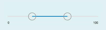
Components
The range slider consists of:
- Progress line
- Minimum and maximum values
- Grips
- Tooltips
Range slider components
Behavior and Interaction
Adjusting the Values
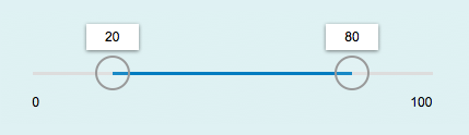
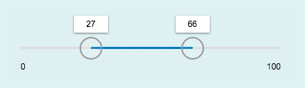
If the range slider is editable, the hand cursor appears when hovering over the range slider with the mouse. A tooltip also appears when hovering, displaying the current values of each grip. The grips move together with the corresponding tooltips.
The value range of the slider can be changed when the grips are adjusted via drag and drop. The grips can be moved with or without increments based on the predefined steps. The value range can be changed by clicking or tapping the bar outside of it. The corresponding grip then moves to this new position.
Range slider - hovered
Equal values
- The grips of the range slider can be positioned on the same value.
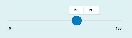
Range slider - equal values
Overlapping
- The grips of the range slider can be moved across each other. The minimum can become the maximum and vice versa.
Properties
- The step property must be positive. If a negative number is provided, the default value 1 is used instead.
- The minimum, maximum, and value properties can be decimals (float values). The slider automatically sets the minimum value to 0 and the maximum value to 100 by default.
- The width of the control can be provided in percentage (%), em, px, and all possible CSS units. The slider automatically sets the width of the slider to 100% by default.
- The range property determines the range in which the user can select values. If the value is lower/higher than the allowed minimum/maximum, a warning message will be sent to the console.
Resources
Want to dive deeper? Follow the links below to find out more about related controls, the SAPUI5 implementation, and the visual design.
 Your feedback has been sent to the SAP Fiori design team.